Travertine, Brass, and the Quiet Power of Natural Materials in Modern Interiors
A STONE WITH A STORY
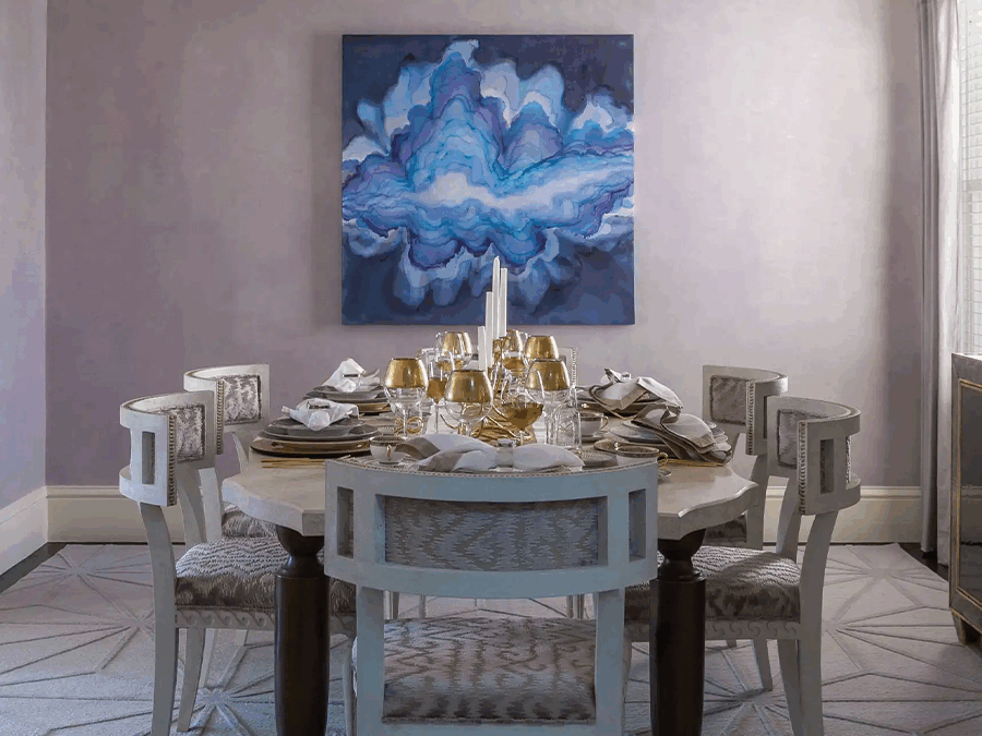
There is a particular moment in every design project when a room stops looking assembled and starts feeling inhabited. More often than not, that shift comes down to material. Not color, not layout, not even the furniture itself—but the substance of the things within the room and what they communicate to the hand, the eye, and the subconscious.
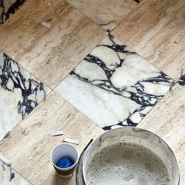
Travertine is having that moment in 2026—though to call it a moment feels reductive. This is a stone that has been used in architecture for over two thousand years, from the Colosseum to the Getty Center. Its appeal is not trendy; it is geological. Each slab carries the record of mineral springs and ancient water, visible in its pitted surface and veined warmth. When you place a travertine vessel on a console or a pedestal table in an entryway, you are not just decorating. You are grounding a space in something older and more permanent than any season’s color forecast.
“The best materials don’t need to announce themselves. They simply make everything around them feel more considered.”
WHY NATURAL MATERIALS ARE DEFINING LUXURY IN 2026
After years of high-gloss lacquer, engineered surfaces, and the sleek anonymity of contemporary minimalism, there has been a meaningful pivot toward materials that carry provenance. Clients are asking not just what something looks like, but where it comes from, how it was made, and what it will feel like underhand in ten years.
This is not nostalgia. It’s sophistication. The most discerning homeowners I work with in Sarasota, Nantucket, and St. Louis share a common instinct: they want their homes to feel grounded. They want warmth without excess, texture without clutter, and permanence without heaviness. Natural materials—travertine, brass, hand-carved stone, woven rattan—deliver on every count.
TRAVERTINE: THE STONE THAT WARMS A ROOM
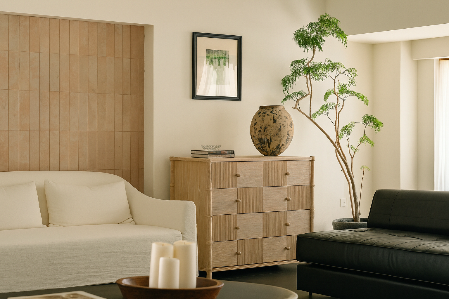
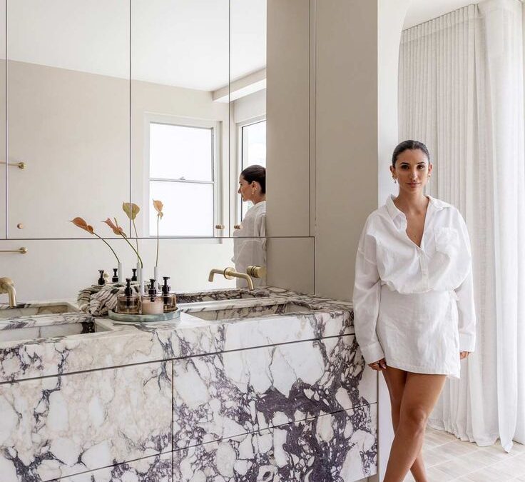
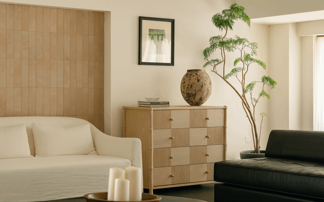
Unlike cooler marbles, travertine reads warm. Its tones range from creamy ivory to honeyed caramel, and its naturally pitted surface creates a tactile quality that polished stone cannot replicate. In a living room, a pair of Drift Form Bowls in travertine on a coffee table becomes more than decor—it becomes an anchor, a grounding gesture that invites touch and slows the eye.
The Solenne Travertine Pedestal Table achieves something similar at a larger scale. As a side table or a sculptural accent in an entryway, it carries the visual weight of stone without the mass of a slab. Its clean geometry lets the material speak—and travertine, when given the floor, is remarkably eloquent.
BRASS: WARMTH THAT DEEPENS WITH TIME
If travertine is the grounding note, brass is the golden thread. It catches light, reflects warmth, and—crucially—develops a patina over time that makes it more beautiful with use. In an era when so many finishes are engineered to remain static, there is something deeply appealing about a material that improves with age.
I use brass selectively but consistently: a pair of Vitruvian Travertine and Brass Bookends on a shelf, the brass collar of the Monolith Table Lamp on a nightstand, the rim of a catchall tray on an entryway console. These are not statements. They are connections—small moments of warmth that unify a room without dominating it.
VESSELS AND SCULPTURAL OBJECTS: THE ART OF THE USEFUL BEAUTIFUL
One of the design principles I return to most often is this: every object in a room should earn its place. A vessel can hold branches or stand alone as sculpture. A bowl can serve olives at dinner or sit empty on a console, beautiful in its curve and weight. The Linea Arc Vessel and the Eclipse Plinth Vessel both occupy this territory—they are functional enough to use and sculptural enough to admire.
This dual purpose is what separates decorating from designing. A decorated room has things placed upon surfaces. A designed room has objects in conversation with the architecture, the light, and each other. Natural materials make this conversation easier, because they carry inherent visual interest. You don’t need to add more when the material itself is doing the work.
HOW TO LAYER NATURAL MATERIALS WITHOUT OVERWHELMING A SPACE
The key is restraint with variety. Choose two or three dominant materials—say, travertine, brass, and linen—and let them recur in different forms across the room. A travertine lamp base, a brass frame, a linen throw. The repetition creates rhythm; the different forms prevent monotony.
Avoid matching everything too precisely. The beauty of natural materials is their irregularity—the way one piece of travertine differs from the next, the way brass ages differently on a lamp than on a tray. Let those differences breathe. They are what make a room feel collected rather than catalog-ordered.
FREQUENTLY ASKED QUESTIONS
Is travertine durable enough for everyday use?
Absolutely. It’s been used in architecture for millennia. For home accessories, its durability is more than sufficient. Sealed travertine resists stains well, and its natural pitting means small imperfections only add character.
Does brass tarnish?
It develops a patina, which most designers consider a feature, not a flaw. If you prefer a bright finish, a gentle polish restores it easily. Lacquered brass maintains its shine longer.
How do I mix natural materials with a more modern aesthetic?
Natural materials are the bridge between modern and warm. Use them as accent pieces—a travertine bowl on a glass-topped table, brass bookends on a minimalist shelf. The contrast is what makes both elements sing.
What’s the best way to start incorporating natural materials?
Start small—with one beautiful object, like a stone vessel or brass tray. Let it live in your space for a while. You’ll find it draws other choices toward it naturally.

SOMETHING FOR EVERYONE
THE PIECES RACHEL RETURNS TO, AGAIN AND AGAIN