Fresh Spring Color Palettes + Spring Product Roundup
Spring is a season of renewal and rejuvenation, and what better way to embrace the spirit of the season than by refreshing your interior color palate and accentuate the season by bringing the outdoors in. Join us as we list our favorite spring color pallates and was to bring the spring indoors.

Fresh Spring Color Palettes
Here are some exciting options to inspire your home in spring:
Spring Pinks and Bright Yellows: Create a vibrant and cheerful atmosphere with a combination of spring pinks and bright yellows. These colors are perfect for bringing warmth and energy into any space.
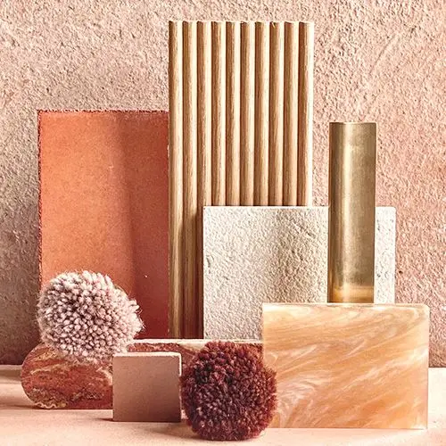
Warm Clay Tones: Embrace the earthy beauty of warm clay tones in your interior design this spring. These colors, reminiscent of terracotta and rustic landscapes, add a cozy and welcoming feel to your home.
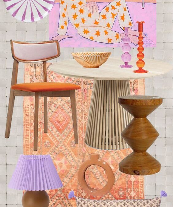
Brighter Palettes: If you’re looking for a bold and daring approach, consider using brighter palettes. Think tangerine orange, sunshiny yellow, Barbie pink, grass green, and Robin’s egg blue. These vibrant colors will infuse your space with freshness and energy.
Soft Greens and Muted Pastels: For a more serene and calming atmosphere, opt for soft greens and muted pastels. These colors evoke the beauty of nature in full bloom and create a sense of tranquility in your home.
Mint, Artichoke, Canary Yellow, and Raspberry Pink: Discover fresh ways to incorporate spring hues with muted shades of mint and artichoke, as well as vibrant canary yellow and raspberry pink. These color palettes add a touch of sophistication and playfulness to your space.
Pops of Green and Soft Pinks: Adding pops of green and soft pinks or light corals can enhance the depth and create a timeless color scheme that radiates ethereal style.


Spring Product Roundup
Now that we’ve explored some inspiring spring color palettes, let’s dive into the world of spring-related interior design products and accessories. Here are some ideas to help you create a fresh and vibrant atmosphere in your home:

The Foyer Table: The foyer table is a favorite spot to change up for the seasons, and spring is no exception. Consider adding some blue/green bottles and faux greens to create a refreshing and inviting display.

Spring Tablescape: Curate a spring-inspired tablescape by incorporating elements such as pastel-colored table linens, floral centerpieces, and delicate dinnerware. These soft furnishings in pastel colors and floral patterns will bring a breath of fresh air to your dining area.

Spring Wreath: Welcome guests with a stunning spring wreath adorning your front door. Opt for wreaths featuring vibrant spring flowers or lush greenery to create a cheerful and inviting entrance.

Indoor Plants: Upgrade your lifestyle with herbs indoors. Opt for basil, mint, dill, cilantro or broccoli sprouts for their superfood health benefits.
By incorporating these fresh spring color palettes and spring-related products and accessories into your interior design, you can create a vibrant and inviting atmosphere that embraces the spirit of the season. So go ahead, refresh your home and welcome spring with open arms!

Something for Everyone
THE PIECES RACHEL RETURNS TO, AGAIN AND AGAIN


")


")