Best Interior Paint Colors for Every Seasonal Color Type: Winter, Spring, Summer, and Autumn

Best Interior Paint Colors for Every Seasonal Color Type: Winter, Spring, Summer, and Autumn

In Search of the Right Color

In a world awash with Pinterest trends and algorithm-driven aesthetics, choosing a paint color can feel oddly transactional—like swiping through a dating app and hoping for chemistry.

You hold up swatches to the light. Scroll through influencer homes. Debate with yourself at the hardware store wondering if it leans yellow, or if it’s just the fluorescent lighting playing tricks again.

. And yet, the decision doesn’t feel right. Because deep down, you know:

Design—real design—is personal.

The right color doesn’t just match your countertops. It reflects your inner light. It supports the way you move through your mornings. It flatters your features in photographs and makes your home feel like a place you belong in, not just one you live in.

And one of the most powerful ways to choose color—one I use with nearly every design client—is seasonal color theory.

Why Seasonal Color Theory Belongs in Your Home

If you’ve ever had your “colors done,” you already know the foundation of this approach. Originally used in personal styling in 1980s, seasonal color theory sorts people into four families—Winter, Spring, Summer, and Autumnbased on their skin tone, eye color, and hair shade.

But this isn’t just for fashion. In interior design, your seasonal palette becomes a tool for harmony. It helps you choose paint, textiles, art, and furniture that work with younot just your architecture.

When your surroundings echo the tones that flatter your natural coloring, something quiet but powerful happens:
you feel more radiant, more at ease, and more at home.

Not sure what your season is?
🎯 Take the free Color Quiz

The Best Paint Colors for Each Seasonal Type

Let’s explore the nuances of each seasonal type and how those palettes translate into room-defining paint choices.

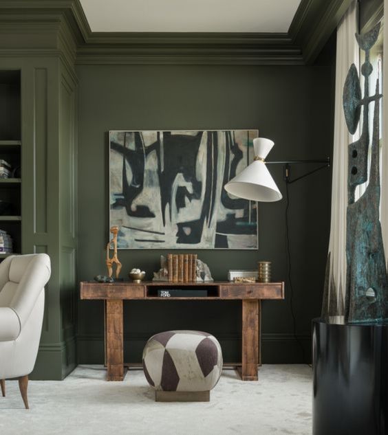
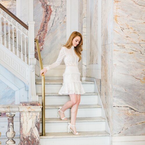
InteriorDesignBlack&White

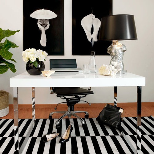
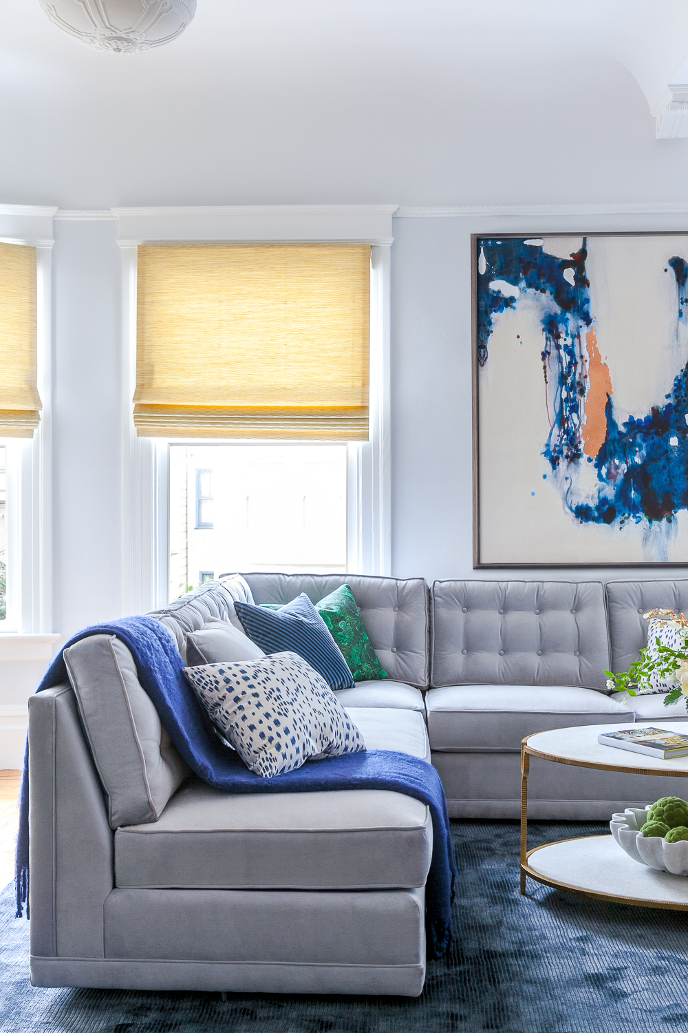
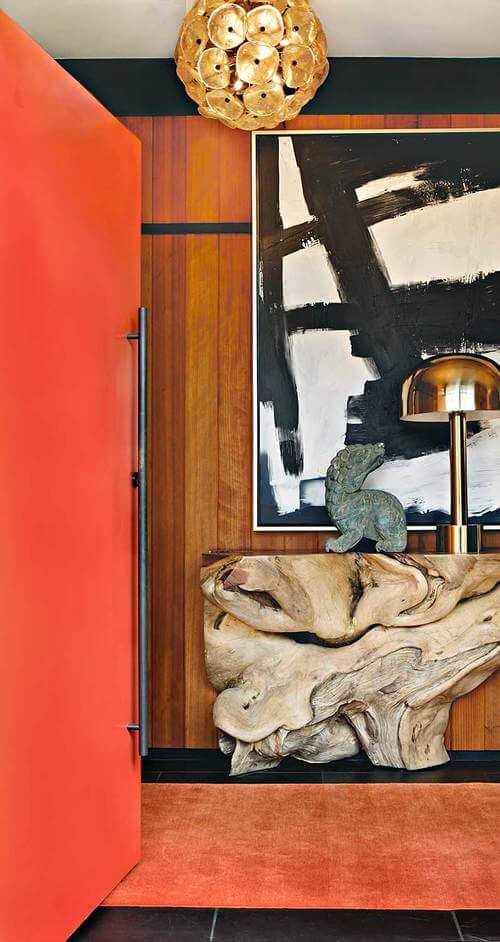
Winter Types: Cool, Bold & Dramatic

You might be: Cool Winter, Deep Winter, or Clear Winter

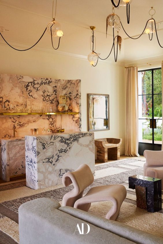
Color Personality: Winters are striking, high-contrast, and thrive in saturated hues. Their style leans modern, sleek, and impactful.

Top Colors for Winter:

  • Charcoal or Deep Navy – Striking for living rooms, offices, or dramatic accent walls.

  • Crisp Cool White – Perfect for trim, ceilings, or creating gallery-style contrast.

  • Emerald, Sapphire, or Ruby – Ideal for bold feature walls or lacquered cabinetry.

  • Jet Black or Graphite – Best used in moody powder rooms or chic modern kitchens.

💡 Design Tip: Winter palettes shine with glossy finishes, clean lines, and bold materials like marble, velvet, or lacquer.

🎨 Paint Tip: Try Sherwin-William’s “Tricorn Black by or Portola Paints “In the Navy Roman Clay” or Farrow & Ball’s “All White”.

❄️ Explore more curated inspiration on our Pinterest Board for Winter

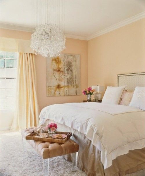
Spring Types: Light, Warm & Clear

You might be: Light Spring, Warm Spring, or Clear Spring

Color Personality: Springs radiate energy, optimism, and light. Your best colors are clear, fresh, and sun-kissed.

Top Colors for Spring:

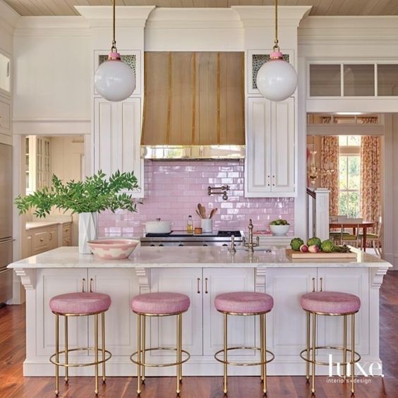
  • Creamy Butter Yellow – A cheerful yet soft neutral for kitchens, entryways, or bedrooms.

  • Peachy Coral – Perfect for feature walls or a playful powder room.

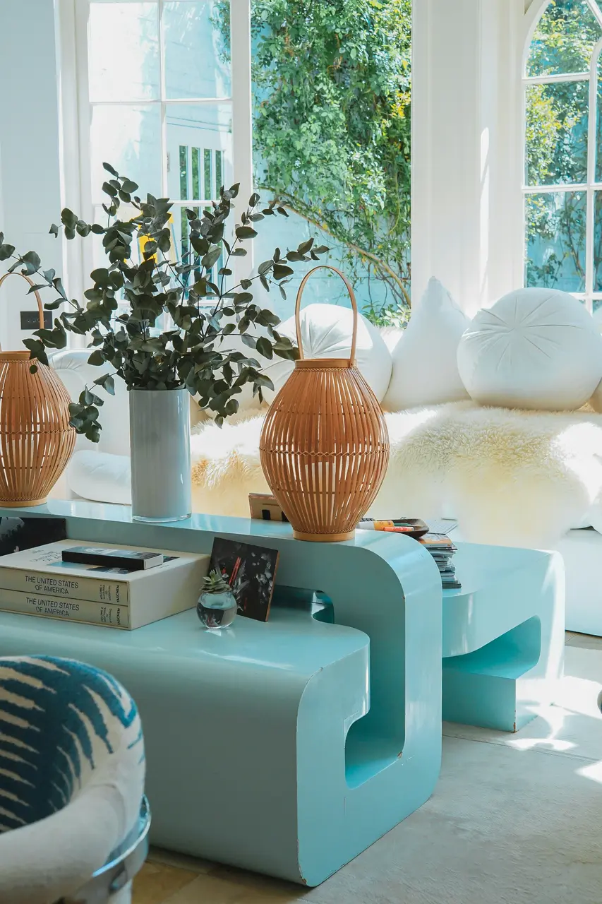
  • Mint or Soft Aqua – Brings life to a bathroom, laundry, or sunroom.

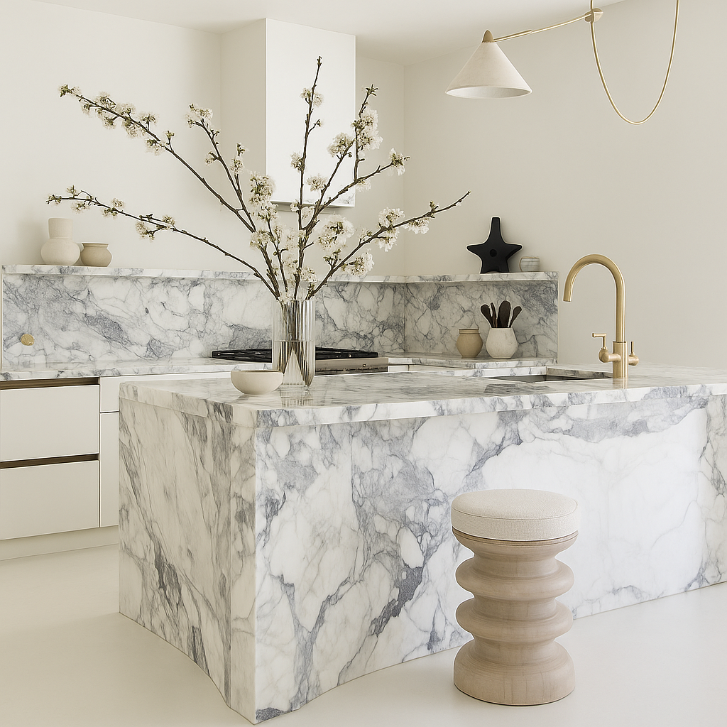
  • Warm Ivory or Buttermilk – A cozy alternative to stark white for trim or base walls.

💡 Design Tip: Pair Spring tones with brass hardware, light oak woods, floral textiles, and plenty of natural light to maximize their uplifting quality.

🌸 Explore more curated inspiration on our Pinterest Board for Spring

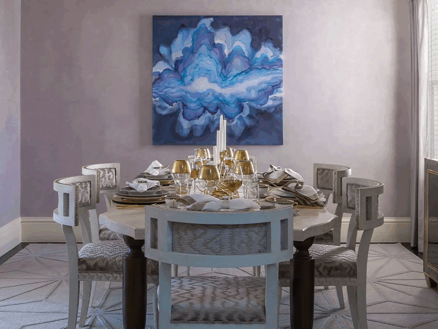
RachelBlindauerInteriorDesign

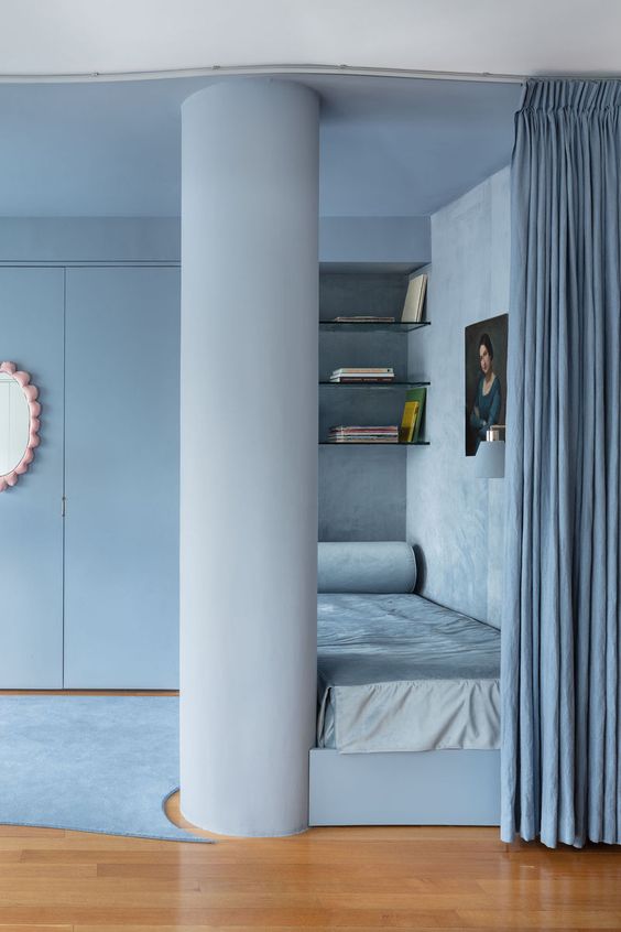
Summer Types: Soft, Cool & Muted

You might be: Soft Summer, Light Summer, or Cool Summer

Color Personality: Summers glow in delicate, powdery tones. Gravitates toward softness, romance, and subtle layering.

Top Colors for Summer:

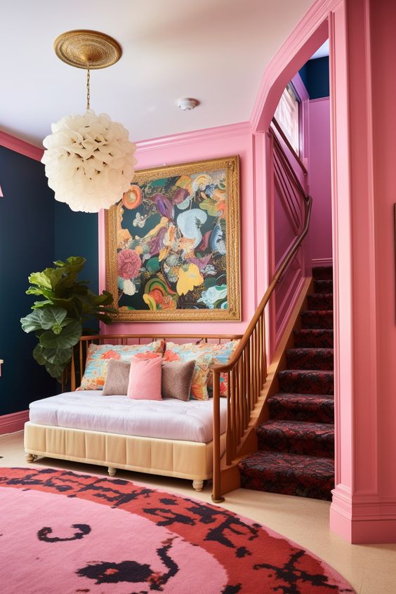
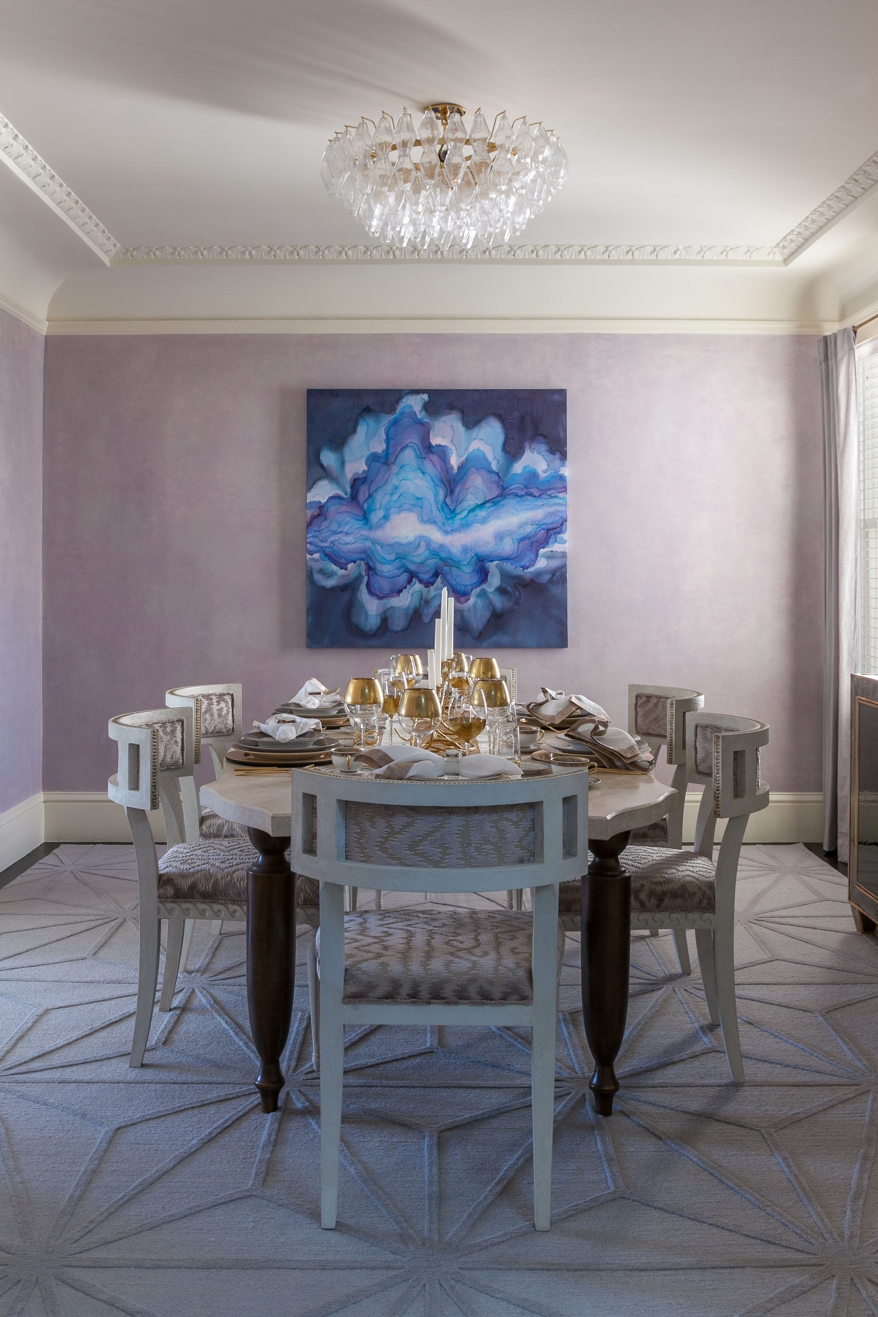
  • Dusty Rose or Mauve – A romantic choice for bedrooms or a serene sitting area.

  • French Blue or Wisteria – Brings tranquility to bathrooms or home offices.

  • Sage Green – A modern, cool-toned neutral that pairs beautifully with natural textures.

  • Oyster Gray or Mist – Timeless and elegant for cabinetry, trim, or entire rooms.

💡 Design Tip: Accentuate Summer palettes with matte finishes, brushed nickel, antique glass, and linen upholstery for a look that’s layered but never loud.

🎨 Paint Tip: Try Benjamin Moore’s “Just Beige” or Farrow and Ball’s Oval Room or Farrow & Ball’s “Skimming Stone”

🌿 Explore more curated inspiration on our Pinterest Board for Summer

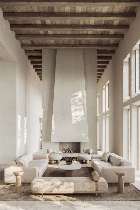
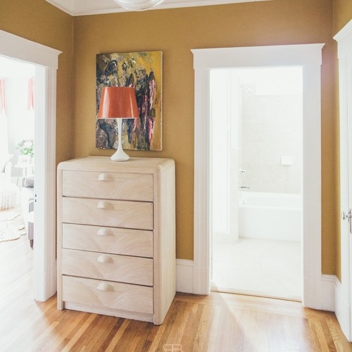
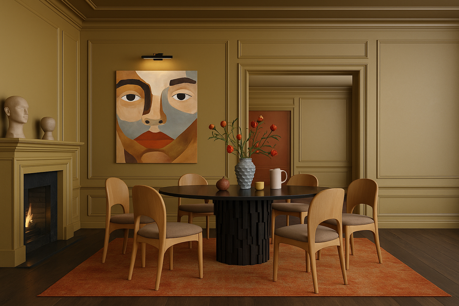
Autumn Types: Warm, Deep & Earthy

You might be: Warm Autumn, Deep Autumn, or Soft Autumn

Color Personality: Autumns feel at home in rich, nature-inspired hues. Your palette is warm, textural, and soulful.

Top Colors for Autumn:

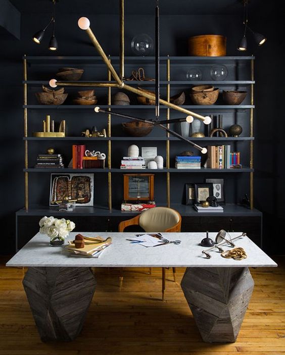
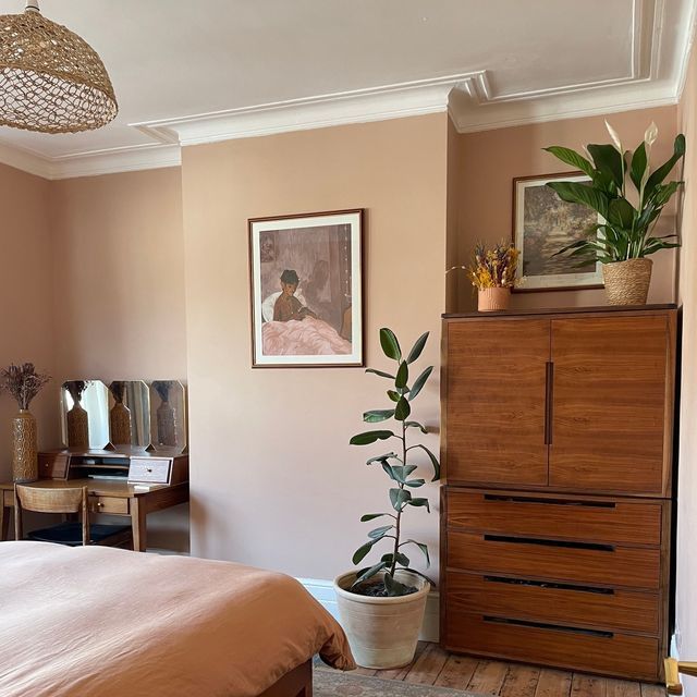
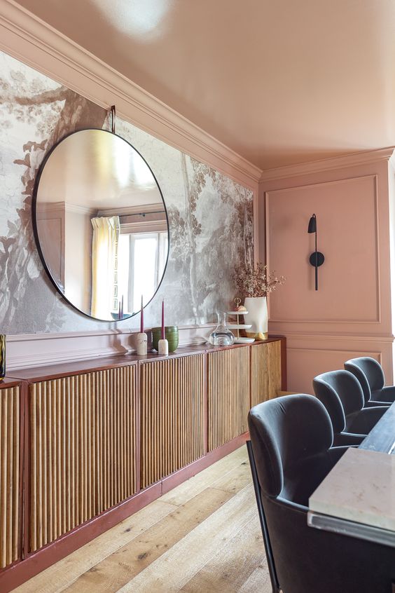
  • Terracotta or Clay – Brings instant depth to dining rooms or cozy nooks.

  • Olive or Moss Green – A sophisticated, grounding choice for libraries or cabinetry.

  • Spiced Pumpkin or Burnt Sienna – Adds seasonal richness to accent walls.

  • Camel or Warm Taupe – A versatile, warm neutral that makes any space feel welcoming.

💡 Design Tip: Use matte or eggshell finishes, layer with natural fibers (like jute and linen), and incorporate wood tones, leather, and rattan for warmth and character.

🍁 Explore more curated inspiration on our Pinterest Board for Autumn

✨ Why It Works: Your Personal Palette, Applied to Your Home

When you walk into a room that aligns with your seasonal palette, something clicks.

The light feels right. The colors flatter your features in photographs. The energy in the space feels calm and tailored—not overstimulating, not dull. Just right. When your home’s colors align with your seasonal palette, everything begins to click. The space feels more flattering, energizing, and serene. Your seasonal palette can subtly influence your energy levels, confidence, and even the cohesion of your wardrobe and interiors.

Not sure of your palette yet?

  • Take the Color Quiz

  • Explore the Power Color Finder Tool for an advanced guide to your top 3 signature colors and the 2 shades to avoid—plus customized recommendations for home and wardrobe.

The Psychology of Alignment

There’s a moment—when the paint is dry, the light hits just right, and the color reflects not only your space but yourselfthat everything clicks.

The room feels calm. The edges feel right.
The color doesn’t overpower—you glow within it.

This is what happens when design honors your natural palette. The result isn’t just aesthetic. It’s psychological. It’s subtle, supportive, and sustaining.

Paint isn’t just pigment—it’s emotional architecture. Studies show that color influences how we think, feel, and even behave. Green, for example, has been found to boost concentration and reading ability by up to 15%. Blue can lower heart rate and reduce anxiety. Yellow stimulates serotonin, improving mood and energy. Meanwhile, red can heighten alertness and stimulate appetite—hence its popularity in dining rooms.

How to Actually Pick a Color (Without Losing Your Mind)

Sample Generously: Paint a 2′ x 2′ square on each wall you’re considering. Yes, every wall. Light changes everything.

Observe in Shifts: Check the color in morning light, afternoon light, and evening lamplight. If you’re still in love after 24 hours, you have a winner.

Choose the Right Sheen: Matte for walls, eggshell for bathrooms, semi-gloss for trim. Simple rules, big impact.

Don’t Forget the Flow: Each room doesn’t need to match, but it should feel connected. Use undertones to unify.

Rachel Blindauer is an award-winning interior and product designer based in St. Louis and Lincoln MA. Through her namesake studio, she helps clients across the U.S. create homes that feel as good as they look.

Book a Color Consultation

Whether you’re choosing a single paint color or planning an entire home refresh, I can help you translate your season into a space that feels tailored and timeless.

📆 Book a 2-Hour Elevate Consultation →

Color doesn’t just decorate a room. It defines how you feel in it. Let’s make yours work for you.
Rachel Blindauer

Get Started Today

Let Rachel Blindauer help you think through your project starting with a consultation.

SOMETHING FOR EVERYONE

Rachel Blindauer’s favorite products

Beautiful Things, Beautifully Chosen.

Top Hotel Interior Design Trends

Top Hotel Interior Design Trends

In the ever-evolving world of hospitality, where the pursuit of excellence is unending, the realm of interior design takes center stage. Crafting distinctive, immersive experiences for hotel guests isn’t merely a matter of aesthetics—it’s a symphony of art, functionality and hidden practicality. I invite you to explore seven groundbreaking trends that are revolutionizing the landscape of hotel interiors. These trends not only redefine how hotels operate but also create indelible, unforgettable experiences for the discerning traveler.

1. Sustainable and Eco-Friendly Practices:

In an era of increased environmental awareness, sustainable design and its savings on lowering the energy consumption of the building is a focus for hotels. From energy-efficient lighting to eco-friendly systems, hotels are adopting sustainable practices to reduce their carbon footprint. The integration of natural elements, such as green walls and rooftop gardens, energy-efficient systems, reducing waste, and using locally sourced and organic products not only enhances aesthetics but also promotes a sense of well-being among guests. Energy-efficient systems, such as lighting and appliances, are also being implemented to reduce energy consumption.
  • Well Designed Energy-Efficient LED lighting: The lighting design plays a crucial role in setting a memorable ambiance and mood of hotel interiors. From warm and inviting lighting in lobby areas to adjustable reading lights and ambient lighting in guest rooms, well-designed lighting creates a sense of comfort and luxury.
  • Passive Solar
  • Waste reduction: Beyond aesthetics, it’s about responsible management. Water-saving fixtures, waste reduction strategies, green low-wash initiatives, and a commitment to recycling.

2. Biophilic Interiors

The concept of biophilic design is beyond a trend; it’s an enduring philosophy. As an interior designer, I’ve witnessed this approach transform spaces from ordinary to extraordinary. Biophilic design aims to connect guests with nature by incorporating natural elements into interior spaces. Creating a calming environment through the use of natural elements has been shown to reduce stress levels and enhance the overall guest experience. In hotels this is how to amplify this experience:
  • Indoor Plants, Gardens and Living Walls: Bringing nature indoors with automated watering is necessary to keep a space from looking sterile and commercial.
  • Atriums and Large windows: The orchestration of natural light through expansive windows, panoramic views, skylights, and the careful integration of atriums transforms hotel spaces into sanctuaries where guests find solace and inspiration.
  • Natural materials: Use of authentic materials like wood and stone portray quality and are an affordable way to achieve an expensive look.
 

3. Technology Integration

Hotels today are at the forefront of technological integration. Seamless and sophisticated, technology is interwoven into the guest experience.  Interactive displays, smart room systems, and mobile check-in services are just a few examples of how hotels are integrating technology seamlessly into their design. The result is a modern, convenient stay that befits the most tech-savvy traveler:
  • Mobile check-ins and keyless entry systems: Your smartphone becomes your key to a world of luxury and comfort as hotels leverage digital systems to offer hassle-free check-ins and keyless room access.
  • In-room Automation: Through intuitive smart systems, guests can customize room features like lighting and temperature with effortless ease.
  • Personalized recommendations: Thanks to artificial intelligence, hotels can now provide recommendations that cater to individual preferences, turning the stay into a bespoke journey.
  • Mobile Apps: Cutting-edge mobile applications put guests in command, allowing them to personalize their environment, request services, and access vital information from their fingertips.
ad

4. Multi-functional Spaces and Comfortable Spaces

Hotels are reimagining their spaces to cater to the changing needs of guests. Flexible and multi-functional spaces are becoming more popular, allowing hotels to accommodate various events and activities. From co-working spaces to pop-up shops and art galleries, hotels are creating dynamic environments that appeal to both guests and the local community.

  • Thoughtful Design and Cozy Nooks: Design, comfort, and groupings in a vast space is a hallmark of my work. Thoughtfully designed seating areas, communal spaces, and cozy nooks provide guests with comfortable spaces for relaxation, work, or socializing. By offering versatile and inviting spaces, hotels foster a sense of comfort and enhance the overall guest experience.
  • Co-working Spaces: Not hidden away in a stale room, co-working spaces offer more than just a desk; they offer a comfortable, social environment conducive to productivity and networking.
  • Pop-up Shops and Art Galleries: By hosting pop-up shops and collaborating with local artists, hotels create cultural microcosms that bridge the gap between guests and the local community. These spaces can be set aside in the lobby with curtain tracks.
  • Versatile Event Venues: Flexibility is paramount. Hotels offer versatile event spaces that can be tailored to host various events and activities.

5. Wellness and Well-being

Guests are increasingly prioritizing their health and well-being when choosing a hotel. Wellness amenities now include fitness centers, yoga studios, spa facilities, healthy dining options. Personalized wellness programs are also on the rise, providing guests with opportunities to rejuvenate and maintain their well-being during their stay. Combining business trips with leisure and services results in a need to cater to both business and leisure needs, such as conference facilities as well.

  • Fitness Centers: Elevating the hotel guest’s workout experience by incorporating state-of-the-art fitness centers with modern equipment.
  • Yoga Studios: Hotels are providing dedicated spaces for yoga and meditation.
  • Pool and Spa Facilities: A sanctuary for body and soul hotel pools allow guests to relax and rejuvenate during their stay.
  • Healthy In-Room and Restaurant Dining: The menu extends beyond traditional offerings, including Gluten Free/Vegetarian/Keto options.

6. Personalization and Customization

In the age of personalization, hotels are crafting unique and tailored experiences that resonate with each guest:
  • Tailored Room Amenities: The era of one-size-fits-all is behind us. Now, personalized room amenities elevate the guest’s experience, making it truly exceptional.
  • Curated Local Experiences: Hotels are weaving the local culture into the guest experience, offering curated, authentic experiences that resonate with the destination’s spirit.
  • Customized Recommendations: By analyzing guest preferences and previous stays, hotels are using data-driven AI to offer guests recommendations that align with their interests, saving them precious time in research and planning.
  • Customized Concierge Services: Guests no longer need to fit into a template; hotels are fitting their services around each guest’s unique needs and desires.

7. Immersive Art, Cultural Integration, Sense of Place

Hotels are embracing art and cultural integration to provide guests with unique and immersive experiences. Incorporating local artwork, traditional motifs, or showcasing the work of local artists adds a touch of authenticity and creates a connection to the destination. By incorporating local artwork, traditional motifs, and showcasing the work of local artists, hotels are able to add a touch of authenticity to their spaces and establish a profound connection between guests and the destination they are visiting.
  • Celebrating Local Artwork: By displaying paintings, sculptures, and other forms of artwork created by local artists, hotels can showcase the talent and creativity of the destination they are situated in. This not only creates a visually appealing environment but also allows guests to immerse themselves in the local culture and art scene.
  • Traditional Motifs and Designs: Traditional motifs and designs into their interior spaces. By using elements inspired by the local culture, such as traditional patterns, colors, and materials, hotels can create a sense of place and authenticity. Whether it’s incorporating intricate Moroccan tiles in a hotel lobby or adorning guest rooms with Chinese calligraphy-inspired wallpaper, these design choices enable guests to feel a genuine connection to the destination’s cultural heritage.
  • Showcasing Local Artists: Supporting local artists and providing them with a platform to showcase their work. Many establishments have started collaborating with artists from the community, dedicating gallery spaces within the hotel premises to exhibit their art. This not only gives guests the opportunity to appreciate and purchase unique artwork but also fosters a sense of connection between guests and the local art scene. Moreover, some hotels even organize art workshops and events, allowing guests to actively engage with the artists and gain deeper insights into the local culture.
  • Enhancing the Guest Experience: By immersing guests in the local culture through art, hotels create a memorable and engaging stay. Guests feel a sense of belonging and are more likely to develop an authentic connection with the destination. This connection can extend beyond the hotel walls, as guests explore the local community and seek out authentic experiences based on the cultural influences they have experienced.

In sum these trends are reshaping the hospitality industry by incorporating sustainable practices, connecting guests with nature, leveraging technology for convenience, creating versatile spaces, prioritizing wellness and well-being, and providing personalized experiences. As the industry continues to evolve, interior designers and hotels continue embrace the ever-changing needs and preferences of travelers.

Take the first step towards creating your dream space. If you are a couple with multiple homes looking for a decorator near you, a hotelier doing a redesign, or a developer looking for top-notch interior design services near you, Rachel Blindauer and her team are here to bring your vision to life. With our wealth of experience and expertise, we can create stunning and functional spaces that exceed your expectations and bring you to a new height of design and sophistication.

Get Started Today

Let Rachel Blindauer help you think through your project starting with a complimentary consultation.

SOMETHING FOR EVERYONE

Rachel’s curated collection of furniture, decor, and kitchen items accessible through Amazon.

Interior Color Theory

Interior Color Theory

Color plays an important role in interior design, affecting everything from how the space looks to how we feel in it. It is also one of the choices many struggle with when it comes to interiors – finding the right shades and combinations to use in their home. So whether you are looking to add color to your home or just learning more about interior design, here’s a rundown of everything you need to know about color for interiors.

To understand color well, it is necessary to go back to a concept we all learnt as children – the color wheel. The color wheel, showing primary, secondary and tertiary colors, form the basis of color theory in interior design. The color wheel was originally made by Isaac Newton while attempting to learn more about the nature of light. His experiments with the prism led to the color wheel and our understanding of primary and secondary colors. Red, Yellow and Blue are three colors that combine to form every other color, and are hence known as the primary colors. The primary colors when mixed with each other give rise to secondary and tertiary colors, and the color wheel is a graphical representation of these color relationships.

WARM AND COOL COLORS

The terms ‘warm’ and ‘cool’ are used frequently in relation to color. Even lightbulbs use these terms to describe the color of the light. And in the color wheel, warm colors are represented on one side, and cool colors on the other. What do these terms mean?

The warmth and coolness of colors refers to the association of these colors with natural elements such as water and fire. This classification also offers a window into how these colors can affect and induce emotions. Colors belonging to the red and yellow family of colors such as ruby, amber, carnelian and citrine are all considered warm colors, as they invoke a warm feeling in us. These colors are generally stronger in nature, and so using them in small amounts goes a long way. The advancing nature of the colors make them a good choice for larger rooms. Cool colors on the other hand are colors that belong to the family of blues and greens, and can recreate the cool feeling of being near water and plants. Colors like azurite, emerald, jade and amethyst belong to the cool range of colors. Cool colors are receding by nature, and can be used to create calming, open spaces, and to make small rooms feel larger.

Unsplash

COLOR SELECTION

Choosing colors for interiors is a daunting task disliked by many. An abundance of color choices coupled with a lack of knowledge of how the colors will look in the space can quickly turn interior color selection into an overwhelming process. Not knowing personal color preferences can also make this harder, as it leads to a fear of disliking certain colors in the future. Make it easier to choose colors for your interiors by analysing your home and wardrobe. I find that the colors we wear and use frequently are the colors we enjoy seeing around us. An understanding of these colors can form the starting point for your color selection.

COLOR PSYCHOLOGY:

Just like how warm and cool colors can change how we feel, each of the individual colors have certain attributes and abilities that can affect how objects and rooms using these colors make us feel. The ability of the colors to impact our mood this way is known as color psychology. This characteristic can be made use of in interiors to adapt spaces for certain activities.

Unsplash

CITRINE

The happy color, citrine is associated with the warmth and brightness of sunshine. Citrine brings in positivity into the room, and is also considered a creativity inducing color. This color adds a joyful ambience to living rooms and home offices. Wallpapers, furnishing and decor are all good ways to use citrine, but it can also be used for a bright pop of color with a single piece of furniture or decor that stands out in the room. When using citrine in spaces, balance is key, as too much of the color can be anxiety inducing. To avoid this, use the color in smaller quantities in these spaces.

CARNELIAN

Carnelian is a color that reminds us of beautiful sunsets and autumn leaves. This color is bright and fresh, and brings about enthusiasm and excitement along with a sense of comfort. It is also a whimsical shade that can put us in a playful mood. The dynamic nature of this color makes it better suited for active areas of the home like the kitchen and playroom. Carnelian can be used for the flooring and backsplash in kitchens, as well as for decor. In playrooms, the color can be applied on accent walls or furniture pieces. I incorporate small amounts of carnelian into many of my interior designs in Sarasota to bring indoors the warmth and brightness of Florida.

color theory
color theory

RUBY

The warmest of the shades, ruby is a powerful color. This vibrant color is associated with passion and energy. As an active color, when used in the right amount, it can grab our attention and keep us stimulated. Use the intensity of ruby in kitchens and dining areas to stimulate appetite and energy levels. A color that signifies affection and sensuality, muted and deep shades of this color can be used in small amounts in the bedroom as well. Ruby can be introduced through cabinets and counters in the kitchen, and as part of furniture or decor in dining areas. In the bedroom, the minimal use of ruby can be best achieved through decor and artwork.

ROSE QUARTZ

Soft and comforting are some of the words often used to describe objects in rose quartz. Leaning towards the warmer end of the color spectrum, this color can bring about a playful and calm mood in a room, as well as stimulate the creative mind. As a calming and cozy color, lighter shades of rose quartz can be used in bedrooms and powder rooms. Rose Quartz is also a color that can be overpowering, and works best when balanced with other colors to create exciting combinations for living rooms and workspaces. The color can be used as part of fabrics, furnishings, and wallpapers in these rooms.

color theory
color theory

AMETHYST

Associated with luxury and mystery, Amethyst can take on multiple roles based on its intensity. Soft, light shades of the color can be used in a room for a relaxing and restful feel. Deep hues of amethyst create a sensuous and luxurious atmosphere in the room, while bold shades of the color are ideal for a dramatic look. The versatility of amethyst makes it a good choice for the bedroom, living room and the dining room. Amethyst is also good for the home office and study as it can help boost creativity. Use wallpapers, fabrics, furniture and decor to add the qualities of amethyst in these rooms. Feel free to check out a summer palate of lavender I designed here.

OBSIDIAN

A powerful neutral that makes for sophisticated spaces, obsidian is highly popular with designers. The color adds a sense of drama to a room, while being yet another great pairing for all colors. Overuse of this color can make a room feel depressing due to a lack of light. Obsidian is well suited for entryways and dining rooms, and looks glamorous with metallic finishes.

With a general idea of how colors influence our mood, the color selection process is made much simpler. Playing around with different shades and intensities of these colors as well as various color combinations can help in creating the perfect color palette for an interior.

color theory
Interior Color Theory Pearl

PEARL

A bright color that is balanced and invokes a sense of peace, pearl is the perfect combination to every color imaginable. As a neutral color, pearl works well in both passive and active spaces. An excess use of this color can create a space that feels detached, so it is ideal when combined with other colors

SAPPHIRE

A cool color, sapphire is calming by nature and brings to mind a sense of safety and stability. This color lends a relaxing ambience where it is used. A classic color that is always in style, sapphire is a strong favorite in fashion and interior design. In Sarasota and Tampa, interior designers use shades of sapphire regularly for beach interior designs. Use dark shades of the color like azurite to compose deep and bold looks, and shades of tanzanite to create formal interior spaces. Light shades of the color like turquoise can be used to calm the mind and bring in clarity, making it a good choice for bedrooms and living rooms. Sapphire makes for a beautiful color on walls, wardrobes and even bookshelves in these rooms

SophisticatedinBlueOffice

EMERALD

Emerald is a calming color that conjures up the beauty of nature in interiors. As a serene color, jade brings about a harmonious feeling in the space. Deeper hues of this color like emerald often have a rich and lush look, and can also be grounding. A cool color, jade is well suited for the passive spaces in homes like bedrooms and bathrooms. It makes a great wall color, as well as for gorgeous furniture and decor. One of the best ways to introduce the color in small amounts into space is to use houseplants, as they bring with them all the lively and natural qualities of the color.

WHITE

When it comes to deciding on how the colors need to be combined, the desired nature and feel of the room should be considered. For instance, if the intention is to create a breezy and light feeling in the room, much like Scandinavian style interiors, using airy neutrals as the base color for the ceiling and walls are ideal. Colors like pearl, selenite, citrine and celestite have an airy quality that can be utilized for this. For a room that is to be more grounded and earthy, colors like smoky quartz, tiger’s-eye, obsidian and hematite provide a good base color. As a base color, this would form the main part of the scheme, with other colors being added in where necessary. These colors can also be utilised as accents for a similar effect in the designs.

SophisticatedinBlueOffice
Interior Color Theory Pink

CONNECTING ROOMS AND COLORS

Every room in a house does not need to follow the same color scheme, and could instead have varying secondary or accent colors. In such schemes, it is important to create a continuity in the design using common colors or textures. For instance, if a living room is designed with the ceiling in an amethyst hue, and the dining room adjacent to it uses ruby on the ceiling, the color scheme can be connected by using a common color in the palette, like selenite. The color schemes can also be bridged by adding amethyst accents in the dining room – as part of the dining chairs or a rug, and ruby accents in the living room – on throws and cushions on the sofa or accessories. This would weave a common thread through the designs and make the design cohesive

60-30-10 RULE

One of the most effective ways to combine colors in an interior is to use the 60-30-10 rule. This rule is a simple ratio for using 3 colors in a room. According to this principle, 60% of an interior should use the dominant or base color, 30% should be in a secondary color and the remaining 10% should be the accent color. In a living room or bedroom, the 60% would include walls, large furniture and furnishing pieces like the bed, sofa, and area rugs. 30% of the room would be cabinetry, curtains, coffee tables and smaller pieces of furniture, while 10% of the room would be accent furniture and decor pieces like artworks, plants and accessories.

The 60-30-10 rule does not need to be adhered to completely, and can be tweaked and played around with as needed. Which part of the room makes up each of the percentages is open to interpretation, as are the number of colors used. For example, 60% of a kitchen or living room can be the walls, ceiling and flooring, or it could include the walls and a majority of the furniture or cabinets. Similarly, if the room design feels like it needs both emerald and gold as accent colors, the percentage can be modified accordingly, as long as the accent colors add up to 10% of the room.

At Rachel blindauer interior designs, I begin every design process with a color analysis. This helps me identify the colors that work best for each person. Working as an interior designer in Tampa and Sarasota, I am inspired by the surroundings, and many of my interior designs in Florida are often bright and colorful. With an understanding of the various facets of color theory, you too can effortlessly choose the colors for your interior and furniture designs.

Blue Sapphire & Amethyst

Take the first step towards creating your dream space. If you are a couple with multiple homes looking for a decorator near you, a hotelier doing a redesign, or a developer looking for top-notch interior design services near you, Rachel Blindauer and her team are here to bring your vision to life. With our wealth of experience and expertise, we can create stunning and functional spaces that exceed your expectations and bring you to a new height of design and sophistication.

Get Started Today

Let Rachel Blindauer help you think through your project starting with a complimentary consultation.

SOMETHING FOR EVERYONE

Rachel’s curated collection of furniture, decor, and kitchen items accessible through Amazon.