Color plays an important role in interior design, affecting everything from how the space looks to how we feel in it. It is also one of the choices many struggle with when it comes to interiors – finding the right shades and combinations to use in their home. So whether you are looking to add color to your home or just learning more about interior design, here’s a rundown of everything you need to know about color for interiors.
To understand color well, it is necessary to go back to a concept we all learnt as children – the color wheel. The color wheel, showing primary, secondary and tertiary colors, form the basis of color theory in interior design. The color wheel was originally made by Isaac Newton while attempting to learn more about the nature of light. His experiments with the prism led to the color wheel and our understanding of primary and secondary colors. Red, Yellow and Blue are three colors that combine to form every other color, and are hence known as the primary colors. The primary colors when mixed with each other give rise to secondary and tertiary colors, and the color wheel is a graphical representation of these color relationships.
WARM AND COOL COLORS
The terms ‘warm’ and ‘cool’ are used frequently in relation to color. Even lightbulbs use these terms to describe the color of the light. And in the color wheel, warm colors are represented on one side, and cool colors on the other. What do these terms mean?
The warmth and coolness of colors refers to the association of these colors with natural elements such as water and fire. This classification also offers a window into how these colors can affect and induce emotions. Colors belonging to the red and yellow family of colors such as ruby, amber, carnelian and citrine are all considered warm colors, as they invoke a warm feeling in us. These colors are generally stronger in nature, and so using them in small amounts goes a long way. The advancing nature of the colors make them a good choice for larger rooms. Cool colors on the other hand are colors that belong to the family of blues and greens, and can recreate the cool feeling of being near water and plants. Colors like azurite, emerald, jade and amethyst belong to the cool range of colors. Cool colors are receding by nature, and can be used to create calming, open spaces, and to make small rooms feel larger.
COLOR SELECTION
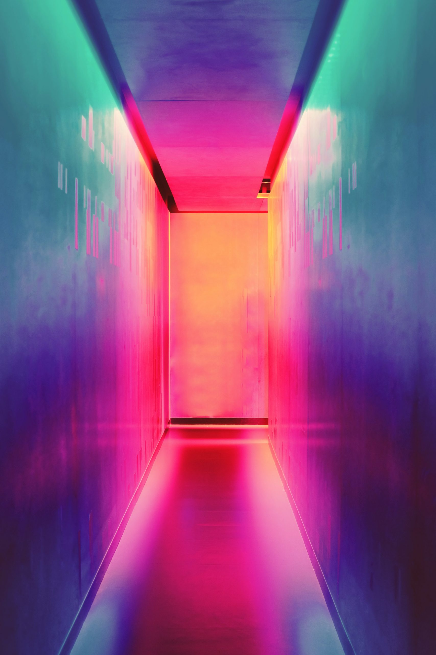
Choosing colors for interiors is a daunting task disliked by many. An abundance of color choices coupled with a lack of knowledge of how the colors will look in the space can quickly turn interior color selection into an overwhelming process. Not knowing personal color preferences can also make this harder, as it leads to a fear of disliking certain colors in the future. Make it easier to choose colors for your interiors by analysing your home and wardrobe. I find that the colors we wear and use frequently are the colors we enjoy seeing around us. An understanding of these colors can form the starting point for your color selection.
COLOR PSYCHOLOGY:
Just like how warm and cool colors can change how we feel, each of the individual colors have certain attributes and abilities that can affect how objects and rooms using these colors make us feel. The ability of the colors to impact our mood this way is known as color psychology. This characteristic can be made use of in interiors to adapt spaces for certain activities.
CITRINE
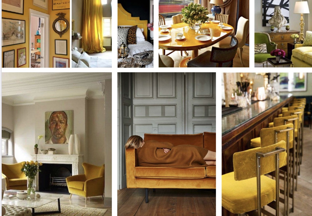
The happy color, citrine is associated with the warmth and brightness of sunshine. Citrine brings in positivity into the room, and is also considered a creativity inducing color. This color adds a joyful ambience to living rooms and home offices. Wallpapers, furnishing and decor are all good ways to use citrine, but it can also be used for a bright pop of color with a single piece of furniture or decor that stands out in the room. When using citrine in spaces, balance is key, as too much of the color can be anxiety inducing. To avoid this, use the color in smaller quantities in these spaces.
CARNELIAN
Carnelian is a color that reminds us of beautiful sunsets and autumn leaves. This color is bright and fresh, and brings about enthusiasm and excitement along with a sense of comfort. It is also a whimsical shade that can put us in a playful mood. The dynamic nature of this color makes it better suited for active areas of the home like the kitchen and playroom. Carnelian can be used for the flooring and backsplash in kitchens, as well as for decor. In playrooms, the color can be applied on accent walls or furniture pieces. I incorporate small amounts of carnelian into many of my interior designs in Sarasota to bring indoors the warmth and brightness of Florida.
RUBY
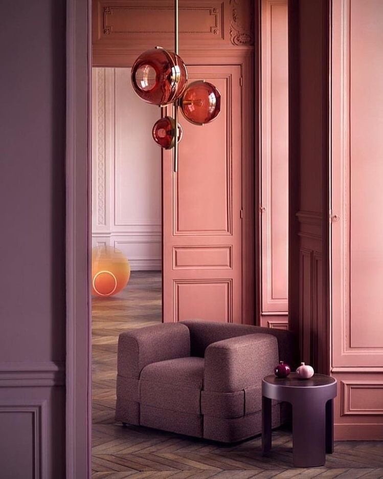
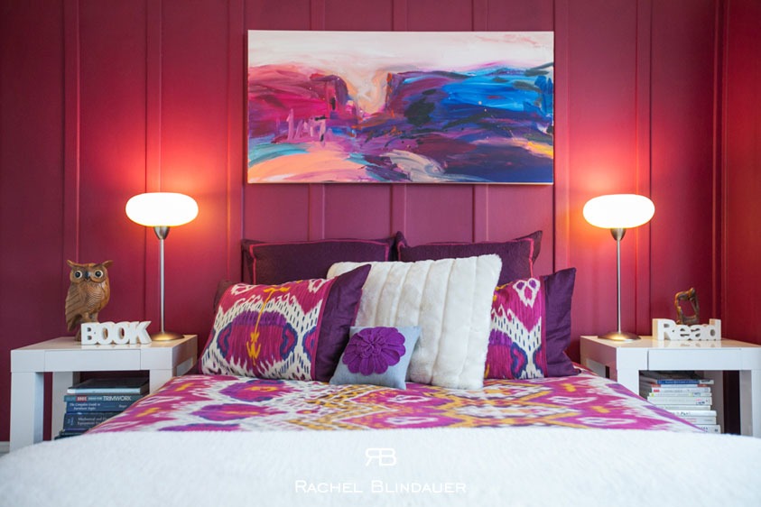
The warmest of the shades, ruby is a powerful color. This vibrant color is associated with passion and energy. As an active color, when used in the right amount, it can grab our attention and keep us stimulated. Use the intensity of ruby in kitchens and dining areas to stimulate appetite and energy levels. A color that signifies affection and sensuality, muted and deep shades of this color can be used in small amounts in the bedroom as well. Ruby can be introduced through cabinets and counters in the kitchen, and as part of furniture or decor in dining areas. In the bedroom, the minimal use of ruby can be best achieved through decor and artwork.
ROSE QUARTZ
Soft and comforting are some of the words often used to describe objects in rose quartz. Leaning towards the warmer end of the color spectrum, this color can bring about a playful and calm mood in a room, as well as stimulate the creative mind. As a calming and cozy color, lighter shades of rose quartz can be used in bedrooms and powder rooms. Rose Quartz is also a color that can be overpowering, and works best when balanced with other colors to create exciting combinations for living rooms and workspaces. The color can be used as part of fabrics, furnishings, and wallpapers in these rooms.
AMETHYST
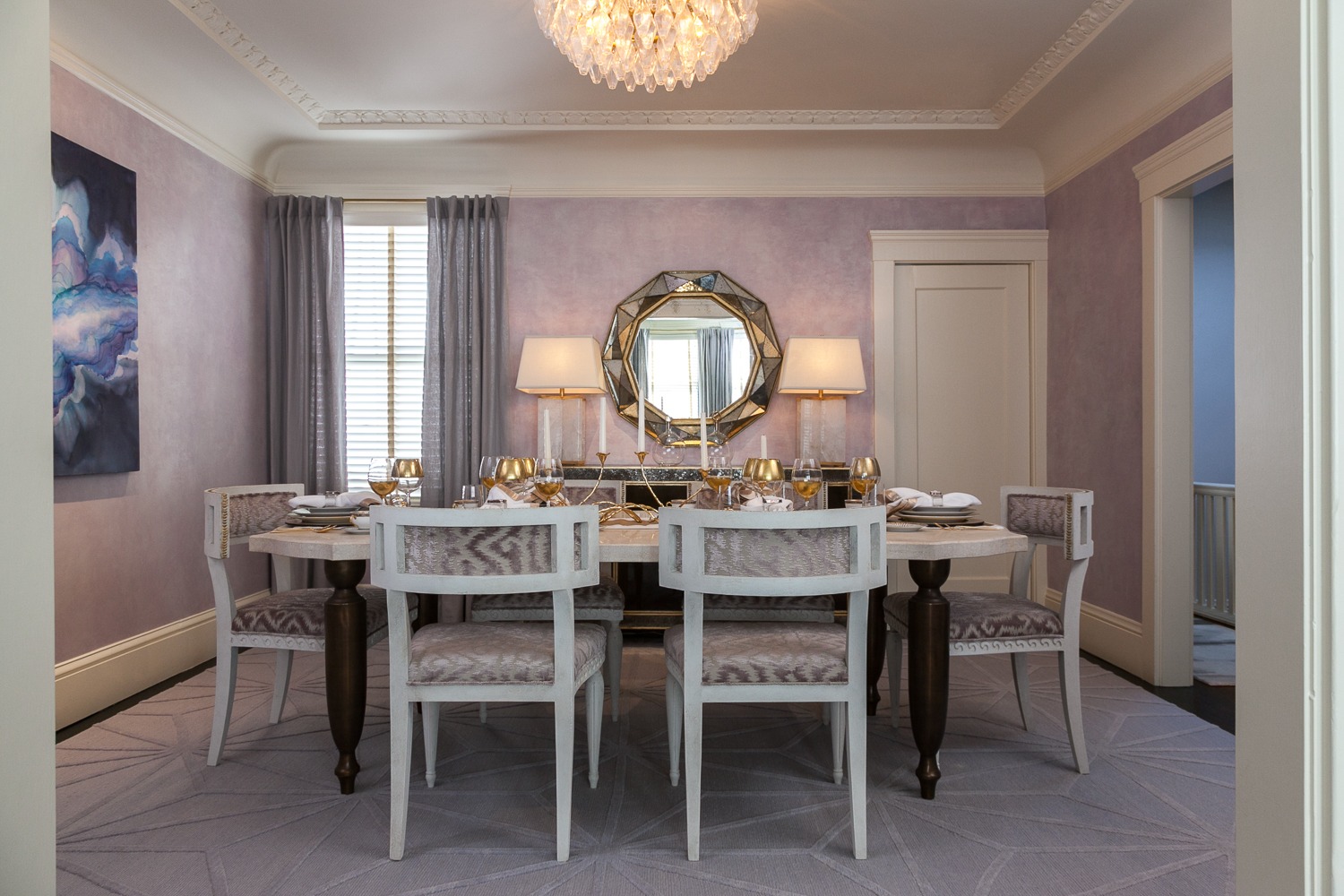
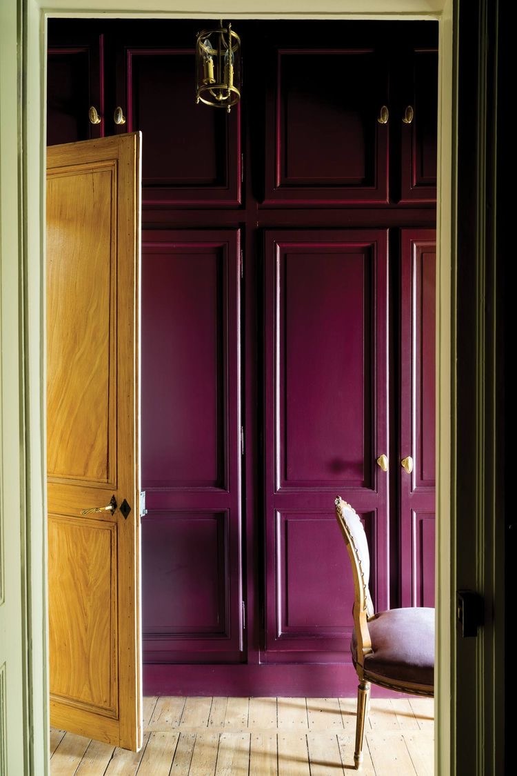
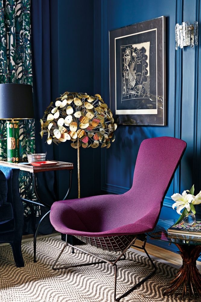
Associated with luxury and mystery, Amethyst can take on multiple roles based on its intensity. Soft, light shades of the color can be used in a room for a relaxing and restful feel. Deep hues of amethyst create a sensuous and luxurious atmosphere in the room, while bold shades of the color are ideal for a dramatic look. The versatility of amethyst makes it a good choice for the bedroom, living room and the dining room. Amethyst is also good for the home office and study as it can help boost creativity. Use wallpapers, fabrics, furniture and decor to add the qualities of amethyst in these rooms. Feel free to check out a summer palate of lavender I designed here.
OBSIDIAN
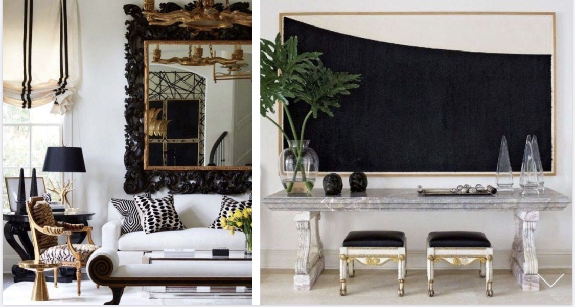
A powerful neutral that makes for sophisticated spaces, obsidian is highly popular with designers. The color adds a sense of drama to a room, while being yet another great pairing for all colors. Overuse of this color can make a room feel depressing due to a lack of light. Obsidian is well suited for entryways and dining rooms, and looks glamorous with metallic finishes.
With a general idea of how colors influence our mood, the color selection process is made much simpler. Playing around with different shades and intensities of these colors as well as various color combinations can help in creating the perfect color palette for an interior.
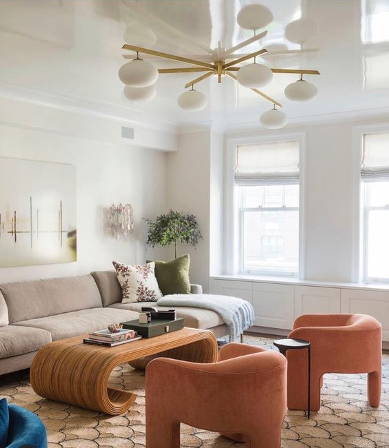
PEARL
A bright color that is balanced and invokes a sense of peace, pearl is the perfect combination to every color imaginable. As a neutral color, pearl works well in both passive and active spaces. An excess use of this color can create a space that feels detached, so it is ideal when combined with other colors
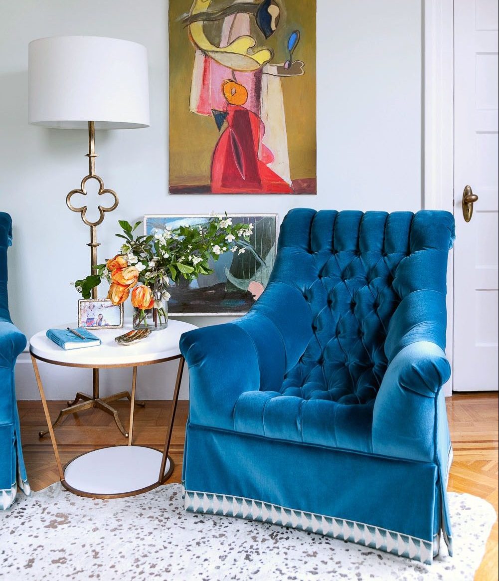
SAPPHIRE
A cool color, sapphire is calming by nature and brings to mind a sense of safety and stability. This color lends a relaxing ambience where it is used. A classic color that is always in style, sapphire is a strong favorite in fashion and interior design. In Sarasota and Tampa, interior designers use shades of sapphire regularly for beach interior designs. Use dark shades of the color like azurite to compose deep and bold looks, and shades of tanzanite to create formal interior spaces. Light shades of the color like turquoise can be used to calm the mind and bring in clarity, making it a good choice for bedrooms and living rooms. Sapphire makes for a beautiful color on walls, wardrobes and even bookshelves in these rooms
EMERALD
Emerald is a calming color that conjures up the beauty of nature in interiors. As a serene color, jade brings about a harmonious feeling in the space. Deeper hues of this color like emerald often have a rich and lush look, and can also be grounding. A cool color, jade is well suited for the passive spaces in homes like bedrooms and bathrooms. It makes a great wall color, as well as for gorgeous furniture and decor. One of the best ways to introduce the color in small amounts into space is to use houseplants, as they bring with them all the lively and natural qualities of the color.
WHITE
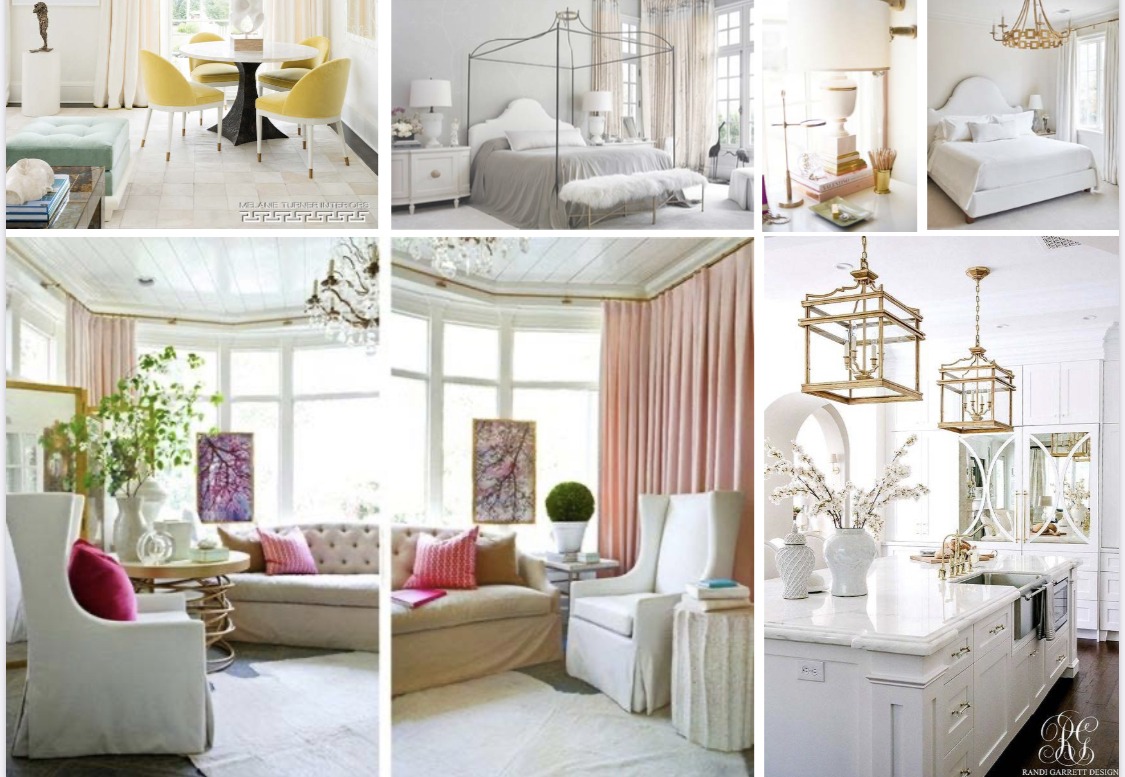
When it comes to deciding on how the colors need to be combined, the desired nature and feel of the room should be considered. For instance, if the intention is to create a breezy and light feeling in the room, much like Scandinavian style interiors, using airy neutrals as the base color for the ceiling and walls are ideal. Colors like pearl, selenite, citrine and celestite have an airy quality that can be utilized for this. For a room that is to be more grounded and earthy, colors like smoky quartz, tiger’s-eye, obsidian and hematite provide a good base color. As a base color, this would form the main part of the scheme, with other colors being added in where necessary. These colors can also be utilised as accents for a similar effect in the designs.
CONNECTING ROOMS AND COLORS
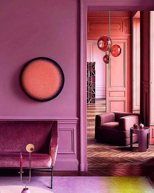
Every room in a house does not need to follow the same color scheme, and could instead have varying secondary or accent colors. In such schemes, it is important to create a continuity in the design using common colors or textures. For instance, if a living room is designed with the ceiling in an amethyst hue, and the dining room adjacent to it uses ruby on the ceiling, the color scheme can be connected by using a common color in the palette, like selenite. The color schemes can also be bridged by adding amethyst accents in the dining room – as part of the dining chairs or a rug, and ruby accents in the living room – on throws and cushions on the sofa or accessories. This would weave a common thread through the designs and make the design cohesive
60-30-10 RULE
One of the most effective ways to combine colors in an interior is to use the 60-30-10 rule. This rule is a simple ratio for using 3 colors in a room. According to this principle, 60% of an interior should use the dominant or base color, 30% should be in a secondary color and the remaining 10% should be the accent color. In a living room or bedroom, the 60% would include walls, large furniture and furnishing pieces like the bed, sofa, and area rugs. 30% of the room would be cabinetry, curtains, coffee tables and smaller pieces of furniture, while 10% of the room would be accent furniture and decor pieces like artworks, plants and accessories.
The 60-30-10 rule does not need to be adhered to completely, and can be tweaked and played around with as needed. Which part of the room makes up each of the percentages is open to interpretation, as are the number of colors used. For example, 60% of a kitchen or living room can be the walls, ceiling and flooring, or it could include the walls and a majority of the furniture or cabinets. Similarly, if the room design feels like it needs both emerald and gold as accent colors, the percentage can be modified accordingly, as long as the accent colors add up to 10% of the room.
At Rachel blindauer interior designs, I begin every design process with a color analysis. This helps me identify the colors that work best for each person. Working as an interior designer in Tampa and Sarasota, I am inspired by the surroundings, and many of my interior designs in Florida are often bright and colorful. With an understanding of the various facets of color theory, you too can effortlessly choose the colors for your interior and furniture designs.
Take the first step towards creating your dream space. If you are a couple with multiple homes looking for a decorator near you, a hotelier doing a redesign, or a developer looking for top-notch interior design services near you, Rachel Blindauer and her team are here to bring your vision to life. With our wealth of experience and expertise, we can create stunning and functional spaces that exceed your expectations and bring you to a new height of design and sophistication.
Get Started Today
Let Rachel Blindauer help you think through your project starting with a complimentary consultation.
SOMETHING FOR EVERYONE
Rachel’s curated collection of furniture, decor, and kitchen items accessible through Amazon.

