St. Louis Kitchen Design: What Works in a Midwest Home (And What’s Just Instagram)

St. Louis Kitchen Design: What Works in a Midwest Home (And What’s Just Instagram)

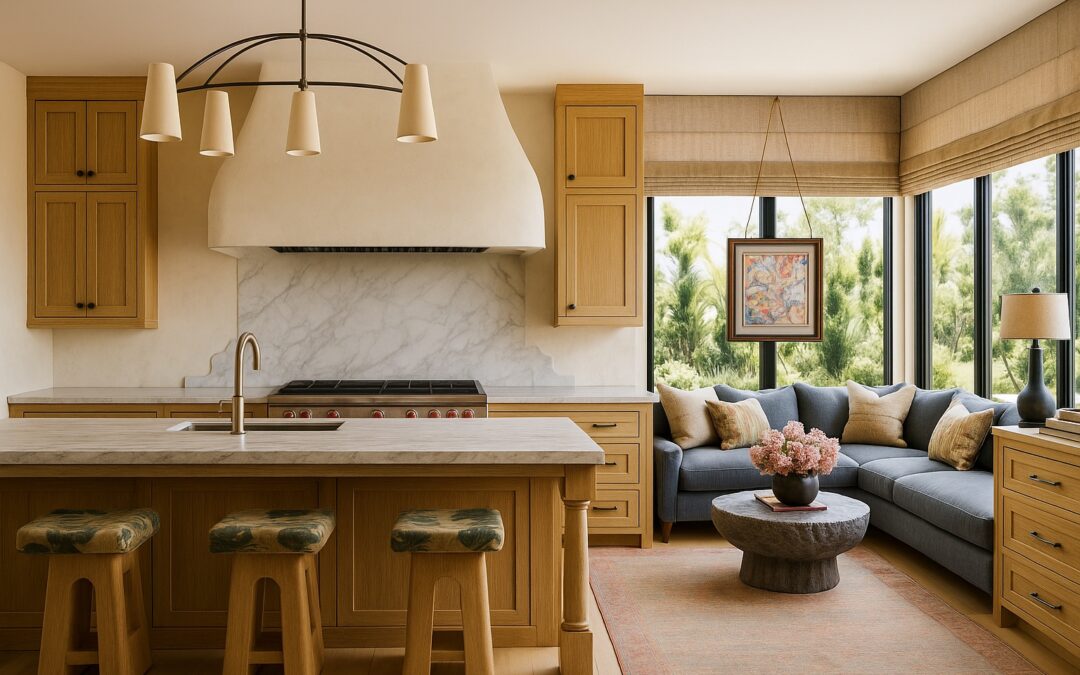
The kitchen is the most remodeled room in America and the one where the gap between aspirational design content and practical reality is widest. The kitchens that photograph brilliantly—white marble, open shelving, industrial fixtures—are often kitchens designed to be looked at rather than cooked in. The kitchens I design in St. Louis are designed to be used: daily, intensively, by people who actually cook, who have children and dogs, who host with genuine hospitality. There’s a significant difference, and it shows up in the decisions.

At a glance

  • Best countertop for a working kitchen: quartzite, such as Taj Mahal
  • Best two-tone pairing: Benjamin Moore White Dove (OC-17) uppers with Benjamin Moore Hale Navy (HC-154) on the island
  • Island clearance: 42 inches for one cook, 48 inches for two
  • Pendant height: 30 to 36 inches above the countertop
  • Hardware finish: unlacquered brass

Countertops: what actually holds up

Carrara marble is beautiful. It is also soft, porous, acid-sensitive, and will show every lemon squeeze, every wine spill, and every sharp object interaction within the first year of use. In a working St. Louis kitchen, marble is a maintenance burden that most clients eventually regret.

What I actually specify:

  • Quartzite (not quartz—quartzite, the natural stone) for clients who want the marble look with far better durability. Taj Mahal is the one I return to: warm, soft veining that sits beautifully beside wood and brass. Seal it once a year.
  • Engineered quartz for clients who want near-zero maintenance and a consistent appearance from slab to slab.
  • Honed or leathered granite for clients who want natural stone with less reflection. Absolute Black in a leathered finish hides fingerprints and crumbs better than anything polished.

The exception: a marble pastry slab in a dedicated baking area. Marble genuinely excels for pastry work.

Cabinet color: moving past all-white

White kitchen cabinets have been the default for so long that they now signal a lack of commitment. What I’m specifying in St. Louis kitchens right now is a warm white on the uppers with a deeper color on the island or lowers. The two-tone kitchen reads as intentional and layered, and the darker base forgives scuffs from shoes, dogs and vacuum cleaners.

  • Uppers: Benjamin Moore White Dove (OC-17), a warm white that stays soft in gray winter light
  • Island in navy: Benjamin Moore Hale Navy (HC-154)
  • Island in a muted green-gray: Farrow & Ball Pigeon (No. 25)
  • Island in a deeper green: Sherwin-Williams Pewter Green (SW 6208)
  • Island in sage: Benjamin Moore October Mist (1495)

Always test a large painted board on the cabinet itself, morning and evening. For more on how kitchen colors behave, see my guide to kitchen colors that work.

Layout: the triangle still matters

The kitchen work triangle—the relationship between the refrigerator, sink, and range—has been declared dead by design media several times and continues to be the most reliable measure of kitchen functionality. The total distance between these three points should ideally be between 13 and 26 feet, with each leg between 4 and 9 feet. Kitchens where these relationships are wrong exhaust their users.

  • Island aisles: 42 inches if one person cooks, 48 inches if two do.
  • Seating at the island: about 24 inches of counter per stool, with a 15-inch overhang for counter-height seating.
  • Older St. Louis homes: many brick homes from the 1920s and 1930s have narrow kitchens. If you can’t keep 42 inches on all sides, a peninsula usually works better than a squeezed-in island. I compare the two in kitchen island vs. peninsula.

Open shelving: honest about the commitment

Open kitchen shelving looks extraordinary in editorial photographs and requires more maintenance than most people are prepared for in real life. Everything on open shelves collects grease and dust. The compromise I frequently recommend: open shelving in one carefully chosen location—a floating shelf above the coffee station, a single shelf beside the range for oils and spices—with closed cabinetry handling everything else.

Lighting and ventilation: the parts nobody photographs

  • Pendants: hang them 30 to 36 inches above the countertop. Over a typical island, two larger pendants look calmer than three small ones.
  • Bulbs: 2700K to 3000K. Cooler bulbs make a kitchen feel clinical, especially in short winter days.
  • Under-cabinet lighting: the single most useful light in a kitchen. Plan it, with outlets, during the renovation.
  • Range hood: duct it to the outside, and size it to your range. A common rule of thumb for gas ranges is about 100 CFM for every 10,000 BTUs.

If you are working with an older kitchen, read renovating an old kitchen the right way before you demo anything.

Hardware: where personality lives

Cabinet hardware is the jewelry of the kitchen—the smallest investment with the most outsized visual impact. I consistently find that upgrading hardware transforms an average kitchen more cost-effectively than almost any other change. My current recommendation: unlacquered brass or warm bronze for kitchens with warm wood tones and warm white cabinets, and matte black for more contemporary, high-contrast kitchens. Avoid satin nickel, which is the kitchen hardware equivalent of greige paint—it goes with everything and elevates nothing.

Pulls on drawers, knobs on doors is the classic rule, and it still looks right. You can see the brass and marble pieces I specify in my hardware collection.

St. Louis kitchen questions I hear most

Is quartzite worth it over quartz?

If you want natural stone that looks like marble, yes. Quartzite is harder than marble and stands up to heat better than engineered quartz. If you never want to think about sealing, choose quartz.

What cabinet color won’t look dated?

A warm white on the uppers with a deeper, muted color on the island. Navy, green-gray and sage have staying power because they behave like neutrals beside wood and stone.

Island or peninsula?

If you can keep at least 42 inches of walkway on every side, an island. If not, a peninsula gives you the same seating and storage without the bottleneck.

Does a kitchen renovation pay off in St. Louis?

Kitchens are among the renovations buyers notice most. I break down which projects return the most in St. Louis renovation ROI.

Rachel Blindauer is an award-winning interior designer with 15+ years designing kitchens and full residential interiors.

Finish the Kitchen

Crescent Brass Cabinet Pull

Crescent Brass Cabinet Pull
From $45

Isla Rattan Counter Stool

Isla Rattan Counter Stool
$771

Bellagio Twisted Brass Lantern Pendant

Bellagio Twisted Brass Lantern Pendant
$3,795
2 Hour Interior Design Virtual or In Person Consultation

SOMETHING FOR EVERYONE

THE PIECES RACHEL RETURNS TO, AGAIN AND AGAIN
The Home Office That Doesn’t Look Like a Home Office

The Home Office That Doesn’t Look Like a Home Office

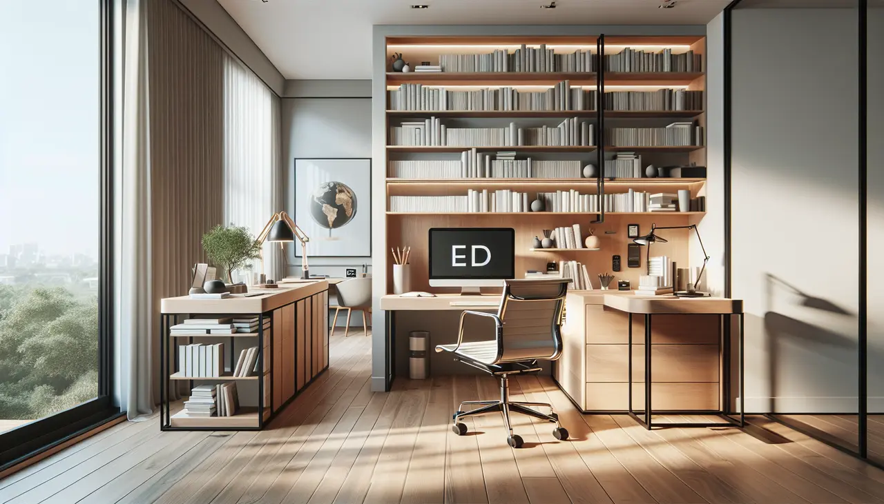
Home office designed as a real room

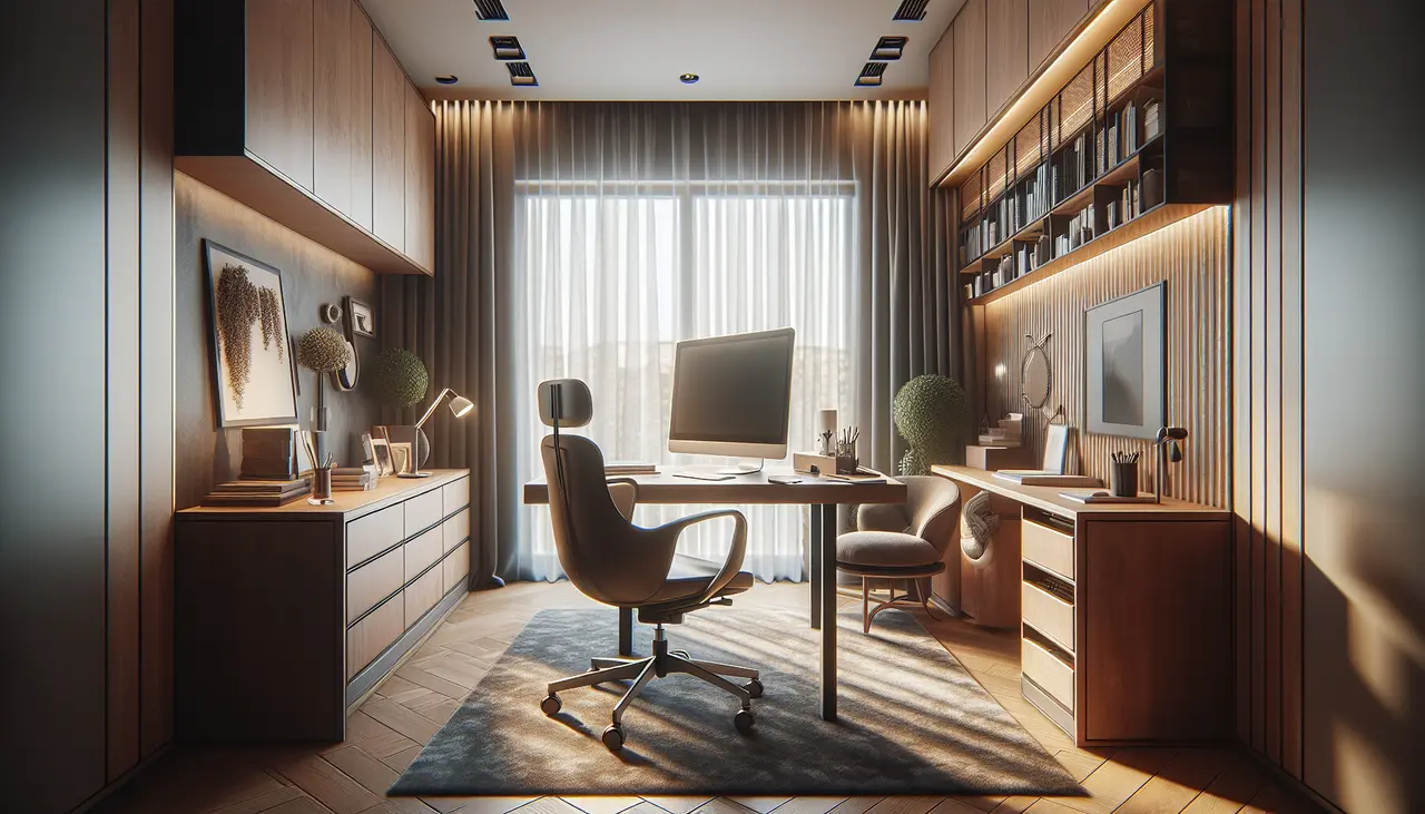
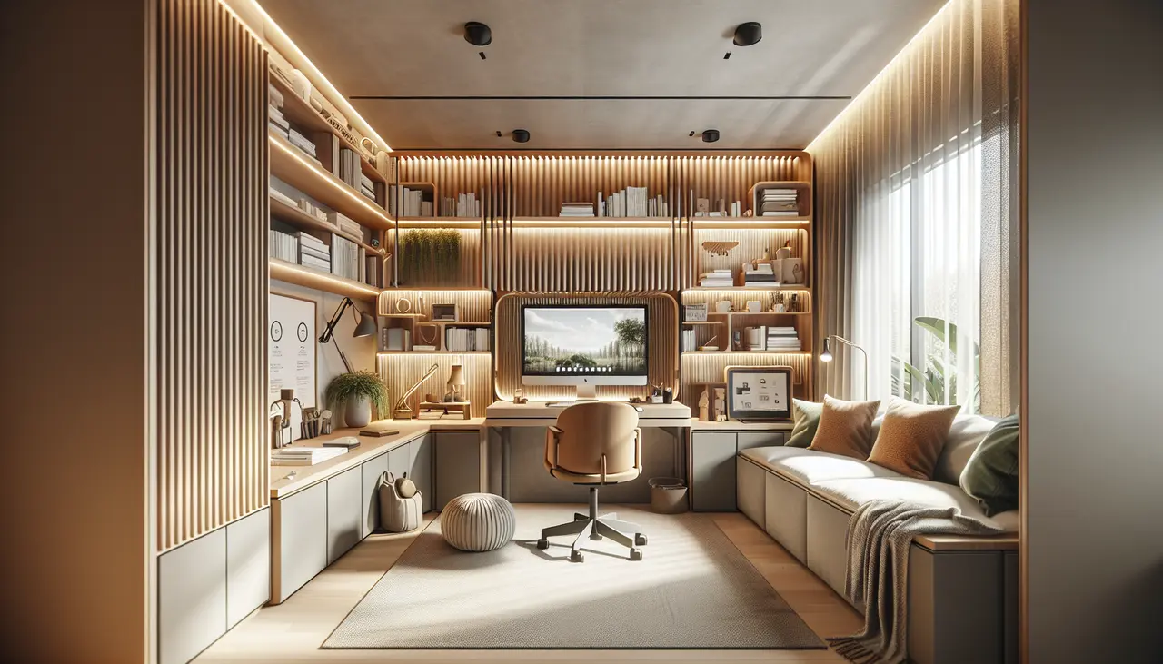
The home office became, through necessity, one of the most important rooms in the American house. And yet most home offices are an afterthought—a desk pushed into a corner, a chair that came from somewhere else, a backdrop of chaos visible on every video call. They are designed for function in the narrowest sense: a place to open a laptop. The home office I design for clients is a room that functions as a brilliant workspace and also feels like a room you’d want to be in if you weren’t working. Those two things are not in conflict. In fact, achieving both is the point.

Workplace wellness in office design

Why the Room Changes How You Work

Everything above is about how the room looks to someone walking past it. This part is about what it does to you while you are sitting in it — which is the part most home office advice skips entirely.

Start with the light—natural first, artificial second

Natural light is the most significant variable in workspace quality. Position your desk to receive natural light from the side—not directly behind your monitor (which creates glare) and not directly in front of you from a window behind the screen (which backlights your face on video calls). Side light is the designer’s and the photographer’s preferred light source: even, directional, and flattering without blinding.

For artificial light: a desk lamp at eye level with a 3000K bulb for task lighting, and a warmer ambient source (floor lamp, table lamp across the room) for the surrounding environment. Overhead lighting alone in a home office creates the institutional feeling of a corporate cubicle. Layer your lighting.

Desk placement in a considered home office

The desk: size, surface, and position

Most desks sold as home office desks are too small. The standard 47-inch desk gives you barely enough room for a monitor, a keyboard, and a notebook. If you work with physical materials or simply like the psychological spaciousness of room to spread out, go wider. A 60-inch desk is meaningfully better. A 72-inch desk, in a room that can accommodate it, transforms the workspace from cramped to generous.

Surface material matters. Glass desks look clean but are cold to the touch, difficult to write on, and show every fingerprint. Wood desks—solid wood or good veneer—are warmer, more pleasant to work on, and read better on video calls.

Shop Writing Desks

Alderley Washed Oak & Brass Writing Desk

Alderley Washed Oak & Brass Writing Desk
$3,295

Hartwell Walnut Writing Desk

Hartwell Walnut Writing Desk
$4,584

Corsica Brass & Glass Writing Desk

Corsica Brass & Glass Writing Desk
$3,495

Home office with an intentional background

Make the background intentional

Video calls have made the space behind your desk one of the most-seen aspects of your professional identity. The best video call backgrounds: a single piece of art or a small curated gallery hung intentionally; a bookshelf organized by color or subject with a few beautiful objects interspersed; a painted wall in a strong, interesting color; or simply a clean, painted wall with good light. Any of these communicates care and intentionality.

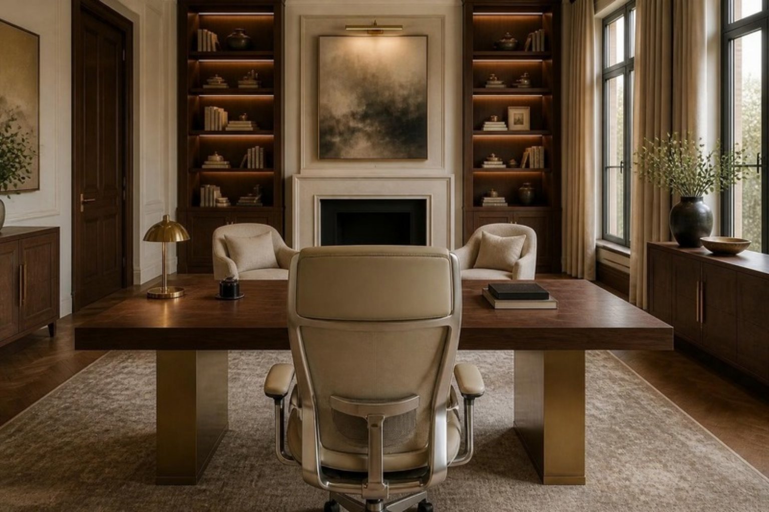
View from behind an ergonomic leather desk chair across a walnut and brass desk to two guest armchairs and a fireplace in an elegant home office

The chair: the one place not to economize

The chair is the object in the home office that your body is in contact with for the most hours. Its ergonomic quality affects your physical health, your energy level, and your concentration. A beautiful but uncomfortable chair will cost you more in back pain and fatigue than you saved on the chair. Excellent ergonomic chairs now exist in aesthetically sophisticated designs. This is the one piece of office furniture I recommend buying well and buying once.

How to tell a chair is truly ergonomic:

  • Adjustable seat height: feet flat on the floor, knees at about 90 degrees, thighs parallel to the floor.
  • Lumbar support: the backrest should meet the natural curve of your lower back. If it does not, add a firm lumbar pillow.
  • Seat depth: two to three finger-widths between the front edge of the seat and the back of your knees, with a rounded waterfall edge so circulation is not cut off.
  • Armrests: at or just below desk height so your shoulders stay relaxed and your elbows rest near 90 degrees.
  • Swivel and casters: so you turn your whole body instead of twisting your spine.

Then set up the rest of the desk around your body: a work surface 28 to 30 inches high, the top of your screen at or slightly below eye level about an arm’s length away, and a task lamp on the side opposite your writing hand so you are never working in your own shadow.

Seating for Guests Across the Desk

Positano Accent Chair

Positano Accent Chair
$455

Cortona Barrel Lounge Chair

Cortona Barrel Lounge Chair
$460

Solaire Upholstered Dining Chair

Solaire Upholstered Dining Chair
$1,315

Shop the Ergonomic Desk Setup

Arden Swivel Desk Chair in Mink Performance Fabric

Arden Swivel Desk Chair in Mink Performance Fabric
$1,523

Cascata Marble Buffet Lamp

Cascata Marble Buffet Lamp
$1,200

Vesper Marble Desk Lamp

Vesper Marble Desk Lamp
$1,299

The detail that separates a home office from a corporate workspace: the room should contain at least one element that has nothing to do with work. A plant. A piece of art you love. A beautiful lamp. These signal to your brain that this is a human space—a place where a whole person works, not just a function being performed.

Rachel Blindauer is an award-winning interior designer based in St. Louis with projects across the United States and internationally. Book a 2-hour design consultation at rachelblindauer.com.

Designing for Deep Work: The Home Office as a Performance Space

The pandemic permanently changed how many high performers work, and with it came a long-overdue reckoning with the home office. A desk in the bedroom corner is not a home office. A dining table with a laptop is not a home office. A performance workspace requires, at minimum, four things: dedicated space that signals transition into work mode, excellent task lighting that doesn’t cause eye strain over long periods, ergonomics that protect the body across extended sessions, and freedom from the visual cues of domestic life that continuously pull focus away from deep work.

The research on this is unambiguous. Psychological distance — the sense that you have “arrived” somewhere to do focused work — measurably increases both the duration and quality of concentrated effort. This is why the office door, the separate entrance, the bespoke built-in shelving that frames the space as professional: these are not affectations. They are cognitive signals that allow the focused, deliberate thinking that produces results.

Natural light is the single most impactful upgrade in any work environment. Exposure to daylight during work hours improves alertness, mood, and cognitive performance, and reduces the kind of end-of-day fatigue that makes evenings difficult to enjoy. Where a window is available, the desk belongs near it. Where it is not, a well-curated combination of task and ambient lighting — layered, warm-to-neutral in color temperature, without the harsh overhead fluorescence that signals institutional space — can meaningfully approximate the quality of natural illumination.

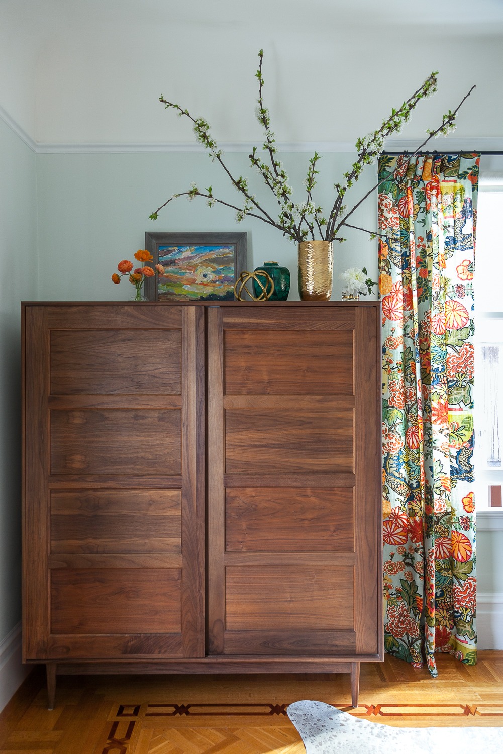
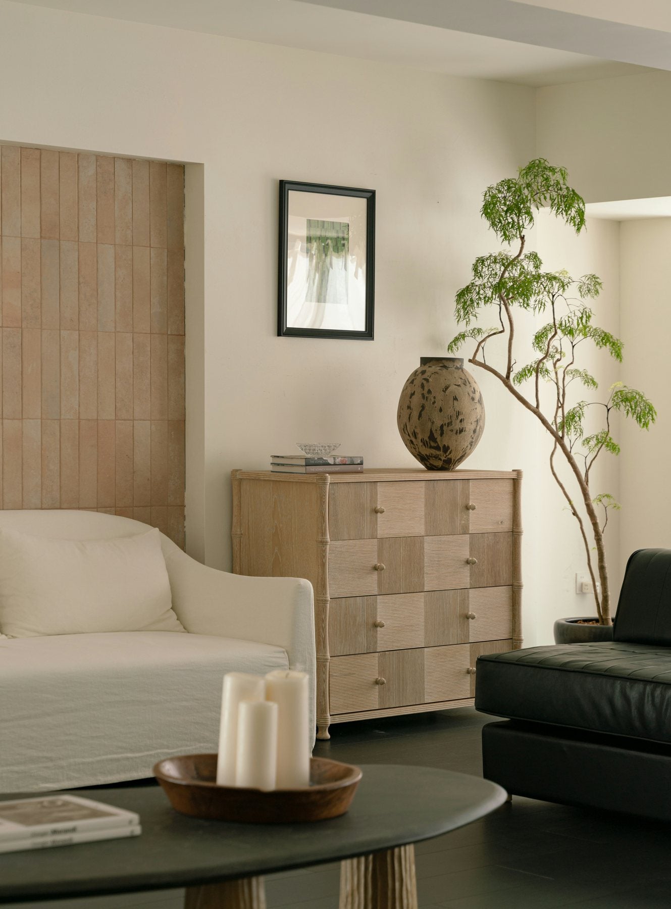
A walnut chest, branches and art — storage that reads as furniture, not filing

Order, Beauty, and the Psychology of Identity

There is a concept in behavioral psychology called behavioral congruence: the tendency to act in ways that are consistent with our sense of who we are. A home that reflects your highest values — that is ordered, beautiful, and genuinely expressive of the person you are becoming rather than the person you have been — functions as a continuous identity signal. Every time you walk through the door, it tells you who you are.

I have watched this phenomenon play out in project after project. A client who felt scattered and overwhelmed redesigns her home office and suddenly works with focus and clarity she hadn’t experienced in years. A couple who renovates their bedroom into a genuine sanctuary reports sleeping better, fighting less, and feeling more connected. A man who transforms a cluttered basement into a proper training space starts exercising consistently for the first time in a decade. The environment did not make these things possible. But it made them much, much easier.

Biophilic Design: The Performance Science of Nature

The research is unambiguous: human beings function better in the presence of natural light, natural materials, plants, and views of nature. Studies across office environments, hospitals, schools, and homes consistently show that exposure to natural elements reduces cortisol, lowers blood pressure, improves attention, and accelerates recovery from stress. Biophilic design — the intentional incorporation of nature into built environments — is perhaps the most evidence-based design philosophy currently in practice.

In a home, this translates to maximizing natural light through window placement, window treatments that can fully open, and mirrors that amplify daylight deeper into the space. It means choosing natural materials — stone, wood, linen, leather, ceramic — over synthetic ones whenever possible. It means maintaining at least a few living plants, whose benefits extend beyond aesthetics to measurable improvements in air quality and psychological wellbeing. It means giving priority to views: positioning seating near windows, keeping sightlines to gardens or trees clear, and resisting the urge to fill every surface with objects that obstruct the natural view.

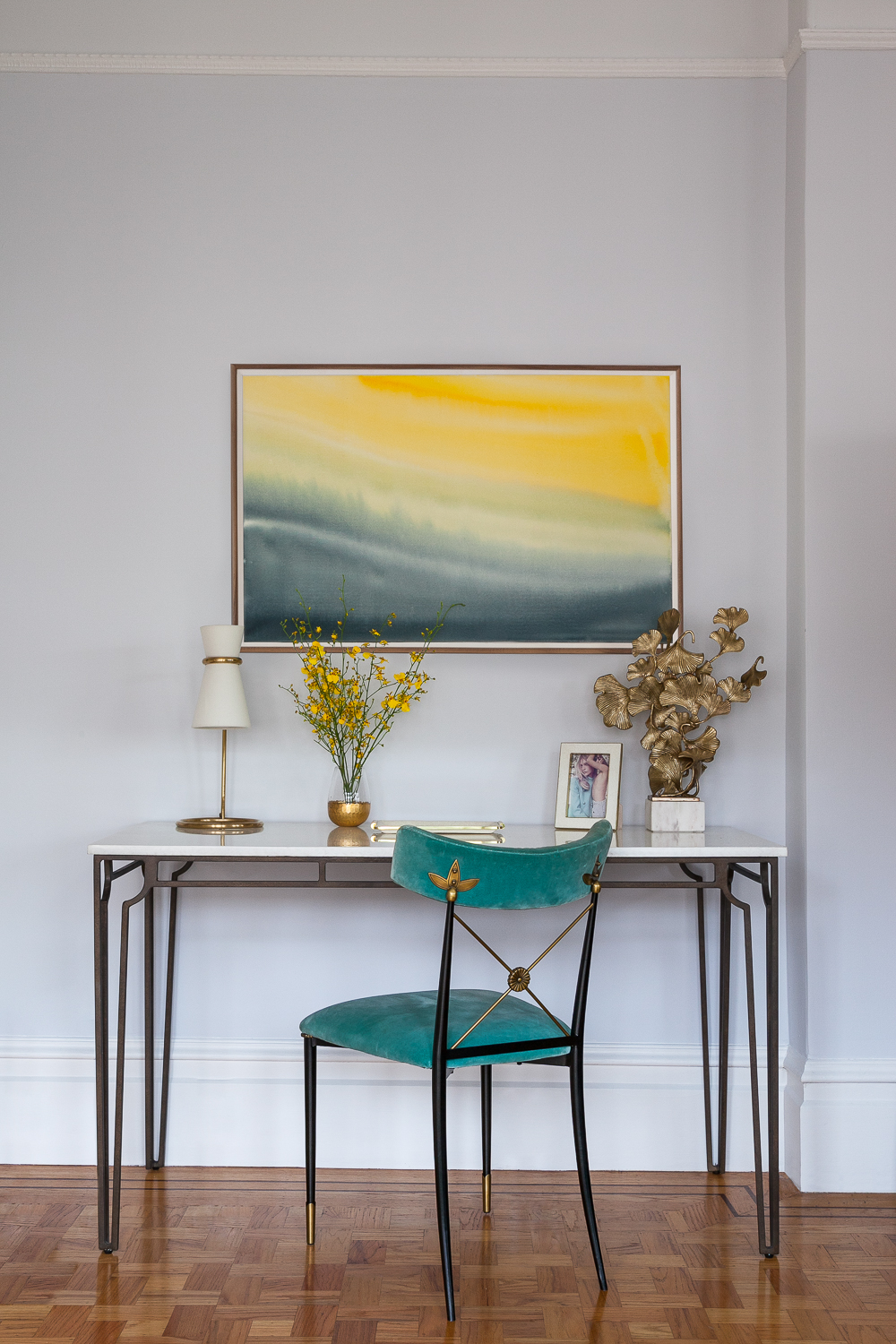
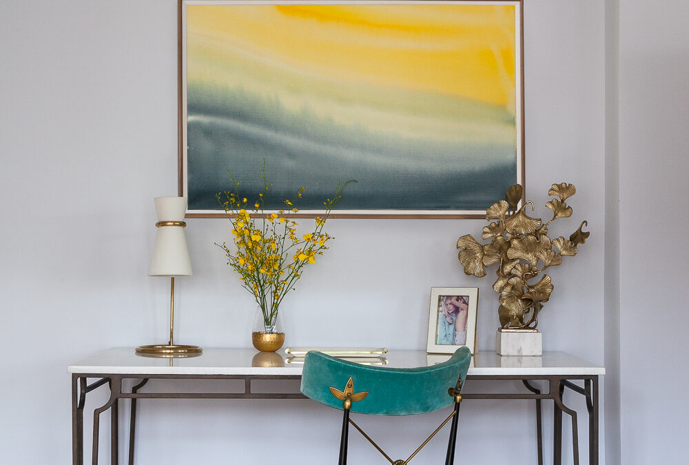
A slim console desk in a living room — a workspace that disappears when the laptop closes

The Question of Clutter

Clutter is not a housekeeping problem. It is a cognitive one. Each object in your visual field that is out of place, unresolved, or unintentional creates a micro-demand on working memory — a small but real fragment of attention that is no longer available for the task at hand. In an environment where hundreds of such objects are present, the cumulative cognitive load is significant. This is why people reliably report feeling calmer, more focused, and more capable after organizing a cluttered space — not because the work itself is satisfying, but because the cognitive friction has been reduced.

The solution is not minimalism for its own sake. It is intentionality: ensuring that every object in your home is either beautiful, functional, or meaningful — and that those which are none of these things are removed. The homes I design for high-performing clients are not bare. They are curated: rich in quality, deliberate in arrangement, and free of the visual noise that invisibly taxes attention around the clock.

2 Hour Interior Design Virtual or In Person Consultation
Marlowe Boucle Bench, Ivory/Natural

Marlowe Boucle Bench, Ivory/Natural
$700

Marais Chandelier

Marais Chandelier
$2,300

Isla Dot Pillow

Isla Dot Pillow
$297

SOMETHING FOR EVERYONE

THE PIECES RACHEL RETURNS TO, AGAIN AND AGAIN
Nantucket Window Boxes: How to Get the Island Look at Home

Nantucket Window Boxes: How to Get the Island Look at Home

by Rachel Blindauer

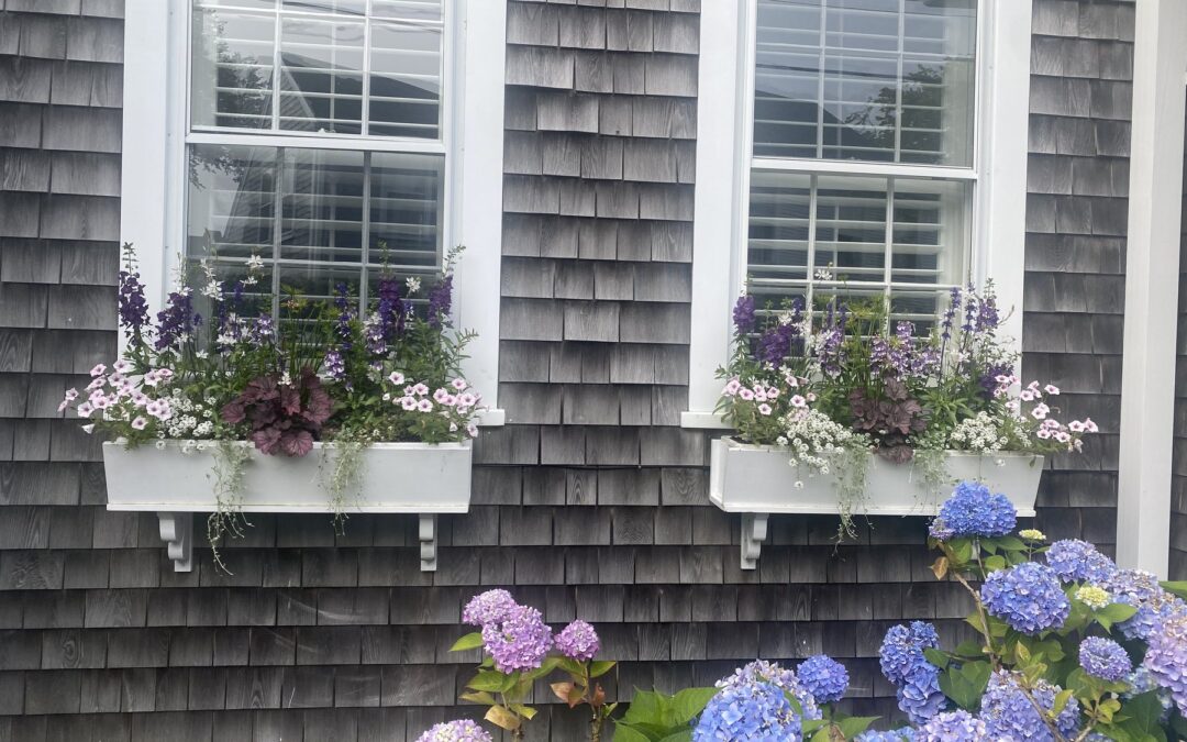
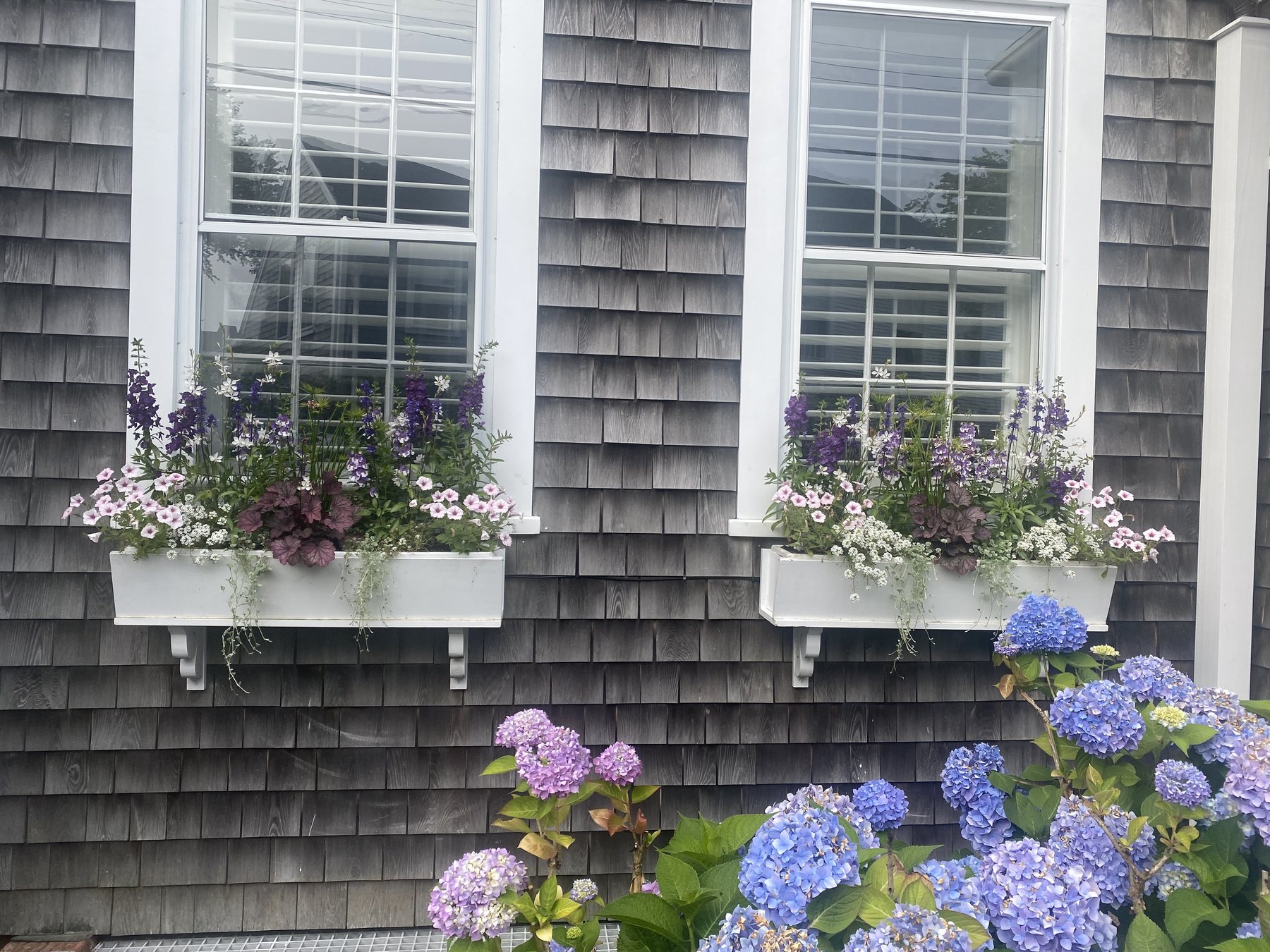
Walk any lane on Nantucket in July and you will see why the island is famous for its window boxes. Against weathered cedar shingles and crisp white trim, boxes spill over with flowers on houses, shops and tiny ‘Sconset cottages alike. They make a house look cared for and welcoming, which is the best thing curb appeal can do. I photographed these on the island, and each one teaches a different lesson you can bring home, wherever you live.

Gray cedar-shingle Nantucket cottage with white window boxes of purple and pink flowers above blue and lavender hydrangeas

Why Nantucket Window Boxes Look So Good

The secret is the backdrop. Silvery shingles and clapboard are neutral enough to let any flower color sing, and white or black trim frames the picture. Notice how this cottage repeats the purple and pink of its window boxes in the hydrangeas below, so the whole facade reads as one composition. If your exterior is busy or warm-toned, simplify the planting so it doesn’t compete.

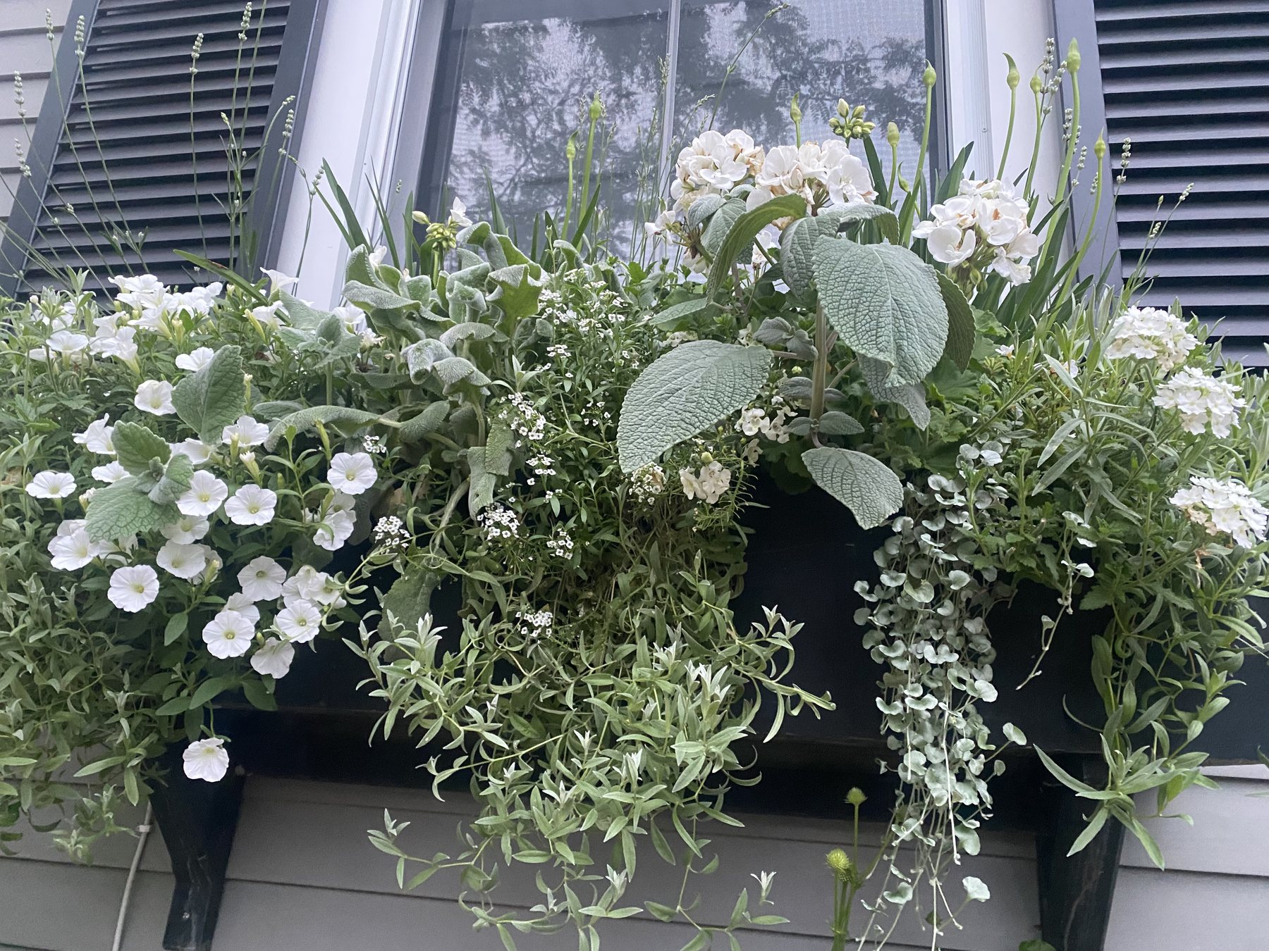
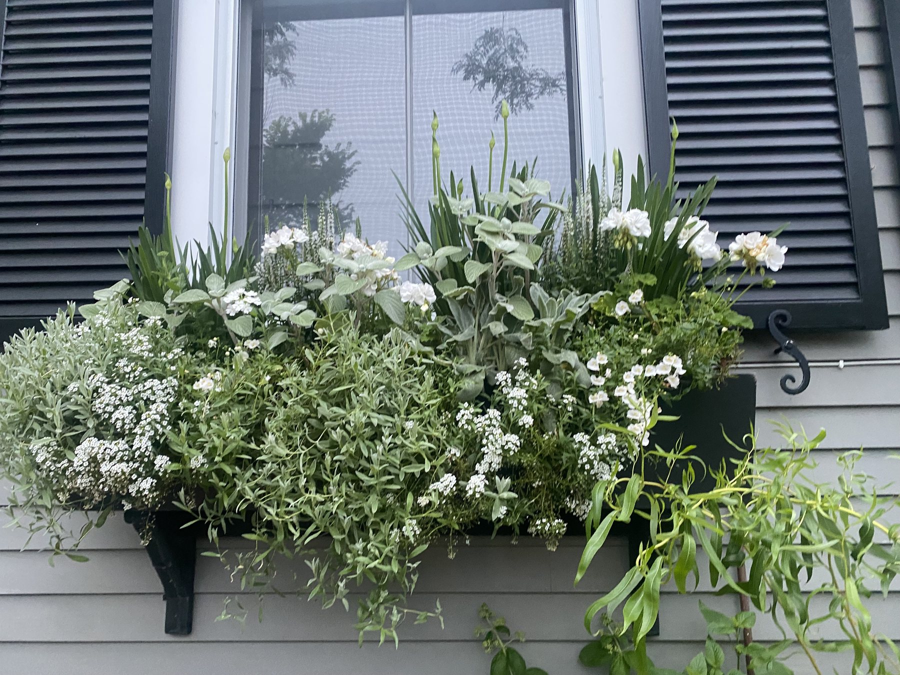
All-white window box with white petunias, silver foliage and trailing greens beneath black shutters on gray clapboard

Recipe 1: The All-White Box

My favorite Nantucket boxes stay with one color. An all-white planting reads as elegant, glows at dusk and works on every house color. This one layers white petunias and small white blooms with soft silver leaves and trailing greens that spill over a black box beneath black shutters. The silver foliage is what makes it look expensive: it adds texture and keeps the white from feeling flat.

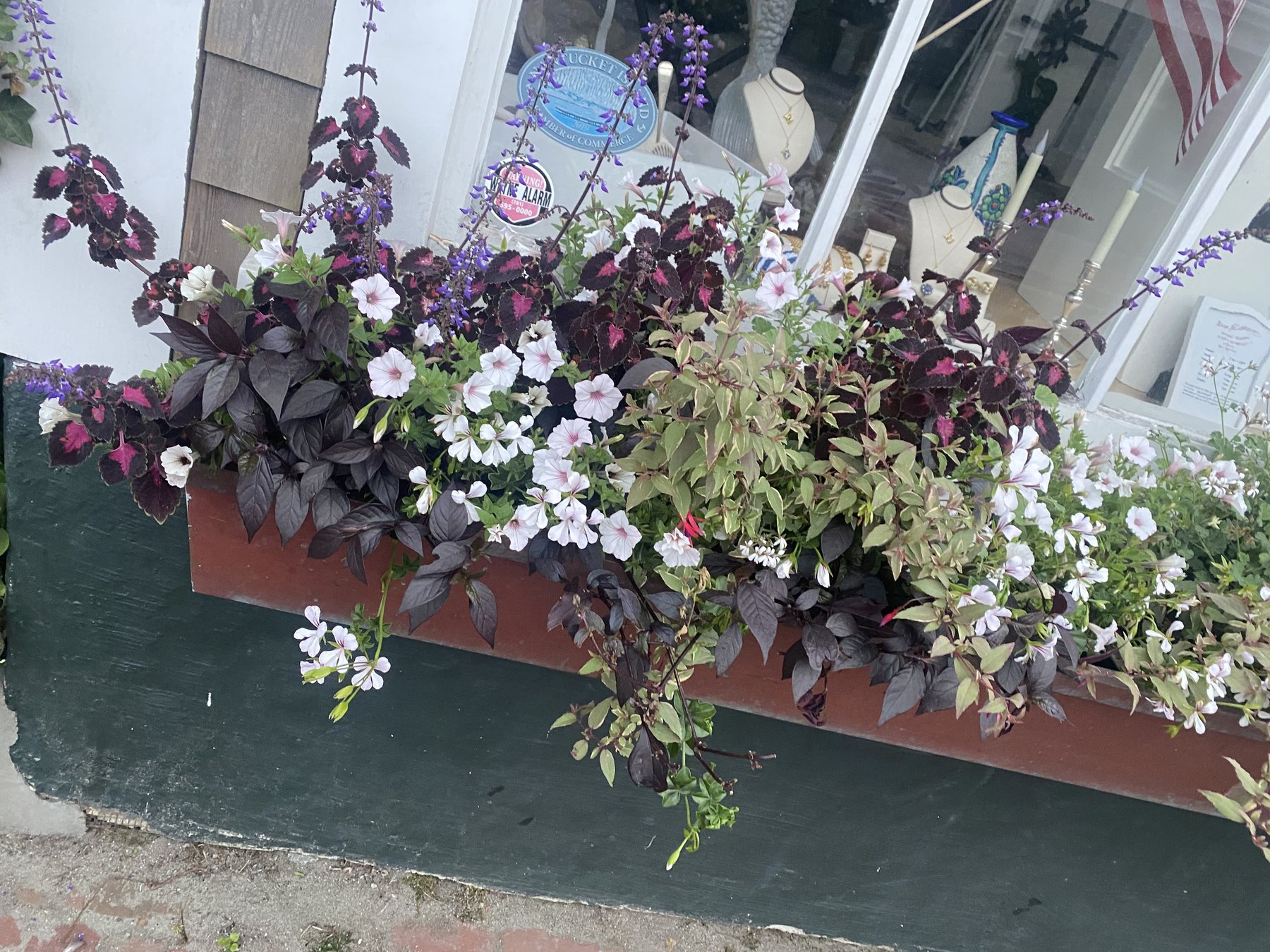
Window box on a Nantucket shop with deep burgundy foliage, white blooms and purple salvia spikes

Recipe 2: Moody Burgundy and White

For a deeper, more dramatic look, let foliage do the heavy lifting. This shop box pairs dark burgundy leaves with white blooms blushed pink at the center, a few purple salvia spikes for height and trailing greens for softness. Dark foliage stays handsome all season, even between flushes of flowers.

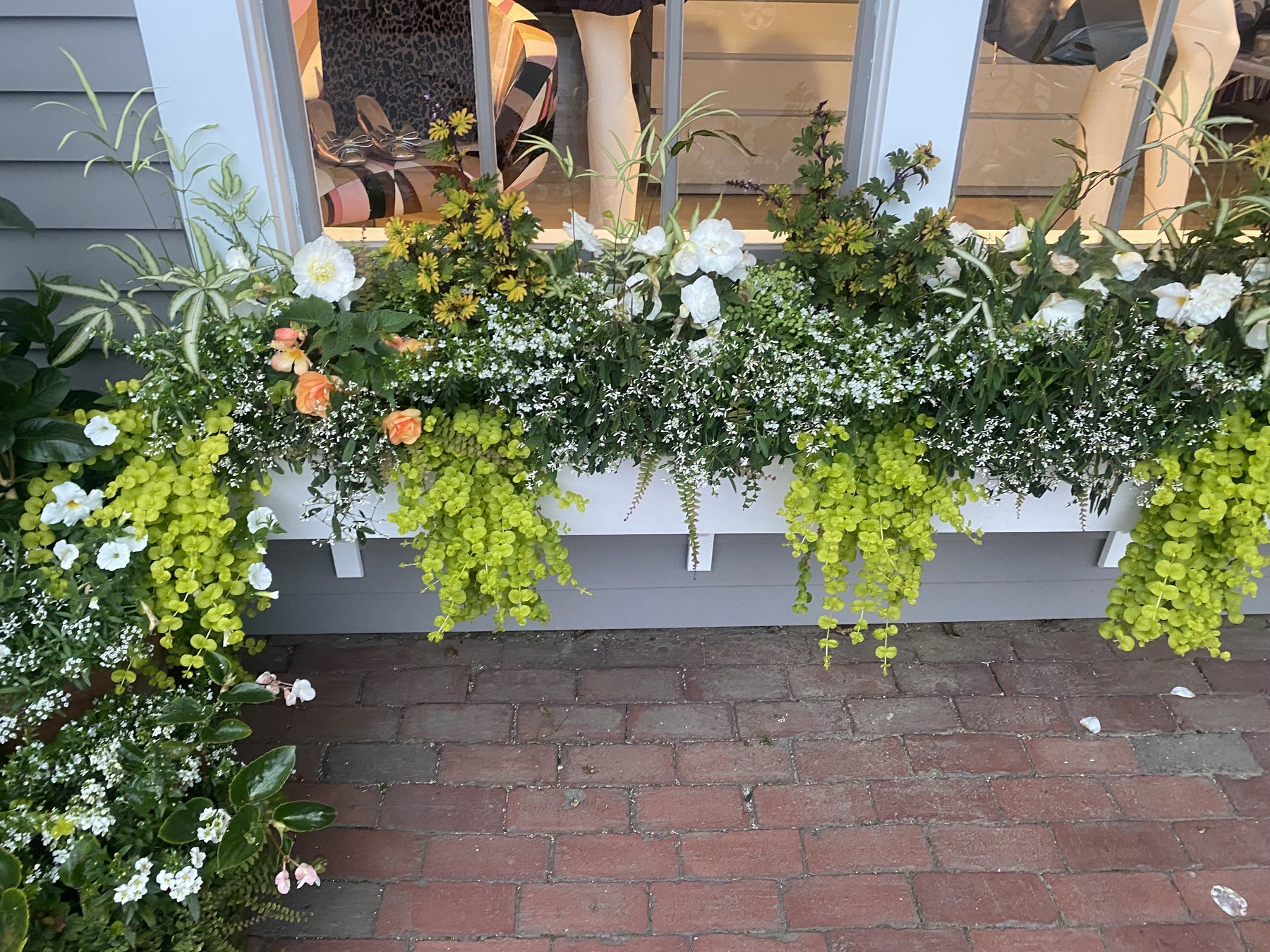
White window box of chartreuse creeping jenny, white petunias and peach flowers above a brick sidewalk

Recipe 3: Chartreuse and Peach

Chartreuse is the color that makes a box glow. Here, golden creeping jenny cascades down the front of a white box while white petunias and a few soft peach blooms fill the top. It is a cheerful, sunny combination that pops against gray siding and old brick.

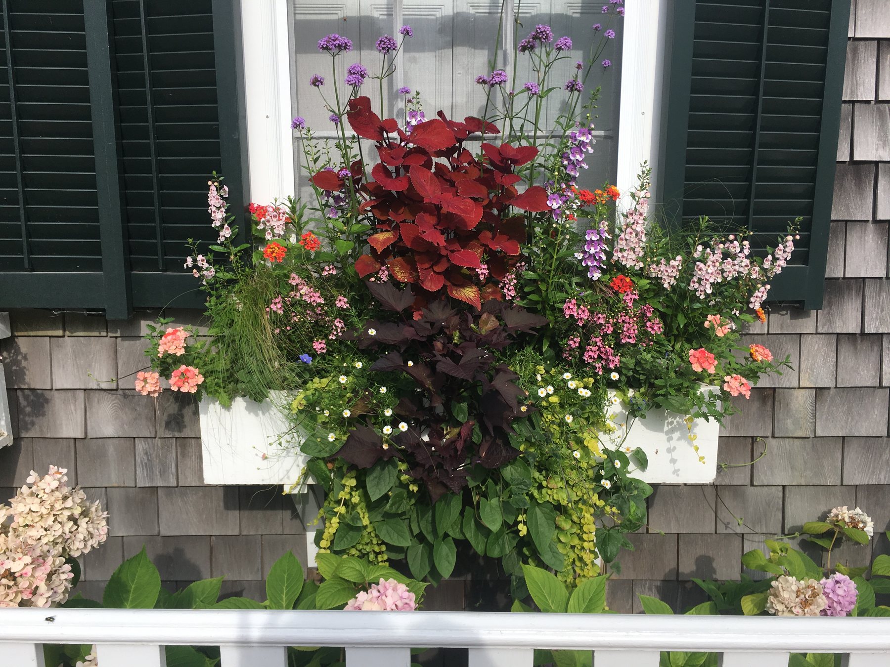
Bold window box of red coleus, coral geraniums, pink flowers and purple verbena on a gray shingle house with hydrangeas

Recipe 4: Bold Red and Coral

When you want a box that stops people on the sidewalk, go bold. Red coleus anchors the center, coral geraniums and pink blooms fill in, airy purple verbena floats above and chartreuse trailers soften the edges. Paired with dark green shutters and a white picket fence, it is classic island color at full volume.

White window box with sweet alyssum, white blooms and silver leaves under black shutters

Design It Like a Pro: Tall, Full, Trailing

Build each box in three layers. Place something upright at the back center, such as angelonia, salvia or an ornamental grass. Fill the middle with mounding bloomers like petunias, geraniums or sweet alyssum. Let trailing plants such as creeping jenny, verbena or sweet potato vine spill over the front edge. Aim for an even balance of flowers and foliage, and step back as you plant so it doesn’t get too busy.

Match the plants to the light

Check which way the window faces before you shop. South-facing boxes need full-sun plants like petunias and geraniums. North-facing boxes want shade lovers like begonias and coleus. East and west windows give you room to experiment.

Soil, Water and Feeding

Use a quality potting mix, never garden soil, and make sure the box drains well. Expect to water at least twice a week, and daily in a heat wave; wind dries boxes out quickly. Starting in early July, feed every two weeks with a liquid fertilizer so the flowers keep coming.

Choose the box itself

A painted box that matches your trim or shutters looks built-in rather than added on. Size it to the full width of the window, and mount it on sturdy brackets set a few inches below the sill.

Keep It Going Through the Seasons

On the island, summer boxes run roughly from Memorial Day to Columbus Day. When summer annuals fade, swap in mums, ornamental kale and grasses for fall, then evergreen boughs and berries for winter. Replacing a tired plant beats nursing it along.

A beautiful window box is one of the simplest ways to make a house feel loved. Pick one color story, plant in three layers and give it a little care each week. For more of the island, read my Nantucket designer’s guide.

Bring the Island Home

Nantucket style doesn’t stop at the window box. Natural textures like seagrass, rattan and woven wicker carry that relaxed, sun-washed feeling indoors. Here are three of my favorite pieces for a coastal entry or living room.

Palma Rattan Gold Vanity Mirror

Palma Rattan Gold Vanity Mirror
$555

Sanctuary Candle

Sanctuary Candle
$45

Hamptons Wicker Scallop Console Table

Hamptons Wicker Scallop Console Table
$1,893

2 Hour Interior Design Virtual or In Person Consultation
Anchor Coffee Table

Anchor Coffee Table
$3,464

Marisol Tray

Marisol Tray
$280

Avalon Square Mirror

Avalon Square Mirror
$1,995

SOMETHING FOR EVERYONE

THE PIECES RACHEL RETURNS TO, AGAIN AND AGAIN
St. Louis Neighborhoods and Their Distinct Design Personalities

St. Louis Neighborhoods and Their Distinct Design Personalities

One of the most persistent myths in interior design is that taste is personal and context is irrelevant—that a well-designed home looks the same wherever it sits. In my experience designing across St. Louis for fifteen years, this is wrong. The best interiors are in conversation with their location: with the architecture, the light, the history, the community character of the place they inhabit. St. Louis is a city of distinct neighborhoods, each with a design personality worth understanding before you begin.

Brass lamp, framed art and a wood console: confident, urbane elegance

Clayton: confident elegance

Clayton is St. Louis’s most urbane residential neighborhood—walkable, with a residential stock that ranges from early-twentieth-century apartment buildings to postwar colonials to contemporary new construction. The design personality here is confident and slightly formal: quality materials, restrained palette, furniture with real weight and presence. Clayton homes wear their elegance without apologizing for it. What works: Farrow & Ball colors, warm wood floors in classic species, traditional furniture forms in contemporary fabrics, art that has been chosen rather than purchased for a space.

Amalfi Rectangle Travertine Coffee Table

Amalfi Rectangle Travertine Coffee Table
$2,616

Monolith Table Lamp, Travertine & Brass

Monolith Table Lamp, Travertine & Brass
$1,164

Linea Arc Vessel

Linea Arc Vessel
$769

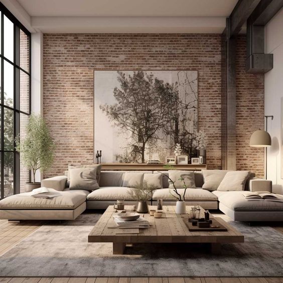
Exposed brick living room with layered neutral furnishings

Webster Groves and Lafayette Square: layered and historically aware

Webster Groves has a specific charm—tree-lined streets, a genuine small-town commercial district, and residential architecture that is mostly pre-war and proud of it. The design personality is warm, layered, and slightly literary: homes that feel accumulated over time, where the vintage French armchair and the contemporary sofa coexist without friction. What works: original millwork honored rather than replaced, paint colors with warmth and body, a mix of inherited and purchased pieces. Lafayette Square is one of St. Louis’s most architecturally significant neighborhoods—Victorian homes of extraordinary quality. The design personality here is romantic and historically aware. Deep, rich colors respond beautifully to the architecture’s Victorian scale; wallpaper used with confidence; lighting that honors the period without being a costume.

Marais Chandelier

Marais Chandelier
$2,300

Jardin Still Life Canvas

Jardin Still Life Canvas
$220

Vitruvian Travertine & Brass Bookends

Vitruvian Travertine & Brass Bookends
$98

Limed oak and ivory living room: quiet luxury

Ladue: quiet luxury

Ladue is St. Louis at its most quietly assured. The houses are generous, the lots are deep, the architecture is mostly traditional—brick colonials, French provincials, ranch estates—and the design register is understated in the way that genuine confidence always is. What works: the highest quality materials used without ostentation, furniture with exceptional construction that doesn’t announce it, art of real merit acquired over time, a palette that whispers rather than announces. What doesn’t: anything that reads as new money trying to look like old—the oversized chandelier that announces expense rather than taste.

Abbey Travertine Bowl

Abbey Travertine Bowl
$813

Sable Travertine Buffet Lamp

Sable Travertine Buffet Lamp
$813

Dune Handwoven Cotton Coverlet – Artisan Fringe Bedspread in Putty

Dune Handwoven Cotton Coverlet – Artisan Fringe Bedspread in Putty
$485

St. Louis Style, Brought Home

Amara Block Print Lumbar Pillow

Amara Block Print Lumbar Pillow
$108

Isla Dot Pillow

Isla Dot Pillow
$297

Petal Horizon

Petal Horizon
From $1,000

Warm grasscloth, travertine lamp and a wood bowl of fruit: cheerful, lived-in warmth

Kirkwood and the Hill: cheerful livability and warmth

Kirkwood has a cheerfulness that is its own kind of design character—a genuine, unpretentious warmth. The design register is welcoming and honest: rooms that are clearly lived in and loved, that prioritize comfort and hospitality over formal impression. What works: color used generously, patterns mixed with confidence, furniture that looks like it’s been sat on, a kitchen that is clearly cooked in. The Hill is St. Louis’s Italian-American neighborhood, and its design character is exactly what that history suggests: warm, generous, family-centered, and proud of its traditions. The kitchen is the heart of the house, the dining room is used for real meals, and the living room is for gathering.

The best interior design always begins with the question of context: where is this home, who lives in it, what does the neighborhood ask of it? St. Louis is a city that rewards this question with extraordinarily rich answers—each neighborhood a distinct invitation to a particular kind of beautiful life.

Rachel Blindauer is an award-winning interior designer based in St. Louis with projects across the United States and internationally. Book a consultation at rachelblindauer.com.

2 Hour Interior Design Virtual or In Person Consultation
Westcott Arc Table Lamp in Aged Brass & Linen

Westcott Arc Table Lamp in Aged Brass & Linen
$769

Winslow Round Side Table

Winslow Round Side Table
$2,224

Textured Waffle Weave Pillow

Textured Waffle Weave Pillow
$127

SOMETHING FOR EVERYONE

THE PIECES RACHEL RETURNS TO, AGAIN AND AGAIN
How to Decorate a St. Louis Historic Home Without Losing Its Soul

How to Decorate a St. Louis Historic Home Without Losing Its Soul

St. Louis has architecture that other American cities would be envious of—the Craftsman bungalows of Webster Groves, the Queen Anne and Italianate homes of Lafayette Square, the grand brick colonials of Ladue and Clayton, the mid-century moderns tucked into the hills of Frontenac. Designing interiors for historic homes is one of the most satisfying challenges in this work. It’s also one of the most commonly botched. The two failure modes are mirror opposites: treating the house as a museum, frozen in its original period; or treating it as a blank canvas and destroying everything that makes it worth owning.

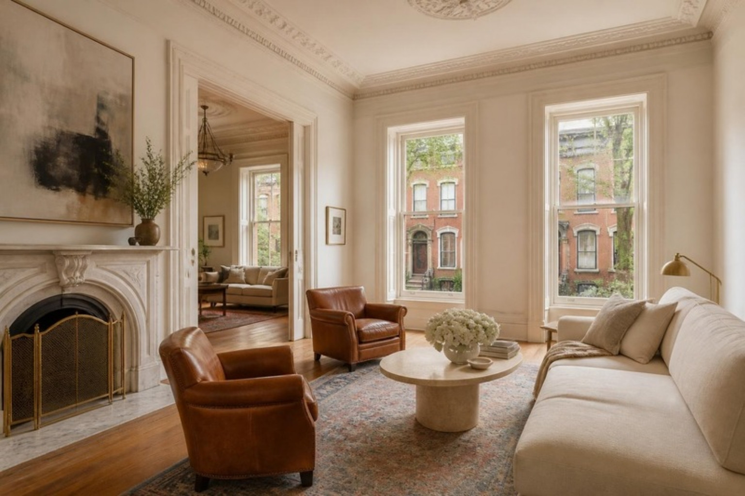
Restored St. Louis Victorian townhouse parlor with original crown molding, marble fireplace and brick rowhouses outside the windows

First: identify what’s original and what’s been added

Most St. Louis historic homes have been through multiple owners and multiple renovations. The first job is always triage: what is original and irreplaceable, what is a period addition that has become part of the home’s character, and what is later modification with no relationship to the home’s authentic identity?

Original elements to protect at nearly all cost: original millwork (baseboard, crown, door and window casings), original hardwood floors, original built-ins, original hardware, any original plasterwork or decorative ceilings. These are what make a historic home irreplaceable.

The millwork question

In pre-war St. Louis homes, the millwork is often the most valuable thing in the room. Wide baseboards, built-up crown molding, paneled doors with original hardware, deep window surrounds with interior sills wide enough to sit on—these create the proportional language of the interior. Everything else in the room should respond to them.

For painted millwork in historic homes, I almost always recommend a warm white—Farrow & Ball Pointing, Benjamin Moore White Dove, or Sherwin-Williams Alabaster—against a wall color with enough body to make the trim read as architectural. The millwork should frame the room. The color on the walls should fill it.

Bringing contemporary furniture into historic rooms

The principle I work from: contemporary furniture reads beautifully in historic rooms when the contemporary pieces are honest about their own time and the historic elements are allowed to anchor the space. A clean-lined linen sofa in a room with original crown molding creates productive tension—both elements are clearly of their moment, and they respect each other. A reproduction Victorian settee in the same room just creates confusion about whose house it is.

Antique and vintage pieces work beautifully for the same reason—they’re honest about their origin. A 1930s French armchair in a 1910 Craftsman reads as layered and collected. A brand-new reproduction of the same chair reads as costume.

For the Historic Home

Harrington Brass Lantern

Harrington Brass Lantern
$7,470

Chesham Marble Top Accent Table, Hazel/Walnut

Chesham Marble Top Accent Table, Hazel/Walnut
$601

Gilded Reflection Mirror

Gilded Reflection Mirror
From $1,600

Color in historic homes

Period-correct paint colors are often more saturated and complex than contemporary taste expects. The Victorians used deep, rich colors—forest greens, burgundies, golds, complex blues—and they were right to do so. A contemporary cool gray in a Victorian parlor flattens everything and makes the ornate millwork look stranded. You don’t have to paint your 1890 home in period-correct colors, but the principle that historic homes benefit from more color, more saturation, and more complexity than modern interiors generally holds.

The best St. Louis historic homes I’ve designed feel like they’ve always been exactly the way they are. That comes from listening to what the architecture is telling you, and then responding to it rather than overriding it.

Rachel Blindauer is an award-winning interior designer based in St. Louis with projects across the United States and internationally. Book a consultation at rachelblindauer.com.

2 Hour Interior Design Virtual or In Person Consultation
Lucerne Oval Mirror

Lucerne Oval Mirror
$1,495

Monteverde Marble Side Table

Monteverde Marble Side Table
$1,595

Harlow Swivel Chair in Cozy Linen

Harlow Swivel Chair in Cozy Linen
$4,344

SOMETHING FOR EVERYONE

THE PIECES RACHEL RETURNS TO, AGAIN AND AGAIN

A Designer’s Guide to the Cozy Bedroom (That Isn’t Beige)

A Designer’s Guide to the Cozy Bedroom (That Isn’t Beige)

The word “cozy” has been so thoroughly weaponized by the home decor industry that it has nearly lost its meaning. Cozy, in the language of fall marketing, means: add a chunky knit blanket, burn a candle, place three decorative pillows you will move every night before bed.

That is not what cozy means. Cozy is a technical quality of a room—a specific combination of scale, texture, light temperature, and material warmth that makes a space feel protective and restorative. It can be achieved in virtually any aesthetic, and it has nothing inherently to do with beige.

Scale is the first variable

The human nervous system responds to scale. Rooms where the ceiling feels closer, where furniture fills the space proportionately, where the human body feels properly nested rather than exposed, read as private and restorative. In a bedroom, your bed should be generous relative to the room. A king bed in a small room often creates more coziness than a queen—counterintuitive, but real. The bed becomes the room’s anchor, and the body feels correctly housed by it.

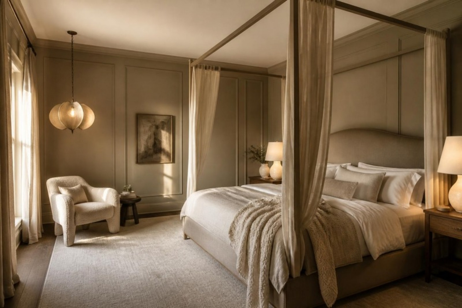
If you have high ceilings, bring them down visually: a statement ceiling light hung low, a canopy bed or curtains hung from ceiling to floor, artwork that draws the eye across rather than up. You’re not making the ceiling lower—you’re redirecting attention to the human scale of the space.

Cozy bedroom with a canopy bed, low-hung pendant over a reading chair and warm paneled walls

The Cozy Bedroom Edit

Dune Handwoven Cotton Coverlet

Dune Handwoven Cotton Coverlet
From $485

Hand-Loomed Cotton Throw

Hand-Loomed Cotton Throw
$79

Sorrento Alabaster Dome Table Lamp

Sorrento Alabaster Dome Table Lamp
$2,995

Texture is the second variable—and the most underused

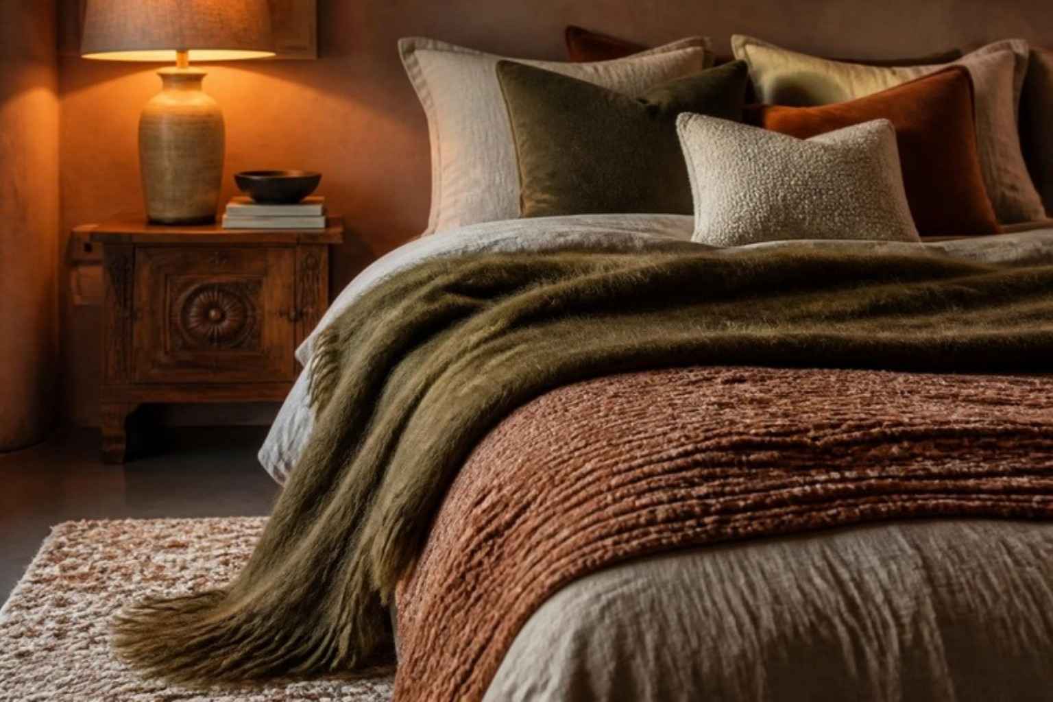
A room with a single texture feels flat and uninviting no matter what color it is. A room with multiple textures—even in a very limited palette—reads as rich, layered, and warm. For a bedroom, I aim for at least five distinct textures: the smoothness of a painted wall, the weight and drape of linen or cotton bedding, the pile of a rug underfoot, the grain of a wood nightstand, and something soft—a throw, an upholstered headboard, a fabric lampshade—that the eye can rest on.

You don’t need expensive materials. A rough-weave cotton duvet cover, a jute rug, a wooden bed frame, linen curtains, and a ceramic table lamp create the full texture spectrum at modest cost. The key is variety of surface—smooth to rough, soft to hard, matte to slightly shiny.

Bed layered with linen, a handwoven coverlet, a mohair throw and velvet and boucle pillows in olive and rust

Light temperature is everything

This is the single most impactful and most neglected variable in bedroom design. The color temperature of your light sources determines whether your room feels warm or clinical regardless of what’s on the walls. Most people have bulbs that are far too cool (4000K or above)—the light equivalent of a fluorescent office ceiling.

For a bedroom, every bulb should be 2700K or warmer—the color temperature of incandescent light, the warm amber light that humans have been falling asleep by for most of history. Switch every bulb in your bedroom to 2700K this week and watch the room change immediately. Beyond color temperature: overhead light is the enemy of cozy. Layer your bedroom lighting with bedside lamps at eye level, a low ambient source, and a focused reading light. The room should be lit from multiple low sources, not one high one.

Color that actually creates cozy

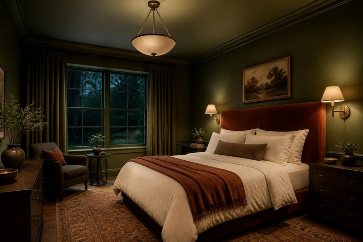
Beige is not cozy. Beige is neutral—it gets out of the way without adding much. Genuinely cozy bedroom colors are warm putty or plaster tones (Benjamin Moore’s Pale Oak, Farrow & Ball’s Elephant’s Breath), soft desaturated greens like sage or dusty olive that lower cortisol and feel organic, or deep enveloping tones—navy, forest green, deep plum—which, when paired with warm-temperature lighting, create a cave-like intimacy that is the most genuinely cozy effect in interior design. These colors feel radical until you’re inside them, at which point they feel inevitable.

The truly cozy bedroom is a considered space where every decision about scale, texture, light, and color has been made in service of how the body and mind feel inside it. Get those things right, and you won’t need the seasonal throw pillow.

Rachel Blindauer is an award-winning interior designer based in St. Louis. She offers 2-hour design consultations virtually and in person. Book at rachelblindauer.com.

Moss green color-drenched bedroom with a rust velvet headboard and warm brass sconces

Color Harmony — The Designer’s Guide, Free

Find Your Season.
Dress In It. Live In It.

Learn to read your own coloring, then carry your palette from your closet to your rooms — 16 pages of Rachel’s method. Not rules. Resonance.

No spam. Unsubscribe anytime.

2 Hour Interior Design Virtual or In Person Consultation
Textured Waffle Weave Pillow

Textured Waffle Weave Pillow
$127

Marais Chandelier

Marais Chandelier
$2,300

Winslow Round Side Table

Winslow Round Side Table
$2,224

SOMETHING FOR EVERYONE

THE PIECES RACHEL RETURNS TO, AGAIN AND AGAIN