Setting the table for daily meals may seem like a menial task, but it can greatly enhance your dining experience. In this blog post, we will explore and discuss the best daily table setting, providing you with valuable tips and recommendations to create a delightful ambiance for every meal.
Invest in Quality Dinnerware
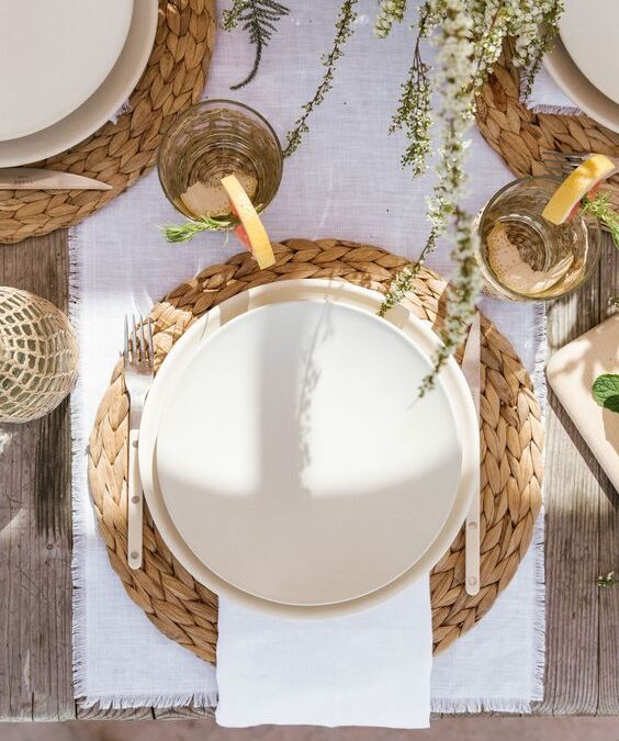
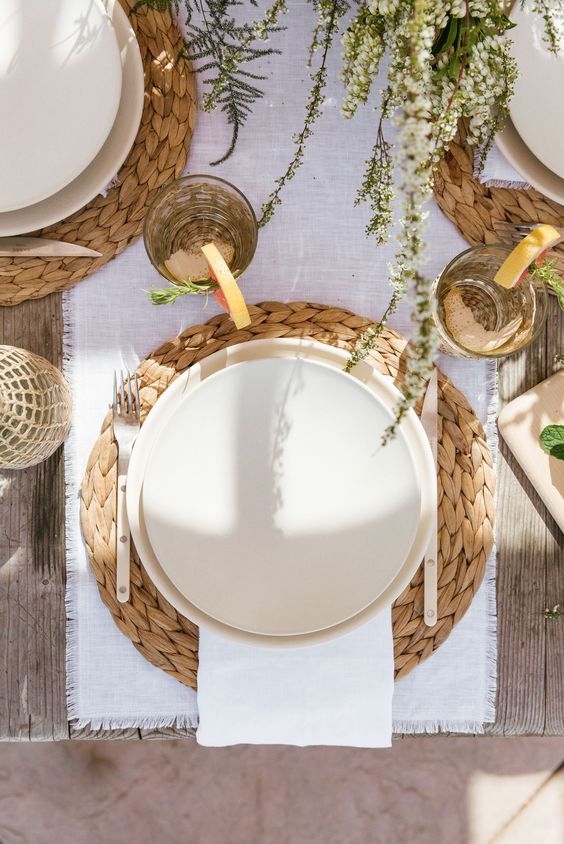
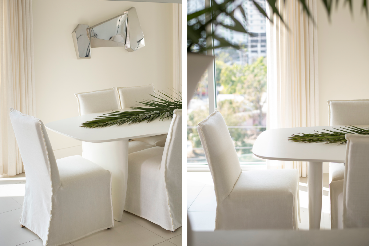
Dinnerware sets the tone for your table setting. Choose plates, bowls, and cutlery that suit your personal taste while ensuring durability and functionality. Classic white plates are versatile and allow your food to take center stage. There is something very human about hand hewn shapes in glassware and plates. Mixing tactile textures such as reclaimed wood, stone, metaled glass can be nice. Personally I love white smooth hand-hewn dish-ware paired with vintage serving accessories and vases.
Utensils and Glassware in Proper Places
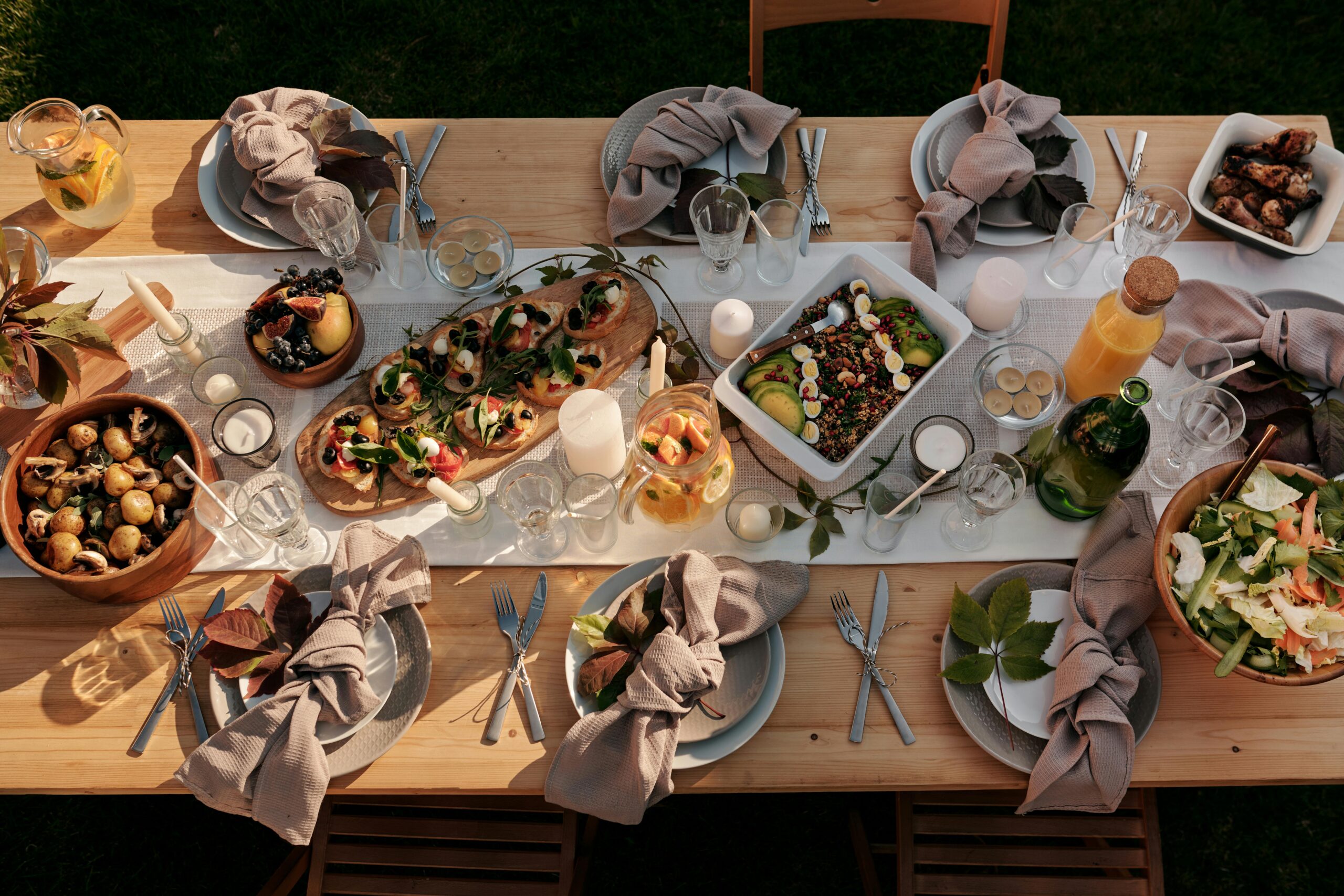
Include the necessary utensils such as forks, knives, and spoons, keeping in mind their placement. The knife should be placed on the right side of the plate, with the blade facing inward. Place the fork on the left side, and the spoon on the right, next to the knife. Add glassware appropriate for the beverages you’ll be serving, such as water glasses, wine glasses, or tumblers.
Fabric Napkins
Fabric Napkins elevate a meal & add an eco friendly texture to your table setting. Place them either on the center of the plate or to the left of the forks. If desired and you have the time you can play with creative folds or use napkin rings.
Create Centerpiece Arrangements Out of What You Have
Use whatever folliage/herbs/flowers/vegetables are growing outdoors and make a casual arrangement down the center of the table. It could be a vase or bowl arrangement, or just have branches strewn Fresh flowers in a vase down the center. If you don’t have any foliage; fruits or veggies/herbs from the grocery store can become arrangements. Be sure to keep the centerpiece at a height that doesn’t obstruct conversation across the table.
Candlelight, Dim Lights and Ambiance
Lighting plays a crucial role in creating the perfect dining atmosphere. Opt for candle light or a dimmed soft, warm electric lighting to set a cozy mood.
You don’t need a tablecloth if you have a great table
If you have a marble or gorgeous wood on your dining table who would want to hide it? However adding depth with chargers or placemats can add depth.
Take the first step towards creating your dream space. If you are looking for top-notch interior design services near you, Rachel Blindauer and her team are here to bring your vision to life. With our wealth of experience and expertise, we can create stunning and functional spaces that exceed your expectations and bring you to a new height of design and sophistication.
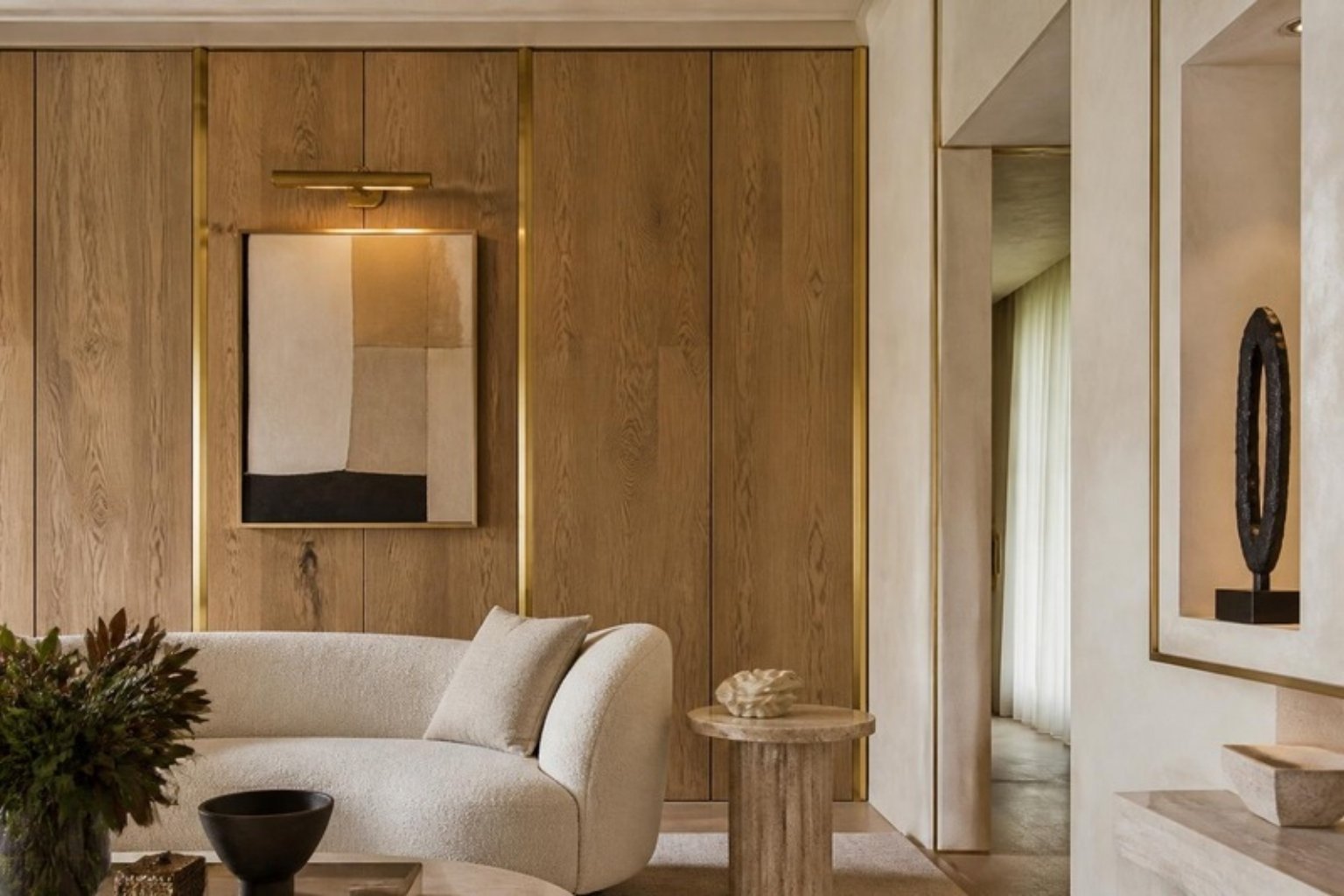
There’s a certain quiet authority that wood paneling lends to a room. It doesn’t clamor for attention like patterned wallpaper, nor does it retreat like flat-painted walls. Instead, it speaks in low tones—of craftsmanship, heritage, and intention.
As an interior designer who’s worked on everything from boutique hotels in wine country to modern family homes in St. Louis, I find myself returning again and again to wood paneling. Not because it’s trendy (though it is), but because it has the power to transform the mood of a room—architecturally, emotionally, and acoustically.
This guide breaks down the most elegant types of wood paneling, how to use them, what to avoid, and how to layer them into interiors that feel lived-in, not themed.
Quick Comparison: Wood Paneling Types at a Glance
Paneling Style
Best Room Use
Avg. Cost per Sq Ft
Design Style Match
Paint or Stain
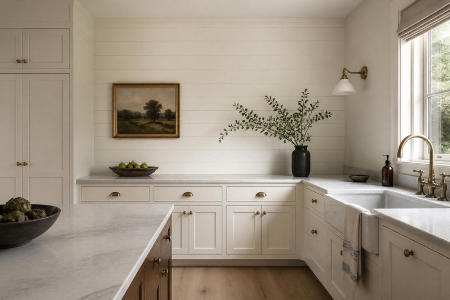
Shiplap
Kitchen, Mudroom
$4–7 (installed)
Coastal, Farmhouse
Paint
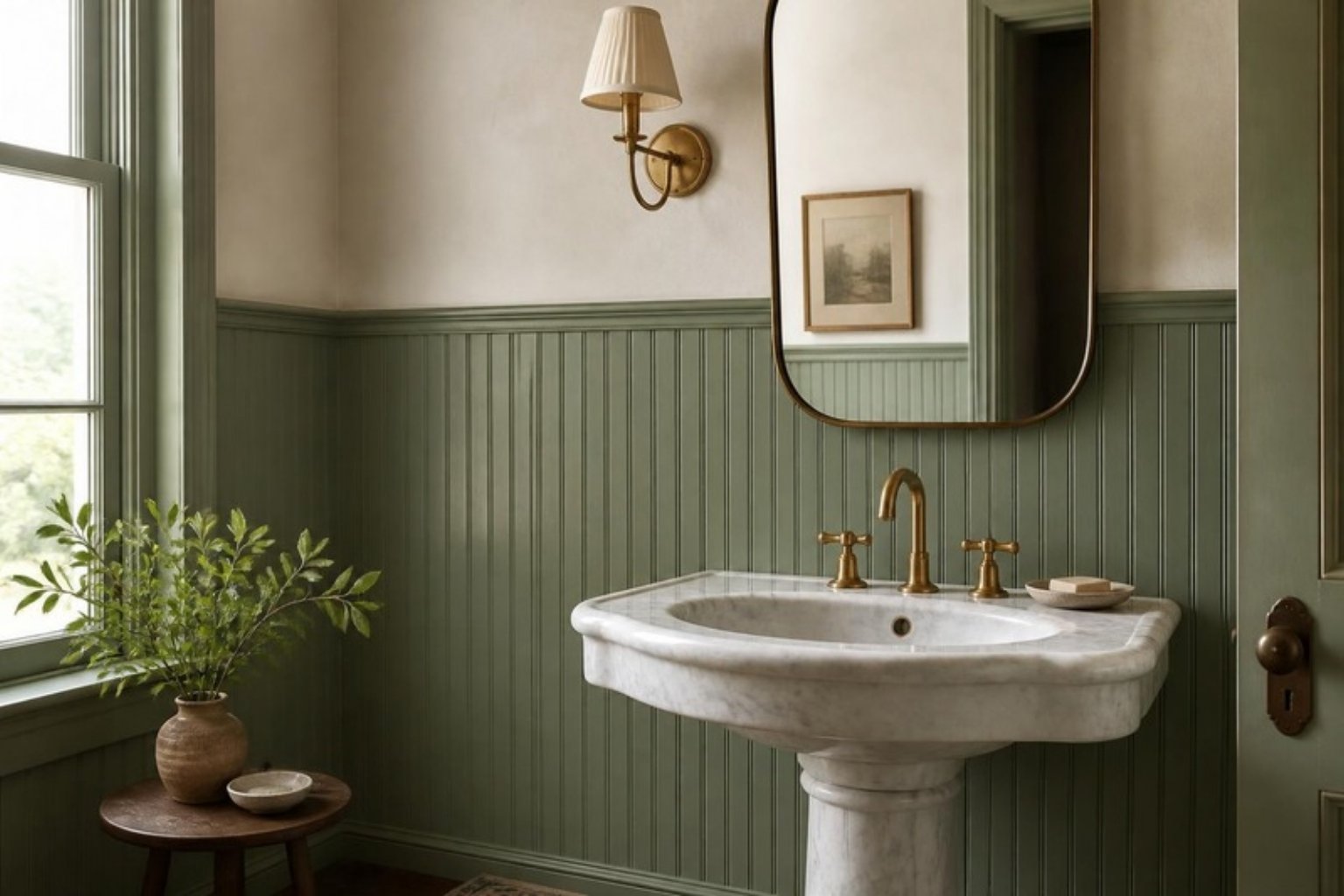
Beadboard
Powder Room, Entry
$3–6
Cottage, Traditional
Paint
Board and Batten
Dining Room, Exterior
$5–9
Transitional, Craftsman
Paint
Tongue and Groove
Bedroom, Ceiling
$6–10
Scandinavian, Classic
Either
Wainscoting
Hallway, Stairwell
$8–15
Traditional, Modern
Paint
Slatted Wood Panels
Living Room, Office
$10–20
Japandi, Contemporary
Stain
Reclaimed Wood Panels
Fireplace, Accent Wall
$10–25+
Rustic, Industrial
Natural
Shiplap
Originally found in barns and boats, shiplap gained modern fame through the farmhouse revival. The horizontal grooves add structure without fuss.
Best For: Kitchens, mudrooms, laundry rooms Design Note: For a modernized feel, paint shiplap the same color as trim—this minimizes contrast and maximizes architectural calm. I talk more about this minimal-tonal strategy in No-Reno, No-Demo Design Hacks.
“When used sparingly, shiplap feels timeless. When overused, it feels like a set piece.”
Beadboard
Beadboard is made of narrow vertical planks, each separated by a “bead.” It adds rhythm and charm, evoking seaside cottages and early 20th-century craftsmanship.
Best For: Bathrooms, breakfast nooks, ceilings Installation Tip: Run it higher than a standard 36″ wainscot for a more elevated proportion. A 48–60″ height can feel more gallery-like and less dated.
Estimated Cost: $3–6 per sq ft installed
Board and Batten
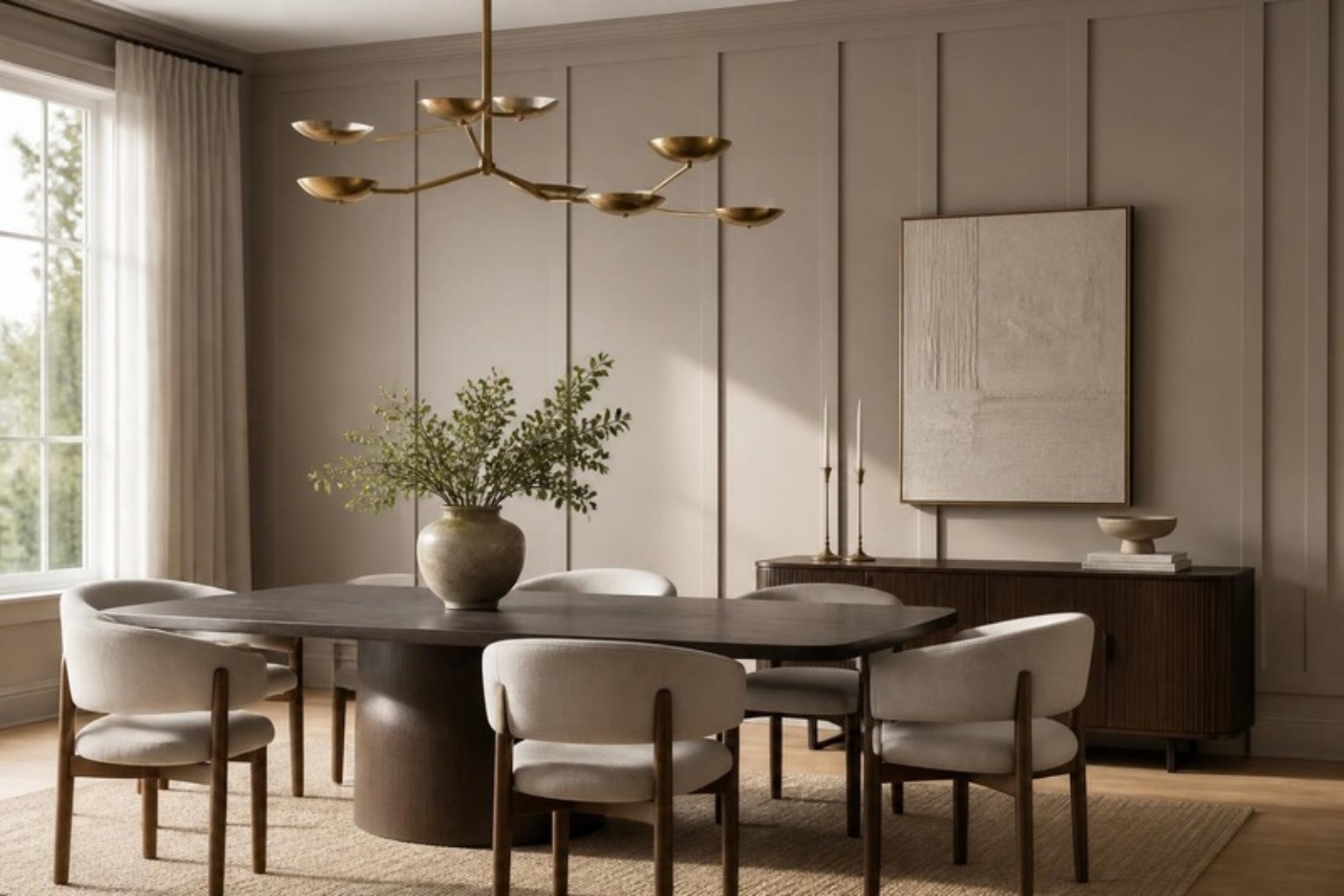
Board and batten creates vertical dimension using wide boards and narrow battens over seams. It can look sleek or traditional depending on spacing.
Best For: Dining rooms, bedrooms, exteriors Cost: $5–9 per sq ft professionally installed Style Advice: Paint it in the same color as the wall to emphasize shadow play rather than contrast. Add a pedestal dining table and sculptural lighting from our Lighting Collection for a moody, editorial look.
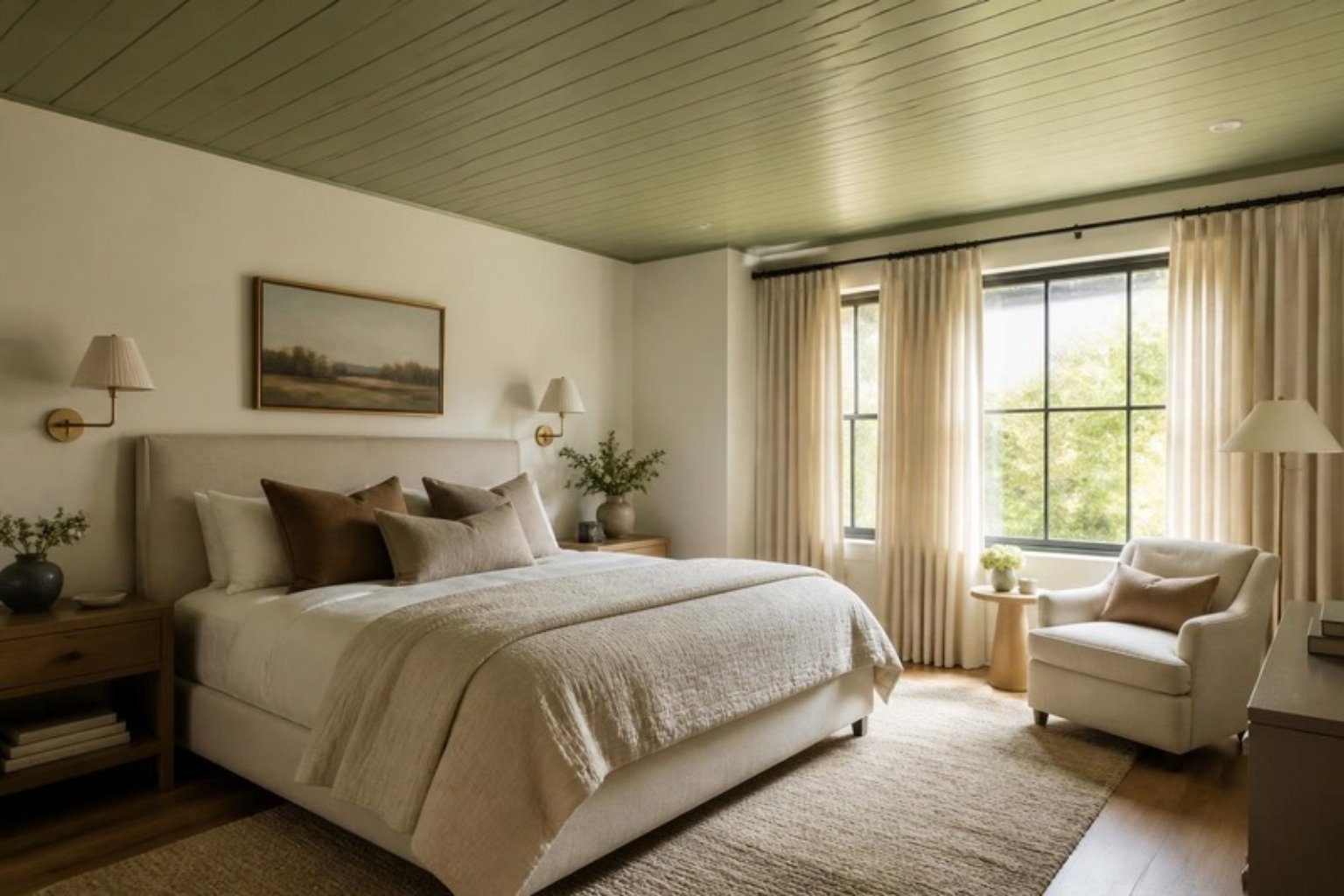
This flush-fitting paneling slots into itself, creating a refined look with no gaps. It offers a tailored, high-end appearance with the warmth of wood.
Best For: Ceilings, bedrooms, or libraries Visual Cue: Imagine a ceiling clad in sage-toned tongue-and-groove, punctuated by a linen drum pendant.
Paint or Stain? Either. Dark stains feel architectural; soft paints feel serene.
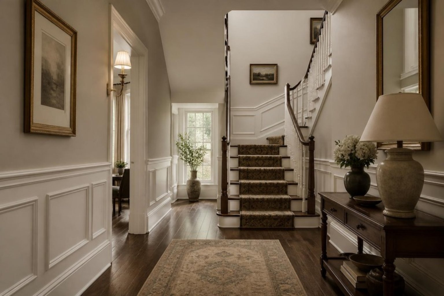
Wainscoting
More than just a wall trim, wainscoting adds proportion and presence to a room. Today’s version can be minimalist or richly traditional.
Best For: Entryways, stairwells, home offices Design Tip: I often pair wainscoting with a contrasting finish above—either limewash, grasscloth, or a matte neutral paint from our Seasonal Color Guide.
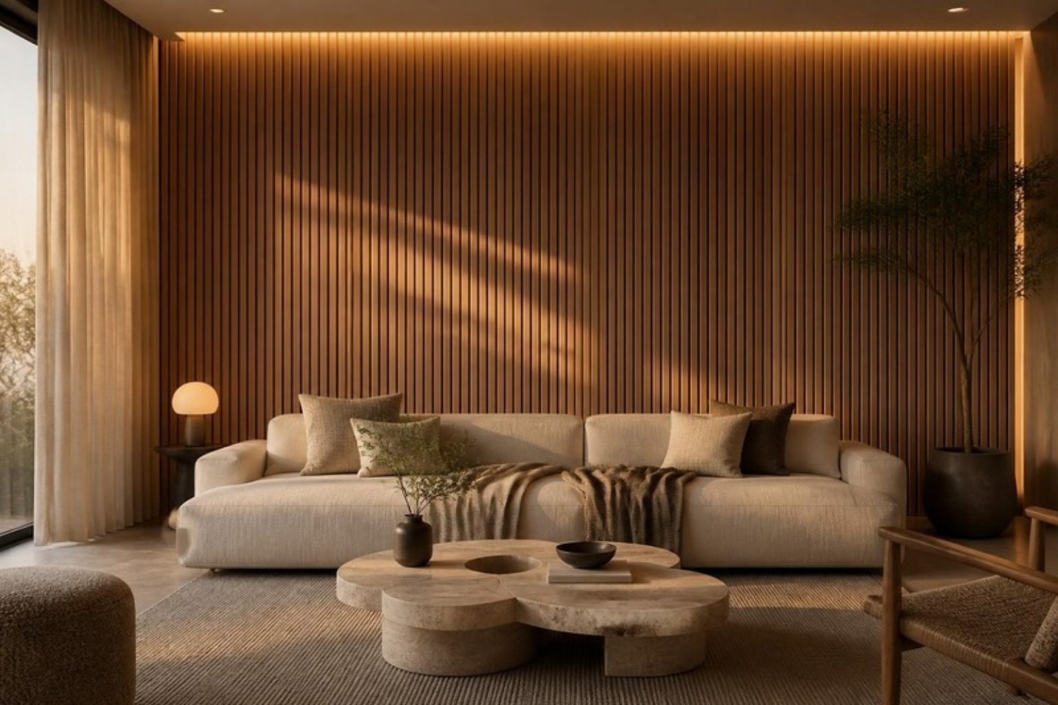
Slatted Wood Panels
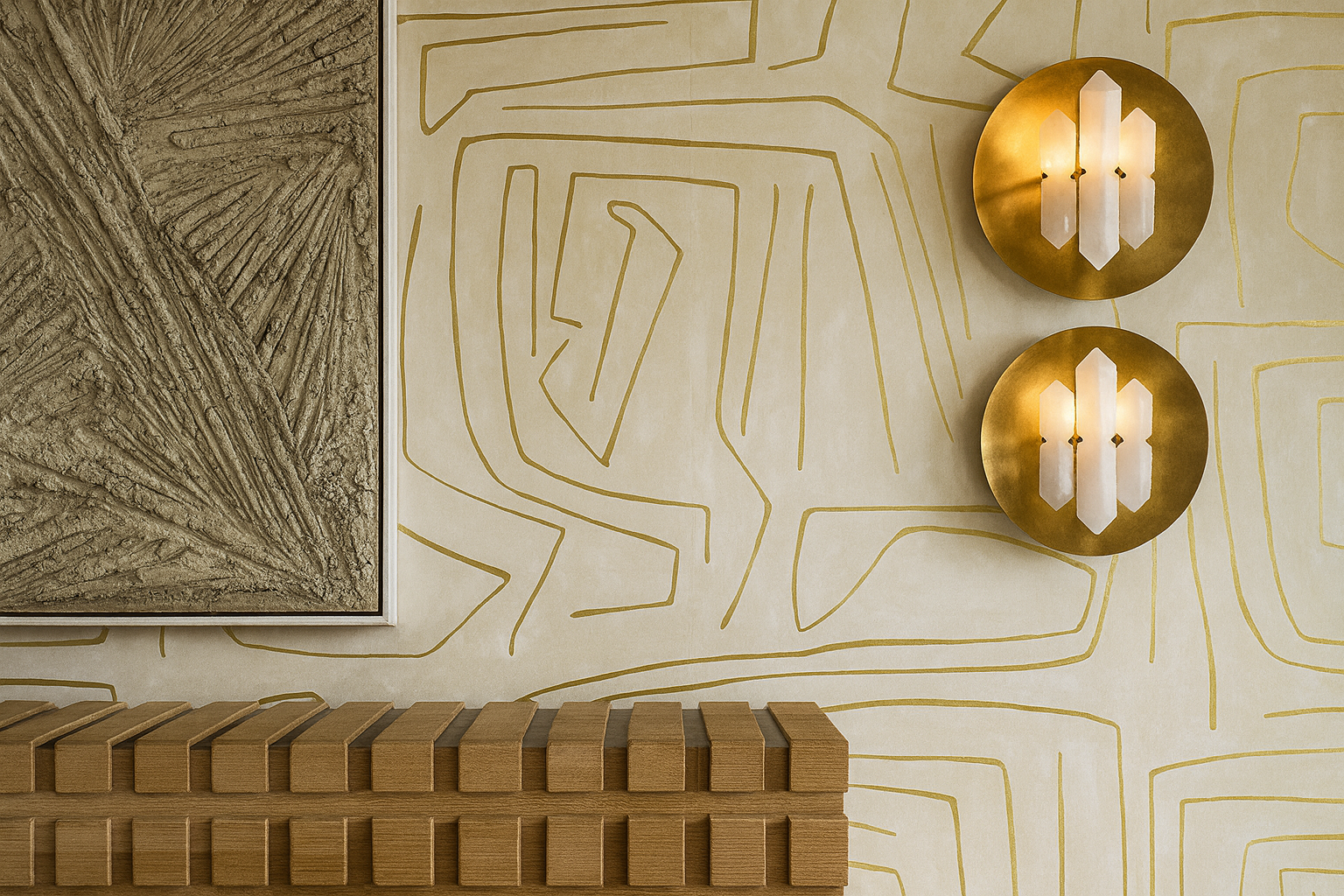
Thin vertical slats, often in walnut or white oak, are becoming the go-to for modern interiors that crave depth. They soften acoustics and add rhythm.
Best For: Accent walls, TV walls, bedroom headboards Lighting Idea: I love backlighting these panels with concealed LED strips—it turns the wall into a sculptural installation.
Where to Style: Pair with our Terra Fold Vase or a travertine coffee table for layered sophistication.
If your space needs soul, this is the answer. Reclaimed wood brings character, texture, and warmth. It’s best used in rooms that crave intimacy or grounding.
Best For: Fireplaces, dens, media rooms Rachel’s Take: Use it in one area only, and balance with clean-lined furniture and natural textiles.
“The right reclaimed wood tells a story. The wrong one tells you to go camping.”
Bonus: Modern Wood Paneling Mistakes to Avoid
Even the best materials fall flat when misused. Here are a few common mistakes to avoid:
Using paneling on every wall of a room: Reserve it for focal walls or architectural alignment.
Poor proportioning: Panels that are too short or battens spaced unevenly can cheapen the look.
Using mismatched trim: Paneling only works when integrated into a cohesive trim strategy.
Skipping color consideration: Don’t default to white. Neutrals like mushroom, greige, storm blue, or muted pine green read far more elevated.
Final Thoughts: Wood Paneling as Design Language
At its core, paneling allows you to control the tone of a space—both literally and emotionally. It can elongate a room, ground a space, draw the eye, or simply provide texture in a room of smooth surfaces.
“Paneling isn’t a style trend. It’s a commitment to architectural clarity.”
And in a world of fast furniture and flimsy finishes, that clarity is what truly sets a space apart.
Want a Space That Feels Designed, Not Just Decorated?
Our 2-Hour Design Consultation is the perfect entry point. Whether you’re selecting paneling for a renovation or refining your current space with timeless materials, I’ll help you build a plan that feels as intentional as it looks.
And for those finishing touches? Explore the sculptural, textural, and refined pieces from Shop.RachelBlindauer.com—curated for homes that don’t just look elevated. They feel it.
Every September, the design internet floods with fall color palettes pulled from Scandinavian studios, California editorial shoots, and New York loft apartments. They’re beautiful. They’re also largely irrelevant to how color actually behaves in a St. Louis home in October.
Midwestern autumn light is specific. As the sun moves lower, the quality of natural light in St. Louis shifts dramatically from September to November—from the long golden afternoons of early fall to the short, flat, cool-gray light of late November. The colors that look warm and rich in September can look muddy and heavy by Thanksgiving. Understanding this transition is how you choose a fall palette that works across the whole season.
Why warm colors work so well here in fall
St. Louis homes—particularly the brick colonials, Craftsman bungalows, and ranch houses that define most of our residential neighborhoods—have a natural warmth built in. Red brick, warm wood trim, hardwood floors that run golden to amber: these are the bones most of us are working with. Warm paint colors don’t compete with these elements. They complete them.
Cool colors—icy blues, stark whites, cool grays—fight the warmth of brick and wood constantly. In fall, when the light is already shifting toward warm, that fight becomes exhausting. A room painted in warm putty or soft terracotta in October feels like it was designed for exactly this moment.
The palette I’m recommending this fall
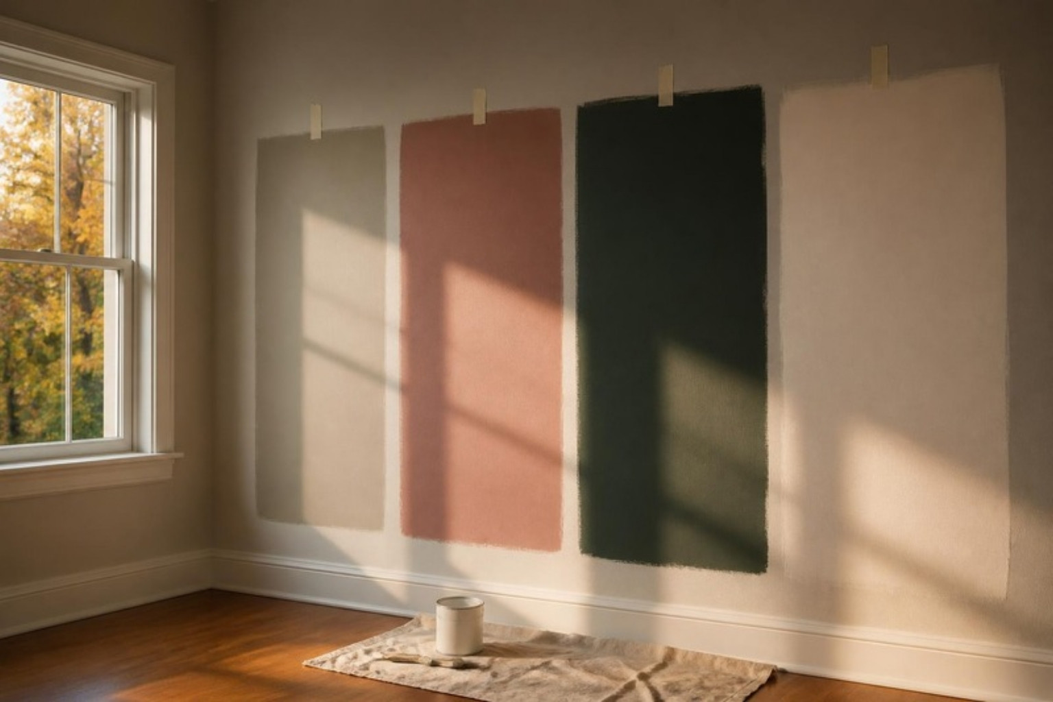
Benjamin Moore Pale Oak (OC-20) reads warm without being orange, neutral without being beige, and responds beautifully to changing autumn light—warmer in the late afternoon, softer in the gray morning. An ideal living room or dining room color for St. Louis homes with wood floors and original trim.
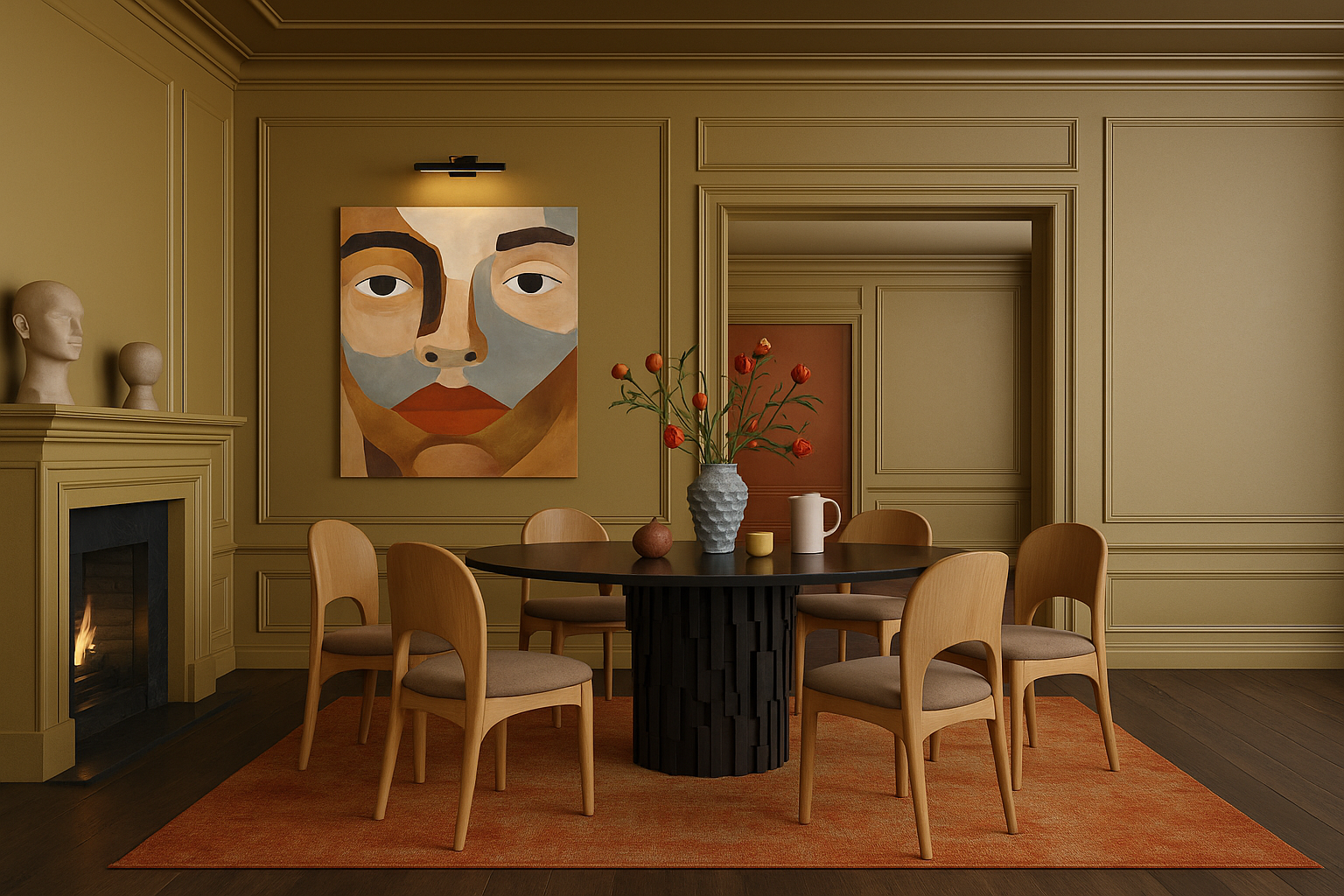
Farrow & Ball Dead Salmon (No. 28) is a warm, dusty, faded terracotta-pink—sophisticated and earthy at once. It’s particularly stunning in dining rooms where candlelight plays against it in the evening. If you want your fall dinner parties to feel warm and memorable, this is your color.
Benjamin Moore Revere Pewter (HC-172) is a classic. It has enough warm gray-green to feel contemporary and enough warmth to feel cozy. In fall light it moves from silvery in the morning to distinctly warm by afternoon.
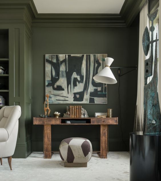
Benjamin Moore Salamander (2050-10) is for the brave—a deep, forest green with enough warmth to avoid feeling cold. In fall, with brass candlesticks and warm wood furniture, it’s extraordinary.
Five More Warm Colors Worth Sampling
If the four colors above don’t fit your house, these five cover almost every other situation I see in St. Louis homes.
Farrow & Ball Setting Plaster (No. 231) is a dusty, plaster-pink that is gentler than Dead Salmon. It warms a north-facing bedroom or powder room without ever reading as “pink.”
Benjamin Moore Hawthorne Yellow (HC-4) is a buttery historic yellow. It suits sunrooms, breakfast rooms and kitchens in older brick homes, and it still looks sunny on the gray days of late November.
Benjamin Moore Caldwell Green (HC-124) is a deep olive green with a brown undertone. Use it in dining rooms, libraries and on built-ins, especially next to oak or walnut.
Sherwin-Williams Urbane Bronze (SW 7048) is a warm brown-black. It is beautiful in a study, on kitchen cabinetry or on a front door, and it makes brass hardware glow.
Sherwin-Williams Accessible Beige (SW 7036) is the dependable warm greige for whole-house flow. Choose it for hallways, open plans and any room that has to connect to several others.
How to layer color across a room (not just on the walls)
Paint is only one layer. The rooms that feel genuinely warm in fall are layered—textiles in amber, rust, and forest tones on top of a warm wall color, with warm-temperature light bulbs (2700K or below) completing the effect. Switch your bulbs to 2700K in October and watch every warm color in your home improve immediately. It’s the fastest and cheapest design upgrade available, and most people never do it.
Test Before You Commit: Sampling in Fall Light
Paint chips are too small to judge, and fall light changes a color more than any other season. A careful sampling routine costs one weekend and prevents the most expensive mistake in painting: repainting.
Go big. Paint sample boards at least 2 feet square, with two coats, and leave a white border so the existing wall color doesn’t influence your eye.
Move them around. Look at each board on every wall of the room, low and high. The wall beside the window and the wall facing it will read as two different colors.
Check three times a day. Look in the morning, mid-afternoon and after dark under your own lamps. In October, the 3 p.m. light is the warmest you will see all year, so don’t decide based on that alone.
Wait for a cloudy day. Live with samples for at least three days, including one overcast day. That gray light is what you will live with from November to March.
Match your bulbs. Judge samples under the 2700K bulbs you’ll actually live with. Cooler bulbs of 4000K and above will make them look muddy.
Match the Undertone to What You Can’t Change
The right wall color is chosen in relation to the finishes you are keeping, not on its own. Hold each sample right next to those fixed elements rather than in the middle of a wall.
Red brick fireplaces and exposed brick: skip pink-beiges, which compete with the brick. Gray-green neutrals like Revere Pewter, or deeper greens like Caldwell Green, calm the red instead.
Orange-toned red oak floors, which are common in post-war St. Louis homes: avoid yellow-beiges, which amplify the orange. A neutral with a whisper of gray, like Pale Oak or Accessible Beige, balances it.
Cherry or walnut cabinetry and furniture: these can carry richer colors. Dusty pinks and deep greens look intentional next to dark wood.
Marble, granite or tile you’re keeping: pull the wall color from the quietest tone in the stone’s veining, never the boldest.
Choosing the Right Sheen
Warm colors look richest in lower sheens, because shine reflects light back as glare and washes out depth. Durability still matters, though, so here is how I specify sheen room by room.
Surface
Sheen
Why
Ceilings
Flat
Hides imperfections; no glare
Living, dining and bedrooms
Matte
The deepest, most velvety color
Hallways and family rooms
Eggshell or scrubbable matte
Wipes clean, still soft
Kitchens and baths
Satin
Resists moisture and grease
Trim, doors and cabinetry
Satin or semi-gloss
Durable, with a crisp edge
For dark colors like Salamander or Urbane Bronze, choose a premium scrubbable matte. Standard flat paint in a deep color scuffs and burnishes easily.
Cool grays and blue-based whites feel increasingly harsh as fall progresses and natural light diminishes. Also avoid: painting a single accent wall in a saturated fall color and leaving the rest of the room untouched. Accent walls were a 2012 trend. If a color is right for your room, commit to it. If it isn’t, find a different color rather than hedging with one wall.
Fall in St. Louis is one of the most beautiful times of year. Your home can feel like an extension of all of it.
Rachel Blindauer is an award-winning interior designer based in St. Louis with projects across the United States and internationally. Book a color consultation at rachelblindauer.com.
Color Harmony — The Designer’s Guide, Free
Find Your Season. Dress In It. Live In It.
Learn to read your own coloring, then carry your palette from your closet to your rooms — 16 pages of Rachel’s method. Not rules. Resonance.
Done — check your inbox. Your guide is on its way.
Introductory CTA Block:
Ready to invest in a piece with timeless presence? Browse shop.rachelblindauer.com for curated decor that complements iconic forms—without competing with them.
The Sofa as Cultural Artifact
Some pieces aren’t just furniture—they’re history. They reflect political optimism, the sensuality of post-war design, or the rigorous beauty of Bauhaus restraint. The most iconic sofas earn their place not by trend, but by their ability to evolve across time and space, anchoring interiors from Milan to Manhattan.
These 25 have done just that.
Comparison Table of Iconic Sofas
Sofa Name
Era
Best For
Style Note
Le Corbusier LC2
1928
Modern minimalist spaces
Cubic steel form, tight upholstery
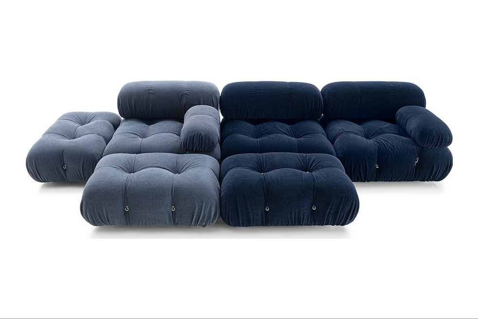
Camaleonda by Mario Bellini
1970
Modular, playful layouts
Sculptural, endlessly reconfigurable
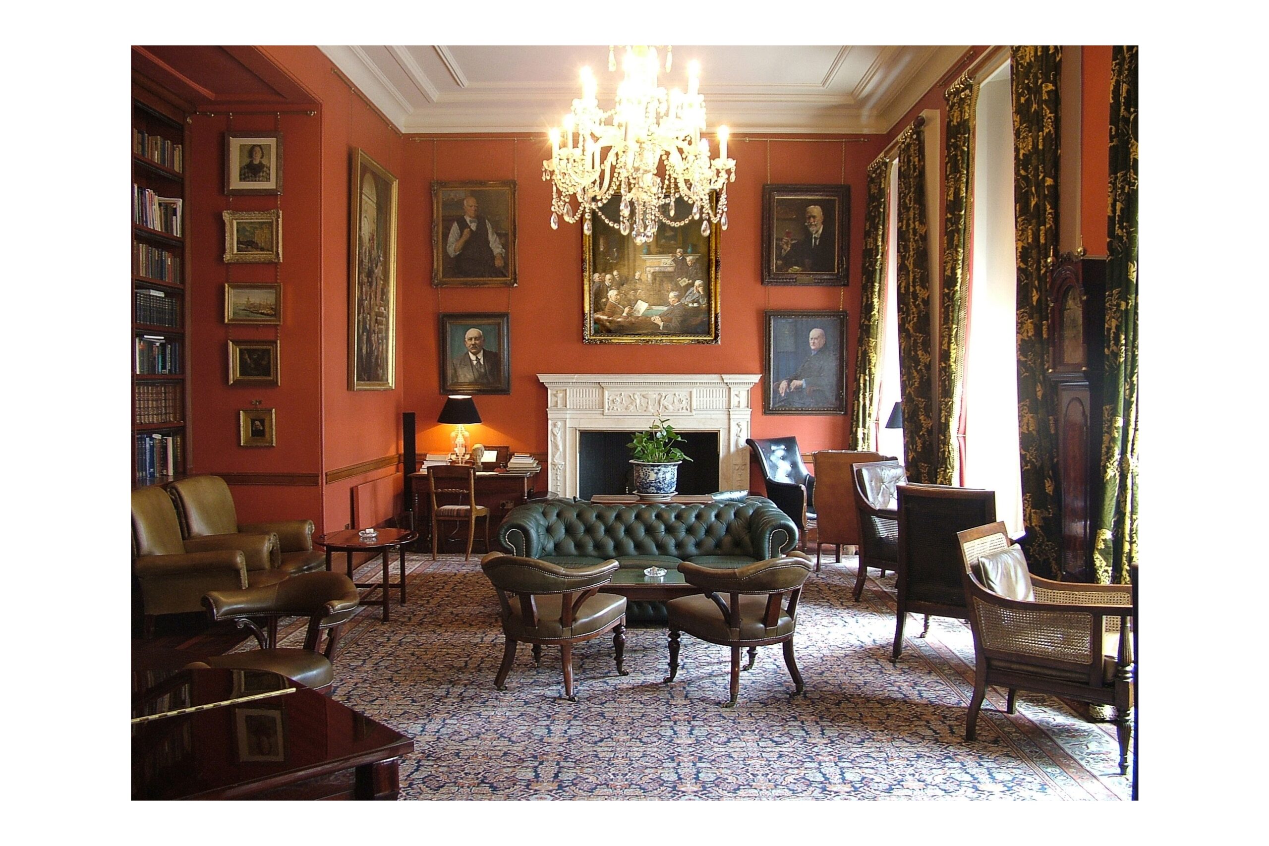
Chesterfield
18th Century
Libraries, masculine rooms
Button-tufted, classic English
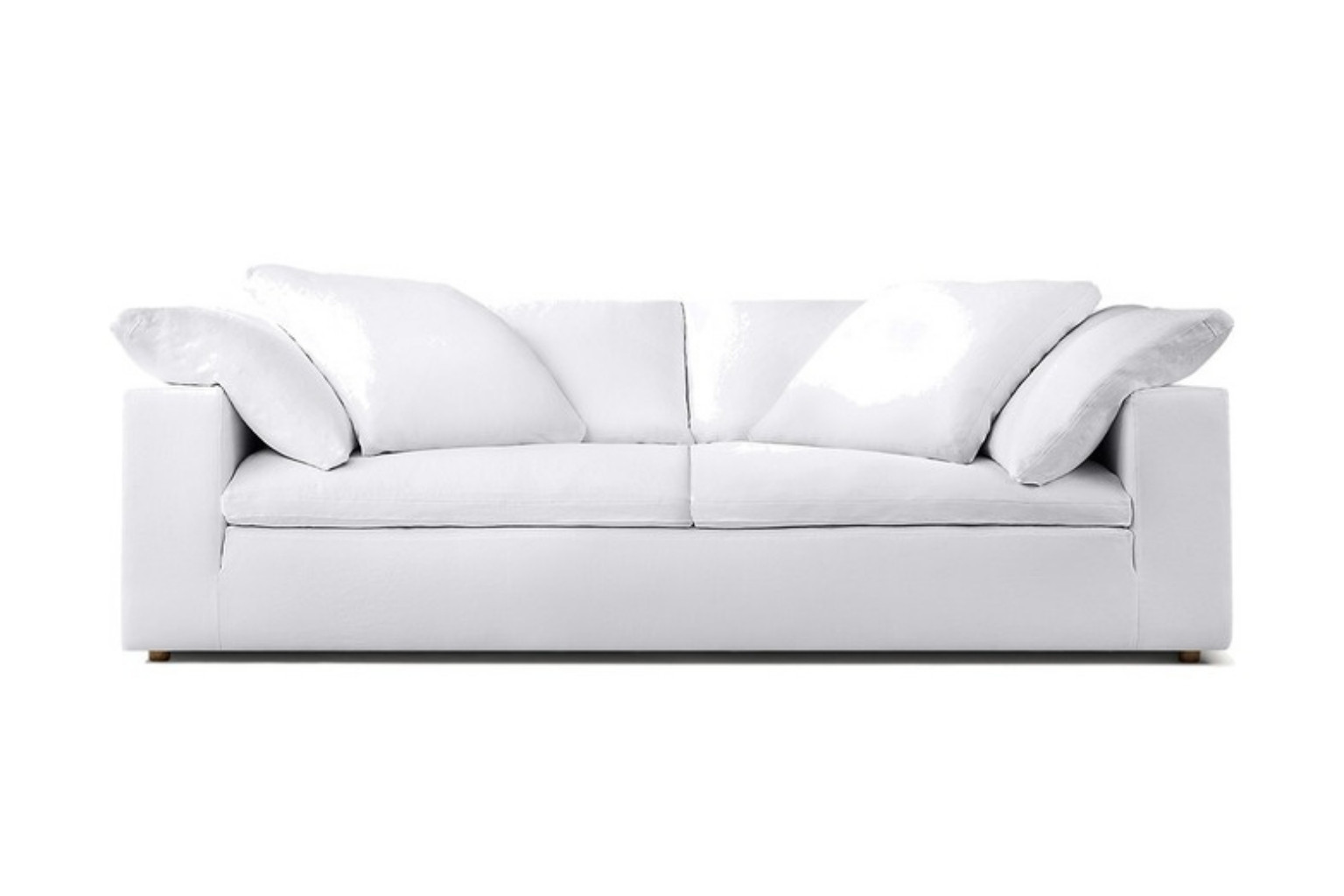
Cloud Sofa (RH)
2010s
Family rooms, lounging
Deep, oversized comfort
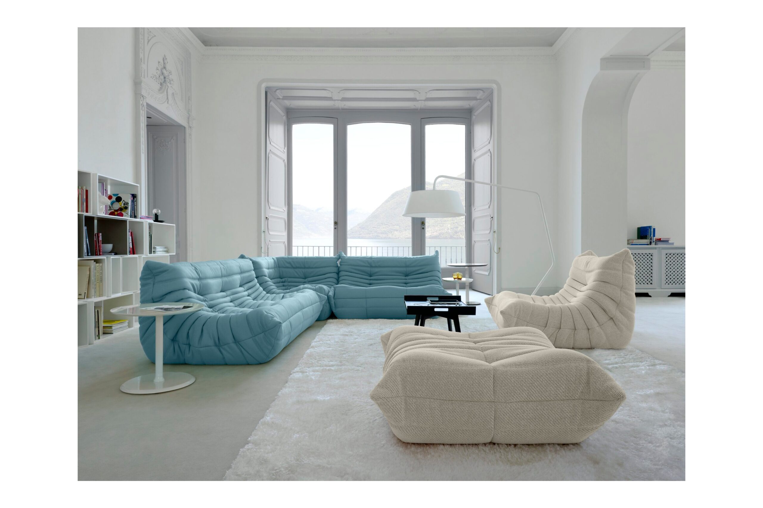
Togo by Michel Ducaroy
1973
Relaxed living spaces
Slouchy, low-slung profile
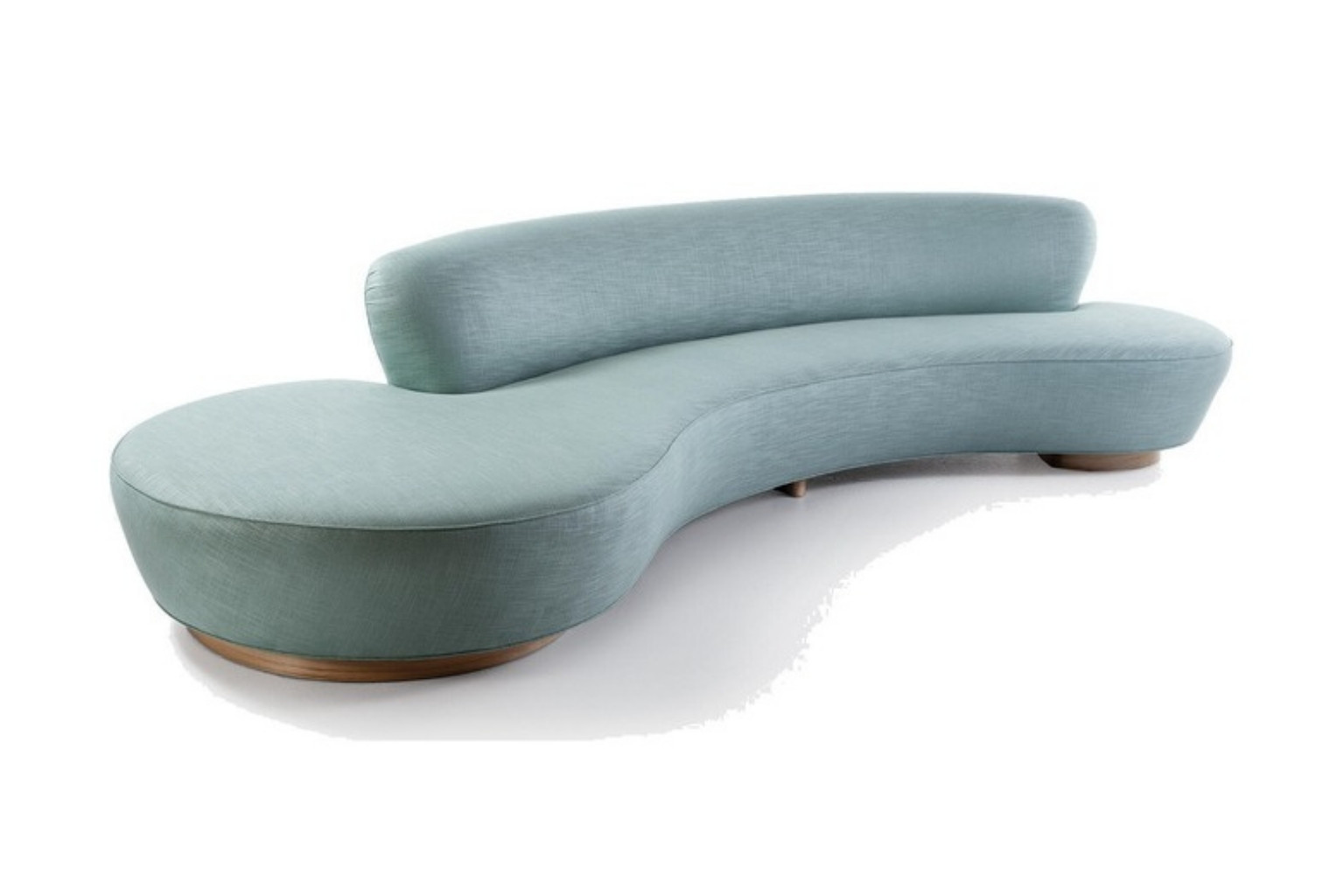
Serpentine by Vladimir Kagan
1950
Show-stopping focal points
Curved, sensuous silhouette
Florence Knoll Sofa
1954
Professional interiors
Architecturally precise
Jean Royère Polar Bear Sofa
1940s
Collector-level interiors
Sculptural, plush, rare
Mah Jong by Roche Bobois
1970s
Boho maximalist setups
Low, modular, colorful
Tufty-Time by Patricia Urquiola
2000s
Modern eclectic homes
Grid modularity, playful form
1. Le Corbusier LC2 Petit Modele Sofa (1928)
Photo: 1904.CC, CC BY 4.0, via Wikimedia Commons
Material poetry in chrome and leather.
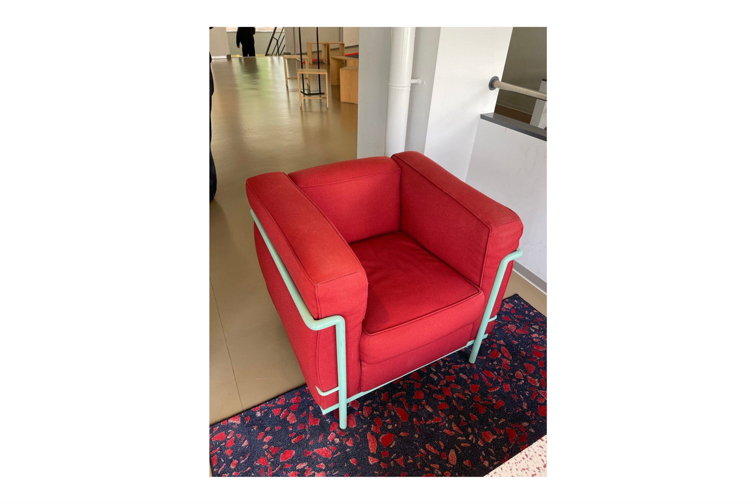
The LC2 isn’t comfortable in the conventional sense. It’s intellectual. A cubic exoskeleton holds plump cushions in a perfect tension of form and function. Use in crisp modern interiors or to contrast lush textures.
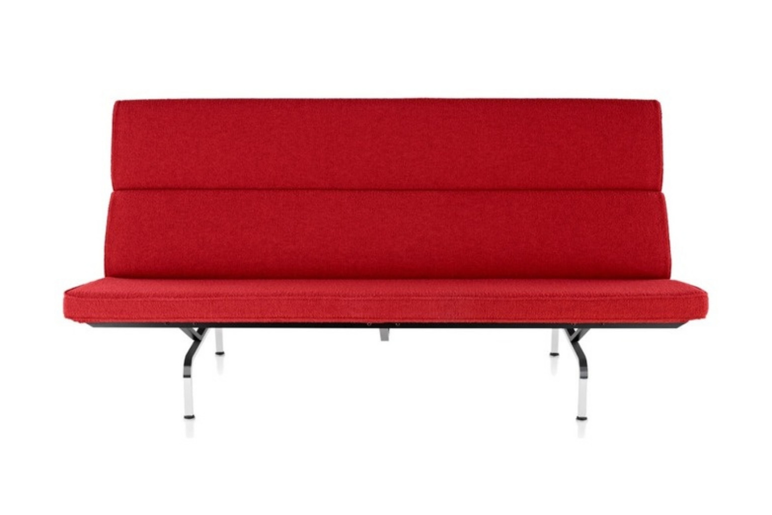
Originally designed for their own home, Charles and Ray Eames envisioned a sofa that felt architectural yet inviting. It still does.
3. Mario Bellini Camaleonda (1970)
Photo: Alexgni, CC BY-SA 4.0, via Wikimedia Commons
Soft power. Modular mastery.
Reissued due to demand, the Camaleonda is tactile, playful, and endlessly adaptable. It’s a favorite in design-forward homes, boutique hotels, and the pages of every respected interiors magazine in the last five years.
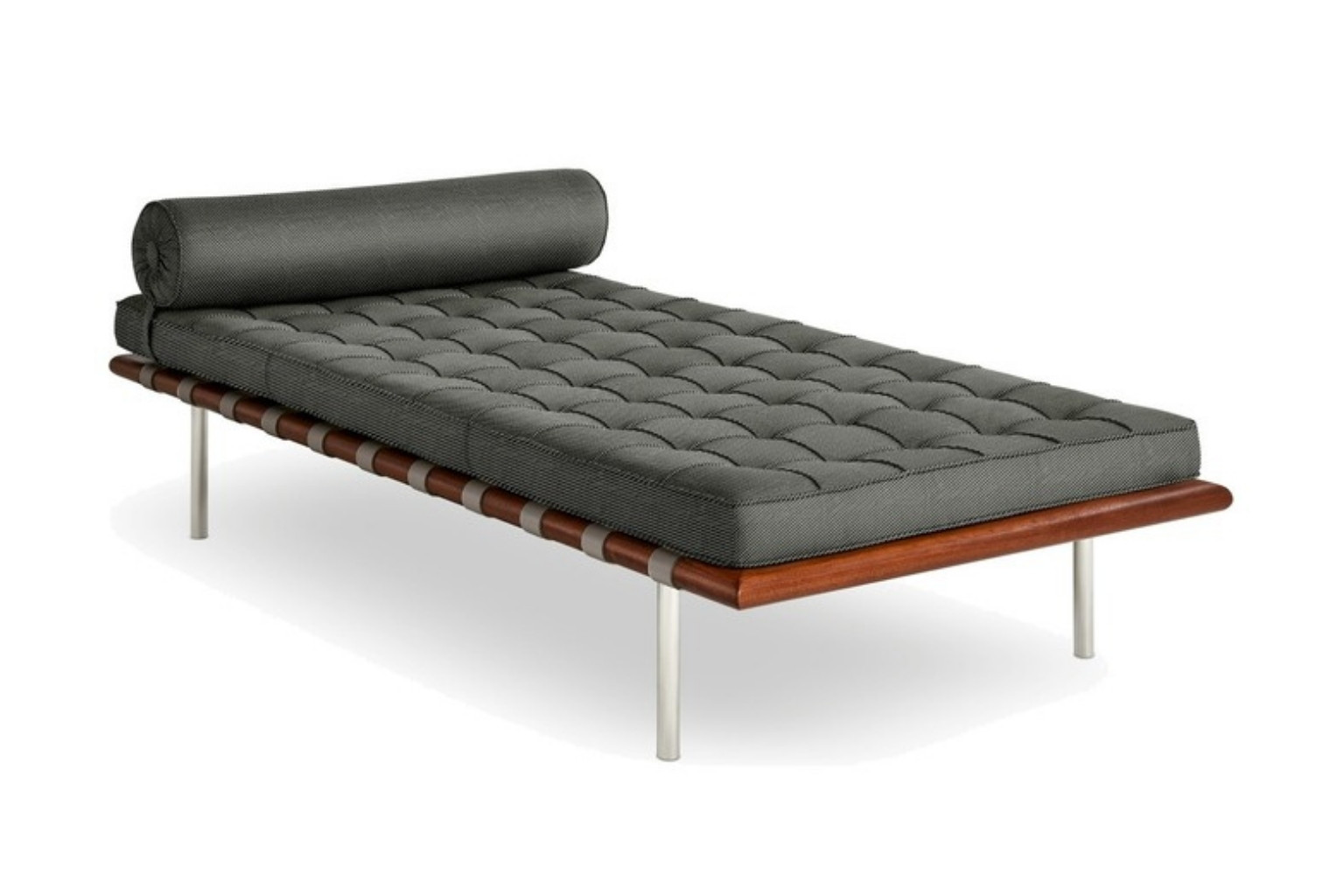
A daybed, yes. But iconic all the same. Designed by Mies van der Rohe for the German Pavilion at the 1929 International Exposition, this is less a place to sprawl than to admire.
The Serpentine is a celebration of line and movement. It invites you to sit—but even more so, to stare. Ideal for rooms that thrive on drama and curves.
6. Chesterfield Sofa (18th Century)
Photo: 40Dover (Public domain), via Wikimedia Commons
Quintessential. Buttoned. British. Timeless.
Whether in tobacco leather or a rich velvet, the Chesterfield carries an air of aristocracy. Perfect for libraries, moody bars, or as a masculine counterpoint in a feminine room.
7. Togo by Michel Ducaroy for Ligne Roset (1973)
Photo: Ligne Roset Deutschland, CC BY-SA 4.0, via Wikimedia Commons
The unofficial sofa of the design-obsessed Gen Z.
Low, plush, and crumpled in the most luxurious way. The Togo is a rebellion against structure—and a magnet for lounging.
It may not be historic in age, but in cultural impact? Monumental. Influencer interiors, celebrity homes, and clients from San Francisco to Sarasota all ask for it by name.
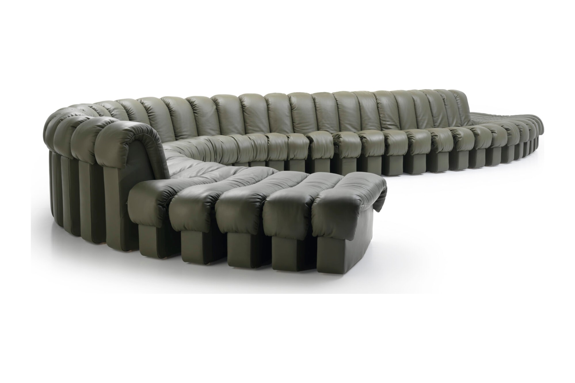
9. De Sede DS-600 (Non Stop Sofa) (1972)
Photo: Stephan Knecht, de Sede, CC BY 3.0 de, via Wikimedia Commons
It snakes. It seduces. Made from modular sections, it can go on forever—literally. A bold move in open-plan homes.
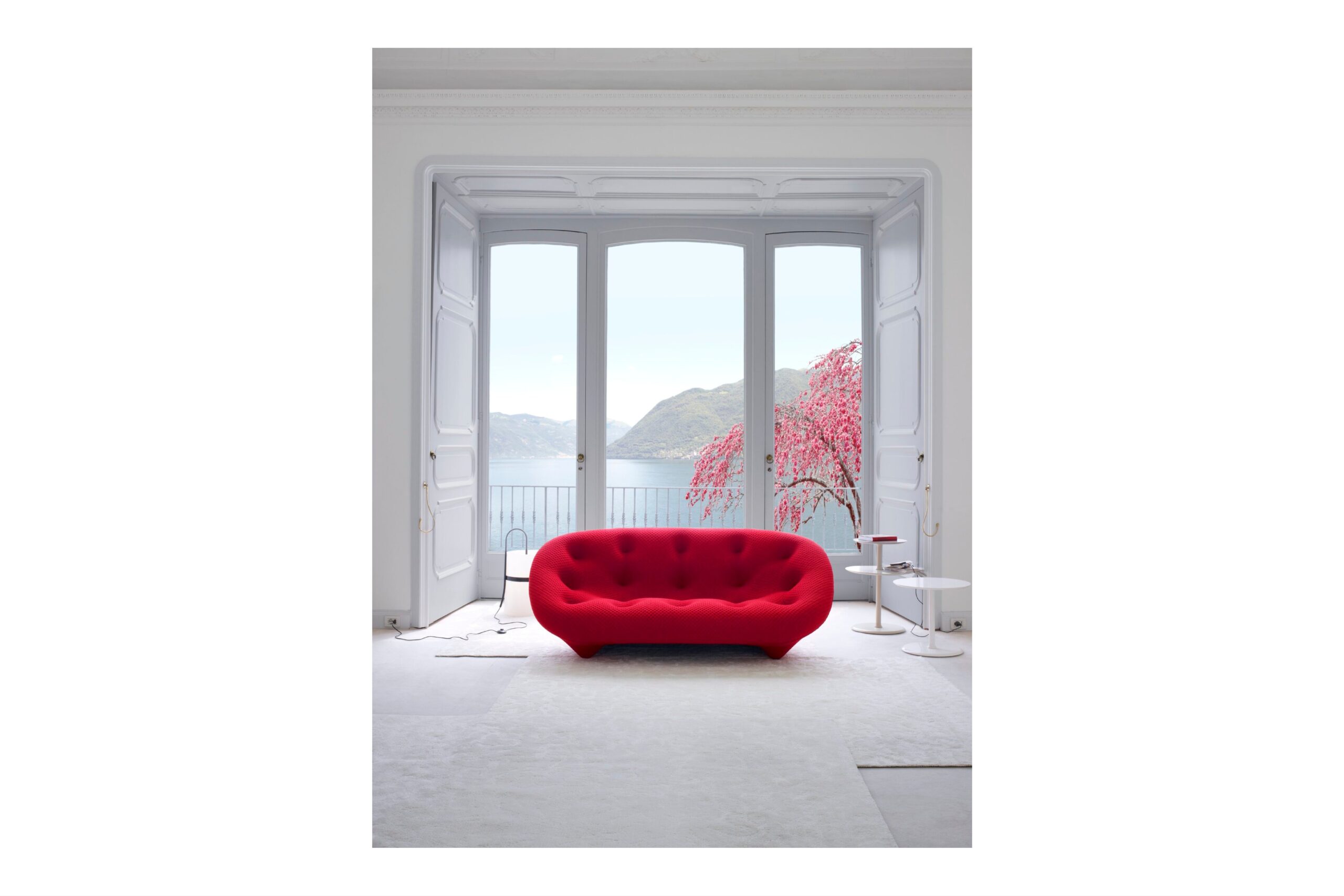
10. Ligne Roset Ploum Sofa (2011)
Photo: Ligne Roset Deutschland, CC BY-SA 4.0, via Wikimedia Commons
Designed for “extreme comfort,” this bulbous beauty hugs the body like a nest. Especially popular in European homes and among the design literate.
11–25 (summarized, with Rachel’s take):
11. Florence Knoll Sofa
An architect’s sofa: structured, rigorous, perfect for professional settings.
12. Edra Standard Sofa
It bends and folds like a body. Feminine and futuristic.
13. Jean Royère Polar Bear Sofa
For collectors and dreamers. Expensive, yes. But unmatched in sculptural softness.
14. George Smith Roll Arm Sofa
Traditional English comfort with bespoke customizability.
15. IKEA Klippan
Humble. Democratic. Ubiquitous. Every designer has owned or modified one.
16. Ligne Roset Saparella
The French cousin of the Togo. Chic, loungy, and slightly more tailored.
17. Mario Marenco Sofa for Arflex
An under-the-radar gem of Italian design. Chunky but sophisticated.
18. Patricia Urquiola Tufty-Time
Lego for adults. Highly configurable, with bold mid-century nods.
19. B&B Italia Camaleonda (Reissued)
Soft but intellectual. The kind of sofa that grows on you.
20. Roche Bobois Mah Jong
A hippie-chic icon. Boho maximalism meets high-end flexibility.
These sofas endure not just because of their form, but because of what they represent: comfort with character, structure that speaks, and shapes that tell a story.
A well-chosen sofa anchors a room. A great one anchors a home.
If you’re looking to pair any of these pieces with design-forward lighting, sculptural accents, or editorial-level accessories, explore the curated offerings in shop.rachelblindauer.com.
Style Advice from Rachel Blindauer
Think of the sofa as the room’s thesis. Whether it whispers or shouts, it sets the tone for how a space feels, functions, and flows. Choose a sofa you love—then design around it. Pair structured silhouettes with warm, touchable textures. Offset curves with clean lines. Mix old and new.
Every sofa tells a story. Make sure yours speaks with intention.
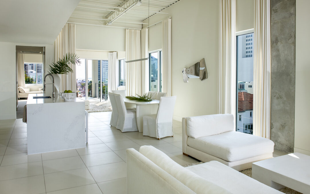
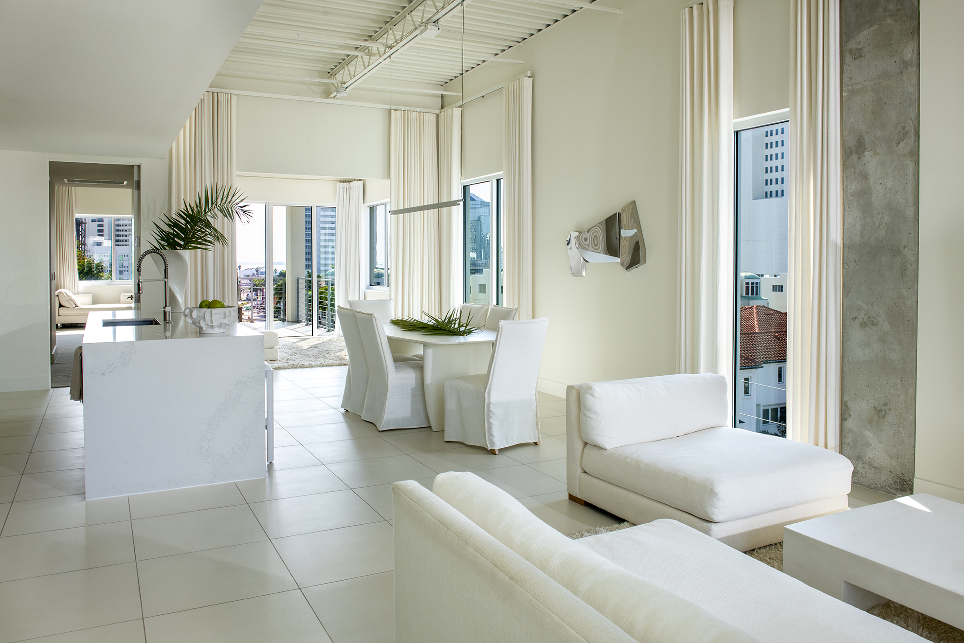
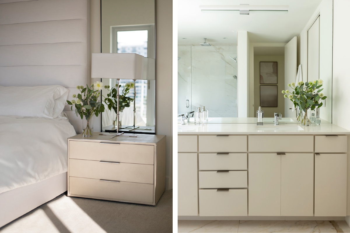
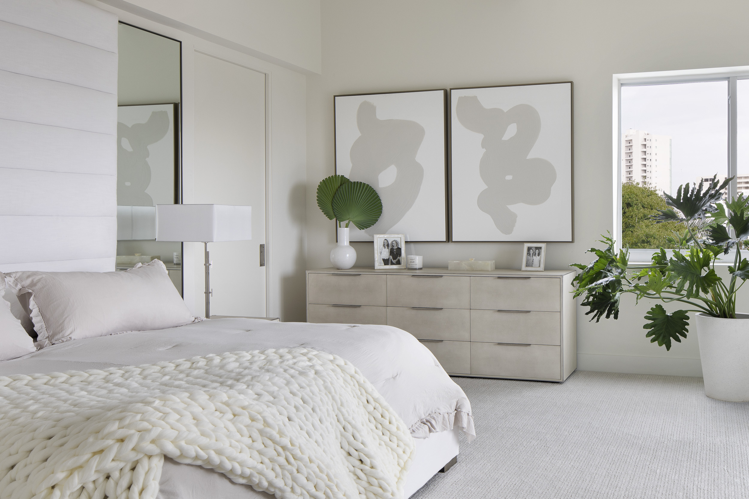
The private elevator opens directly into 4,800 square feet of almost unnerving calm. No logos, no accent walls, no statement lighting that begs for its own Instagram account. Just one Benjamin Moore color (Swiss Coffee OC-45) applied everywhere, in four different sheens, and the Gulf of Mexico doing all the talking beyond the glass.
This is luxury that edits itself down to a single perfect color and dares the view to compete.
I joined the project before land break. The developer (who had already sold half the building off-plan) wanted the crowning penthouse to feel like the best hotel suite its future owner had ever stayed in, except no one would ever have to leave. The brief from the buyer, a private-equity founder with homes in Manhattan and Gstaad, was three sentences long: “Make it disappear when I walk in. Make it age like it was built in 1925. Make it feel expensive to the touch, not to the eye.”
One Color, Four Sheens, Zero Noise
Swiss Coffee OC-45 on the walls in matte. Swiss Coffee OC-45 on the ceilings in flat. Swiss Coffee OC-45 on every door and trim in subtle semi-gloss. Swiss Coffee OC-45 on the baseboards returned to matte so they visually dissolve into the oak floors.
The effect is the interior-design equivalent of a perfectly cut white shirt: simple only to the untrained eye. In reality, it is obsessive. The color is warm enough to flatter skin at golden hour, cool enough to read as crisp at noon, and neutral enough that a single cyanotype on the wall becomes a thunderclap of texture rather than a competing voice.
Materials That Speak in a Lower Register
Touch anything in this apartment and you understand the budget immediately.
Book-matched Calacatta Borghini slabs in the primary bath, veined like lightning frozen mid-flash.
A 14-foot leathered quartzite island that absorbs light instead of bouncing it back at you.
White-oak floors brushed and oiled (never stained) so the grain stays pale and honest for decades.
A custom Minotti dining table whose top is back-painted glass the color of wet Sarasota sand.
Nothing here is trying to be noticed. Everything is waiting to be felt.
The Bedroom Where Sunset Is the Only Artwork
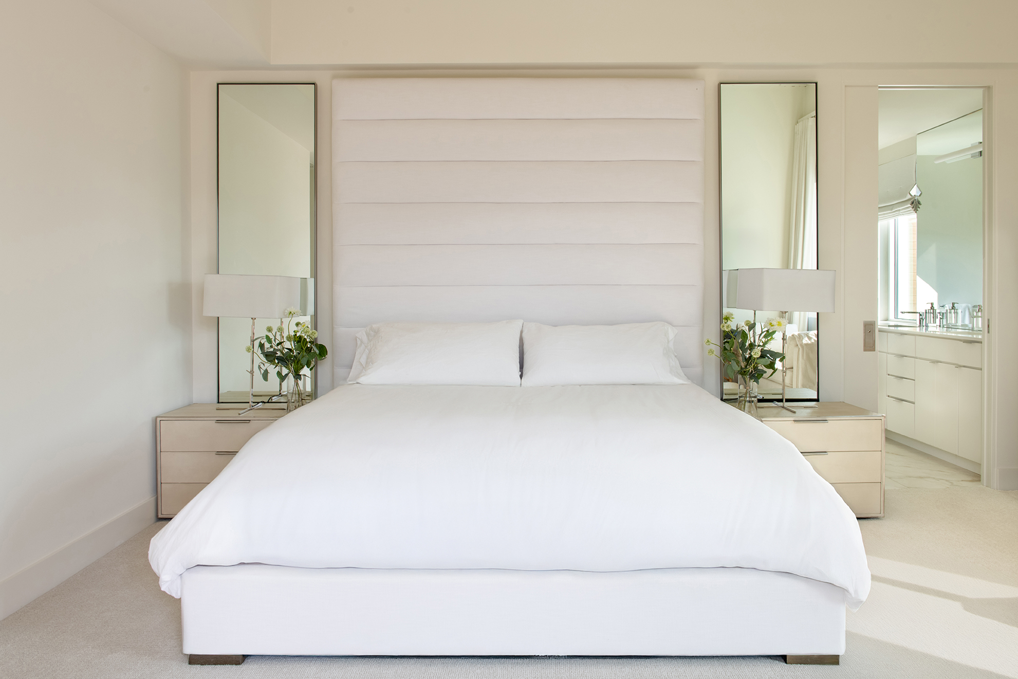
The primary suite faces due west. At 6:47 p.m. on a clear evening the room turns peach, then amber, then the color of a dying ember, and finally the deep indigo of the Gulf after the sun drops. There is no television. There is only a hidden ceiling projector for the rare night the owner wants to watch old Godard films. Otherwise the screen is the horizon, and the sound is silence.
A New Benchmark for 2025
In an age of algorithmic interiors and dopamine décor, a home this disciplined feels almost radical. It is deeply indebted to John Pawson’s monastic clarity and Vincent Van Duysen’s Flemish warmth, yet it is unmistakably Sarasota: the light here is softer than Miami, more luminous than Tampa, and it demanded a palette that could hold its own without ever raising its voice.
This penthouse is the new standard for clients who understand that the most expensive thing you can put in a room is restraint.
If you’re ready for a residence (city aerie or waterfront retreat) that prioritizes permanence over performance, let’s talk.
Interior Designer. Furniture Designer. Purveyor of Beautiful Things.
With over 15 years of experience designing homes, boutique hotels, and more than 1,000 products, I create interiors that live as beautifully as they look. My work blends structure with soul—architectural clarity, sculptural lighting, painterly palettes, and lived-in luxury.
Rachel Blindauer isn’t just a studio. It’s a lifestyle destination for the intentionally styled—where every item, service, and space is rooted in one belief: