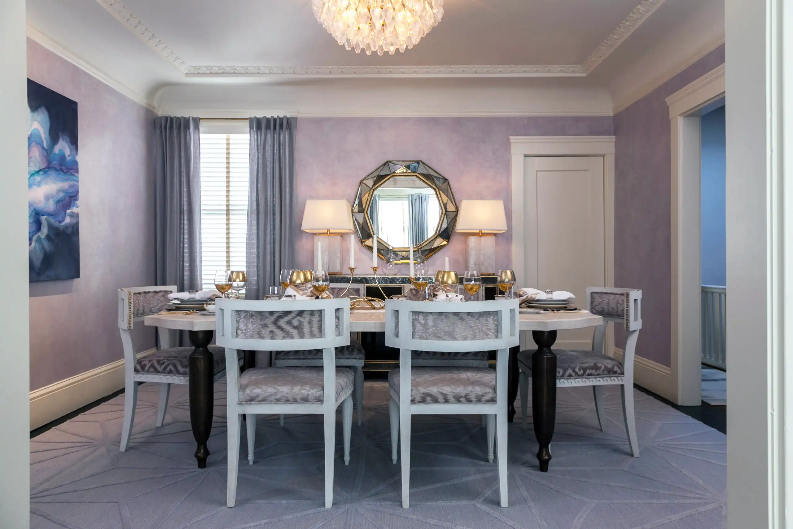
Color drenching is not a new idea—it is an old one that has been rediscovered and widely discussed in recent years. The principle is simple: paint the walls, ceiling, trim, and all millwork in the same color, or very close variations of it. The effect, when done correctly, is a room that feels like it was designed rather than decorated. When done incorrectly, it looks like someone ran out of time and painted everything the same color by accident. Here is how to do it correctly.
At a glance
- What it is: walls, ceiling, trim and millwork in one color
- Best rooms: libraries, dining rooms, powder rooms and entryways
- Best colors: complex ones, such as Farrow & Ball Calke Green or Hague Blue
- The detail most people miss: the same sheen on every surface
- The softer version: fabric on the walls instead of paint
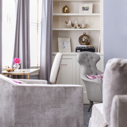
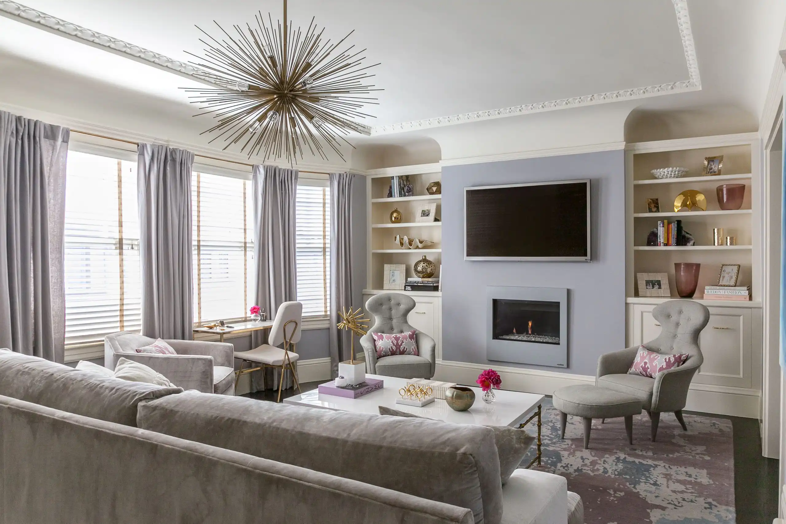
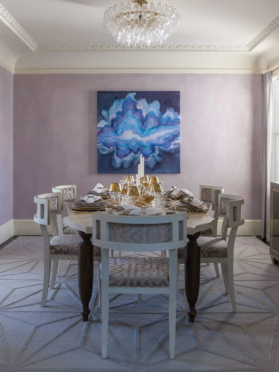
Tonal drenching from my Lilac Textural Glamour project — walls, drapery, and upholstery held in one family.
Why a Drenched Room Feels Calmer Than a Painted One
Contrast between wall and trim creates edges, and edges make the eye read a room as a collection of separate surfaces — wall, then molding, then ceiling, each announcing where it stops. Remove the contrast and you remove the announcements. What is left is a single volume, and a single volume is quieter to sit in. This is the same reason a monochrome outfit reads as more considered than a coordinated one: fewer decisions visible on the surface.
Choose a color with enough complexity to carry the room
Simple colors—pure whites, clear blues, bright yellows—tend to flatten under color drenching because there’s not enough variation in how they read across different surfaces and angles. The colors that work best are complex ones: dusty sages with gray and green undertones, warm putty whites with yellow and pink layering, deep navies with barely-visible purple in them, earthy terracottas that shift from almost-red to almost-brown depending on the light.
My most-recommended colors for drenching: Farrow & Ball Mole’s Breath (a warm, complex gray-brown), Farrow & Ball Hague Blue (a deep teal-navy that transforms under different lighting), Benjamin Moore Newburyport Blue (a dusty, complex blue-gray), and Farrow & Ball Calke Green (a desaturated sage that is as close to a perfect color as I’ve encountered).
For a softer, more romantic drench, I am loving the dusty lilacs right now: Sherwin-Williams Grape Mist (SW 6548) and Ash Violet (SW 6549), and Behr Plum Taupe. They read as a quiet neutral in daylight and turn warm and enveloping by lamplight.
Hold the same sheen from wall to ceiling
People expect me to shift sheen between the wall, the trim, and the ceiling — eggshell here, semi-gloss there, flat overhead. I do not. I run the same sheen throughout, and it is the detail that separates a room that reads as drenched from one that reads as a paint job that got away from someone.
The reason is the same as the reason for drenching at all. Every change in sheen creates an edge, because light bounces differently off each surface. You can remove every color boundary in a room and still see the outline of the crown molding, purely because it is shinier than the wall behind it. Hold the sheen and the edges go with the color.
The rooms that benefit most
In a library I will often pair the drenched envelope with a hide wallpaper — the color does the wrapping and the hide gives it something to catch on, so the room reads as considered rather than simply painted.
Libraries and studies are the natural home of color drenching—a deep green or warm navy wrapped around a room full of books, with warm lamplight, is one of the most satisfying interiors in residential design.
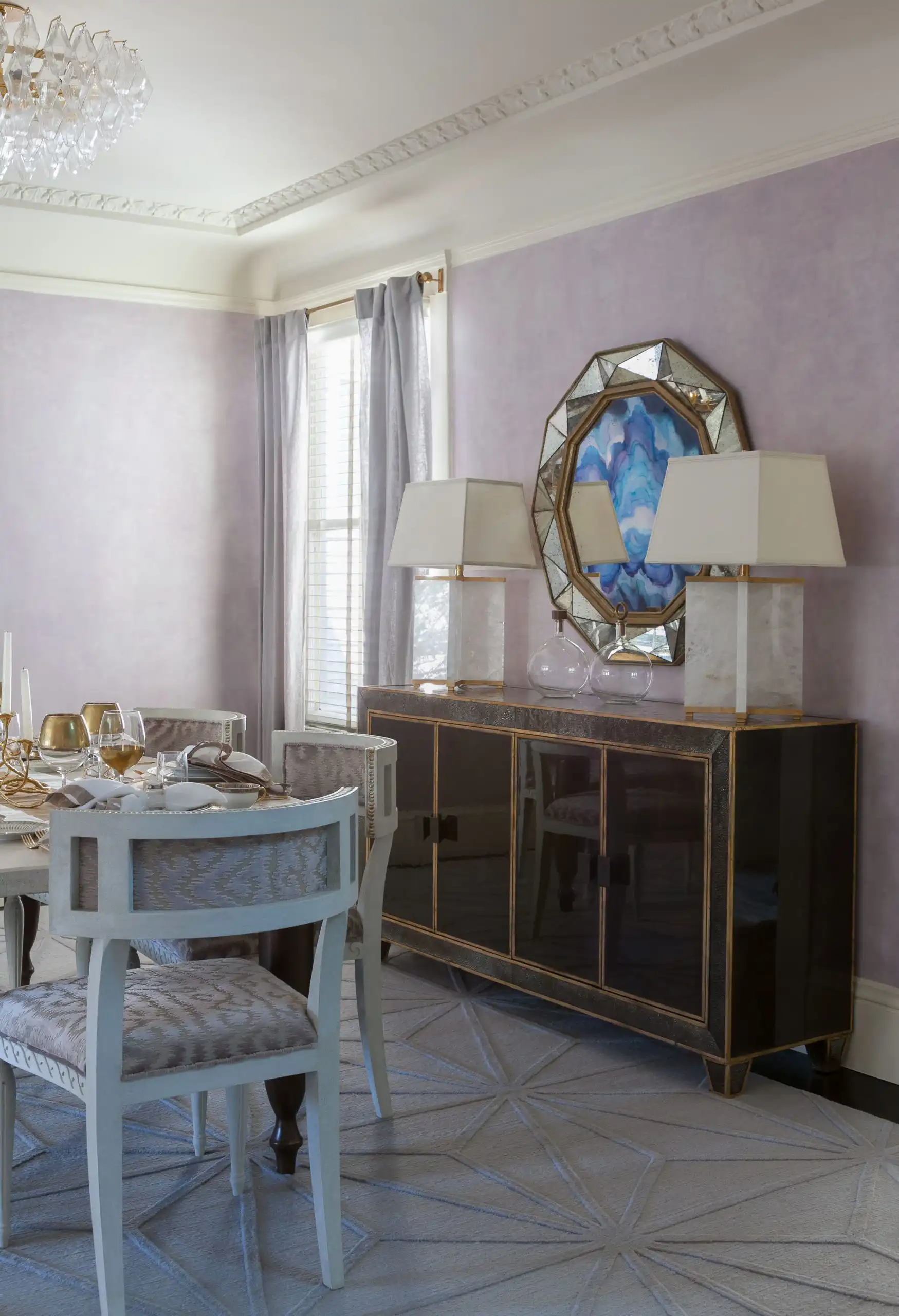
Dining rooms benefit enormously from drenching, particularly in saturated colors. A deep, complex color on all surfaces creates the same intimacy as restaurant lighting.
Powder rooms and small bathrooms are ideal candidates because the small scale means the material cost is minimal and the impact is disproportionate. A drenched powder room in a deep color—Farrow & Ball Railings, Hague Blue, or even Pitch Black—is a moment in an otherwise neutral home that guests remember.
Entryways benefit from drenching because they’re typically small and benefit from making a strong first impression.
The dining room from the same project. Same principle, executed in cloth as much as in paint.
Drenching in Fabric, Not Only Paint
Paint is the version everyone writes about. The one I love more is fabric — upholstering the walls and the ceiling in the same cloth, wrapping the room rather than coating it.
It does everything paint does and then two things paint cannot. It absorbs sound, so the room goes quiet in a way people notice before they can name. And it introduces texture at the same moment it removes contrast, which means the room stays interesting even though it has stopped varying in color. A drenched paint room relies on light for its depth. A drenched fabric room carries its own.
Where Fabric Drenching Belongs
| Room | Fabric or paint | Why |
|---|---|---|
| Primary bedroom | Fabric | The acoustic softening is worth the cost here more than anywhere else in the house. |
| Dining room | Fabric | Conversation improves in a room that is not bouncing sound off four hard walls. |
| Library or study | Fabric | Quiet, and it flatters the way you sound on a call. |
| Powder room | Paint | Small, damp, and high-traffic. Save the fabric for somewhere it will survive. |
| Kitchen | Paint | Grease and cloth do not negotiate. |
| Hallway | Either | Fabric if you want the hush; paint if shoulders and luggage are going to touch the walls. |
| Bathroom | Paint | Moisture rules this one out. |
Practical notes: fabric-wrapping wants a solid or a texture rather than a directional pattern, since pattern reintroduces exactly the visual breaks you are drenching to remove. Budget for more yardage than the square footage suggests, because the ceiling and the returns eat it. And it is an upholsterer’s job, not a painter’s — get the right trade in the room before you fall in love with the idea.
What to keep in mind
Drenching amplifies what’s already in the room. Beautiful millwork becomes more beautiful. Mediocre millwork becomes more mediocre. Light matters more in a drenched room than in any other context—test extensively in all lighting conditions before committing. And remember: paint is the most recoverable design decision you’ll make. If you’ve been considering a color for two years and have been too afraid to commit, color drenching is one of the best possible reasons to finally try it.
Color drenching questions I hear most
Do you paint the ceiling the same color?
Yes, in the same color and the same sheen. A white ceiling draws a line around the top of the room, which is exactly what drenching is meant to remove.
Will color drenching make a small room feel smaller?
Usually the opposite. Without contrast at the corners and the trim, the eye cannot find the edges of the room, so a small room feels more enveloping rather than more cramped.
Which sheen should I use?
Choose the sheen the most-used surface needs, then hold it everywhere. In a living room or bedroom that is usually a low sheen; in a powder room, choose something more scrubbable.
Is color drenching just a trend?
No. It is how many historic rooms were painted, long before it had a name. Done in a complex color, it will outlast the conversation about it.
Rachel Blindauer is an award-winning interior designer based in St. Louis with projects across the United States and internationally. Book a consultation at rachelblindauer.com.
Color-Drenched Pieces

Violet Cascade
From $700

Amethyst Breccia Bowl
$560

Amara Block Print Lumbar Pillow
$108

SOMETHING FOR EVERYONE
THE PIECES RACHEL RETURNS TO, AGAIN AND AGAIN
Before you go
Not sure what your style is? Take the two-minute Style Quiz and I’ll send you your look.