Every September, the design internet floods with fall color palettes pulled from Scandinavian studios, California editorial shoots, and New York loft apartments. They’re beautiful. They’re also largely irrelevant to how color actually behaves in a St. Louis home in October.
Midwestern autumn light is specific. As the sun moves lower, the quality of natural light in St. Louis shifts dramatically from September to November—from the long golden afternoons of early fall to the short, flat, cool-gray light of late November. The colors that look warm and rich in September can look muddy and heavy by Thanksgiving. Understanding this transition is how you choose a fall palette that works across the whole season.
Why warm colors work so well here in fall
St. Louis homes—particularly the brick colonials, Craftsman bungalows, and ranch houses that define most of our residential neighborhoods—have a natural warmth built in. Red brick, warm wood trim, hardwood floors that run golden to amber: these are the bones most of us are working with. Warm paint colors don’t compete with these elements. They complete them.
Cool colors—icy blues, stark whites, cool grays—fight the warmth of brick and wood constantly. In fall, when the light is already shifting toward warm, that fight becomes exhausting. A room painted in warm putty or soft terracotta in October feels like it was designed for exactly this moment.
The palette I’m recommending this fall
Benjamin Moore Pale Oak (OC-20) reads warm without being orange, neutral without being beige, and responds beautifully to changing autumn light—warmer in the late afternoon, softer in the gray morning. An ideal living room or dining room color for St. Louis homes with wood floors and original trim.
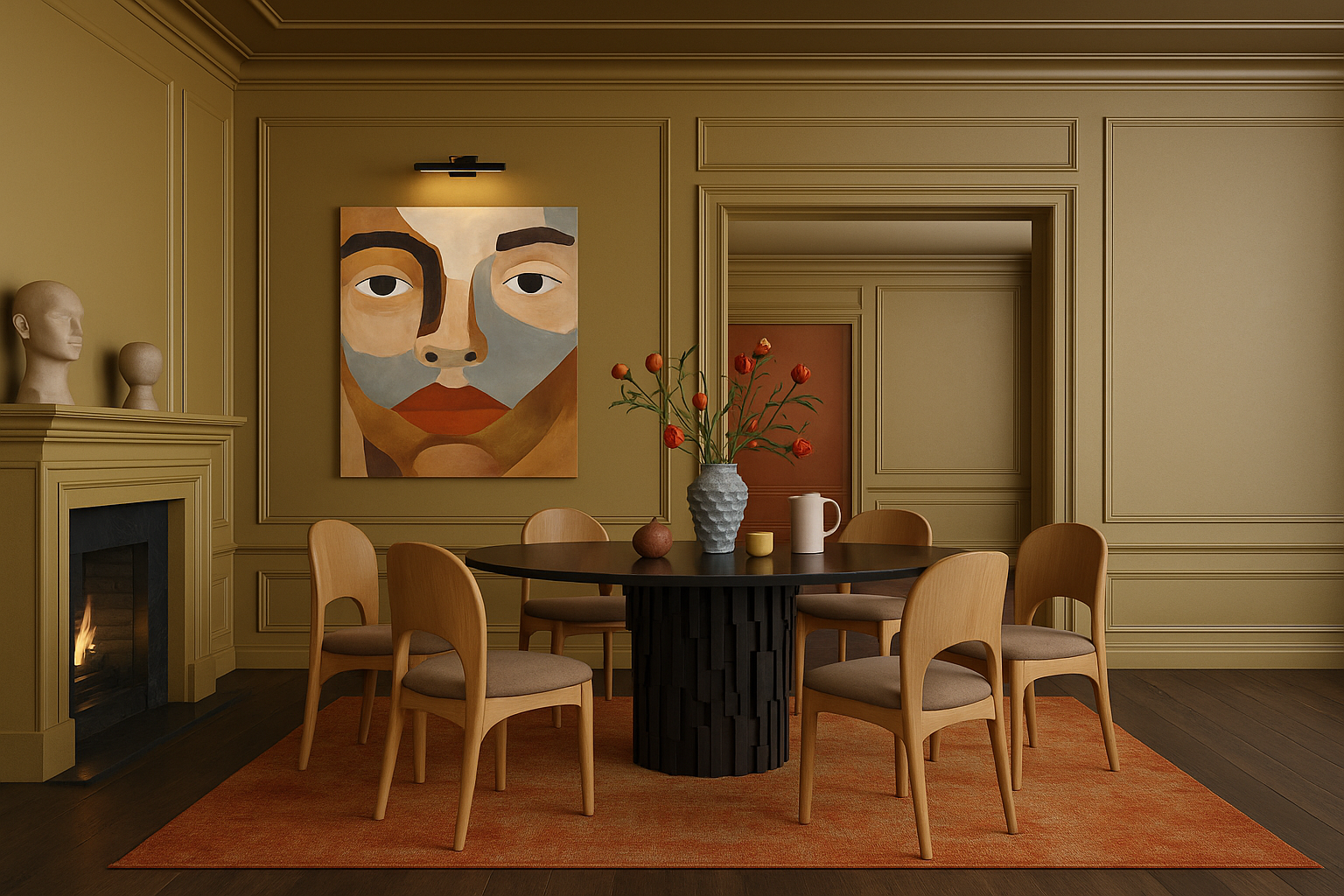
Farrow & Ball Dead Salmon (No. 28) is a warm, dusty, faded terracotta-pink—sophisticated and earthy at once. It’s particularly stunning in dining rooms where candlelight plays against it in the evening. If you want your fall dinner parties to feel warm and memorable, this is your color.
Benjamin Moore Revere Pewter (HC-172) is a classic. It has enough warm gray-green to feel contemporary and enough warmth to feel cozy. In fall light it moves from silvery in the morning to distinctly warm by afternoon.
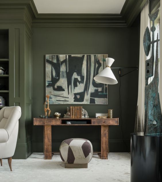
Benjamin Moore Salamander (2050-10) is for the brave—a deep, forest green with enough warmth to avoid feeling cold. In fall, with brass candlesticks and warm wood furniture, it’s extraordinary.
Five More Warm Colors Worth Sampling
If the four colors above don’t fit your house, these five cover almost every other situation I see in St. Louis homes.
Farrow & Ball Setting Plaster (No. 231) is a dusty, plaster-pink that is gentler than Dead Salmon. It warms a north-facing bedroom or powder room without ever reading as “pink.”
Benjamin Moore Hawthorne Yellow (HC-4) is a buttery historic yellow. It suits sunrooms, breakfast rooms and kitchens in older brick homes, and it still looks sunny on the gray days of late November.
Benjamin Moore Caldwell Green (HC-124) is a deep olive green with a brown undertone. Use it in dining rooms, libraries and on built-ins, especially next to oak or walnut.
Sherwin-Williams Urbane Bronze (SW 7048) is a warm brown-black. It is beautiful in a study, on kitchen cabinetry or on a front door, and it makes brass hardware glow.
Sherwin-Williams Accessible Beige (SW 7036) is the dependable warm greige for whole-house flow. Choose it for hallways, open plans and any room that has to connect to several others.
How to layer color across a room (not just on the walls)
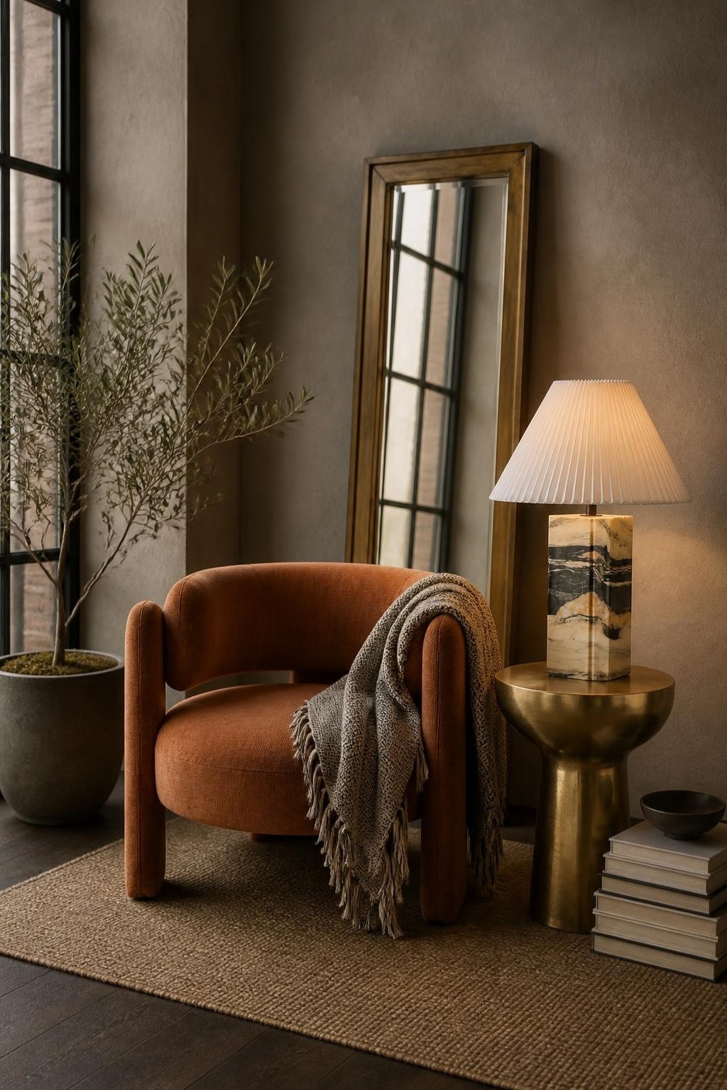
Paint is only one layer. The rooms that feel genuinely warm in fall are layered—textiles in amber, rust, and forest tones on top of a warm wall color, with warm-temperature light bulbs (2700K or below) completing the effect. Switch your bulbs to 2700K in October and watch every warm color in your home improve immediately. It’s the fastest and cheapest design upgrade available, and most people never do it.
Test Before You Commit: Sampling in Fall Light
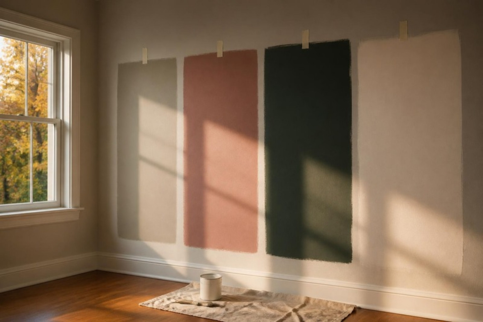
Paint chips are too small to judge, and fall light changes a color more than any other season. A careful sampling routine costs one weekend and prevents the most expensive mistake in painting: repainting.
- Go big. Paint sample boards at least 2 feet square, with two coats, and leave a white border so the existing wall color doesn’t influence your eye.
- Move them around. Look at each board on every wall of the room, low and high. The wall beside the window and the wall facing it will read as two different colors.
- Check three times a day. Look in the morning, mid-afternoon and after dark under your own lamps. In October, the 3 p.m. light is the warmest you will see all year, so don’t decide based on that alone.
- Wait for a cloudy day. Live with samples for at least three days, including one overcast day. That gray light is what you will live with from November to March.
- Match your bulbs. Judge samples under the 2700K bulbs you’ll actually live with. Cooler bulbs of 4000K and above will make them look muddy.
Match the Undertone to What You Can’t Change
The right wall color is chosen in relation to the finishes you are keeping, not on its own. Hold each sample right next to those fixed elements rather than in the middle of a wall.
- Red brick fireplaces and exposed brick: skip pink-beiges, which compete with the brick. Gray-green neutrals like Revere Pewter, or deeper greens like Caldwell Green, calm the red instead.
- Orange-toned red oak floors, which are common in post-war St. Louis homes: avoid yellow-beiges, which amplify the orange. A neutral with a whisper of gray, like Pale Oak or Accessible Beige, balances it.
- Cherry or walnut cabinetry and furniture: these can carry richer colors. Dusty pinks and deep greens look intentional next to dark wood.
- Marble, granite or tile you’re keeping: pull the wall color from the quietest tone in the stone’s veining, never the boldest.
Choosing the Right Sheen
Warm colors look richest in lower sheens, because shine reflects light back as glare and washes out depth. Durability still matters, though, so here is how I specify sheen room by room.
| Surface | Sheen | Why |
|---|---|---|
| Ceilings | Flat | Hides imperfections; no glare |
| Living, dining and bedrooms | Matte | The deepest, most velvety color |
| Hallways and family rooms | Eggshell or scrubbable matte | Wipes clean, still soft |
| Kitchens and baths | Satin | Resists moisture and grease |
| Trim, doors and cabinetry | Satin or semi-gloss | Durable, with a crisp edge |
For dark colors like Salamander or Urbane Bronze, choose a premium scrubbable matte. Standard flat paint in a deep color scuffs and burnishes easily.
Warm Pieces for Fall

Terra Travertine Box
$387

Marigot Rattan Table Lamp
$1,040

Apiary Marble Box
$112

Monolith Table Lamp
$1,164

Sienna Handwoven Cotton Coverlet
From $485

Terra Fold Sculptural Vase
$110

Juniper Leather Table Lamp
$1,941

Chesham Marble Top Accent Table, Hazel/Walnut
$601

Root Teak Wood Bowl
$180
What to avoid this season
Cool grays and blue-based whites feel increasingly harsh as fall progresses and natural light diminishes. Also avoid: painting a single accent wall in a saturated fall color and leaving the rest of the room untouched. Accent walls were a 2012 trend. If a color is right for your room, commit to it. If it isn’t, find a different color rather than hedging with one wall.
Fall in St. Louis is one of the most beautiful times of year. Your home can feel like an extension of all of it.
Rachel Blindauer is an award-winning interior designer based in St. Louis with projects across the United States and internationally. Book a color consultation at rachelblindauer.com.


Luna Travertine Table Lamp
$665

Biarritz Round Travertine Coffee Table
$2,658

Marisol Tray
$280
SOMETHING FOR EVERYONE
THE PIECES RACHEL RETURNS TO, AGAIN AND AGAIN
Before you go
Not sure what your style is? Take the two-minute Style Quiz and I’ll send you your look.