Every designer has a material they reach for without thinking. For some it is oak, for some it is unlacquered brass. For me it has been travertine for the better part of fifteen years, and the longer I work the less I apologize for it.
Travertine is limestone that formed in and around hot springs, laid down in layers as mineral-rich water cooled and left its calcium behind. That is why it looks the way it does: banded, pitted, never quite uniform. The holes are not flaws. They are the record of gas escaping through the sediment before it hardened. A slab of travertine is, quite literally, a fossil of moving water.
I bring that up because it explains everything I like about the material, and everything clients sometimes worry about.
What travertine does that marble doesn’t
Marble is a performance. It wants the light, it wants the spotlight, and in the wrong room it can feel like a hotel lobby. Travertine is the opposite temperament. Its palette sits in a narrow band of ivory, bone, wheat and, in the darker cuts, a walnut brown that reads almost like leather. The veining runs in soft horizontals rather than dramatic diagonals. Put a piece of it in a room and the room gets calmer, not louder.
That is why it works in so many settings. On the Gulf Coast it picks up the warm afternoon light and holds it into the evening. In a St. Louis brick colonial it warms up a room that might otherwise go cold and formal. It is one of the very few materials I would put in both places without changing a thing.
Where I use it, and where I don’t
Coffee tables. This is where I start with most clients. A travertine coffee table is a low, heavy, honest object; it anchors a seating group the way a rug does, but you can put a drink on it. My standard recommendation is a rectangular slab on plinth legs, so the veining runs across the top and down the sides in one continuous story. The Amalfi coffee table in the shop is that idea exactly, and it is the piece I am asked about most often.
Lamps. Travertine takes light beautifully because the surface is matte and slightly porous; there is no glare, just a soft bloom around the base. The Monolith table lamp, a tapered travertine column under a brass cone, is what I put on a console when the console needs one perfect thing and nothing else.
Bowls and vessels. A carved stone bowl on a dining table is the most efficient styling move I know. It is sculptural, it is useful, and it never goes out of season. I keep the Abbey bowl on my own table; the faceted Strata bowl is the dressier cousin for a room that can take a little drama.
Where I hold back. Kitchen counters, unless the client understands what they are signing up for. Travertine is softer than granite and more absorbent than quartz. It will etch from lemon juice and stain from red wine if it is not sealed and wiped promptly. On a coffee table that is a patina. On a work surface it is a maintenance schedule. Floors are fine (honed and filled, please, not polished); showers are fine if sealed on a calendar; bar tops are a judgment call.
Living With Travertine
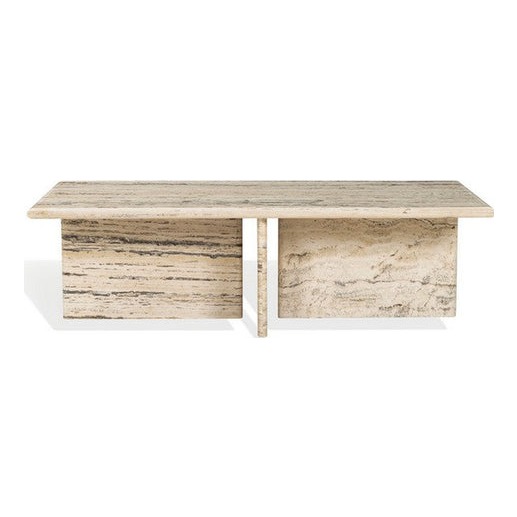
Amalfi Rectangle Travertine Coffee Table
$2,616
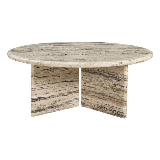
Biarritz Round Travertine Coffee Table
$2,658
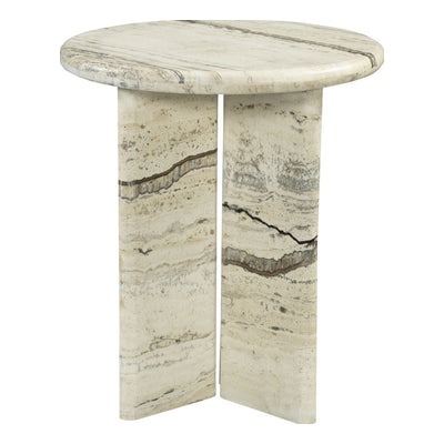
Capri Travertine Accent Table
$1,464
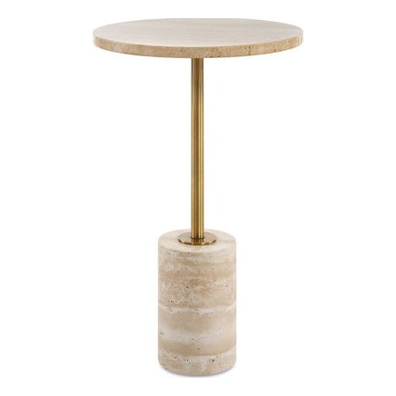
Solenne Travertine Pedestal Table
$355

Monolith Table Lamp
$1,164

Sable Travertine Buffet Lamp
$813

Luna Travertine Table Lamp
$665

Abbey Travertine Bowl
$813

Abbey Travertine Bowl
$1,300

Drift Form Bowls
$768

Terra Travertine Box
$387

Travertine Trove Box
$348
Filled or unfilled, honed or polished
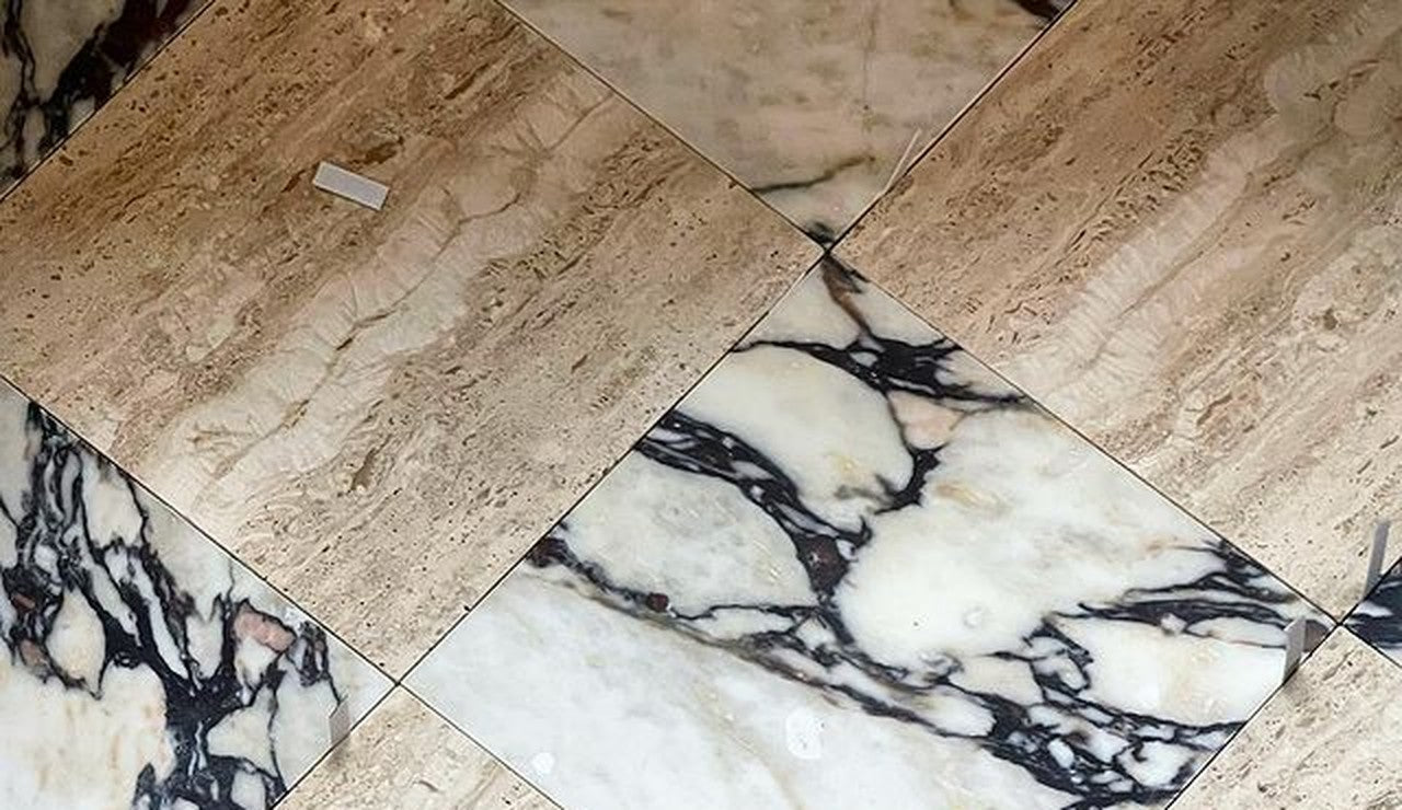
You will see these words on every spec sheet, so here is the plain version. Filled means the natural pits have been packed with resin or grout so the surface is flat; unfilled leaves them open. Honed is a matte finish; polished is glossy. For furniture I almost always choose honed and filled: matte enough to feel like stone rather than tile, smooth enough that a glass sits flat. Unfilled is beautiful on a wall or a garden piece, less practical where you set things down.
How to pair it
Travertine is a neutral, but it is a warm neutral, and that decides its company. It likes linen in oatmeal and putty, wool in camel, leather in cognac, and wood with visible grain: white oak, walnut, cerused ash. It likes brass more than chrome. It looks wonderful against a plaster wall and slightly cheap against a glossy white one. If you are working in a cool grey scheme, choose the darker walnut-toned travertine so the stone reads as a deliberate contrast rather than a mismatch.
Color-wise, it is the quiet ground under almost any palette I use. Blush and rose sit on it beautifully. So does olive. So does the deep marine blue of a framed abstract above a console. The one thing I would avoid is pairing it with a lot of cool white and stainless steel, which makes the travertine look dusty instead of warm.
Buying it well
Three things to check. First, weight: a real stone coffee table is heavy, which is why the shop delivers the larger pieces white glove, inside the house and placed. Second, consistency: ask to see the actual slab or a photo of the actual piece, because two travertine tables from the same maker can differ as much as two pieces of wood. Third, sealing: a good maker seals furniture before it ships; if not, a penetrating sealer once a year is all it takes.
Everything travertine in the shop lives in one place: the Travertine collection. Coffee tables, lamps, bowls and boxes, each one chosen because I have specified it, or something very like it, in a real room for a real client.
And if you are not sure whether your home leans coastal, traditional or something in between, the two-minute Style Quiz will tell you, and point you toward the pieces that fit.


Sculptural Serenity Off-White Ceramic Bowl
$352

Anchor Coffee Table
$3,464

Vitruvian Travertine & Brass Bookends
$98
SOMETHING FOR EVERYONE
THE PIECES RACHEL RETURNS TO, AGAIN AND AGAIN
Before you go
Not sure what your style is? Take the two-minute Style Quiz and I’ll send you your look.