Best Bedroom Paint Colors for Restorative, Refined Interiors

Best Bedroom Paint Colors for Restorative, Refined Interiors

Why Bedroom Color Choice Is Everything

The bedroom is where your nervous system goes to exhale. Color should support that. The right paint palette anchors the senses, softens transition, and gently shapes the emotional rhythm of your day.

For my clients, the bedroom isn’t just a place to sleep—it’s where ease begins. That’s why the color on the walls matters.

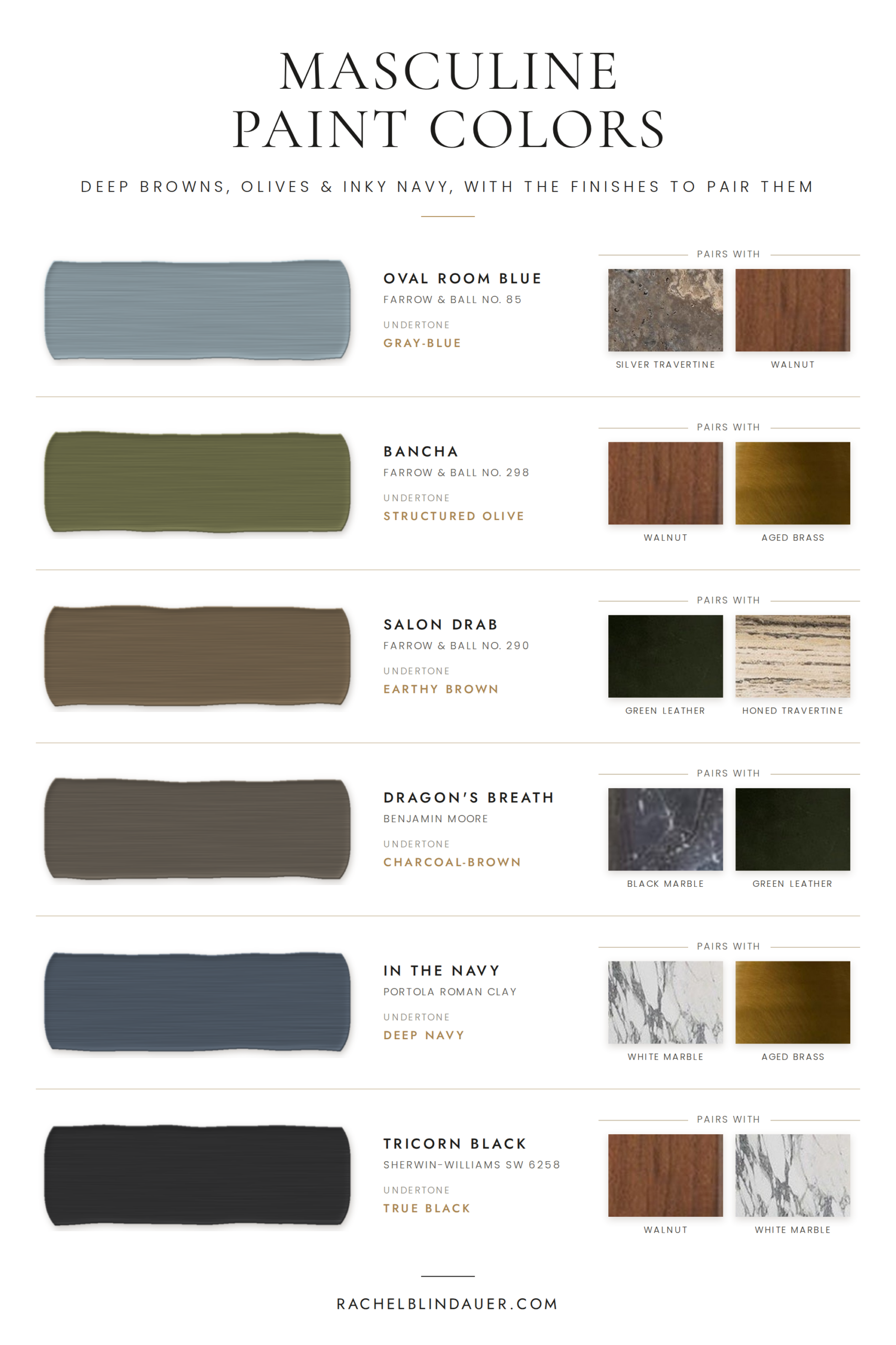
The Best Neutral Bedroom Paint Colors

These neutrals are refined, not flat. They support both minimalism and romance.

  • Benjamin Moore Classic Gray – Calm, warm greige that shifts beautifully with light.

  • Farrow & Ball School House White – Creamy, timeless, and never too cold.

  • Sherwin-Williams Drift of Mist – Barely-there and modern; especially good in bright rooms.

Rachel Blindauer Guest Bedroom Bed

Deep, Saturated Hues for Sophisticated Sleep Spaces

When clients want a bedroom that feels more like a retreat, I lean into saturated, cocooning hues:

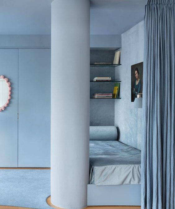
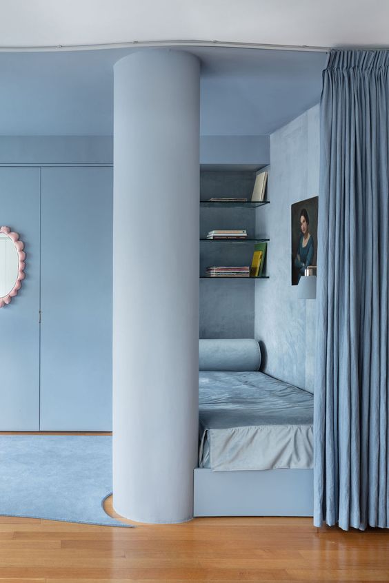
  • Farrow & Ball De Nimes – Romantic, moody blue-gray.

  • Sherwin-Williams Iron Ore – Deep and grounding with rich undertones.

  • Benjamin Moore Nightfall – Charcoal with a violet base—sensual and striking.

What to Consider Before Choosing Bedroom Paint

  • Lighting: North-facing = warmer tones. South-facing = cooler hues welcome.

  • Function: Is this just for sleep—or work, too?

  • Tone Matching: Consider how your bedding, floors, and curtains will interact.

  • Emotional Feel: What do you want to feel every time you walk in?

For deeper insight on how color shapes behavior, read:
👉 The Psychology of Color in Interior Design →

Bedroom Paint by Natural Light & Region

Paint behaves differently in Missouri, Massachusetts, and Florida. Here’s how I approach each:

  • Florida (Sarasota) – White walls often skew blue; go for warm taupes and creams.

  • Missouri (St. Louis) – Light fluctuates seasonally. Greiges are your safest bet.

  • Nantucket – Think weathered neutrals and coastal-inspired soft blues.

Multi Family Condo Condominium Complex Model Unit Bedroom Interior Design

Finish Matters: Choosing the Right Sheen

  • Matte – Ideal for walls. Soft and forgiving.

  • Eggshell – Slightly more durable with subtle sheen.

  • Satin/Semi-Gloss – Only for trim or millwork. Never on walls—it flattens the space emotionally.

Paint by Personality: Let Emotion Lead

Choosing the right bedroom paint color isn’t just about trends—it’s about resonance. Here’s a cheat sheet I often use during consultations:

If you want to feel… Try this color
Calm & Minimal Classic Gray or School House White
Grounded & Centered Iron Ore or Drift of Mist
Romantic & Restorative De Nimes or Nightfall
Bright but Soft Drift of Mist or Classic Gray
Wrapped in Quiet Drama Nightfall with satin bronze accents

“Color should feel like a mood you want to live inside.”

Shop the Look: Bedroom Accents That Pair Beautifully

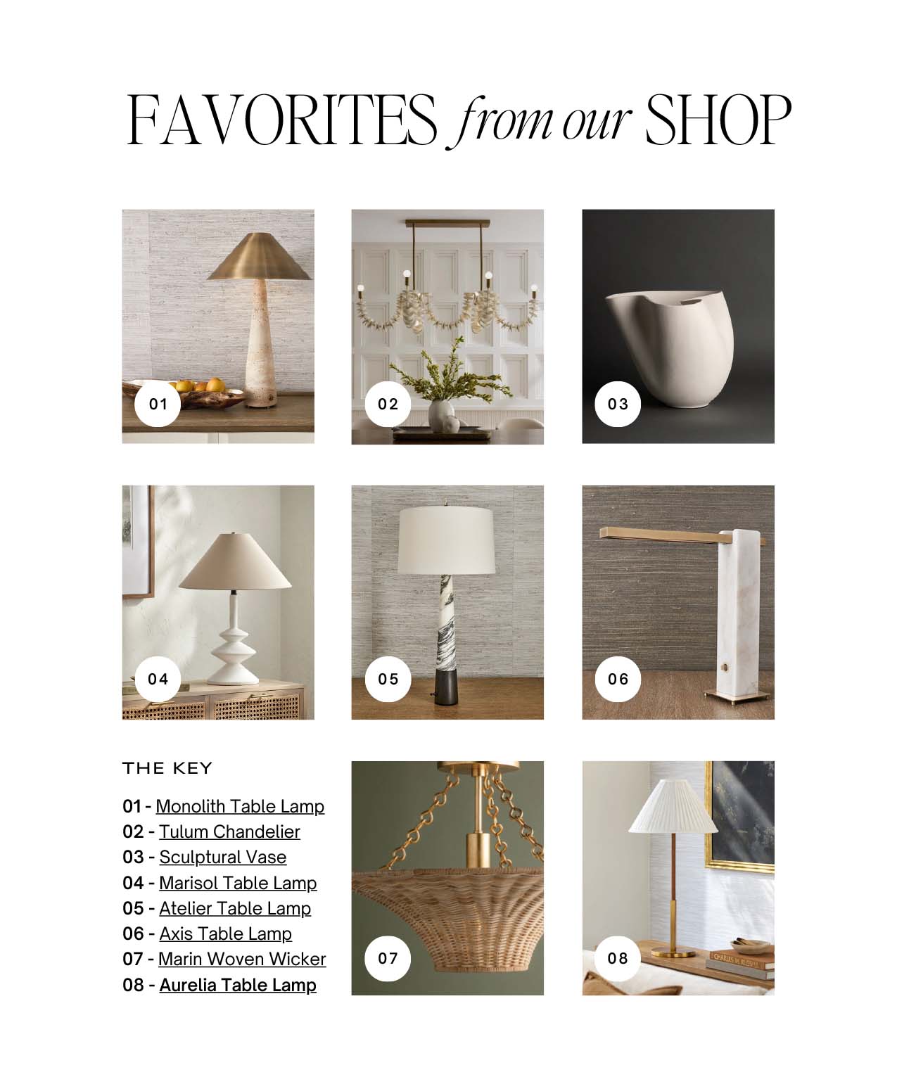
1. Alina Ceramic Table Lamp
Matte ivory glaze, sculptural shape. Creates warmth on both pale and dark walls.
Shop Now →

2. Louisa Washed Linen Throw
Stonewashed texture. A soft counterpoint to moody bedrooms and a cozy layer for light ones.
Shop Now →

Color as a Catalyst for Peace

Paint isn’t just surface—it’s atmosphere. When we choose colors with intention, we give ourselves more than a beautiful room. We give ourselves the kind of space we come home to emotionally.

A well-colored bedroom doesn’t wake you up—it welcomes you in.

Need help refining your palette? Book a 2-Hour Consultation →
Or browse calming textures and accents at shop.rachelblindauer.com →

FAQs About Bedroom Paint Colors

What is the most relaxing bedroom paint color?
Classic Gray by Benjamin Moore and De Nimes by Farrow & Ball are top contenders—one neutral, one moody. Both promote calm without dullness.

Should bedrooms be painted light or dark?
It depends on your emotional goals. Light colors expand and brighten. Darker tones cocoon and soften. Both work—just not in the same room.

What sheen is best for bedroom walls?
Always matte or eggshell. Avoid gloss—it breaks the softness of the space.

Can I use dark paint in a small bedroom?
Yes. In fact, small rooms often benefit from saturated tones. It creates depth and intimacy—especially with strategic lighting.

2 Hour Interior Design Virtual or In Person Consultation

Shop The Post

SOMETHING FOR EVERYONE

THE PIECES RACHEL RETURNS TO, AGAIN AND AGAIN

How to Warm a House: Global Traditions and a New Ritual for Modern Life

How to Warm a House: Global Traditions and a New Ritual for Modern Life

They say it takes a village to raise a child—but quietly, across cultures and centuries, it also takes a village to warm a house. Not just the structure. The soul of it.

A home isn’t made the day the keys change hands or the boxes are unpacked. It’s made the moment others step inside and bring it to life—with a story, a shared meal, a blessing, or a laugh that echoes down the hallway. It’s the ritual of arrival—and almost every culture has one.

“Design may shape the space, but it’s people—and the rituals they bring—that truly warm a home.”

In a time when we crave belonging more than ever, the housewarming is being quietly rediscovered—not as a party with passed hors d’oeuvres, but as a ceremony of connection. And if we were to invent a new tradition for the way we live now, it might just be the most meaningful one yet.

FlowersEntertainingDiningTable

What the World Has Always Known

From Asia to the Mediterranean, from spiritual ceremonies to superstitions, housewarming rituals reflect what each culture believes is essential to a life well-lived.

China hosts the Qiáoqiān yàn, a celebratory banquet where friends bring gifts like red envelopes, jade plants, and framed calligraphy bearing wishes for longevity. The scroll is hung the same day, rooting the home in intention from the very start.

In Greece, guests bring bread, olive oil, or wine—symbols of abundance and care. Sometimes a priest sprinkles holy water. But whether spiritual or secular, the heart of it is xenia: sacred hospitality.

The Philippines celebrates with gestures of luck—coins tossed into corners, rice scattered at the door. It’s not just ritual; it’s community-made abundance.

In India, the Griha Pravesh ceremony involves lighting a fire, boiling milk until it overflows, and blessing the space with mantras and sweets. The home is not just entered—it is consecrated.

Russia and Japan let a cat cross the threshold first. A quiet, quirky superstition perhaps—but one that honors energy, luck, and the emotional intuition animals so often sense before we do.

Italy gifts what sustains: salt, lemons, and olive oil. And in Jewish tradition, bread ensures the home knows no hunger, salt preserves flavor, and a candle lights the way forward.

If We Were to Create the Best New Tradition Today…

What if we borrowed the soul of these rituals and shaped something new—something that fits how we live, love, and gather now?

A housewarming for the modern age wouldn’t be transactional. It wouldn’t be Pinterest-perfect. It would be layered, quiet, and deeply felt. Here’s what it might include:

1. A Communal Object

Each guest contributes to a shared piece—perhaps a ceramic serving bowl, a candleholder, or a linen tablecloth—that travels from home to home within a chosen family or friend group. It’s passed down with intention, carrying the memory of each celebration before it.

2. Letters Over Likes

Instead of gifts, each guest brings three sealed notes:

  • One to open that night

  • One to open on a hard day

  • One to open a year later

Together, they become a time capsule of affirmation, anchoring the homeowner to their people through every season.

3. A Blessing Circle

Before dessert or drinks, everyone gathers for a few unhurried minutes. Each person speaks one word aloud—something they wish the home to hold: joy, forgiveness, quiet mornings, full tables. This isn’t performance—it’s presence. A moment of shared breath before the next chapter begins.

4. A Signature Scent

The homeowner selects a candle or essential oil blend to represent their home’s emotional tone. It’s lit for the first time during the housewarming, filling the space with what will become its own olfactory memory—part ritual, part identity.

This isn’t just a new tradition. It’s a new kind of welcome. One rooted not in things, but in meaning. Not in decorating for show, but in gathering for soul.

Because a house becomes a home the moment someone walks in and says not “you live here”—but “we showed up.”

EntertainingHacksBBQPeaches

About the Author: Rachel Blindauer is an award-winning interior and product designer known for crafting interiors that feel as good as they look. With over 15 years of experience, she’s designed homes and boutique hospitality spaces from Nantucket to Sarasota, and for brands like Williams-Sonoma and Gabby Home. Her work blends architectural restraint with emotional depth—and her curated online shop offers timeless, design-forward pieces that support beauty in daily life.

2 Hour Interior Design Virtual or In Person Consultation

Shop The Post

SOMETHING FOR EVERYONE

THE PIECES RACHEL RETURNS TOAGAIN AND AGAIN

How to Update Dated Wood Finishes Without a Full Renovation

How to Update Dated Wood Finishes Without a Full Renovation

“Wood finishes tell the story of an era—sometimes beautifully, sometimes a little too literally.” — Rachel Blindauer

In every home I enter, wood is one of the first things I notice. It reveals not just taste, but time. It can quietly elevate a space—or unintentionally trap it in a design decade we’ve long since moved past. As an interior designer, I believe updating these finishes doesn’t always require a gut renovation. Sometimes, a more restrained, informed touch is all it takes to shift a home from dated to timeless.

Here are five wood finishes that tend to reveal a home’s age, and the strategies I use to help clients refresh them without losing their original character.

Orange Toned Oak

Orange-Toned Oak (1990s Builder Grade)

Why it dates your home: That telltale honey-orange hue found in so many suburban builds of the late ’80s and ’90s casts a warm, artificial glow that clashes with today’s cooler, more neutral palettes. It lacks the tonal depth we now associate with luxury.

How to update it: Skip the gray-wash trend, which often feels equally artificial. Instead, consider stripping and refinishing the oak in a mid-tone neutral. A lime-wash can also desaturate the yellow-orange undertones for a more sophisticated base. Pair with matte black or unlacquered brass hardware to introduce contrast and quiet tension.

“When a wood finish feels loud, the solution isn’t silence—it’s harmony.”

Limed Oak — the recommended finish for orange-toned oak
Red Mahogany with High Gloss

Red Mahogany with High Gloss (Early 2000s Formal)

Why it dates your home: This high-gloss stain, often seen in oversized dining sets or ‘executive’ home offices, creates a sense of heaviness that feels disconnected from the relaxed, layered interiors of today. It absorbs light and anchors the room—not always in a good way.

How to update it: A matte recoat or tinted wax can tone down both the sheen and the red. Surround the piece with textured materials—think bouclé upholstery or abstract linen art—to soften the weight and modernize the environment.

Matte-finish dark wood — toned down and sophisticated
Espresso Stained Cabinets

Espresso-Stained Cabinets (Mid-2000s Spec Homes)

Why it dates your home: Espresso cabinetry, popular in kitchens and bathrooms circa 2005, can now feel too slick and one-note, especially in rooms that lack abundant light.

How to update it: Hardware is a quick win—swap out chrome for aged brass or matte bronze. Layer in warm materials nearby: creamy Zellige tile, marble counters, or linen roman shades. If refinishing is an option, shift to a natural walnut tone for a warm yet contemporary feel. Explore cabinetry options and styling inspiration at shop.rachelblindauer.com.

Natural walnut — the warm, updated alternative to espresso
Knotty Pine Done Well

Knotty Pine (1970s Cabins & Basements)

Why it dates your home: Knotty pine paneling often evokes nostalgia—just not the right kind. Its yellowing hue and strong grain can overpower and darken a space.

How to update it: Preserve its character while toning it down. Whitewashing or limewashing neutralizes the color while keeping the texture. In some homes, painting the walls and leaving the ceiling pine creates a rustic yet modern balance. Explore more on how to layer textures with intention in our styling blogs.

White knotty pine — preserved character, contemporary feel
To Much Wood

Matchy-Matchy Wood Sets

Why it dates your home: Matching floors, cabinetry, and furniture in the same wood tone creates a flat, showroom feel. While once a marker of “cohesive design,” it now reads as safe and overdone.

How to update it: Break the visual repetition. Leave the floors, but re-stain or paint the cabinetry. Introduce other materials like leather, cane, stone, or painted finishes. Layer in textile accents from our curated shop collection to bring contrast and dimension.

“Updating a dated wood finish isn’t about erasing the past. It’s about giving it new context.” — Rachel Blindauer

Mixed wood tones — intentional contrast done right

Considering a Renovation?

If you’re unsure whether to refinish, repaint, or replace, I offer 2-Hour Elevate Consultations for homeowners who want clarity before investing in a remodel. We discuss how to modernize with subtlety, honor the home’s architecture, and make smart updates that resonate.

About Rachel Blindauer

Rachel Blindauer is an award-winning interior and product designer known for crafting spaces that feel as intelligent as they look. With over 15 years of experience, her work blends architectural clarity with emotional depth—transforming outdated interiors into refined, modern environments with soul.

Shop The Post

Prescott Brass Cabinet Pull

Prescott Brass Cabinet Pull
$45.00

Prescott Brass Appliance Pull

Prescott Brass Appliance Pull
$56.00

Globe Brass Cabinet Pull

Globe Brass Cabinet Pull
$97.00

The Design Consultation with Rachel Blindauer — two hours on your project

SOMETHING FOR EVERYONE

THE PIECES RACHEL RETURNS TOAGAIN AND AGAIN

Guide to Performance Fabrics for Indoor and Outdoor Spaces

Guide to Performance Fabrics for Indoor and Outdoor Spaces

Indoor Outdoor Fabric Maria Flora

Photo from Maria Flora

When it comes to furnishing the spaces we actually live in—inside and out—the material matters more than almost any other decision. After fifteen-plus years specifying textiles for residences, model homes, and hospitality projects, I’ve watched performance fabrics go from a compromise to a first choice. They resist stains, shrug off water and UV, and hold their beauty under real, daily use. This is the guide I wish every client had before we sat down with samples: what performance fabric actually is, the technical specs that separate the good from the marketing, how I choose it, and—just as important—when I don’t.

What Are Performance Fabrics?

Performance fabric is shorthand for any textile engineered to resist the things that ruin ordinary upholstery: stains, abrasion, moisture, fading, and microbial growth. What makes a fabric “performance” isn’t a single feature but a combination of fiber, construction, and finish. The category now spans everything from rugged outdoor acrylics to bouclés and velvets soft enough for a formal living room. The point is that durability no longer requires giving up the hand, color, or texture you actually want.

The Science Behind Performance Fabrics

Here’s where most guides hand-wave, so let me get specific.

Solution-dyed vs. piece-dyed. The single biggest predictor of how a fabric holds color is how it’s dyed. In solution-dyed fibers, pigment is added to the liquid polymer before the fiber is spun—color runs all the way through, like a carrot rather than a radish. That’s why solution-dyed acrylics can be cleaned aggressively and sit in full sun for years without fading. Piece-dyed (surface-dyed) fabrics are cheaper but fade and bleed.

Abrasion (double rubs). Durability is measured in “double rubs” on the Wyzenbeek test. Roughly: 15,000+ double rubs is solid for residential use; 30,000+ is heavy-duty/contract grade. For a family sofa I want to see at least 30,000; for a formal chair that’s rarely used, the number matters far less than the hand.

Lightfastness. Fade resistance is rated by hours of UV exposure (AATCC Test Method 16). True outdoor fabrics are tested to 500–1,500+ hours. If a fabric doesn’t publish a lightfastness number, assume it isn’t meant for sun.

PFAS-free finishes. This is the question I get most now. Older stain treatments relied on PFAS (“forever chemicals”). Many mills have reformulated to PFAS-free finishes—worth asking about directly, especially in homes with kids, pets, or anyone health-conscious. Solution-dyed fibers are inherently stain-resistant without heavy topical treatment, which is part of why I favor them.

Key Features of Performance Fabrics

The best performance fabrics deliver four things at once: stain and spill resistance you can actually test (red wine, coffee, and ink that blot away rather than set), abrasion resistance that survives daily life, fade resistance that keeps color true in sunlight, and easy—often bleach-cleanable—care. What separates a great performance fabric from a merely durable one is that it delivers all four without ever announcing itself as “outdoor” fabric.

How I Choose: Matching the Fabric to How You Live

The right fabric is the one matched to how the space is actually used:

  • High-traffic rooms with kids or pets: prioritize a high double-rub count (30,000+) and a solution-dyed or easy-clean construction.
  • Coastal or full-sun outdoor: solution-dyed acrylic with a published lightfastness rating (500+ hours). For sun, this is non-negotiable.
  • Poolside or high-moisture: mildew-resistant, quick-drying constructions; avoid anything that traps water.
  • Formal, low-use rooms: here you can prioritize hand and beauty over durability—this is where a delicate weave or natural fiber earns its place.

The mistake I see most often is mis-speccing—putting contract-grade fabric on a chair no one sits in, or under-speccing a family sectional because a fabric “felt nice” in the showroom.

Performance Fabrics for Indoor Use

Indoors, performance fabrics have quietly taken over the pieces that take the most abuse—sofas, dining chairs, ottomans, and increasingly drapery and rugs. In homes with children or pets, they’re often the only thing standing between a beautiful room and a stressful one—it’s how I keep kid-friendly interiors looking genuinely elevated. The range is now wide enough that I can put a performance fabric into a project and never have to explain a tradeoff, because there isn’t one anymore.

Outdoor Spaces and Performance Fabrics

Outdoors is where performance fabric earns its name. Sun, rain, pollen, and temperature swings destroy ordinary textiles in a single season. A properly specified outdoor fabric—solution-dyed, high lightfastness—comes through summer after summer looking essentially new. That’s what lets an outdoor room feel like a true extension of the house rather than an afterthought.

Care and Maintenance—Done Right

Performance fabrics are forgiving, but forgiving isn’t indestructible. My rules:

  • Spot cleaning: Blot, don’t rub—rubbing drives the stain into the weave. A little mild soap in lukewarm water handles most spills.
  • Diluted bleach—only when rated for it: Solution-dyed acrylics (like Sunbrella) tolerate a diluted bleach solution; many other fibers, wools, and blends do not and will be damaged by it. Always check the manufacturer’s cleaning code first.
  • Never: machine heat-dry, use harsh solvents, or power-wash upholstery—high heat and pressure break down finishes and stitching.
  • Routine: vacuum upholstery so grit doesn’t act like sandpaper, and rinse outdoor pieces occasionally.

When in doubt, the cleaning code on the manufacturer’s tag wins over any general advice—including mine.

What’s Changing in Performance Fabrics

A few shifts I’m watching. Sustainability has moved from marketing to spec sheet: more lines made from recycled inputs, and certifications like GREENGUARD (low emissions) and Cradle to Cradle worth looking for if that matters to your household. One honest caveat—”made from recycled materials” and “recyclable at end of life” are different claims, so ask which one you’re actually getting. And the hand keeps improving: performance bouclés, velvets, and linen-look weaves that would have been impossible a decade ago now feel genuinely luxurious.

The Fabrics I Actually Specify

I’m not going to hand you a generic brand list—curated expertise is the whole point of working with a designer. After years of testing, my outdoor go-to is one line, and I’m deliberate about the rest.

Maria Flora—my outdoor favorite. For outdoor and indoor/outdoor work, Maria Flora is the fabric I reach for first. The hand is more refined than typical outdoor goods, the color and weave feel designed rather than utilitarian, and it genuinely performs. When a client wants outdoor upholstery that doesn’t look like “patio fabric,” this is where I start. (The photo at the top of this guide is Maria Flora.)

Sunbrella—for commercial awnings. I specify Sunbrella selectively, mostly for commercial awnings, where its solution-dyed acrylic and proven lightfastness are exactly right for large, sun-exposed expanses.

Direct to the mill. For manufacturing I source direct to the mill rather than through layers of markup. That means better goods, better pricing, and access to constructions and colorways that don’t always reach the retail floor—one of the real advantages of working with a designer who specifies at this level.

When I Don’t Use Performance Fabric

A good advisor tells you where a category stops. I don’t default to performance fabric when a formal, low-use room calls for the irreplaceable hand of a fine silk, mohair, or a vintage textile and the client understands the care tradeoff; when a piece is decorative rather than functional (a pillow, a headboard) and beauty should lead; or when a specific antique or heirloom textile is simply the right emotional and design choice. Performance fabric is a tool, not a religion—the skill is knowing when the situation calls for it and when it doesn’t.

The Bottom Line

Choosing the right performance fabric is a technical decision that shapes how a space looks and how you live in it for years—not a guess to make in a showroom under fluorescent light. The fiber, the double-rub count, the lightfastness rating, and the finish all matter, and they should be matched to how each room is actually used.

If you’re furnishing a home and want this decided correctly the first time, fabric sourcing and specification are part of how I work with clients. I offer virtual design consultations anywhere, and in-person by appointment in St. Louis. Book a consultation →

Performance Fabric for Kids and Pets

This is the question I get asked more than any other: “Will it survive my life?” For households with young kids, dogs, or both, the answer isn’t just “choose a performance fabric” — it’s choosing the right one for the specific kind of damage you’re actually defending against.

For pets: claws and shedding are a texture problem before they’re a stain problem. Tight, flat weaves (not bouclé or loop) resist snagging, and a slightly heavier hand — 30,000+ double rubs on the Wyzenbeek scale — holds up to daily jumping on and off furniture. Crypton and Sunbrella upholstery both perform well here; I steer clients away from chenille and velvet in a house with claws, no matter how the fabric is treated.

For kids: the real enemy is pigment, not liquid — marker, crayon, and food dye stain more than water ever will. Solution-dyed acrylic (the same category used outdoors) cleans up with diluted bleach and won’t fade or ghost where you scrubbed. I also lean toward a printed or textured pattern over a solid in family rooms — it’s not about hiding mess, it’s about a fabric that still looks intentional between cleanings.

My actual picks: Sunbrella’s indoor performance line for anything in direct kid or pet traffic, Crypton for upholstered pieces that need a softer hand, and Perennials for anything that also needs to survive a pool day. All three are in my Amazon storefront if you want to see swatches before you commit.

2 Hour Interior Design Virtual or In Person Consultation

Something for Everyone

THE PIECES RACHEL RETURNS TO, AGAIN AND AGAIN

The Psychological Impact of Interior Design on Well-Being and Productivity

The Psychological Impact of Interior Design on Well-Being and Productivity

Importance of Interior Design for Well-Being

Interior design plays a significant role in influencing our well-being. Well-designed spaces can promote feelings of calmness and positivity, while poorly designed areas can evoke stress and discomfort. When it comes to our homes or workplaces, the interior design can greatly impact our mood and productivity. Colors, lighting, furniture arrangement, and overall aesthetic all contribute to how we feel in a space. A well-thought-out interior design can create a harmonious and pleasant environment that supports our well-being and enhances our productivity.

Psychological Effects of Color and Light in Design

Colors and lighting in interior design can have a significant impact on your mood and productivity. Warm colors such as red, yellow, and orange tend to evoke feelings of energy and warmth, while cool colors like blue, green, and purple often create a calming and relaxing atmosphere. Natural light sources can enhance your mood and increase your productivity, as they mimic the effects of the sun. On the other hand, artificial lighting can influence your alertness and focus depending on its intensity and color temperature. Consider these factors when designing your space to promote a positive environment.

Creating Functional Spaces for Productivity

To create well thought out spaces that boost productivity, consider furniture that supports good posture and easy access to tools. Keep clutter to a minimum to prevent distractions and use natural lighting whenever possible. Plants can improve air quality and mood. Position your desk to face the door for a sense of control, include a sitting area for guests and don’t forget to personalize with items that inspire you.

Impact of Texture and Materials on Emotional Well-Being

Different textures and materials in interior design can deeply affect how we feel and work in a space. For example, rough textures may create a sense of coziness, while smooth materials can promote a modern and sleek atmosphere. Natural materials like wood and stone often bring a feeling of warmth and connection to nature. On the other hand, metallic finishes can convey a sense of sophistication and luxury. By choosing the right textures and materials, you can cultivate a space that enhances your emotional well-being and productivity.

Incorporating Nature in Interior Design

Adding elements of nature in interior design, such as plants, natural materials, and natural light, can positively impact your well-being and productivity. Research suggests that being surrounded by nature indoors can reduce stress levels, improve concentration, and increase creativity. Plants in particular can purify the air and create a sense of calm. Natural materials like wood and stone can bring a grounding and soothing effect to your space. Natural light not only saves energy but also enhances the overall ambiance of a room. Consider incorporating these natural elements to create a harmonious and rejuvenating environment in your living or working space.

Personalization and Individuality in Living Spaces

When you personalize your living space, you create a unique environment that reflects your personality and style. This individual touch can boost your well-being and productivity by making you feel more comfortable and connected to your surroundings. Adding personal touches, like photographs, artwork, or furniture that holds sentimental value, can enhance the sense of personalization in your living space. By incorporating elements that speak to your individuality, you can create a space that truly feels like your own.

Designing Workspaces for Improved Focus and Motivation

Designing a workspace that promotes focus and motivation is crucial for your well-being and productivity. Here are some simple ways to enhance your workspace:

  • Ensure good lighting to reduce eye strain and boost energy levels.
  • Incorporate greenery for a calming effect and improved air quality.
  • Organize your space to minimize distractions and increase efficiency.
  • Use color psychology to create a stimulating or soothing environment, depending on your work tasks.
    By making these small changes, you can create a workspace that supports your focus and motivation throughout the day.

Elements of Interior Design that Enhance Mood

Certain elements of interior design play a crucial role in influencing your mood and productivity. Here are some key factors to consider for creating a space that positively impacts your well-being and work efficiency:

  • Colors: Bright and warm colors like yellow and orange can evoke energy and positivity, while cool tones like blue and green promote relaxation.
  • Lighting: Natural light enhances mood and productivity, so aim to maximize sunlight exposure in your space. Additionally, adjustable artificial lighting can help create the right ambiance for different tasks.
  • Furniture arrangement: A well-organized layout that promotes movement and comfort can contribute to a sense of calm and focus. Ensure your furniture arrangement allows for efficient workflow and reflects your personal style.

Designing Workspaces for Improved Focus and Motivation

Designing a workspace that promotes focus and motivation is crucial for your well-being and productivity. Here are some simple ways to enhance your workspace:

  • Ensure good lighting to reduce eye strain and boost energy levels.
  • Incorporate greenery for a calming effect and improved air quality.
  • Organize your space to minimize distractions and increase efficiency.
  • Use color psychology to create a stimulating or soothing environment, depending on your work tasks.
    By making these small changes, you can create a workspace that supports your focus and motivation throughout the day.

The Role of Organization in Mental Clarity

A cluttered space can lead to a cluttered mind. Keeping your environment organized can help clear your thoughts and improve your focus. By organizing your surroundings, you create a sense of order that can lead to increased mental clarity and productivity. Organized spaces are less distracting, allowing you to concentrate better on the task at hand. By reducing visual clutter, you can create a calmer and more peaceful environment that promotes overall well-being.

Conclusion: Harmonizing Design and Mental Wellness

Incorporating elements of nature like plants and natural light in your living or workspace can improve your mood and productivity. A study by the University of Exeter found that people working in environments with natural elements reported a 15% increase in well-being. Opt for calming colors such as blues and greens to create a serene atmosphere. Declutter your space regularly to reduce anxiety and promote mental clarity. By striking a balance between aesthetic appeal and mental well-being, you can create an environment that nurtures both your mind and productivity.

2 Hour Interior Design Virtual or In Person Consultation

SOMETHING FOR EVERYONE

THE PIECES RACHEL RETURNS TO, AGAIN AND AGAIN

The Psychology of Color in Interior Design: How Hue Shapes Mood, Memory, and Meaning

The Psychology of Color in Interior Design: How Hue Shapes Mood, Memory, and Meaning

There are rooms that calm you on contact. Others energize you. And then there are spaces you can’t explain—you just feel good in them.

That feeling isn’t accidental. It’s not just about square footage or expensive furniture. More often than not, what you’re responding to is something invisible but deeply powerful: color.

As an interior designer, I work with color the way some work with scent or sound. It’s a mood-setter, a storyteller, a subconscious message to the people who live there. And the difference between a house that photographs well and one that actually feels like home often comes down to how color is used—not just aesthetically, but psychologically.

Purple Brown Dining Area Interior Design

Why Color Affects Us (Even When We Don’t Notice)

Color impacts how we feel long before we process it logically. Studies show that certain hues can affect heart rate, cortisol levels, focus, and even appetite. But beyond biology, there’s also memory, culture, and personal association: a yellow kitchen that reminds you of your grandmother’s pie crust, a navy bedroom that makes you feel safe, a green office that clears your mind.

Color isn’t neutral. But it can be intentionally grounding.

The Emotional Palette: What Different Hues Signal in the Home

Blue—Often associated with calm, intelligence, and trust. Pale blues open up a space. Deep navies can ground it. Perfect for bedrooms, offices, or anywhere you need to exhale.
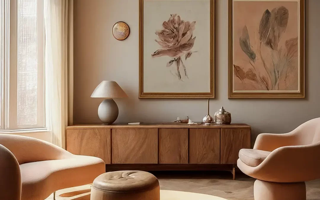
Green—Balances the nervous system. Evokes nature, wellness, and stability. Great for living spaces, kitchens, and entryways where you want to feel connected.

Yellow—Bright, social, and energetic. In small doses, it’s uplifting. In excess, it can agitate. I use yellow strategically—a mustard velvet pillow, a ochre backsplash, not a whole wall.

Red—Intense and visceral. Best reserved for accents—a lacquered cabinet, a wine-colored rug. In the right setting, it can feel romantic and bold.

Neutrals—Not boring. Just subtle. Warm whites and layered taupes can create quiet, layered spaces that feel expensive without effort.

Black—Yes, black. It adds contrast, depth, and sophistication. I often use it in powder rooms, window mullions, or sculptural lighting. (You can find some of my favorite black-accented decor in the shop.)

Bold Art

Using Color to Match Energy—Not Just Style

Designers often talk about color in terms of style: modern, coastal, bohemian. But the better question is: how do you want to feel in this space? Safe? Inspired? Grounded? Awake?

That answer tells me more than a Pinterest board ever could.

In my consultations, I often ask clients to describe their energy goals for each room. From there, we layer in hue, material, and light to create a space that supports the way they live. Because true design isn’t just visual. It’s behavioral.

Designing in Partnership

The Couples Conundrum: When Two Palettes Collide

Color is personal. And when designing for couples, it’s not uncommon to find clashing emotional associations. One partner may feel calm in gray. The other may find it depressing. The solution isn’t compromise. It’s layering.

I build palettes that bridge both nervous systems. Softening edges with texture. Finding tonal overlap. Adding depth through neutrals that can stretch across both personalities. Because the most successful rooms aren’t designed for one person. They’re curated for connection.

Small Changes, Big Impact

You don’t need to repaint your entire home to benefit from color psychology. Often, a shift in one hue—a new rug, a deeper cabinet, a warmer lightbulb—can change how a room feels.

I designed this whole collection with color harmony in mind. You’ll find pieces that pair beautifully with every seasonal palette, but more importantly, create a mood that lasts.

Final Thought: Color as a Mirror

Color isn’t decoration. It’s identity. It reflects back who we are, what we need, and how we want to feel. When used with intention, color creates alignment. Between your space and your self.

And in that alignment, something beautiful happens: your home begins to feel like it knows you.

2 Hour Interior Design Virtual or In Person Consultation

SOMETHING FOR EVERYONE

THE PIECES RACHEL RETURNS TOAGAIN AND AGAIN

Related Reading