St. Louis Home Design Styles: What Works Here That Won’t Work Anywhere Else
I have designed homes in San Francisco, Sarasota, Nantucket, and internationally. I have walked into rooms built in 1890 and rooms built last year. But I keep returning to St. Louis, because this city has something most design markets don’t: genuine character baked into its bones. And genuine character demands a different kind of attention.
This is not a guide for people who want to decorate their St. Louis home the way they saw it done in a California design magazine. This is a guide for people who want their home to work—beautifully, practically, and specifically here.
The humidity problem nobody talks about
St. Louis summers are punishing on certain materials. What looks gorgeous in a Palm Beach showroom can warp, crack, or swell in a Missouri July. Before I specify any solid wood furniture for a St. Louis client, I ask two questions: Is the home well air-conditioned? And do they open the windows?
The answers change everything. Solid hardwoods with tight joinery—walnut, white oak, cherry—perform beautifully in a climate-controlled home. But if a client loves cross-breezes in June, I lean toward quarter-sawn oak (dimensionally more stable) or furniture with engineered wood cores and solid wood faces. Beautiful and durable are not in conflict. You just have to know the conditions.
The same logic applies to upholstery. Velvet—which I love dearly—shows every impression, every water spot, every paw print with more drama in high-humidity environments. In St. Louis, I balance velvet accents with performance-weave or high-count linen on the pieces that take daily use. The velvet still makes the room. It just doesn’t carry it alone.
The light here is different—and most designers don’t account for it
Midwestern light is not coastal light. It doesn’t bounce off water. It doesn’t have the golden warmth of a California afternoon or the sharp clarity of a Nantucket morning. St. Louis light—especially in older homes with deep window surrounds and covered porches—tends to be filtered, indirect, and slightly warm.
This is good news if you know what to do with it. Warm, filtered light makes earthy neutrals sing—putty whites, warm greige, soft taupe read rich rather than muddy. Walnut furniture and amber textiles feel like evening even at noon.
What it doesn’t do is flatter cool, bright colors. That icy white you saw in a Malibu magazine shoot? In a north-facing St. Louis living room, it reads lavender-gray in winter. Those pale-blue kitchen cabinets? Depending on your exposure, they look dingy by 3pm in February. I always ask clients to live with paint samples for a full week—morning light, afternoon light, evening lamp light—before committing. St. Louis light rewards patience.
The architecture here is irreplaceable—treat it that way
One of the most common mistakes I see in St. Louis is homeowners trying to make their 1910 Craftsman or their 1955 brick ranch look like something it isn’t. The proportions of original St. Louis architecture are specific and meaningful: high ceilings in pre-war homes, smaller windows in mid-century ranches, deeply inset doorways, brick columns on porches with a particular rhythm. When you fight those proportions, you lose. When you work with them, you win completely.
In a Webster Groves foursquare from 1908, the right move is almost always to honor the trim. Paint it white if it’s oak with filler in the grain, or strip it if the wood is worthy—but don’t replace it with something more modern. Those proportions are the reason the room has presence. In a mid-century ranch in Creve Coeur, the right move is usually the opposite: remove the fussy additions later owners installed—the ornate valances, the oversized fireplace surrounds—and let the horizontal elegance of the original architecture breathe again.
Know what you have before you try to change it. St. Louis has extraordinary architectural bones. Most of it just needs editing, not replacement.
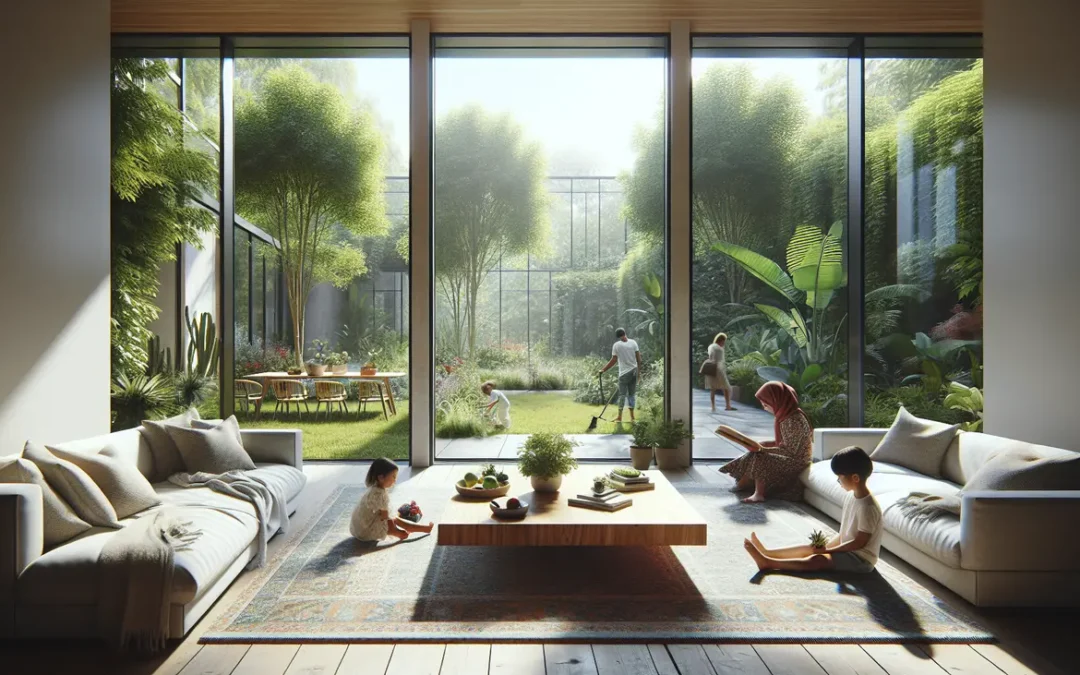
What the Midwestern lifestyle actually demands from a home
St. Louis families use their homes. This is not a city where people host for show. People gather here with genuine hospitality—big Sunday dinners, kids running through the house, dogs underfoot, neighbors staying late. A beautiful home in St. Louis has to be a livable home, or it’s just a showroom nobody uses.
This shapes how I specify materials differently here. I look for performance fabrics that are cleanable and durable at the same level I look for beautiful ones. Wool rugs perform brilliantly in St. Louis interiors—durable, forgiving of spills, beautiful for decades. Stone and quartz countertops over marble in kitchens that actually cook. None of this means sacrificing beauty. It means building beauty that lasts—which is the only kind worth having.
The neighborhoods have personalities—and your design should respond to them
Clayton wants to be elegant. Webster Groves wants to feel settled and smart. The Hill wants warmth and tradition. Ladue wants understated luxury that doesn’t announce itself. Lafayette Square wants historical romance. Kirkwood wants cheerful livability. These aren’t stereotypes—they’re the accumulated personality of a neighborhood’s architecture, topography, and community character.
I pay attention to these personalities not because design should be generic to location, but because the best interiors are in conversation with their context. The most satisfying rooms feel inevitable. They feel like they belong exactly where they are.
Rachel Blindauer is an award-winning interior designer based in St. Louis, Missouri, with projects across the United States and internationally. Book a consultation at rachelblindauer.com.


SOMETHING FOR EVERYONE
The pieces Rachel returns to, again and again.