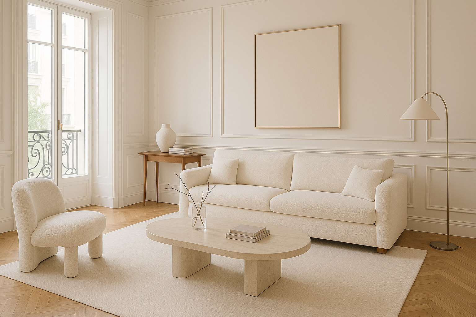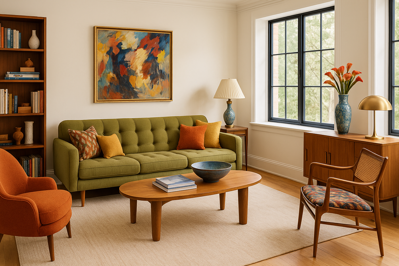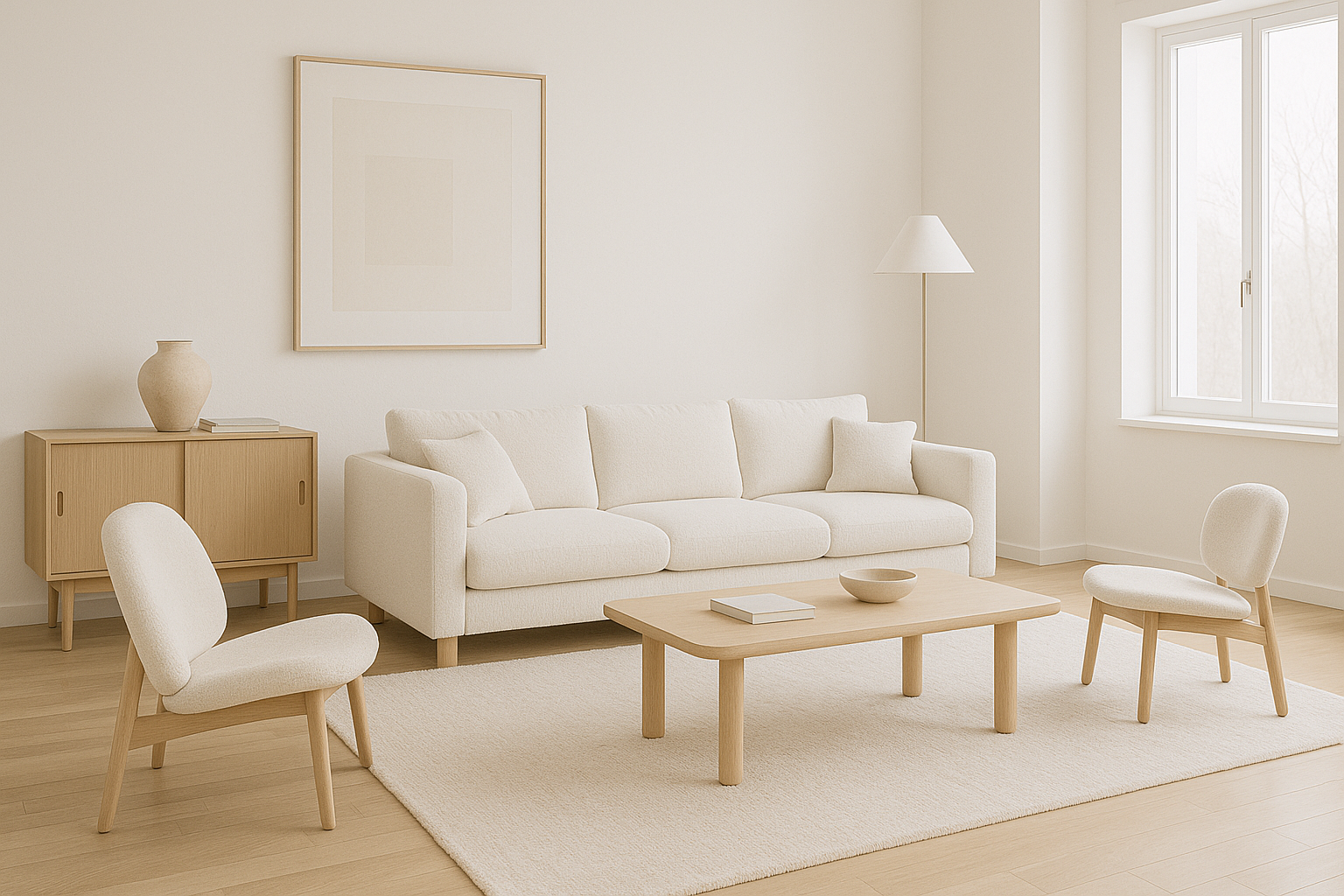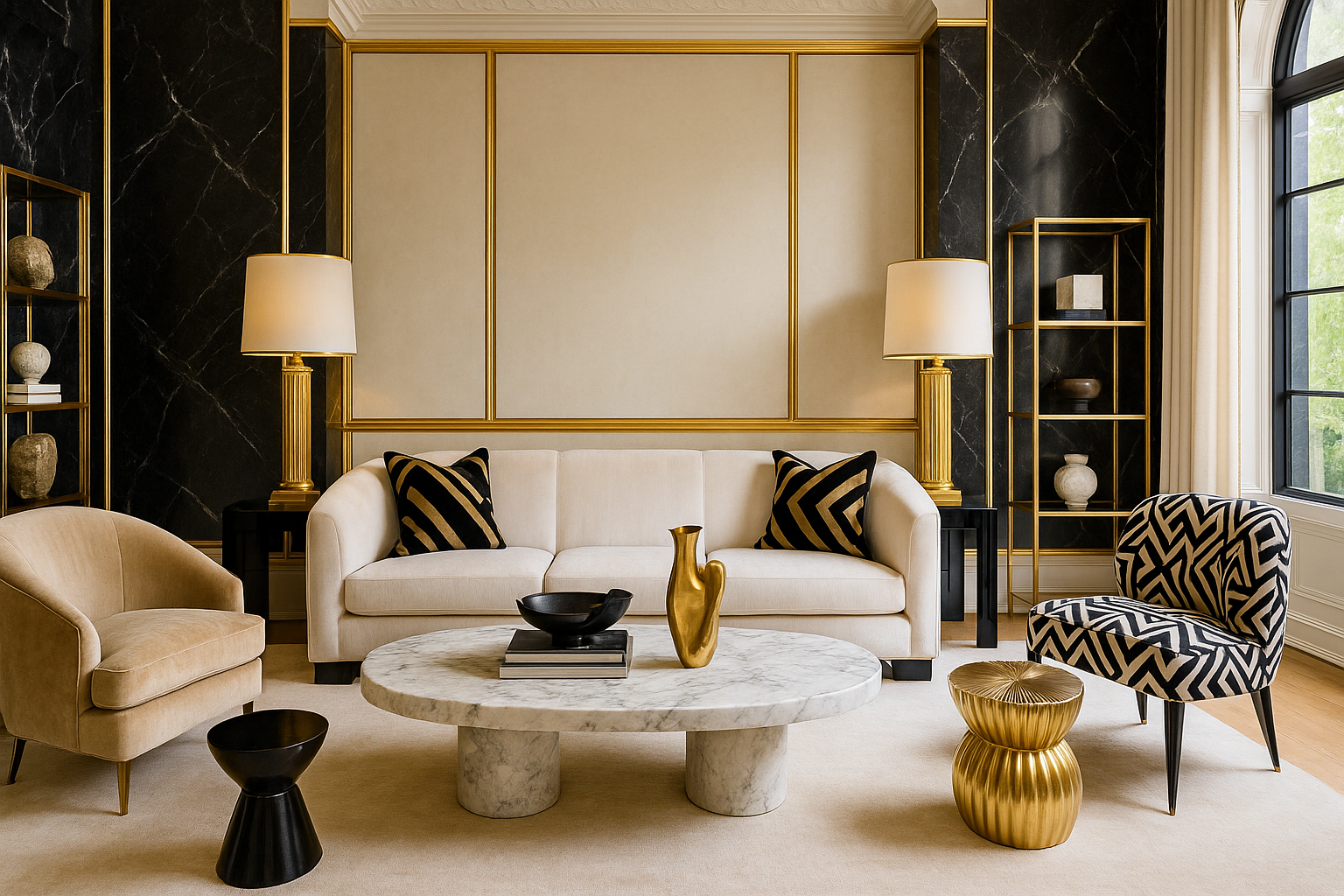
Beyond Aesthetics: How Designer Interiors Can Enhance Your Well-being

Beyond Aesthetics: How Designer Interiors Can Enhance Your Well-being

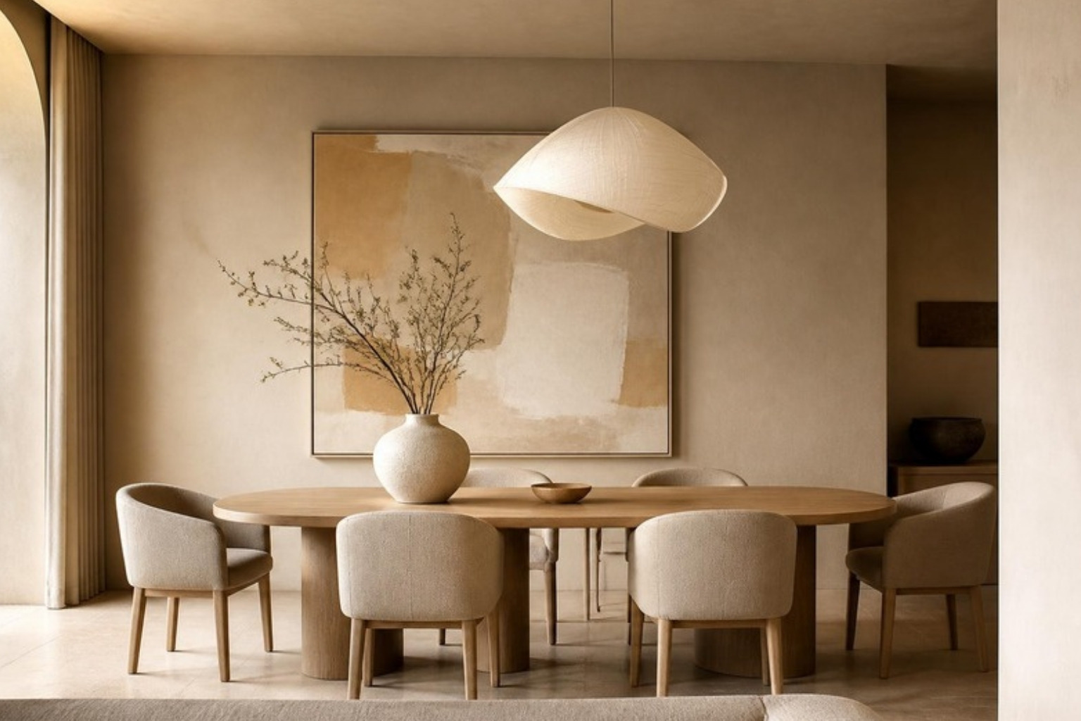
Designer interiors often capture our attention with their stunning aesthetics. However, there’s more to these captivating spaces than meets the eye. This blog explores how well-crafted interiors transcend beauty, impacting our overall well-being in surprising and meaningful ways.

Designing for Emotional Balance

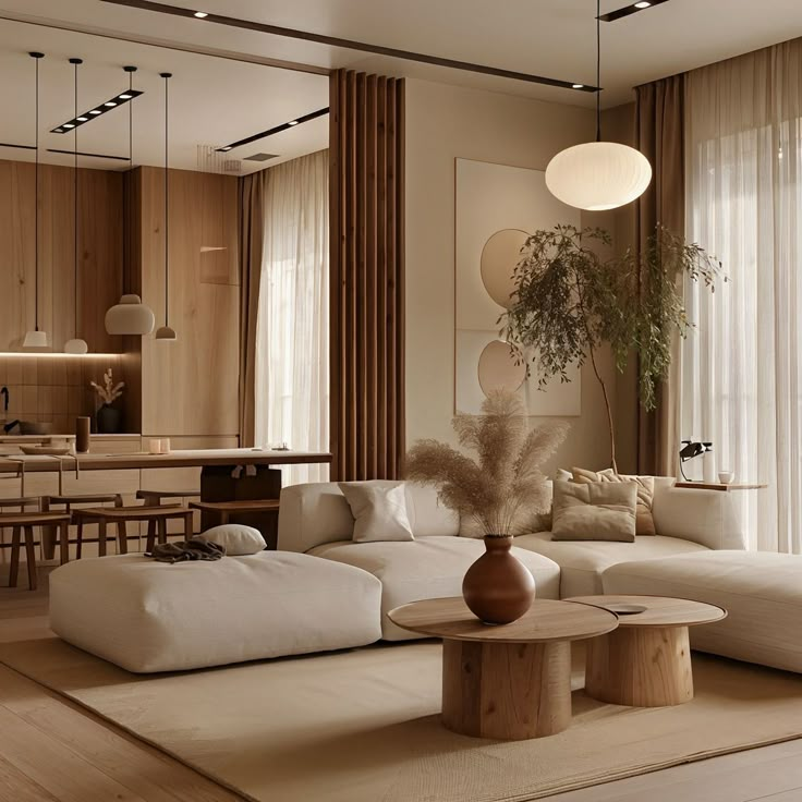
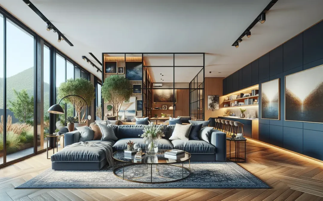
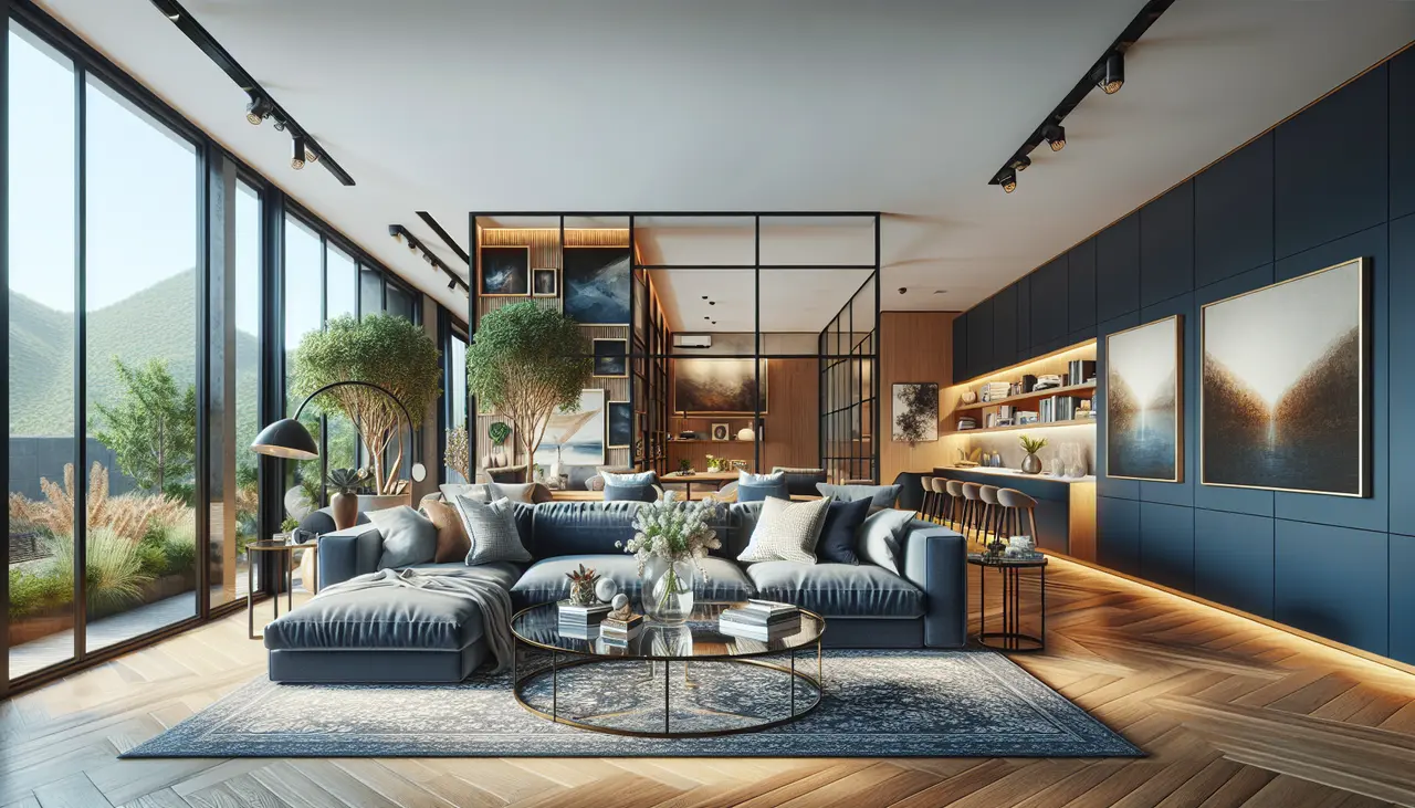
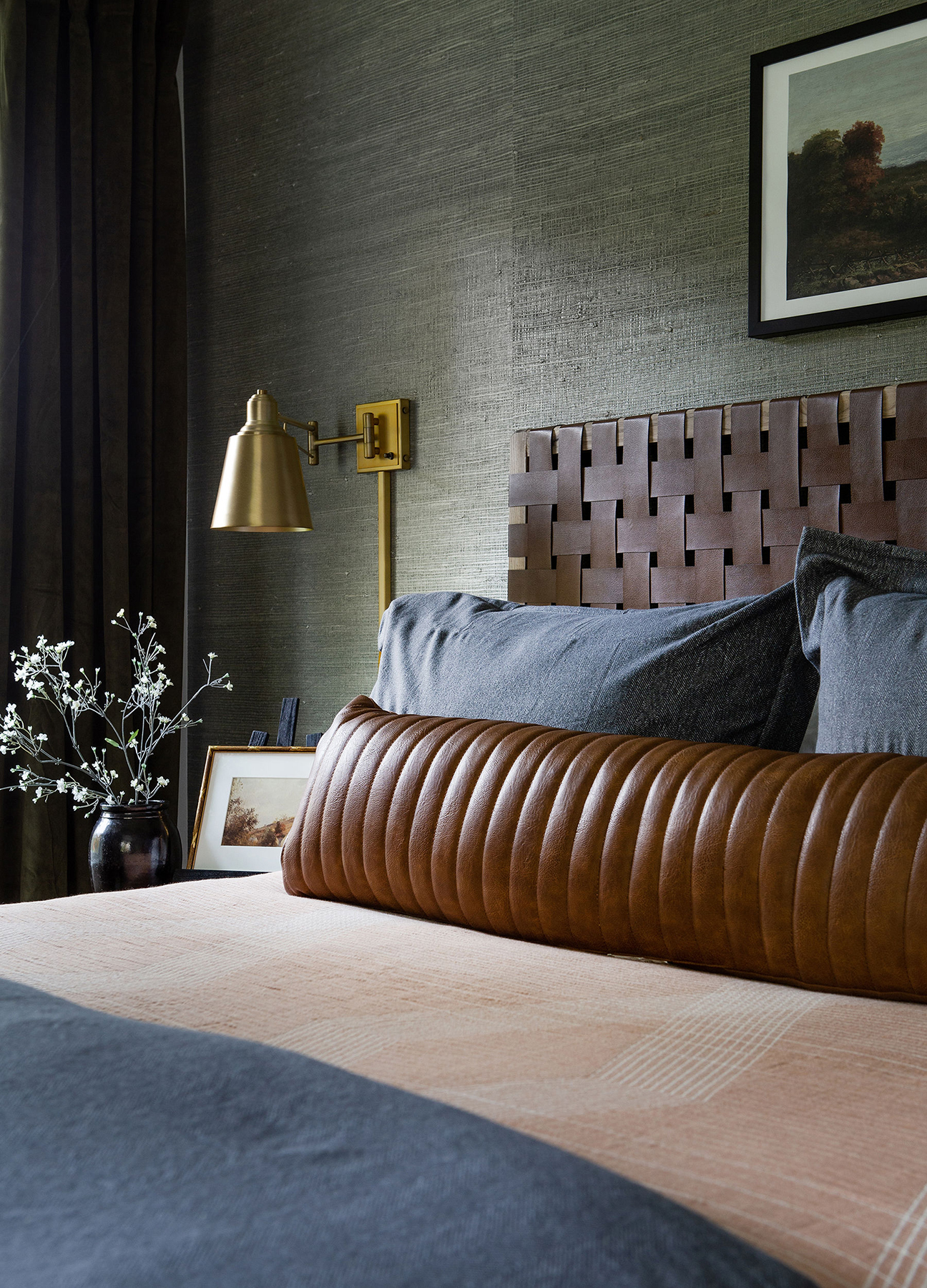
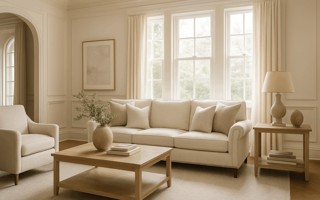
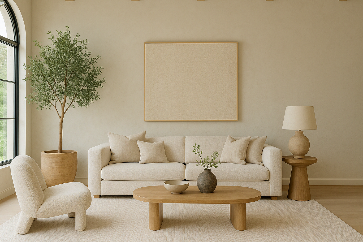
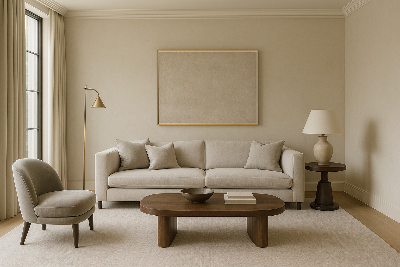
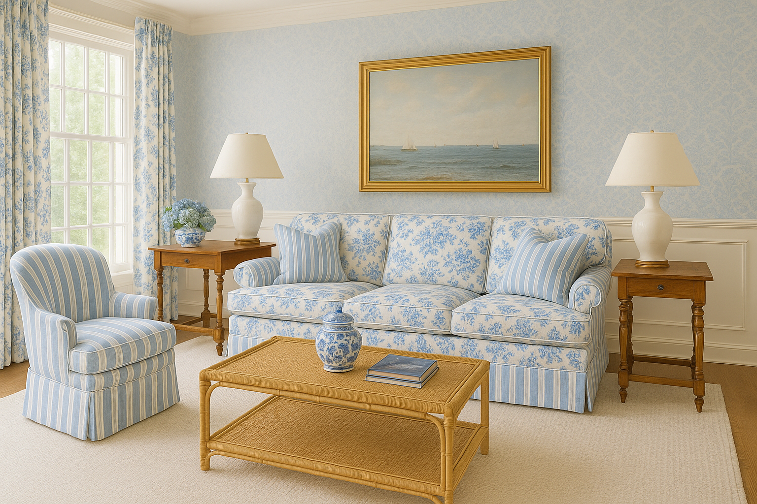
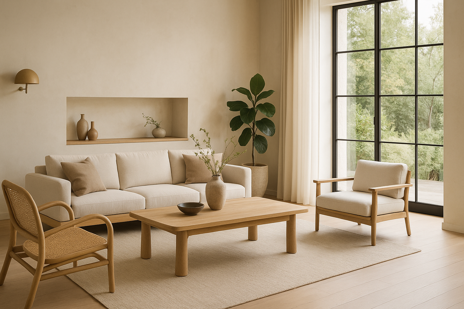
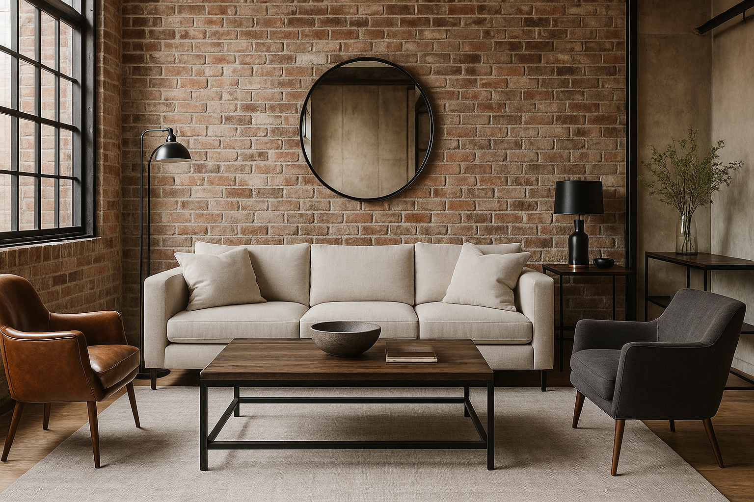
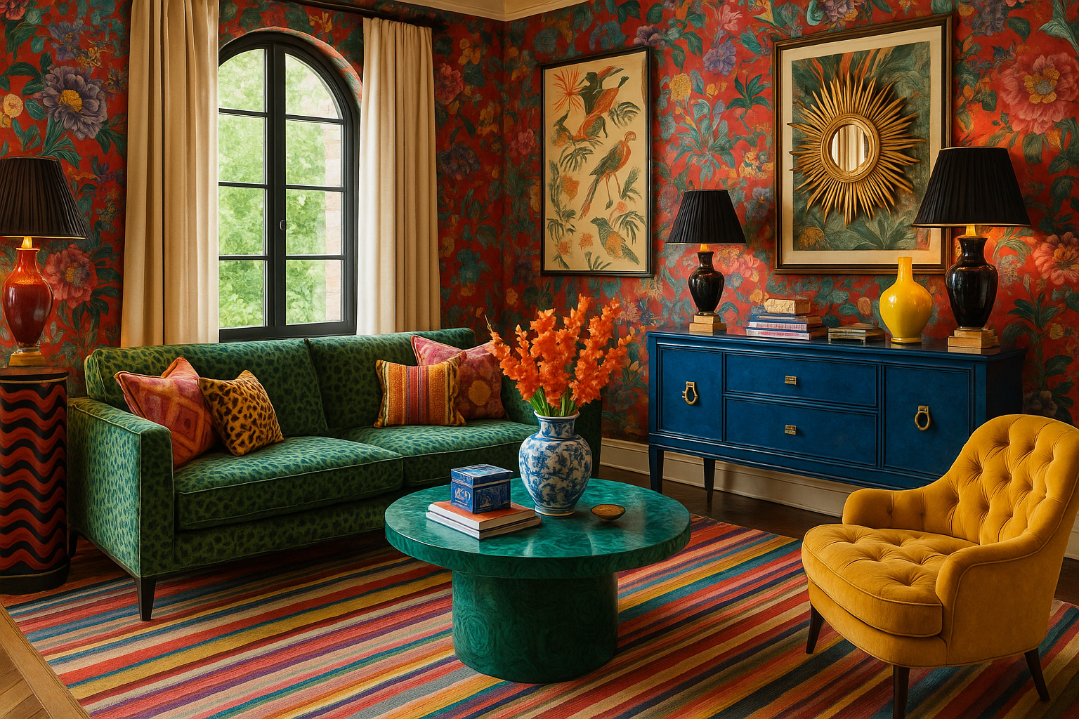
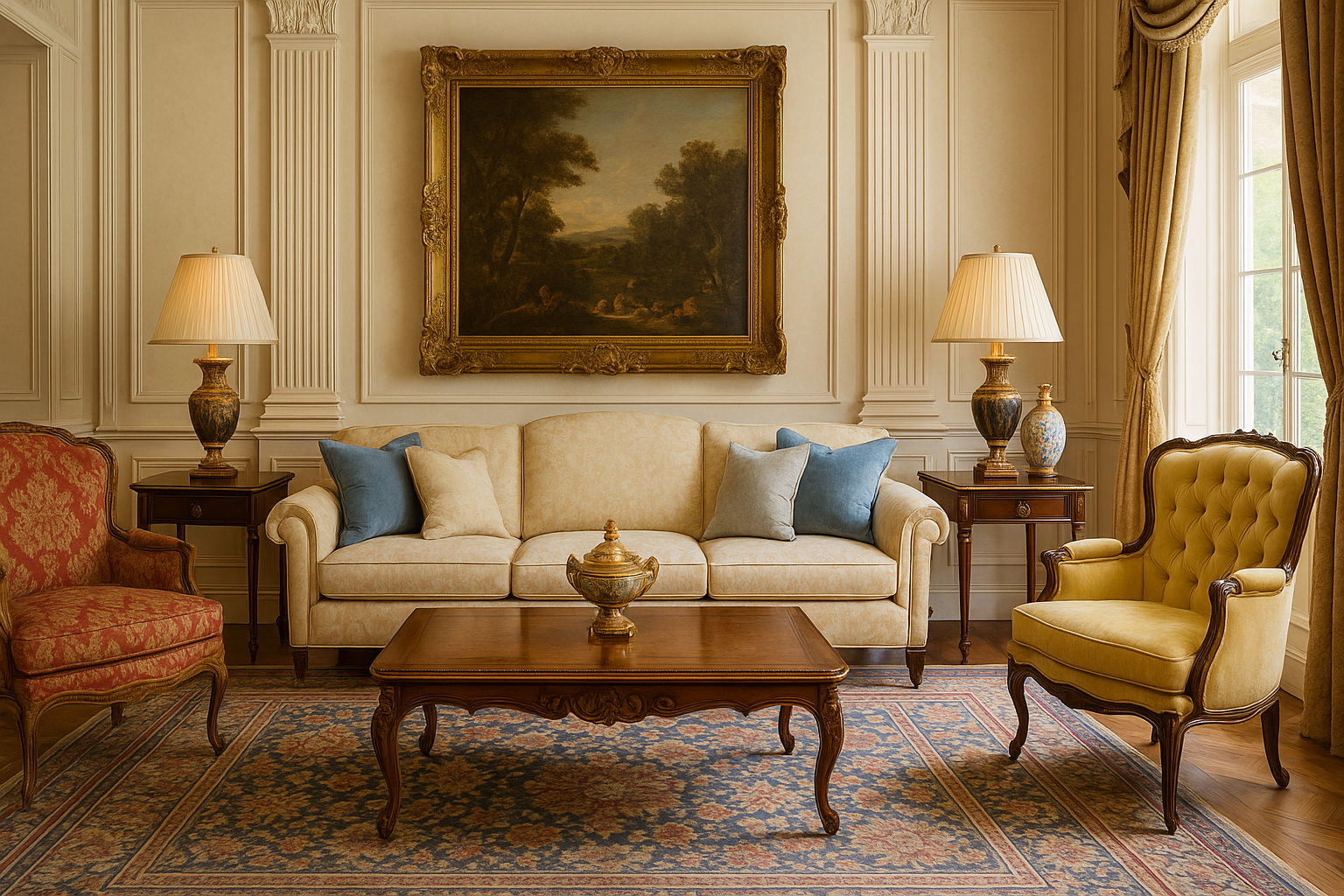
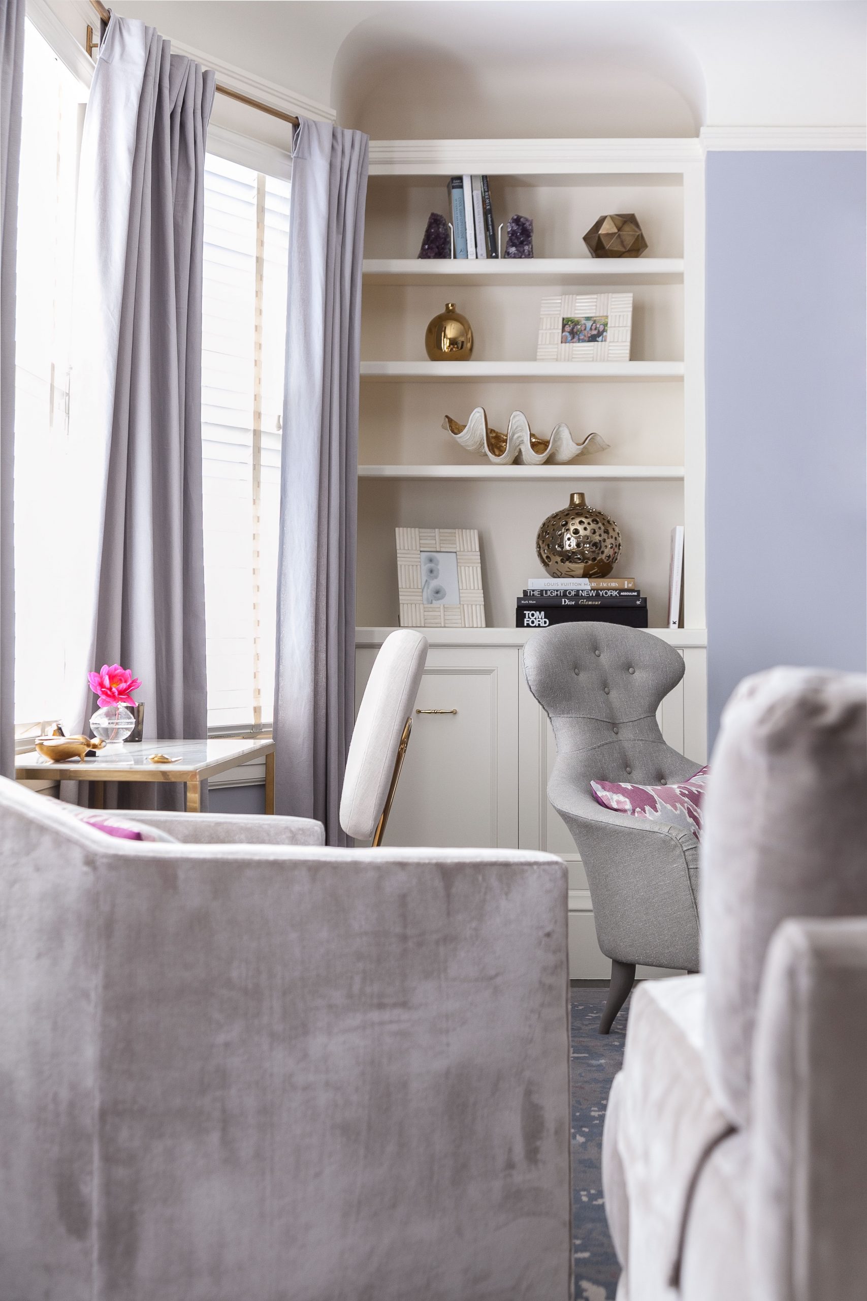
Colors, textures, and lighting are often overlooked elements that dramatically impact our emotional health. The gentle hues of a well-curated space can evoke serenity, while contrasting textures add an element of interest, keeping our senses engaged without overwhelming them. The subtle warmth provided by soft lighting can transform a space into a haven of relaxation and reflection. When these elements work together harmoniously, they create an environment that supports emotional balance by reducing stress and enhancing mood. For instance, cooler tones such as blues and greens are known to induce calmness and tranquility, which can be beneficial in spaces designated for rest, such as bedrooms. Similarly, darker, earthy textures can ground a space, providing a sense of stability.

Incorporating such thoughtful design choices is essential in combating the chaos of everyday life. When you walk into a room that feels tailored to your emotional needs, you’re likely to experience a sense of relief and comfort. This can significantly affect your daily routine and productivity levels. A designer interior isn’t just about the ‘look’ of a space; it’s about creating environments that speak to the soul’s need for rest and rejuvenation.

Functionality Meets Aesthetic

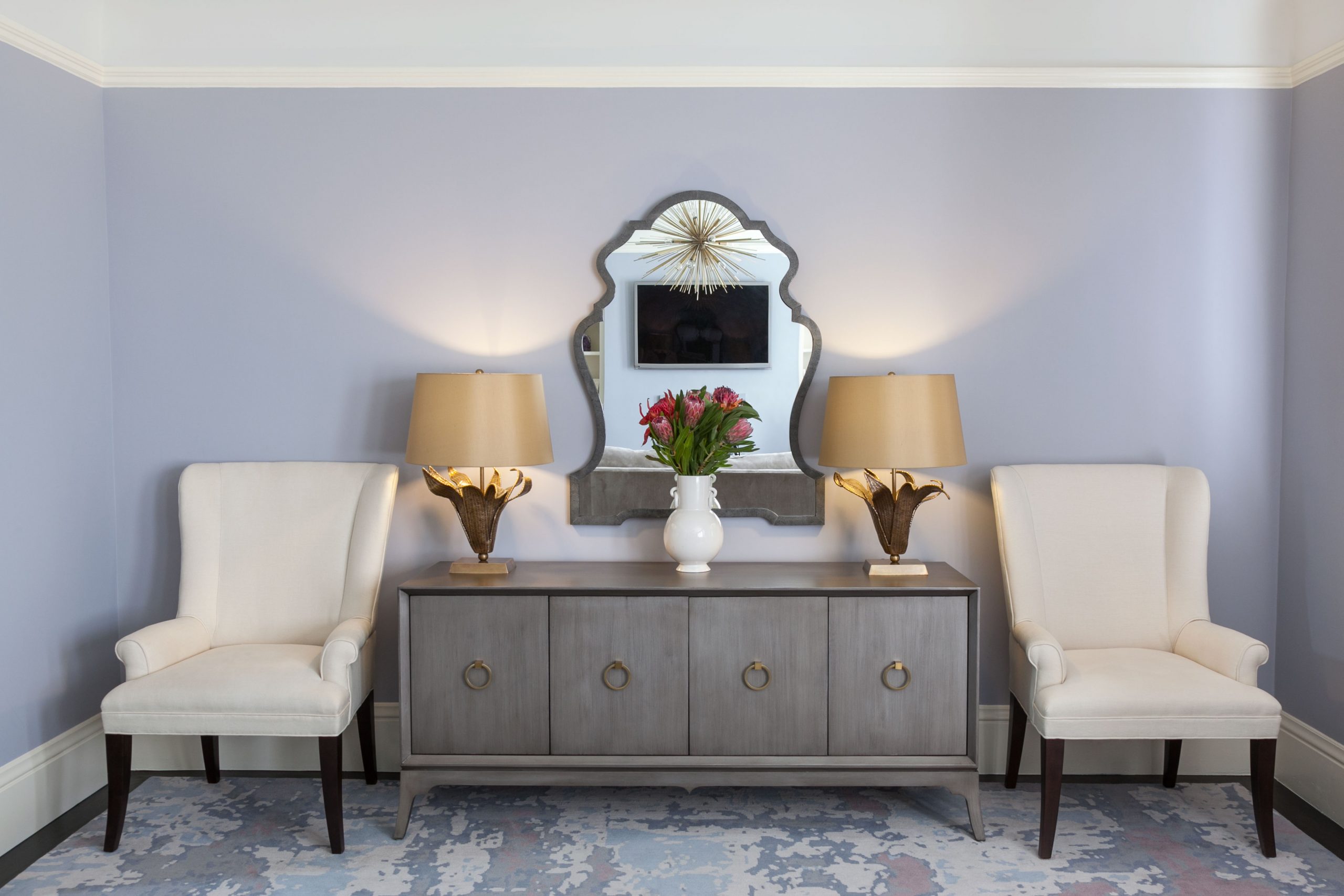
When a well-designed interior successfully marries functionality with aesthetic appeal, it results in spaces that are not only beautiful but also incredibly practical. Imagine a living room where every piece of furniture is not only eye-catching but also serves a purpose—an artful lamp that provides ample lighting for reading or a sleek storage solution that doubles as a decorative focal point. These thoughtfully chosen elements enable us to move through our daily lives more fluidly, offering convenience while simultaneously uplifting our spirits.

Integrating technology seamlessly into design further exemplifies the blend of form and function. From hidden charging stations to smart lighting systems, these modern conveniences discretely complement the elegance of a room, enhancing its usability without detracting from its beauty. This symbiosis of function and aesthetics encourages us to engage more fully with our spaces, knowing that they cater to both our practical needs and our desire for a pleasing visual environment.

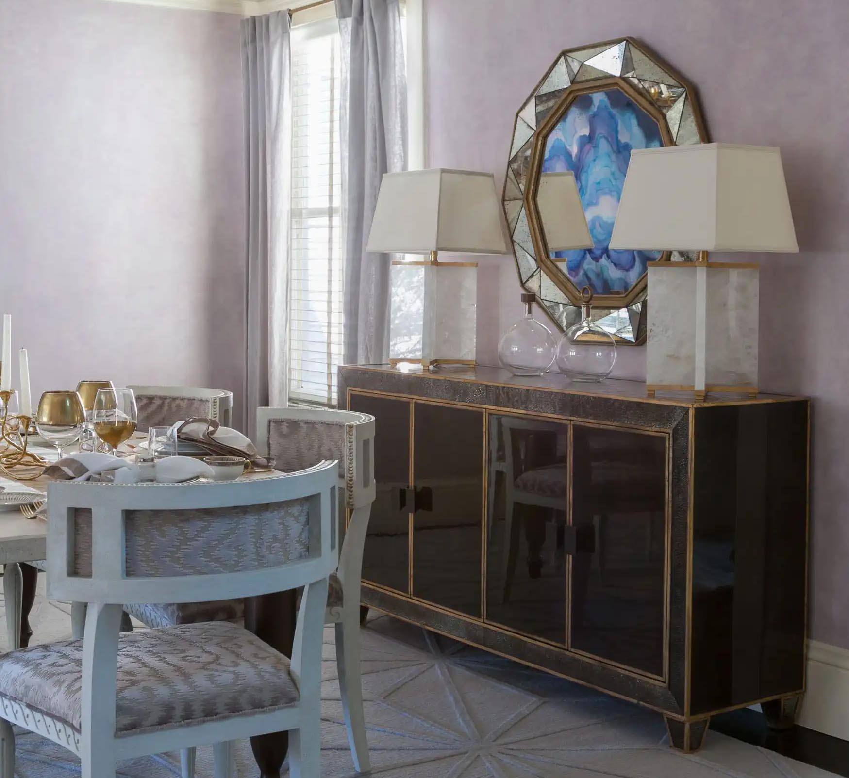
Collection Interior Design

Personalization and Reflection of Identity

Your living space is a canvas to express who you are. By infusing personal touches into your interior design, you create a home that resonates with your identity, making you feel more connected and comfortable. Whether it’s through the vibrant colors of a cherished painting, the warmth of family photographs, or the textures of heirloom furniture, personalization fosters a deep sense of belonging. A personalized space is not just a reflection of personal taste; it’s an ongoing narrative of our lives and experiences.

Designer interiors that cater to personal identity offer more than visual satisfaction; they contribute to mental well-being by promoting a sense of security and sanctuary. This emotional connection to our surroundings plays an integral role in our everyday well-being, transforming our homes into personalized retreats that recharge and inspire us.

Creating Spaces for Social and Personal Interaction

Intentionally designed spaces encourage interaction, both social and personal. Socially, they provide welcoming environments that facilitate conversation, connection, and community. The arrangement of seating, the flow of a room, and the strategic use of communal areas are pivotal in sparking interactions among people. Meanwhile, quieter, more intimate corners can offer solitude and a chance to unwind, which is just as vital for our well-being.

Spaces designed with interaction in mind create the backdrop for meaningful relationships and personal introspection. Whether hosting friends for a dinner party or retreating to a cozy nook for reflection and relaxation, our surroundings have the power to shape how we connect with others and ourselves. Thus, investing in designer interiors that enhance interaction quality adds incredible value to our lives.

Eco Friendly

Sustainable Design for Peace of Mind

Sustainability in design is increasingly recognized for its positive impact on both the environment and mental health. By choosing eco-friendly materials and energy-efficient solutions, designer interiors not only lessen the carbon footprint but also introduce elements of tranquility and peace into a home. This conscious approach aligns with a growing awareness of ecological impact, enabling spaces to reflect a commitment to sustainability which, in turn, provides peace of mind to homeowners.

Moreover, the natural elements often used in sustainable design—such as reclaimed wood or organic textiles—evoke the calming essence of nature. These materials carry a timeless quality, grounding spaces with an authenticity that artificial materials can’t replicate. By integrating sustainability into interior design, the home becomes a space of harmony, nourishing both the planet and the soul.

The Transformative Power of Thoughtful Design

While visual appeal holds significant importance, the influence of designer interiors goes far beyond mere aesthetics. By fostering a sense of harmony, functionality, and personal connection, these spaces can significantly enhance your environment and well-being. Choosing thoughtfully designed interiors could be a transformative step toward a more fulfilling life.

2 Hour Interior Design Virtual or In Person Consultation

SOMETHING FOR EVERYONE

THE PIECES RACHEL RETURNS TO, AGAIN AND AGAIN

Top 2025 Interior Design Trends for a Beautiful, Timeless Home

Top 2025 Interior Design Trends for a Beautiful, Timeless Home

Design trends, like fashion or art, aren’t just about what’s new—they’re a mirror of what we’re craving: more calm, more beauty, more meaning. In 2025, the homes we admire most are less about perfection, more about presence. We want spaces that reflect how we live—and who we’re becoming.

Organic Living Room Interior Design

Curved & Sculptural Forms

2025 favors curves over corners. Rounded sofas, waterfall islands, and sculptural lighting offer visual softness and a human-centric sensibility.

Rachel’s Insight: In a Nantucket home, we softened a formal space by layering arched alcoves with curved vintage club chairs. The room now feels more conversational—and less staged.

Shop sculptural accents and soft forms

Benjamin Moore Summer Shower

Color Drenching: Bold, Saturated Expression

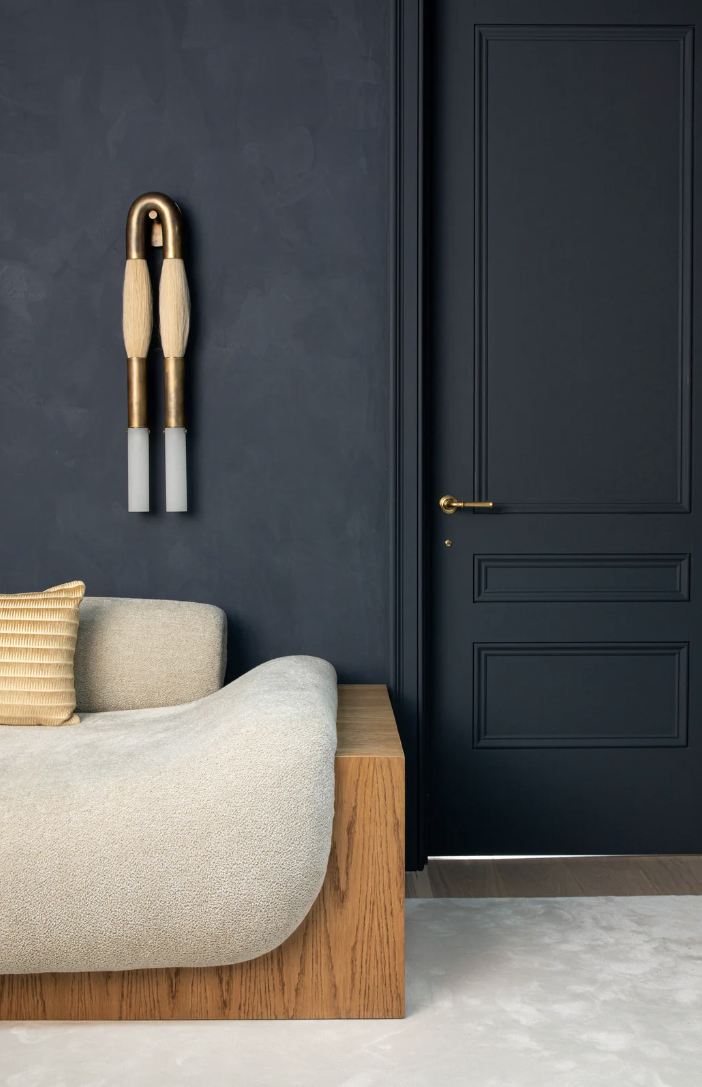
Gone are the days of all-white interiors. In 2025, color drenching—where a single hue envelops walls, ceilings, and even upholstery—takes center stage. Deep oxbloods, chalky blues, and terracotta pinks lend richness and personality.

“Color is back—with depth, not drama.”

Rachel’s Insight: We recently transformed a client’s reading room by wrapping it in one deep plum tone. The result? Cocooning, serene, and completely unforgettable.

See more of our color-driven projects

Darkside Lime Wash Portola Paints

Textured Walls and Ceilings: Dimension is the New Minimalism

Smooth drywall is losing its grip. Limewash, hand-troweled plaster, and wallpapered ceilings are infusing homes with quiet drama.

Rachel’s Insight: Texture adds a kind of softness that paint alone can’t deliver. We often use plaster finishes to blur light and shadow, bringing calm into high-traffic spaces.

Explore our tiered design services

RachelBlindauerHotel&HospitalityDesign

Wellness Rooms: Where Design Meets Restoration

From saunas and meditation nooks to biophilic lighting and aromatherapy zones, wellness-centric spaces are here to stay.

“The smartest design trend? Spaces that feel like exhale.”

Rachel’s Insight: I’ve found that even small additions—like a reading bench near a window or a calming scent plan—can create a daily rhythm of restoration.

Maximalism, But Make It Personal

Layered textiles. Eclectic art. Statement lighting. Maximalism is evolving beyond clutter into a curated celebration of self.

Rachel’s Insight: The key isn’t quantity—it’s story. We help clients layer meaningful objects without overwhelming the space. A well-traveled home is always in style.

Multi Family Condo Dining Room Interior Design

Natural & Artisanal Materials: Soul Over Shine

Expect more stone, rattan, clay, and handwoven textiles—materials that carry the hand of the maker. These pieces ground even the most modern homes.

Rachel’s Insight: I’m constantly sourcing pieces that feel imperfect in the best way. Our shop carries handcrafted goods that speak to this trend.

Real Estate 8470229

Tech That Disappears

Smart design is becoming seamless—invisible speakers, climate-adaptive shades, and lighting that learns your habits.

Rachel’s Insight: I love embedding tech that elevates daily life without stealing attention. We install it so your home feels considered, not coded.

The Bottom Line: Design for Who You Are Becoming

2025 interiors are less about trends and more about transformation. At Rachel Blindauer, we design spaces that reflect not just your taste—but your next chapter.

Let’s make your space a reflection of who you are—and who you’re becoming.

Explore our design services or shop our collection of curated goods that bring the best of 2025 home.

FAQ: Interior Design Trends 2025

What are the biggest interior design trends in 2025? Color drenching, textured finishes, wellness-centric spaces, and natural materials top the list.

How do I create a timeless yet trendy home in 2025? Layer natural materials, invest in sculptural shapes, and use color purposefully.

What’s one high-impact trend I can try now? Introduce one deeply saturated color in a room—via paint, textiles, or a standout furniture piece.

2 Hour Interior Design Virtual or In Person Consultation

SOMETHING FOR EVERYONE

THE PIECES RACHEL RETURNS TO, AGAIN AND AGAIN

Fresh Spring Color Palettes + Spring Product Roundup

Fresh Spring Color Palettes + Spring Product Roundup

Spring is a season of renewal and rejuvenation, and what better way to embrace the spirit of the season than by refreshing your interior color palate and accentuate the season by bringing the outdoors in. Join us as we list our favorite spring color pallates and was to bring the spring indoors.

Spring Color Palate Mood Board

Fresh Spring Color Palettes

Here are some exciting options to inspire your home in spring:

Spring Pinks and Bright Yellows: Create a vibrant and cheerful atmosphere with a combination of spring pinks and bright yellows. These colors are perfect for bringing warmth and energy into any space.

Warm Clay Tones: Embrace the earthy beauty of warm clay tones in your interior design this spring. These colors, reminiscent of terracotta and rustic landscapes, add a cozy and welcoming feel to your home.

Brighter Palettes: If you’re looking for a bold and daring approach, consider using brighter palettes. Think tangerine orange, sunshiny yellow, Barbie pink, grass green, and Robin’s egg blue. These vibrant colors will infuse your space with freshness and energy.

Soft Greens and Muted Pastels: For a more serene and calming atmosphere, opt for soft greens and muted pastels. These colors evoke the beauty of nature in full bloom and create a sense of tranquility in your home.

Mint, Artichoke, Canary Yellow, and Raspberry Pink: Discover fresh ways to incorporate spring hues with muted shades of mint and artichoke, as well as vibrant canary yellow and raspberry pink. These color palettes add a touch of sophistication and playfulness to your space.

Pops of Green and Soft Pinks: Adding pops of green and soft pinks or light corals can enhance the depth and create a timeless color scheme that radiates ethereal style.

Soft Purple Mood Board Color Palate
Soft Pink Neutral Mood Board Color Palate
Pink Mood Board Color Palate

Spring Product Roundup

Now that we’ve explored some inspiring spring color palettes, let’s dive into the world of spring-related interior design products and accessories. Here are some ideas to help you create a fresh and vibrant atmosphere in your home:

Shop the Look: Spring

Four pieces from the shop that do the work below — a tray for the foyer, a placemat for the table, a vessel for branches, and a bowl for herbs.

Marisol Tray

Marisol Tray
$280.00

Paloma Scallop Placemat

Paloma Scallop Placemat
$36.00

Sculptural Serenity Vase

Sculptural Serenity Vase
$452.00

Serene White Marble Bowl — Round

Serene White Marble Bowl — Round
$82.00

The Foyer Table: The foyer table is a favorite spot to change up for the seasons, and spring is no exception. Consider adding some blue/green bottles and faux greens to create a refreshing and inviting display.

Spring Tablescape: Curate a spring-inspired tablescape by incorporating elements such as pastel-colored table linens, floral centerpieces, and delicate dinnerware. These soft furnishings in pastel colors and floral patterns will bring a breath of fresh air to your dining area.

Spring Wreath: Welcome guests with a stunning spring wreath adorning your front door. Opt for wreaths featuring vibrant spring flowers or lush greenery to create a cheerful and inviting entrance.

Indoor Plants: Upgrade your lifestyle with herbs indoors. Opt for basil, mint, dill, cilantro or broccoli sprouts for their superfood health benefits.

By incorporating these fresh spring color palettes and spring-related products and accessories into your interior design, you can create a vibrant and inviting atmosphere that embraces the spirit of the season. So go ahead, refresh your home and welcome spring with open arms!

2 Hour Interior Design Virtual or In Person Consultation

Something for Everyone

THE PIECES RACHEL RETURNS TO, AGAIN AND AGAIN

The Best Paint Colors for Sarasota FL, San Francisco CA & Nantucket MA

The Best Paint Colors for Sarasota FL, San Francisco CA & Nantucket MA

Expert Interior Design Guidance by Rachel Blindauer

When it comes to creating a well-styled home, selecting the right paint color goes far beyond following trends—it’s about curating a palette that complements your architecture, decor and natural light. As a nationally recognized interior designer working across coastal markets, I know how regional nuances shape design choices. In this guide, I’m sharing my go-to paint colors for three distinctly styled locales: Sarasota, Florida; San Francisco, California; and Nantucket, Massachusetts.

From sunlit modernism to fog-filtered warmth and heritage-driven charm, these curated paint palettes are designed to elevate your space and feel intuitively “you.”

Not All Paint Is Created Equal

Paint finish, texture, and depth dramatically change the feel of a room. While I work with many high-quality brands, Portola Paints is a current favorite for its stunning lime wash and Roman clay options, which bring organic texture and movement to walls—perfect for spaces seeking dimension and softness. Farrow and Ball is hard to paint with but Benjamin Moore is a dream to paint with and the Aura line is scrubbable!!

A Quick Design Rule: Paint Comes Last

In every project I lead, paint is selected last. Why? Because your palette should support key elements like art, rugs, or upholstery—not compete with them. Once these anchors are chosen, paint becomes the harmonious bridge that ties everything together. And remember: always sample in your actual space, across multiple times of day.

Best Paint Colors for Sarasota, FL

Sarasota’s abundant sunlight and blend of contemporary and tropical architecture call for nuanced, warm neutrals and coastal-inspired whites. These tones ground bright environments without feeling stark.

Multi Family Condo Dining Room Interior Design

1. Swiss Coffee by Benjamin Moore
A creamy, yellowed white that reads warm without heaviness. Ideal for interiors with warm wood or smooth cement. Important: no bright white trim—use Swiss Coffee on all millwork for cohesion.

Pale Oak by Benjamin Moore

2. Pale Oak by Benjamin Moore
A soft greige with yellow undertones—effortlessly elegant in sunlit rooms.

Blondie Lime Wash Portola Paints

3. Blondie Lime Wash, Portola Paints
A buttery lime wash that layers beautifully in neutral coastal interiors.

Portola Paints Lime Wash Dry Ground

4. Leisure Lime Wash, Portola Paints
Chalky and sun-washed—perfect for creating texture in beach-style homes.

Wood Ash C

5. Wood Ash by C2 Paint
A rich mid-toned greige with character. Excellent on exteriors or layered interiors with natural textures. Tip: skip bright trim—use this tone on all moldings.

Sherwin Williams Sea Salt

6. Sea Salt by Sherwin-Williams
A fresh, ocean-inspired soft blue-gray—ideal for bedrooms or bathrooms.

Benjamin Moore Summer Shower

7. Summer Shower by Benjamin Moore
Crystal clear and light-as-air, this soft blue is a refreshing pale robins egg blue.

Little Greene Masquerade

8. Masquerade by Little Greene
Warm and cozy, this is a dream for blackout-curtained bedrooms or media rooms.

Salon Drab Farrow Ball

9. Salon Drab by Farrow & Ball
A timeless, earthy brown. Use in dens, game rooms, or more traditional masculine spaces.

Best Paint Colors for San Francisco, CA

San Francisco’s architectural variety—Victorians to sleek moderns—and its cool, gray-filtered light call for warmer, moodier neutrals that can soften fog’s blue cast.

Gem Lime Wash

1. Gem Lime Wash, Portola Paints
Creates a subtle, moody chalk finish perfect for layered interiors.

Half Moon Bay Lime Wash Portola Paints

2. Half Moon Bay Lime Wash, Portola Paints
Soft and atmospheric—pairs beautifully with oak, linen, and vintage pieces.

Wood Ash C

3. Wood Ash by C2 Paint
A repeat favorite for a reason—it grounds eclectic San Francisco interiors.

Ralph Lauren Ul Urban Living Paint Color Match

4. Urban Living by Ralph Lauren (discontinued)
Still worth color matching—rich, versatile, and classic.

Avocado by Sherwin Williams

5. Avocado by Sherwin-Williams
Earthy and bold—beautiful in kitchens or studies paired with warm metals.

Darkside Lime Wash Portola Paints

6. Darkside Lime Wash, Portola Paints
Adds instant sophistication—ideal for a dramatic powder room or bedroom.

Bancha No.298 by Farrow Ball

7. Bancha No.298 by Farrow & Ball
A structured olive green with timeless appeal—stunning with walnut and gold.

Devonshire Green by Benjamin Moore

8. Devonshire Green by Benjamin Moore
Fresh yet grounded—great for trim, built-ins, or exteriors.

Dragons Breath by Benjamin Moore

9. Dragon’s Breath by Benjamin Moore
A rich, deep brown with charcoal undertones—luxurious and grounding.

Farrow Ball Oval Room Blue Optimized

10. Oval Room Blue by Farrow & Ball
Elegant and moody—perfect for dining rooms or library-style spaces.

Soul Mate by Benjamin Moore

11. Soul Mate by Benjamin Moore
An earthy red softened to a gentle pink hue.

IN the NAVY

12. In the Navy Roman Clay by Portola Paints
Bold and textured—an artistic take on a classic navy wall.

Best Paint Colors for Nantucket, MA

Nantucket’s historical charm and coastal chic lean into both timeless whites and rich, shadowy tones. Think whitewashed millwork, black windows, and warm navy or olive interiors.

White Dove by Benjamin Moore

1. White Dove by Benjamin Moore
The go-to white for New England homes with detailed millwork.

All White by Farrow Ball

2. All White by Farrow & Ball
Clean, classic, and crisp. Especially good when paired with black accents.

Pale Oak by Benjamin Moore

3. Pale Oak by Benjamin Moore
A soft transitional neutral—timeless and calming.

Repose Gray by Sherwin-Williams

4. Repose Gray by Sherwin-Williams
Pair with crisp white moldings or use monochromatically for depth.

Salon Drab Farrow Ball

5. Salon Drab by Farrow & Ball
Elevated and traditional—beautiful in intimate spaces or paneled rooms.

Bancha No.298 by Farrow Ball

6. Bancha by Farrow & Ball
Green with gravitas. Works wonderfully in libraries or as an unexpected kitchen cabinet color.

Avocado by Sherwin Williams

7. Avocado by Sherwin-Williams
For a slightly retro but cozy pop of depth.

Pewter Green by Sherwin Williams

8. Pewter Green by Sherwin-Williams
Great on exteriors, built-ins, or as contrast trim.

Shady Lane by Benjamin Moore

9. Shady Lane by Benjamin Moore
A dark, botanical green for moody spaces.

French Gray by Farrow Ball

10. French Gray by Farrow & Ball
A misty, historical tone that suits Nantucket’s heritage charm.

Oval Room Blue by Farrow Ball

11. Oval Room Blue by Farrow & Ball
Understated and watery—great in rooms with natural fiber rugs and oversized art.

Cromarty by Farrow Ball

12. Cromarty by Farrow & Ball
A chalky coastal sage—fresh yet sophisticated.

IN the NAVY

13. In the Navy Roman Clay by Portola Paints
Textured depth for dramatic rooms.

Tricorn Black by Sherwin Williams

14. Tricorn Black by Sherwin-Williams
Use for trim, windows, or doors to create strong contrast.

Coriander Seed by Benjamin Moore

15. Coriander Seed by Benjamin Moore
A golden undertone neutral that reads warm in cool Northeast light.

Soft Chinchilla by Benjamin Moore

16. Soft Chinchilla by Benjamin Moore
A gentle, misty hue that adds elegance to bedrooms or baths.

Final Thoughts

Every region has a different soul and every home has different architecture—your home should exalt that. Whether you’re soaking up the Sarasota sun, enjoying San Francisco’s eclectic style, or embracing Nantucket’s timeless architecture, your paint palette can tie everything in your space together beautifully.

If you’re not sure which colors are right for your space or style, we can help. Rachel Blindauer Interiors offers expert color consultation services rooted in regional design knowledge and timeless taste.

Ready to Elevate Your Space?

Let’s choose colors that feel like home.
Book a design consultation with Rachel Blindauer Interiors and take the first step toward a space that reflects your lifestyle, taste, and locale.

2 Hour Interior Design Virtual or In Person Consultation

SOMETHING FOR EVERYONE

THE PIECES RACHEL RETURNS TOAGAIN AND AGAIN

Homes That Create High Functioning Adults

Homes That Create High Functioning Adults

Our homes are more than the structures we live in—they are quiet collaborators in who we become. The right environment can make you calmer, sharper, and more capable; the wrong one drains energy you never realize you’re spending. After more than fifteen years designing residences, I’ve come to see interior design less as decoration and more as behavioral architecture: the deliberate shaping of spaces that help the people inside them function at their best.

A high-functioning home doesn’t happen by accident. It’s built through systems—how you organize your belongings, how you let light move through the day, how you design a kitchen that feeds both body and mind, and how you carve out room to recover. Here’s how I think about each one, with practical steps you can put in place this week.

The Architecture of Organization

Minimalism is a starting point, but organization is the operating system. A calm home isn’t about owning less for its own sake—it’s about designing storage and flow so every object has a logical home and every daily ritual has a dedicated stage.

High-functioning adults don’t spend cognitive bandwidth hunting for keys or excavating a closet. They live in homes with intentional zones: an entryway that catches the day’s chaos before it spreads, kitchen drawers that separate prep tools from serving pieces, a closet edited until getting dressed is a five-minute decision. I treat storage as architecture, not an afterthought—built-in millwork, concealed charging drawers, furniture that quietly doubles as filing. Done well, the organization disappears into the design.

Try this: Create a “landing zone” by your main entrance—a small surface for mail, a hook for bags, a drawer for keys and sunglasses. Two minutes resetting it each evening buys you twenty minutes of morning calm.

Light That Follows the Day

Natural light is one of the most powerful—and most overlooked—tools in a home. It lifts mood, sharpens focus, and steadies sleep by anchoring your circadian rhythm. Morning light especially tells your brain the day has begun.

Maximize it: keep windows unobstructed, add a skylight where you can, and place mirrors to bounce daylight deeper into a room. Orient a desk or breakfast table toward eastern exposure, and consider sheer shades that rise with the sun. The goal is a home that feels awake when you need to be, and softens as the day winds down.

Workspaces With Boundaries

In a work-from-anywhere world, a functional home office is no longer a luxury. But the most productive ones share a single trait: boundaries. When the day ends, the space should be able to transform.

Carve out a dedicated zone—even a compact one—with an ergonomic layout and layered lighting that supports the full rhythm of work and rest. A rolling desk that tucks into a cabinet, or a folding screen that visually separates “office” from “living room,” protects both your focus during the day and your recovery in the evening.

Homes That Create High Functioning Adults

The Edible Home: Growing Food for Nutrient Density

A high-functioning home feeds the people in it—literally. Growing even a little of your own food isn’t a rural hobby; it’s a design strategy with a real health dividend. Produce begins losing nutrients the moment it’s picked, and by the time most fruits and vegetables are harvested early, shipped, and stored, much of their vitamin content is gone. Food you grow and pick steps from your kitchen is eaten at its peak—more flavor, and far more of the nutrient density that makes healthy eating worth the effort.

Fruit Trees as Living Sculpture

Dwarf citrus—Meyer lemon, calamondin orange—thrives in a sunny window or on a protected patio, offering glossy green year-round and fragrant blossoms that become breakfast. Outdoors, an espaliered apple or fig trained flat against a wall becomes an architectural focal point that also produces fruit. A potted olive by a south-facing window doesn’t just look Mediterranean; it feels like a small promise of patience and longevity.

The Purple Bok Choy Principle

Not every kitchen garden hides in a backyard plot. Purple bok choy, with its violet stems and ruffled leaves, is as beautiful as any ornamental—and far more useful. Grown in a shallow planter on the counter or a raised bed visible from the dining room, it’s what I call edible design: nourishment that doesn’t sacrifice visual impact. A windowsill of herbs means fresh basil for Tuesday’s pasta without a grocery run. A tray of microgreens adds living texture to a backsplash and nutrients to lunch. When food production is woven into the look of your home, eating well stops being a chore and becomes part of your environment.

Try this: Start with three containers where you’ll see them daily—one for herbs (basil, rosemary, thyme), one for nutrient-dense leafy greens (purple bok choy, kale, arugula), and one for a dwarf tomato or pepper. Visibility is what drives consistency.

Homes That Create High Functioning Adults

Room to Restore

A truly supportive home holds space for rest, movement, connection, and solitude. These aren’t indulgences—they’re what sustain a high-functioning life. A yoga nook with a mat rolled into a beautiful basket, a reading alcove with task lighting calibrated for evening wind-down, an open kitchen that keeps conversation flowing while dinner comes together: each one gives a different part of you somewhere to land.

I often build small daily rituals into a kitchen or dining design—a table scaled for real conversation, where “what did you learn today?” becomes part of the meal. These aren’t decorative choices. They’re behavioral architecture: the habits of a good life made physical.

Calmly Colorful: The Role of Color and Texture

My work is often described as “calmly colorful,” and that balance is deliberate. Color and texture are sensory data points: they shape mood and perception, and used with intention they can invigorate the spirit without overwhelming the mind. The deep violet of a bok choy stem, the warm ochre of a ripe lemon against glossy leaves, the matte grain of an unglazed terra-cotta pot—none of these are random. They keep the eye engaged and the nervous system settled at the same time. Texture adds the depth that makes a room feel considered rather than staged.

A Home That Helps You Become

Put it all together and a home stops being a passive container and becomes an active partner: organization that disappears into the millwork and gives back your mental bandwidth, light that regulates your energy, workspaces that protect your focus, and edible gardens that nourish both the eye and the body. That’s what I mean by a high-functioning home—not a showpiece, but a foundation for a life that’s well-lived and well-loved.

If you’d like help designing yours, I’d love to talk it through. Book a design consultation—virtual or in person—and we’ll build a home that works as beautifully as it looks.

2 Hour Interior Design Virtual or In Person Consultation

SOMETHING FOR EVERYONE

THE PIECES RACHEL RETURNS TOAGAIN AND AGAIN