The Psychological Impact of Interior Design on Well-Being and Productivity

Importance of Interior Design for Well-Being
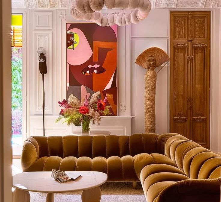
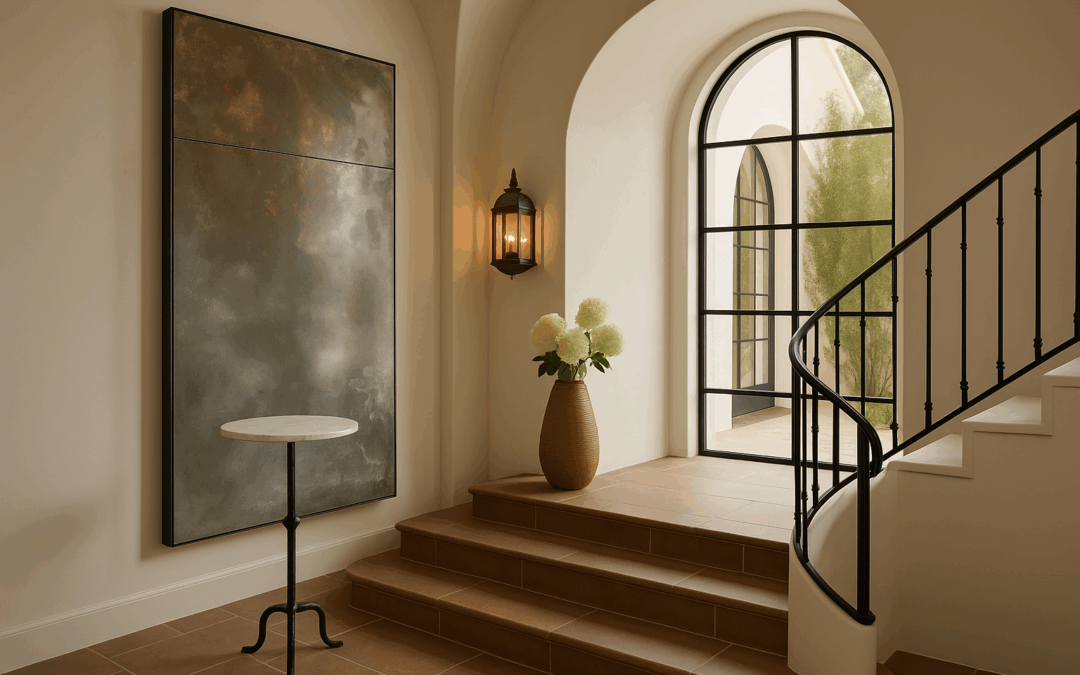
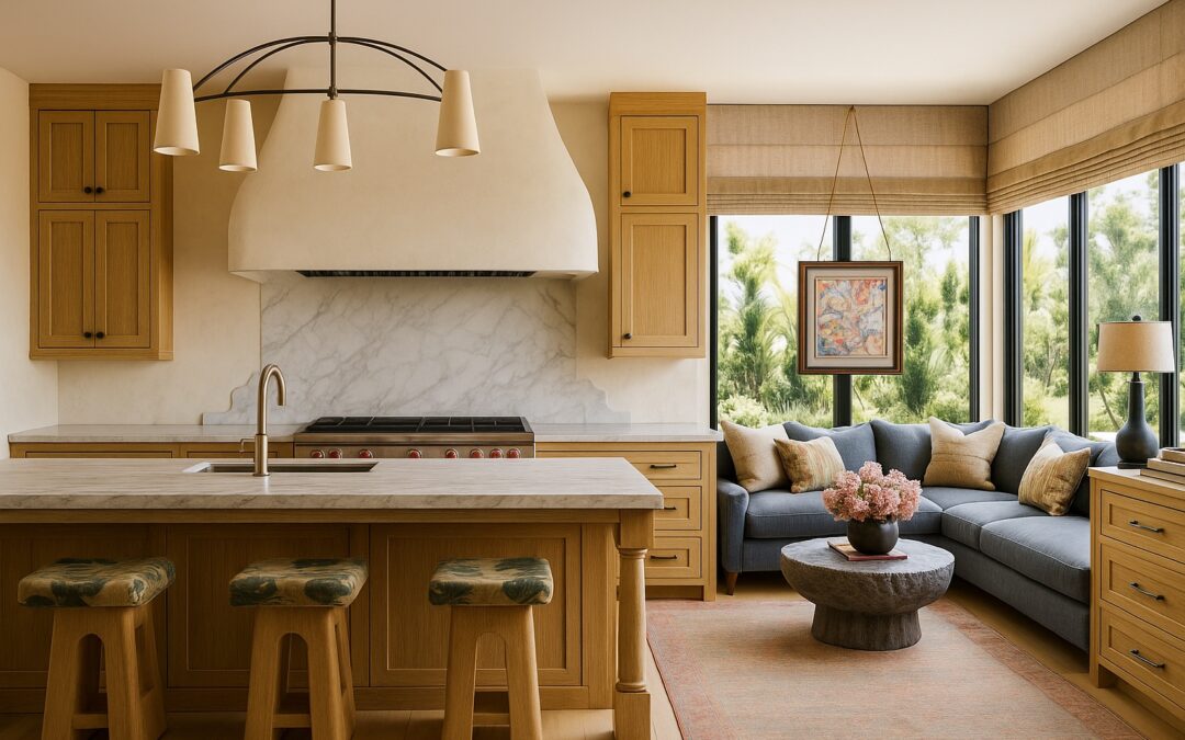
Interior design plays a significant role in influencing our well-being. Well-designed spaces can promote feelings of calmness and positivity, while poorly designed areas can evoke stress and discomfort. When it comes to our homes or workplaces, the interior design can greatly impact our mood and productivity. Colors, lighting, furniture arrangement, and overall aesthetic all contribute to how we feel in a space. A well-thought-out interior design can create a harmonious and pleasant environment that supports our well-being and enhances our productivity.

Psychological Effects of Color and Light in Design
Colors and lighting in interior design can have a significant impact on your mood and productivity. Warm colors such as red, yellow, and orange tend to evoke feelings of energy and warmth, while cool colors like blue, green, and purple often create a calming and relaxing atmosphere. Natural light sources can enhance your mood and increase your productivity, as they mimic the effects of the sun. On the other hand, artificial lighting can influence your alertness and focus depending on its intensity and color temperature. Consider these factors when designing your space to promote a positive environment.

Creating Functional Spaces for Productivity
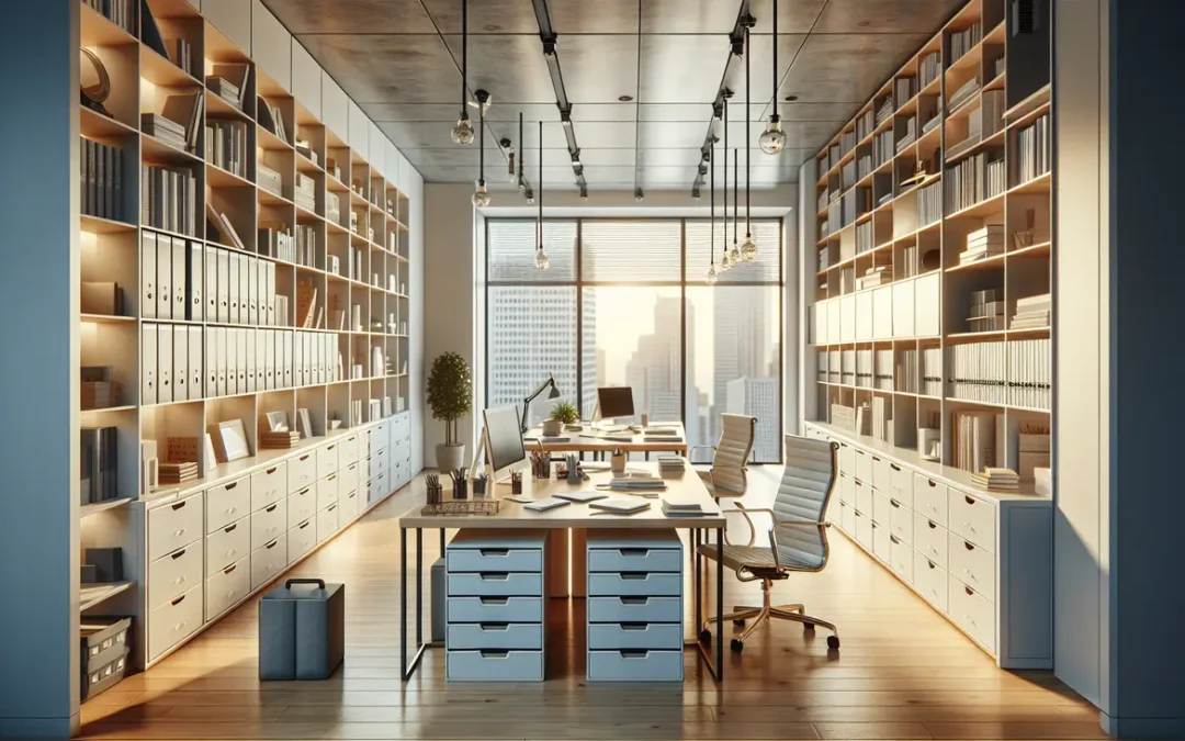
To create well thought out spaces that boost productivity, consider furniture that supports good posture and easy access to tools. Keep clutter to a minimum to prevent distractions and use natural lighting whenever possible. Plants can improve air quality and mood. Position your desk to face the door for a sense of control, include a sitting area for guests and don’t forget to personalize with items that inspire you.

Impact of Texture and Materials on Emotional Well-Being
Different textures and materials in interior design can deeply affect how we feel and work in a space. For example, rough textures may create a sense of coziness, while smooth materials can promote a modern and sleek atmosphere. Natural materials like wood and stone often bring a feeling of warmth and connection to nature. On the other hand, metallic finishes can convey a sense of sophistication and luxury. By choosing the right textures and materials, you can cultivate a space that enhances your emotional well-being and productivity.

Incorporating Nature in Interior Design
Adding elements of nature in interior design, such as plants, natural materials, and natural light, can positively impact your well-being and productivity. Research suggests that being surrounded by nature indoors can reduce stress levels, improve concentration, and increase creativity. Plants in particular can purify the air and create a sense of calm. Natural materials like wood and stone can bring a grounding and soothing effect to your space. Natural light not only saves energy but also enhances the overall ambiance of a room. Consider incorporating these natural elements to create a harmonious and rejuvenating environment in your living or working space.

Personalization and Individuality in Living Spaces
When you personalize your living space, you create a unique environment that reflects your personality and style. This individual touch can boost your well-being and productivity by making you feel more comfortable and connected to your surroundings. Adding personal touches, like photographs, artwork, or furniture that holds sentimental value, can enhance the sense of personalization in your living space. By incorporating elements that speak to your individuality, you can create a space that truly feels like your own.

Designing Workspaces for Improved Focus and Motivation
Designing a workspace that promotes focus and motivation is crucial for your well-being and productivity. Here are some simple ways to enhance your workspace:
- Ensure good lighting to reduce eye strain and boost energy levels.
- Incorporate greenery for a calming effect and improved air quality.
- Organize your space to minimize distractions and increase efficiency.
- Use color psychology to create a stimulating or soothing environment, depending on your work tasks.
By making these small changes, you can create a workspace that supports your focus and motivation throughout the day.

Elements of Interior Design that Enhance Mood
Certain elements of interior design play a crucial role in influencing your mood and productivity. Here are some key factors to consider for creating a space that positively impacts your well-being and work efficiency:
- Colors: Bright and warm colors like yellow and orange can evoke energy and positivity, while cool tones like blue and green promote relaxation.
- Lighting: Natural light enhances mood and productivity, so aim to maximize sunlight exposure in your space. Additionally, adjustable artificial lighting can help create the right ambiance for different tasks.
- Furniture arrangement: A well-organized layout that promotes movement and comfort can contribute to a sense of calm and focus. Ensure your furniture arrangement allows for efficient workflow and reflects your personal style.
Designing Workspaces for Improved Focus and Motivation
Designing a workspace that promotes focus and motivation is crucial for your well-being and productivity. Here are some simple ways to enhance your workspace:
- Ensure good lighting to reduce eye strain and boost energy levels.
- Incorporate greenery for a calming effect and improved air quality.
- Organize your space to minimize distractions and increase efficiency.
- Use color psychology to create a stimulating or soothing environment, depending on your work tasks.
By making these small changes, you can create a workspace that supports your focus and motivation throughout the day.

The Role of Organization in Mental Clarity
A cluttered space can lead to a cluttered mind. Keeping your environment organized can help clear your thoughts and improve your focus. By organizing your surroundings, you create a sense of order that can lead to increased mental clarity and productivity. Organized spaces are less distracting, allowing you to concentrate better on the task at hand. By reducing visual clutter, you can create a calmer and more peaceful environment that promotes overall well-being.

Conclusion: Harmonizing Design and Mental Wellness
Incorporating elements of nature like plants and natural light in your living or workspace can improve your mood and productivity. A study by the University of Exeter found that people working in environments with natural elements reported a 15% increase in well-being. Opt for calming colors such as blues and greens to create a serene atmosphere. Declutter your space regularly to reduce anxiety and promote mental clarity. By striking a balance between aesthetic appeal and mental well-being, you can create an environment that nurtures both your mind and productivity.

SOMETHING FOR EVERYONE
THE PIECES RACHEL RETURNS TO, AGAIN AND AGAIN