In Search of the Right Color
In a world awash with Pinterest trends and algorithm-driven aesthetics, choosing a paint color can feel oddly transactional—like swiping through a dating app and hoping for chemistry.
You hold up swatches to the light. Scroll through influencer homes. Debate with yourself at the hardware store wondering if it leans yellow, or if it’s just the fluorescent lighting playing tricks again.
And yet, the decision doesn’t feel right. Because deep down, you know:
Design—real design—is personal.
The right color doesn’t just match your countertops. It reflects your inner light. It supports the way you move through your mornings. It flatters your features in photographs and makes your home feel like a place you belong in, not just one you live in.
And one of the most powerful ways to choose color—one I use with nearly every design client—is seasonal color theory.
Why Seasonal Color Theory Belongs in Your Home
If you’ve ever had your “colors done,” you already know the foundation of this approach. Originally used in personal styling in 1980s, seasonal color theory sorts people into four families—Winter, Spring, Summer, and Autumn—based on their skin tone, eye color, and hair shade.
But this isn’t just for fashion. In interior design, your seasonal palette becomes a tool for harmony. It helps you choose paint, textiles, art, and furniture that work with you—not just your architecture.
When your surroundings echo the tones that flatter your natural coloring, something quiet but powerful happens:
you feel more radiant, more at ease, and more at home.
The Best Paint Colors for Each Seasonal Type
Let’s explore the nuances of each seasonal type and how those palettes translate into room-defining paint choices.
")
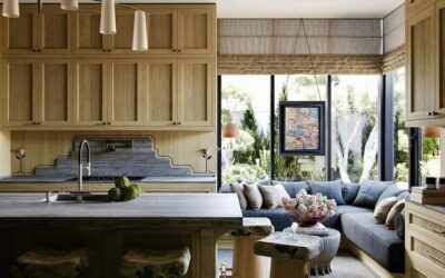
Winter Types: Cool, Bold & Dramatic
You might be: Cool Winter, Deep Winter, or Clear Winter
Color Personality: Winters are striking, high-contrast, and thrive in saturated hues. Their style leans modern, sleek, and impactful.
Top Colors for Winter:
-
Charcoal or Deep Navy – Striking for living rooms, offices, or dramatic accent walls.
-
Crisp Cool White – Perfect for trim, ceilings, or creating gallery-style contrast.
-
Emerald, Sapphire, or Ruby – Ideal for bold feature walls or lacquered cabinetry.
-
Jet Black or Graphite – Best used in moody powder rooms or chic modern kitchens.
💡 Design Tip: Winter palettes shine with glossy finishes, clean lines, and bold materials like marble, velvet, or lacquer.
🎨 Paint Tip: Try Sherwin-William’s “Tricorn Black by“ or Portola Paints “In the Navy Roman Clay” or Farrow & Ball’s “All White”.
❄️ Explore more curated inspiration on our Pinterest Board for Winter


")

Spring Types: Light, Warm & Clear
You might be: Light Spring, Warm Spring, or Clear Spring
Color Personality: Springs radiate energy, optimism, and light. Your best colors are clear, fresh, and sun-kissed.
Top Colors for Spring:
-
Creamy Butter Yellow – A cheerful yet soft neutral for kitchens, entryways, or bedrooms.
-
Peachy Coral – Perfect for feature walls or a playful powder room.
-
Mint or Soft Aqua – Brings life to a bathroom, laundry, or sunroom.
-
Warm Ivory or Buttermilk – A cozy alternative to stark white for trim or base walls.
💡 Design Tip: Pair Spring tones with brass hardware, light oak woods, floral textiles, and plenty of natural light to maximize their uplifting quality.
🌸 Explore more curated inspiration on our Pinterest Board for Spring


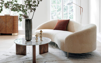
Summer Types: Soft, Cool & Muted
You might be: Soft Summer, Light Summer, or Cool Summer
Color Personality: Summers glow in delicate, powdery tones. Gravitates toward softness, romance, and subtle layering.
Top Colors for Summer:
-
Dusty Rose or Mauve – A romantic choice for bedrooms or a serene sitting area.
-
French Blue or Wisteria – Brings tranquility to bathrooms or home offices.
-
Sage Green – A modern, cool-toned neutral that pairs beautifully with natural textures.
-
Oyster Gray or Mist – Timeless and elegant for cabinetry, trim, or entire rooms.
💡 Design Tip: Accentuate Summer palettes with matte finishes, brushed nickel, antique glass, and linen upholstery for a look that’s layered but never loud.
🎨 Paint Tip: Try Benjamin Moore’s “Just Beige” or Farrow and Ball’s Oval Room or Farrow & Ball’s “Skimming Stone”
🌿 Explore more curated inspiration on our Pinterest Board for Summer


Autumn Types: Warm, Deep & Earthy
You might be: Warm Autumn, Deep Autumn, or Soft Autumn
Color Personality: Autumns feel at home in rich, nature-inspired hues. Your palette is warm, textural, and soulful.
Top Colors for Autumn:
-
Terracotta or Clay – Brings instant depth to dining rooms or cozy nooks.
-
Olive or Moss Green – A sophisticated, grounding choice for libraries or cabinetry.
-
Spiced Pumpkin or Burnt Sienna – Adds seasonal richness to accent walls.
-
Camel or Warm Taupe – A versatile, warm neutral that makes any space feel welcoming.
💡 Design Tip: Use matte or eggshell finishes, layer with natural fibers (like jute and linen), and incorporate wood tones, leather, and rattan for warmth and character.
🍁 Explore more curated inspiration on our Pinterest Board for Autumn


✨ Why It Works: Your Personal Palette, Applied to Your Home
When you walk into a room that aligns with your seasonal palette, something clicks.
The light feels right. The colors flatter your features in photographs. The energy in the space feels calm and tailored—not overstimulating, not dull. Just right. When your home’s colors align with your seasonal palette, everything begins to click. The space feels more flattering, energizing, and serene. Your seasonal palette can subtly influence your energy levels, confidence, and even the cohesion of your wardrobe and interiors.
Not sure of your palette yet?
-
Take the Color Quiz
-
Explore the Power Color Finder Tool for an advanced guide to your top 3 signature colors and the 2 shades to avoid—plus customized recommendations for home and wardrobe.
The Psychology of Alignment
There’s a moment—when the paint is dry, the light hits just right, and the color reflects not only your space but yourself—that everything clicks.
The room feels calm. The edges feel right.
The color doesn’t overpower—you glow within it.
This is what happens when design honors your natural palette. The result isn’t just aesthetic. It’s psychological. It’s subtle, supportive, and sustaining.
Paint isn’t just pigment—it’s emotional architecture. Studies show that color influences how we think, feel, and even behave. Green, for example, has been found to boost concentration and reading ability by up to 15%. Blue can lower heart rate and reduce anxiety. Yellow stimulates serotonin, improving mood and energy. Meanwhile, red can heighten alertness and stimulate appetite—hence its popularity in dining rooms.
How to Actually Pick a Color (Without Losing Your Mind)
Sample Generously: Paint a 2′ x 2′ square on each wall you’re considering. Yes, every wall. Light changes everything.
Observe in Shifts: Check the color in morning light, afternoon light, and evening lamplight. If you’re still in love after 24 hours, you have a winner.
Choose the Right Sheen: Matte for walls, eggshell for bathrooms, semi-gloss for trim. Simple rules, big impact.
Don’t Forget the Flow: Each room doesn’t need to match, but it should feel connected. Use undertones to unify.
Not Sure What Your Season Is?
🖌 Take the 3-Minute Color Quiz →
🎯 Use the Power Color Finder Tool
Rachel Blindauer is an award-winning interior and product designer based in St. Louis and Lincoln MA. Through her namesake studio, she helps clients across the U.S. create homes that feel as good as they look.
Book a Color Consultation
Whether you’re choosing a single paint color or planning an entire home refresh, I can help you translate your season into a space that feels tailored and timeless.
📆 Book a 2-Hour Elevate Consultation →
Color doesn’t just decorate a room. It defines how you feel in it. Let’s make yours work for you.
— Rachel Blindauer
Get Started Today
Let Rachel Blindauer help you think through your project starting with a consultation.
SOMETHING FOR EVERYONE
THE PIECES RACHEL RETURNS TO, AGAIN AND AGAIN