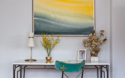
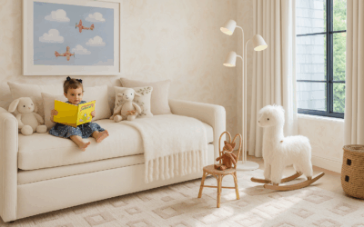
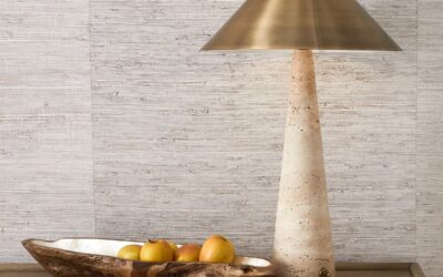
Every week, someone asks me about white paint. It is the most searched interior design question in America—and the most misunderstood. A homeowner buys a gallon of Chantilly Lace because a design blogger loved it, puts it on their north-facing dining room walls, and three weeks later calls me asking why their walls look like a hospital.
Here is what I tell them: white is not a color. It is a category containing hundreds of completely different colors, each of which will behave entirely differently depending on your light, your flooring, your furniture, your trim, and the time of day. There is no universally correct white. There is only the right white for your specific room.
Understand undertones first—everything else follows
Every white paint has an undertone: pink, yellow, green, gray, or blue. This undertone is invisible on the chip in the store and completely visible on your walls in afternoon light. Before you test a single color, you need to understand what undertone your room will amplify.
Rooms with warm natural light—south or west facing, warm wood floors, brass or bronze fixtures—will amplify warm undertones. A white with yellow or pink undertone becomes creamier and richer. A white with gray or blue undertone can look sickly or cold in these rooms. Rooms with cool, indirect light—north facing, gray stone floors, chrome fixtures—will amplify cool undertones. Before you open a paint fan deck, walk through your room at three different times: morning, midday, and at night with your actual light fixtures on. That tells you your baseline.
The whites that actually work—and when
Benjamin Moore White Dove (OC-17) is the white I specify most often. It has a soft warmth—just enough yellow undertone to feel inviting without reading cream. It works in most lighting conditions and pairs beautifully with natural wood, warm metals, and almost any neutral. If you’re paralyzed by choice, start here.
Benjamin Moore Chantilly Lace (OC-65) is brilliant—but only in rooms with abundant natural light or where you want a clean, paper-white effect. It has almost no undertone, which means it reads exactly as cold and flat in low light. Many people choose it because they’ve seen it in magazine shoots taken in sun-drenched California homes. In a north-facing Missouri living room in January, it can be brutal.
Farrow & Ball Pointing (No. 2003) works particularly well in historic homes—St. Louis Craftsmans, pre-war brick colonials, anything with original wood trim. It has enough body to look intentional against antique and vintage pieces.
Benjamin Moore Simply White (OC-117) sits between White Dove and Chantilly Lace—warmer than the latter, brighter than the former. Particularly good for trim and millwork when you want woodwork to feel clean without going stark.
The wall-trim question: match or contrast?
This depends entirely on the age and quality of your trim. In a home with beautiful original millwork—deep baseboards, built-up crown, paneled doors—I often recommend painting walls and trim the same white. This creates a monolithic effect that honors the architecture without competing with it. In a home with builder-grade trim—flat, thin, characterless—contrast can help. A warmer wall white against a brighter trim white gives the millwork more presence than it actually has.
The testing protocol that actually works
Paint large swatches—at least 12 by 12 inches—directly on the wall, in multiple spots in the room. Not on white paper, not on cardboard: on the actual wall. Look at them at 8am, noon, 4pm, and 9pm with lights on. Look at them next to your sofa fabric, your floor finish, your cabinet color. Live with them for at least four days before deciding.
This feels excessive until the moment you’re repainting a room you just painted the wrong white three weeks ago. Four days of patience saves hundreds of dollars and weeks of regret.
For finish: matte or eggshell on walls, semi-gloss on trim and millwork. The combination of matte walls and semi-gloss trim is one of the most reliable moves in residential painting.
Rachel Blindauer is an award-winning interior designer based in St. Louis with projects across the United States and internationally. Book a 2-hour consultation at rachelblindauer.com.



SOMETHING FOR EVERYONE
The pieces Rachel returns to, again and again.
Before you go
Not sure what your style is? Take the two-minute Style Quiz and I’ll send you your look.