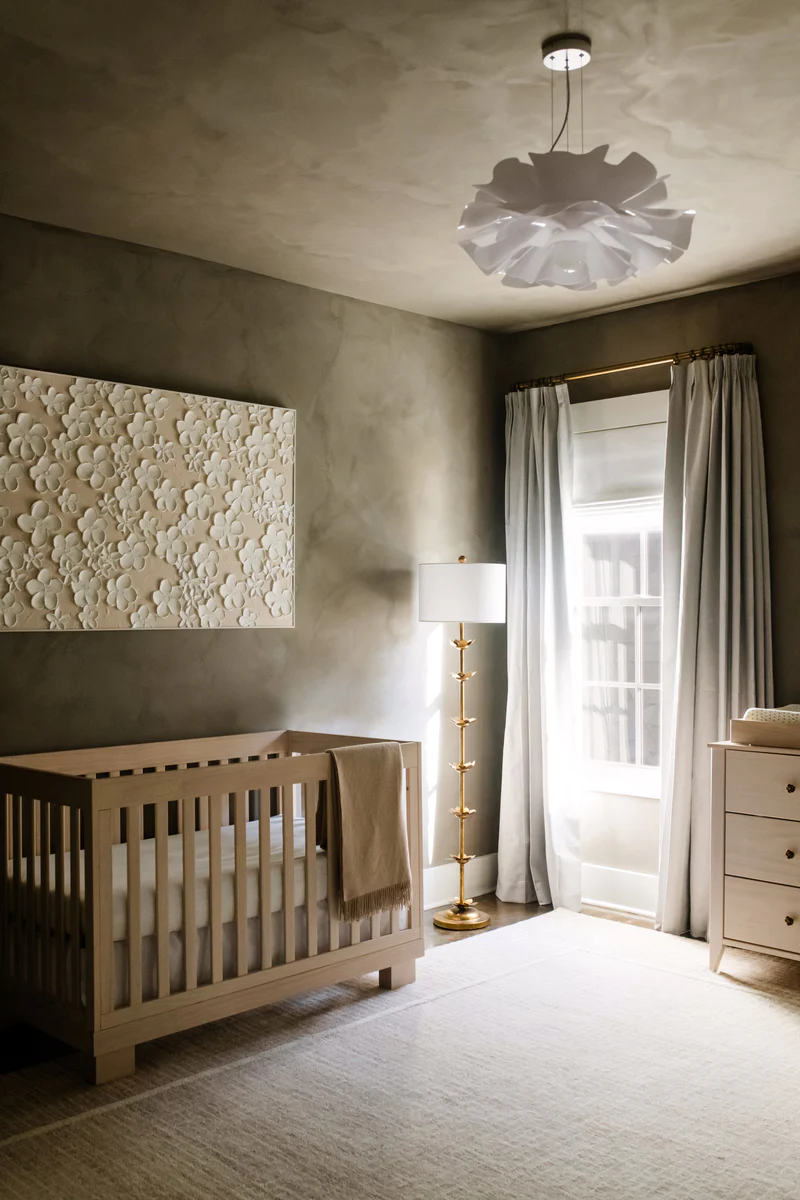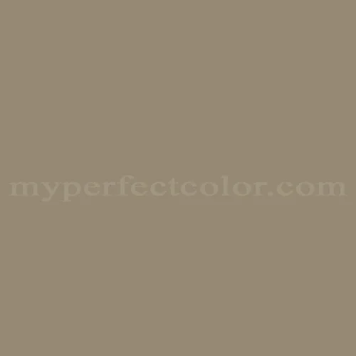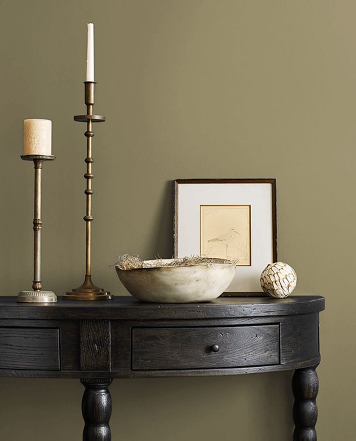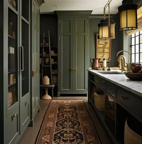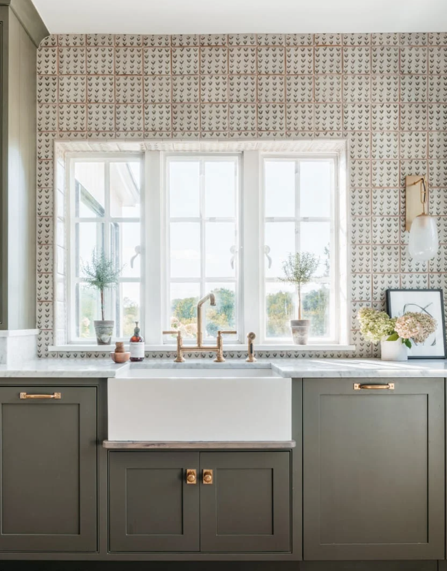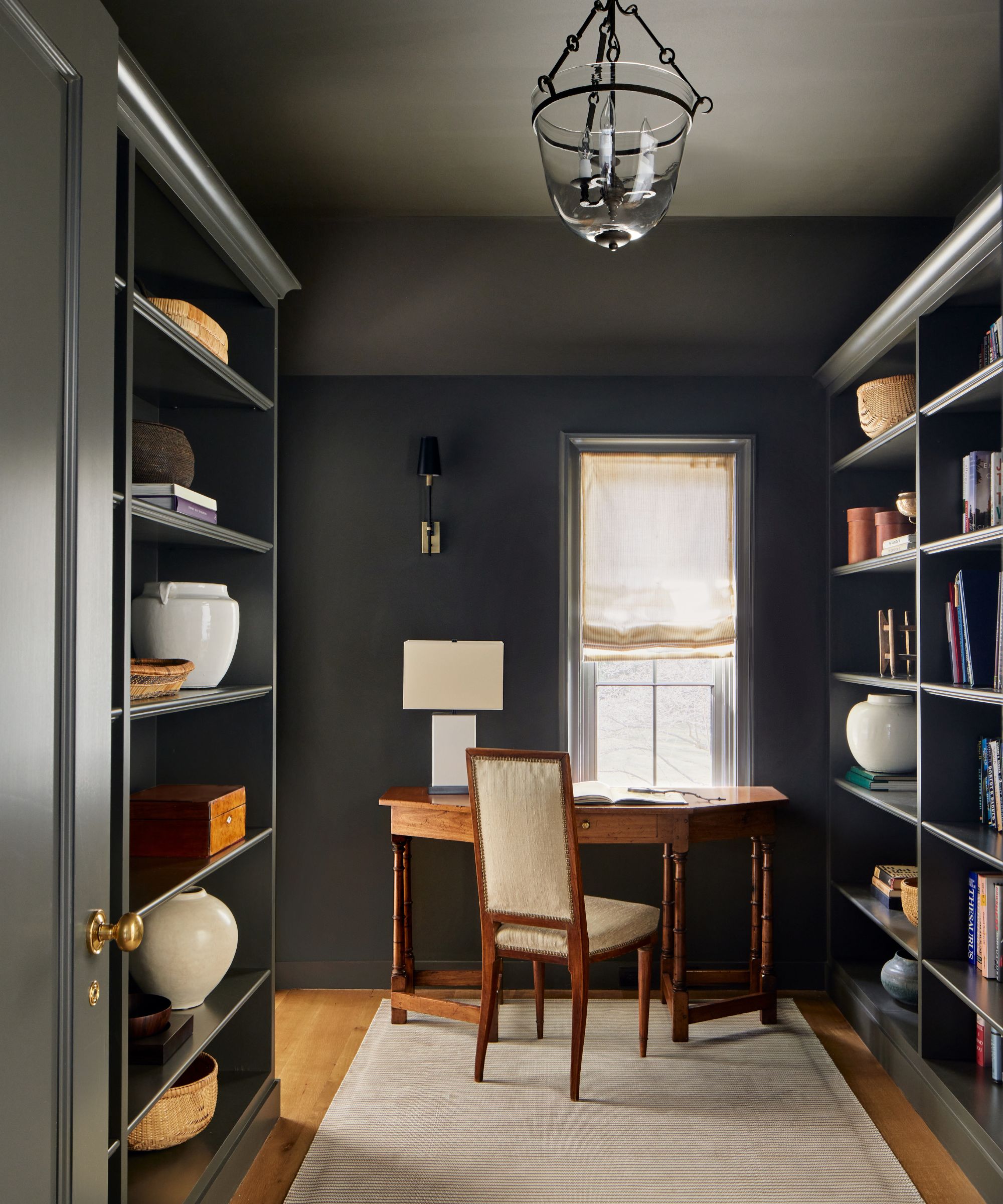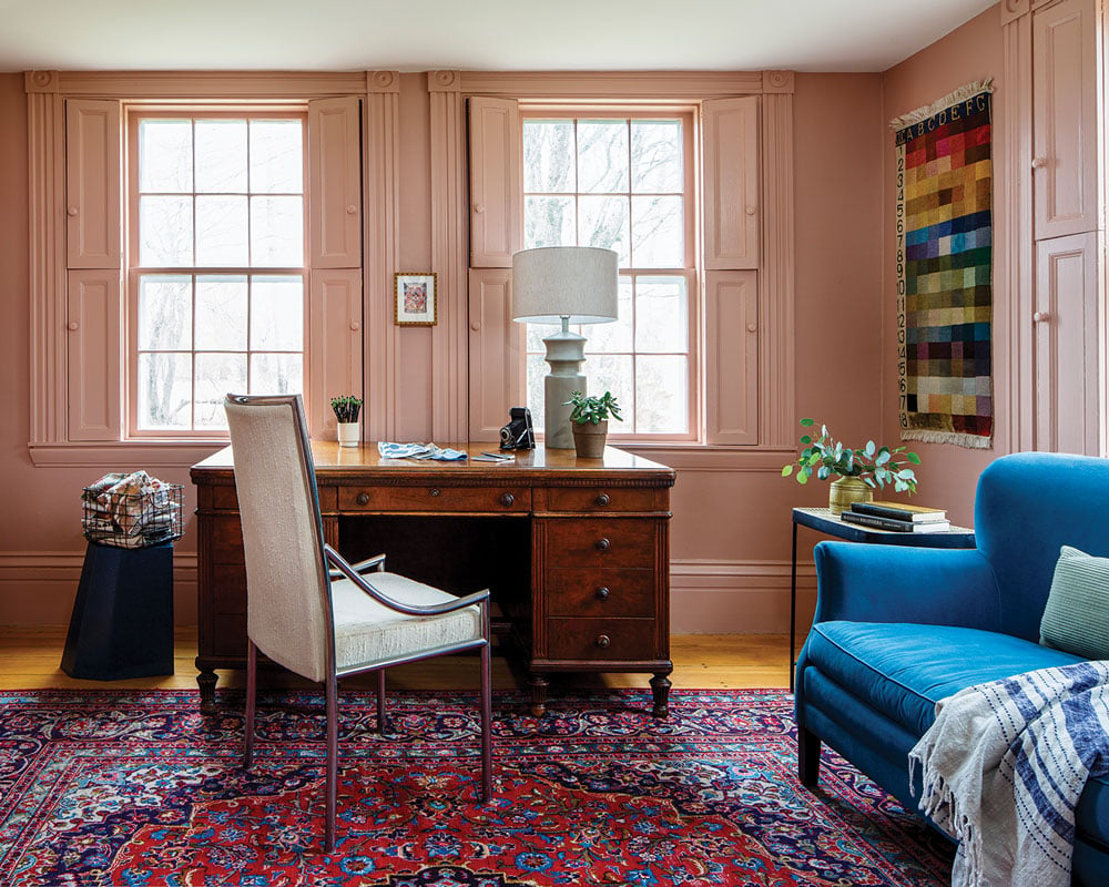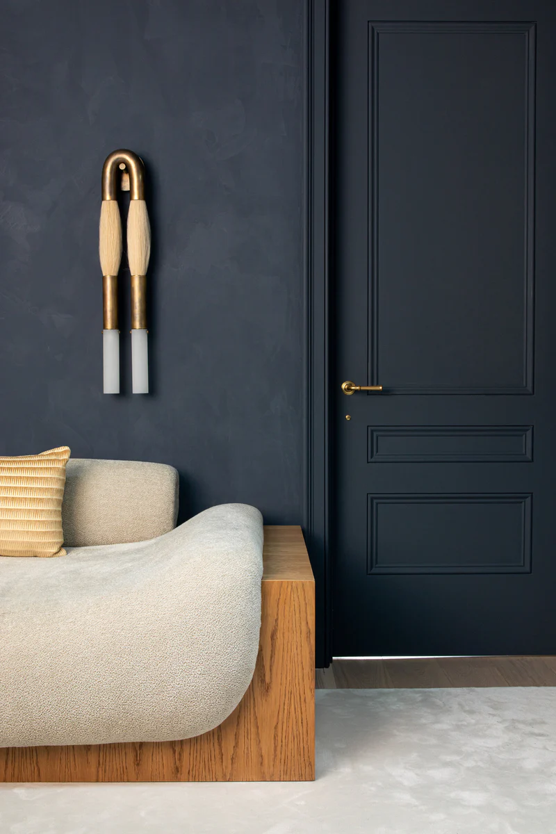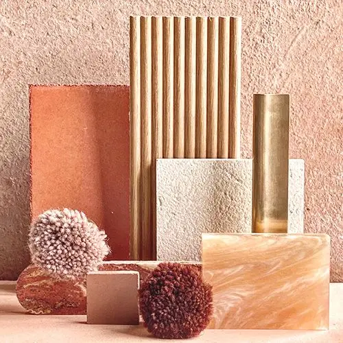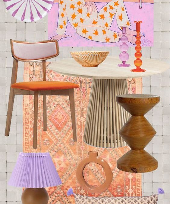
The Best Colors To Live in & Wear If You’re A Summer Color Palette

The Best Colors To Live in & Wear If You’re A Summer Color Palette

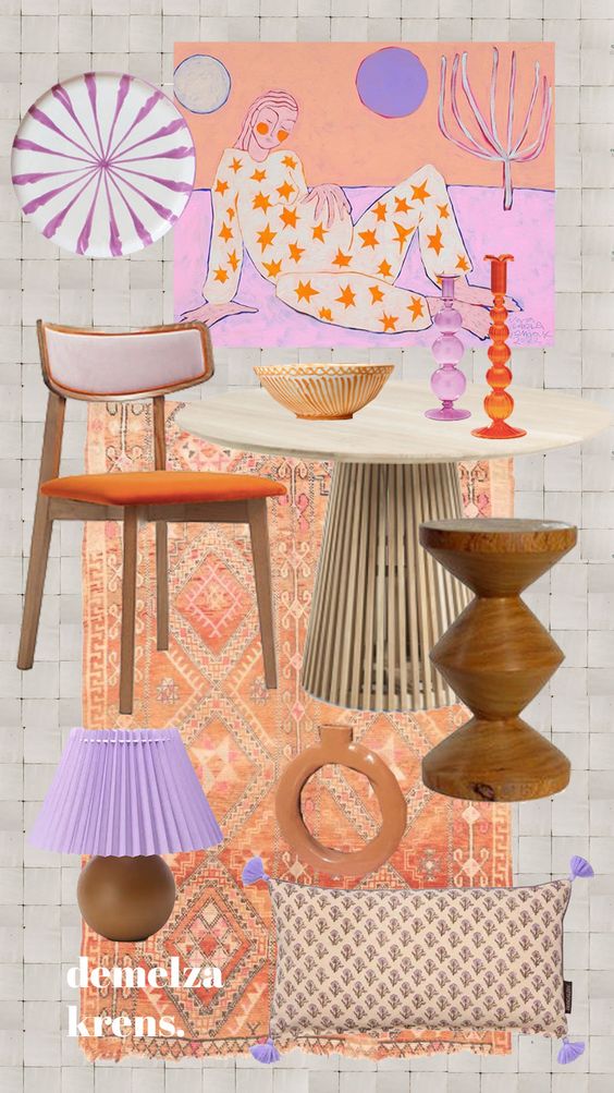
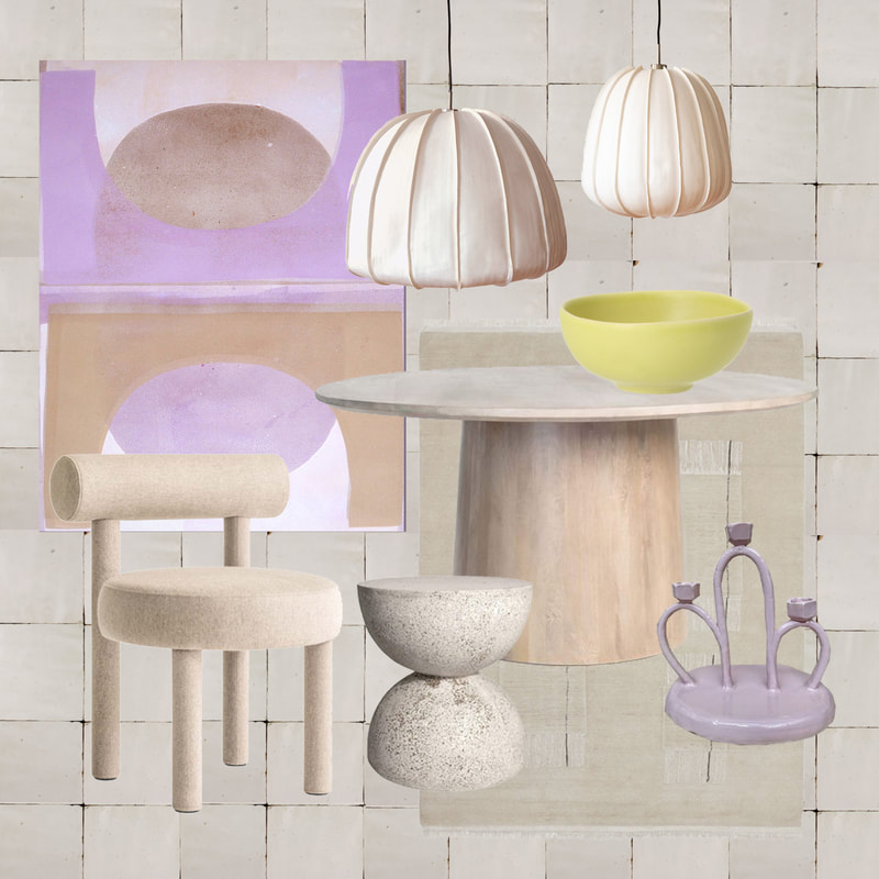
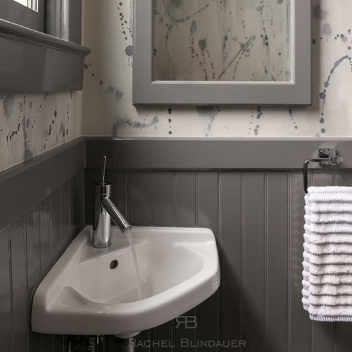
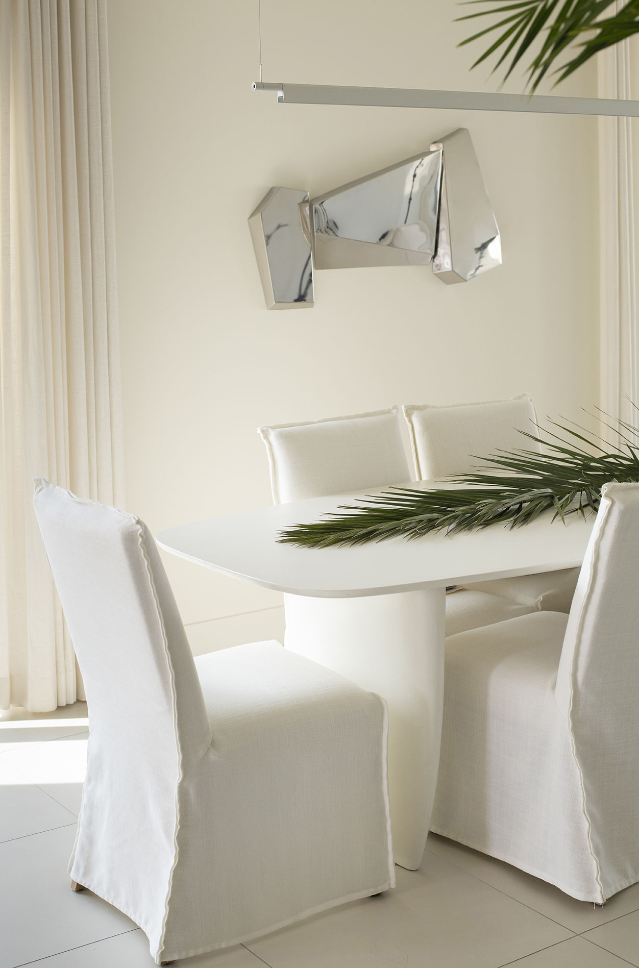
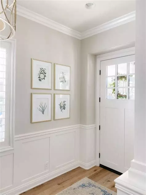
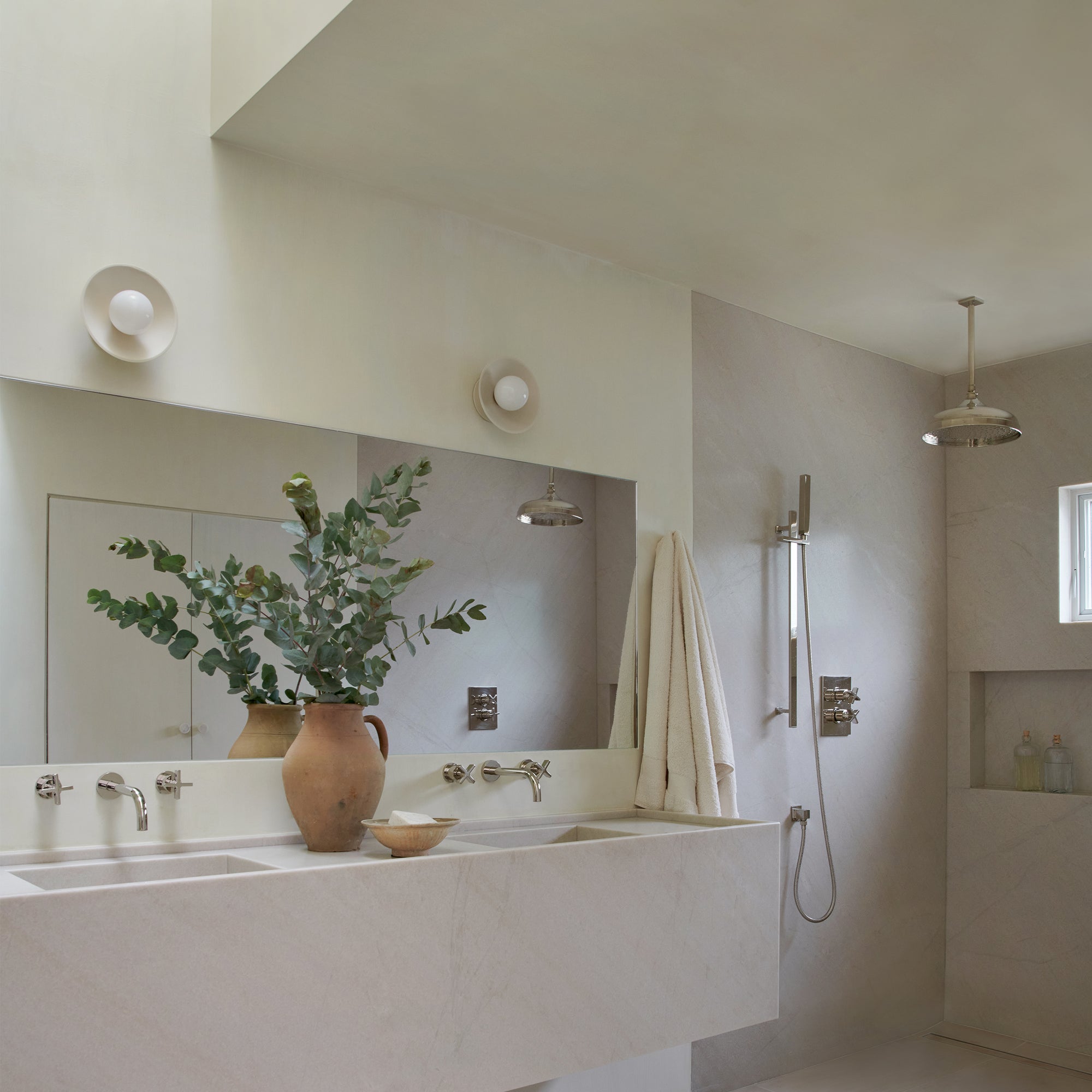
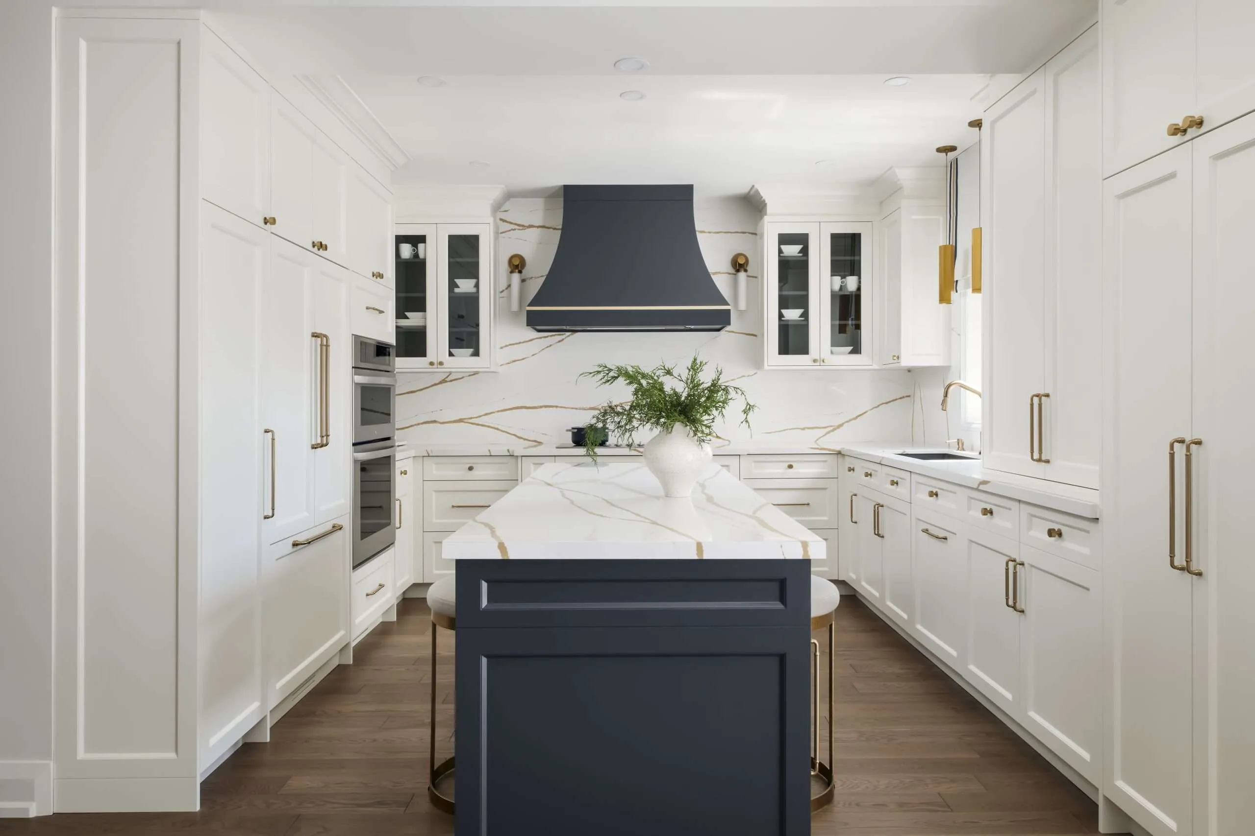
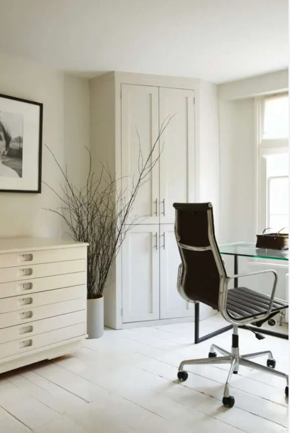
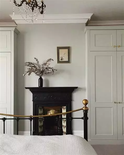
Summers are characterized by warm weather, sunny days, and vibrant energy. To complement this delightful season, it is important to choose colors that evoke a sense of freshness, brightness, and coolness. In this blog post, we will explore the best colors to live in and wear if you’re a Summer Color Palette.

Understanding the Summer Color Palette

Before diving into the specific colors, let’s understand what the Summer Color Palette represents. Summer is one of the four seasons in the color analysis system, where individuals are categorized into different color palettes based on their skin tone, hair color, and eye color. The Summer Color Palette typically features cool undertones, delicate hues, and soft shades.

Living in the Colors of Summer

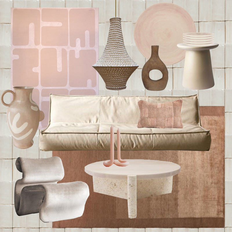
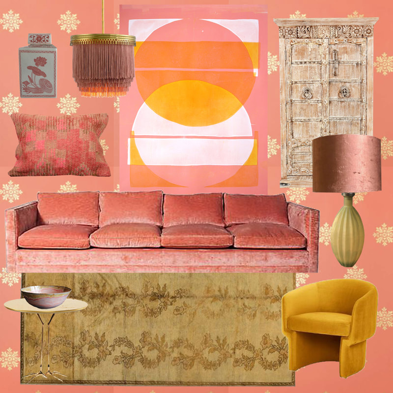
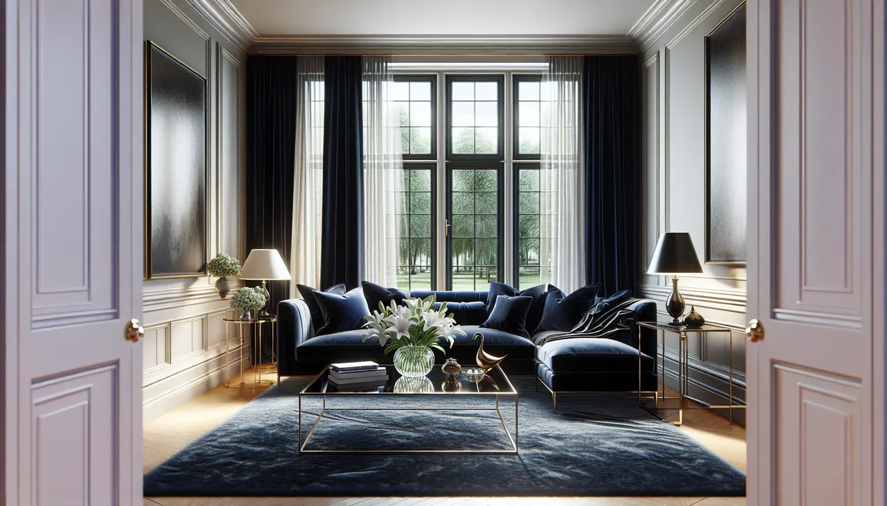
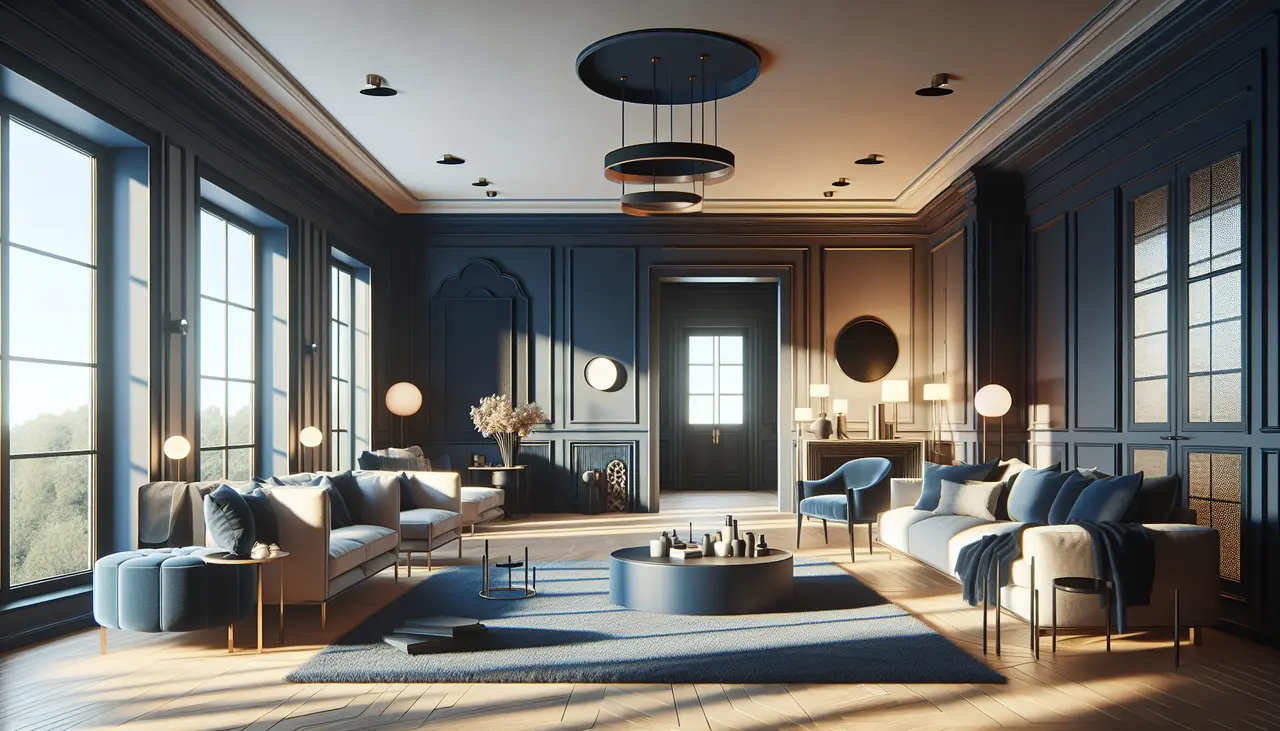
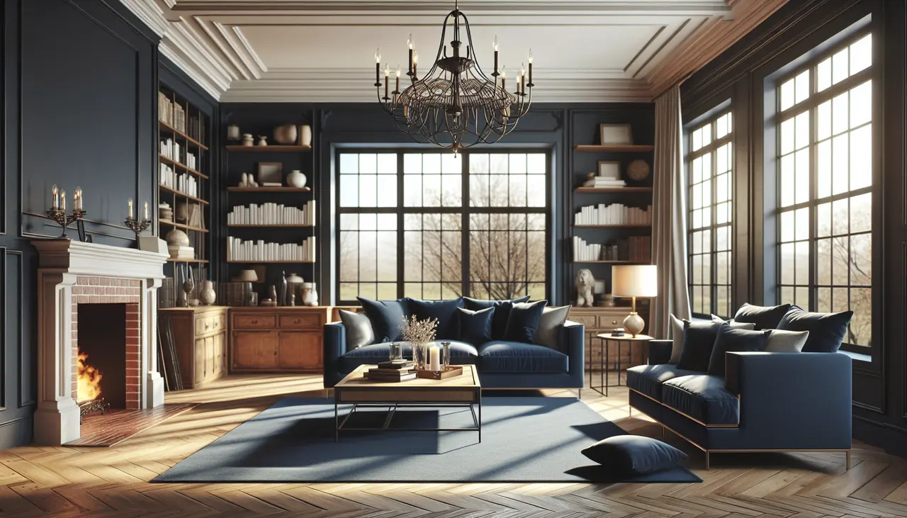
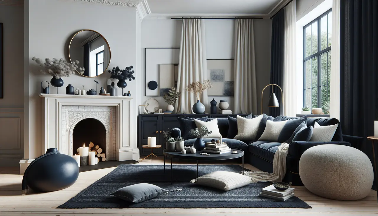
When it comes to interior design, choosing the right colors for your living space can greatly impact the atmosphere and overall vibe. Here are some of the best colors to live in if you’re a Summer Color Palette:

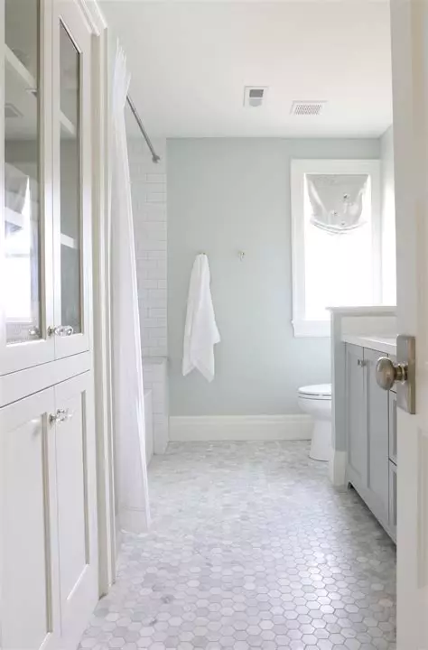
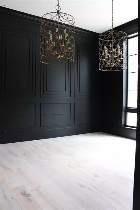
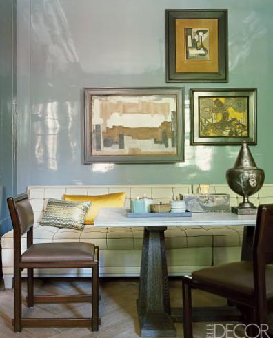
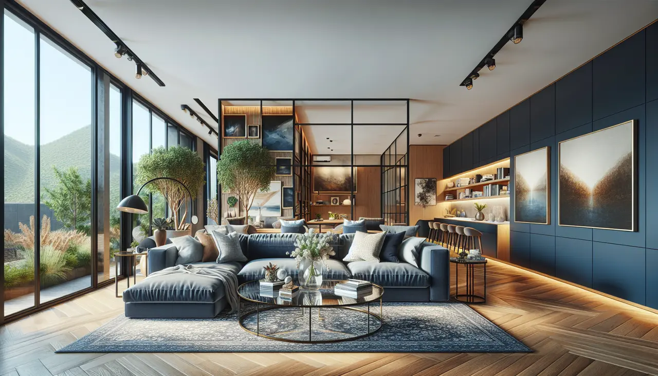
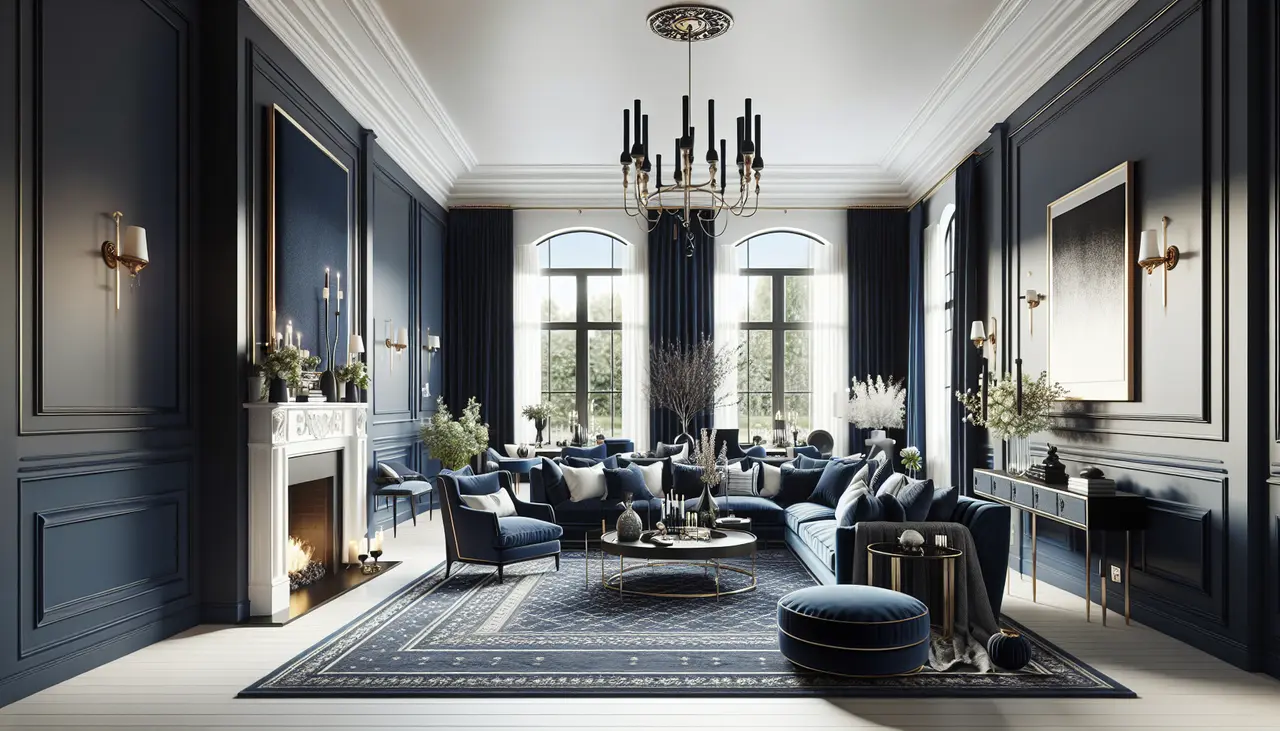
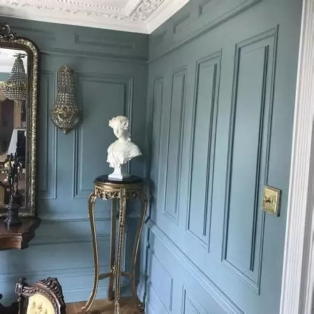
  1. Sky Blue: The color of clear summer skies, sky blue brings a sense of tranquility and calmness to any room. It pairs well with white and neutral tones, creating a light and airy ambiance.
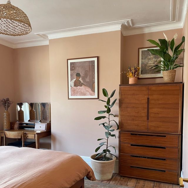
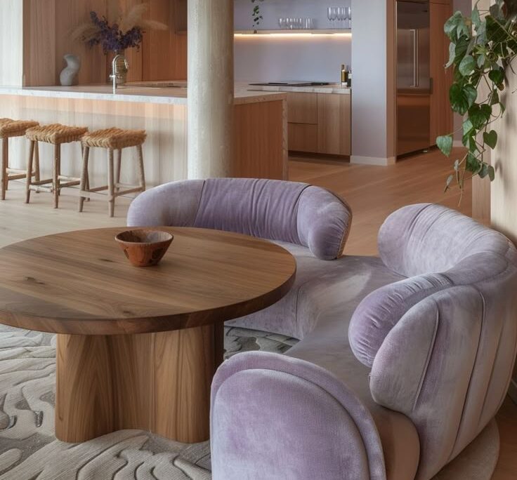
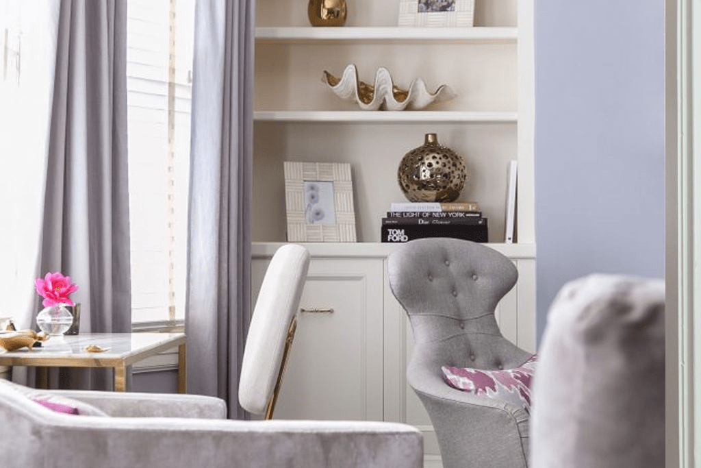
  1. Lavender: Soft and soothing, lavender adds a touch of elegance to your living space. It works well as an accent color or as the main color for a bedroom or relaxation area.
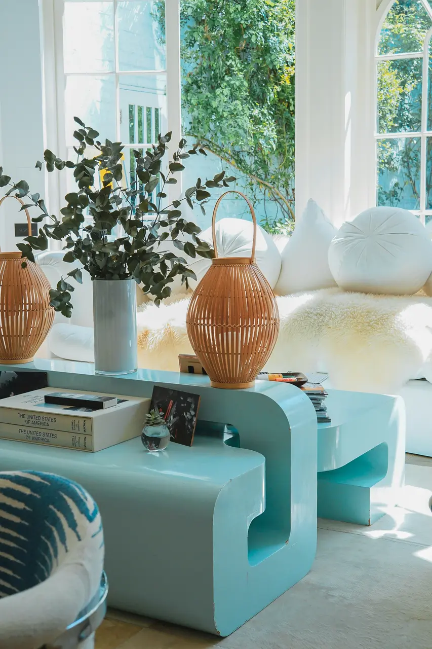
  2. Mint Green: Mint green is a refreshing color that brings a cool and rejuvenating feel to a room. It can be used as a wall color or incorporated through furniture and decor pieces.

Wearing the Best Colors for Summer

Just as colors can transform your living space, they can also enhance your personal style and appearance. Here are some of the best colors to wear if you have a Summer Color Palette:

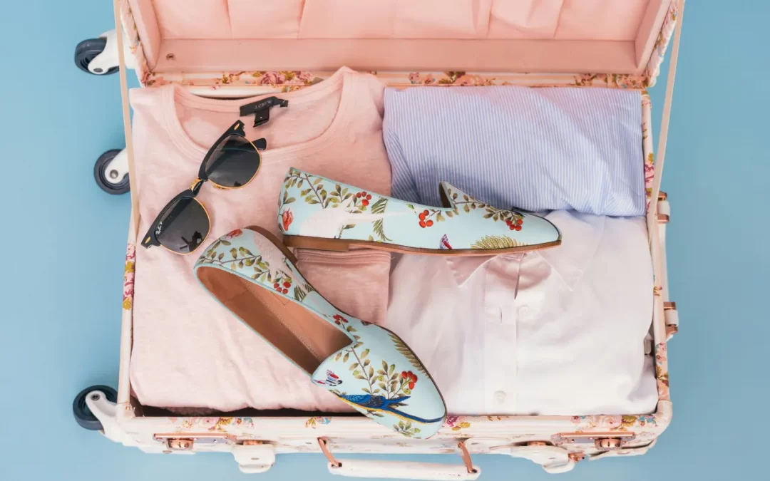
  1. Light and airy blues: Shades like sky blue or periwinkle can create a fresh and breezy look, perfect for summer outfits. Pair them with white or beige for a stylish and summery ensemble.
  1. Soft pinks: Rose quartz or salmon shades can bring a touch of femininity and elegance to your wardrobe. These colors can be worn in dresses, tops, or even accessories like scarves or handbags.
  2. Cool-toned neutrals: Dove gray or pale beige are versatile colors that can be easily incorporated into your summer wardrobe. They provide a subtle and sophisticated backdrop for other colors and patterns.Remember to consider your personal style and preferences when incorporating colors into your outfits. Experiment with different combinations and find what makes you feel confident and comfortable.

Additional Tips for Incorporating Colors

To fully embrace the essence of a Summer Color Palette, consider the following tips for incorporating colors into your living space and wardrobe:

  1. Accent pieces: Start small by adding accent pillows, drapes, or artwork that feature the soft hues of summer. These small touches can make a big impact on the overall ambiance of your home.
  1. Statement walls: If you’re feeling bold, consider painting a statement wall in one of the recommended summer colors. This can add a vibrant and energetic focal point to your living space.
  1. Furniture choices: When selecting furniture, opt for pieces in the recommended summer colors. This can create a cohesive and visually appealing look in your home.
  1. Accessories: In your wardrobe, incorporate summer colors through accessories like jewelry, handbags, or shoes. These can add pops of color to your outfits and tie everything together.

Remember, there are no strict rules when it comes to incorporating colors. Feel free to experiment, mix and match, and create a living space and wardrobe that truly reflects your personal style and embraces the beauty of the Summer Color Palette.
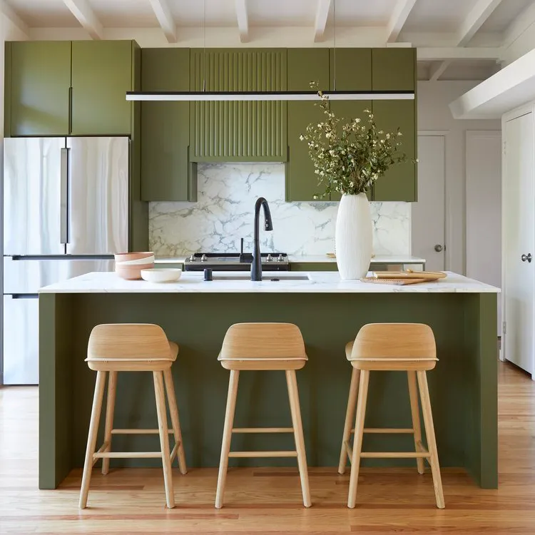
Understanding and embracing your Summer Color Palette can greatly enhance both your living spaces and personal style. By incorporating the recommended colors, you can create a harmonious environment that reflects the essence of summer.
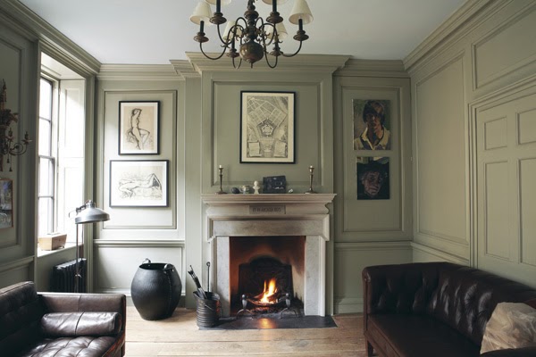
Whether you choose to live in the best colors for summer or wear them in your outfits, the key is to choose colors that make you feel vibrant, fresh, and confident. So go ahead, explore the world of summer colors, and create a space and wardrobe that truly celebrates the beauty of the season!
Take the first step towards creating your dream space. Weather you are a couple with multiple homes looking for a decorator near you, a hotelier doing a redesign, or a developer looking for top-notch interior design services near you, Rachel Blindauer and her team are here to bring your vision to life. With our wealth of experience and expertise, we can create stunning and functional spaces that exceed your expectations and bring you to a new height of design and sophistication.

Get Started Today

Let Rachel Blindauer help you think through your project starting with a complimentary consultation.

Something For Everyone

Rachel’s curated collection of furniture, decor, and kitchen items accessible through Amazon.

New Build Construction: have an interior designer on the project early

New Build Construction: have an interior designer on the project early

The importance of interior design in new build construction

When embarking upon a new build construction project, involving an interior designer from the outset can make a significant enhancement to the final look and feel of your space. By collaborating with an interior designer early on, you can ensure a cohesive and well-integrated design that aligns with your vision, enhances your daily functioning with the architecture. Interior designers bring valuable insights into optimizing space usage, enhancing functionality, and creating a harmonious aesthetic. A designers expertise can also help streamline the decision-making process, helping to avoid costly design changes later in the project. Incorporating a professional focused on the interior design scale from the beginning can ultimately result in a more cohesive, visually appealing, and functional space.

How interior designers contribute to the early project phases

In new build construction interior designers provide valuable input on layout design, material selection, and color schemes, ensuring a cohesive and aesthetically pleasing outcome. By collaborating with architects and builders from the start, interior designers can help streamline the construction process, minimize potential design conflicts, and optimize the use of space. Their expertise in spatial planning and knowledge of current design trends and building materials can ultimately lead to a more efficient and successful project.

Collaboration between interior designers and architects

Having an interior designer involved early in a new build construction project can bring multiple benefits. The collaboration between interior designers and architects helps ensure that the building’s interior and exterior are harmoniously designed, maximizing both functionality and aesthetics. Early involvement of interior designers allows them to provide input on spatial planning, lighting, and materials, ensuring that the design vision is cohesive and consistent throughout the entire project. This collaboration can lead to a more efficient use of space and optimized aesthetic appeal, ultimately contributing to a more successful and appealing end result.

Designing for functionality and aesthetics

When it comes to designing a new build construction, it’s important to consider both functionality and aesthetics. Hiring an interior designer early in the project can ensure that the space not only looks beautiful but also works well for your needs. This can include optimizing the layout for better flow, selecting durable and practical materials, and creating a cohesive design that reflects your style. Working with an interior designer from the start allows for a seamless integration of the design with the architectural plans, leading to a more cohesive and thoughtfully designed space.

Maximizing space and layout during the construction process

To maximize space and layout during the construction process, involving an interior designer early on can make a big difference. They can provide valuable input on optimizing the use of space, creating efficient layouts, ensure the size of the rooms will fit larger bedsides, double check usage requirements are provided for and ensuring a functional design that meets your needs. With their expertise, an interior designer can help you make the most of the available space, allowing for better flow and functionality within the new build construction.

Material and finish selections for new build construction

Getting the interior designer and the architect on the same page is important. Selecting materials and finishes for new build construction is a critical process that can significantly impact the final look and feel of your space. Getting an interior designer involved early in the project can help ensure that the materials and finishes chosen align with your desired aesthetic and functionality. Here are a few key considerations when making these selections:

  • The type and quality of materials can affect the durability and maintenance of your space
  • Different finishes can create distinct atmospheres within your home
  • Interior designers can provide valuable insights and access to a wider range of options
  • Early involvement of an interior designer can help maintain the overall design vision and prevent costly changes later on

Incorporating sustainable and eco-friendly design elements

Sustainable and eco-friendly design elements are important for new build construction projects. By incorporating these elements, you can reduce the environmental impact of the building and create a healthier indoor environment. Some ways to achieve this include using renewable materials such as bamboo or cork, installing energy-efficient appliances and lighting, and utilizing natural ventilation and daylight to reduce the need for artificial heating and cooling. Additionally, implementing water-saving fixtures and recycled materials can further contribute to the overall sustainability of the project. Working with an interior designer early on can help ensure that these elements are seamlessly integrated into the overall design, resulting in a more efficient and environmentally conscious building.

Budgeting and cost considerations with an interior designer

When considering budgeting and cost considerations with an interior designer for a new build construction project, it’s important to remember that hiring an interior designer early on can help you save money in the long run. Here are a few key points to keep in mind:

  1. Cost Efficiency: Working with an interior designer from the beginning can help you make informed decisions that can potentially save you money on the overall project.
  1. Budget Planning: An interior designer can help you establish a realistic budget for your project, preventing unexpected expenses down the line.
  1. Value for Money: While it may seem like an added expense upfront, the expertise of an interior designer can lead to cost-effective choices in materials, furniture, and decor, ultimately maximizing your budget.
  1. Customization: An interior designer can help you prioritize where to invest your money, customizing the design to your needs while staying within your budget.

By involving an interior designer early in the new build construction process, you can ensure that your project stays within budget and meets your vision for the space.

Communication and coordination throughout the construction process

Throughout the construction process, clear communication and coordination are essential for ensuring that the interior design aligns with the overall vision. Having an interior designer involved early on allows for seamless integration of design elements and avoids any potential conflicts with the construction timeline. This collaboration ensures that the construction team and the interior designer work together efficiently, leading to a cohesive and harmonious end result.

The benefits of early interior design involvement

Early involvement of an interior designer in new build construction can result in a more cohesive and well-planned design. It allows for seamless integration of various design elements, such as layout, lighting, and materials, creating a more harmonious and functional space. Interior designers can also provide valuable input on space utilization and aesthetic choices, ensuring that the final result meets both practical and aesthetic goals. Their early involvement can lead to cost-saving by avoiding design changes and ensuring that the built environment reflects the desired aesthetic and functional needs from the start.

Take the first step towards creating your dream space. If you are a client with multiple homes looking for a decorator near you, a hotelier doing a redesign, or a developer looking for top-notch interior design services near you, Rachel Blindauer and her team are here to bring your vision to life. With their wealth of experience and expertise, they can create stunning and functional spaces that exceed your expectations and bring you to a new height of design and sophistication.

Get Started Today

Let Rachel Blindauer help you think through your project starting with a complimentary consultation.

SOMETHING FOR EVERYONE

Rachel’s curated collection of furniture, decor, and kitchen items accessible through Amazon.

2024 Interior Design Trends

2024 Interior Design Trends

As we look ahead to 2024, let’s explore the new trends in interior design from furniture to color schemes. Based on my research of trending searches and design knowledge, here are the top 9 trends in interior design for 2024:

Embracing the Warmth of Brown

Brown couches are set to be popular in 2024 as they bring earthen warmth, hide spills/dirt and function as a warm dark neutral in room. They create a cozy and inviting atmosphere and function as a neutral that grounds the popular cream texture looks. Sofa shown by Vladimir Kegan

Curved Couches and Chairs

Embracing flowing lines and organic shapes, curved couches and chairs are becoming increasingly popular. They add a touch of modernity and sophistication to your living space while also promoting a sense of comfort and relaxation. Chair and ottoman by Rachel Blindauer’s vendor Collector Group

Stacked Tile and Brick

This trend puts a twist on the classic tile and brick pattern by stacking tiles so they are aligned horizontally and vertically creating an unexpected layout. Stacked-tile backsplashes create visual interest and add a unique touch to your kitchen or bathroom. Domomite stacked tile pictured.

Industrial Charm Gets Sophisticated

Industrial-style decor continues to be popular in 2024, but gets more sophisticated with hand hewn stone, hand hewn wood, brick and metal accents. These features add a rustic yet modern charm to your home, creating a earthen and relaxed atmosphere.

Sculptural Art + Statement Pieces

Wall-mounted sculptures offer depth and dimension, adding a unique touch to your space. Mixing artworks in a variety of finishes, textures, and shapes can create a bold statement. Statement pieces add personality and create a wow factor. Moon Light by Rachel Blindauer vendor Ben & Aja Blanc at Future Perfect.

Dynamic Range Hoods

I anticipate a greater focus on hood vent covers in 2024. Bolder designs incorporating distinct textures such as plaster or wood fluting will be popular. Pairing a dramatic hood vent with an eye-catching range can elevate the overall aesthetic of your kitchen. Custom plaster range hood pictured.

Two or Tri-Tone Color Schemes

Creating depth and complexity, two or tri-tone color schemes are among the top interior design color trends for 2024. These combinations of colors add visual interest and allow you to play with different shades and tones in your home.

A Pause From Technology

In 2024, there is a shift towards “dumb homes” where clients are seeking a break from technology. Harsh blue daylight lights, flashing led lights, tech listening in and bright touchscreens are giving way to a love of mechanical controls: old-school buttons, switches that toggle up and down, and simpler toilet washlets.

Inviting Living Rooms

So long to cold, white living rooms! Embrace a living room you can actually enjoy without worrying about accidental wine stains. Minimalism has evolved into a look that is less rigid for a more organic and inviting feel. Warm, textural spaces with natural materials in moodier, earthy color palettes. We’re moving away from bright whites and grays toward more creams, browns, rusts.

Take the first step towards creating your dream space. If you are a couple with multiple homes looking for a decorator near you, a hotelier doing a redesign, or a developer looking for top-notch interior design services near you, Rachel Blindauer and her team are here to bring your vision to life. With our wealth of experience and expertise, we can create stunning and functional spaces that exceed your expectations and bring you to a new height of design and sophistication.

Get Started Today

Let Rachel Blindauer help you think through your project starting with a complimentary consultation.

SOMETHING FOR EVERYONE

Rachel’s curated collection of furniture, decor, and kitchen items accessible through Amazon.

Interior Color Theory

Interior Color Theory

Color plays an important role in interior design, affecting everything from how the space looks to how we feel in it. It is also one of the choices many struggle with when it comes to interiors – finding the right shades and combinations to use in their home. So whether you are looking to add color to your home or just learning more about interior design, here’s a rundown of everything you need to know about color for interiors.

To understand color well, it is necessary to go back to a concept we all learnt as children – the color wheel. The color wheel, showing primary, secondary and tertiary colors, form the basis of color theory in interior design. The color wheel was originally made by Isaac Newton while attempting to learn more about the nature of light. His experiments with the prism led to the color wheel and our understanding of primary and secondary colors. Red, Yellow and Blue are three colors that combine to form every other color, and are hence known as the primary colors. The primary colors when mixed with each other give rise to secondary and tertiary colors, and the color wheel is a graphical representation of these color relationships.

WARM AND COOL COLORS

The terms ‘warm’ and ‘cool’ are used frequently in relation to color. Even lightbulbs use these terms to describe the color of the light. And in the color wheel, warm colors are represented on one side, and cool colors on the other. What do these terms mean?

The warmth and coolness of colors refers to the association of these colors with natural elements such as water and fire. This classification also offers a window into how these colors can affect and induce emotions. Colors belonging to the red and yellow family of colors such as ruby, amber, carnelian and citrine are all considered warm colors, as they invoke a warm feeling in us. These colors are generally stronger in nature, and so using them in small amounts goes a long way. The advancing nature of the colors make them a good choice for larger rooms. Cool colors on the other hand are colors that belong to the family of blues and greens, and can recreate the cool feeling of being near water and plants. Colors like azurite, emerald, jade and amethyst belong to the cool range of colors. Cool colors are receding by nature, and can be used to create calming, open spaces, and to make small rooms feel larger.

Unsplash

COLOR SELECTION

Choosing colors for interiors is a daunting task disliked by many. An abundance of color choices coupled with a lack of knowledge of how the colors will look in the space can quickly turn interior color selection into an overwhelming process. Not knowing personal color preferences can also make this harder, as it leads to a fear of disliking certain colors in the future. Make it easier to choose colors for your interiors by analysing your home and wardrobe. I find that the colors we wear and use frequently are the colors we enjoy seeing around us. An understanding of these colors can form the starting point for your color selection.

COLOR PSYCHOLOGY:

Just like how warm and cool colors can change how we feel, each of the individual colors have certain attributes and abilities that can affect how objects and rooms using these colors make us feel. The ability of the colors to impact our mood this way is known as color psychology. This characteristic can be made use of in interiors to adapt spaces for certain activities.

Unsplash

CITRINE

The happy color, citrine is associated with the warmth and brightness of sunshine. Citrine brings in positivity into the room, and is also considered a creativity inducing color. This color adds a joyful ambience to living rooms and home offices. Wallpapers, furnishing and decor are all good ways to use citrine, but it can also be used for a bright pop of color with a single piece of furniture or decor that stands out in the room. When using citrine in spaces, balance is key, as too much of the color can be anxiety inducing. To avoid this, use the color in smaller quantities in these spaces.

CARNELIAN

Carnelian is a color that reminds us of beautiful sunsets and autumn leaves. This color is bright and fresh, and brings about enthusiasm and excitement along with a sense of comfort. It is also a whimsical shade that can put us in a playful mood. The dynamic nature of this color makes it better suited for active areas of the home like the kitchen and playroom. Carnelian can be used for the flooring and backsplash in kitchens, as well as for decor. In playrooms, the color can be applied on accent walls or furniture pieces. I incorporate small amounts of carnelian into many of my interior designs in Sarasota to bring indoors the warmth and brightness of Florida.

color theory
color theory

RUBY

The warmest of the shades, ruby is a powerful color. This vibrant color is associated with passion and energy. As an active color, when used in the right amount, it can grab our attention and keep us stimulated. Use the intensity of ruby in kitchens and dining areas to stimulate appetite and energy levels. A color that signifies affection and sensuality, muted and deep shades of this color can be used in small amounts in the bedroom as well. Ruby can be introduced through cabinets and counters in the kitchen, and as part of furniture or decor in dining areas. In the bedroom, the minimal use of ruby can be best achieved through decor and artwork.

ROSE QUARTZ

Soft and comforting are some of the words often used to describe objects in rose quartz. Leaning towards the warmer end of the color spectrum, this color can bring about a playful and calm mood in a room, as well as stimulate the creative mind. As a calming and cozy color, lighter shades of rose quartz can be used in bedrooms and powder rooms. Rose Quartz is also a color that can be overpowering, and works best when balanced with other colors to create exciting combinations for living rooms and workspaces. The color can be used as part of fabrics, furnishings, and wallpapers in these rooms.

color theory
color theory

AMETHYST

Associated with luxury and mystery, Amethyst can take on multiple roles based on its intensity. Soft, light shades of the color can be used in a room for a relaxing and restful feel. Deep hues of amethyst create a sensuous and luxurious atmosphere in the room, while bold shades of the color are ideal for a dramatic look. The versatility of amethyst makes it a good choice for the bedroom, living room and the dining room. Amethyst is also good for the home office and study as it can help boost creativity. Use wallpapers, fabrics, furniture and decor to add the qualities of amethyst in these rooms. Feel free to check out a summer palate of lavender I designed here.

OBSIDIAN

A powerful neutral that makes for sophisticated spaces, obsidian is highly popular with designers. The color adds a sense of drama to a room, while being yet another great pairing for all colors. Overuse of this color can make a room feel depressing due to a lack of light. Obsidian is well suited for entryways and dining rooms, and looks glamorous with metallic finishes.

With a general idea of how colors influence our mood, the color selection process is made much simpler. Playing around with different shades and intensities of these colors as well as various color combinations can help in creating the perfect color palette for an interior.

color theory
Interior Color Theory Pearl

PEARL

A bright color that is balanced and invokes a sense of peace, pearl is the perfect combination to every color imaginable. As a neutral color, pearl works well in both passive and active spaces. An excess use of this color can create a space that feels detached, so it is ideal when combined with other colors

SAPPHIRE

A cool color, sapphire is calming by nature and brings to mind a sense of safety and stability. This color lends a relaxing ambience where it is used. A classic color that is always in style, sapphire is a strong favorite in fashion and interior design. In Sarasota and Tampa, interior designers use shades of sapphire regularly for beach interior designs. Use dark shades of the color like azurite to compose deep and bold looks, and shades of tanzanite to create formal interior spaces. Light shades of the color like turquoise can be used to calm the mind and bring in clarity, making it a good choice for bedrooms and living rooms. Sapphire makes for a beautiful color on walls, wardrobes and even bookshelves in these rooms

SophisticatedinBlueOffice

EMERALD

Emerald is a calming color that conjures up the beauty of nature in interiors. As a serene color, jade brings about a harmonious feeling in the space. Deeper hues of this color like emerald often have a rich and lush look, and can also be grounding. A cool color, jade is well suited for the passive spaces in homes like bedrooms and bathrooms. It makes a great wall color, as well as for gorgeous furniture and decor. One of the best ways to introduce the color in small amounts into space is to use houseplants, as they bring with them all the lively and natural qualities of the color.

WHITE

When it comes to deciding on how the colors need to be combined, the desired nature and feel of the room should be considered. For instance, if the intention is to create a breezy and light feeling in the room, much like Scandinavian style interiors, using airy neutrals as the base color for the ceiling and walls are ideal. Colors like pearl, selenite, citrine and celestite have an airy quality that can be utilized for this. For a room that is to be more grounded and earthy, colors like smoky quartz, tiger’s-eye, obsidian and hematite provide a good base color. As a base color, this would form the main part of the scheme, with other colors being added in where necessary. These colors can also be utilised as accents for a similar effect in the designs.

SophisticatedinBlueOffice
Interior Color Theory Pink

CONNECTING ROOMS AND COLORS

Every room in a house does not need to follow the same color scheme, and could instead have varying secondary or accent colors. In such schemes, it is important to create a continuity in the design using common colors or textures. For instance, if a living room is designed with the ceiling in an amethyst hue, and the dining room adjacent to it uses ruby on the ceiling, the color scheme can be connected by using a common color in the palette, like selenite. The color schemes can also be bridged by adding amethyst accents in the dining room – as part of the dining chairs or a rug, and ruby accents in the living room – on throws and cushions on the sofa or accessories. This would weave a common thread through the designs and make the design cohesive

60-30-10 RULE

One of the most effective ways to combine colors in an interior is to use the 60-30-10 rule. This rule is a simple ratio for using 3 colors in a room. According to this principle, 60% of an interior should use the dominant or base color, 30% should be in a secondary color and the remaining 10% should be the accent color. In a living room or bedroom, the 60% would include walls, large furniture and furnishing pieces like the bed, sofa, and area rugs. 30% of the room would be cabinetry, curtains, coffee tables and smaller pieces of furniture, while 10% of the room would be accent furniture and decor pieces like artworks, plants and accessories.

The 60-30-10 rule does not need to be adhered to completely, and can be tweaked and played around with as needed. Which part of the room makes up each of the percentages is open to interpretation, as are the number of colors used. For example, 60% of a kitchen or living room can be the walls, ceiling and flooring, or it could include the walls and a majority of the furniture or cabinets. Similarly, if the room design feels like it needs both emerald and gold as accent colors, the percentage can be modified accordingly, as long as the accent colors add up to 10% of the room.

At Rachel blindauer interior designs, I begin every design process with a color analysis. This helps me identify the colors that work best for each person. Working as an interior designer in Tampa and Sarasota, I am inspired by the surroundings, and many of my interior designs in Florida are often bright and colorful. With an understanding of the various facets of color theory, you too can effortlessly choose the colors for your interior and furniture designs.

Blue Sapphire & Amethyst

Take the first step towards creating your dream space. If you are a couple with multiple homes looking for a decorator near you, a hotelier doing a redesign, or a developer looking for top-notch interior design services near you, Rachel Blindauer and her team are here to bring your vision to life. With our wealth of experience and expertise, we can create stunning and functional spaces that exceed your expectations and bring you to a new height of design and sophistication.

Get Started Today

Let Rachel Blindauer help you think through your project starting with a complimentary consultation.

SOMETHING FOR EVERYONE

Rachel’s curated collection of furniture, decor, and kitchen items accessible through Amazon.

Color Theory – Winter, Spring, Summer, and Fall

Color Theory – Winter, Spring, Summer, and Fall

Winter, Spring, Summer, Fall. People’s complexions fall under one of these categories. I find the colors that people like to wear the most are typically the colors they love to live in. I apply this principle and one other color selection analysis for my interior design clients. When designing for a couple I take both of their palates into consideration in their individual and shared spaces.
InteriorDesignBlack&White

WINTER

If you look good in rich colors, such as navy blue, emerald green, hot pink and/or black, then the design of your space should incorporate that winter palette. Light colors that work with your skin tone are icy pastels and bright white. These people typically have dark eyes and hair. They look radiant in clear vivid cool colors but sallow in warm colors.


Colors Associated With A Winter Skin Tone:
  • Navy
  • Emerald Green
  • Hot Pink
  • Black
  • Icy Pastels
  • Optic White

SPRING

The spring palette contains clear, warm colors, some delicate, some bright – all with yellow undertones. The palette includes peach, aqua, ivory and clear blues. Spring people are blonde in childhood and their hair usually darkens with age but retains it’s golden cast though a few stay blonde naturally. Springs can have blue-green, hazel or amber eyes usually with golden tones.

Colors Associated With A Spring Skin Tone:
  • Peach
  • Aqua
  • Ivory
  • Clear Blues
  • Warm Colors With Yellow Under Tone
RachelBlindauerInteriorDesign

SUMMER

The summer palette consists of soft neutrals and pastels such as powder blue, dusty pink, mauve, lavender and pale yellow. Most summer’s have blonde light hair to dark ash brown hair and their eyes can be green hazel or occasionally rosie brown. The summer is flattered by soft colors with blue undertones.


Colors Associated With A Summer Skin Tone:
  • Soft Neutrals
  • Powder Blue
  • Dusty Pink
  • Mauve
  • Lavender
  • Pale Yellow
LilacTexturalGlamour-LivingRoom

AUTUMN

The autumn palette is full of rich spicy earth tones such as olive, orange, gold and dark browns. Most Autumn’s have brown, green or hazel eyes but a few have a blue eyes (usually redheads) and their hair has gold or red highlights.


Colors Associated With An Autumn Skin Tone:
  • Spicy Earth Tones
  • Olive
  • Orange
  • Dark Browns

Finding Your Season

When working with a client I always ask what colors you wear the most and determine what colors compliment you. Once I determine what color season you are I use that season’s palette as a starting point. This is how I am able to quickly understand what type of interior design you will flourish in. While this may be my starting point it is never the rule. Some people love all color so much they find it hard to commit to a single palette at which time the rainbow (evenly distributed) becomes the color palette.

So, take a look in your closet and find out what season you are!

Take the first step towards creating your dream space. If you are a couple with multiple homes looking for a decorator near you, a hotelier doing a redesign, or a developer looking for top-notch interior design services near you, Rachel Blindauer and her team are here to bring your vision to life. With our wealth of experience and expertise, we can create stunning and functional spaces that exceed your expectations and bring you to a new height of design and sophistication.

For further information on Rachel Blindauer’s process click here

Get Started Now!

Let Rachel Blindauer help you think through your project starting with a complimentary consultation.

SOMETHING FOR EVERYONE

Rachel’s curated collection of furniture, decor, and kitchen items accessible through Amazon.

The Best Paint Colors for Sarasota FL, San Francisco CA & Nantucket MA

The Best Paint Colors for Sarasota FL, San Francisco CA & Nantucket MA

In this comprehensive article, we will explore the world of whites and neutrals and discover the best paint colors for Sarasota FL, San Francisco CA, and Nantucket MA. Taking into account the architectural and lighting differences of each region and recommend specific shades that will elevate in those locals.

Types of Paint

All paint is not created equally. In general Portola Paints is my favorite paint brand right now because of their lime wash and roman clay finishes. They give a beautiful modeled texture.

Choose Paint Last

Paint color is always selected last in the design process so you can select a color that ties together everything in a space (a great piece of art, rug or fabric pattern are typically what initially inspires my color palates). It’s always recommended to test paint samples in the actual space before making a final decision. Always consider the interplay between natural and artificial light, architectural style, existing decor coloring, and aesthetic preferences when choosing the perfect paint color the space.
 

Best Paint Colors for Sarasota, FL

Florida’s bright sun and modern architecture calls for paint colors that complement it. In Florida we mostly do whites with various under tones because of this. Neutral colors ground color pallets, you cannot have a lot of pure color in a space without grounding it in neutrals. Yet the right white can tie together a room in a brighter way using its under tones. We recommend the following:
 
1. Swiss Coffee by Benjamin Moore: In Florida I do mostly this yellow’d white and pair it with wood and warm colored smooth cement. Do NOT do white moldings with this. All moldings if any should be in this color.
 
 
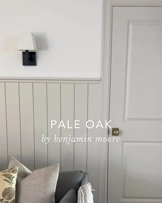
2. Pale Oak by Benjamin Moore: A yellowed and versatile neutral with a hint of greige, Pale Oak creates a serene and airy atmosphere


5. Wood Ash C2-439M by C2 Paint: This mid toned greige looks great on the exterior of a traditional home or when you pile textures, wood and different shades of greige with it. Do NOT do white moldings with this. All moldings if any should be in this color.
 
6. Sea Salt Sherwin-Williams: This soft and soothing gray-blue color evokes the tranquility of the ocean, making it a perfect choice for a coastal-inspired interiors.
 
 
8. Masquerade by Little Greene: This color is perfect cozy color for a black out curtained bedroom, a closet or a movie room.
 
 
9. Salon Drab by Farrow and Ball: A sophisticated and warm neutral tone that adds depth and richness to any space. Perfect for a darker masculine space, smoking room, game room, or more traditional space

Best Paint Colors for San Francisco, CA


San Francisco’s unique blend of Victorian architecture, young laid back modernists and blue sun cast calls for a warm darker color palette. I suggest considering the following shades:


  1. Gem in Lime Wash, Portola Paints has a soft chalky appearance
  2. Half Moon Bay Lime Wash, Portola Paints
  3. Wood Ash C2-439M by C2 Paint This mid toned greige looks great on the exterior of a traditional home or when you pile textures, wood and different shades of greige with it. Do NOT do white moldings with this. All moldings if any should be in this color.
  4. Urban Living RLUL215 Ralph Lauren (This paint is no longer available but I still match the old swatch)
  5. Avocado by Sherwin-Williams
  6. Darkside Lime Wash, Portola Paints
  7. Bancha No.298 by Farrow & Ball a lovely rich color to pair with gold and wood.
  8. Devonshire Green 1489, Benjamin Moore
  9. Dragon’s Breath 1547 by Benjamin Moore
  10. Farrow and Ball’s Salon Drab: Exuding a sense of sophistication, Salon Drab adds depth and richness to a room. It pairs beautifully with warmer shades of blue and black accents, creating a refined and elegant ambiance.
  11. Soul Mate by Benjamin Moore
  12. In the Navy Roman Clay, Portola Paints

Best Paint Colors for Nantucket, MA

 
Massachusetts, with its rich history and timeless architecture colors go darker or coastal. Think black, navy, coastal whites, geek chic and so on. I would suggest using light colors with mill work and make movie rooms, basements, etc in darker colors. The darker the color the less millwork needed, instead just use spot or art lights to light up art on the walls. Black trim, black doors, and black window panes with an optic white wood work is often preferred.
 
 
1. White Dove by Benjamin Moore: Ensure the home has millwork and use one of these whites. They work inside and outside.
 
2. All White by Farrow Ball: Ensure the home has millwork and use one of these whites. They work inside and outside.
 
3. Pale Oak by Benjamin Moore: A yellowed and versatile neutral with a hint of greige.
 
4. Repose Gray by Sherwin-Williams: A light and airy gray with warm undertones, it works on exteriors with white wood work and in kitchens when you paint the molding to match. Like white in New England pale colors need the depth of millwork to make them interesting, on flat walls I wouldn’t suggest it.
 
5. Salon Drab by Farrow and Ball: Exuding a sense of sophistication, Salon Drab adds depth and richness to a room. It pairs beautifully with warmer shades of blue and black accents, creating a refined and elegant ambiance.
 
6. Bancha No.298 by Farrow & Ball: a lovely rich color to pair with gold and wood. 


10. Coriander Seed by Benjamin Moore: A warm neutral with golden undertones, Coriander Seed brings warmth and richness to Florida homes. It complements the vibrant colors often found in the state’s tropical surroundings, creating a harmonious and inviting atmosphere.

11. Oval Room Blue by Farrow & Ball

12. In the Navy Roman Clay by Portola Paints

13. Tricorn Black by Sherwin Williams

14. Cromarty by Farrow & Ball

15. Soft Chinchilla by Benjamin Moore


It’s important to note that when choosing paint colors, the architectural style of your home should also be taken into consideration. For traditional or colonial-style homes in Massachusetts, classic colors such as cream, navy blue, or forest green are often preferred. Regardless the above colors add depth and sophistication to a room.

Take the first step towards creating your dream space. If you are looking for top-notch interior design services near you, Rachel Blindauer and her team are here to bring your vision to life. With our wealth of experience and expertise, we can create stunning and functional spaces that exceed your expectations and bring you to a new height of design and sophistication.

Get Started Today

Let Rachel Blindauer help you think through your project starting with a complimentary consultation.

SOMETHING FOR EVERYONE

Rachel’s curated collection of furniture, decor, and kitchen items accessible through Amazon.

You may also like...

Sarasota Interior Designer: My Sarasota Neighborhood, Bird Key

Sarasota Interior Designer: My Sarasota Neighborhood, Bird Key

Welcome to Bird Key, an island nestled between Downtown Sarasota and St. Armand’s Circle. With its prime location in Sarasota Bay, Bird Key offers residents a stunning waterfront lifestyle and convenience. Bird Key, is a 250-acre barrier island, boasts lush greenery, tranquil ambiance, and picturesque surroundings. If a movie was made about Bird Key it would be retires flitting back and forth to Lido beach, downtown and to the Bird Key tennis courts along meandering avenues adorned with graceful palms, bougainvillea, and vibrant hibiscus.

Multigenerational Home: How 3 generations can thrive together

Multigenerational Home: How 3 generations can thrive together

In a world where families are increasingly seeking to reconnect and reinforce bonds, the concept of a multigenerational home emerges not just as a trend, but as a heartfelt solution to modern living. Imagine a space where grandparents, parents, and children share not only meals but life’s milestones, each generation contributing its unique vibrancy under a single roof.