Create a home that grows with you from the start. Universal Design principals used during the design process create a space that is inclusive of the elderly (aka aging in place) and children resulting in a better thought out space.
The Best Paint Colors for Sarasota FL, San Francisco CA & Nantucket MA
In this comprehensive article, we will explore the world of whites and neutrals and discover the best paint colors for Sarasota FL, San Francisco CA, and Nantucket MA. Taking into account the architectural and lighting differences of each region and recommend specific shades that will elevate in those locals.
Types of Paint
All paint is not created equally. In general Portola Paints is my favorite paint brand right now because of their lime wash and roman clay finishes. They give a beautiful modeled texture.
Choose Paint Last
Paint color is always selected last in the design process so you can select a color that ties together everything in a space (a great piece of art, rug or fabric pattern are typically what initially inspires my color palates). It’s always recommended to test paint samples in the actual space before making a final decision. Always consider the interplay between natural and artificial light, architectural style, existing decor coloring, and aesthetic preferences when choosing the perfect paint color the space.
Best Paint Colors for Sarasota, FL
Florida’s bright sun and modern architecture calls for paint colors that complement it. In Florida we mostly do whites with various under tones because of this. Neutral colors ground color pallets, you cannot have a lot of pure color in a space without grounding it in neutrals. Yet the right white can tie together a room in a brighter way using its under tones. We recommend the following:
1. Swiss Coffee by Benjamin Moore: In Florida I do mostly this yellow’d white and pair it with wood and warm colored smooth cement. Do NOT do white moldings with this. All moldings if any should be in this color.
2. Pale Oak by Benjamin Moore: A yellowed and versatile neutral with a hint of greige, Pale Oak creates a serene and airy atmosphere
5. Wood Ash C2-439M by C2 Paint: This mid toned greige looks great on the exterior of a traditional home or when you pile textures, wood and different shades of greige with it. Do NOT do white moldings with this. All moldings if any should be in this color.
6. Sea Salt Sherwin-Williams: This soft and soothing gray-blue color evokes the tranquility of the ocean, making it a perfect choice for a coastal-inspired interiors.
8. Masquerade by Little Greene: This color is perfect cozy color for a black out curtained bedroom, a closet or a movie room.
9. Salon Drab by Farrow and Ball: A sophisticated and warm neutral tone that adds depth and richness to any space. Perfect for a darker masculine space, smoking room, game room, or more traditional space
Best Paint Colors for San Francisco, CA
San Francisco’s unique blend of Victorian architecture, young laid back modernists and blue sun cast calls for a warm darker color palette. I suggest considering the following shades:
- Gem in Lime Wash, Portola Paints has a soft chalky appearance
- Half Moon Bay Lime Wash, Portola Paints
- Wood Ash C2-439M by C2 Paint This mid toned greige looks great on the exterior of a traditional home or when you pile textures, wood and different shades of greige with it. Do NOT do white moldings with this. All moldings if any should be in this color.
- Urban Living RLUL215 Ralph Lauren (This paint is no longer available but I still match the old swatch)
- Avocado by Sherwin-Williams
- Darkside Lime Wash, Portola Paints
- Bancha No.298 by Farrow & Ball a lovely rich color to pair with gold and wood.
- Devonshire Green 1489, Benjamin Moore
- Dragon’s Breath 1547 by Benjamin Moore
- Farrow and Ball’s Salon Drab: Exuding a sense of sophistication, Salon Drab adds depth and richness to a room. It pairs beautifully with warmer shades of blue and black accents, creating a refined and elegant ambiance.
- Soul Mate by Benjamin Moore
- In the Navy Roman Clay, Portola Paints
Best Paint Colors for Nantucket, MA
Massachusetts, with its rich history and timeless architecture colors go darker or coastal. Think black, navy, coastal whites, geek chic and so on. I would suggest using light colors with mill work and make movie rooms, basements, etc in darker colors. The darker the color the less millwork needed, instead just use spot or art lights to light up art on the walls. Black trim, black doors, and black window panes with an optic white wood work is often preferred.
1. White Dove by Benjamin Moore: Ensure the home has millwork and use one of these whites. They work inside and outside.
2. All White by Farrow Ball: Ensure the home has millwork and use one of these whites. They work inside and outside.
3. Pale Oak by Benjamin Moore: A yellowed and versatile neutral with a hint of greige.
4. Repose Gray by Sherwin-Williams: A light and airy gray with warm undertones, it works on exteriors with white wood work and in kitchens when you paint the molding to match. Like white in New England pale colors need the depth of millwork to make them interesting, on flat walls I wouldn’t suggest it.
5. Salon Drab by Farrow and Ball: Exuding a sense of sophistication, Salon Drab adds depth and richness to a room. It pairs beautifully with warmer shades of blue and black accents, creating a refined and elegant ambiance.
6. Bancha No.298 by Farrow & Ball: a lovely rich color to pair with gold and wood.
10. Coriander Seed by Benjamin Moore: A warm neutral with golden undertones, Coriander Seed brings warmth and richness to Florida homes. It complements the vibrant colors often found in the state’s tropical surroundings, creating a harmonious and inviting atmosphere.
11. Oval Room Blue by Farrow & Ball
12. In the Navy Roman Clay by Portola Paints
13. Tricorn Black by Sherwin Williams
15. Soft Chinchilla by Benjamin Moore
It’s important to note that when choosing paint colors, the architectural style of your home should also be taken into consideration. For traditional or colonial-style homes in Massachusetts, classic colors such as cream, navy blue, or forest green are often preferred. Regardless the above colors add depth and sophistication to a room.
Take the first step towards creating your dream space. If you are looking for top-notch interior design services near you, Rachel Blindauer and her team are here to bring your vision to life. With our wealth of experience and expertise, we can create stunning and functional spaces that exceed your expectations and bring you to a new height of design and sophistication.
Get Started Today
Let Rachel Blindauer help you think through your project starting with a complimentary consultation.
You may also like...
Create a Home that Grows with You from Age 1-100
Ultimate Lighting Guide
When it comes to interior design, lighting plays a crucial role in creating the right atmosphere and enhancing the overall aesthetic appeal of your space. Whether you're renovating your home or designing a new one, it's important to understand the different types of...
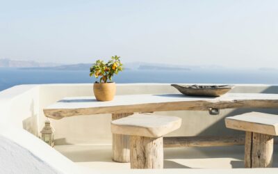
Coastal Interior Design
Picture this: a serene coastal retreat, right in the comfort of your own home. With beach interior design, you can transform any space into a coastal oasis that exudes relaxation and tranquility. Whether you prefer a minimalistic and modern look (as seen above) or a...