In this comprehensive article, we will explore the world of whites and neutrals and discover the best paint colors for Sarasota FL, San Francisco CA, and Nantucket MA. Taking into account the architectural and lighting differences of each region and recommend specific shades that will elevate in those locals.
Types of Paint
Choose Paint Last
Best Paint Colors for Sarasota, FL
Best Paint Colors for San Francisco, CA
San Francisco’s unique blend of Victorian architecture, young laid back modernists and blue sun cast calls for a warm darker color palette. I suggest considering the following shades:
- Gem in Lime Wash, Portola Paints has a soft chalky appearance
- Half Moon Bay Lime Wash, Portola Paints
- Wood Ash C2-439M by C2 Paint This mid toned greige looks great on the exterior of a traditional home or when you pile textures, wood and different shades of greige with it. Do NOT do white moldings with this. All moldings if any should be in this color.
- Urban Living RLUL215 Ralph Lauren (This paint is no longer available but I still match the old swatch)
- Avocado by Sherwin-Williams
- Darkside Lime Wash, Portola Paints
- Bancha No.298 by Farrow & Ball a lovely rich color to pair with gold and wood.
- Devonshire Green 1489, Benjamin Moore
- Dragon’s Breath 1547 by Benjamin Moore
- Farrow and Ball’s Salon Drab: Exuding a sense of sophistication, Salon Drab adds depth and richness to a room. It pairs beautifully with warmer shades of blue and black accents, creating a refined and elegant ambiance.
- Soul Mate by Benjamin Moore
- In the Navy Roman Clay, Portola Paints
Best Paint Colors for Nantucket, MA
10. Coriander Seed by Benjamin Moore: A warm neutral with golden undertones, Coriander Seed brings warmth and richness to Florida homes. It complements the vibrant colors often found in the state’s tropical surroundings, creating a harmonious and inviting atmosphere.
11. Oval Room Blue by Farrow & Ball
12. In the Navy Roman Clay by Portola Paints
13. Tricorn Black by Sherwin Williams
15. Soft Chinchilla by Benjamin Moore
It’s important to note that when choosing paint colors, the architectural style of your home should also be taken into consideration. For traditional or colonial-style homes in Massachusetts, classic colors such as cream, navy blue, or forest green are often preferred. Regardless the above colors add depth and sophistication to a room.
Take the first step towards creating your dream space. If you are looking for top-notch interior design services near you, Rachel Blindauer and her team are here to bring your vision to life. With our wealth of experience and expertise, we can create stunning and functional spaces that exceed your expectations and bring you to a new height of design and sophistication.
Get Started Today
Let Rachel Blindauer help you think through your project starting with a complimentary consultation.
SOMETHING FOR EVERYONE
Rachel’s curated collection of furniture, decor, and kitchen items accessible through Amazon.
You may also like...

Multigenerational Home: How 3 generations can thrive together
In a world where families are increasingly seeking to reconnect and reinforce bonds, the concept of a multigenerational home emerges not just as a trend, but as a heartfelt solution to modern living. Imagine a space where grandparents, parents, and children share not only meals but life’s milestones, each generation contributing its unique vibrancy under a single roof.
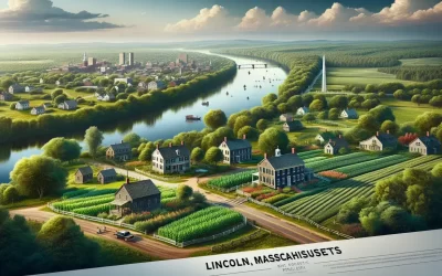
Lincoln Massachusetts Interior Designer
Discover Lincoln, Massachusetts through the eyes of an interior designer. This charming town, located in Middlesex County just northwest of Boston, is a hidden gem that offers a unique blend of natural beauty, historical significance, and a vibrant community. From its picturesque landscapes to its rich heritage, there is something for everyone in this idyllic town.
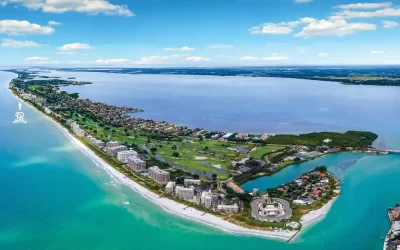
My Sarasota Neighborhood: Long Boat Key Interior Designer
Nestled on the breathtaking Gulf coast, Long Boat Key offers a slice of paradise with its serene beaches, luxurious lifestyle, and enchanting sunsets. This charming Sarasota neighborhood is a haven for those seeking tranquility amidst Florida’s natural beauty.