The Psychology of Color in Interior Design: How Hue Shapes Mood, Memory, and Meaning

The Psychology of Color in Interior Design: How Hue Shapes Mood, Memory, and Meaning

There are rooms that calm you on contact. Others energize you. And then there are spaces you can’t explain—you just feel good in them.

That feeling isn’t accidental. It’s not just about square footage or expensive furniture. More often than not, what you’re responding to is something invisible but deeply powerful: color.

As an interior designer, I work with color the way some work with scent or sound. It’s a mood-setter, a storyteller, a subconscious message to the people who live there. And the difference between a house that photographs well and one that actually feels like home often comes down to how color is used—not just aesthetically, but psychologically.

Purple Brown Dining Area Interior Design

Why Color Affects Us (Even When We Don’t Notice)

Color impacts how we feel long before we process it logically. Studies show that certain hues can affect heart rate, cortisol levels, focus, and even appetite. But beyond biology, there’s also memory, culture, and personal association: a yellow kitchen that reminds you of your grandmother’s pie crust, a navy bedroom that makes you feel safe, a green office that clears your mind.

Color isn’t neutral. But it can be intentionally grounding.

The Emotional Palette: What Different Hues Signal in the Home

Blue—Often associated with calm, intelligence, and trust. Pale blues open up a space. Deep navies can ground it. Perfect for bedrooms, offices, or anywhere you need to exhale.

Green—Balances the nervous system. Evokes nature, wellness, and stability. Great for living spaces, kitchens, and entryways where you want to feel connected.

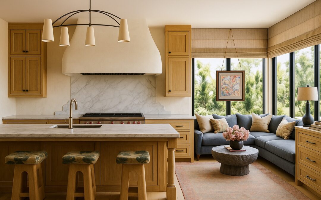
Yellow—Bright, social, and energetic. In small doses, it’s uplifting. In excess, it can agitate. I use yellow strategically—a mustard velvet pillow, a ochre backsplash, not a whole wall.

Red—Intense and visceral. Best reserved for accents—a lacquered cabinet, a wine-colored rug. In the right setting, it can feel romantic and bold.

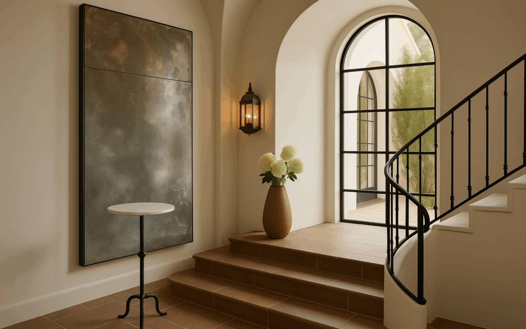
Neutrals—Not boring. Just subtle. Warm whites and layered taupes can create quiet, layered spaces that feel expensive without effort.

Black—Yes, black. It adds contrast, depth, and sophistication. I often use it in powder rooms, window mullions, or sculptural lighting. (You can find some of my favorite black-accented decor in the shop.)

Using Color to Match Energy—Not Just Style

Designers often talk about color in terms of style: modern, coastal, bohemian. But the better question is: how do you want to feel in this space? Safe? Inspired? Grounded? Awake?

That answer tells me more than a Pinterest board ever could.

In my consultations, I often ask clients to describe their energy goals for each room. From there, we layer in hue, material, and light to create a space that supports the way they live. Because true design isn’t just visual. It’s behavioral.

The Couples Conundrum: When Two Palettes Collide

Color is personal. And when designing for couples, it’s not uncommon to find clashing emotional associations. One partner may feel calm in gray. The other may find it depressing. The solution isn’t compromise. It’s layering.

I build palettes that bridge both nervous systems. Softening edges with texture. Finding tonal overlap. Adding depth through neutrals that can stretch across both personalities. Because the most successful rooms aren’t designed for one person. They’re curated for connection.

Small Changes, Big Impact

You don’t need to repaint your entire home to benefit from color psychology. Often, a shift in one hue—a new rug, a deeper cabinet, a warmer lightbulb—can change how a room feels.

I designed this whole collection with color harmony in mind. You’ll find pieces that pair beautifully with every seasonal palette, but more importantly, create a mood that lasts.

Final Thought: Color as a Mirror

Color isn’t decoration. It’s identity. It reflects back who we are, what we need, and how we want to feel. When used with intention, color creates alignment. Between your space and your self.

And in that alignment, something beautiful happens: your home begins to feel like it knows you.

2 Hour Interior Design Virtual or In Person Consultation

SOMETHING FOR EVERYONE

THE PIECES RACHEL RETURNS TOAGAIN AND AGAIN

The Objects That Make a Room: Why Intentional Accents Matter More Than You Think

The Objects That Make a Room: Why Intentional Accents Matter More Than You Think

In a world where trends fade faster than you can pin them, the pieces that stay—the ones you keep moving from house to house—aren’t just beautiful. They’re personal, textured, and quietly powerful.

There’s a reason the best rooms don’t look overdesigned. They carry the soul of the collector, not the decorator.

As a designer who’s walked through homes in Nantucket and Naples, San Francisco and St. Louis, I can tell you: It’s not always the furniture that makes a space sing. It’s the supporting cast—the quietly sculptural lamp, the hand-formed vessel, the napkin that feels like a linen dress. These aren’t afterthoughts. They’re intention made tangible.

When I designed the shop, I didn’t want a warehouse of trendy things. I wanted to build a collection of what I personally reach for—pieces with presence. Items that hold a room’s energy the way good art does. You’ll notice natural materials, heritage craft, and a throughline of subtle texture: abaca, raw brass, stoneware, seeded glass, and Belgian linen, to name a few.

But why do these matter?

The Anthropology of a Well-Styled Home

Across time and culture, the home has been more than shelter—it’s a stage for meaning. From Japanese tokonoma alcoves (meant to highlight a single treasured object) to the 18th-century French concept of objets de vertu (decorative items made with exceptional skill), we’ve always curated what we surround ourselves with.

The modern home should do the same. It should reflect more than what’s trending. It should show who you are.

Objects carry memory. They express mood. They allow contrast to live within harmony. That scalloped placemat that softens your concrete dining table. The blown-glass pendant that casts shadows like poetry. The bracelet on your nightstand that catches morning light. These are not “decor”—they are emotional cues.

And when you’re designing with longevity in mind, these cues matter more than ever.

How I Use Accents to Elevate a Room

Design isn’t just about big gestures. In fact, the most expensive homes I’ve worked on didn’t flaunt their budgets—they whispered. A few styling rules I come back to again and again:

  • Contrast sharp lines with soft finishes. If your furniture is angular, add curve through a sculptural bowl or rounded sconce.

  • Ground neutral palettes with tactile depth. That means choosing real textures over flat imitations: think handwoven abaca or linen with visible slubs.

  • Balance modern restraint with handmade imperfection. A modern plaster pendant feels even more special next to a hand-glazed ceramic lamp.

  • Layer with intent. One artfully placed object has more impact than five cluttered ones.

If you’re feeling unsure where to start, begin small. A braided table mat, a woven mirror, or a linen napkin can shift the entire tone of your space. And all of those are available now in the shop I personally curated for people who want their homes to feel intentional, not just filled.

Explore artisan-made accents at shop.rachelblindauer.com →

What to Buy—and Why It Lasts

Every object I select has a reason behind it. Here are a few favorites that show how design and soul coexist:

When Styling Gets Stuck, Begin with Story

If your room feels incomplete, it’s usually not the sofa’s fault. It’s that the room lacks punctuation. A well-placed object adds visual rhythm. It slows the eye. It offers a pause, or a point of entry.

Your home deserves to feel layered over time—not manufactured overnight. That’s why I built this shop the way I design rooms: with restraint, clarity, and a touch of poetic edge.

Whether you’re starting from scratch or layering into an existing space, the right accents make all the difference. You don’t need more. You need the right few.

Shop the Curated Collection →

Objects are more than items. They are atmosphere. And the right ones turn a house into a feeling.

2 Hour Interior Design Virtual or In Person Consultation

SOMETHING FOR EVERYONE

THE PIECES RACHEL RETURNS TO, AGAIN AND AGAIN

Kitchen Island vs. Peninsula: Designing for How You Really Live

Kitchen Island vs. Peninsula: Designing for How You Really Live

“Choosing between a kitchen island and a peninsula isn’t just a matter of style—it’s a matter of choreography. How do you move? Where do you gather? What does your space need to support the life you’re actually living?”
— Rachel Blindauer

In the world of kitchen design, few decisions carry as much weight—or as much nuance—as the choice between an island and a peninsula. It’s a question I encounter often in my design consultations, but it’s rarely about trends or surface aesthetics. It’s about rhythm. Flow. The kind of space that doesn’t just function—but supports a way of life.

Both islands and peninsulas offer utility, visual interest, and opportunities for layered design. But which one belongs in your home depends not on Pinterest boards, but on how your space actually moves.

Let’s unpack both options—what they offer, where they shine, and how to know which one truly fits.

Kitchen Living Seating Area

What Is a Kitchen Island?

A kitchen island is a freestanding work surface, typically centered in an open-concept floor plan. It’s accessible from all sides, offering a 360-degree moment of utility and interaction.

This isn’t just extra counter space—it’s often the kitchen’s command center. Islands can house sinks, wine fridges, pull-out drawers, integrated storage, or cooktops. They invite guests to linger and conversations to unfold naturally, blurring the line between host and home chef.

In my own design portfolio, I’ve used islands to sculpt visual symmetry in large kitchens or to anchor an otherwise undefined layout. They’re often paired with pendant lighting to create both function and atmosphere (see more in my portfolio).

What Is a Kitchen Peninsula?

A kitchen peninsula is essentially a connected cousin to the island—attached at one end to the wall or cabinetry, forming an L- or U-shaped layout. It can still offer seating, storage, and prep space, but does so with a smaller footprint.

While less sculptural, the peninsula is often more spatially efficient. It serves as a natural boundary between kitchen and adjacent rooms, which is especially useful in open-concept homes that need subtle definition without closing off space.

For galley kitchens or renovation projects, I often recommend peninsulas as a high-impact, budget-conscious solution. They allow us to retain existing plumbing and cabinetry—while dramatically improving flow and form.

When to Choose a Kitchen Island

Choose an island when your kitchen layout allows for generous clearance—ideally 42–48 inches around the perimeter. This ensures that movement around the island remains fluid and doesn’t interrupt the functional “work triangle.”

Islands are ideal for:

  • Open floor plans that benefit from a visual anchor

  • Homes where entertaining is frequent and central

  • Families who want multi-functional prep, dining, and homework zones in one

  • Design lovers seeking a sculptural centerpiece

From a material perspective, islands also invite bold choices—waterfall countertops, slab stone, or mixed materials like wood and honed marble can all elevate the visual impact. Many of these finishes are available through our curated selections at shop.rachelblindauer.com.

Kitchen Shelves & Wood

When to Choose a Kitchen Peninsula

Choose a peninsula when space is tighter—or when you’re working within a more traditional floor plan. Peninsulas can be brilliant in transitional layouts where a bit of separation is desired without enclosing the kitchen completely.

Peninsulas are ideal for:

  • Galley or L-shaped kitchens with limited square footage

  • Renovations where moving plumbing or wiring isn’t feasible

  • Spaces that benefit from built-in boundaries (without building a wall)

  • Homes seeking a more compact, anchored layout that still offers seating and storage

In many cases, a peninsula becomes an opportunity for strategic zoning—softly separating kitchen from dining, or framing a breakfast nook with intention.

At a Glance: Kitchen Island vs. Peninsula

Feature Kitchen Island Kitchen Peninsula
Access All sides Three sides
Footprint Larger Smaller
Best For Open layouts, entertaining, custom features Compact spaces, renovations, natural boundaries
Challenges Requires clearance; needs more structural support Can interrupt flow if misaligned
Kitchen Marble

Which Do I Prefer?

That depends on the architecture—and the energy—of the home. In larger spaces, I lean toward islands for their presence and versatility. There’s something quietly powerful about a well-centered island: it grounds the room, invites community, and provides an open invitation to gather.

But a peninsula, thoughtfully done, can be equally compelling. In smaller homes where flow matters more than flash, a peninsula can serve as the spine of the kitchen—unassuming, functional, and quietly brilliant.

In every project, the answer begins with the same question: how do you want to live here?

“Good design doesn’t dictate. It adapts—with elegance, with empathy, and with just enough edge to make it unforgettable.”
— Rachel Blindauer

If you’re considering a remodel, or you’re building a home and trying to decide how the kitchen will live, I offer 2-Hour Design Consultations for clients who want expert clarity before making big decisions. It’s one of the most high-impact steps you can take to align your space with your life.

And for those looking to complement a finished kitchen with curated decor, lighting, or tabletop details—shop.rachelblindauer.com offers a selection of elegant pieces designed to live beautifully, not just look good.

2 Hour Interior Design Virtual or In Person Consultation

SOMETHING FOR EVERYONE

THE PIECES RACHEL RETURNS TOAGAIN AND AGAIN

Bathroom Trends 2025: Spaces That Restore, Not Just Refresh

Bathroom Trends 2025: Spaces That Restore, Not Just Refresh

A bathroom used to be the place you rushed through. In 2025, it’s the place you return to. As wellness becomes less trend and more imperative, design is shifting—quietly but profoundly—toward spaces that restore. Whether you’re redesigning a primary suite, outfitting a guest retreat, or building from the ground up, this year’s bathroom trends aren’t just about looks. They’re about longevity, sanctuary, and subtle luxury.

“The best-designed bathrooms don’t shout. They exhale.”
—Rachel Blindauer

Travertine & Voile Marble Floor

Bathed in Natural Texture

Glossy surfaces are taking a backseat. In their place: textural contrast and tactile richness. Think honed limestone, matte zellige, raked travertine, brushed oak vanities. These materials don’t just photograph well—they feel right in real life. They whisper calm. They age well. They remind us, even in the most functional space, to slow down and feel something.

What to Try:

  • Textural tile in a single color, varied finishes
  • Unlacquered brass or patina-prone fixtures
  • Custom millwork in rift-cut white oak

Rachel’s Tip: Choose texture over pattern in small bathrooms—it feels immersive, not busy.

The Color Shift: From Spa White to Earth-Toned Calm

Color in 2025 isn’t there to dazzle. It’s there to ground you. Chalky mauves. Washed clay. Soft olive. These hues are quiet, even contemplative. The palette feels like a breath held and released.

Paint Colors We’re Recommending:

  • Farrow & Ball “Skimming Stone”
  • C2 Paint “Cotton Flannel”
  • Benjamin Moore “October Mist”

Floating Vanities

We’re shedding bulk in favor of grace. Floating vanities give the illusion of more space—and with the right detailing, they feel bespoke, not built-in. The best ones blend heritage carpentry with minimalist posture.

Details That Elevate:

  • Fluted fronts, inset pulls, and under-vanity lighting
  • Marble tops with soft, honed finishes
  • Seamless wall-mount installation for easy cleaning

Rachel’s Tip: A floating vanity in warm oak or rift-cut ash gives the illusion of calm and openness, especially in tighter spaces.

Wellness Features

True luxury in 2025 is what you don’t see. Radiant heat beneath your toes. A shower that knows your rhythm. Light that changes with the sun. These are not indulgences—they’re micro-rituals of ease.

Details That Matter:

  • Integrated towel warmers that look like sculpture
  • Wall-mounted aromatherapy diffusers
  • Motion-activated night lighting

Biophilic Touches

A sculptural fern. A pebble sink. Light moving through a skylight like a sundial. Biophilic design is more than a trend—it’s a return. The best bathrooms of 2025 make space for the outdoors to come in.

Bring Nature In:

  • Potted olive trees or sculptural ferns in corner niches
  • Skylights or high windows for natural light
  • Water feature accents for a true spa-like feel

The Rise of Mood Lighting

There’s nothing flattering about overhead-only lighting. In 2025, bathrooms glow. Ambient sconces, under-cabinet LEDs, artful picture lights—they add warmth, dimension, emotion. You don’t just see the room. You feel it.

Lighting That Elevates:

  • Picture lights over art or mirrors
  • Dimmable sconces flanking the vanity
  • Low-profile floor lamps in large ensuites

Smart Bathrooms That Don’t Feel Like Tech

The best bathroom tech is invisible. Mirrors that defog. Showers that remember. Music that fades in. In 2025, the innovation is embedded—not imposing.

Rachel’s Tip: Choose tech that disappears into the design. The goal is harmony, not gadgets.

Sculptural Soaking Tubs

A tub isn’t just a fixture. It’s a punctuation mark. The organic, asymmetrical, matte tubs trending now are more than places to bathe—they’re statements in softness.

Popular Finishes:

  • Matte stone resin
  • Textured concrete
  • Clawfoot revival with modern colorways

Art and Objects in the Bathroom? Yes.

Designers are treating bathrooms like living rooms. The art doesn’t stop at the hallway. Plinths, ceramic vessels, framed works—they make your daily routine feel curated, not clinical.

Design Rule: If it belongs in the living room, it probably elevates the bathroom.

Space Planning That Honors Daily Rituals

The most luxurious bathrooms aren’t the largest—they’re the most thoughtful. Where does the robe go? Can you do your makeup in natural light? Are there drawers that close softly and lights that dim as you wind down?

What We Design For:

  • Seated vanity zones with elegant lighting
  • Integrated laundry built-ins that don’t kill the mood
  • Quiet zones with sound insulation for tubs

[Link: Interior Design Services Overview]

Sink

Rachel’s Bathroom Design Principles

“Edit the materials, not the experience.”
“Form doesn’t follow function. It fulfills it.”
“Every faucet, tile, and towel hook should feel chosen.”

Final Thought: Let the Bathroom Lead

Sometimes, it’s the bathroom that teaches you what kind of home you want. A retreat. A reset. A quiet revolution in the rhythm of your day. In 2025, we design bathrooms not as afterthoughts, but as anchors of intentional living.

2 Hour Interior Design Virtual or In Person Consultation

SOMETHING FOR EVERYONE

THE PIECES RACHEL RETURNS TO, AGAIN AND AGAIN

The Best Living Room Paint Colors for Timeless, Intentional Homes

The Best Living Room Paint Colors for Timeless, Intentional Homes

Why the Living Room Sets the Emotional Tone

Your living room is more than the first space guests see—it’s where the mood of your home takes root.

It must be flexible enough to host conversation yet calming enough for quiet evenings. And paint color—chosen well—frames those moments with intention. I often tell clients: design begins with the walls, not the sofa.

The Best Neutral Paint Colors for Living Rooms

These aren’t safe choices. They’re intelligent ones—designed to support, not steal attention.

  • Benjamin Moore White Dove
    Creamy, warm, and architectural. It softens harsh light and flatters natural materials like wood, linen, and stone.

  • Sherwin-Williams Repose Gray
    A balanced greige that adapts to both northern and southern light. Ideal for open-concept spaces.

  • Farrow & Ball Shaded White
    Understated but elegant. Works in traditional and modern settings alike.

See more curated neutrals in: The Best Paint Colors by Region

Deeper Living Room Colors for Mood & Sophistication

Used thoughtfully, rich tones anchor a room and lend presence without weight.

  • Farrow & Ball Pigeon
    A green-gray with a slightly aged feel. Pairs beautifully with oak floors and brass fixtures.

  • Sherwin-Williams Urbane Bronze
    Earthy, dramatic, and grounding. Best with layered textiles and textured neutrals.

  • Benjamin Moore Chelsea Gray
    More urban than farmhouse. A confident choice that reads modern without feeling cold.

Rachel’s 3-Layer Living Room Color Strategy

Foundational Walls
Choose a soft white or greige that sets the emotional tone and works across seasons.

Focal Contrast
Consider painting built-ins, millwork, or even the ceiling a deeper shade for dimension.

Tactile Harmony
Let textiles, woods, and metals complete the palette—our curated decor line is designed to echo this rhythm.

See the approach in action: Project Portfolio →

Choose Based on Light, Not Just Preference

Lighting transforms color. What reads creamy in St. Louis may go blue-gray in Nantucket.

  • North-facing rooms: Opt for warmer tones like White Dove or Shaded White.

  • South-facing rooms: You can explore cooler tones like Chelsea Gray or even Pigeon.

  • Open-plan spaces: Greiges like Repose Gray help connect zones subtly.

Test swatches in morning, noon, and evening light. Then test again.

RachelBlindauerLivingRoomEichlerColorPop

Paint by Personality: Living Room Edition

If you want to feel… Try this color
Welcoming & airy White Dove or Repose Gray
Grounded & intimate Urbane Bronze or Chelsea Gray
Sophisticated & modern Pigeon or Shaded White
Neutral but expressive Shaded White or Repose Gray
Calm but artistic Pigeon with mixed textures

“The living room is where your home’s story begins—color is your opening line.”

Shop the Look: Bedroom Accents That Elevate Color

Paint sets the mood—but the right pieces complete the experience. When curating bedrooms, I often reach for accents that don’t just match the palette, but magnify its intention. Two standout pieces from my collection do exactly that:

CelesteLaqueredNightstand

1. Celeste Lacquered Nightstand
A fresh, modern take on bedside design, the Celeste Nightstand is where quiet whimsy meets refined utility. Wrapped in a light blue matte lacquer, its curved silhouette softens angular architecture, while a trio of soft-close drawers delivers function with style. And that brass beetle knob? Pure delight.

It’s especially striking against neutrals like Farrow & Ball’s School House White or moody hues like Nightfall—the soft blue lacquer becomes the color you didn’t know you needed.

“I love using the Celeste when a space calls for softness—but also for something with soul.”
Shop the Celeste Nightstand →

2. The Tropical Reverie Artwork
Bedrooms deserve art that doesn’t just fill space—but transforms it. “Tropical Reverie” is a lush four-panel giclée work housed in a Lucite® shadow box with silver nailhead detailing. The palette—vibrant, sun-drenched, dreamlike—creates a sense of place far beyond the ordinary.

Pair it with walls in Classic Gray or De Nimes to make the colors sing. This piece holds its own as a statement, yet plays beautifully with linen, rattan, and sculptural lighting.

“Tropical Reverie invites the eye to travel—and the spirit to rest.”
Shop Tropical Reverie →

Pro Tip: If you’re working with a neutral wall, let your accents do the storytelling. If your paint color is bold, choose furnishings with sculptural restraint or tonal harmony. Either way, a well-designed bedroom is never accidental.

Color Is How a Room Learns to Speak

We often think of living rooms in terms of furniture—but it’s the paint that makes space feel like sanctuary, or salon, or storybook. With the right palette, your living room doesn’t just look finished. It feels lived in—by design.

Living Room Paint Color FAQs

What’s the most timeless paint color for living rooms?
White Dove. It’s warm, elegant, and endlessly adaptable.

Should I use dark paint in a small living room?
Yes, if you pair it with soft textures and proper lighting. Small doesn’t mean light-only.

Which finish is best for living room walls?
Matte or eggshell. Avoid glossy finishes—they disrupt calm and read harshly in daylight.

How do I make my living room feel cohesive with an open floor plan?
Use a unifying neutral (like Repose Gray) and introduce contrast through millwork or furniture upholstery.

2 Hour Interior Design Virtual or In Person Consultation

SOMETHING FOR EVERYONE

THE PIECES RACHEL RETURNS TO, AGAIN AND AGAIN