This post contains affiliate links. If you buy through them I may earn a small commission at no extra cost to you. How that works.
Tip: test any of these on your wall with a peel-and-stick Samplize sample before committing to a gallon.
Why the Living Room Sets the Emotional Tone
Your living room is more than the first space guests see—it’s where the mood of your home takes root.
It must be flexible enough to host conversation yet calming enough for quiet evenings. And paint color—chosen well—frames those moments with intention. I often tell clients: design begins with the walls, not the sofa.
The Best Neutral Paint Colors for Living Rooms
These aren’t safe choices. They’re intelligent ones—designed to support, not steal attention.
-
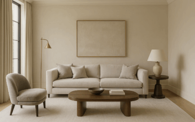
Benjamin Moore White Dove
Creamy, warm, and architectural. It softens harsh light and flatters natural materials like wood, linen, and stone. -
Sherwin-Williams Repose Gray
A balanced greige that adapts to both northern and southern light. Ideal for open-concept spaces. -
Farrow & Ball Shaded White
Understated but elegant. Works in traditional and modern settings alike.
See more curated neutrals in: The Best Paint Colors by Region →
Deeper Living Room Colors for Mood & Sophistication
Used thoughtfully, rich tones anchor a room and lend presence without weight.
-
Farrow & Ball Pigeon
A green-gray with a slightly aged feel. Pairs beautifully with oak floors and brass fixtures. -
Sherwin-Williams Urbane Bronze
Earthy, dramatic, and grounding. Best with layered textiles and textured neutrals. -
Benjamin Moore Chelsea Gray
More urban than farmhouse. A confident choice that reads modern without feeling cold.
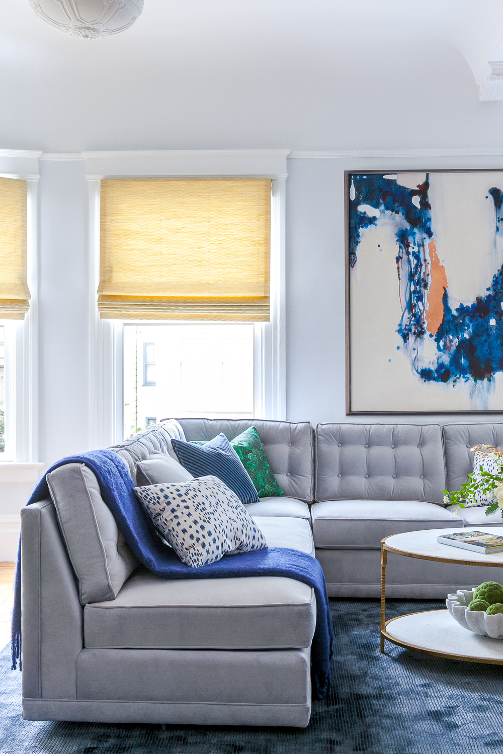
Rachel’s 3-Layer Living Room Color Strategy
Foundational Walls
Choose a soft white or greige that sets the emotional tone and works across seasons.
Focal Contrast
Consider painting built-ins, millwork, or even the ceiling a deeper shade for dimension.
Tactile Harmony
Let textiles, woods, and metals complete the palette—our curated decor line is designed to echo this rhythm.
Choose Based on Light, Not Just Preference
Lighting transforms color. What reads creamy in St. Louis may go blue-gray in Nantucket.
-
North-facing rooms: Opt for warmer tones like White Dove or Shaded White.
-
South-facing rooms: You can explore cooler tones like Chelsea Gray or even Pigeon.
-
Open-plan spaces: Greiges like Repose Gray help connect zones subtly.
Test swatches in morning, noon, and evening light. Then test again.

Paint by Personality: Living Room Edition
| If you want to feel… | Try this color |
|---|---|
| Welcoming & airy | White Dove or Repose Gray |
| Grounded & intimate | Urbane Bronze or Chelsea Gray |
| Sophisticated & modern | Pigeon or Shaded White |
| Neutral but expressive | Shaded White or Repose Gray |
| Calm but artistic | Pigeon with mixed textures |
“The living room is where your home’s story begins—color is your opening line.”
Shop the Look: Bedroom Accents That Elevate Color
Paint sets the mood—but the right pieces complete the experience. When curating bedrooms, I often reach for accents that don’t just match the palette, but magnify its intention. Two standout pieces from my collection do exactly that:
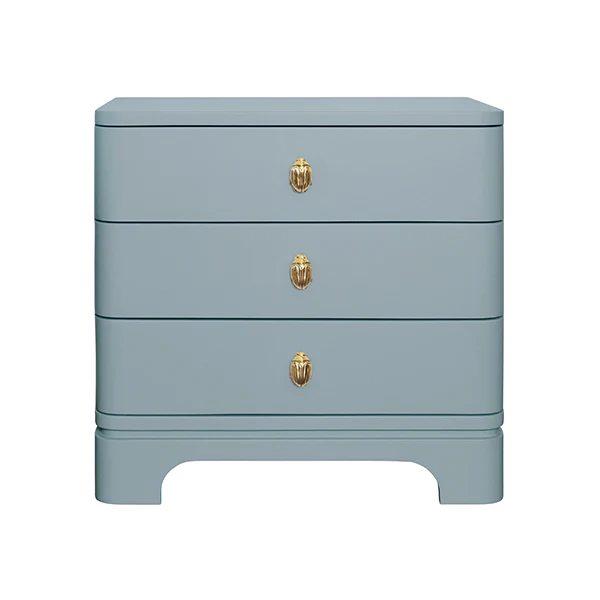
1. Celeste Lacquered Nightstand
A fresh, modern take on bedside design, the Celeste Nightstand is where quiet whimsy meets refined utility. Wrapped in a light blue matte lacquer, its curved silhouette softens angular architecture, while a trio of soft-close drawers delivers function with style. And that brass beetle knob? Pure delight.
It’s especially striking against neutrals like Farrow & Ball’s School House White or moody hues like Nightfall—the soft blue lacquer becomes the color you didn’t know you needed.
“I love using the Celeste when a space calls for softness—but also for something with soul.”
Shop the Celeste Nightstand →
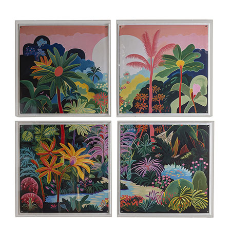
2. The Tropical Reverie Artwork
Bedrooms deserve art that doesn’t just fill space—but transforms it. “Tropical Reverie” is a lush four-panel giclée work housed in a Lucite® shadow box with silver nailhead detailing. The palette—vibrant, sun-drenched, dreamlike—creates a sense of place far beyond the ordinary.
Pair it with walls in Classic Gray or De Nimes to make the colors sing. This piece holds its own as a statement, yet plays beautifully with linen, rattan, and sculptural lighting.
“Tropical Reverie invites the eye to travel—and the spirit to rest.”
Shop the Éclat Frame →
Pro Tip: If you’re working with a neutral wall, let your accents do the storytelling. If your paint color is bold, choose furnishings with sculptural restraint or tonal harmony. Either way, a well-designed bedroom is never accidental.
Color Is How a Room Learns to Speak
We often think of living rooms in terms of furniture—but it’s the paint that makes space feel like sanctuary, or salon, or storybook. With the right palette, your living room doesn’t just look finished. It feels lived in—by design.
Living Room Paint Color FAQs
What’s the most timeless paint color for living rooms?
White Dove. It’s warm, elegant, and endlessly adaptable.
Should I use dark paint in a small living room?
Yes, if you pair it with soft textures and proper lighting. Small doesn’t mean light-only.
Which finish is best for living room walls?
Matte or eggshell. Avoid glossy finishes—they disrupt calm and read harshly in daylight.
How do I make my living room feel cohesive with an open floor plan?
Use a unifying neutral (like Repose Gray) and introduce contrast through millwork or furniture upholstery.
Finish the Living Room

Marbella Nesting Coffee Tables
$5,495

Axis Table Lamp
$756

Two-Tone Banded Throw Pillow
$105


Atelier Table Lamp
$957

Amara Block Print Lumbar Pillow
$108
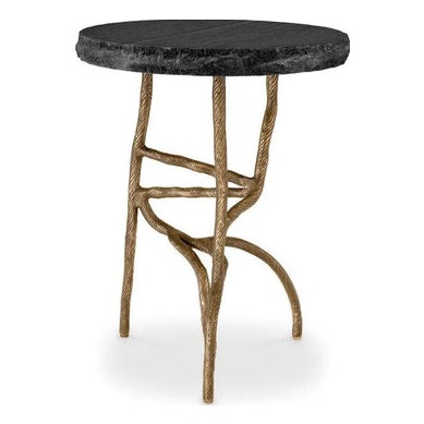
Monteverde Marble Side Table
$1,595
SOMETHING FOR EVERYONE
THE PIECES RACHEL RETURNS TO, AGAIN AND AGAIN
Before you buy a gallon
See the color on your wall first.
Every shade in this post comes as a 12×12 peel-and-stick sample from Samplize — real paint, two coats, on your wall in a day, no chips or mess. It's how I sample for clients, and it has saved more than one wrong gallon.
Benjamin Moore samplesSherwin-Williams samplesFarrow & Ball samplesBefore you go
Not sure what your style is? Take the two-minute Style Quiz and I’ll send you your look.