The Best Bathroom Paint Colors for 2026: Timeless Interior Trends with Expert Insights from Rachel Blindauer

The Best Bathroom Paint Colors for 2026: Timeless Interior Trends with Expert Insights from Rachel Blindauer

Bathrooms in 2026 are evolving into deeply personal sanctuaries—spaces that blend emotional restoration with tactile luxury. This year’s top paint colors emphasize warmth, texture, and intentionality, drawing from nature-inspired palettes that feel grounding and sophisticated. As an interior designer specializing in refined, narrative-driven spaces, I favor hues that support mood, natural light, and sensory depth while standing the test of time.

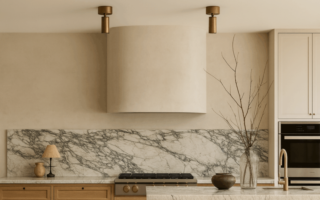
Sandstone Beige: Warm, Clean & Enduring Neutral

Warm sandstone beiges remain a cornerstone for 2026 bathrooms, offering subtle structure and softness without overwhelming architectural details. These nuanced neutrals—think oatmeal and khaki tones—create a serene backdrop that’s both modern and timeless.

Best paired with: Brass or aged bronze fixtures, woven textures, natural stone tile, and white oak accents. Paint recommendations:

  • Benjamin Moore “Muslin”
  • C2 Paint “Bone”
  • Farrow & Ball “Slipper Satin” or “Stirabout” (a cozy oatmeal neutral trending strongly this year)

Pro tip: Layer with textured elements like a scalloped linen shower curtain or handmade ceramics to enhance the organic feel.

Shop The Look

Mocha & Deep Earthy Tones: The Luxe New Neutrals

Rich browns, mochas, and tobacco-inspired hues are dominating 2026, evolving from 2025’s Mocha Mousse into deeper, more expressive shades like warm mahogany and cinnamon. These create velvet-like warmth and intimacy—perfect for a moody, cocooning escape.

Best paired with: Stained wood vanities, tumbled travertine, antique brass hardware, and layered lighting. Paint recommendations:

  • Pantone-inspired Mocha Mousse (or similar)
  • Benjamin Moore “Cinnamon Slate”
  • Farrow & Ball “Preference Red” or emerging tobacco browns like “London Clay”

Used thoughtfully, these shades add personal depth without feeling heavy.

Greige with Taupe Depth: Modern, Layered & Adaptable

Greige is shifting toward warmer taupes in 2026—calm, contemporary shades that bridge neutral and earthy for spa-like serenity.

Best paired with: White oak, microcement floors, linen textiles, and subtle metallic accents. Paint recommendations:

  • Farrow & Ball “Elephant’s Breath”
  • C2 “Cobblestone”
  • Little Greene “Joanna”

These adaptable tones reflect light beautifully in smaller spaces.

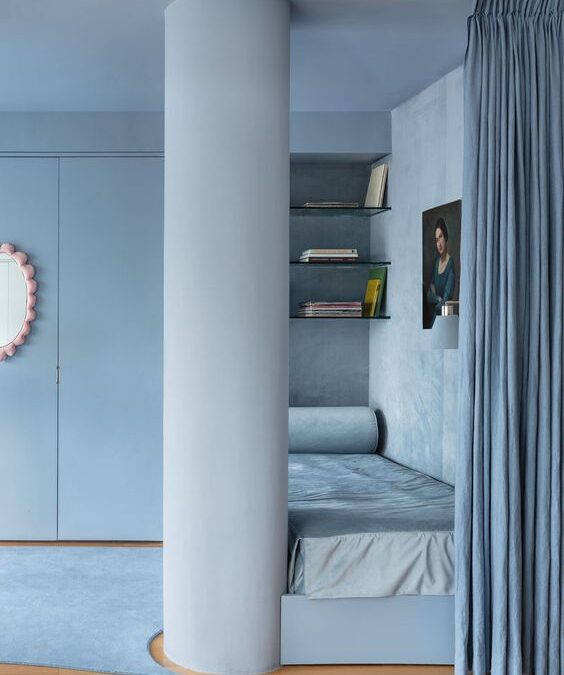
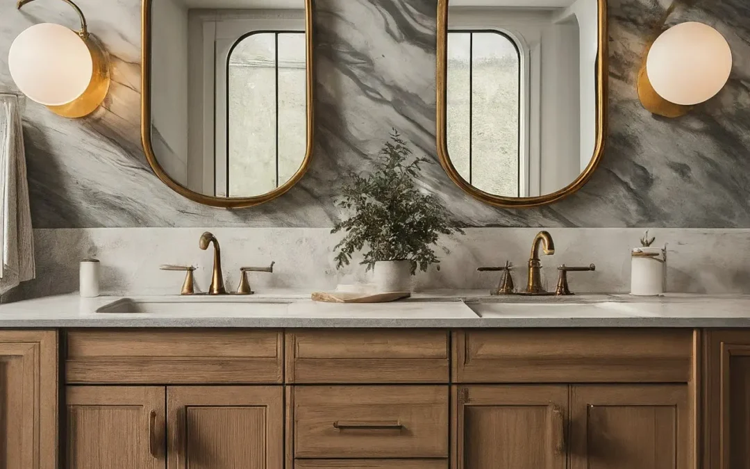
Textural Off-Whites: Sculptural, Restorative & Spa-Like

Move beyond clinical whites to layered, textural off-whites with limewash or plaster effects. These create a wabi-sabi elegance that’s restorative and on-trend for 2026’s focus on patina and tactility.

Best paired with: Hand-troweled plaster walls, sculptural brass fixtures, natural wood elements. Paint recommendations:

  • Portola Paints “Ash” (limewash)
  • Farrow & Ball “Wimborne White”
  • Benjamin Moore “Chantilly Lace” in matte

Pro tip: Apply limewash for subtle movement that catches light throughout the day.

Color-Drenched Atmospheres: Bold, Immersive Drama

Color drenching—painting walls, ceilings, and trim in one hue—continues strongly into 2026, with earthy terracottas, deep reds, and muted clays leading the way. These immersive tones add drama and cohesion, especially in powder rooms or en suites.

Best paired with: Matching tile, sculptural accessories, arched niches, and warm metals. Color suggestions: Smoky terracotta, oxblood, claret, or emerging deep plums. Paint recommendations: Farrow & Ball “Red Earth” or similar muted reds.

Multi Family Condo Bathroom Interior Design

2026 Bathroom Color Mood Chart

Vibe Key Tone Paint Ideas Mood Created
Calm & Natural Sandstone Beige/Oatmeal Muslin, Bone, Stirabout Grounding, serene
Luxe & Moody Mocha/Burgundy/Tobacco Cinnamon Slate, London Clay Intimate, velvet-like warmth
Modern Minimalist Warm Greige/Taupe Elephant’s Breath, Cobblestone Layered, adaptable calm
Spa-Textural Off-White + Limewash Ash (limewash), Wimborne White Restorative, sculptural
Immersive Drama Terracotta/Deep Red Red Earth, Claret, Smoky Terracotta Bold, enveloping depth
 

Expert Design Guidance for 2026 Bathrooms

2026 trends prioritize texture and tactility over polished perfection: think zellige tiles, limewash plaster, travertine, tadelakt, and artisanal hardware.

  • Layer for sensory depth: Combine stone, tile, plaster, and metal.
  • Embrace patina: Opt for antique or brushed finishes over shiny chrome.
  • Consider wet-room layouts: Curbless showers for seamless, luxurious flow.
  • Shift from cold tones: Icy blues and grays are out; embrace earthy warmth and material drenching for visual cohesion.

Rachel Blindauer’s Design Advice for 2026 Bathrooms

“Bathrooms should feel layered and intentional. Color sets tone—texture tells the story.”
Rachel favors plaster walls, moody cabinetry, and matte finishes.

Tips:

  • Use matte or eggshell paint for a soft, luminous glow.

  • Mix warm cabinetry with soft walls for balanced depth.

  • Explore rich tones and wallpaper in powder rooms for curated impact.

Final Thought: Make It Calm & Personal

In 2026, bathroom design is about creating retreats that nurture—select colors that resonate with you, not just trends. Luxury starts with intention.

Interested in personalized interior design for your home, hospitality project, or model residence?

2 Hour Interior Design Virtual or In Person Consultation

SOMETHING FOR EVERYONE

THE PIECES RACHEL RETURNS TO, AGAIN AND AGAIN

Summer Colors: The Ultimate Palette to Wear and Decorate With

Summer Colors: The Ultimate Palette to Wear and Decorate With

There’s a certain softness in summer that resists definition—something between sea glass and silk, between quiet mornings and golden hours. In both fashion and interiors, we call this ephemeral feeling the summer palette.

But summer colors aren’t just pretty—they’re powerful. They influence mood, perception, even how we remember a space or moment not just on runways and Pinterest boards, but in homes that crave calm and wardrobes that whisper sophistication.

This is your complete guide to summer colors—what they are, how to wear them, and how to live in them.

What Are Summer Colors?

In color theory, summer tones fall into a family of soft, muted, and cool hues with blue undertones. Think: the sky before a storm, petals after rain, chalky seafoam.

Here’s a classic Summer Color Palette to know in 2025:

  • Dusty Blue – calming, timeless, serene
  • Mauve – romantic but grounded
  • Pale Sage – barely green, endlessly elegant
  • Soft White – not quite cream, not quite ivory
  • Blush Rose – tender, quiet warmth
  • Lilac Grey – a neutral with personality
  • Pale Lemon – the softest yellow, barely-there brightness

These aren’t the bold brights of high summer—they’re the colors of reflection, breath, and subtle radiance.

The Psychology of Summer Tones

Summer colors create emotional spaciousness.

In interiors, they open up rooms without feeling cold. In fashion, they flatter without overpowering. Research in environmental psychology suggests that these cooler, dusted hues help regulate the nervous system—promoting focus, calm, and a gentle sense of presence.

It’s no accident that luxury hotels and Mediterranean interiors are bathed in these tones.

They don’t demand attention. They invite it.

How to Use Summer Colors in Your Home

These colors aren’t seasonal—they’re timelessly season-inspired. Here’s how I use them in design:

1. Paint It Soft

  • For walls, trim, or cabinetry:
    • Farrow & Ball’s Skylight,
    • Benjamin Moore’s Moonshine, or
    • Little Greene’s French Grey Pale
      deliver that chalky softness summer tones are known for.

[See my full list of the best summer paint colors →]

2. Layer Texture, Not Color

Pair pale sage upholstery with linen, matte ceramics, and raffia. Summer tones thrive when they feel dimensional—natural textures over loud contrast.

3. Let the Light Work

These colors change dramatically in daylight—use them in rooms with natural exposure and let the lighting do the layering.

Summer Colors at a Glance

Color Interior Use Styling Tip
Dusty Blue Bedroom walls, linens Layer with ivory and natural wood finishes
Mauve Dining room walls, florals Pair with brass, navy, or slate
Pale Sage Cabinetry, soft seating Beautiful with matte black or cane textures
Soft White All-over wall color Elevate with mixed neutrals and texture
Blush Rose Accent pillows, art Works well with creamy whites and gold
Pale Lemon Powder rooms, trim Adds glow without overwhelming


How to Wear Summer Colors

Summer tones flatter most when worn like watercolors—layered, flowing, and soft at the edges.

Pant Sets + Dresses

  • Linen pant sets in dusty rose or sage feel intentional but relaxed.
  • A lilac-grey dress paired with gold accessories has just enough contrast for evening.

Accessories

  • Pearlescent clutches, raffia textures, matte gold accents—small touches that echo the larger palette.
SummerColorFashion
Summer Color Fashion Mint Purple
Summer Color Fashion Yellow

Summer Color Palettes by Region

Light behaves differently in different parts of the country—and summer palettes shift accordingly.

  • In Sarasota: Warm light makes pale cool tones feel grounded. Try ivory, pale green, and faded denim.
  • In San Francisco: Fog-soft light loves greys and mauve-pink pairings.
  • In Nantucket: Slate blue, driftwood grey, and shell white—nature’s summer palette.

[Browse the Best Summer Paint Colors for Sarasota, San Francisco & Nantucket]

FAQ: Summer Colors & Interior Design

What are summer colors in interior design?
They’re soft, cool-toned hues like dusty blue, sage, mauve, and chalky white that evoke calm and elegance.

How can I use summer colors at home?
Use them in walls, textiles, and layered materials. They pair well with organic textures and sculptural forms.

Are summer colors warm or cool?
They’re cool or neutral, often with blue or grey undertones. They’re meant to soothe, not stimulate.

What’s the best summer color for paint?
It depends on your lighting. Try a test swatch of soft white or sage near your windows and watch it shift throughout the day.

I still remember a client project in San Francisco where we painted a room in Little Greene’s French Grey Pale. In morning light, it felt soft and grounded. By afternoon, it shifted toward lavender mist. That’s the beauty of summer colors—they’re alive. They change with the day. And they change us, too.

A Final Word from Rachel

Color is more than a choice—it’s a memory. Summer colors linger in the background of our most peaceful days. They’re the hue of ease, of sunlight filtered through linen, of lives lived with intention.

I design with them not just because they’re beautiful, but because they’re quietly transformative.

If you want your home to reflect the calm clarity of summer—any time of year—I’d love to help you design it through our design services or our curated shop.

2 Hour Interior Design Virtual or In Person Consultation

SOMETHING FOR EVERYONE

THE PIECES RACHEL RETURNS TO, AGAIN AND AGAIN

Things That Are Typically Forgotten When Doing a New Build

Things That Are Typically Forgotten When Doing a New Build

Building a new home is an exciting process, filled with endless possibilities. However, amidst the excitement, it’s common for some important aspects to be overlooked. Here we will list out commonly forgotten elements when undertaking a new build. From universal design to seamless vents and hidden trashcan cabinets, we’ll cover a range of essential features that will enhance the functionality and convenience of your new home.

Universal Design: Curbless Showers, Lever Door Handles, Main Level Living, Handrails, No Step Entrance

Create a home that works better for the 1 to 100 year olds with universal design by incorporating a no step entrance, main level living, wide exterior and interior doorways, wide hallways, curbless showers, lever door handles, and bathroom handrails. Curbless showers eliminate the need for stepping over a threshold, making shower access easier for everyone. Lever door handles are easier to use and allow for effortless opening and closing. It’s better to have a home that grows with you and all your family members from the start.

Modern Seamless Vents

One often overlooked element in new builds is the choice of vents. Traditional vents can be unsightly and disrupt the overall aesthetics of a home. However, modern seamless vents from Envisivent provide a sleek and contemporary look. These vents blend seamlessly with the surrounding walls and ceilings, creating a cohesive and visually appealing design. To learn more about modern seamless vents and their benefits, visit [Envisivent](https://www.envisivent.com/).

Trimless Doors for Modern & Stucco Architecture

Another element that is typically forgotten when building a new home is the trim around doors. Traditional door trim can create a dated look and disrupt the modern aesthetics of a house. Instead, consider opting for trimless doors with rounded edges. This design choice creates a seamless and clean look that is perfect for a modern home. By utilizing gypsum and rounding the edges, you can achieve a sleek and contemporary feel throughout your house.

Laundry Room Attached to Master Closet

Having a laundry room adjacent to the master closet is a convenience that is often overlooked during the planning stages of a new build. By placing the laundry room in close proximity to the master closet, you can streamline your daily routines and enhance efficiency. This setup allows for easy access to clean clothes and ensures that dirty laundry is conveniently stored away, keeping your living spaces clutter-free.

Outlet Placement and Switch for Christmas Decor

During the holiday season, many homeowners overlook the importance of strategically placed floor outlets for their Christmas trees and on the roofline for Christmas lights and an interior light switch to turn them on. Having an outlet on the floor means no more extension cords running across the room or visible outlets disrupting the overall aesthetics. With some planning, you can enjoy a visually appealing and hassle-free holiday display.

Block Walls for Fixtures and Storage

When it comes to fixtures and storage in your new home, don’t forget the benefits of block walls. Utilizing block walls for toilet fixtures, cabinets, towel racks, and other elements provides enhanced stability and durability. Block walls are more resistant to wear and tear compared to other materials, ensuring that your fixtures and storage areas remain in top condition for years to come.

Outlets on Either Side of the Bed and Electric Run to Bedside Sconces

Convenience is key when it comes to bedroom design. One aspect that is often forgotten is the placement of outlets on either side of the bed. By having outlets on both sides, you can easily charge your devices and have easy access to power for bedside lamps, alarm clocks, and other essentials. Additionally, running electric to bedside sconces enhances the functionality and aesthetics of your bedroom, creating a cozy and well-lit space.

Hideaway Outlets in Kitchen Islands

In modern kitchen designs, countertop space is highly valued. To maximize the functionality of your kitchen island, consider incorporating hideaway outlets with USB/lightning outlets. These hidden outlets provide convenient charging options for your devices without cluttering the countertop. By keeping the outlets hidden, you can maintain a clean and visually appealing kitchen space.

Outlets and Light Integration Under All Upper Cabinets

When it comes to workspaces in the kitchen, having outlets and integrated lighting under all upper cabinets is essential. By installing outlets under the cabinets, you can easily plug in kitchen appliances and avoid unsightly cords hanging down from the countertop. Integrated lighting ensures proper visibility while preparing meals, creating a functional and well-lit workspace.

Outlets in Closets and Pantries

Strategically placing outlets in closets and pantries is another often overlooked element in new builds. These outlets provide convenient charging options for rechargeable items such as cordless vacuums, handheld devices, and coffee makers. By having outlets in these areas, you can keep your closets and pantries organized and functional, catering to your daily needs.

Ensure Electric is Run to Steam Shower, Infrared Saunas, Cold Plunges, and Bidet Locations

For wellness amenities, it is crucial to ensure that electric is run to steam showers, infrared saunas, and the bidet in your new build. Make sure everything is on the cads and locations are communicated to the electrician during the construction process. Also consider if you want a cold plunge…

Other Considerations

When building a new home, there are several other things that are often forgotten or overlooked. Some additional elements to consider include ensuring your plumber knows the height of your baseboards to avoid notches, whole house water filtration, insta hot, incorporating a hidden trashcan cabinet for a clean and organized kitchen, and considering an intercom system and laundry shoot for families with homes that have multiple floors. Additionally, electric pool covers are a great feature to consider for ease of use and maintenance.

Building a new home is an exciting journey, and by paying attention to these typically forgotten elements, you can ensure that your new build is both beautiful and functional. Don’t let the excitement overshadow these crucial details. Take the time to consider these features and incorporate them into your new home for a truly enhanced living experience.

2 Hour Interior Design Virtual or In Person Consultation

Something for Everyone

THE PIECES RACHEL RETURNS TOAGAIN AND AGAIN

Winter Color Palette Ideas: Best Paint Colors, Moodboards, and Design Tips

Winter Color Palette Ideas: Best Paint Colors, Moodboards, and Design Tips

There’s something about winter that sharpens the eye. The light is clearer, the shadows longer. In color theory, Winter types echo this intensity—cool, bold, and high contrast. While Summer leans soft and Spring leans bright, Winter is where elegance meets edge. It’s not for the undecided.

But that doesn’t mean stark. Done right, winter interiors can feel deeply luxurious—grounded by contrast, elevated by restraint, and quietly unforgettable.

As a designer who’s worked everywhere from minimal penthouses to snow-covered retreats, I’ve learned that winter palettes aren’t about cold—they’re about clarity.

Unlocking Your Seasonal Palatte for Style & Space

What Is the Winter Color Palette?

The winter palette includes cool, high-contrast tones with depth and structure. Think pure white, blackened navy, rich burgundy, emerald, charcoal, icy gray, and true black. It’s the most dramatic of the seasonal palettes and the most architectural.

These are the colors of sharp tailoring, gallery walls, vintage mirrors, and velvet chairs. They bring a room into focus.

Core Winter Colors:

  • True White

  • Inky Navy

  • Charcoal Gray

  • Black

  • Emerald

  • Burgundy

  • Cool Taupe

  • Blue-Black

“Winter colors don’t whisper. They articulate.”

Winter Colors

Why Winter Colors Work in Interior Design

Winter color palettes create instant refinement in interior design. They command space without overwhelming it, making them ideal for:

  • Open-concept living spaces with modern lines

  • City apartments with little natural light

  • Entryways and powder rooms that need impact

  • Kitchens with clean finishes and statement hardware

In one St. Louis townhouse, we used Benjamin Moore’s Hale Navy in a library paired with antique brass picture lights and white oak built-ins. The palette didn’t feel dark—it felt deliberate. Controlled. Elevated.

Best Paint Colors for a Winter Color Palette

These shades have been tested across varied lighting—from snowy northern exposures to shaded urban lofts.

For Northern Light (St. Louis, MO)

  • Benjamin Moore Hale Navy – a balanced deep blue with complexity

  • Sherwin-Williams Tricorn Black – crisp, bold, pure black

  • Farrow & Ball All White – warm-balanced but still clean

For Cloudy Days (San Francisco, CA)

  • Little Greene Vulcan – an architectural charcoal

  • Benjamin Moore Chantilly Lace – sharp gallery white

  • C2 Paint Stout – a deep espresso-black with warmth

For Sun-Drenched Rooms (Sarasota, FL)

  • Sherwin-Williams Iron Ore – sophisticated, soft black

  • Farrow & Ball Wine Dark – a blue-black that shifts in light

  • Portola Paints Ash – cool, grounded, textural

Pair these with metals like polished nickel or antique brass, and balance with textured neutrals (bouclé, nubby linen, matte stone).

Layering: Winter’s Secret Weapon

To keep winter palettes from feeling cold:

  • Add depth through contrasting sheens (matte walls, satin upholstery)

  • Bring in texture: velvet, wool, smoked glass

  • Use strong silhouettes (think curved sofas, sculptural pendants)

These spaces are successful not because they are loud, but because they are intentional.

Winter Moodboard Pairings

St. Louis Winter
Paint: Hale Navy + Chantilly Lace
Materials: Cerused oak, aged leather
Anchor: Oversized landscape in black and white

San Francisco Winter
Paint: Vulcan + Chantilly Lace
Materials: Polished concrete, graphite linen
Anchor: Modular sectional in icy gray

Sarasota Winter
Paint: Iron Ore + Ash
Materials: Bouclé, brass, travertine
Anchor: Sculptural lighting in matte black

How to Know If You’re a Winter

Are You a Winter?

  • You prefer bold neutrals over pastels

  • You wear crisp white better than cream

  • You gravitate toward clean lines and high contrast

  • You want rooms that feel intentional, not ornamental

Winter Colors

Wear It, Live It

The same palette that flatters your skin tone can bring cohesion to your space. If you look best in black, white, emerald, and navy—your interiors should reflect that.

Pair your home’s palette with wardrobe neutrals that echo it: dark denim, tailored black trousers, crisp shirting, and statement coats.

Download the Seasonal Color Palette Guide or book a 2-Hour Design Consultation to translate your tone into your space.

FAQ: Winter Color Palette in Interiors

What are winter color palette tones?
Cool, high-contrast colors like navy, black, burgundy, emerald, and icy white.

Where do winter palettes work best?
Urban homes, modern renovations, powder rooms, and anywhere drama meets refinement.

Do winter colors make a room feel smaller?
Not if balanced correctly with texture, light, and layout. Depth can feel expansive.

Can I use black walls in small spaces?
Yes—just add sculptural lighting, contrasting art, and soft texture.

What undertones should I avoid as a Winter?
Warm yellows and muted earth tones. Stick with crisp, blue-based shades.

Ready to Design with Intention?

Book a 2-Hour Design Consultation and let’s craft a palette that reflects clarity, contrast, and modern elegance.

About Rachel Blindauer
Rachel Blindauer is an award-winning interior and product designer known for creating spaces that feel as good as they look. Her work spans from boutique hotels to coastal homes, always grounded in clarity, texture, and timeless detail.

2 Hour Interior Design Virtual or In Person Consultation

SOMETHING FOR EVERYONE

THE PIECES RACHEL RETURNS TO, AGAIN AND AGAIN

Kitchen Renovation Mistakes to Avoid: A Designer’s Guide to a Stress-Free Remodel

Kitchen Renovation Mistakes to Avoid: A Designer’s Guide to a Stress-Free Remodel

There’s something mythic about a well-designed kitchen. It’s not just the heart of the home—it’s where life unfolds: morning rituals, weeknight meals, and late-night confessions. So when it comes time to renovate, the stakes are high. Mistakes here aren’t small. They’re expensive, disruptive, and long-lasting.

I’ve walked hundreds of clients through kitchen remodels, and I can tell you with certainty: a successful renovation is all about thoughtful sequencing, function-forward decisions, and avoiding common pitfalls. Below are the key kitchen renovation mistakes to avoid, plus what to do instead to ensure your kitchen isn’t just beautiful, but brilliantly livable.

Gold Finish Cabinets

Choosing Finishes in the Wrong Order

Start with appliances → then cabinetrycountertopsbacksplash → and finally paint. Why? Appliances set the layout and dimensions. Cabinetry is then designed around them. Countertops and backsplash flow from those choices, and paint ties it all together. This order ensures harmony and avoids costly re-dos.

Explore my Ultimate Kitchen Planning Checklist for a printable guide to your renovation sequence.

Ignoring Layered Lighting

Lighting makes or breaks a kitchen’s atmosphere and usability. A layered plan includes:

  • Ambient lighting (overhead or recessed)
  • Task lighting (under-cabinet, pendant lights)
  • Accent lighting (toe-kick lights, uplights)

Proper lighting adds drama, improves function, and prevents fatigue. For a full breakdown, visit my Ultimate Lighting Guide.

Underestimating Storage Needs

Avoid visual clutter and maximize flow by designing with zoned storage: prep, bake, clean, serve, snack. Consider vertical pull-outs, drawer inserts, and cabinet risers.

Pro tip: A dedicated coffee bar or appliance garage adds luxury and eliminates countertop mess.

Overlooking Electrical and Outlets

Kitchens today rely on smart devices, high-powered appliances, and hidden outlets for seamless surfaces. Plan for:

  • In-island outlets
  • Charging drawers
  • Appliance-specific circuits

Fixing this post-renovation is costly and disruptive. Bring in an electrician early.

can you improve the attached change the image into a horizontal photo that is a jpg? Focus should be the cabinet finish only and improve the accessories. Remove red

Forgetting Ventilation

Good design includes what you don’t see. Invest in a quality, ducted range hood. Recirculating fans don’t cut it—they trap odors and grease. Proper ventilation also extends cabinetry life and keeps your space fresher, longer.

Disregarding Workflow

The famed “work triangle” (sink, stove, fridge) still matters. But modern workflow also includes:

  • Garbage location during prep

  • Beverage stations away from the cook zone

  • Dish zone logic (think: dishwasher next to sink and storage)

Read my guide on How to Renovate a Home for Less to maximize layout without overspending.

Making Last-Minute Changes

Design indecision is costly. Swapping tile or moving appliances mid-reno can delay projects and require reordering materials. Design with intention upfront, then trust your plan.

Choosing High-Maintenance Materials

Skip:

  • High-gloss cabinets (show every fingerprint)

  • Real marble countertops (stain and etch easily)

  • Soft woods or unsealed flooring (warp with moisture)

Choose instead:

  • Matte or satin cabinets

  • Durable quartz with marble veining

  • Engineered wood or large-format porcelain tile

Using the Wrong Paint Finishes

Flat paint near sinks or stoves? A recipe for grime. Opt for satin or semi-gloss on walls and trim for wipeable, water-resistant surfaces.

Installing Cabinets Before Floors

Always install floors first. It ensures a seamless visual flow and simplifies future remodels. Cabinet installation on top of flooring also improves structural integrity.

SophisticatedKitchenDetail

Designing for Instagram Instead of Real Life

Trends fade. Your kitchen should serve you for years. Add trend-forward elements (like colorful hardware or statement lighting) in ways that are easy to change later.

Final Tip: Don’t Skip the Planning Phase

Give yourself at least 6 weeks of design and sourcing time before demo day. Use mood boards, tap into design experts, and align with your contractor early.

Want to work with me? Book a 2-hour renovation consultation to get clarity, sources, and next steps before committing to costly mistakes.

A well-designed kitchen isn’t just about beauty. It’s about living well—and smart planning. By avoiding these common kitchen renovation mistakes, you can create a space that enhances daily life and endures with grace.
2 Hour Interior Design Virtual or In Person Consultation

SOMETHING FOR EVERYONE

Rachel Blindauer’s favorite products

Beautiful Things, Beautifully Chosen.