Color and Mood: How to Design Spaces That Feel as Good as They Look

Color and Mood: How to Design Spaces That Feel as Good as They Look

Before color becomes design, it begins as feeling.
In a Florida guest room, I once painted the walls a chalky blue-gray. The room had become a relief and mirror of calm the client didn’t know she needed.

This is what good color does: not just decorate, but restore, energize, clarify. And while design trends may come and go, the emotional impact of color remains quietly powerful. Whether you’re designing a restful bedroom or an invigorating kitchen, understanding the psychology of color is one of the most potent tools in your interiors toolkit.

Lavender Kitchen

The Psychology of Color: What Science—and Experience—Reveal

Color doesn’t just live in the eye; it lives in the body. Cool blues can slow your heart rate. Vibrant reds can raise it. This isn’t just design dogma—it’s backed by research in cognitive science and psychology.

  • Blue: Linked to trust, calm, and lowered blood pressure. Think open sky, still water.

  • Red: Stimulates alertness, passion, appetite. Useful in spaces where energy is welcome—like kitchens or dining rooms.

  • Green: Associated with growth and balance. Just as nature restores us, so do its tones indoors.

But it’s not universal. Cultural context matters. In many Western cultures, white symbolizes purity. In parts of Asia, it’s the color of mourning. Purple, once reserved for royalty due to its rarity and cost, now signifies spirituality and depth. Good design doesn’t impose—it listens. And your color story should reflect the layers of who you are.

Warm Colors: Energy, Comfort, and Connection

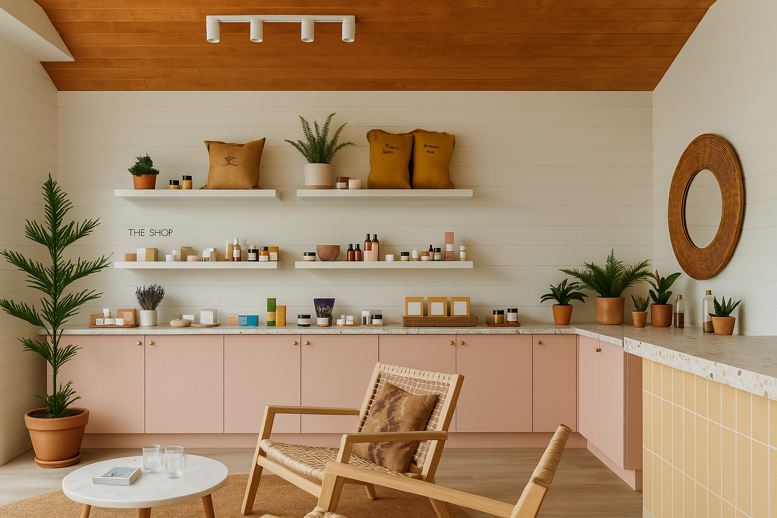
There’s a reason so many kitchens glow with hints of terracotta or marigold—warm colors gather people. They create intimacy, spark conversation, and infuse rooms with a lived-in kind of joy.

  • Red: Bold, passionate, best used intentionally. In small doses—an accent wall, a piece of art—it adds confidence and heat.

  • Orange: The happy medium. Inviting like a late-summer sunset, orange works well in creative spaces or casual dining areas.

  • Yellow: Light itself. Uplifting and optimistic, ideal for rooms that benefit from a mental boost—like breakfast nooks or small home offices.

Style note: Balance the exuberance of warm hues with organic textures—think handwoven placemats, linen curtains, or matte ceramic vases.

desk

Cool Colors: Calm, Clarity, and Reflection

Cool tones are the interior world’s exhale. They offer reprieve from visual noise and support the kind of deep rest modern life rarely makes room for.

  • Blue: From pale sky to deep indigo, it’s the most psychologically calming hue. Best for bedrooms, bathrooms, or focus zones.

  • Green: Evokes nature, renewal, and growth. Use it in offices, kitchens, or anywhere you need grounded energy.

  • Purple: A fusion of fire and water. Soft lavenders feel meditative; deeper plums add intellectual depth.

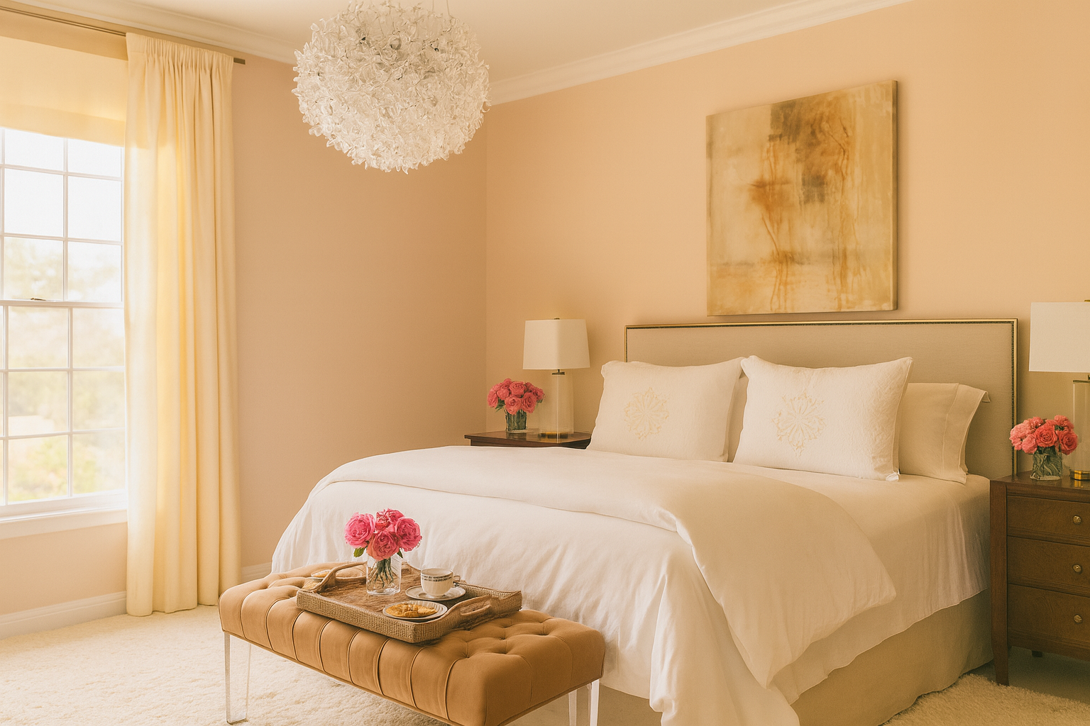
Tip from Rachel: Pair cool hues with tactile contrast. Try a navy blue linen napkin beside raw oak. Or a sage green pillow atop crisp white bedding.

Neutrals: Balance Without Boredom

Neutrals are often underestimated. Done right, they’re not bland—they’re grounding. They allow other elements—light, form, material—to shine.

  • White: Pure, expansive, quietly modern. Use it to create visual breathing room.

  • Gray: Sophisticated and endlessly adaptable. Warmer grays feel cozy; cooler tones read clean and minimal.

  • Beige: The unsung hero of timeless interiors. Its warmth plays beautifully with wood, metal, and woven materials.

Beige is trending again—not as a default, but as a choice. Its softness feels like permission to rest.

Pink Dining Room

Color Combinations That Work—and Why

Designing with color is rarely about a single hue. It’s about relationship and rhythm.

  • Complementary colors: Opposites on the color wheel (e.g., blue and orange). High contrast, high impact—perfect for dynamic, statement-making spaces.

  • Analogous colors: Neighbors on the wheel (e.g., blue, blue-green, green). Naturally harmonious and serene.

  • Monochromatic: Variations of a single hue. Elegant and controlled—ideal for minimalist or tonal interiors.

  • Triadic: Three evenly spaced colors (e.g., red, yellow, blue). Vibrant and balanced, great for playful or creative rooms.

Design tip: Limit your palette to 3 main tones. Then layer in texture, form, and material to keep things interesting.

Final Thought: Color is a Language. What Are You Saying?

The colors that surround you don’t just affect your space—they affect your state. Choose with intention. Use what calms you, what energizes you, what feels like you.

Whether you’re repainting a single wall or reimagining an entire home, color is your quietest—and most powerful—design collaborator.

2 Hour Interior Design Virtual or In Person Consultation

SOMETHING FOR EVERYONE

THE PIECES RACHEL RETURNS TOAGAIN AND AGAIN

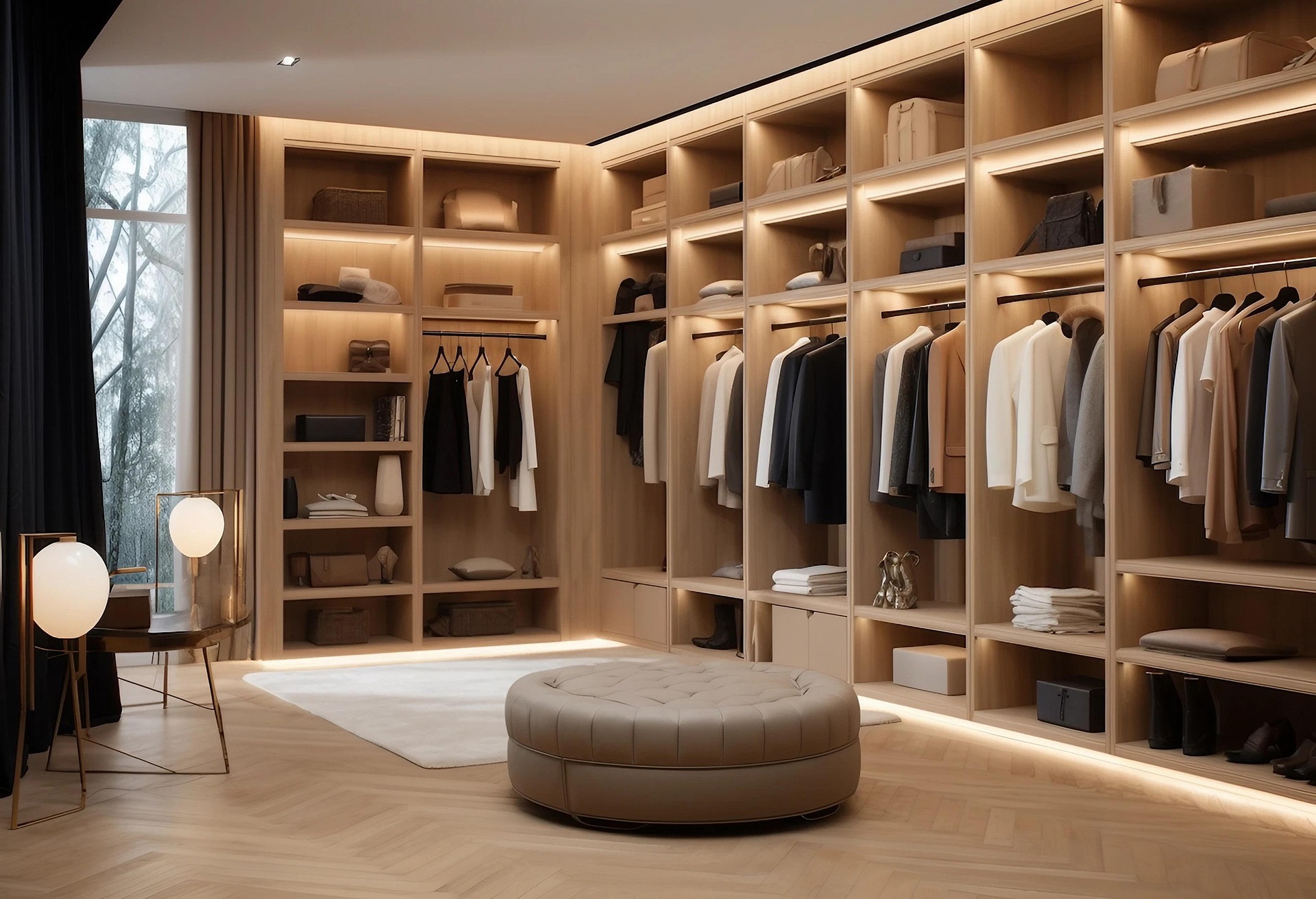
How to Design a High-End Walk-In Closet: 7 Luxury Tips from Rachel Blindauer

How to Design a High-End Walk-In Closet: 7 Luxury Tips from Rachel Blindauer

“A high-end walk-in closet doesn’t just store clothes. It dresses your mind for the day ahead.”
— Rachel Blindauer

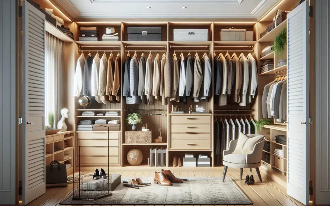
The most luxurious closets aren’t always the biggest. They’re the ones that anticipate your needs, reflect your lifestyle, and feel as intentional as any other room in the home. In my design practice, I approach walk-in closets the way I approach kitchens or living rooms: with equal parts function, form, and emotion. Below are a few of my go-to design strategies to elevate a closet from utilitarian to quietly exquisite.

Flattering, Layered Lighting—With a Hint of Drama

The trick: Mix warm recessed LED lighting with softly diffused sconces or a small statement pendant. And always—always—backlight the hanging rods or install ribbon lighting within each shelf.

Why it works: Harsh lighting flattens textures and colors, while layered, warm lighting makes everything feel more tailored and inviting. It also lets clients actually see their clothing as it will appear in natural daylight.

Linked inspiration: Discover more designer-approved lighting tips to elevate your everyday.

“Good lighting doesn’t just illuminate a space—it elevates your self-perception.”

Matching Velvet or Linen-Covered Hangers

The trick: Ditch the rainbow of plastic and mismatched hangers for slim, uniform ones in velvet or linen-wrapped wood. I recommend choosing a neutral color that mimics the closet’s palette.

Why it works: This single switch instantly creates visual cohesion and a sense of calm. It’s like replacing folding chairs with built-ins—it refines the entire room without changing the structure.

Glass-Front Drawers or Cabinets for Accessories

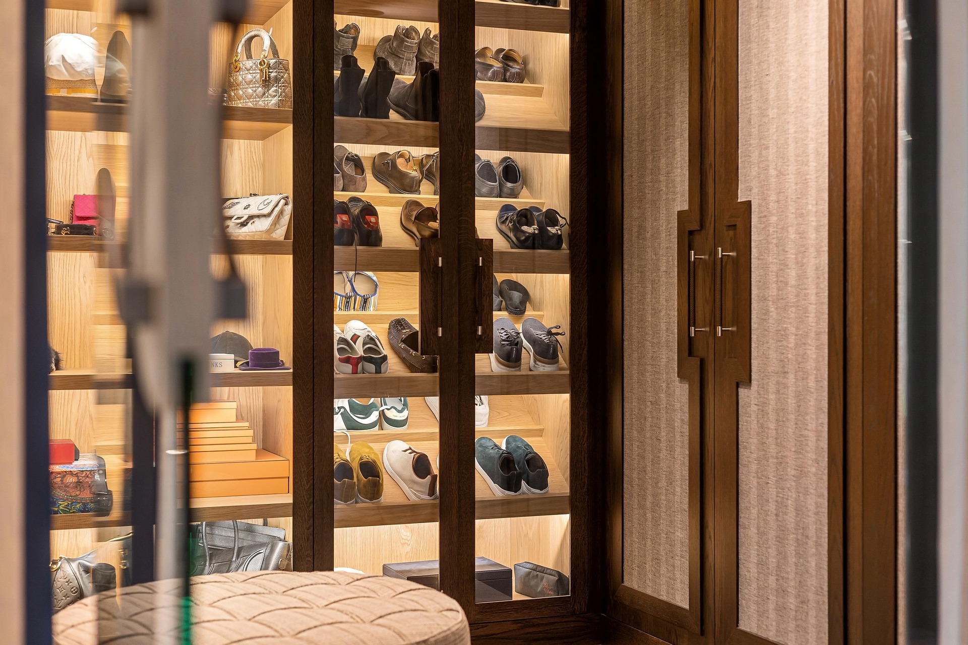
The trick: Incorporate shallow, velvet-lined drawers with glass tops for jewelry, watches, or sunglasses. For larger spaces, I’ll build out museum-style accessory towers or handbag displays with glass doors and subtle lighting.

Why it works: These features bring a sense of reverence to the everyday. Seeing your favorite things beautifully displayed encourages more intentional use—and feels personal, not performative.

Integrated Seating or a Vanity Moment

The trick: Add a plush ottoman or a slim built-in bench with hidden storage. In larger closets, I often float a freestanding vanity stool (that has storage in it) or table with an inset mirror and artful stool.

Why it works: Seating slows the rhythm of the space. It invites you to sit down to put on the shoes, listen to music as you get ready and makes the act of dressing feel like a ritual instead of a task. It also signals that the closet is not just storage—it’s a private sanctuary.

Floor-to-Ceiling Millwork and Molding Details

The trick: Extend cabinetry all the way up and finish it with molding that mirrors the architectural language of the home. Even in small spaces, I’ll use millwork or wall paneling to elevate the closet’s visual weight.

Why it works: Custom finishes bring intention and gravitas. They suggest permanence and purpose, not retrofit or overflow.

A Signature Scent or Diffuser

The trick: Keep a beautiful diffuser tucked into a drawer or open shelf. My personal favorites include sandalwood-cedar blends or light amber fragrances. But you could just use your signature perfume.

Why it works: Scent is a detail clients rarely expect—but always remember. It quietly enhances the luxury experience and reinforces the sense that this is a private, well-considered retreat.

Art & Objects That Start the Day Off Right

The trick: Incorporate one or two small framed photos of your loved ones, a sculptural object, or something emotional that will get your day started off right. It should remind you of your “why.” In one project, I even framed a handwritten note.

Why it works: This turns a closet into a getting-ready ritual that helps you become your best self.

“A high-end closet isn’t about labels. It’s about how well it understands the life unfolding inside it.”

Thinking About a Custom Closet?

If you’re building or renovating a home and want clarity around your storage strategy, layout, or lighting design, consider booking a 2-Hour Design Consultation. It’s one of the highest-impact steps you can take to align your space with your lifestyle. Feel free  to also Download our Free Whole Home Organization Planner below.

For those looking to complement their dream closet with designer decor, storage, or scent, visit shop.rachelblindauer.com for a refined selection of home essentials that elevate the everyday.

About the Author: Rachel Blindauer is an award-winning interior and product designer known for crafting spaces that feel as good as they look. With over 15 years of experience, her work blends elevated form with practical insight—serving private clients and boutique properties from Nantucket to Sarasota. Her thoughtful approach to design honors both aesthetic beauty and emotional resonance, helping families live with more clarity, comfort, and joy.

2 Hour Interior Design Virtual or In Person Consultation

SOMETHING FOR EVERYONE

THE PIECES RACHEL RETURNS TOAGAIN AND AGAIN

What Color Season is Navy Blue? A Guide for Interiors & Style

What Color Season is Navy Blue? A Guide for Interiors & Style

Navy blue is more than a color—it’s a state of mind. A visual exhale. Associated with intelligence, confidence, and calm, it’s no wonder navy remains one of the most used and most loved hues across fashion and interior design.

But here’s the question many still ask:
What color season is navy blue—and how should you use it at home?

From crisp Winter navy to muted Summer chambray, here’s how to find your shade—and your palette.

Color Psychology Meets Color Seasons

Color psychology studies how hues affect mood, behavior, and perception. Navy blue, for instance, is often used in uniforms and branding because it evokes trust and stability.

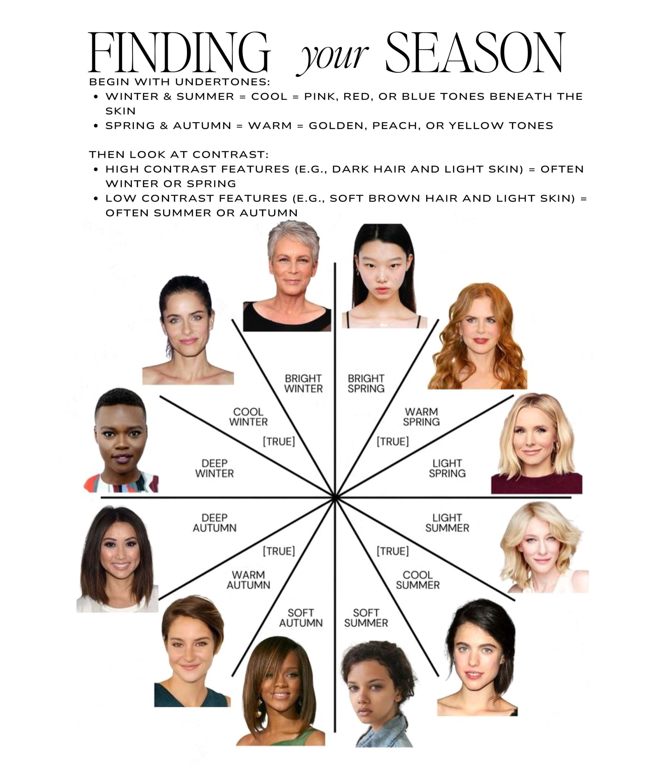
Color seasons, on the other hand, come from color analysis—a method of identifying the best colors for you based on the undertones in your skin, eyes, and hair. Each person aligns with one of four main palettes: Winter, Summer, Autumn, or Spring.

Layer the psychology of color over seasonal theory, and you get more than a color match—you get emotional resonance. Whether in your wardrobe or your home, the right navy can bring clarity, composure, and cohesion.

Is Navy Blue a Winter Color?

Yes. Rich, deep navy belongs in Winter’s world of high-contrast, cool tones. It pairs beautifully with crisp whites, icy blues, charcoal, and jewel accents like emerald or ruby.

For Winter types, navy is a grounding neutral—it brings out the cool undertones in your features and balances bolder hues.

In interiors, a navy velvet sofa or high-gloss cabinetry evokes quiet sophistication. It reflects light while absorbing mood.

Try this: Anchor your space with the Ashcroft Hand-Loomed Wool Rug — Blue to contrast clean white walls and deep navy cabinetry for sculptural balance.

Paint ideas:

  • Sherwin-Williams “Tricorn Black”

  • Farrow & Ball “All White”

  • Portola Paints “In the Navy” (Roman Clay)

Can Summers Wear & Decorate with Navy?

Absolutely. Summers do best with muted, cool tones, and navy—when dusted down—offers a softer alternative to black. Think chambray or washed indigo.

Pair it with blush, sage, lavender, and dove gray. Use tactile materials like stonewashed linen, unfinished ceramics, or antique silver to soften the palette even more.

Pair with: Celeste Lacquered Nightstand—a soft plum tone that echoes dusty navy with romantic subtlety.

Can Navy Blue Work for Fall?

Surprisingly, yes. While Autumns thrive in earthy tones, certain navies with green or golden undertones blend beautifully into the mix.

Use navy as a neutral backdrop for camel, terracotta, olive, or ochre. The trick is to balance it with texture and warmth—wood, leather, wool, and jute.

Much like a navy dress grounded with suede or leather boots, navy interiors layered with brass and oak feel timeless for fall.

Enhance your palette with: Paloma Scallop Placemat to add a woven organic counterpoint to deep blue cabinetry or walls.

Color Harmony — The Designer’s Guide, Free

Find Your Season.
Dress In It. Live In It.

Learn to read your own coloring, then carry your palette from your closet to your rooms — 16 pages of Rachel’s method. Not rules. Resonance.

No spam. Unsubscribe anytime.

How Springs Can Wear Navy

Traditional navy can feel too heavy for Springs, but lighter, clearer versions like Mediterranean blue or air force blue can work beautifully.

Pair them with Spring’s happy hues—coral, aqua, butter yellow—for a playful contrast that feels alive. Choose breezy fabrics like voile, washed linen, or crisp cotton.

Bring Spring energy home with the Isla Dot Pillow—a dotted accent pillow that gives navy a bright cheery uplift.

Why Navy Works for Nearly Everyone

Navy is one of the few colors that adapts across all four seasons—it just depends on undertone and saturation:

  • Cool & Deep = Winter

  • Cool & Muted = Summer (aka “muted navy blue”)

  • Warm & Muted = Autumn

  • Clear & Light = Spring

Unlike royal blue, which is electric and energizing, navy is more grounded—offering emotional depth and subtle contrast. It’s not just timeless—it’s stabilizing.

3 Ways to Use Navy Blue at Home, Based on Your Season

Winter:
Try a lacquered navy console against a crisp white wall for contrast and control.

Summer:
Add a chambray throw to a pale linen bed for softness and quiet cool.

Autumn:
Contrast navy cabinetry with ochre accessories and warm brass hardware.

Spring:
Use a striped navy runner on a whitewashed table for breezy definition.

And if you’re bringing navy into the bath: it’s one of the few vanity colors that flatters every color season and every metal finish. I cover where it lands among my bathroom cabinet paint colors for 2026 — including the exact navy I specify.

Shop the Navy Story

Vortex Porcelain Bowl

Vortex Porcelain Bowl

$470

Shibori Nesting Boxes

Shibori Nesting Boxes

$990

Celestial Weave

Celestial Weave

$1,165

Cobalt Diptych

Cobalt Diptych

$1,295

Sapphire Dot Field

Sapphire Dot Field

$1,555

Dusk Horizon Field

Dusk Horizon Field

$1,555

Frequently Asked Questions

What season is navy blue in color analysis?
Navy blue is traditionally a Winter color but can suit all four seasons depending on the undertone.

Can Summers wear navy blue?
Yes—especially if it’s softened, like chambray, stonewash, or stormy blue.

Is navy blue warm or cool?
Navy is usually cool, but some versions with green, gray, or gold lean warm—great for Autumns.

What’s the difference between navy and royal blue?
Royal blue is vibrant and assertive. Navy is more stable and sophisticated—easier to layer and live with.

Related Reading to Deepen Your Palette

Looking for more seasonal styling advice? Read our:

Final Thought

Navy blue offers more than visual depth—it offers grounding. In a world of overexposure, it gives us pause. It carries weight without heaviness, style without noise.

Whether you’re designing a space or dressing for the day, the right navy is never out of season.

2 Hour Interior Design Virtual or In Person Consultation

SOMETHING FOR EVERYONE

THE PIECES RACHEL RETURNS TOAGAIN AND AGAIN

How Long Does It Take to Complete a Designer Interior Project?

How Long Does It Take to Complete a Designer Interior Project?

Embarking on a designer interior project is an exciting journey for any homeowner. However, one of the most common questions is how long such a project typically takes. Understanding the timeline can help set realistic expectations and ensure a smooth process.

Understanding the Initial Consultation Phase

The first step in a designer interior project is the initial consultation. This phase typically involves meeting with your chosen interior designer to discuss your ideas, budget, and expectations. Depending on availability, this stage may take a week or two.

During these initial meetings, you and your designer will explore the vision for your space. It’s a time to align on the project’s scope and goals, ensuring both parties are on the same page. This phase is crucial in creating a solid foundation for the rest of the project.

In some cases, clients may have very clear ideas, while others may rely more heavily on the designer’s expertise to shape the vision. Regardless, your designer should take the time to understand your preferences, functional needs, and any specific requests you may have.

Design and Planning: The Heart of the Project

Once the consultation is complete, the design and planning phase begins. This involves creating mood boards, selecting materials, and drafting detailed design plans. This phase can take anywhere from 2 to 6 weeks, depending on the complexity of the project.

At this stage, designers often create several concept designs to present to clients, ensuring that every detail aligns with their vision. The process can be iterative, requiring adjustments and refinements before reaching the final design.

An essential part of this phase is deciding on a color palette. The choice of colors will set the tone for the entire space, impacting its mood and functionality.

Effective communication between the designer and client is key. Regular updates and discussions help to accommodate any changing preferences or new ideas that may arise. The collaborative nature of this phase ensures that the end product is both beautiful and practical.


Securing Permits and Ordering Materials

Before any physical work begins, necessary permits must be obtained, and materials need to be ordered. The time required for permits varies by location, but it could take several weeks. Ordering materials can also range from a few days to a few weeks, depending on the availability.

The availability of materials can often dictate the pace of the project. Items such as custom furniture or unique fixtures may have longer lead times. Therefore, early ordering becomes crucial to prevent any project delays.

Designers work closely with vendors and suppliers to streamline the procurement process. At Rachel Blindauer Interior Design, robust networks with suppliers help mitigate risks associated with delayed materials.

Securing permits can sometimes pose challenges if structural changes are involved. Rachel Blindauer typically works directly with a local architect and ensures that everything proceeds according to plan.

The Construction and Implementation Phase

The hands-on part of the project is construction and implementation. This is where the design comes to life. Depending on the project’s scope, this phase can last from several weeks to several months.

This phase involves detailed coordination among contractors, and designers. A clear timeline and regular site visits are crucial to ensure that everything proceeds as planned. Any unforeseen issues, like delayed deliveries or construction challenges, can extend timelines.

Complex projects that include custom-built elements or significant structural modifications may naturally require a longer timeframe. However, thorough planning and efficient project management can minimize potential delays, making the completion process smoother and more predictable.

For large-scale projects or renovations, patience is key. Each detail, from paint colors to light fixtures, contributes to the overall vision. Designers aim to oversee the process closely, ensuring that the implementation matches the agreed-upon design.

Final Touches and Project Handover

After construction is completed, the final touches are applied. This includes adding furniture, decor, and other elements that were part of the design plan. Usually, this stage takes a couple of weeks. Once everything is perfect, the project is handed over to the homeowner.

These final stages are where the personality of the space really shines through. Decor elements, such as art pieces, rugs, and decorative lighting, are implemented to add depth and warmth.

Your designer will often provide an opportunity for a walk-through, ensuring all aspects have been executed perfectly. Any minor deficiencies are addressed before concluding the project, ensuring the client’s satisfaction.

This culmination of hard work results in a space tailored to the homeowner’s preferences and needs. The transformation is usually accompanied by a sense of fulfillment and excitement, marking the transition from project to living space ready to be enjoyed.

House Warming Party!

The timeline for completing a designer interior project can vary based on several factors, including planning, design, complexity, and project management but after the accessories layer and photoshoot we typically have a house warming party. By understanding these aspects, you’ll be better prepared to manage your time and expectations, ensuring a successful outcome.

2 Hour Interior Design Virtual or In Person Consultation

SOMETHING FOR EVERYONE

THE PIECES RACHEL RETURNS TOAGAIN AND AGAIN
Maximizing Small Spaces: Tips for Creating the Illusion of Space

Maximizing Small Spaces: Tips for Creating the Illusion of Space

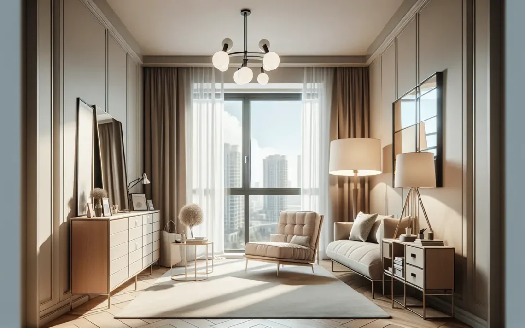
Unlock the secrets to making small rooms appear larger through clever design techniques and strategic furniture placement. and maximize small spaces and creating the illusion of a larger, more open area. With clever design techniques and strategic furniture placement, you can transform your compact living spaces into stylish and functional havens. Say goodbye to cluttered rooms and embrace the art of making the most out of limited space to unlock its full potential!

Choose Light Colors

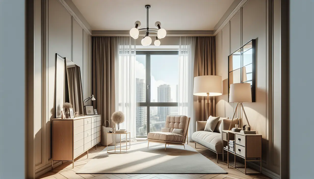
When it comes to maximizing small spaces, color plays a crucial role. Opt for light and neutral colors for your walls, floor, and furniture. Lighter shades reflect natural light, making the room feel more open and airy. Stick to a consistent color palette to create a cohesive and spacious look.

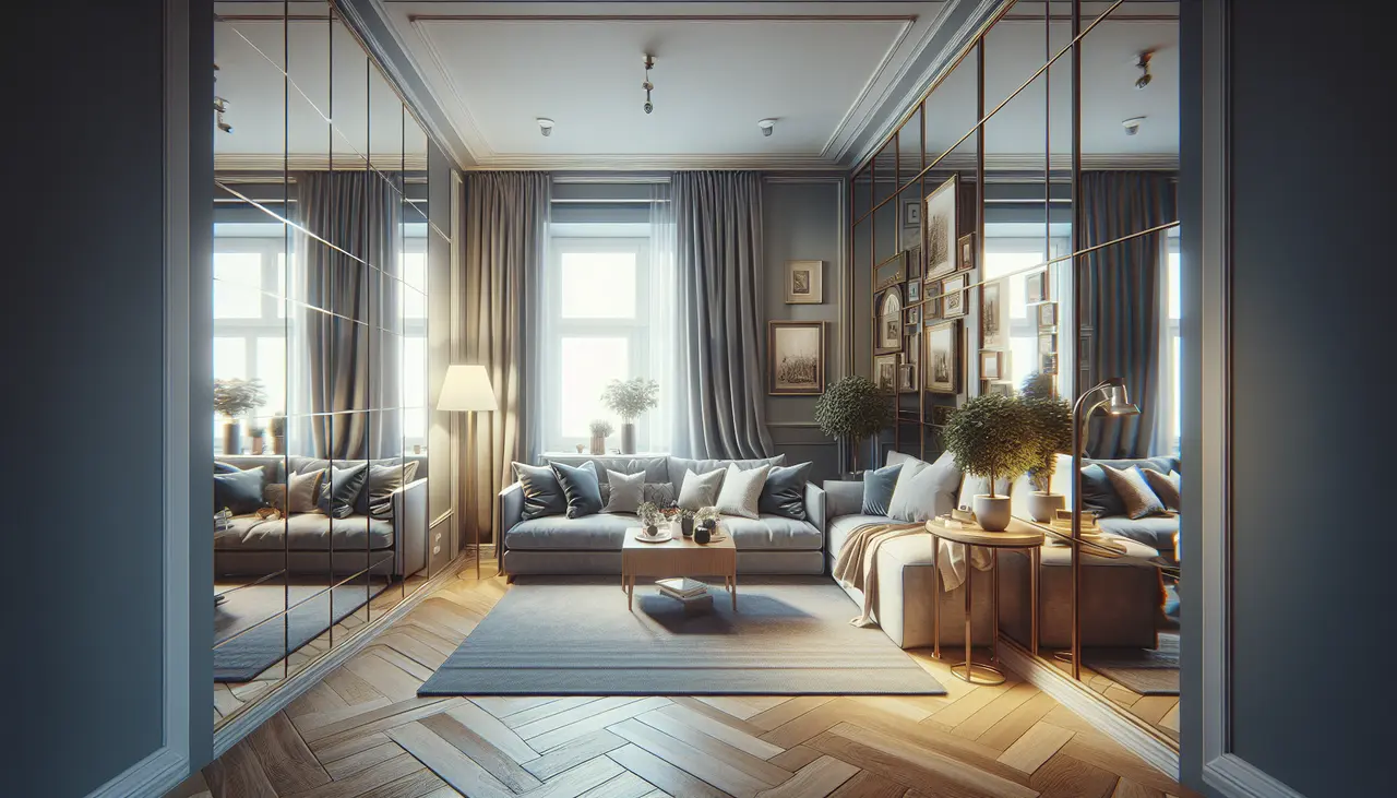
Utilize Mirrors

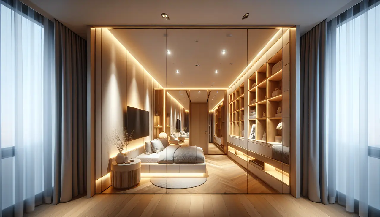
Mirrors are magical when it comes to creating the illusion of space. Hang a large mirror on a wall opposite a window to reflect natural light and visually expand the room. You can also use mirrored furniture or decorative mirrors to add depth and create a sense of openness.

Embrace Natural Light

Natural light is your best friend when it comes to maximizing small spaces. Keep your windows uncovered or opt for sheer curtains to allow maximum light to enter the room. Avoid heavy drapes or dark shades that can block natural light and make the space feel cramped.

Strategic Furniture Placement

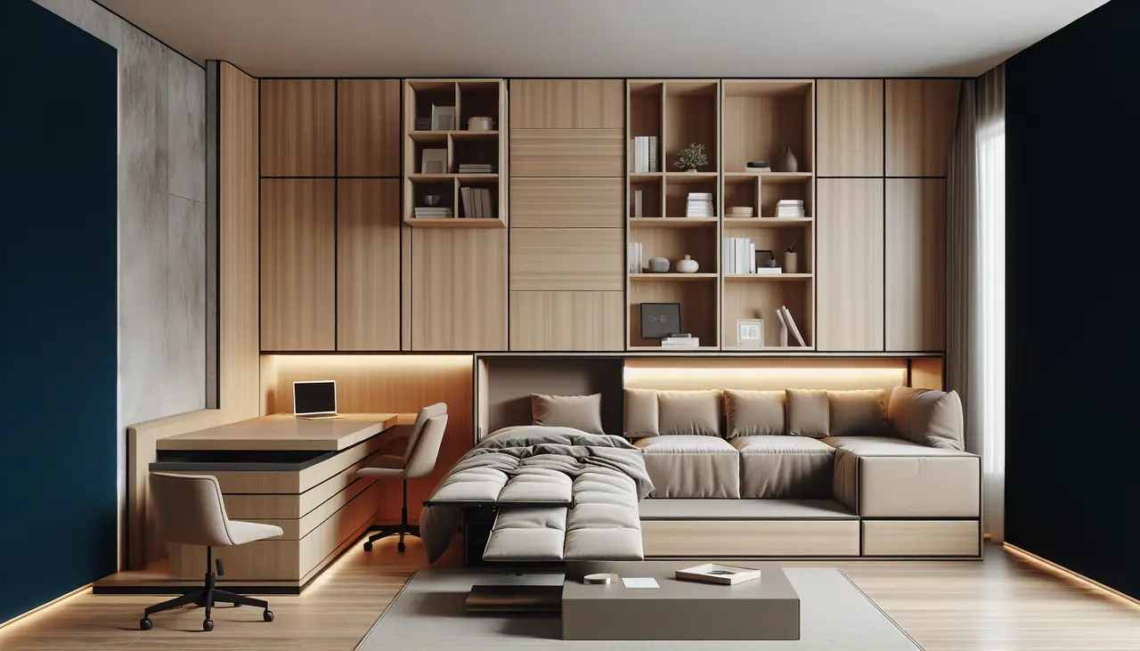
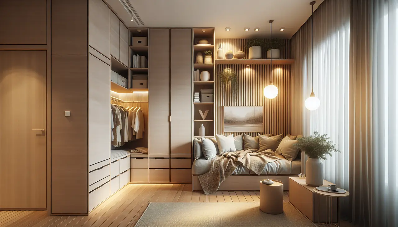
Carefully consider the size and placement of furniture in small rooms. Opt for multifunctional furniture pieces like a storage ottoman or a sofa with built-in drawers. Choose furniture with exposed legs to create a sense of openness. Avoid blocking pathways and ensure there is ample space for movement.

Clever Storage Solutions

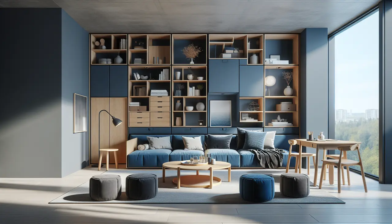
Clutter is the enemy of small spaces. To maintain an organized and spacious look, invest in clever storage solutions. Utilize vertical space with floating shelves or tall bookcases. Opt for furniture with hidden storage compartments. Use decorative baskets or bins to store items and keep surfaces clutter-free.

Utilize Wall Space

When floor space is limited, make the most of your walls. Install floating shelves or wall-mounted cabinets to store books, decorative items, or everyday essentials. Hanging plants or artwork can also draw the eye upward and give the illusion of higher ceilings.

Create Visual Interest

Incorporate visual interest and focal points to distract from the small size of the room. Use a statement piece of artwork or a bold rug to draw attention. Incorporate textures and patterns to add depth to the space. By following these tips, you can create the illusion of a larger space and optimize the functionality of your small room.

Remember, maximizing small spaces is all about clever design techniques and strategic furniture placement. With these tips in mind, you can transform your small rooms into stylish and functional spaces that feel larger than they actually are. So go ahead, unlock the secrets to creating the illusion of space and enjoy your newly optimized small spaces!

2 Hour Interior Design Virtual or In Person Consultation

Something for Everyone

THE PIECES RACHEL RETURNS TOAGAIN AND AGAIN