Best Bedroom Paint Colors for Restorative, Refined Interiors

Best Bedroom Paint Colors for Restorative, Refined Interiors

Why Bedroom Color Choice Is Everything

The bedroom is where your nervous system goes to exhale. Color should support that. The right paint palette anchors the senses, softens transition, and gently shapes the emotional rhythm of your day.

For my clients, the bedroom isn’t just a place to sleep—it’s where ease begins. That’s why the color on the walls matters.

The Best Neutral Bedroom Paint Colors

These neutrals are refined, not flat. They support both minimalism and romance.

  • Benjamin Moore Classic Gray – Calm, warm greige that shifts beautifully with light.

  • Farrow & Ball School House White – Creamy, timeless, and never too cold.

  • Sherwin-Williams Drift of Mist – Barely-there and modern; especially good in bright rooms.

Deep, Saturated Hues for Sophisticated Sleep Spaces

When clients want a bedroom that feels more like a retreat, I lean into saturated, cocooning hues:

  • Farrow & Ball De Nimes – Romantic, moody blue-gray.

  • Sherwin-Williams Iron Ore – Deep and grounding with rich undertones.

  • Benjamin Moore Nightfall – Charcoal with a violet base—sensual and striking.

What to Consider Before Choosing Bedroom Paint

  • Lighting: North-facing = warmer tones. South-facing = cooler hues welcome.

  • Function: Is this just for sleep—or work, too?

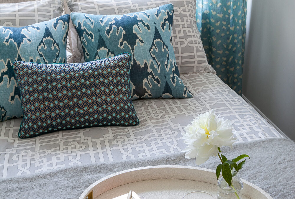
  • Tone Matching: Consider how your bedding, floors, and curtains will interact.

  • Emotional Feel: What do you want to feel every time you walk in?

For deeper insight on how color shapes behavior, read:
👉 The Psychology of Color in Interior Design →

Bedroom Paint by Natural Light & Region

Paint behaves differently in Missouri, Massachusetts, and Florida. Here’s how I approach each:

  • Florida (Sarasota) – White walls often skew blue; go for warm taupes and creams.

  • Missouri (St. Louis) – Light fluctuates seasonally. Greiges are your safest bet.

  • Nantucket – Think weathered neutrals and coastal-inspired soft blues.

Multi Family Condo Condominium Complex Model Unit Bedroom Interior Design

Finish Matters: Choosing the Right Sheen

  • Matte – Ideal for walls. Soft and forgiving.

  • Eggshell – Slightly more durable with subtle sheen.

  • Satin/Semi-Gloss – Only for trim or millwork. Never on walls—it flattens the space emotionally.

Paint by Personality: Let Emotion Lead

Choosing the right bedroom paint color isn’t just about trends—it’s about resonance. Here’s a cheat sheet I often use during consultations:

If you want to feel… Try this color
Calm & Minimal Classic Gray or School House White
Grounded & Centered Iron Ore or Drift of Mist
Romantic & Restorative De Nimes or Nightfall
Bright but Soft Drift of Mist or Classic Gray
Wrapped in Quiet Drama Nightfall with satin bronze accents

“Color should feel like a mood you want to live inside.”

Shop the Look: Bedroom Accents That Pair Beautifully

1. Alina Ceramic Table Lamp
Matte ivory glaze, sculptural shape. Creates warmth on both pale and dark walls.
Shop Now →

2. Louisa Washed Linen Throw
Stonewashed texture. A soft counterpoint to moody bedrooms and a cozy layer for light ones.
Shop Now →

Color as a Catalyst for Peace

Paint isn’t just surface—it’s atmosphere. When we choose colors with intention, we give ourselves more than a beautiful room. We give ourselves the kind of space we come home to emotionally.

A well-colored bedroom doesn’t wake you up—it welcomes you in.

Need help refining your palette? Book a 2-Hour Consultation →
Or browse calming textures and accents at shop.rachelblindauer.com →

FAQs About Bedroom Paint Colors

What is the most relaxing bedroom paint color?
Classic Gray by Benjamin Moore and De Nimes by Farrow & Ball are top contenders—one neutral, one moody. Both promote calm without dullness.

Should bedrooms be painted light or dark?
It depends on your emotional goals. Light colors expand and brighten. Darker tones cocoon and soften. Both work—just not in the same room.

What sheen is best for bedroom walls?
Always matte or eggshell. Avoid gloss—it breaks the softness of the space.

Can I use dark paint in a small bedroom?
Yes. In fact, small rooms often benefit from saturated tones. It creates depth and intimacy—especially with strategic lighting.

2 Hour Interior Design Virtual or In Person Consultation

SOMETHING FOR EVERYONE

THE PIECES RACHEL RETURNS TO, AGAIN AND AGAIN

Color and Mood: How to Design Spaces That Feel as Good as They Look

Color and Mood: How to Design Spaces That Feel as Good as They Look

Before color becomes design, it begins as feeling.
In a Florida guest room, I once painted the walls a chalky blue-gray. The room had become a relief and mirror of calm the client didn’t know she needed.

This is what good color does: not just decorate, but restore, energize, clarify. And while design trends may come and go, the emotional impact of color remains quietly powerful. Whether you’re designing a restful bedroom or an invigorating kitchen, understanding the psychology of color is one of the most potent tools in your interiors toolkit.

Lavender Kitchen

The Psychology of Color: What Science—and Experience—Reveal

Color doesn’t just live in the eye; it lives in the body. Cool blues can slow your heart rate. Vibrant reds can raise it. This isn’t just design dogma—it’s backed by research in cognitive science and psychology.

  • Blue: Linked to trust, calm, and lowered blood pressure. Think open sky, still water.

  • Red: Stimulates alertness, passion, appetite. Useful in spaces where energy is welcome—like kitchens or dining rooms.

  • Green: Associated with growth and balance. Just as nature restores us, so do its tones indoors.

But it’s not universal. Cultural context matters. In many Western cultures, white symbolizes purity. In parts of Asia, it’s the color of mourning. Purple, once reserved for royalty due to its rarity and cost, now signifies spirituality and depth. Good design doesn’t impose—it listens. And your color story should reflect the layers of who you are.

Warm Colors: Energy, Comfort, and Connection

There’s a reason so many kitchens glow with hints of terracotta or marigold—warm colors gather people. They create intimacy, spark conversation, and infuse rooms with a lived-in kind of joy.

  • Red: Bold, passionate, best used intentionally. In small doses—an accent wall, a piece of art—it adds confidence and heat.

  • Orange: The happy medium. Inviting like a late-summer sunset, orange works well in creative spaces or casual dining areas.

  • Yellow: Light itself. Uplifting and optimistic, ideal for rooms that benefit from a mental boost—like breakfast nooks or small home offices.

Style note: Balance the exuberance of warm hues with organic textures—think handwoven placemats, linen curtains, or matte ceramic vases.

desk

Cool Colors: Calm, Clarity, and Reflection

Cool tones are the interior world’s exhale. They offer reprieve from visual noise and support the kind of deep rest modern life rarely makes room for.

  • Blue: From pale sky to deep indigo, it’s the most psychologically calming hue. Best for bedrooms, bathrooms, or focus zones.

  • Green: Evokes nature, renewal, and growth. Use it in offices, kitchens, or anywhere you need grounded energy.

  • Purple: A fusion of fire and water. Soft lavenders feel meditative; deeper plums add intellectual depth.

Tip from Rachel: Pair cool hues with tactile contrast. Try a navy blue linen napkin beside raw oak. Or a sage green pillow atop crisp white bedding.

Neutrals: Balance Without Boredom

Neutrals are often underestimated. Done right, they’re not bland—they’re grounding. They allow other elements—light, form, material—to shine.

  • White: Pure, expansive, quietly modern. Use it to create visual breathing room.

  • Gray: Sophisticated and endlessly adaptable. Warmer grays feel cozy; cooler tones read clean and minimal.

  • Beige: The unsung hero of timeless interiors. Its warmth plays beautifully with wood, metal, and woven materials.

Beige is trending again—not as a default, but as a choice. Its softness feels like permission to rest.

Pink Dining Room

Color Combinations That Work—and Why

Designing with color is rarely about a single hue. It’s about relationship and rhythm.

  • Complementary colors: Opposites on the color wheel (e.g., blue and orange). High contrast, high impact—perfect for dynamic, statement-making spaces.

  • Analogous colors: Neighbors on the wheel (e.g., blue, blue-green, green). Naturally harmonious and serene.

  • Monochromatic: Variations of a single hue. Elegant and controlled—ideal for minimalist or tonal interiors.

  • Triadic: Three evenly spaced colors (e.g., red, yellow, blue). Vibrant and balanced, great for playful or creative rooms.

Design tip: Limit your palette to 3 main tones. Then layer in texture, form, and material to keep things interesting.

Final Thought: Color is a Language. What Are You Saying?

The colors that surround you don’t just affect your space—they affect your state. Choose with intention. Use what calms you, what energizes you, what feels like you.

Whether you’re repainting a single wall or reimagining an entire home, color is your quietest—and most powerful—design collaborator.

2 Hour Interior Design Virtual or In Person Consultation

SOMETHING FOR EVERYONE

THE PIECES RACHEL RETURNS TOAGAIN AND AGAIN

Interior Color Theory Explained: Warm vs. Cool Colors & How to Use Them

Interior Color Theory Explained: Warm vs. Cool Colors & How to Use Them

Color isn’t just visual—it’s visceral. It can energize, calm, expand, or contain. But choosing the right shades for your home often feels like guesswork. Here’s how to understand interior color theory like a designer—starting with the color wheel and ending with practical palettes that live beautifully.

Understanding the Color Wheel

To understand color well, we return to a concept we all learned as children—the color wheel. This visual guide, originally created by Isaac Newton during his studies on light and prisms, maps out how primary, secondary, and tertiary colors relate.

Primary colors—red, yellow, and blue—combine to form every other color. Mixing these creates secondary and tertiary colors, all of which find their place on the wheel. In design, this understanding forms the foundation for harmonious palettes.

Warm vs. Cool Colors

Colors aren’t just seen—they’re felt. We often refer to them as “warm” or “cool,” but what does that really mean?

Warm colors—ruby, amber, carnelian, citrine—are associated with sun, fire, and energy. They advance in space, making them ideal for expansive rooms that can handle intensity. Cool colors—azurite, emerald, jade, amethyst—mirror water and foliage. They recede visually, creating calming environments and helping smaller rooms feel open.

Warm Colors:

  • Ruby
  • Carnelian
  • Citrine

Cool Colors:

  • Amethyst
  • Sapphire
  • Emerald
Unsplash

Choosing Your Colors

Color selection can feel overwhelming. An abundance of options, uncertainty about undertones, and fear of regret can lead to indecision. My advice? Start with your wardrobe. The hues we wear most often tend to reflect what we enjoy seeing around us.

Another smart starting point: take the Style Quiz to uncover your personal palette.

Color Psychology: How Colors Make You Feel

Each color carries an emotional charge. Here’s how to work with that:

Unsplash

CITRINE

Uplifting, positive, and creativity-inducing. Perfect for offices and social spaces. Use sparingly to avoid overstimulation.

CARNELIAN

Passionate, sensual, and stimulating. Use in dining areas to boost appetite, or bedrooms in muted tones.

color theory
color theory

RUBY

Passionate, sensual, and stimulating. Use in dining areas to boost appetite, or bedrooms in muted tones.

ROSE QUARTZ

Playful and soft. Lovely in bedrooms and powder rooms. Best when balanced with neutrals.

color theory
color theory

AMETHYST

Luxurious and creative. Light tones are restful; dark tones are dramatic. Ideal for studies, bedrooms, and lounges.

OBSIDIAN

A dramatic neutral that pairs well with everything. Great for entryways and dining rooms but should be tempered with light sources.

color theory
Interior Color Theory Pearl

PEARL

A balanced neutral. Works anywhere but should be warmed or accented to avoid sterility.

SAPPHIRE

Classic and calming. Deep blues bring sophistication, while lighter shades feel coastal and breezy.

SophisticatedinBlueOffice

EMERALD

Earthy and serene. Excellent for bathrooms, bedrooms, and spaces designed for restoration.

WHITE

When it comes to deciding on how the colors need to be combined, the desired nature and feel of the room should be considered. For instance, if the intention is to create a breezy and light feeling in the room, much like Scandinavian style interiors, using airy neutrals as the base color for the ceiling and walls are ideal. Colors like pearl, selenite, citrine and celestite have an airy quality that can be utilized for this. For a room that is to be more grounded and earthy, colors like smoky quartz, tiger’s-eye, obsidian and hematite provide a good base color. As a base color, this would form the main part of the scheme, with other colors being added in where necessary. These colors can also be utilised as accents for a similar effect in the designs.

SophisticatedinBlueOffice
Interior Color Theory Pink

CONNECTING ROOMS AND COLORS

Every room in a house does not need to follow the same color scheme, and could instead have varying secondary or accent colors. In such schemes, it is important to create a continuity in the design using common colors or textures. For instance, if a living room is designed with the ceiling in an amethyst hue, and the dining room adjacent to it uses ruby on the ceiling, the color scheme can be connected by using a common color in the palette, like selenite. The color schemes can also be bridged by adding amethyst accents in the dining room – as part of the dining chairs or a rug, and ruby accents in the living room – on throws and cushions on the sofa or accessories. This would weave a common thread through the designs and make the design cohesive

Coordinating Across Rooms

Not every room needs to match. In fact, variation is part of good design. Still, connecting color schemes across rooms through repeated hues or textures ensures flow. Think: a ruby ceiling in one room echoed in a pillow or art piece in the next.

60-30-10 RULE

One of the most effective ways to combine colors in an interior is to use the 60-30-10 rule. This rule is a simple ratio for using 3 colors in a room. According to this principle, 60% of an interior should use the dominant or base color, 30% should be in a secondary color and the remaining 10% should be the accent color. In a living room or bedroom, the 60% would include walls, large furniture and furnishing pieces like the bed, sofa, and area rugs. 30% of the room would be cabinetry, curtains, coffee tables and smaller pieces of furniture, while 10% of the room would be accent furniture and decor pieces like artworks, plants and accessories.

The 60-30-10 rule does not need to be adhered to completely, and can be tweaked and played around with as needed. Which part of the room makes up each of the percentages is open to interpretation, as are the number of colors used. For example, 60% of a kitchen or living room can be the walls, ceiling and flooring, or it could include the walls and a majority of the furniture or cabinets. Similarly, if the room design feels like it needs both emerald and gold as accent colors, the percentage can be modified accordingly, as long as the accent colors add up to 10% of the room.

At Rachel blindauer interior designs, I begin every design process with a color analysis. This helps me identify the colors that work best for each person. Working as an interior designer in Tampa and Sarasota, I am inspired by the surroundings, and many of my interior designs in Florida are often bright and colorful. With an understanding of the various facets of color theory, you too can effortlessly choose the colors for your interior and furniture designs.

Blue Sapphire & Amethyst

Frequently Asked Questions

What’s the difference between an interior designer and decorator? A decorator focuses on the visual—furniture, lighting, colors—while a designer can also address layout and renovation decisions. Rachel Blindauer blends both for a cohesive, expert-led experience.

Do you work with existing furniture or only start fresh? Both. Rachel can elevate what you have or curate a full design from the ground up—based on your vision, lifestyle, and budget.

Can I book a virtual design consultation if I’m not in Missouri? Yes. Rachel offers 2-hour virtual consultations for clients nationwide, bringing her refined design sensibility to any home, wherev

Take the first step towards creating your dream space. If you are a couple with multiple homes looking for a decorator near you, a hotelier doing a redesign, or a developer looking for top-notch interior design services near you, Rachel Blindauer and her team are here to bring your vision to life. With our wealth of experience and expertise, we can create stunning and functional spaces that exceed your expectations and bring you to a new height of design and sophistication.

2 Hour Interior Design Consultation

SOMETHING FOR EVERYONE

THE PIECES RACHEL RETURNS TOAGAIN AND AGAIN