The Psychology of Beige: Why This ‘Boring’ Color is a Design Power Move

The Psychology of Beige: Why This ‘Boring’ Color is a Design Power Move

Beige isn’t bland. It’s brave in its restraint.

Once dismissed as the safe choice, beige is staging one of the quietest, most powerful comebacks in design history. But its resurgence isn’t about nostalgia or neutrality—it’s about emotional intelligence.

In a world of overstimulation, beige is the visual equivalent of a deep breath. A reset. A reminder that clarity doesn’t always come in color. Sometimes, it comes in the space between.

Where Beige Went Wrong (and Why It’s Back)

For years, beige suffered from a reputation problem. Brushed onto countless builder-grade walls, it became shorthand for indecision. The absence of color. The default.

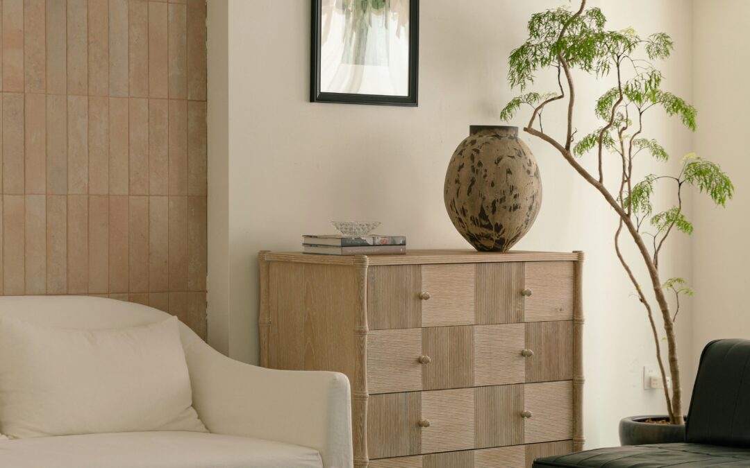
But beige isn’t indecisive—it’s nuanced. Its power lies in undertone, context, and materiality. The right beige doesn’t disappear. It grounds. It supports boldness, highlights texture, and invites stillness.

And in today’s world, stillness is a luxury.

From the Kelly Wearstler rebrand of the Santa Monica Proper Hotel to the tonal mastery seen in Bottega Veneta’s latest runway—beige isn’t just having a moment. It’s leading the quiet luxury movement. No logos, no noise—just presence.

“Beige is the pause between two loud thoughts. The margin where good design breathes.” —Rachel Blindauer

Neutral Beige Interior Design

The Psychology of Beige: Calm, Comfort, and Control

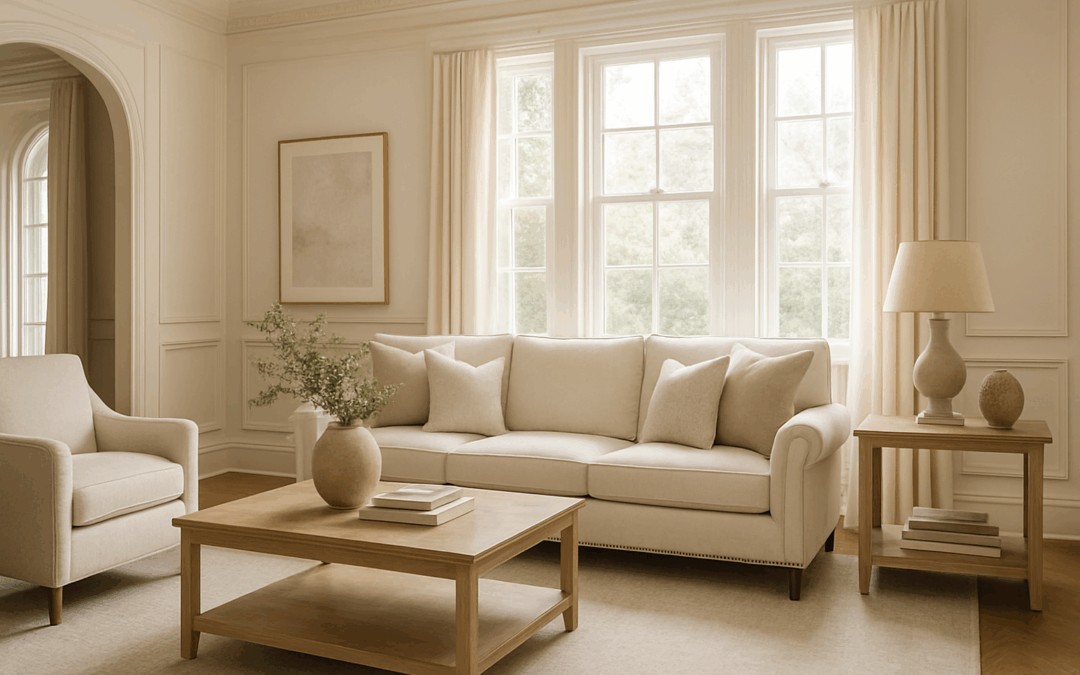
Beige tones evoke safety, warmth, and trust. Unlike stark white—which can feel clinical—beige is relational. It flatters skin tones, plays well with light, and transitions gracefully from morning to evening.

In color psychology, beige is linked to:

  • Stability: It’s the color of sand, stone, and woven natural fibers.

  • Elegance: When layered with texture and tone, it feels quietly refined.

  • Mental clarity: Less contrast means fewer visual demands—creating a restorative visual field.

This makes beige particularly effective in:

  • Bedrooms (paired with soft lighting and plush textiles)

  • Living rooms (as a backdrop for collected layers)

  • Entryways and transitional spaces (where it calms the pace)

Curious how other colors affect behavior and energy? Explore the Psychology of Color guide.

Beige by Mood & Undertone: A Quick Guide

Undertone Vibe Best With
Warm Beige Cozy, grounded Walnut, brass, terracotta
Cool Beige Minimal, composed Marble, steel, soft blue
Rosy Beige Romantic, feminine Mauve, dusty rose, antique gold

Beige isn’t beige without intention. Undertone is everything.

Designing with Beige: It’s All in the Layers

Beige isn’t one note—it’s a scale. From pale oat to rich fawn, what you choose matters.

Key undertones to consider:

  • Warm Beige: Think creamy cashew or camel—best with brass, walnut, or terracotta.

  • Cool Beige: Think putty or greige—perfect with marble, steel, and muted blues.

  • Rosy Beige: Works beautifully with mauve, dusty rose, or soft plum.

Styling Advice from Rachel:

“Beige doesn’t compete. It completes. I use it to pull focus where I want it—to an heirloom table, a hand-thrown ceramic, the shadow play of afternoon light on linen.”

Texture is the secret: Combine matte finishes, open weaves, and natural materials.
Think abaca placemats, linen napkins, raw oak, and woven lighting.

Beige Neutral Interior Design

Is Beige the New White? (Yes—But Smarter)

Where white can feel sterile, beige adds depth. It’s a better backdrop for art, photography, and people. It warms cool daylight and softens harsh shadows.

If you’ve ever stood in a perfectly beige room and felt…relieved—that’s no accident. It’s color psychology doing its quiet work.

Try this: Replace bright whites with soft beiges in your next space refresh. Walls, slipcovers, even cabinetry. The result? Timeless, tranquil, and quietly confident.

Rachel’s Favorite Beiges for Interiors

  • Farrow & Ball “Skimming Stone” – Elegant and barely-there

  • Benjamin Moore “Muslin” – A warm, flexible beige that flatters every room

  • C2 “Bone” – Complex and grounding, ideal for cabinetry or trim

  • Little Greene “Joanna” – A cool-leaning beige that feels polished, not cold

Subtle, Not Subdued: Shopping in the Beige Spectrum

Design-forward beige doesn’t mean “boring.” Here are a few pieces that embrace the palette without losing personality:

Paloma Scallop Placemat – Woven abaca that adds natural texture to a neutral table
Capri Marble Catchall Tray – Beige heirloom tray that turns a quiet surface into a curated still life.
Marais Woven Rattan Chest – A quiet standout in any room it brings artisanal texture and everyday grace to the art of storage.
Solaire Upholstered Dining Chair – Textured upholstery meets soft-spoken sophistication

3 Reasons Beige Is a Design Power Move

It reflects light more softly than white, flattering skin tones and furnishings.

It highlights texture—wood, linen, rattan—without competing for attention.

It creates a calming, restorative atmosphere that adapts to any mood or season.

Final Thought: Beige Is an Intentional Blank Canvas

Beige is what makes everything else make sense. It’s not a filler—it’s a frame. A color that doesn’t need to shout to be heard.

Because when a space feels right—but you can’t quite explain why—there’s a good chance beige had something to do with it.

Book a 2-Hour Color & Design Consultation
Discover the tones that restore you—and build a palette that’s quietly powerful.

Designing a hotel, model home, or branded space?
Inquire about partnerships to bring this intentional aesthetic to your next project.

2 Hour Interior Design Virtual or In Person Consultation

SOMETHING FOR EVERYONE

THE PIECES RACHEL RETURNS TO, AGAIN AND AGAIN
“Interior Designers Near Me” vs. The One Who Gets You: How to Hire the Right Fit in 2025

“Interior Designers Near Me” vs. The One Who Gets You: How to Hire the Right Fit in 2025

Because your home deserves more than proximity—it deserves clarity.

You’ve typed it in—“interior designers near me”—and Google delivered a stack of smiling headshots, star ratings, and slogans that all blur together.

But here’s what Google doesn’t show:
Who can actually make your space feel like you.

Rachel Blindauer Interior Design, Interior Designer Near Me

After 15 years designing homes across Nantucket, Sarasota, and now St. Louis, I’ve learned this:
Most people don’t need more design options. They need a framework.

Because design isn’t decoration—it’s decision-making. It’s who you let guide your most personal spaces. And it matters more than a five-star review.

What “Interior Designer Near Me” Really Gets You

Search engines are built for logistics. But hiring a designer isn’t a logistical decision—it’s an emotional one. Design touches your daily routines, your stress levels, even your sleep. A list of who’s nearby won’t tell you:

  • Who listens more than they pitch

  • Who sees your style even when you can’t articulate it

  • Who brings both artistic restraint and architectural logic

“A good designer brings taste. A great one brings alignment.”

How to Choose the Right Interior Designer—Even If They’re Not Local

Instead of asking “Who’s closest?”—ask this:

  • Can they show restraint where others add clutter?

  • Do they have a point of view—or just Pinterest boards?

  • Do they consider your life—not just your floorplan?

  • Can they hold space for couples, conflicting ideas, or decision fatigue?

Design is not just style. It’s psychology with a floorplan.

When Local Does Matter

If you’re remodeling, coordinating trades, or sourcing custom furnishings, local access matters. I personally serve clients in:

But many of my clients start with a virtual consultation—and find it offers more clarity than weeks of back-and-forth with a designer down the road.

Book a Session That Brings Instant Direction

I designed the 2-Hour Design Consultation for clients who want expert clarity—not sales pressure. It’s ideal for:

  • A single room you can’t figure out

  • A full home you want to align

  • Couples who want a neutral third-party perspective

  • Renovation guidance before expensive decisions are made

And if we move into full-service design afterward? The $300 fee is fully credited.

“Design that just looks good isn’t enough. It has to live well.”

You Don’t Need Just Any Interior Designer Near You

You need a partner who listens like a therapist, plans like an architect, and edits like a stylist.
One who sees more than square footage—who sees you.

That’s how good design becomes lasting peace of mind.

Start With a 2-Hour Design Consultation →

Rachel Blindauer is an award-winning interior and product designer known for crafting spaces that feel as good as they look. With 15+ years of experience and projects across Florida, Missouri, and Massachusetts, her studio specializes in calm, colorful interiors and boutique hospitality design

2 Hour Interior Design Virtual or In Person Consultation

SOMETHING FOR EVERYONE THE PIECES

RACHEL RETURNS TO, AGAIN AND AGAIN

What Color Is Navy? A Deep Dive into Design’s Most Enduring Hue

What Color Is Navy? A Deep Dive into Design’s Most Enduring Hue

It’s not just blue—it’s navy. And in the world of design, that distinction matters.

What Color Season is Navy Blue? A Deep Dive into Design’s Most Enduring Hue

Navy blue is one of those rare shades that feels timeless, yet endlessly adaptable. It can ground a room like a neutral, or it can command attention like a jewel tone. But when it comes to personal style and interiors, many ask the same question: what color season is navy blue?

The answer is both simple and nuanced. Navy’s versatility allows it to sit comfortably across multiple palettes—its exact character depends on the undertones, the finish, and how it’s paired.

A Brief History of Navy Blue

The name “navy blue” dates back to 1748, when it was first worn by officers in the British Royal Navy. Since then, it has carried connotations of strength, dignity, and formality. In design, navy emerged as an anchor shade in the late 19th century, a counterpoint to softer Victorian pastels. By the mid-20th century, it became synonymous with authority—think uniforms, boardrooms, and traditional libraries lined with leather-bound books.

Today, navy blue has been reimagined. It’s no longer confined to preppy stripes or nautical motifs. Instead, it’s embraced by interior designers for its depth, its mood-setting quality, and its ability to bridge modern minimalism with classic tradition.

What Color Season is Navy Blue?

Color seasons help us understand how hues interact with light, undertones, and personal coloring. Navy blue is unique because it flexes across multiple seasons:

  • Winter Palette: True navy, with its crisp, inky depth, belongs here. Pair it with cool jewel tones—emerald, fuchsia, or icy gray—for a dramatic effect.

  • Summer Palette: Soft navy, with muted undertones, works beautifully for those who shine in cool but lighter tones. It feels less severe than black but equally refined.

  • Autumn Palette: Navy with a hint of warmth (think midnight with a drop of brown) pairs seamlessly with earthy tones—camel, rust, and olive.

  • Spring Palette: Rare, but possible. A brighter, more vibrant navy leans toward cobalt and pairs with fresh, clear hues like coral or aqua.

Tip: If you’re unsure where your navy belongs, hold it against pure white. If it looks sharp and high-contrast, it’s Winter. If it softens into a dusty pairing, it’s Summer.

Using Navy in Interiors

Navy is often called “the new black” in design—and for good reason. Unlike black, which can feel stark, navy carries depth without overwhelming warmth. It’s endlessly versatile:

  • Walls: A navy-painted room feels cocooning yet elegant. (Explore my blog Best Paint Colors for Each Seasonal Type for shade recommendations tailored to light conditions.)

  • Cabinetry: Navy kitchens have become modern classics, pairing beautifully with marble, brass, or pale oak.

  • Textiles: Upholstered in velvet, navy reads as luxurious. In linen, it feels relaxed.

  • Accents: A single navy vase, lamp, or rug can anchor an otherwise neutral space.

Technically speaking, navy blue is a dark shade of blue with undertones of black or gray. In digital design, it hovers around #000080, though in interiors it can vary widely based on lighting, material, and context. It’s the difference between a room that recedes and a room that envelops. A navy wall absorbs light—and with it, distraction. A navy sofa feels grounded, sculptural. The color’s inherent seriousness makes every object it touches feel more considered.

The Psychology of Navy

Where cobalt energizes and turquoise soothes, navy centers. It is the color of confidence and control, often associated with trustworthiness and intelligence. Psychologically, it behaves like black—lending weight to a space—but without the harshness. It tempers emotion while inviting contemplation. Studies show deep blues foster trust, calm, and focus. It’s why corporations favor it in branding, and why homeowners turn to it for spaces meant to feel serene but strong.

In bedrooms, navy can induce calm and deepen rest. In dining rooms, it creates intimacy. And in powder rooms or libraries, it becomes a dramatic gesture of restraint—where richness doesn’t require ornamentation.

“I often use navy the way a writer uses punctuation,” says Rachel Blindauer. “It breaks up a space and gives it rhythm. A navy wall isn’t just a backdrop—it’s a pause that heightens everything else.”

The Best Navy Paint Colors

Not all navies are created equal. A few designer favorites:

  • Benjamin Moore Hale Navy: A true, balanced navy that flatters almost every palette.

  • Farrow & Ball Hague Blue: A moody, green-leaning navy perfect for atmospheric rooms.

  • Sherwin-Williams Naval: Crisp, classic, and versatile—ideal for cabinetry.

  • Little Greene Basalt: A rich navy with subtle complexity, perfect for traditional-meets-modern interiors.

Materials Matter: Navy in Texture

Navy is never just navy. In matte limewash, it reads like shadow. In lacquer, it glows like obsidian. Velvet makes it royal; linen makes it relaxed. Paint navy on plaster, and it feels aged and architectural. Use it in tile or enamel, and it skews nautical.

This versatility makes it a favorite for interior designers who love nuance. At shop.rachelblindauer.com, pieces like the Matte Indigo Ceramic Bowl or the Navy Bouclé Bench channel this shade in tactile, intentional ways—turning color into a design material of its own.

Navy vs. Other Blues: A Comparison

Color Undertone Mood Best Use
Navy Blue Black, Gray Grounded, Sophisticated Walls, Upholstery, Accent Pieces
Cobalt Blue Bright, Cool Energetic, Bold Art, Lacquered Finishes
Slate Blue Gray, Muted Calm, Transitional Cabinetry, Bedrooms
Midnight Blue Nearly Black Dramatic, Mysterious Powder Rooms, Formal Spaces
Bedroom Bedding Interior Design

How to Use Navy in Interior Design

Here’s where to start:

  • Walls: For a moody backdrop, try Benjamin Moore’s Hale Navy or Farrow & Ball’s Hague Blue. In sunlit spaces, it reads vibrant. In low light, it cocoons.

  • Furniture: Choose navy when black feels too severe but white too expected. A navy velvet sofa feels intentional, not trendy.

  • Accents: Pair navy with brass, walnut, ivory, or even olive for a rich, layered palette. Avoid pairing it with high-contrast neon or stark whites—it dilutes navy’s elegance.

  • Rooms: Navy thrives in transitional spaces like hallways, powder rooms, or entry vestibules where its drama can be contained and savored.

Need guidance bringing navy into your home? Book a 2 Hour Design Consultation for tailored advice and expert color strategy that goes far beyond the paint chip.

2 Hour Interior Design Virtual or In Person Consultation

SOMETHING FOR EVERYONE

THE PIECES RACHEL RETURNS TO, AGAIN AND AGAIN

12 Most Popular Interior Design Styles in 2025 – Rachel Blindauer

12 Most Popular Interior Design Styles in 2025 – Rachel Blindauer

Interior Design Styles: A Guide to the Most Timeless—and Searched—Looks

“Most people don’t need more furniture. They need a framework.” —Rachel Blindauer

From sun-drenched villas in the Mediterranean to the edited restraint of a Parisian apartment, design styles do more than shape spaces—they shape the lives lived inside them. They’re not just aesthetic decisions; they’re psychological ones. And with Pinterest boards, magazine spreads, and algorithms offering endless inspiration, clarity is more valuable than ever.

This guide cuts through the visual noise to highlight the most enduring and most-searched-for interior design styles of 2025. What follows isn’t just a list—it’s a lens, giving you the cultural, historical, and tactile insight to define your aesthetic and live beautifully within it.

Start Here: Which Style Fits You?

Still unsure of your style? Start with Rachel’s Interior Style Quiz or submit a project inquiry for personalized design guidance.

Modern Organic Style

Modern Organic

Top search terms: “organic modern living room,” “natural home decor”

Clean lines meet natural textures. Modern Organic emerged as a soft rebellion against sterile minimalism—inviting the outside in with plaster walls, unfinished wood, and tactile linens.

Its roots stretch from California’s early modernist homes to Japan’s reverence for imperfection. Today, it evokes grounded serenity through a palette of stone, sand, and soft white.

“Modern Organic is where I begin when someone says, ‘I want calm, but not cold.’” —Rachel Blindauer

Materials to Lean Into: Raw oak, matte ceramics, tumbled travertine, textural boucle.

Try This: Anchor your entryway with the Ravena Marble Bowl—an object that feels found, not purchased.

Quiet Luxury Style

Quiet Luxury

Top search terms: “quiet luxury home,” “luxury without labels”

Born of the same ethos as The Row or Succession’s set design, Quiet Luxury is more about discernment than display. It’s the feeling of unlacquered brass, the weight of a handmade bowl, the presence of negative space.

“True luxury is confidence without spectacle.” —Rachel Blindauer

Cultural Touchpoint: It harks back to Axel Vervoordt’s Belgian minimalism and the kind of restraint that suggests generational knowledge, not trend-following.

Materials That Matter: Limestone, bronze, velvet, handmade tile, unlacquered fixtures.

Try This: Combine the Johanna Table Lamp with sculptural stoneware and clean-lined upholstery. Let the materials speak.

Coastal Grandmillennial Style

Coastal Grandmillennial

Top search terms: “coastal grandmother aesthetic,” “modern coastal decor”

Think Nancy Meyers kitchens—only layered with block-printed pillows, chinoiserie vases, and rattan details. Coastal Grandmillennial is beachy but bookish. Fresh but familiar.

A modern tribute to classic Americana with a Southern wink, this style marries comfort with charm.

Tactile Notes: Cotton slipcovers, wicker, ticking stripe, jute, sea glass, ginger jars.

Try This: Style your console with the Natasha Raffia Tray and a cluster of hydrangeas.

Parisian Minimalist Style

Parisian Minimalist

Top search terms: “Parisian apartment decor,” “elevated minimalist”

This is minimalism with poetry. A single sculptural chair in a room with crown molding. High ceilings, herringbone floors, and art that doesn’t explain itself.

“Parisian style isn’t about what’s there. It’s about what’s not—and why.” —Rachel Blindauer

Materials That Define It: Boucle, marble, blackened iron, smoked glass.

Try This: Float the Demi Dining Chair under a plaster pendant and let silence do the styling.

Midcentury Eclectic Style

Midcentury Eclectic

Top search terms: “Midcentury modern decor,” “eclectic home design”

Post-war optimism meets thrifted charm. This look honors midcentury bones—walnut credenzas, sputnik lighting—but injects color, pattern, and whimsy.

It’s not about authenticity to era—it’s about energy.

Materials Palette: Terrazzo, velvet, brass, shag rugs, glass globes, leather.

Try This: Pair a 1970s-inspired chair with the Opaline Vase and layered abstract art.

Scandinavian Minimalism Style

Scandinavian Minimalism

Top search terms: “Scandinavian interior design,” “Scandi living room”

Understated and luminous. Scandinavian design draws from Nordic winters, emphasizing light, functionality, and warmth. It’s less about “things” and more about the feeling of space.

Material Focus: Birch, wool, paper, soapstone, ceramic.

Aspirational: What would your home look like if you only kept what you loved or earned its place?

Transitional Style

Transitional Style

Top search terms: “transitional design style,” “modern traditional home”

The most client-friendly of all styles. Transitional homes are grounded by traditional architecture but made livable with cleaner lines, soft textures, and updated finishes.

“When you want timelessness without the weight of tradition—this is the sweet spot.” —Rachel Blindauer

Typical Elements: Tailored upholstery, brass or nickel fixtures, muted palettes, statement lighting.

Hollywood Regency Style

Hollywood Regency

Top search terms: “Hollywood glam interior,” “regency home style”

Symmetry. Shine. Sex appeal. Inspired by old-Hollywood sets and Dorothy Draper’s maximalism, this style embraces glossy finishes, rich color, and dramatic flourishes.

Material Glossary: Lacquer, mirror, velvet, palm fronds, lucite.

Try This: Add Art Deco-style sconces and high-contrast art. Think glamour that doesn’t need to try too hard.

Japandi Style

Japandi

Top search terms: “Japandi interior design,” “Japanese Scandinavian style”

Minimal but not cold. Japandi combines the mindfulness of Japanese wabi-sabi with Scandinavian warmth. Think low furniture, diffused light, and curated imperfection.

Signature Materials: Ash wood, paper lanterns, clay, linen, stone.

Try This: Let negative space do the talking. Edit your living room to its essentials—and elevate each.

Industrial Modern Style

Industrial Modern

Top search terms: “industrial loft design,” “modern industrial decor”

Where warehouse grit meets refinement. This look brings together raw textures (exposed brick, aged leather) with sharp silhouettes and clean proportion.

Material Notes: Concrete, steel, dark wood, glass, vintage hardware.

Aspirational Prompt: Can your home feel both industrial and intimate?

Maximalism Style

Maximalism

Top search terms: “maximalist interior,” “colorful eclectic home”

More is more. Done well, Maximalism is curated chaos—books, art, color, pattern. Each piece tells a story, and together, they create a world.

“Maximalist homes read like memoirs. You’re not decorating; you’re storytelling.” —Rachel Blindauer

Key Materials: Velvet, wallpaper, mixed prints, ceramics, collected objects.

Traditional European Style

Traditional European

Top search terms: “traditional interior design,” “European classic homes”

This isn’t granny’s house. It’s layered, intelligent, and rooted in history. Think English libraries, Parisian parlors, and Italian villas.

Material Vocabulary: Silk, antique brass, carved wood, limestone, tapestry.

Try This: Mix a 19th-century painting with clean-lined upholstery. Let heritage and modernity coexist.

“When a home has history, I don’t overwrite it. I frame it.” —Rachel Blindauer

Style Comparison Table

Style Key Materials Mood Best For
Modern Organic Plaster, linen, oak Grounded Retreat-like homes
Quiet Luxury Cashmere, brass, stone Refined Sophisticated primary homes
Coastal Grandmillennial Rattan, linen, blue + white Breezy Second homes, beach towns
Parisian Minimalist Boucle, marble, iron Sculptural Urban apartments
Midcentury Eclectic Walnut, shag, Murano glass Retro Vintage lovers
Scandinavian Birch, wool, ceramic Airy Minimalist families
Transitional Velvet, brass, neutrals Timeless Clients between styles
Hollywood Regency Lacquer, mirror, velvet Glamorous Entertaining spaces
Japandi Ash wood, paper, linen Serene Design purists
Industrial Modern Concrete, steel, leather Edgy Lofts + urban conversions
Maximalist Velvet, books, bold prints Expressive Art-forward creatives
Traditional European Silk, antiques, plaster Grand Historic + large homes


Find Your Style—Then Live It

The best-designed homes don’t just photograph well—they feel right. They support how you live, love, host, rest. They tell your story with clarity and care.

Not sure where to begin?

“Design isn’t about perfection. It’s about peace, clarity, and living intentionally.” —Rachel Blindauer

2 Hour Design Consultation

SOMETHING FOR EVERYONE

THE PIECES RACHEL RETURNS TO, AGAIN AND AGAIN

What Color Season Is Lavender?

What Color Season Is Lavender?

A Study in Subtle Power, Seasonal Belonging & Sensory Design

Lavender sits somewhere between presence and whisper. It’s not a color that demands your attention—it earns it. But despite its graceful ambiguity, lavender is not neutral. It carries with it a distinct emotional temperature and seasonality that makes it a fascinating case study in both personal color analysis and interior design.

As a designer, I’ve seen lavender quietly shape everything from entryways to wardrobes, offering unexpected depth when paired with the right textures, light, and tone. So let’s answer the perennial question: what color season does lavender belong to?

LilacTexturalGlamour-LivingRoom

Lavender in Color Theory: More Than Just a Pretty Pastel

In traditional seasonal color theory, lavender belongs primarily to the Summer color season. It reflects the hallmarks of Summer: cool undertones, softness, and a dusted, powdered quality—almost like light filtered through silk.

Where Winter’s purples are saturated and bold (think royal purple or violet), Summer’s are muted and romantic. Lavender leans blue rather than red. It’s gentler than lilac, cooler than mauve, and doesn’t carry the warm pink of spring’s orchid tones.

Lavender aligns with individuals whose natural coloring is cool and delicate—those with ash blonde to medium brown hair, soft eye colors (gray, hazel, muted blue), and skin that flushes more pink than golden.

For interiors, lavender lives best in homes filled with northern or indirect light. It whispers rather than shouts—ideal for bedrooms, powder rooms, and reading nooks where a sense of calm is not just preferred, but designed for.

Rachel’s Rule: “If it looks too bright, it’s not lavender—it’s lilac trying too hard.”

Historical & Cultural Context: Lavender’s Dual Legacy

Lavender’s place in history is one of quiet rebellion and elegance. In Victorian England, it was the second-stage mourning color, symbolizing dignity, grace, and restraint. In French provincial homes, it was a practical yet poetic presence—lavender bundles tucked into linen drawers, the hue echoed in painted shutters or toile fabric.

Fast forward, and lavender became a symbol of gender neutrality and artistic freedom. In the 1970s, it found new life in fashion as a soft protest—elevating the feminine without apology.

Today, lavender bridges classical refinement and contemporary softness. In a world obsessed with bold statements, lavender reminds us that nuance is a power move.

blindaur
sarasotainteriordesign
LilacTexturalGlamour-LivingRoom
Purple Brown Dining Area Interior Design

How Lavender Functions in Interiors

Lavender is not a trend—it’s a tone. And tone is timeless when paired well.

Tactile Notes

The success of lavender in a room hinges on materials and light. On velvet, it feels lush and cool. On plaster, ethereal and organic. Lavender linen offers a Provençal ease; in lacquered finishes, it flirts with modernity.

Use lavender when you want a space to feel dressed, not decorated.

Ideal Pairings

Lavender thrives beside:

  • Chalky whites (Farrow & Ball’s Wevet or Benjamin Moore’s White Dove)

  • Soft greens and sages (See our Spring Color Palette)

  • Aged brass and unlacquered metals

  • Blonde or white oak woods for a warm-cool balance

If you want it to sing, pair it with texture—bouclé, brushed metals, or a matte wall paint like Portola Paints Roman Clay.

Explore lavender-forward pieces like the Wisteria Art Print or Lilac Linen Napkins in our shop for subtle ways to layer the shade into your space.

drawin

Could Your Home Hold a Whisper of Lavender?

Ask yourself:

  • Could your guest room feel more welcoming with lavender linen drapes and white oak nightstands?

  • Would a single lavender lacquered sconce beside your vanity soften the morning light?

  • Is your wardrobe missing a lavender blouse that does more for your skin tone than five black tops combined?

Lavender doesn’t need the spotlight—it just needs a seat at the table.

sarasotainteriordesign

Final Word: A Soft Power Color

Lavender isn’t for everyone. But for those it suits, it becomes a signature—softly magnetic, soothing, and quietly bold. Whether you’re exploring your seasonal color palette or selecting a powder room paint, lavender is a hue that transcends trend and taps into something deeper: clarity, elegance, and balance.

And like all the best design choices, it meets you where you are—and then gently raises the bar.

2 Hour Interior Design Virtual or In Person Consultation

SOMETHING FOR EVERYONE

THE PIECES RACHEL RETURNS TO, AGAIN AND AGAIN

Summer Color Palette Ideas: Best Paint Colors, Moodboards, and Design Tips

Summer Color Palette Ideas: Best Paint Colors, Moodboards, and Design Tips

There’s a reason summer feels like a sigh of relief. The heat softens the edges of everything, and in color theory, Summer types are no different—cool, light, and gently muted. Unlike the bold clarity of winter or the bright intensity of spring, the summer palette speaks in hushed tones. Think of it less as decoration and more as atmosphere.

As an interior and product designer who’s worked across climates—from Sarasota’s glare to San Francisco’s fog—I’ve seen firsthand how color plays differently by region. A shade that sings in Nantucket’s filtered light may fall flat in the Midwest. That’s why a refined seasonal palette isn’t just aesthetically pleasing—it’s strategic.

What Is the Summer Color Palette?

The summer palette includes cool, muted colors with soft undertones. Think dusty rose, soft periwinkle, French blue, muted lavender, and greige. These tones are elegant and diffused—meant to live beautifully in natural light and never shout for attention.

These hues work especially well in interiors that aim for serenity without sterility. They’re the tones of misty mornings, vintage linen, and soft-focus memories.

Core Summer Colors:

  • Dusty Mauve

  • Powder Blue

  • Sage Mist

  • Warm Greige

  • Soft Lavender

  • French Gray

  • Faded Rose

These aren’t just trending—they’re timeless.

“The goal is not just to choose a color that looks good—but one that lives well.”

Why Summer Colors Work in Interiors

Summer colors are flattering to both people and architecture. They read elevated but not aloof, and age well in both northern and southern light. If you’re designing a space that’s meant to feel calm but not cold—this is your palette.

These tones are especially powerful in:

  • Bedrooms where softness matters

  • Primary bathrooms designed for restoration

  • Open-concept spaces that need flow without visual fatigue

In a recent Nantucket project, I used Farrow & Ball’s Skimming Stone in a sunroom paired with French blue cushions and brushed brass sconces. The palette anchored the space with subtlety—letting the view steal the show without the room feeling flat.

“A Summer palette is like poetry in a whisper—you notice it more the longer you live with it.”

Best Paint Colors for a Summer Color Palette

These curated selections are tested across lighting conditions and geographic regions:

For Sunny Climates (Sarasota, FL)

  • Benjamin Moore Moonshine – warm silver-gray with movement

  • Farrow & Ball Calluna – quiet lavender that doesn’t skew purple

  • Sherwin-Williams Silver Strand – coastal classic with soft green-gray undertones

For Diffused Light (San Francisco, CA)

  • Farrow & Ball Skimming Stone – warm greige with elegance

  • Benjamin Moore Silver Lake – a true, clean powder blue

  • Little Greene China Clay Mid – soft bone with chalky neutrality

For Seasonal Light Shifts (Nantucket, MA)

  • C2 Vex – a shadowy mauve with richness

  • Benjamin Moore French Canvas – luminous off-white with warmth

  • Portola Paints Limestone – matte and mineral-like with textural depth

Pair with trim in Chantilly Lace or White Dove for softness without harsh contrast.

Layering and Materiality: The Key to Depth

Summer hues don’t demand—they invite. To build layered depth:

  • Combine similar undertones (a greige sofa with blue-gray drapery and rose accents)

  • Use materials that absorb and reflect light differently (matte ceramic next to soft linen)

  • Keep patterns subtle—this palette thrives in clarity and restraint

Summer Moodboard Pairings

Nantucket Summer
Paint: C2 Vex + Portola Limestone
Materials: Belgian linen, white oak
Anchor: Vintage nautical watercolor in faded navy

San Francisco Summer
Paint: Skimming Stone + Silver Lake
Materials: Textured ceramic tile, brushed brass
Anchor: Sculptural alabaster pendant

Sarasota Summer
Paint: Moonshine + Silver Strand
Materials: Handwoven raffia, polished nickel
Anchor: Coral abstract art on raw canvas

Spring Color Palate Mood Board

How to Know If You’re a Summer

Are You a Summer?

  • You prefer silver to gold

  • Your skin looks best in muted, cool tones

  • You gravitate toward softness—both in people and in style

  • You favor calm over contrast, flow over flash

sarasotainteriordesign

Wear It, Live It

These colors don’t just live on walls. If you’re a true Summer type, your best wardrobe neutrals likely mirror these hues: soft navy, blush, and misty gray. The same logic applies—these tones flatter without overwhelming.

Use this guide with the Rachel Color Method Quiz or download the Seasonal Color Palette Guide to explore your color harmony across fashion, beauty, and interiors.

FAQ: Summer Color Palette Design

What are summer color palette tones?
Soft, cool, and muted shades like dusty mauve, powder blue, sage mist, and warm greige.

Which rooms look best in summer colors?
Bedrooms, living rooms, and bathrooms—spaces where calm and cohesion matter.

Can I use the summer color palette year-round?
Yes. These tones feel fresh in summer but hold their elegance all year.

What is the difference between soft summer and light summer palettes?
Soft summer is more grounded and dusky; light summer leans pastel and airy.

What undertones should I avoid if I’m a summer?
Avoid overly warm, yellow-based hues. Stick to cool, blue-based neutrals.

Purple Brown Dining Area Interior Design

Ready to Create a Space That Reflects You?

Book a 2-Hour Design Consultation and let’s build a space that reflects your seasonal essence—with clarity, elegance, and ease.

About: Rachel Blindauer is an award-winning interior and product designer known for creating spaces that feel as good as they look. With over 15 years of experience and projects from Florida to California, her work blends architectural clarity with an artist’s restraint.

2 Hour Interior Design Virtual or In Person Consultation

SOMETHING FOR EVERYONE

THE PIECES RACHEL RETURNS TOAGAIN AND AGAIN