Paint or Furnishings First? Why the Order of Design Changes Everything

Paint or Furnishings First? Why the Order of Design Changes Everything

Some rooms look perfect on paper—and still feel wrong.
There’s scale, symmetry, even great lighting. But something resists. A kind of ambient dissonance. You rearrange. You edit. Still, the space doesn’t settle.

More often than not, it starts at the beginning.

“Design a room in the wrong order, and you’ll spend months trying to fix what never needed to be broken.”

In design, order matters. And while paint feels like a natural starting point, it’s rarely the right one. I don’t just mean practically—I mean energetically. Furniture grounds. Paint decorates. One is foundation. The other, finish.

Why Furnishings Should Come Before Paint in Interior Design

Paint seduces. It’s instant gratification—a swipe of mood, a signal of momentum. But it also tricks us into thinking we’ve made a meaningful decision. In truth, paint is flexible. It changes in daylight. It shifts against fabrics. There are thousands of options for every undertone.

Furnishings, however, are finite. There are only so many coffee tables that speak your language. Only so many sofas with the right proportions, textures, and presence.

Once the furniture is chosen, the paint practically picks itself.

“Color isn’t just visual—it’s relational. It reacts to what surrounds it.”

Choosing paint first is like naming a character before you’ve written the story. It feels productive, but often misdirects.

Common Mistakes When You Paint Too Early

In new builds and renovations, painting first can seem like progress. Clients feel accomplished. Rooms appear ‘done.’

But then the limitations set in:

  • The warm gray you loved clashes with your cool-toned velvet chairs.

  • That pale green looks minty next to your rug.

  • The cream you picked in a showroom reads yellow at 3 PM in your living room.

So you repaint. Or worse, you keep it—and design around it. And that’s where beauty starts to feel like a burden.

The Right Order to Design a Room, According to an Expert

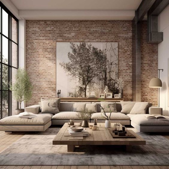
I begin most rooms with a single emotional anchor: a rug, a piece of art, or a tactile fabric that sets the mood. From there, we layer the room with furnishings—pieces that introduce structure, function, and form.

Paint is one of the last things we choose. Not because it’s unimportant, but because by then, the room is speaking. And the right color becomes obvious.

You’ll see this layered approach in my interior design portfolio. These rooms weren’t pulled together—they were composed. Slowly, intentionally. Paint was the final punctuation, not the opening line.

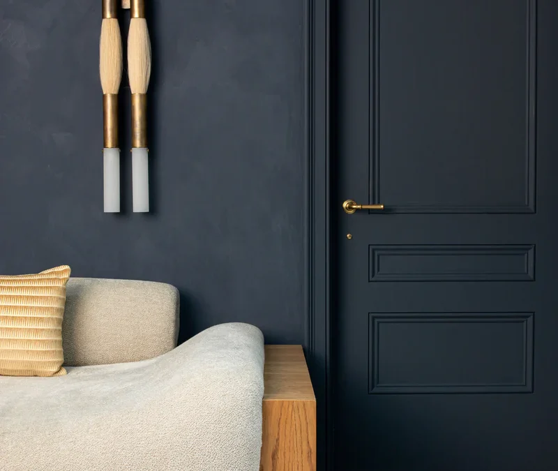
What Paint Can Do—When Used at the Right Time

When chosen after the room’s emotional tone is established, paint becomes a powerful support character.

It can:

  • Deepen a natural material story

  • Balance warm and cool lighting

  • Amplify the serenity of neutrals or the drama of contrast

“Let your furniture and textiles lead the way. Paint is the chorus, not the soloist.”

From Philosophy to Purchase: Where to Begin

Begin with what’s tangible:

These are the decisions that shape how you live—not just how your space looks.

And when you’re ready to select paint, this guide can help you find the right shade based on your room’s orientation, region, and natural light.

Bonus: Want My Go-To Paint Colors by Region?

From fog-diffused grays for San Francisco to sun-balanced whites for Sarasota, I’ve compiled the paints that truly work—mapped by light, style, and seasonal palette.

Take the Style Quiz to get your free custom palette—and I’ll send over expert recommendations tailored to your aesthetic and lighting.

Rachel Blindauer is an award-winning interior and product designer known for creating homes that feel as good as they look. Her firm blends architectural rigor with editorial restraint—designing spaces that are tactile, intuitive, and enduring.

Explore full-service offerings at RachelBlindauer.com or shop her curated home collection.

Get Started Today

Let Rachel Blindauer help you think through your project starting with a consultation.

SOMETHING FOR EVERYONE

THE PIECES RACHEL RETURNS TOAGAIN AND AGAIN

Quiet Luxury Interiors 2026: Why the Most Powerful Spaces Speak Softly

Quiet luxury is not minimalism. And it is certainly not neutrality for its own sake.

It is restraint with intention—the kind that reveals itself slowly, through surfaces that age beautifully, proportions that feel inevitable, and rooms that know exactly what they are without announcing it. In interiors, quiet luxury resists spectacle. It favors material honesty over decoration, proportion over polish, and spaces that feel edited rather than styled.

As an interior designer, I have spent years watching trends cycle through extremes—maximalism, then stark minimalism, then pattern overload. What endures, every time, are the rooms built on quality materials, considered layouts, and a restraint that feels generous rather than sparse. In 2026, this philosophy feels more relevant than ever, evolving with warmer textures, sculptural curves, and subtle connections to nature.

The Roots of Quiet Luxury in Interior Design

The most enduring interiors have never been loud. European townhouses with their centuries-old plaster walls and hand-laid stone floors. Early American coastal homes where wide plank boards and simple millwork spoke of craft without pretension. Mid-century modernist residences where every window placement was deliberate, every material honest about what it was.

These spaces share something essential: materials chosen to age gracefully, layouts that respect how people actually move through rooms, and a disciplined approach to color that lets light do much of the work.

Today, quiet luxury continues that lineage—infused with 2026’s emphasis on tactile warmth, biophilic wellbeing, and sustainable craft. After years of visual noise and performative design on social media, we are craving spaces that genuinely nurture. Calm sanctuaries that reflect discernment over excess.

Sink

What Quiet Luxury Really Means in 2026

At its core, quiet luxury prioritizes function, feel, and endurance—spaces that work intuitively and reward you more deeply the longer you live in them.

This means layouts with effortless circulation, where you never feel like you are fighting the room. It means long-lasting, eco-conscious materials that develop character over years rather than deteriorating. It means thoughtful, layered color that responds to changing light throughout the day. And it means furniture with sculptural presence and softened curves—pieces that look as good in person as they do in photographs, maybe better.

Nothing shouts. Everything invites lingering. In 2026, this also includes subtle biophilic touches—abundant natural light, organic forms, living greenery positioned where it catches your eye naturally—that enhance calm without adding clutter.

You know the feeling when you walk into a room and your shoulders instantly drop? That is the quiet power we are chasing.

Shop The Look

Materials That Define Quiet Luxury

Quiet luxury is tactile first. The materials that define it are surfaces that improve with age and touch—stone that develops a patina, wood that deepens in color, textiles that soften with every wash.

In my design practice, I start every project with materials before anything else. The palette of surfaces in a room—what you touch when you set down a glass, lean against a wall, or walk barefoot across a floor—determines whether a space feels expensive or merely decorated. True quiet luxury registers in your fingertips before your eyes.

Marble kitchen surfaces exemplifying quiet luxury materials

Stone and Mineral Surfaces

Honed travertine, limestone, and soft-veined marble ground a space with quiet authority. These are materials that have been used in the finest interiors for centuries, and for good reason—they carry visual weight without heaviness, and they age into something more beautiful than they started.

In 2026, the trend is moving toward textured stone finishes rather than high-polish. Limewash accents on plaster walls, leathered granite countertops, and tumbled marble floors all add organic depth that catches light softly throughout the day. I often incorporate sculptural stone pieces in my projects—a travertine pedestal table, a marble catchall tray—because they anchor a room effortlessly and connect the space to something ancient and enduring.

Wood with Character

White oak, walnut, and reclaimed timbers bring warmth and biography to quiet luxury interiors. The key is letting the wood show its grain, its knots, its natural variation—finished with oil or wax rather than heavy lacquer so it can breathe and develop richness over time.

In 2026, the most compelling wood applications pair beautifully with textured stone and soft textiles, creating rooms that feel layered and lived-in from day one. Wide plank floors, a hand-turned wooden bowl on a console, open shelving in a kitchen—these elements add soul that no synthetic material can replicate.

Natural wood shelving paired with marble in a quiet luxury kitchen

Textiles That Invite Daily Use

Linen, wool, and bouclé blends that soften over time are the textiles of quiet luxury. They are not precious—they are meant to be used, draped across, curled up in. If a fabric is too delicate to sit on without worrying, it has no place in a room designed for actual living.

Upholstery with gentle curves beckons you to stay. A swivel chair in heavy linen, an ottoman in performance bouclé, pillows that you actually lean into—these are the pieces that make a room feel both refined and completely welcoming. The best textiles in a quiet luxury interior should make you want to reach out and touch them.

Color in Quiet Luxury Interiors

Quiet luxury is far from beige-only. The palettes of 2026 are calmly colorful and warmly grounded: muted taupe, mineral greens, earthy ochres, soft mahoganies, and chalky blues that shift beautifully throughout the day as light changes.

The key is restraint in application, not in range. A room can hold several colors gracefully when each one is chosen for how it plays with its neighbors—and with the light at different times of day. I often recommend clients paint large swatches and live with them for a full day cycle before committing. The color that looks perfect at noon may feel entirely different at dusk.

In my paint guides on RachelBlindauer.com, I curate geography-specific palettes that account for regional light quality—because a warm taupe that sings in Sarasota may fall flat in a north-facing Nantucket living room. Quiet luxury demands this level of specificity.

Neutral warm tones in a quiet luxury interior

Layout: The Invisible Ingredient

True luxury is designed, not bought. The most expensive furniture in the world cannot save a room with poor flow, awkward sightlines, or lighting that fights you at every turn.

In quiet luxury interiors, layout is the invisible ingredient that makes everything else work. Prioritize natural light fall—arrange seating where morning sun warms it, position dining tables where evening light creates atmosphere. Design seamless circulation so that moving through a room feels effortless rather than like an obstacle course.

This is where working with a designer early in the process pays for itself many times over. Getting the layout right from the foundation means every piece you add afterward has a place that feels inevitable. My consultations often start here—rethinking flow before we ever discuss a single finish or fabric.

Furniture: Fewer Pieces, Better Choices

Edited intentionality is the hallmark of quiet luxury furniture. Rather than filling a room, you are curating it—selecting fewer pieces, each one chosen for its sculptural presence, its comfort, and its ability to anchor the space around it.

In 2026, the most compelling furniture shares certain qualities: softened curves that invite touch, proportions that feel grounded rather than spindly, and materials that reward close inspection. A swivel chair in heavy linen. A chaise with the kind of curve that makes you want to stretch out. A side table in natural travertine that doubles as a sculptural object.

The best quiet luxury interiors feel like every piece was placed with care—and then the room was left alone. No filler, no matching sets, no pieces that exist only to occupy space. Just the essentials, chosen exceptionally well.

Bringing Quiet Luxury Home

Quiet luxury is not about spending more. It is about choosing differently—with patience, with specificity, and with an eye toward how a space will feel in five years, not just five minutes after the delivery truck leaves.

Whether you are starting from scratch or reimagining what you already have, the principles are the same: invest in materials that age well, design layouts that serve how you actually live, choose color with intention, and edit ruthlessly until every piece earns its place.

If you are ready to explore what quiet luxury looks like in your home, I would love to help. My design consultations are available virtually or in person in Sarasota, St. Louis, Nantucket, and Lincoln, MA—and consultation fees credit toward your project.

2 Hour Interior Design Virtual or In Person Consultation

SOMETHING FOR EVERYONE

THE PIECES RACHEL RETURNS TO, AGAIN AND AGAIN

Best Luxury Home Decor Items for Coastal Interiors: Shop Roundup

As an interior designer specializing in refined, narrative-driven spaces, I hand-select pieces that bring serenity and sophistication to coastal-inspired homes. Drawing from New England’s misty light and timeless elegance, my shop features minimalist lamps, sculptural vases, textured pillows, and brass accents—curated for luxurious layers that elevate any room. Whether you’re refreshing a beachside retreat or adding quiet luxury to your urban oasis, these must-have items blend natural materials like travertine, rattan, and brass with modern forms. Discover my top picks below, optimized for 2026 trends in coastal home decor, and shop now to transform your space.
Favorites From Our Shop

Luxury Table Lamps: Illuminate with Minimalist Elegance

Table lamps are the cornerstone of coastal lighting—soft, sculptural, and perfectly balanced. These brass and stone pieces cast a warm, diffused glow that complements serene palettes.

  • Axis Table Lamp — Marble & Brass ($645.00): This minimalist marvel combines polished marble with antique brass for a timeless coastal accent. Ideal for bedside or console tables, its clean lines add refined warmth. Shop Now
  • Monolith Table Lamp — Travertine & Brass ($1,164.00): Crafted from natural travertine stone and brass, this sculptural lamp evokes ocean-worn elegance. Perfect for entryways or living rooms—limited stock for this high-demand piece. Shop Now
  • Laurel Quartz Buffet Lamp ($831.00): Featuring quartz crystal and brass, this lamp brings subtle sparkle to dining areas or buffets. Its luminous quality enhances coastal serenity. Shop Now

Elegant Sculptural Vases: Add Artistic Depth to Your Decor

Vases and bowls from my collection double as art—textural, organic forms that ground coastal spaces with minimalist luxury.

  • Linea Arc Vessel ($769.00): A curved, sculptural vase with clean arcs, perfect for fresh florals or standalone display. Its stone-inspired finish ties into natural coastal themes. Shop Now
  • Eclipse Plinth Vessel ($475.00): This eclipse-shaped vase blends modern geometry with refined elegance—ideal for mantels or shelves. A bestseller for its versatile coastal appeal. Shop Now
  • Drift Form Bowls — Travertine, Set of 2 ($684.00): Handcrafted travertine bowls with organic drift shapes, great for fruit displays or decorative accents. Elevate your tabletop with timeless texture. Shop Now

Textured Pillows: Layer Comfort with Coastal Softness

Pillows are an easy way to infuse luxury—my selections feature cloud-like textures and neutral tones for effortless layering in serene interiors.

  • Colette Cloud Pillow ($297.00): This plush, cloud-shaped pillow in soft neutrals adds whimsical yet sophisticated comfort to sofas or beds. A favorite for coastal lounging. Shop Now
  • Isla Dot Pillow ($297.00): Featuring subtle dot patterns in muted tones, this pillow brings quiet texture to any seating area. Perfect for mixing with solids in a layered look. Shop Now

Brass Sculptures & Accents: Refined Touches for Everyday Luxury

Sculptures and catchalls add personality—brass and rattan pieces from the shop offer functional art that enhances coastal refinement.

  • Reverie Brass Figure ($311.00): An abstract brass sculpture evoking thoughtful reverie—ideal for bookshelves or consoles. Its modern form elevates any vignette. Shop Now
  • Palermo Rattan & Brass Catchall Tray ($405.00): This versatile tray combines rattan weave with brass for coastal organization. Use for keys, jewelry, or as a decorative base. Shop Now
  • Gamekeeper Antique Gold Catchall ($63.25): An affordable antique gold tray for small accents—perfect entry-level luxury for nightstands or vanities. Shop Now

Ready to bring coastal luxury home? These hand-curated pieces are in limited stock—shop the full collection now and elevate your space with timeless elegance. For personalized styling, inquire about my paid virtual concierge service.

2 Hour Interior Design Virtual or In Person Consultation

SOMETHING FOR EVERYONE

THE PIECES RACHEL RETURNS TOAGAIN AND AGAIN

Evidence Based Living Integrated into Interior Design

Evidence Based Living Integrated into Interior Design

The Science of Living Well

Here we will explore the concept of evidence-based living integrated into interior design and discuss its benefits in improving well-being and quality of life. Evidence-based living refers to the use of scientific research and empirical evidence to inform decision-making and design choices in various aspects of our lives. When applied to interior design, evidence-based living can have a profound impact on creating spaces that promote health, happiness, and productivity. In this blog, we will discuss some key principles of evidence-based living that can be integrated into interior design, such as the use of natural light, natural materials, color psychology, ergonomics and comfort, and acoustics and soundproofing.

Natural Light

One of the key aspects of evidence-based living in interior design is the use of natural light. Numerous studies have shown the positive effects of natural light on human well-being. By incorporating large windows and skylights, interior designers can maximize the amount of natural light entering a space. Natural light not only enhances the aesthetic appeal of a room but also has numerous health benefits. It helps regulate our circadian rhythm, improves mood, increases vitamin D production, and enhances overall productivity.

Circadian Rhythm Study: https://www.ncbi.nlm.nih.gov/pmc/articles/PMC6751071/

Natural Materials

Natural Materials is another approach that integrates evidence-based living into interior design. It focuses on incorporating elements of nature and the natural environment into indoor spaces. No breathing in plastic particles from carpet or plastic throws here. This can be achieved through the use of plants, natural materials, and views of nature. Research has shown that biophilic design can reduce stress, improve cognitive function, and promote a sense of well-being.

Color Psychology

Color psychology is another aspect of evidence-based living that can be applied to interior design. Different colors have been found to evoke different emotional responses and can impact our mood and behavior. For example, warm colors like red and orange can create a sense of energy and excitement, while cool colors like blue and green can promote relaxation and calmness. By selecting appropriate colors for different spaces within a home or office, interior designers can create environments that support specific activities and desired emotional states.

Ergonomics and Comfort

Another important aspect of evidence-based living integrated into interior design is ergonomics. The design of furniture, fixtures, and layout should prioritize comfort, functionality, and efficiency. By considering factors such as proper seating posture, adjustable desks and chairs, and adequate lighting, interior designers can create spaces that promote physical well-being and reduce the risk of musculoskeletal disorders.

Acoustics and Soundproofing

The impact of sound on our well-being should not be underestimated. Interior designers can incorporate evidence-based strategies to minimize noise levels within interior spaces. This can include using sound-absorbing materials like carpets, curtains, or acoustic panels to reduce echoes and create a more peaceful environment. By creating spaces with good acoustics and soundproofing, designers can enhance the comfort and well-being of the occupants.

By incorporating these evidence-based design principles, interior spaces can be transformed into environments that promote well-being, comfort, and a sense of connection with the surrounding world. Evidence-based living integrated into interior design allows for the creation of spaces that are not only visually appealing but also contribute to the overall well-being of the occupants. Whether it’s maximizing natural light, incorporating elements of nature, selecting colors based on their psychological impact, prioritizing ergonomic furniture, or addressing acoustics, evidence-based living in interior design has the potential to greatly enhance our living spaces and improve our quality of life.

Take the first step towards creating your dream space. Weather you are a couple with multiple homes looking for a decorator near you, a hotelier doing a redesign, or a developer looking for top-notch interior design services near you, Rachel Blindauer and her team are here to bring your vision to life. With our wealth of experience and expertise, we can create stunning and functional spaces that exceed your expectations and bring you to a new height of design and sophistication.

Get Started Today

Let Rachel Blindauer help you think through your project starting with a complimentary consultation.

Something for Everyone

Rachel’s curated collection of furniture, decor, and kitchen items accessible through Amazon.

The Best Bathroom Paint Colors for 2026: Timeless Interior Trends with Expert Insights from Rachel Blindauer

The Best Bathroom Paint Colors for 2026: Timeless Interior Trends with Expert Insights from Rachel Blindauer

Bathrooms in 2026 are evolving into deeply personal sanctuaries—spaces that blend emotional restoration with tactile luxury. This year’s top paint colors emphasize warmth, texture, and intentionality, drawing from nature-inspired palettes that feel grounding and sophisticated. As an interior designer specializing in refined, narrative-driven spaces, I favor hues that support mood, natural light, and sensory depth while standing the test of time.

Sandstone Beige: Warm, Clean & Enduring Neutral

Warm sandstone beiges remain a cornerstone for 2026 bathrooms, offering subtle structure and softness without overwhelming architectural details. These nuanced neutrals—think oatmeal and khaki tones—create a serene backdrop that’s both modern and timeless.

Best paired with: Brass or aged bronze fixtures, woven textures, natural stone tile, and white oak accents. Paint recommendations:

  • Benjamin Moore “Muslin”
  • C2 Paint “Bone”
  • Farrow & Ball “Slipper Satin” or “Stirabout” (a cozy oatmeal neutral trending strongly this year)

Pro tip: Layer with textured elements like a scalloped linen shower curtain or handmade ceramics to enhance the organic feel.

Shop The Look

Mocha & Deep Earthy Tones: The Luxe New Neutrals

Rich browns, mochas, and tobacco-inspired hues are dominating 2026, evolving from 2025’s Mocha Mousse into deeper, more expressive shades like warm mahogany and cinnamon. These create velvet-like warmth and intimacy—perfect for a moody, cocooning escape.

Best paired with: Stained wood vanities, tumbled travertine, antique brass hardware, and layered lighting. Paint recommendations:

  • Pantone-inspired Mocha Mousse (or similar)
  • Benjamin Moore “Cinnamon Slate”
  • Farrow & Ball “Preference Red” or emerging tobacco browns like “London Clay”

Used thoughtfully, these shades add personal depth without feeling heavy.

Greige with Taupe Depth: Modern, Layered & Adaptable

Greige is shifting toward warmer taupes in 2026—calm, contemporary shades that bridge neutral and earthy for spa-like serenity.

Best paired with: White oak, microcement floors, linen textiles, and subtle metallic accents. Paint recommendations:

  • Farrow & Ball “Elephant’s Breath”
  • C2 “Cobblestone”
  • Little Greene “Joanna”

These adaptable tones reflect light beautifully in smaller spaces.

Textural Off-Whites: Sculptural, Restorative & Spa-Like

Move beyond clinical whites to layered, textural off-whites with limewash or plaster effects. These create a wabi-sabi elegance that’s restorative and on-trend for 2026’s focus on patina and tactility.

Best paired with: Hand-troweled plaster walls, sculptural brass fixtures, natural wood elements. Paint recommendations:

  • Portola Paints “Ash” (limewash)
  • Farrow & Ball “Wimborne White”
  • Benjamin Moore “Chantilly Lace” in matte

Pro tip: Apply limewash for subtle movement that catches light throughout the day.

Color-Drenched Atmospheres: Bold, Immersive Drama

Color drenching—painting walls, ceilings, and trim in one hue—continues strongly into 2026, with earthy terracottas, deep reds, and muted clays leading the way. These immersive tones add drama and cohesion, especially in powder rooms or en suites.

Best paired with: Matching tile, sculptural accessories, arched niches, and warm metals. Color suggestions: Smoky terracotta, oxblood, claret, or emerging deep plums. Paint recommendations: Farrow & Ball “Red Earth” or similar muted reds.

Multi Family Condo Bathroom Interior Design

2026 Bathroom Color Mood Chart

Vibe Key Tone Paint Ideas Mood Created
Calm & Natural Sandstone Beige/Oatmeal Muslin, Bone, Stirabout Grounding, serene
Luxe & Moody Mocha/Burgundy/Tobacco Cinnamon Slate, London Clay Intimate, velvet-like warmth
Modern Minimalist Warm Greige/Taupe Elephant’s Breath, Cobblestone Layered, adaptable calm
Spa-Textural Off-White + Limewash Ash (limewash), Wimborne White Restorative, sculptural
Immersive Drama Terracotta/Deep Red Red Earth, Claret, Smoky Terracotta Bold, enveloping depth
 

Expert Design Guidance for 2026 Bathrooms

2026 trends prioritize texture and tactility over polished perfection: think zellige tiles, limewash plaster, travertine, tadelakt, and artisanal hardware.

  • Layer for sensory depth: Combine stone, tile, plaster, and metal.
  • Embrace patina: Opt for antique or brushed finishes over shiny chrome.
  • Consider wet-room layouts: Curbless showers for seamless, luxurious flow.
  • Shift from cold tones: Icy blues and grays are out; embrace earthy warmth and material drenching for visual cohesion.

Rachel Blindauer’s Design Advice for 2026 Bathrooms

“Bathrooms should feel layered and intentional. Color sets tone—texture tells the story.”
Rachel favors plaster walls, moody cabinetry, and matte finishes.

Tips:

  • Use matte or eggshell paint for a soft, luminous glow.

  • Mix warm cabinetry with soft walls for balanced depth.

  • Explore rich tones and wallpaper in powder rooms for curated impact.

Final Thought: Make It Calm & Personal

In 2026, bathroom design is about creating retreats that nurture—select colors that resonate with you, not just trends. Luxury starts with intention.

Interested in personalized interior design for your home, hospitality project, or model residence?

2 Hour Interior Design Virtual or In Person Consultation

SOMETHING FOR EVERYONE

THE PIECES RACHEL RETURNS TO, AGAIN AND AGAIN

Summer Colors: The Ultimate Palette to Wear and Decorate With

Summer Colors: The Ultimate Palette to Wear and Decorate With

There’s a certain softness in summer that resists definition—something between sea glass and silk, between quiet mornings and golden hours. In both fashion and interiors, we call this ephemeral feeling the summer palette.

But summer colors aren’t just pretty—they’re powerful. They influence mood, perception, even how we remember a space or moment not just on runways and Pinterest boards, but in homes that crave calm and wardrobes that whisper sophistication.

This is your complete guide to summer colors—what they are, how to wear them, and how to live in them.

What Are Summer Colors?

In color theory, summer tones fall into a family of soft, muted, and cool hues with blue undertones. Think: the sky before a storm, petals after rain, chalky seafoam.

Here’s a classic Summer Color Palette to know in 2025:

  • Dusty Blue – calming, timeless, serene
  • Mauve – romantic but grounded
  • Pale Sage – barely green, endlessly elegant
  • Soft White – not quite cream, not quite ivory
  • Blush Rose – tender, quiet warmth
  • Lilac Grey – a neutral with personality
  • Pale Lemon – the softest yellow, barely-there brightness

These aren’t the bold brights of high summer—they’re the colors of reflection, breath, and subtle radiance.

The Psychology of Summer Tones

Summer colors create emotional spaciousness.

In interiors, they open up rooms without feeling cold. In fashion, they flatter without overpowering. Research in environmental psychology suggests that these cooler, dusted hues help regulate the nervous system—promoting focus, calm, and a gentle sense of presence.

It’s no accident that luxury hotels and Mediterranean interiors are bathed in these tones.

They don’t demand attention. They invite it.

How to Use Summer Colors in Your Home

These colors aren’t seasonal—they’re timelessly season-inspired. Here’s how I use them in design:

1. Paint It Soft

  • For walls, trim, or cabinetry:
    • Farrow & Ball’s Skylight,
    • Benjamin Moore’s Moonshine, or
    • Little Greene’s French Grey Pale
      deliver that chalky softness summer tones are known for.

[See my full list of the best summer paint colors →]

2. Layer Texture, Not Color

Pair pale sage upholstery with linen, matte ceramics, and raffia. Summer tones thrive when they feel dimensional—natural textures over loud contrast.

3. Let the Light Work

These colors change dramatically in daylight—use them in rooms with natural exposure and let the lighting do the layering.

Summer Colors at a Glance

Color Interior Use Styling Tip
Dusty Blue Bedroom walls, linens Layer with ivory and natural wood finishes
Mauve Dining room walls, florals Pair with brass, navy, or slate
Pale Sage Cabinetry, soft seating Beautiful with matte black or cane textures
Soft White All-over wall color Elevate with mixed neutrals and texture
Blush Rose Accent pillows, art Works well with creamy whites and gold
Pale Lemon Powder rooms, trim Adds glow without overwhelming


How to Wear Summer Colors

Summer tones flatter most when worn like watercolors—layered, flowing, and soft at the edges.

Pant Sets + Dresses

  • Linen pant sets in dusty rose or sage feel intentional but relaxed.
  • A lilac-grey dress paired with gold accessories has just enough contrast for evening.

Accessories

  • Pearlescent clutches, raffia textures, matte gold accents—small touches that echo the larger palette.
SummerColorFashion
Summer Color Fashion Mint Purple
Summer Color Fashion Yellow

Summer Color Palettes by Region

Light behaves differently in different parts of the country—and summer palettes shift accordingly.

  • In Sarasota: Warm light makes pale cool tones feel grounded. Try ivory, pale green, and faded denim.
  • In San Francisco: Fog-soft light loves greys and mauve-pink pairings.
  • In Nantucket: Slate blue, driftwood grey, and shell white—nature’s summer palette.

[Browse the Best Summer Paint Colors for Sarasota, San Francisco & Nantucket]

FAQ: Summer Colors & Interior Design

What are summer colors in interior design?
They’re soft, cool-toned hues like dusty blue, sage, mauve, and chalky white that evoke calm and elegance.

How can I use summer colors at home?
Use them in walls, textiles, and layered materials. They pair well with organic textures and sculptural forms.

Are summer colors warm or cool?
They’re cool or neutral, often with blue or grey undertones. They’re meant to soothe, not stimulate.

What’s the best summer color for paint?
It depends on your lighting. Try a test swatch of soft white or sage near your windows and watch it shift throughout the day.

I still remember a client project in San Francisco where we painted a room in Little Greene’s French Grey Pale. In morning light, it felt soft and grounded. By afternoon, it shifted toward lavender mist. That’s the beauty of summer colors—they’re alive. They change with the day. And they change us, too.

A Final Word from Rachel

Color is more than a choice—it’s a memory. Summer colors linger in the background of our most peaceful days. They’re the hue of ease, of sunlight filtered through linen, of lives lived with intention.

I design with them not just because they’re beautiful, but because they’re quietly transformative.

If you want your home to reflect the calm clarity of summer—any time of year—I’d love to help you design it through our design services or our curated shop.

2 Hour Interior Design Virtual or In Person Consultation

SOMETHING FOR EVERYONE

THE PIECES RACHEL RETURNS TO, AGAIN AND AGAIN