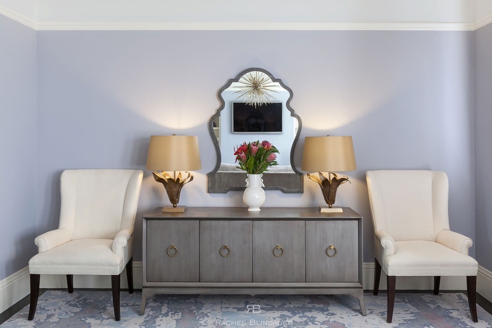
Interior Designer in St. Louis, MO — Rachel Blindauer
A quietly luxurious approach to modern living, now available in St. Louis.

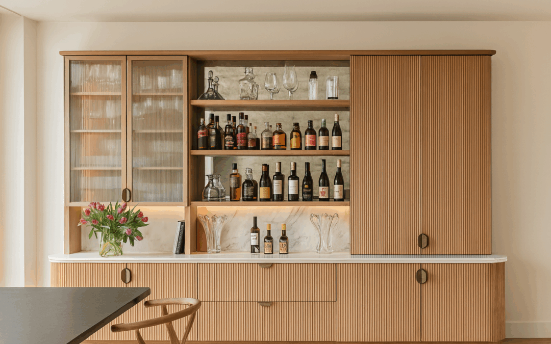
Design that feels like you—and functions for how you actually live.
With over 15 years of experience designing homes, boutique hotels, and custom furnishings, Rachel Blindauer brings a nationally recognized aesthetic to the heart of the Midwest. Based in St. Louis, Rachel blends architectural clarity with a painter’s restraint—offering full-service interior design rooted in your story, your lifestyle, and your need for beauty that actually works.
Whether you’re redesigning a historic home in the Central West End, refreshing a Clayton condo, or starting from scratch in a new build outside Chesterfield, our process is designed to be both refined and human. Always luxurious, never loud. Always personal, never prepackaged.
St. Louis Interior Design Services
We specialize in residential interiors, model home merchandising, and boutique commercial projects, including:
-
Full-Service Interior Design
From concept to installation—renovations, new builds, and legacy homes -
2-Hour Design Consultation – Virtual or in-person
A strategic session designed to bring clarity and vision to your project
(Your $500 consultation fee is credited toward full-service engagements) -
Hospitality & Commercial Interiors
Ideal for boutique properties, short-term rentals, and destination businesses
(View: Designing Iconic Hospitality) -
Furniture & Lighting Design
Custom pieces created by Rachel for private clients and national brands
Local Design with a National Point of View
Having designed homes from Florida to California, Rachel brings a nationally informed perspective to every St. Louis project. That means knowing how to balance old-world architecture with new-world functionality, or when a color should soften midwestern light instead of reflecting it.
Her design philosophy has been featured in national publications and trusted by developers, hoteliers, and homeowners alike. Now, she’s bringing that elevated approach to the place she calls home.

“Our space finally feels like it fits us. Every detail feels intentional, not just styled. It’s calm, but never boring.”
— St. Louis Client
Not Sure Where to Start? Start Here.
The best way to begin is with a focused consultation—whether you’re choosing a paint palette or planning a full renovation.
➡️ Book a 2-Hour Consultation
Available virtually or in person in St. Louis. Credited toward full-service.
Or, explore recent blog insights tailored to Midwestern light, color, and lifestyle:
Areas Served
Rachel Blindauer offers in-person services throughout:
St. Louis, Clayton, Kirkwood, Ladue, University City, Town and Country, Frontenac, Chesterfield, and surrounding Missouri communities.
Design services are available virtually nationwide.
Let’s Design Something Worth Remembering
Every space we create is meant to feel like a reflection of you. Styled with care. Lived in with ease. And built to last.

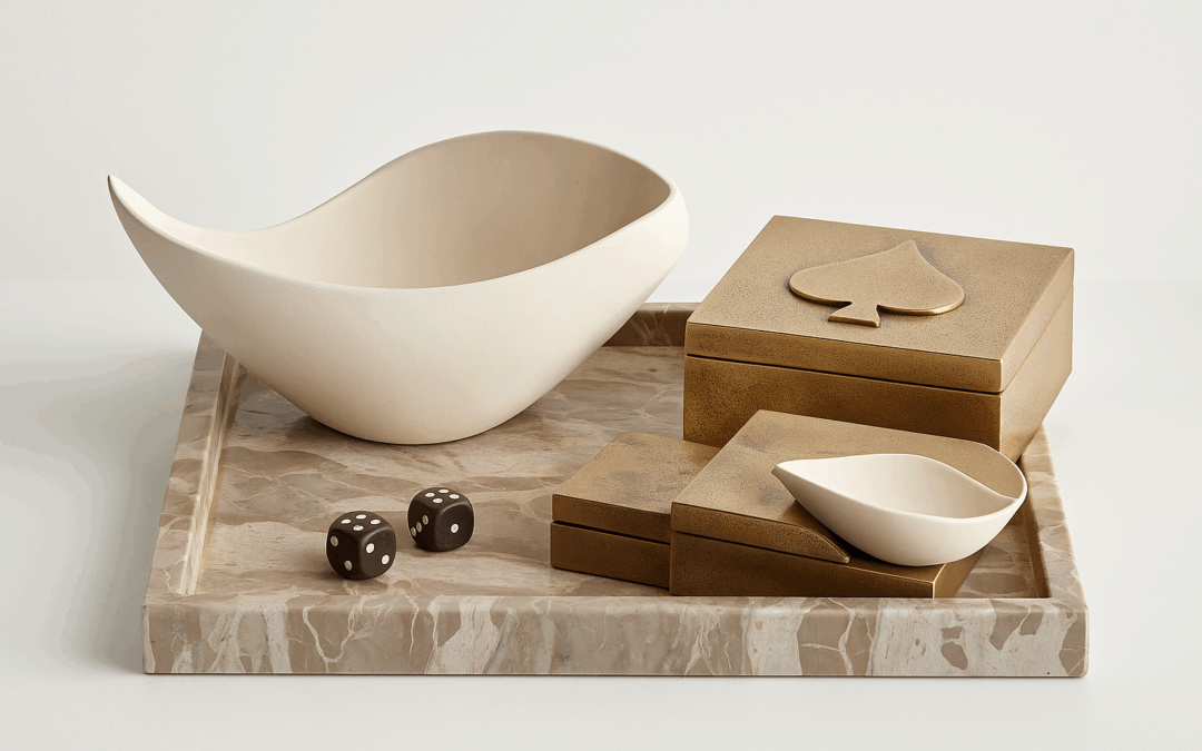
SOMETHING FOR EVERYONE
THE PIECES RACHEL RETURNS TO, AGAIN AND AGAIN