The Invisible Kitchen: How to Make Your Kitchen Disappear (Without Sacrificing Function)
What if your kitchen didn’t look like a kitchen at all?
We’re seeing a quiet revolution in luxury design—one that trades appliance arms races for elegance, restraint, and flow. The invisible kitchen is not a look. It’s a philosophy. One that says your home should nourish you without shouting at you.
This new wave of kitchen design seamlessly blends advanced function with architectural calm. It’s for those who want their living space to feel like a gallery, not a showroom.
And in some cases, it even lets you cook directly on the countertop.

What Is an Invisible Kitchen?
An invisible kitchen is a kitchen that visually disappears into its surroundings. At its most advanced, it includes induction cooktops embedded beneath porcelain or ultra-thin stone countertops, allowing you to prepare meals directly on the surface—no visible burners, no control panel, no fuss.
It’s not minimalist for minimalism’s sake. It’s intentional design for intentional living. This concept has been embraced by everyone from boutique hoteliers to forward-thinking developers and high-end homeowners seeking a more fluid, serene lifestyle.
Key Elements of the Invisible Kitchen
1. Countertop Induction Cooking
This is the new frontier: cooking directly on a slab of stone. Induction elements are installed beneath the countertop, invisible to the eye but activated by compatible cookware. It’s as functional as a gas range—only sleeker, safer, and shockingly elegant.
“With nothing but a pan and a surface, you can make dinner appear—on a counter that looks like sculpture.”
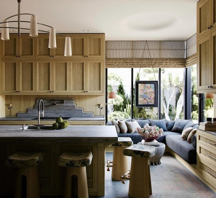
2. Panel-Ready and Integrated Appliances
Dishwashers and refrigerators disappear behind matching cabinetry. Ovens, if used, are tucked into walls or concealed behind full-height panels. The goal: zero appliance visibility when not in use.
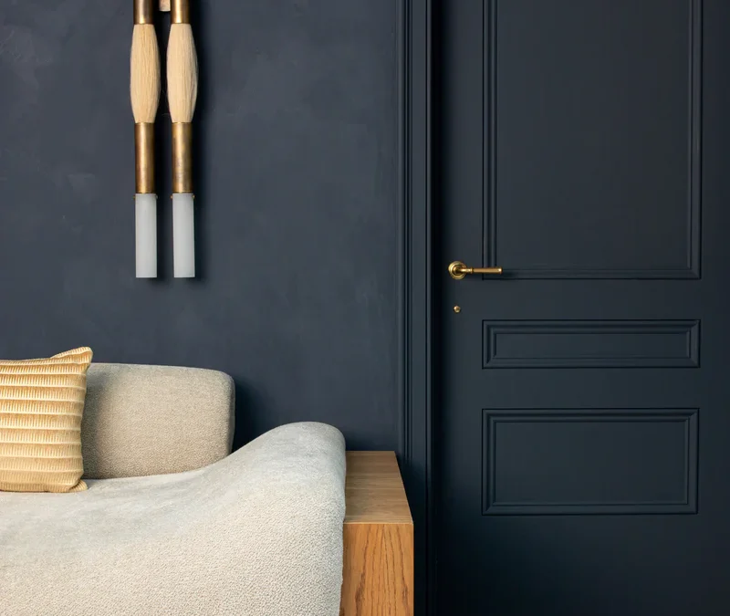
3. Slab-Front, Push-to-Open Cabinetry
Cabinetry becomes architecture. No handles, no visual interruption—just clean lines that recede. I often specify edge pulls or push-latch hardware in materials that mimic the walls or counters.
Explore sculptural hardware and kitchen accents →
4. Tonal or Monochromatic Color Schemes
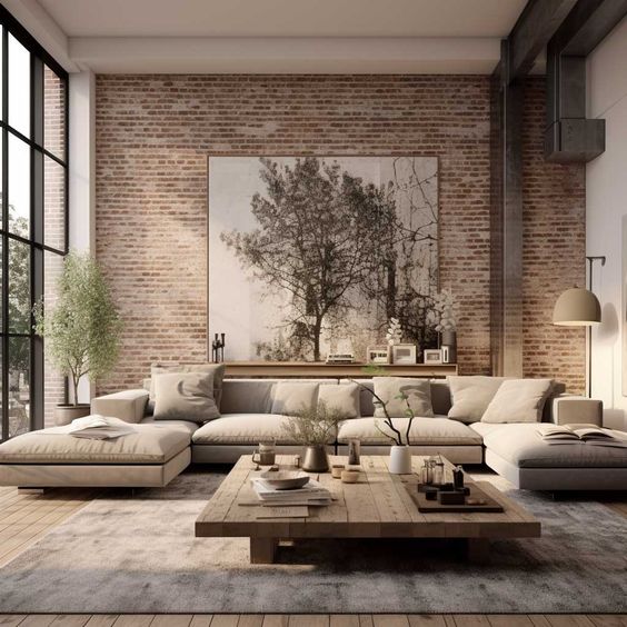
Invisible doesn’t mean sterile. Warm taupe plaster, mushroom-toned oak, or soft matte limestone let the kitchen dissolve into the background while still feeling rich and textured.
5. Hidden Sculleries or Storage Walls
Behind every calm space is a hidden workhorse. Often, we build a fully functional secondary space—what used to be called a butler’s pantry—to house the mess, prep, and storage. This allows the main space to remain open, airy, and camera-ready.
Is Cooking on Stone Really Safe?
Yes—and often safer than traditional methods.
Induction-only zones heat only when compatible cookware is placed directly above them, leaving the rest of the stone surface cool to the touch. There’s no open flame, no coils, and no knobs to bump. Many homeowners find it ideal for homes with children, pets, or frequent guests.
And because the cooktop is completely hidden, it offers the holy grail of design: true dual-use space. Your island becomes a prep zone, dinner bar, and sculpture all in one.
It’s not just a kitchen countertop—it’s performance art.

How to Get the Look Without Renovating
Want to channel the invisible kitchen vibe without a total overhaul? Here’s how:
• Paint cabinetry and walls the same color
This reduces visual contrast and gives the space a unified, calming presence.
• Use push-latch hardware or minimal pulls
Even a small hardware swap can eliminate visual noise.
• Hide small appliances in a tray or cabinet cubby
Create a “disappear zone” for countertop items so the surface reads as clear.
• Curate tonal styling pieces only
Edit down to one statement bowl or vessel that matches the wall or counter tone. Consider this sculptural bowl as a subtle centerpiece.
• Switch to induction-compatible cookware
Even if you’re not cooking on stone just yet, upgrading your cookware to induction-ready keeps your options open and aligns with the future of luxury cooking.
Why Clients Are Asking for It Now
The invisible kitchen answers a new kind of desire. Not for more gadgets. Not for flash. But for peace.
My clients—especially in city flats, second homes, and open-concept retreats—are looking for design that serves their lives without overperforming visually. The invisible kitchen creates a home that breathes. That calms. That elevates the everyday.
Good design doesn’t need to be seen to be felt.

For Developers, Architects & Boutique Hotels
If you’re designing a high-end multifamily, residential development, or boutique hospitality concept, an invisible kitchen creates unmatched wow-factor and long-term livability.
I offer strategic design consulting and product sourcing for integrating invisible kitchens, countertop induction, and custom millwork into architectural plans. Inquire here →
Rachel Blindauer is an award-winning interior and product designer known for creating environments that balance architectural rigor with artful restraint. With over 1,000 products designed for brands like Williams-Sonoma and a portfolio spanning luxury residences and boutique hotels, she brings a deeply intentional lens to everything she touches.
Get Started Today
Let Rachel Blindauer help you think through your project starting with a consultation.
SOMETHING FOR EVERYONE
THE PIECES RACHEL RETURNS TO, AGAIN AND AGAIN


")