The Rise of Organic Curves and Sculptural Forms: Softening Luxury Interiors in 2026
It was during a late-afternoon site visit in Sarasota, the Gulf breeze carrying the faint salt of the sea through open doors, that a client paused mid-sentence and simply touched the gently rounded edge of a new plaster console we’d installed. “It feels alive,” she said. Not dramatic, not imposing—just present, welcoming, human. That quiet observation captured something I’ve felt building in my work over the past year: a collective exhale from sharp angles and rigid lines toward softer, more organic forms that invite touch and ease. As we settle into 2026, sculptural curves and flowing silhouettes are redefining luxury—not as ornament, but as essential to spaces that nurture rather than perform.

Echoes of the Past, Reimagined for Today
Curves have historical depth. Think of the sinuous lines in Art Nouveau furniture, where designers like Hector Guimard drew inspiration from nature’s fluidity to counter the industrial rigidity of their era. Or the mid-century modernism of Finn Juhl and Charlotte Perriand, whose organic shapes brought warmth to functionalism. In the 2020s, we’ve circled back—post-minimalism, post-sharp-edges—craving forms that mirror the body’s natural contours and the world’s gentle irregularities.
This isn’t whimsy; it’s intentional. High-end clients today seek interiors that support wellbeing amid uncertainty. Rounded edges soften a room psychologically, reducing visual tension and encouraging relaxation. In hospitality projects, like boutique inns where guests crave escape, curved headboards and undulating banquettes foster intimacy and linger-worthy moments. Even in residential work—from Nantucket shingled cottages to Los Angeles hillside retreats—I’ve found that introducing sculptural elements creates a sense of flow, guiding movement through space without abrupt stops.
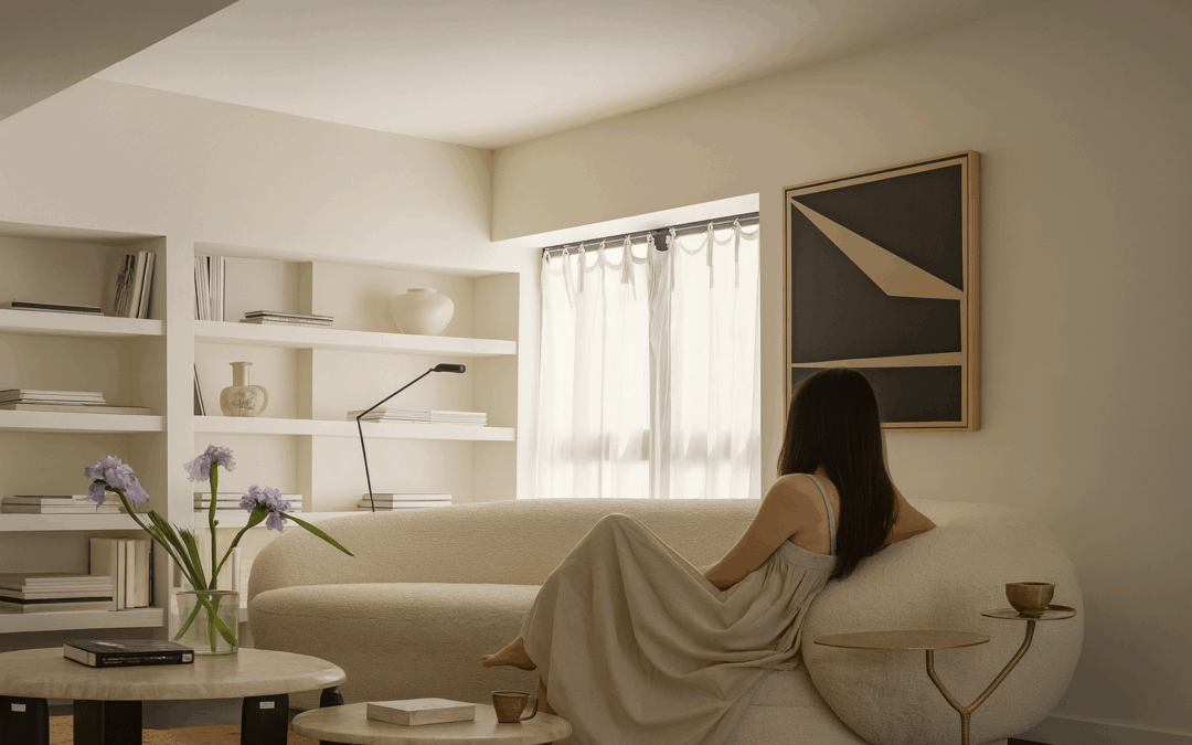
Materials That Breathe and Bend
The magic lies in how these forms interact with materials. Honed marble or limestone, with its subtle veining, gains life when shaped into gentle arcs—evoking ancient Roman baths or the smooth stones worn by rivers over centuries. Plaster, hand-applied in sweeping curves, adds tactile warmth; its slight imperfections tell a story of craftsmanship, much like the limewashed walls of Tuscan villas.
Wood plays a starring role too: walnut or oak bent into fluid arms on chairs, or carved into organic side tables that feel grown rather than built. Upholstery follows suit—bouclé, velvet, or performance linen draped over rounded frames, their textures amplified by the play of light on curves. In one Massachusetts project, we paired a custom curved sofa in deep olive velvet with arched mirrors and a sculptural travertine coffee table; the result was layered yet serene, a space that felt both grounded and expansive.
Metals soften the palette: unlacquered brass or blackened steel in sinuous lamp bases or hardware that catches the eye without shouting. These elements add subtle drama while maintaining that edited elegance central to my approach.
Aspirational prompt: Imagine your living room anchored by a low, enveloping sectional with gently rounded arms, its fabric inviting bare feet and long conversations. How does the absence of hard corners change the way you gather, rest, or simply pass through the space at day’s end?

Bringing Curves Home: Practical Guidance for Lasting Impact
Start with restraint—curves shine brightest when balanced against straighter lines. A rounded armchair beside a clean-lined console creates rhythm; an arched doorway or niche adds architectural softness without overwhelming.
Scale matters: oversized sculptural pieces can anchor a room, while smaller accents (a kidney-shaped ottoman, a curved console) introduce subtlety. In coastal homes like those in Florida or Nantucket, opt for moisture-resistant materials—treated woods, sealed stones—that withstand humidity while embracing organic shapes. Urban spaces benefit from mirrored or reflective curves that amplify light and openness.
Sustainability aligns naturally here: seek artisans who hand-form pieces, reducing waste and ensuring longevity. Pieces built to last decades become part of your story, their patina deepening with use.
If you’re considering how curves might reshape your home, a 2-hour design consultation offers a focused way to explore—often applying toward larger collaborations. For tactile inspiration, our shop features sculptural vessels, curved lighting, and refined textiles that embody this gentle shift.

Why Curves Matter Now
In the end, this movement toward organic forms isn’t about following a trend—it’s about returning to what feels intuitively right. As interiors evolve from statement-making to soul-supporting, curves remind us that luxury can be soft, inviting, and profoundly human. They create spaces that don’t just look beautiful but feel restorative, spaces where life unfolds with ease.
If the idea of sculptural softness resonates, share your thoughts—perhaps on a favorite curved piece in your own home. For more on crafting intentional environments, revisit our pieces on textural layering or livable luxury. Here’s to homes that embrace the curve of comfort.