Top 2025 Interior Design Trends for a Beautiful, Timeless Home

Top 2025 Interior Design Trends for a Beautiful, Timeless Home

Design trends, like fashion or art, aren’t just about what’s new—they’re a mirror of what we’re craving: more calm, more beauty, more meaning. In 2025, the homes we admire most are less about perfection, more about presence. We want spaces that reflect how we live—and who we’re becoming.

Curved & Sculptural Forms

2025 favors curves over corners. Rounded sofas, waterfall islands, and sculptural lighting offer visual softness and a human-centric sensibility.

Rachel’s Insight: In a Nantucket home, we softened a formal space by layering arched alcoves with curved vintage club chairs. The room now feels more conversational—and less staged.

Shop sculptural accents and soft forms

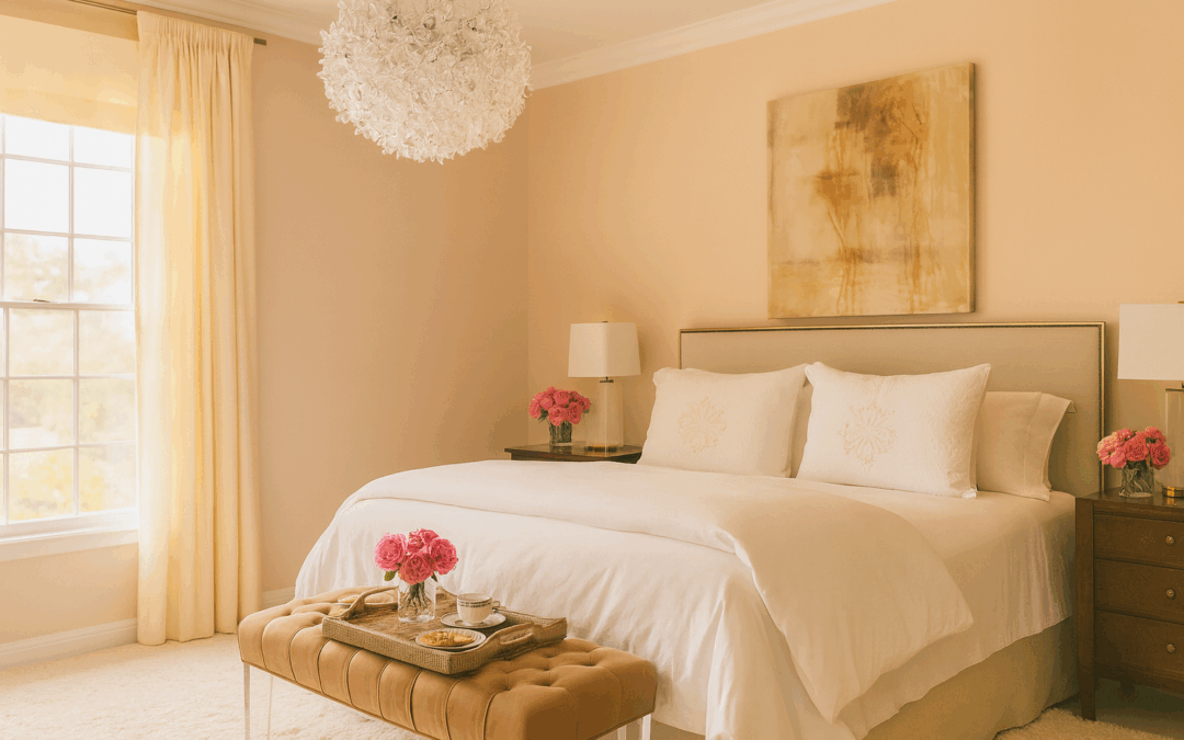
Color Drenching: Bold, Saturated Expression

Gone are the days of all-white interiors. In 2025, color drenching—where a single hue envelops walls, ceilings, and even upholstery—takes center stage. Deep oxbloods, chalky blues, and terracotta pinks lend richness and personality.

“Color is back—with depth, not drama.”

Rachel’s Insight: We recently transformed a client’s reading room by wrapping it in one deep plum tone. The result? Cocooning, serene, and completely unforgettable.

See more of our color-driven projects

Textured Walls and Ceilings: Dimension is the New Minimalism

Smooth drywall is losing its grip. Limewash, hand-troweled plaster, and wallpapered ceilings are infusing homes with quiet drama.

Rachel’s Insight: Texture adds a kind of softness that paint alone can’t deliver. We often use plaster finishes to blur light and shadow, bringing calm into high-traffic spaces.

Explore our tiered design services

Wellness Rooms: Where Design Meets Restoration

From saunas and meditation nooks to biophilic lighting and aromatherapy zones, wellness-centric spaces are here to stay.

“The smartest design trend? Spaces that feel like exhale.”

Rachel’s Insight: I’ve found that even small additions—like a reading bench near a window or a calming scent plan—can create a daily rhythm of restoration.

Maximalism, But Make It Personal

Layered textiles. Eclectic art. Statement lighting. Maximalism is evolving beyond clutter into a curated celebration of self.

Rachel’s Insight: The key isn’t quantity—it’s story. We help clients layer meaningful objects without overwhelming the space. A well-traveled home is always in style.

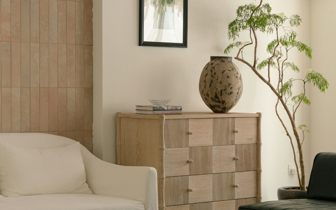
Natural & Artisanal Materials: Soul Over Shine

Expect more stone, rattan, clay, and handwoven textiles—materials that carry the hand of the maker. These pieces ground even the most modern homes.

Rachel’s Insight: I’m constantly sourcing pieces that feel imperfect in the best way. Our shop carries handcrafted goods that speak to this trend.

Tech That Disappears

Smart design is becoming seamless—invisible speakers, climate-adaptive shades, and lighting that learns your habits.

Rachel’s Insight: I love embedding tech that elevates daily life without stealing attention. We install it so your home feels considered, not coded.

The Bottom Line: Design for Who You Are Becoming

2025 interiors are less about trends and more about transformation. At Rachel Blindauer, we design spaces that reflect not just your taste—but your next chapter.

Let’s make your space a reflection of who you are—and who you’re becoming.

Explore our design services or shop our collection of curated goods that bring the best of 2025 home.

FAQ: Interior Design Trends 2025

What are the biggest interior design trends in 2025? Color drenching, textured finishes, wellness-centric spaces, and natural materials top the list.

How do I create a timeless yet trendy home in 2025? Layer natural materials, invest in sculptural shapes, and use color purposefully.

What’s one high-impact trend I can try now? Introduce one deeply saturated color in a room—via paint, textiles, or a standout furniture piece.

2 Hour Interior Design Virtual or In Person Consultation

SOMETHING FOR EVERYONE

Beautiful Things, Beautifully Chosen.

The Best Paint Colors for Sarasota FL, San Francisco CA & Nantucket MA

The Best Paint Colors for Sarasota FL, San Francisco CA & Nantucket MA

Expert Interior Design Guidance by Rachel Blindauer

When it comes to creating a well-styled home, selecting the right paint color goes far beyond following trends—it’s about curating a palette that complements your architecture, decor and natural light. As a nationally recognized interior designer working across coastal markets, I know how regional nuances shape design choices. In this guide, I’m sharing my go-to paint colors for three distinctly styled locales: Sarasota, Florida; San Francisco, California; and Nantucket, Massachusetts.

From sunlit modernism to fog-filtered warmth and heritage-driven charm, these curated paint palettes are designed to elevate your space and feel intuitively “you.”

Not All Paint Is Created Equal

Paint finish, texture, and depth dramatically change the feel of a room. While I work with many high-quality brands, Portola Paints is a current favorite for its stunning lime wash and Roman clay options, which bring organic texture and movement to walls—perfect for spaces seeking dimension and softness. Farrow and Ball is hard to paint with but Benjamin Moore is a dream to paint with and the Aura line is scrubbable!!

A Quick Design Rule: Paint Comes Last

In every project I lead, paint is selected last. Why? Because your palette should support key elements like art, rugs, or upholstery—not compete with them. Once these anchors are chosen, paint becomes the harmonious bridge that ties everything together. And remember: always sample in your actual space, across multiple times of day.

Best Paint Colors for Sarasota, FL

Sarasota’s abundant sunlight and blend of contemporary and tropical architecture call for nuanced, warm neutrals and coastal-inspired whites. These tones ground bright environments without feeling stark.

1. Swiss Coffee by Benjamin Moore
A creamy, yellowed white that reads warm without heaviness. Ideal for interiors with warm wood or smooth cement. Important: no bright white trim—use Swiss Coffee on all millwork for cohesion.

2. Pale Oak by Benjamin Moore
A soft greige with yellow undertones—effortlessly elegant in sunlit rooms.

3. Blondie Lime Wash, Portola Paints
A buttery lime wash that layers beautifully in neutral coastal interiors.

4. Leisure Lime Wash, Portola Paints
Chalky and sun-washed—perfect for creating texture in beach-style homes.

5. Wood Ash by C2 Paint
A rich mid-toned greige with character. Excellent on exteriors or layered interiors with natural textures. Tip: skip bright trim—use this tone on all moldings.

6. Sea Salt by Sherwin-Williams
A fresh, ocean-inspired soft blue-gray—ideal for bedrooms or bathrooms.

7. Summer Shower by Benjamin Moore
Crystal clear and light-as-air, this soft blue is a refreshing pale robins egg blue.

8. Masquerade by Little Greene
Warm and cozy, this is a dream for blackout-curtained bedrooms or media rooms.

9. Salon Drab by Farrow & Ball
A timeless, earthy brown. Use in dens, game rooms, or more traditional masculine spaces.

Best Paint Colors for San Francisco, CA

San Francisco’s architectural variety—Victorians to sleek moderns—and its cool, gray-filtered light call for warmer, moodier neutrals that can soften fog’s blue cast.

1. Gem Lime Wash, Portola Paints
Creates a subtle, moody chalk finish perfect for layered interiors.

2. Half Moon Bay Lime Wash, Portola Paints
Soft and atmospheric—pairs beautifully with oak, linen, and vintage pieces.

3. Wood Ash by C2 Paint
A repeat favorite for a reason—it grounds eclectic San Francisco interiors.

4. Urban Living by Ralph Lauren (discontinued)
Still worth color matching—rich, versatile, and classic.

5. Avocado by Sherwin-Williams
Earthy and bold—beautiful in kitchens or studies paired with warm metals.

6. Darkside Lime Wash, Portola Paints
Adds instant sophistication—ideal for a dramatic powder room or bedroom.

7. Bancha No.298 by Farrow & Ball
A structured olive green with timeless appeal—stunning with walnut and gold.

8. Devonshire Green by Benjamin Moore
Fresh yet grounded—great for trim, built-ins, or exteriors.

9. Dragon’s Breath by Benjamin Moore
A rich, deep brown with charcoal undertones—luxurious and grounding.

10. Oval Room Blue by Farrow & Ball
Elegant and moody—perfect for dining rooms or library-style spaces.

11. Soul Mate by Benjamin Moore
An earthy red softened to a gentle pink hue.

12. In the Navy Roman Clay by Portola Paints
Bold and textured—an artistic take on a classic navy wall.

Best Paint Colors for Nantucket, MA

Nantucket’s historical charm and coastal chic lean into both timeless whites and rich, shadowy tones. Think whitewashed millwork, black windows, and warm navy or olive interiors.

1. White Dove by Benjamin Moore
The go-to white for New England homes with detailed millwork.

2. All White by Farrow & Ball
Clean, classic, and crisp. Especially good when paired with black accents.

3. Pale Oak by Benjamin Moore
A soft transitional neutral—timeless and calming.

Repose Gray by Sherwin-Williams

4. Repose Gray by Sherwin-Williams
Pair with crisp white moldings or use monochromatically for depth.

5. Salon Drab by Farrow & Ball
Elevated and traditional—beautiful in intimate spaces or paneled rooms.

6. Bancha by Farrow & Ball
Green with gravitas. Works wonderfully in libraries or as an unexpected kitchen cabinet color.

7. Avocado by Sherwin-Williams
For a slightly retro but cozy pop of depth.

8. Pewter Green by Sherwin-Williams
Great on exteriors, built-ins, or as contrast trim.

9. Shady Lane by Benjamin Moore
A dark, botanical green for moody spaces.

10. French Gray by Farrow & Ball
A misty, historical tone that suits Nantucket’s heritage charm.

11. Oval Room Blue by Farrow & Ball
Understated and watery—great in rooms with natural fiber rugs and oversized art.

12. Cromarty by Farrow & Ball
A chalky coastal sage—fresh yet sophisticated.

13. In the Navy Roman Clay by Portola Paints
Textured depth for dramatic rooms.

14. Tricorn Black by Sherwin-Williams
Use for trim, windows, or doors to create strong contrast.

15. Coriander Seed by Benjamin Moore
A golden undertone neutral that reads warm in cool Northeast light.

16. Soft Chinchilla by Benjamin Moore
A gentle, misty hue that adds elegance to bedrooms or baths.

Final Thoughts

Every region has a different soul and every home has different architecture—your home should exalt that. Whether you’re soaking up the Sarasota sun, enjoying San Francisco’s eclectic style, or embracing Nantucket’s timeless architecture, your paint palette can tie everything in your space together beautifully.

If you’re not sure which colors are right for your space or style, we can help. Rachel Blindauer Interiors offers expert color consultation services rooted in regional design knowledge and timeless taste.

Ready to Elevate Your Space?

Let’s choose colors that feel like home.
Book a design consultation with Rachel Blindauer Interiors and take the first step toward a space that reflects your lifestyle, taste, and locale.

2 Hour Interior Design Virtual or In Person Consultation

SOMETHING FOR EVERYONE

THE PIECES RACHEL RETURNS TOAGAIN AND AGAIN

What’s Next for the U.S. Housing Market? 2025 Edition

What’s Next for the U.S. Housing Market? 2025 Edition

Back in 2024, the housing market was a wild ride: skyrocketing prices, intense bidding wars, and an overwhelming sense that the pace couldn’t sustain. Fast forward to April 2025, and the landscape has evolved. It’s no longer the chaotic free-for-all it once was, but it’s not quite a buyer’s paradise either. So, what’s happening now, and what can we expect in the months ahead?

The Market Today: A Shift in Dynamics

The U.S. housing market is taking a breath after years of rapid growth. While prices remain high in many areas—some even breaking records—they are no longer climbing at breakneck speed. In fact, certain markets are starting to see slight price dips, especially where inventory is beginning to pick up. This shift is giving buyers more room to negotiate than in recent years.

Demand, however, is still there, but with less urgency. The desire for new homes persists—families are growing, remote work continues to influence location preferences—but the sense of urgency has faded somewhat. Affordability remains a significant concern, with mortgage rates easing but still not low enough to entice everyone into the market. This financial reality is causing many potential buyers to hold off, either renting or waiting for more favorable conditions.

What’s Driving the Shift?

A few significant factors are behind these changes:

  • Increased Homebuilding: After years of underbuilding, builders are finally bringing new homes to market. While it’s not enough to flood the market, regions like Texas and Florida are seeing a surge in new construction, helping meet demand from an influx of new residents.

  • The “Lock-In Effect” Fading: Homeowners who locked in ultra-low mortgage rates a few years ago were reluctant to sell, fearing higher rates on their next purchase. But as rates stabilize and life circumstances change, more of these homes are hitting the market, offering buyers a bit more choice.

  • Policy Changes on the Horizon: With new federal policies being discussed—such as opening up federal land for development—there could be significant shifts ahead in how housing is developed. While nothing is set in stone, it’s something to watch closely as it may impact supply.

Regional Trends: Hotspots and Cool-Offs

The U.S. is never a one-size-fits-all market, and 2025 is no exception:

  • The Sun Belt: States like Arizona, Texas, and the Carolinas remain popular, with relatively affordable prices and ample new construction. These areas continue to attract people looking for a warmer climate and lower cost of living.

  • Coastal Cities: Markets in places like San Francisco and New York are cooling off. While prices remain high, homes are sitting on the market longer, and sellers are getting creative with incentives.

  • Midwest Surge: The Midwest is quietly becoming a hot spot. Cities like Ohio and Indiana are seeing steady interest due to affordability and strong job markets, making them appealing for practical buyers.

What’s Ahead for 2025?

Looking to the rest of the year, we’re not expecting a drastic boom or bust. The market is settling into a more balanced pace—not the chaotic highs of previous years, but certainly not stagnant. Experts predict home prices could rise modestly by around 3% nationally, though this will vary by region. Mortgage rates are likely to hover in a stable, “not terrible, not amazing” range, providing a bit of predictability for buyers and sellers alike.

For buyers, this could be an ideal time to enter the market. With more options and less competition, you might not have to waive every contingency or overbid to secure your dream home. Sellers, however, may need to adjust their expectations. Pricing a home right and offering perks—like covering closing costs—could make all the difference.

The Big Picture

When I wrote about the housing market in 2024, I questioned whether the rapid pace could continue. It turns out, it couldn’t—not forever. What we’re seeing now is a market recalibrating, with supply gradually catching up, demand easing, and affordability still a major challenge for many. While it’s not a perfect storm, it’s also not smooth sailing. For anyone buying, selling, or just watching, 2025 presents a year of cautious opportunity—less chaos, more choices, and the potential for making smart, strategic moves.

2 Hour Interior Design Virtual or In Person Consultation

SOMETHING FOR EVERYONE

THE PIECES RACHEL RETURNS TOAGAIN AND AGAIN

St. Louis Boutique Hotel Design & Branding | Rachel Blindauer

St. Louis Boutique Hotel Design & Branding | Rachel Blindauer

Looking for a luxury boutique hotel interior designer in St. Louis or beyond? At Rachel Blindauer, we specialize in creating immersive, brand-aligned hotel interiors that captivate guests and elevate ROI. From full-service hotel renovations to branded signature suites and sensory guest experiences, we help boutique properties stand apart with design that feels effortless, curated, and unforgettable.

When a Hotel Becomes the Destination

A boutique hotel succeeds not by scale—but by soul.

In a world of templated luxury and indistinguishable lobbies, the true boutique experience stands apart: it evokes, it surprises, it lingers. And increasingly, it is the interior—the light against the wall, the materials that tell a story, the quiet choreography of arrival—that defines whether a property is simply visited… or remembered.

At Rachel Blindauer, we transform spaces into fully realized sensory experiences. From spatial design to visual identity, we craft immersive environments where beauty is not just seen—it’s felt.

Why Boutique Hotels Choose Rachel Blindauer

Designing for the hospitality industry requires more than good taste. It demands strategic clarity, narrative thinking, and an obsessive attention to emotional resonance.

Luxury Interior Expertise

With a background in high-end residential, commercial, and yacht interiors, our studio brings a level of refinement that translates seamlessly to boutique hospitality.

Brand-Centric Design

Every space begins with the story. We align interiors with the hotel’s distinct personality—ensuring that each touchpoint reinforces a singular, unforgettable brand.

Elevated Guest Experience

From the texture of the linens to the lighting in the spa, we design with the guest’s senses in mind—enhancing comfort, encouraging connection, and deepening loyalty.

Market Positioning that Performs

Design is your first impression—and your strongest differentiator. Hotels with compelling environments command higher nightly rates, increased press visibility, and greater direct bookings.

Our Signature Services for Boutique Hotels in St. Louis and Beyond

1. Full-Service Interior Design & Renovation

We oversee comprehensive transformations—reimagining lobbies, suites, restaurants, spas, and rooftop lounges.
From initial concept to final installation, our design process includes:

  • Space planning with flow and function at the core
  • Curated selections of furniture, textiles, lighting, and custom decor
  • FF&E procurement tailored to your property’s needs and narrative
  • Bespoke statement pieces that distinguish your hotel in a competitive market

Explore our full-service interior design process to see how we guide hospitality transformations from blueprint to final flourish.

2. Branded Partnerships & Signature Suites

Design becomes aspirational when it becomes personal.

    • Launch a “Rachel Blindauer Signature Suite” that guests seek out by name
    • Collaborate on limited-edition furniture and décor collections exclusive to your hotel
    • Co-branded partnerships that drive press, influencers, and word-of-mouth buzz

3. Graphic Rebranding & Visual Identity

Luxury is in the details—especially the visual ones.

  • Logo refreshes, refined typography, and color palettes that mirror the interior tone
  • Custom design for signage, menus, in-room touchpoints, and digital branding
  • Website design that converts browsers into booked guests

4. Guest Experience Enhancements

From scent to sculpture, we design moments that become memories:

  • Signature fragrance development to create emotional recall
  • Curated art and sculpture programs featuring local or notable artists
  • High-touch in-room amenities that feel deeply personal—not mass produced

“The best hotel experiences don’t shout luxury. They whisper presence.”
— Rachel Blindauer

Design That Performs: Maximizing ROI in Boutique Hospitality

An investment in great design is not aesthetic—it’s strategic.

  • Higher ADR (Average Daily Rate): Well-designed rooms command premium pricing
  • Brand Awareness: Beautiful spaces generate press, influencer content, and social buzz
  • Guest Retention: A coherent, curated experience builds loyalty and drives repeat visits
  • Differentiation in a Saturated Market: Guests remember how your hotel felt—not just how it looked

From the Designer

“In my work across the U.S., I’ve found that design becomes most magnetic when it reflects both place and intention. Whether I’m developing a project in Sarasota or a rooftop spa in St. Louis, the goal is always to design not just for luxury, but for loyalty.”

Let’s Elevate Hospitality—Together

Looking for a luxury boutique hotel interior designer in St. Louis or beyond? At Rachel Blindauer, we specialize in creating immersive, brand-aligned hotel interiors that captivate guests and elevate ROI. From full-service hotel renovations to branded signature suites and sensory guest experiences, we help boutique properties stand apart with design that feels effortless, curated, and unforgettable.

Whether you’re launching a new concept, rebranding a hidden gem, or ready to elevate your guest experience, we bring clarity, creativity, and quiet authority to every space we design.

To learn more about how strategic design and branding can transform your property, download our complimentary PDF: Designing Iconic Hospitality

Start with a conversation. Let’s explore what your space could become.

About Rachel Blindauer

Rachel Blindauer is an award-winning interior and product designer known for crafting spaces that feel as good as they look. With over 15 years of experience, she has designed more than 1,000 products for national retailers like Williams-Sonoma and led acclaimed residential and commercial design projects across the U.S.—from Nantucket to Sarasota. Based in St. Louis, her studio brings elevated interiors, branding fluency, and sensory storytelling to a growing portfolio of hospitality, residential, and development clients.

Designing Iconic Hospitality

Get Started Today

Let Rachel Blindauer help you think through your project starting with a complimentary consultation.
Spring Color Palette Ideas: Best Paint Colors, Moodboards, and Design Tips

Spring Color Palette Ideas: Best Paint Colors, Moodboards, and Design Tips

Spring isn’t just a season—it’s a sensibility. A lightness, a lift, a turning outward. In color theory, Spring types are warm, clear, and bright. Their palettes feel effervescent—bringing the clarity of a daffodil or the promise of a cherry blossom into a space that lives, breathes, and uplifts.

Spring interiors aren’t defined by pastels—they’re defined by energy. Warm light. Crisp edges. And just enough softness to keep it graceful.

I’ve worked with Spring palettes everywhere from breezy bungalows in Florida to refined pied-à-terres in San Francisco. What unites them isn’t geography—it’s the feeling they create: forward-looking, joyful, and just a touch undone.

What Is the Spring Color Palette?

The Spring palette includes warm, clear colors with an undertone of optimism. Think peach, butter yellow, celadon green, fresh white, clear coral, and pale robin’s egg blue. Unlike the dusky tones of Autumn or Summer, Spring tones feel sunlit and translucent.

These are the hues of blooming branches, café au lait, morning light, and woven grass. In a well-designed home, they don’t feel precious—they feel personal.

Core Spring Colors:

  • Buttery Cream
  • Celadon Green
  • Pale Apricot
  • Robin’s Egg Blue
  • Coral Pink
  • Warm White
  • Soft Marigold

“Spring palettes don’t imitate nature. They revive it—room by room.”

Unlocking Your Seasonal Palatte for Style & Space

How to Know If You’re a Spring

Are You a Spring?

  • You look best in clear, warm tones (like peach, coral, mint)
  • You gravitate toward movement and lightness in design
  • You love vintage that feels edited—not cluttered
  • Your spaces reflect joy more than polish

Why Spring Colors Work in Interior Design

Spring palettes make spaces feel alive. They’re especially powerful in:

  • Entryways that need a bright welcome
  • Kitchens with natural light and wood tones
  • Kids’ spaces that grow with elegance
  • Sunrooms and dining areas designed to lift mood

In a recent Sarasota kitchen, I used Benjamin Moore’s Simply White on the walls, paired with painted cabinetry in Sherwin-Williams Peach Fuzz and antique brass hardware. The effect? Uplifting without being sweet. Bright without glare.

Best Paint Colors for a Spring Color Palette

Tested and refined across projects in various lighting conditions:

For Coastal Light (Sarasota, FL)

  • Benjamin Moore Simply White – clean, not stark
  • Sherwin-Williams Peach Fuzz – a clear, friendly peach
  • Farrow & Ball Teresa’s Green – soft green-blue with warmth

For Diffused Light (San Francisco, CA)

  • Little Greene Blush – a gentle pink that’s never babyish
  • Benjamin Moore Acadia White – warm without yellowing
  • Portola Paints Sea Salt – clear and natural without chalkiness

For Seasonal Contrast (Nantucket, MA)

  • C2 Limonata – a refined soft yellow
  • Farrow & Ball Pink Ground – sophisticated, not sugary
  • Sherwin-Williams Topsail – a crisp robin’s egg blue

Pair these with rattan, handwoven textiles, unlacquered brass, or ceramic tile for tactile contrast.

Spring Color Pallate

Layering: The Spring Edit

Spring colors shine when layered with lightness. To build depth:

  • Layer materials like linen, washed cotton, raffia, and cane
  • Use painted woods (whitewashed, not dark)
  • Mix old and new—heirloom meets handmade

Nothing should match perfectly. Spring lives in the mix.

Spring Moodboard Pairings

Sarasota Spring
Paint: Simply White + Teresa’s Green
Materials: Cane, linen, white oak
Anchor: Oversized botanical in pale green

San Francisco Spring
Paint: Blush + Acadia White
Materials: Matte ceramic tile, tumbled brass
Anchor: Woven pendant over tulip table

Nantucket Spring
Paint: Topsail + Pink Ground
Materials: Whitewashed maple, vintage linen
Anchor: Abstract pastel art with coastal framing

Wear It, Live It

If your best colors are soft corals, celadon, and cream—your interiors should echo that. Spring types benefit from surroundings that mirror their lightness.

Pair your palette with natural textures, crisp white denim, botanical prints, and sun-washed tones.

Download the Seasonal Color Palette Guide or book a 2-Hour Design Consultation to translate your seasonal palette into a space that breathes.

Spring Color Pallate

FAQ: Spring Color Palette in Interiors

What are spring color palette tones?
Warm, clear, sunlit shades like peach, celadon, cream, and coral.

Where do spring palettes work best?
Kitchens, entryways, nurseries, and sunrooms—or anywhere you want energy without chaos.

Do spring colors look too pastel in real life?
Not if they’re grounded with natural materials and contrast. Use texture and shape.

What undertones should I avoid as a Spring?
Cool grays and muddy taupes. Stick with warm whites and clear brights.

Ready to Refresh Your Space with Color?

Book a 2-Hour Design Consultation and let’s bring clarity, charm, and cohesion to your space—rooted in your personal color season.

About Rachel Blindauer
Rachel Blindauer is an award-winning interior and product designer known for crafting spaces that feel as good as they look. From boutique homes to coastal retreats, her work blends joyful restraint with timeless detail.

2 Hour Interior Design Virtual or In Person Consultation

SOMETHING FOR EVERYONE

THE PIECES RACHEL RETURNS TO, AGAIN AND AGAIN