What Color Season Is Lavender?

What Color Season Is Lavender?

A Study in Subtle Power, Seasonal Belonging & Sensory Design

Lavender sits somewhere between presence and whisper. It’s not a color that demands your attention—it earns it. But despite its graceful ambiguity, lavender is not neutral. It carries with it a distinct emotional temperature and seasonality that makes it a fascinating case study in both personal color analysis and interior design.

As a designer, I’ve seen lavender quietly shape everything from entryways to wardrobes, offering unexpected depth when paired with the right textures, light, and tone. So let’s answer the perennial question: what color season does lavender belong to?

LilacTexturalGlamour-LivingRoom

Lavender in Color Theory: More Than Just a Pretty Pastel

In traditional seasonal color theory, lavender belongs primarily to the Summer color season. It reflects the hallmarks of Summer: cool undertones, softness, and a dusted, powdered quality—almost like light filtered through silk.

Where Winter’s purples are saturated and bold (think royal purple or violet), Summer’s are muted and romantic. Lavender leans blue rather than red. It’s gentler than lilac, cooler than mauve, and doesn’t carry the warm pink of spring’s orchid tones.

Lavender aligns with individuals whose natural coloring is cool and delicate—those with ash blonde to medium brown hair, soft eye colors (gray, hazel, muted blue), and skin that flushes more pink than golden.

For interiors, lavender lives best in homes filled with northern or indirect light. It whispers rather than shouts—ideal for bedrooms, powder rooms, and reading nooks where a sense of calm is not just preferred, but designed for.

Rachel’s Rule: “If it looks too bright, it’s not lavender—it’s lilac trying too hard.”

Historical & Cultural Context: Lavender’s Dual Legacy

Lavender’s place in history is one of quiet rebellion and elegance. In Victorian England, it was the second-stage mourning color, symbolizing dignity, grace, and restraint. In French provincial homes, it was a practical yet poetic presence—lavender bundles tucked into linen drawers, the hue echoed in painted shutters or toile fabric.

Fast forward, and lavender became a symbol of gender neutrality and artistic freedom. In the 1970s, it found new life in fashion as a soft protest—elevating the feminine without apology.

Today, lavender bridges classical refinement and contemporary softness. In a world obsessed with bold statements, lavender reminds us that nuance is a power move.

blindaur
sarasotainteriordesign
LilacTexturalGlamour-LivingRoom
Purple Brown Dining Area Interior Design

How Lavender Functions in Interiors

Lavender is not a trend—it’s a tone. And tone is timeless when paired well.

Tactile Notes

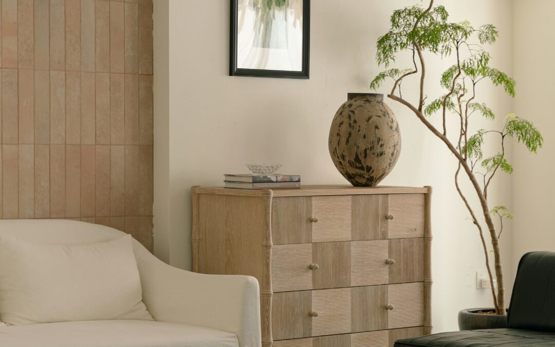
The success of lavender in a room hinges on materials and light. On velvet, it feels lush and cool. On plaster, ethereal and organic. Lavender linen offers a Provençal ease; in lacquered finishes, it flirts with modernity.

Use lavender when you want a space to feel dressed, not decorated.

Ideal Pairings

Lavender thrives beside:

  • Chalky whites (Farrow & Ball’s Wevet or Benjamin Moore’s White Dove)

  • Soft greens and sages (See our Spring Color Palette)

  • Aged brass and unlacquered metals

  • Blonde or white oak woods for a warm-cool balance

If you want it to sing, pair it with texture—bouclé, brushed metals, or a matte wall paint like Portola Paints Roman Clay.

Explore lavender-forward pieces like the Wisteria Art Print or Lilac Linen Napkins in our shop for subtle ways to layer the shade into your space.

drawin

Could Your Home Hold a Whisper of Lavender?

Ask yourself:

  • Could your guest room feel more welcoming with lavender linen drapes and white oak nightstands?

  • Would a single lavender lacquered sconce beside your vanity soften the morning light?

  • Is your wardrobe missing a lavender blouse that does more for your skin tone than five black tops combined?

Lavender doesn’t need the spotlight—it just needs a seat at the table.

sarasotainteriordesign

Final Word: A Soft Power Color

Lavender isn’t for everyone. But for those it suits, it becomes a signature—softly magnetic, soothing, and quietly bold. Whether you’re exploring your seasonal color palette or selecting a powder room paint, lavender is a hue that transcends trend and taps into something deeper: clarity, elegance, and balance.

And like all the best design choices, it meets you where you are—and then gently raises the bar.

2 Hour Interior Design Virtual or In Person Consultation

SOMETHING FOR EVERYONE

THE PIECES RACHEL RETURNS TO, AGAIN AND AGAIN

Summer Color Palette Ideas: Best Paint Colors, Moodboards, and Design Tips

Summer Color Palette Ideas: Best Paint Colors, Moodboards, and Design Tips

There’s a reason summer feels like a sigh of relief. The heat softens the edges of everything, and in color theory, Summer types are no different—cool, light, and gently muted. Unlike the bold clarity of winter or the bright intensity of spring, the summer palette speaks in hushed tones. Think of it less as decoration and more as atmosphere.

As an interior and product designer who’s worked across climates—from Sarasota’s glare to San Francisco’s fog—I’ve seen firsthand how color plays differently by region. A shade that sings in Nantucket’s filtered light may fall flat in the Midwest. That’s why a refined seasonal palette isn’t just aesthetically pleasing—it’s strategic.

What Is the Summer Color Palette?

The summer palette includes cool, muted colors with soft undertones. Think dusty rose, soft periwinkle, French blue, muted lavender, and greige. These tones are elegant and diffused—meant to live beautifully in natural light and never shout for attention.

These hues work especially well in interiors that aim for serenity without sterility. They’re the tones of misty mornings, vintage linen, and soft-focus memories.

Core Summer Colors:

  • Dusty Mauve

  • Powder Blue

  • Sage Mist

  • Warm Greige

  • Soft Lavender

  • French Gray

  • Faded Rose

These aren’t just trending—they’re timeless.

“The goal is not just to choose a color that looks good—but one that lives well.”

Why Summer Colors Work in Interiors

Summer colors are flattering to both people and architecture. They read elevated but not aloof, and age well in both northern and southern light. If you’re designing a space that’s meant to feel calm but not cold—this is your palette.

These tones are especially powerful in:

  • Bedrooms where softness matters

  • Primary bathrooms designed for restoration

  • Open-concept spaces that need flow without visual fatigue

In a recent Nantucket project, I used Farrow & Ball’s Skimming Stone in a sunroom paired with French blue cushions and brushed brass sconces. The palette anchored the space with subtlety—letting the view steal the show without the room feeling flat.

“A Summer palette is like poetry in a whisper—you notice it more the longer you live with it.”

Best Paint Colors for a Summer Color Palette

These curated selections are tested across lighting conditions and geographic regions:

For Sunny Climates (Sarasota, FL)

  • Benjamin Moore Moonshine – warm silver-gray with movement

  • Farrow & Ball Calluna – quiet lavender that doesn’t skew purple

  • Sherwin-Williams Silver Strand – coastal classic with soft green-gray undertones

For Diffused Light (San Francisco, CA)

  • Farrow & Ball Skimming Stone – warm greige with elegance

  • Benjamin Moore Silver Lake – a true, clean powder blue

  • Little Greene China Clay Mid – soft bone with chalky neutrality

For Seasonal Light Shifts (Nantucket, MA)

  • C2 Vex – a shadowy mauve with richness

  • Benjamin Moore French Canvas – luminous off-white with warmth

  • Portola Paints Limestone – matte and mineral-like with textural depth

Pair with trim in Chantilly Lace or White Dove for softness without harsh contrast.

Layering and Materiality: The Key to Depth

Summer hues don’t demand—they invite. To build layered depth:

  • Combine similar undertones (a greige sofa with blue-gray drapery and rose accents)

  • Use materials that absorb and reflect light differently (matte ceramic next to soft linen)

  • Keep patterns subtle—this palette thrives in clarity and restraint

Summer Moodboard Pairings

Nantucket Summer
Paint: C2 Vex + Portola Limestone
Materials: Belgian linen, white oak
Anchor: Vintage nautical watercolor in faded navy

San Francisco Summer
Paint: Skimming Stone + Silver Lake
Materials: Textured ceramic tile, brushed brass
Anchor: Sculptural alabaster pendant

Sarasota Summer
Paint: Moonshine + Silver Strand
Materials: Handwoven raffia, polished nickel
Anchor: Coral abstract art on raw canvas

Spring Color Palate Mood Board

How to Know If You’re a Summer

Are You a Summer?

  • You prefer silver to gold

  • Your skin looks best in muted, cool tones

  • You gravitate toward softness—both in people and in style

  • You favor calm over contrast, flow over flash

sarasotainteriordesign

Wear It, Live It

These colors don’t just live on walls. If you’re a true Summer type, your best wardrobe neutrals likely mirror these hues: soft navy, blush, and misty gray. The same logic applies—these tones flatter without overwhelming.

Use this guide with the Rachel Color Method Quiz or download the Seasonal Color Palette Guide to explore your color harmony across fashion, beauty, and interiors.

FAQ: Summer Color Palette Design

What are summer color palette tones?
Soft, cool, and muted shades like dusty mauve, powder blue, sage mist, and warm greige.

Which rooms look best in summer colors?
Bedrooms, living rooms, and bathrooms—spaces where calm and cohesion matter.

Can I use the summer color palette year-round?
Yes. These tones feel fresh in summer but hold their elegance all year.

What is the difference between soft summer and light summer palettes?
Soft summer is more grounded and dusky; light summer leans pastel and airy.

What undertones should I avoid if I’m a summer?
Avoid overly warm, yellow-based hues. Stick to cool, blue-based neutrals.

Purple Brown Dining Area Interior Design

Ready to Create a Space That Reflects You?

Book a 2-Hour Design Consultation and let’s build a space that reflects your seasonal essence—with clarity, elegance, and ease.

About: Rachel Blindauer is an award-winning interior and product designer known for creating spaces that feel as good as they look. With over 15 years of experience and projects from Florida to California, her work blends architectural clarity with an artist’s restraint.

2 Hour Interior Design Virtual or In Person Consultation

SOMETHING FOR EVERYONE

THE PIECES RACHEL RETURNS TOAGAIN AND AGAIN

Quiet Luxury Interiors: A Designer’s Guide to Minimalist Luxury

Quiet Luxury Interiors: A Designer’s Guide to Minimalist Luxury

Some rooms whisper—and somehow, they stay with you longer.

They don’t beg for attention. They don’t follow trends. But they have a way of getting under your skin, softening your breath, reminding you of what truly matters. That is the essence of quiet luxury.

In a design world increasingly dominated by bold gestures and algorithm-chasing aesthetics, quiet luxury offers something else: a return to intentionality. It’s not about how much you show—it’s about how much you don’t have to.

Kitchen Cocktail Bar & Sideboard

What Is Quiet Luxury in Design?

Let’s clarify what quiet luxury interiors are not: they’re not sterile, boring, or beige on beige. And they’re not simply minimalist.

Quiet luxury in design is richer and more grounded. It’s the thoughtful layering of texture, patina, and material that creates a space you feel before you fully see.

Think:

  • A linen that wrinkles just so

  • A hand-thrown vessel tucked on a shelf

  • A sconce that glows like candlelight in the late afternoon

These aren’t design flexes. They’re quiet choices that build emotional depth. The best minimalist luxury interiors don’t strip everything away—they leave only what serves.

Why Quiet Luxury Matters More Than Ever

As a designer working in boutique hospitality and residential interiors, I’ve noticed a shift.

People are no longer decorating to impress. They’re designing to exhale.

They want homes that hold them, not perform for an audience. They want objects that feel like heirlooms, even when they’re new. That’s the promise of quiet luxury—it welcomes you back to yourself.

“Quiet luxury is where restraint meets resonance. It’s the design equivalent of a deep breath.”

And in a noisy world? That breath becomes everything.

Scrap Marble as Backsplash

The DNA of Quiet Luxury Interiors

If you’re wondering how to decorate quiet luxury, start here:

1. Timeless, Honest Materials

Marble with movement. Unfilled travertine. Solid oak. Unlacquered brass. Textiles with tactile soul. These materials ground the space and age with grace.

2. Masterful Restraint

Negative space is part of the design. Every object earns its place. Scale and balance carry more weight than accessories ever could.

3. Sculptural Silhouettes

Quiet luxury favors curved sofas, folded vases, and organically shaped lighting. Shape becomes art. Rhythm matters.

4. Subdued, Story-Led Color

The palette leans neutral but never flat—clay, sand, and chalk with grounding depth. Color supports the story; it never dominates.
(See our Color Psychology Guide for deeper examples.)

5. Quiet Luxury Designer Picks

Forget matching sets. The best interiors are collected.
Shop Rachel’s Curated Picks for sculptural lighting, refined vessels, and artful accents that reflect this philosophy.

RachelBlindauerHotel&HospitalityDesign

Where to Use Quiet Luxury at Home

Bedrooms:
Layer nubby linen, moody taupes, and sculptural nightstands. Choose lighting that dims, warms, and flatters. Prioritize silence and softness.

Living Rooms:
Opt for low, deep seating. Mix vintage and custom. Layer tactile rugs. Skip the brand names. Let character win.

Kitchens:
Textured stone countertops. Hand-thrown backsplash tile. One sculptural pendant instead of three. Let the bones of the space shine.

Bathrooms:
Edit. Then edit again. A stone basin, brass fixtures, and a natural stool create more impact than trend-driven tile. Choose materials that calm.

Need help bringing this to life? Book a 2-Hour Design Consultation—in person or virtual. Consultation fee is credited toward full-service design.

The Psychology of Quiet Luxury

What makes quiet luxury interiors so magnetic? It’s physiological.

Research shows that subdued palettes, natural materials, and organic shapes reduce cortisol and promote nervous system regulation. In other words:
This isn’t just style. It’s sanctuary.

It’s design that breathes with you.

Why Quiet Luxury Converts Better (for Developers + Hoteliers)

For commercial spaces, quiet luxury isn’t just beautiful—it’s smart business. It:

  • Photographs exceptionally for branding

  • Requires fewer costly updates over time

  • Boosts emotional recall, which increases repeat bookings

In boutique hotels, branded residences, and wellness properties, minimalist luxury interiors create long-term ROI by building emotional memory and timeless visual identity.

Final Thought: Elegance Without Effort

Quiet luxury is what remains when the noise is gone.

It’s the rug with the right footfall. The basin that ages beautifully. The light that flatters your skin.

It doesn’t shout. It doesn’t sell. It serves.

“Quiet luxury is not a trend. It’s a standard. And the more chaotic the world becomes, the more people will seek it out.”

Ready to bring this philosophy home?
Start with Rachel’s curated shop of quiet luxury, or book your consultation here.

2 Hour Interior Design Consultation

SOMETHING FOR EVERYONE

THE PIECES RACHEL RETURNS TO, AGAIN AND AGAIN

The Ultimate Kitchen Design Guide 2025: From Renovation Costs to Upgrades That Actually Pay Off

The Ultimate Kitchen Design Guide 2025: From Renovation Costs to Upgrades That Actually Pay Off

From Kitchen Elegance to Upgrades That Actually Pay Off

Because a well-designed home doesn’t just look better—it lives better.
By Rachel Blindauer, Interior Designer, Furniture Designer & Purveyor of Beautiful Things

A Renovation Isn’t Just a Project—It’s a Recalibration

When done well, renovating your home isn’t about chasing trends or adding square footage. It’s about solving the friction points in your everyday life. A cluttered kitchen. A dark hallway. A layout that worked ten years ago but doesn’t anymore.

As a designer who’s worked on homes from Sarasota to San Francisco, I’ve seen that the best renovations are refined. They return your home to what it was always meant to be—a place that supports you.

Below, I’m breaking down what to upgrade in 2025, how to budget wisely, and why the kitchen still deserves its own rulebook.

Silver Gold Stove

Renovation Trends with Staying Power (Not Shelf Life)

Yet these 2025 trends aren’t just stylish—they’re intentional.

  • Outdoor Living Rooms
    Pergola-shaded dining spaces. Modular outdoor kitchens. Fireplaces beneath the stars. Exteriors are being reimagined as year-round sanctuaries, not seasonal bonuses.

  • Warm, Layered Kitchens
    Sterile white kitchens are fading. In their place? Natural wood cabinetry, unlacquered brass, and artisan stone. Try Farrow & Ball’s Scallop for cabinetry—soft, grounded, and quietly elegant.

  • Flexible Built-Ins That Disappear
    Storage is trending—but only if it doesn’t scream utility. From window-seat drawers to millwork that mimics furniture, smart storage is getting prettier and more personal.

  • Sustainable Finishes with Soul
    Think reclaimed wood, handmade tile, and honed natural stone that ages with grace. These aren’t just material choices—they’re lifestyle statements.

The Kitchen Still Has Its Own Rulebook

“Your kitchen is your home’s engine. Every finish, fixture, and layout choice carries weight.”
—Rachel Blindauer

I’ve designed kitchens for over 15 years, and here’s what I’ve learned: the best ones aren’t the biggest—they’re the most considered. Below are the decisions that matter most.

What Really Drives Kitchen Renovation Costs

Not square footage. Scope.

Factor What It Impacts
Materials Countertops, backsplash, flooring
Permits & Location Labor rates, timelines
Extent of Work Cosmetic vs. full gut remodel

Pro tip: Choose one hero finish—like a bookmatched marble slab—and scale back elsewhere to balance the budget.

The Backsplash Isn’t Background—It’s Architecture

A full-height slab behind the range. Zelige Tiles. Antique Mirror in a pantry. These details quietly elevate the whole room.

Hide the Microwave—Beautifully

Modern solutions include drawer microwaves, appliance garages, and recessed pantry installs. Because design should never be compromised by convenience.

Marble: Myth, Maintenance & Magic

Yes, it etches. Yes, it chips. And yes, it’s worth it. Honed or leathered finishes can hide wear, while bookmatched slabs create showstopping continuity. Marble isn’t just a surface—it’s a story. Calacatta Viola Marble is my current favorite for all bathrooms and kitchens. Gorgeous statement and hides stains.

can you improve the attached change the image into a horizontal photo that is a jpg? Focus should be the cabinet finish only and improve the accessories. Remove red

Where to Spend, Where to Save: Your 2025 ROI Cheat Sheet

Not all upgrades are created equal. Some soothe your senses. Others quietly build long-term value. The best do both. Improvements with tangible impact (like curb appeal, kitchens and bathrooms) consistently perform well at resale.

Need help choosing paint? Explore my curated color palette blog.

Budgeting

Every project I take on begins the same way: What do you want this space to feel like?
From there, we build a roadmap.

Your 3-Tier Budget Strategy:

Must-Dos: Structural issues, outdated HVAC, poor lighting

Nice-to-Haves: Cabinet upgrades, reconfigured layouts

Eventuallys: Custom details, sculptural lighting, statement stone

Reserve 10–20% for surprises. They always come.

Need a personalized roadmap? You can book your 2-hour design consultation here.

Kitchen Marble

Rachel’s Picks: Small Changes, Big Impact

Interior upgrades that punch above their price tag.

Unfinished Brass or Matte Black Hinges & Knobs
Update builder-grade hardware for instant elevation.

Scented Candle as Your Signature Fragrance
Especially in entries and powder rooms.

Calacatta Viola Marble
Is my current favorite for all bathrooms and kitchens. Gorgeous and hides stains. Then bookmatch the countertop onto the backsplash. Not cheap but big impact.

Stainless & Brass Mixed Finish Stoves
Stainless stoves with brass knobs stoves is my current favorite. It makes sense of the mix of gold lighting and silver faucets.

LED Lighting
Place under floating cabinets. Motion censored bathroom toe kicks can be helpful.

Panel Ready Appliances
Just always. It’s much better looking.

Oversized Mirror
Use across from windows to bounce natural light and enlarge the feel of a room.

Zellige Tile
Hand-cut with imperfect texture. Luxurious without trying.

Elevate the Light Switches
Match the architecture in the design of the light switches. Nowadays you can schedule your lights from a phone or when your out of town and have multi-use switches by your bedside to close back out curtains.

Find more of Rachel’s Favorites in our curated shop.

Drink Station Cabinet

Your 2025 Renovation Questions Answered

Q: What renovations increase home value the most?

Kitchens, HVAC systems, and outdoor living areas top the list for both buyer appeal and emotional ROI.

Q: Is 2025 a good year to renovate?

Yes. Interest rates are fluctuating, but material prices are stabilizing. Now is a sweet spot for value + flexibility.

Q: What’s the biggest kitchen design mistake?

Undervaluing lighting. A well-lit kitchen feels larger, cleaner, and more functional—even before the backsplash is installed.

Q: What should I upgrade if I’m not ready for a full reno?

Paint, lighting, and cabinet hardware. Small moves. Big returns.

Design How You Want to Live

Your kitchen isn’t just where meals happen. It’s where time is marked, guests gather, and the days begin and end. It’s a mirror of your rhythms, your rituals, your relationships.

Renovation is never just about resale—it’s about resonance.

So whether you’re planning a full kitchen redesign or just updating fixtures this spring, remember: the best renovations don’t just add value. They improve efficiency.

If you’re ready to create a kitchen that feels effortless—but lives beautifully—book a consultation here.

2 Hour Design Consultation

SOMETHING FOR EVERYONE

THE PIECES RACHEL RETURNS TOAGAIN AND AGAIN

The Art of the Kitchen Island: Styling Tips from an Interior Designer

The Art of the Kitchen Island: Styling Tips from an Interior Designer

“The kitchen island is the hearth of the modern home—an altar of daily ritual, family choreography, and quiet beauty.”—Rachel Blindauer

A well-styled kitchen island doesn’t just enhance your kitchen’s visual harmony—it communicates how you live. Whether it’s citrus slices for evening cocktails or a cascade of school papers during homework hour, the island becomes an intimate stage for daily life. At RachelBlindauer.com, we believe great design tells the truth of a home while elevating it. Here’s how to do just that with your kitchen island—with intention, rhythm, and restraint.

Create a Centerpiece That Breathes

The island shouldn’t be crowded. One grounded element—a hand-thrown ceramic bowl, a sculptural branch, or a low vase of fresh-cut fruit—goes much further than a clutter of objects. In summer, I lean toward early peaches and garden stems. Come fall, gourds or moody greenery in smoked glass takes their place.

“Let the centerpiece feel alive—seasonal, sculptural, and never too polished.”

Think in Trios—But Break the Rules Deliberately

Yes, threes tend to work. A tall candle, a medium floral, a small bowl—all varied in texture and height. But sometimes, the negative space is the statement. Two striking objects can make more of an impact when the room calls for quiet.

“Balance is not the same as symmetry.”

Living by Candlelight is Just Better

Even in the kitchen, candlelight belongs. I love massing out candle holders in groups—either on the counter or low ones sprinkled on the island. It softens the utilitarian quality of the space and invites a slower pace.

San-FranciscoEdwardianKitchen

Style for the Way You Actually Live

Your kitchen island is a surface in motion. If it’s your breakfast bar and inbox, treat it as such. Try a chic pen holder, a set of coasters, and a beautiful bowl that collects incoming keys and letters. If you entertain? Make space for a drinks zone—perhaps a vintage ice bucket, bar spoon, and a marble bowl for cocktail napkins. Practical doesn’t have to mean plain.

“Your island isn’t just a surface—it’s a story in motion. Decor should support that, not interrupt it.”

Use Texture to Quiet the Space

In open-concept homes, your eye needs places to rest. I often introduce texture through boucle stools, ceramic vessels with matte glazes, or linen runners. These organic materials counterbalance glossy stone counters and reduce visual noise.

Explore more tips on whole-home texture layering here.

Avoid Décor That Feels Static

Design should evolve with the season and the rhythm of your life. Use seasonal floral and branch cuttings from the yard, a rotating fruit bowl, or a board that moves between service and display. This living approach communicates ease—not effort.

For more seasonal styling ideas, visit our Rachel About Town blog.

Let One Piece Steal the Show

In highly edited spaces, sometimes one dramatic object is all you need: an antique urn, a wild branch, or a sculptural form. When styled with restraint, the island becomes the statement.

Explore heirloom-worthy accents in our Decor & Gifts Collection.

Final Thought

Styling your kitchen island should reflect your pace of life and your personal rhythm. At RachelBlindauer.com, we design spaces that feel deeply considered but never fussy. If you’re ready to elevate your space—or begin again with purpose—explore our interior design services or browse curated accents in the Rachel Blindauer Shop.

Because beauty lives in the details—especially the ones you touch every day.

2 Hour Interior Design Virtual or In Person Consultation

SOMETHING FOR EVERYONE

THE PIECES RACHEL RETURNS TOAGAIN AND AGAIN