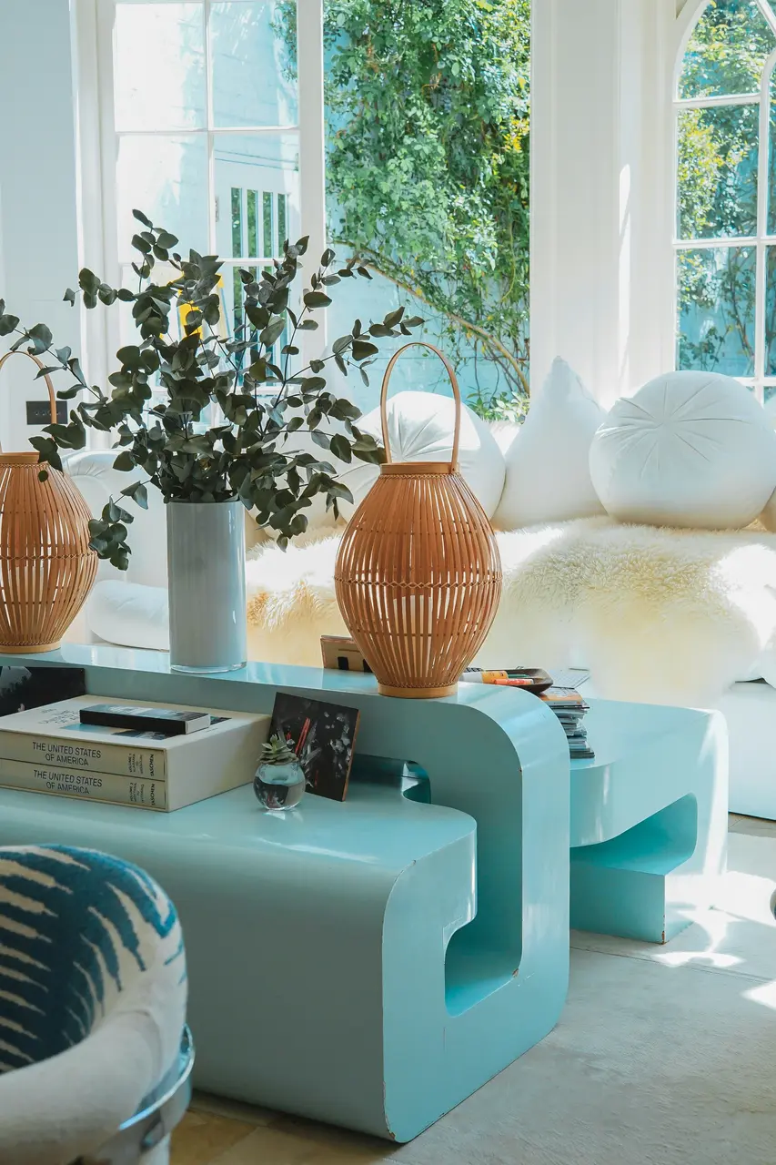
Summer Colors 2025: Calm, Collected, and Radiant
There’s something about summer light—it softens everything. The days stretch, the air shifts, and our homes beg to feel lighter, brighter, and calmer. But summer doesn’t mean neon. At least not here. As a designer, I see seasonal color not just as a trend—but as a chance to recalibrate. To bring freshness without chaos. In this guide, I’m sharing my favorite summer colors to live in and wear—rooted in design theory, shaped by sunlight, and softened for calm, collected living.
“From boutique hotels to homes that feel like retreats—I create the spaces you never want to leave.”
—Rachel Blindauer

What “Summer Colors” Really Means
- Seasonal color palettes for people based on their skin, eye, and hair tone (in color analysis, Summer types wear soft, cool hues).
- Colors that thrive in natural summer light, especially in home design.
This post covers both—how to dress and how to decorate with calm, refreshing hues that reflect the energy of the season without overwhelming it.
Rachel’s Go-To Summer Interior Colors (2025 Edition)
Grouped by mood, not just color:
Serene Summer
- Sky Blue: Tranquil, expansive, best in bedrooms and bathrooms
- Shell Pink: Soft and flattering, especially in natural light
- Cool Sage: A neutral-with-benefits. Great for cabinets, linens, and upholstery
- Misty White: A warm white that reflects sunlight gently
Coastal Summer
- Dune Beige: Calm and grounding—pairs well with white oak and rattan
- Seafoam: A refreshing pastel with coastal roots
- Sunwashed Terra Cotta: For those who love color but want restraint
Refined Summer
- Dusty Lilac: Elegant and unexpected
- Charcoal Navy: Sophisticated depth for trim or accents
- Chalky Linen: Understated but not forgettable
What to Wear If You’re a Summer Palette (Or Want to Look Radiant)
Even if you’re not deep into color analysis, the “Summer” palette—with its cool undertones and delicate hues—flatters most in warm-weather lighting.
Try:
- Light and Airy Blues: Sky blue, periwinkle, dusty aqua
- Soft Pinks: Rose quartz, blush, ballet pink
- Cool-Toned Neutrals: Dove gray, shell white, misty beige
These colors glow at golden hour and photograph beautifully—a quiet nod to the season without trying too hard.
Rachel’s Rules for Summer Color
“Don’t match summer’s energy. Soften it.”
“Cool doesn’t mean cold.”
“Your space should feel like an exhale.”
Your Next Step: Design with Clarity If you’re craving calm in your home—or clarity in your wardrobe—I can help you design both. Whether you’re planning a renovation, a wardrobe reset, or just need a palette that brings you back to center, the right color is where it all begins.
Get Started Today
Let Rachel Blindauer help you think through your project starting with a complimentary consultation.
Something For Everyone
THE PIECES RACHEL RETURNS TO, AGAIN AND AGAIN
