The Book That Changed the Way We Dress, Decorate, and See Ourselves
It started as a quiet revolution. In the early 1980s, amid shoulder pads and perms, a slender paperback made its way into women’s closets—and consciousness. Color Me Beautiful by Carole Jackson was more than a bestseller. It was a manifesto, handed down from mother to daughter, friend to friend, like a treasured secret. And its message was both radical and reassuring: You already look your best. You just need the right colors to prove it.
Jackson’s premise was deceptively simple: each person belongs to a seasonal color palette—Winter, Spring, Summer, or Autumn—based on undertones in their skin, eyes, and hair. Find your season, and everything else falls into place. Shopping becomes easier. Makeup makes more sense. Even your living room might begin to feel more like you.
“Color isn’t a trend. It’s a mirror.”
The System That Gave Women a Language for Their Beauty
Seasonal color theory didn’t emerge in a vacuum. Jackson drew on the work of artist and Bauhaus teacher Johannes Itten, who observed that students instinctively gravitated toward colors that harmonized with their complexions. She adapted this philosophy into something democratic and accessible—something that felt more like liberation than limitation.
Suddenly, women who had never felt “seen” by the fashion industry had a framework. Winters could stop pretending to like pastels. Autumns had permission to embrace rust and olive without apology. Summers found softness in muted tones, and Springs lit up in citrus and cream. More than a style system, it was a kind of permission slip: to be more yourself.
“Knowing your season was like finding your voice—in color.”
From Wardrobe to Wallpaper: How a Personal System Became a Lifestyle
What began in front of a mirror eventually seeped into the home. As an interior designer, I often return to this foundational theory not out of nostalgia, but because it continues to reveal truth.
When we design a space using a client’s seasonal palette, the transformation is subtle but undeniable. A Winter’s living room in crisp white and sapphire doesn’t just look chic—it feels right. A Summer’s powdery lavender walls quiet the mind. A Spring’s sunny kitchen energizes the morning routine. The home, like the wardrobe, becomes a second skin.
As an interior designer designing for a couple, I take both of their palettes into consideration. A successful space should reflect the people who live in it—not just as individuals, but as a partnership. Sometimes that means finding the harmonious overlap; other times, it’s about balancing contrast to create something layered, nuanced, and uniquely theirs.
This isn’t aesthetic matching. It’s psychological alignment.
The Enduring Allure of Color Me Beautiful
Forty years on, Jackson’s framework still resonates. TikTok is filled with color analysts holding swatches to glowing faces. Instagram carousels map lipstick to leaf season. In a world of endless options, we crave systems that give structure to our style—and meaning to our choices.
But more than that, we’re rediscovering the joy of being truly seen. And that’s the lasting genius of seasonal color theory: it doesn’t push you to fit in. It shows you where you’ve always belonged.
Interior Color Guide by Season
| Season | Best Paint Colors | Accent Colors | Design Tips |
|---|---|---|---|
| Winter | Tricorn Black, All White, In the Navy | Emerald, Sapphire, Ruby | High contrast, glossy finishes, bold materials |
| Spring | Summer Shower, Masquerade, Sea Salt | Coral, Aqua, Apple Green | Light woods, brass accents, floral textiles |
| Summer | Just Beige, Oval Room, Skimming Stone | Mauve, Dusty Rose, Sage | Matte finishes, antique glass, linen upholstery |
| Autumn | Bancha, Devonshire Green, Wonderland, Salon Drab | Terracotta, Camel, Olive | Earth tones, jute, leather, layered textures |
Your Season, Your Story
Curious how your palette might shape more than just your outfit but also your interior? Here’s a look at the original four types—and what they reveal.
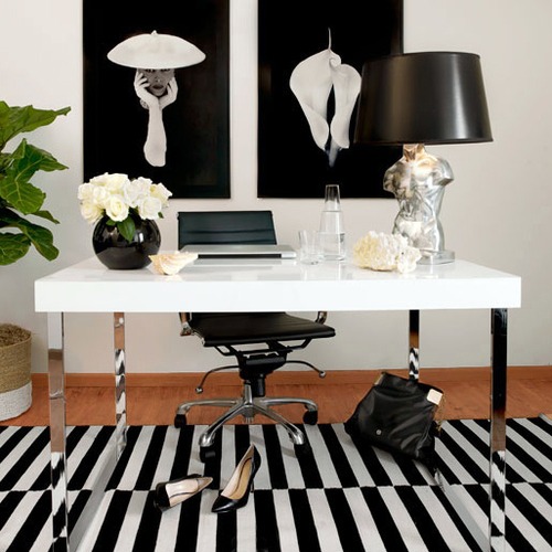
Winter Interior Color Palette: Cool, Bold & Dramatic
You might be: Cool Winter, Deep Winter, or Clear Winter
- Complexion: Cool undertones, often fair with pink tones or deep skin with a blue or olive undertone.
- Hair: Dark brown, black, or platinum blonde.
- Eyes: Dark brown, black, icy blue, or vivid green.
Color Personality: Winters are striking, high-contrast, and thrive in saturated hues. Their style leans modern, sleek, and impactful.
Winter Colors: icy white, true black, charcoal gray, cobalt blue, jewel-toned ruby, emerald, and fuchsia.
Top Colors for Winter Interiors:
-
Charcoal or Deep Navy – Striking for living rooms, offices, or dramatic accent walls.
-
Crisp Cool White – Perfect for trim, ceilings, or creating gallery-style contrast.
-
Emerald, Sapphire, or Ruby – Ideal for bold feature walls or lacquered cabinetry.
- Jet Black or Graphite – Best used in moody powder rooms or chic modern kitchens.
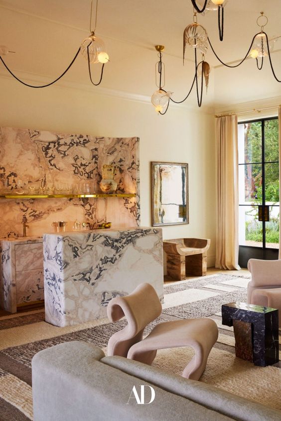
💡 Design Tip: Winter palettes shine with glossy finishes, clean lines, and bold materials like marble, velvet, or lacquer.
🎨 Paint Tip: Try Sherwin-William’s “Tricorn Black by“ or Portola Paints “In the Navy Roman Clay” or Farrow & Ball’s “All White”
❄️ Explore more curated inspiration on our Pinterest Board for Winter Interiors
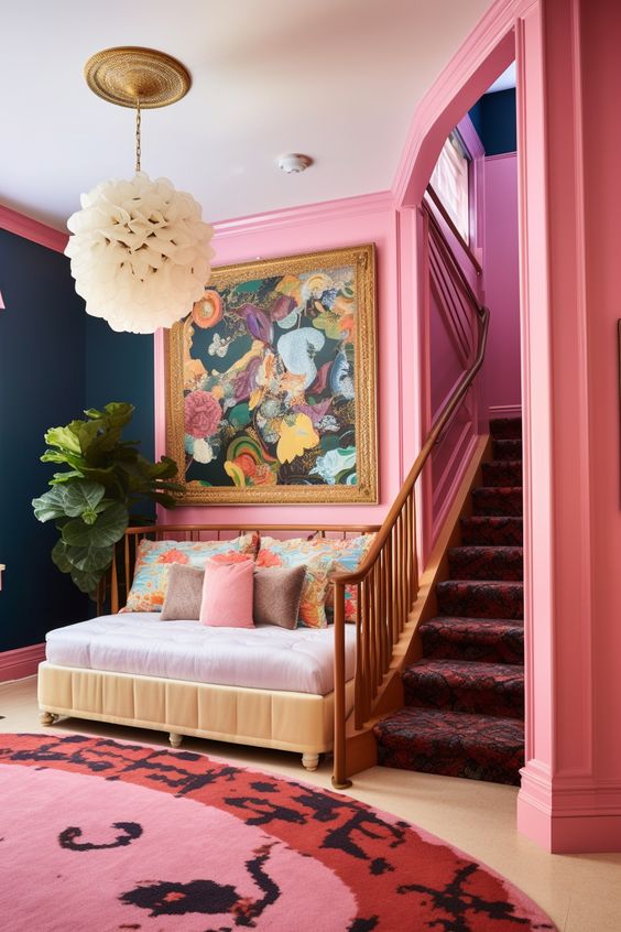

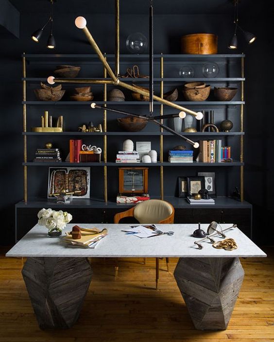
Shop the Winter Palette

Ashford Chenille Dining Chair, Olive Green
$524

Villefranche Square Marble Table Lamp, Black
$333

Vicenza Nickel Candelabra
$795

Calder Bowl, Smoke Gray
$2,888
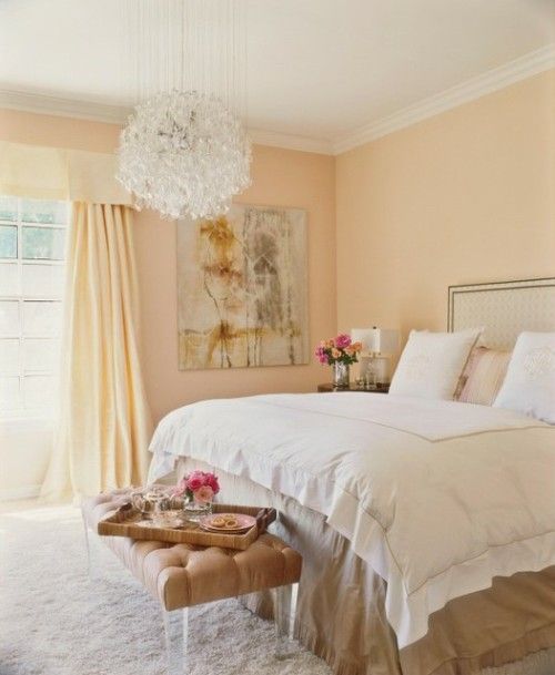
Spring Interior Color Palette: Light, Fresh & Uplifting
You might be: Light Spring, Warm Spring, or Clear Spring
- Complexion: Warm undertones, often peachy or ivory skin that flushes easily.
- Hair: Golden blonde, strawberry blonde, or light auburn.
- Eyes: Clear blue, green, or light hazel with golden flecks.
Color Personality: Springs radiate energy, optimism, and light. Your best colors are clear, fresh, and sun-kissed.
Spring Colors: creamy butter yellow, coral, clear aqua, apple green, peach, and golden ivory.
Top Colors for Spring Interiors:
-
Creamy Butter Yellow – A cheerful yet soft neutral for kitchens, entryways, or bedrooms.
-
Peachy Coral – Perfect for feature walls or a playful powder room.
-
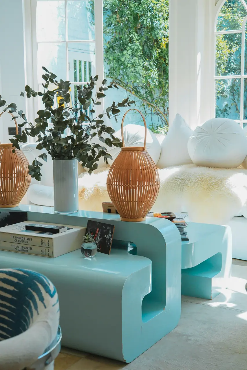
Mint or Soft Aqua – Brings life to a bathroom, laundry, or sunroom.
-
Warm Ivory or Buttermilk – A cozy alternative to stark white for trim or base walls.
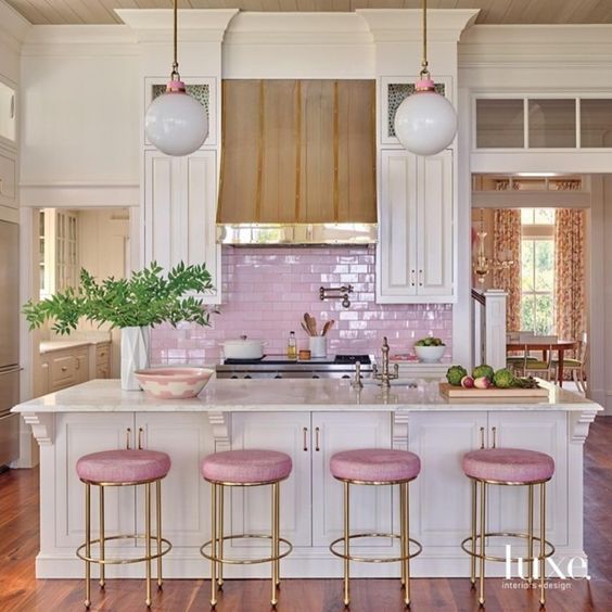
💡 Design Tip: Pair Spring tones with brass hardware, light oak woods, floral textiles, and plenty of natural light to maximize their uplifting quality.
🌸 Explore more curated inspiration on our Pinterest Board for Spring Interiors
Shop the Spring Palette

Seven-Petal Ceramic Plate – French Ceramic
$98

Celadon Corduroy Scalloped Pillow
$105

Jardin Still Life Canvas
$220

Magnolia Bud Wreath – 24" Luxury Faux Floral
$400
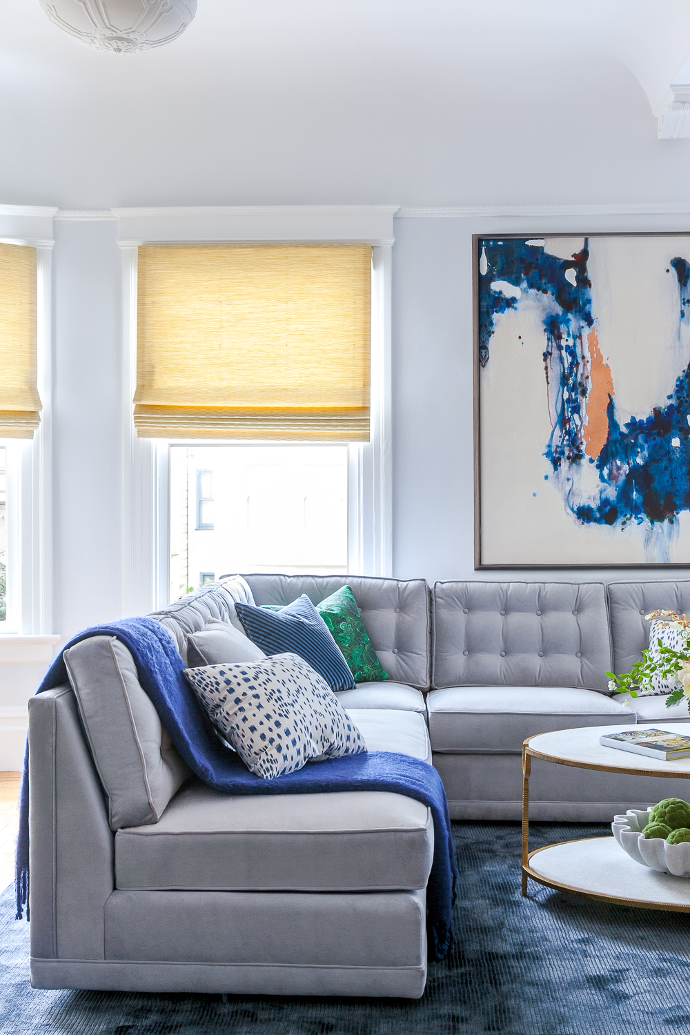
Summer Interior Color Palette: Soft, Cool & Muted
You might be: Soft Summer, Light Summer, or Cool Summer
- Complexion: Cool undertones, often with rosy beige or porcelain skin.
- Hair: Ash blonde, light brown, or soft gray.
- Eyes: Soft blue, gray, or muted green.
Color Personality: Summers glow in delicate, powdery tones. Gravitates toward softness, romance, and subtle layering.
Summer Colors: powdery rose, stormy blue, sage green, mist, mauve, and soft lavender-gray.
Top Colors for Summer Interiors:
-
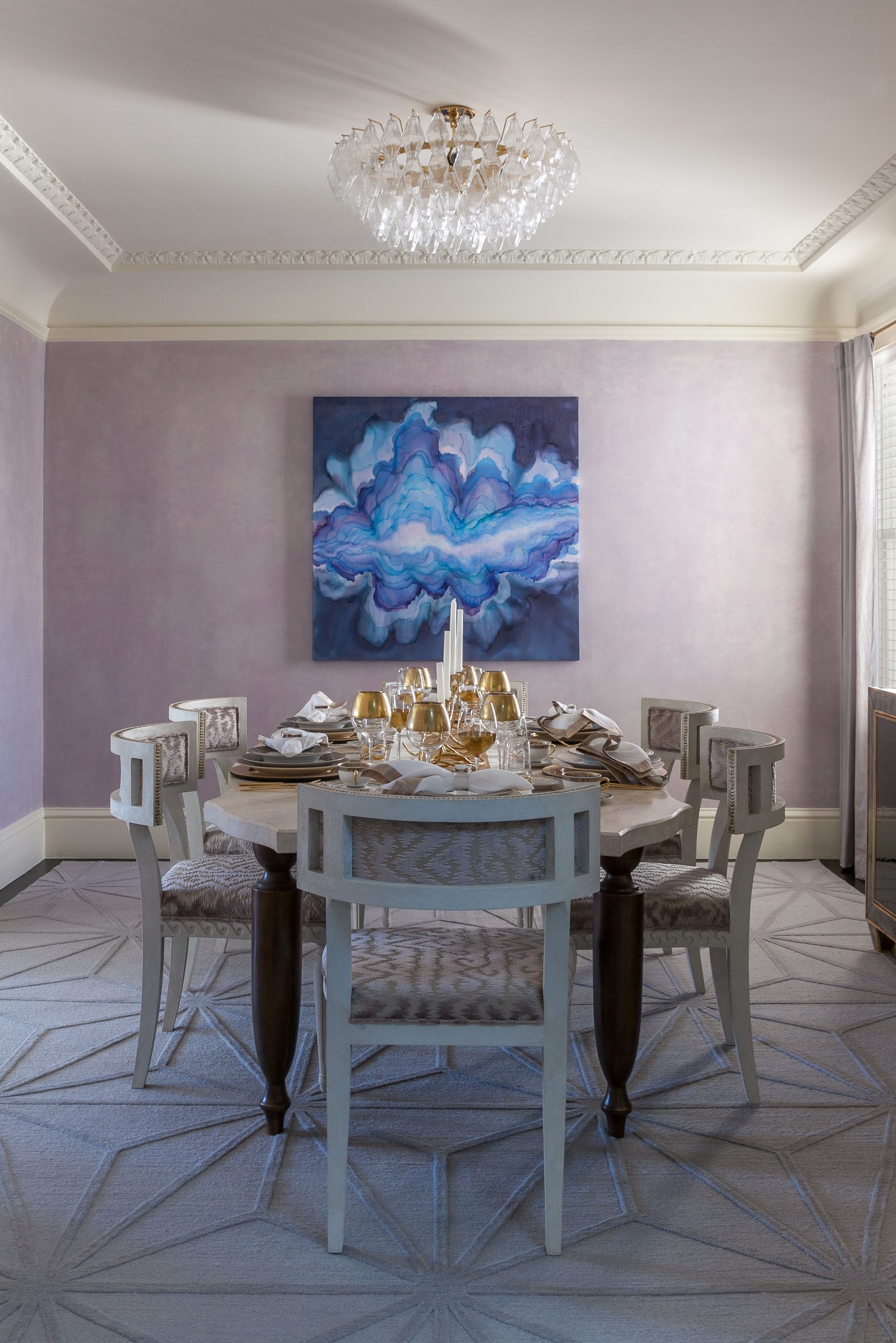
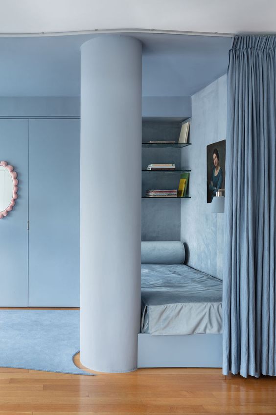
Dusty Rose or Mauve – A romantic choice for bedrooms or a serene sitting area.
-
French Blue or Wisteria – Brings tranquility to bathrooms or home offices.
-
Sage Green – A modern, cool-toned neutral that pairs beautifully with natural textures.
-
Oyster Gray or Mist – Timeless and elegant for cabinetry, trim, or entire rooms.
💡 Design Tip: Accentuate Summer palettes with matte finishes, brushed nickel, antique glass, and linen upholstery for a look that’s layered but never loud.
🎨 Paint Tip: Try Benjamin Moore’s “Just Beige” or Farrow and Ball’s Oval Room or Farrow & Ball’s “Skimming Stone”
🌿 Explore more curated inspiration on our Pinterest Board for Summer Interiors
Shop the Summer Palette

Blush Marble Bowl
$450

Colette Cloud Pillow
$297

Ashcroft Hand-Loomed Wool Rug — Dusty Blue
$50

Violet Cascade
$650
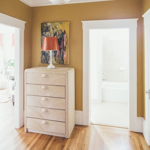
Autumn Interior Color Palette: Rich, Earthy & Warm
You might be: Warm Autumn, Deep Autumn, or Soft Autumn
Color Personality: Autumns feel at home in rich, nature-inspired hues. Your palette is warm, textural, and soulful.
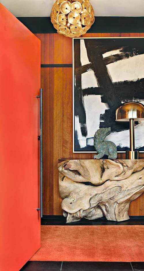
Autumn Colors: terracotta, moss, aubergine, ochre, rust, pumpkin, camel, and espresso.
Top Colors for Autumn Interiors:
-
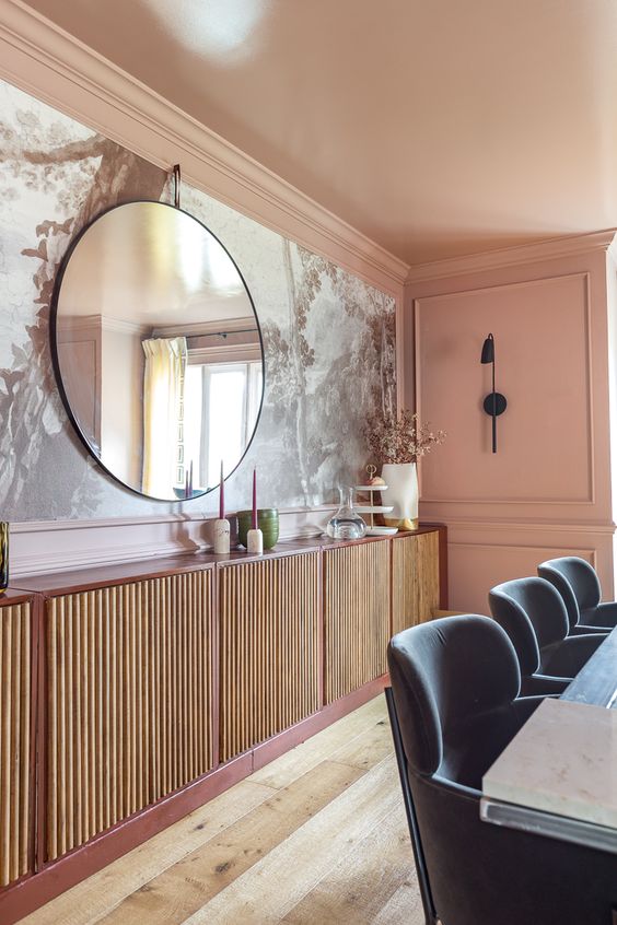
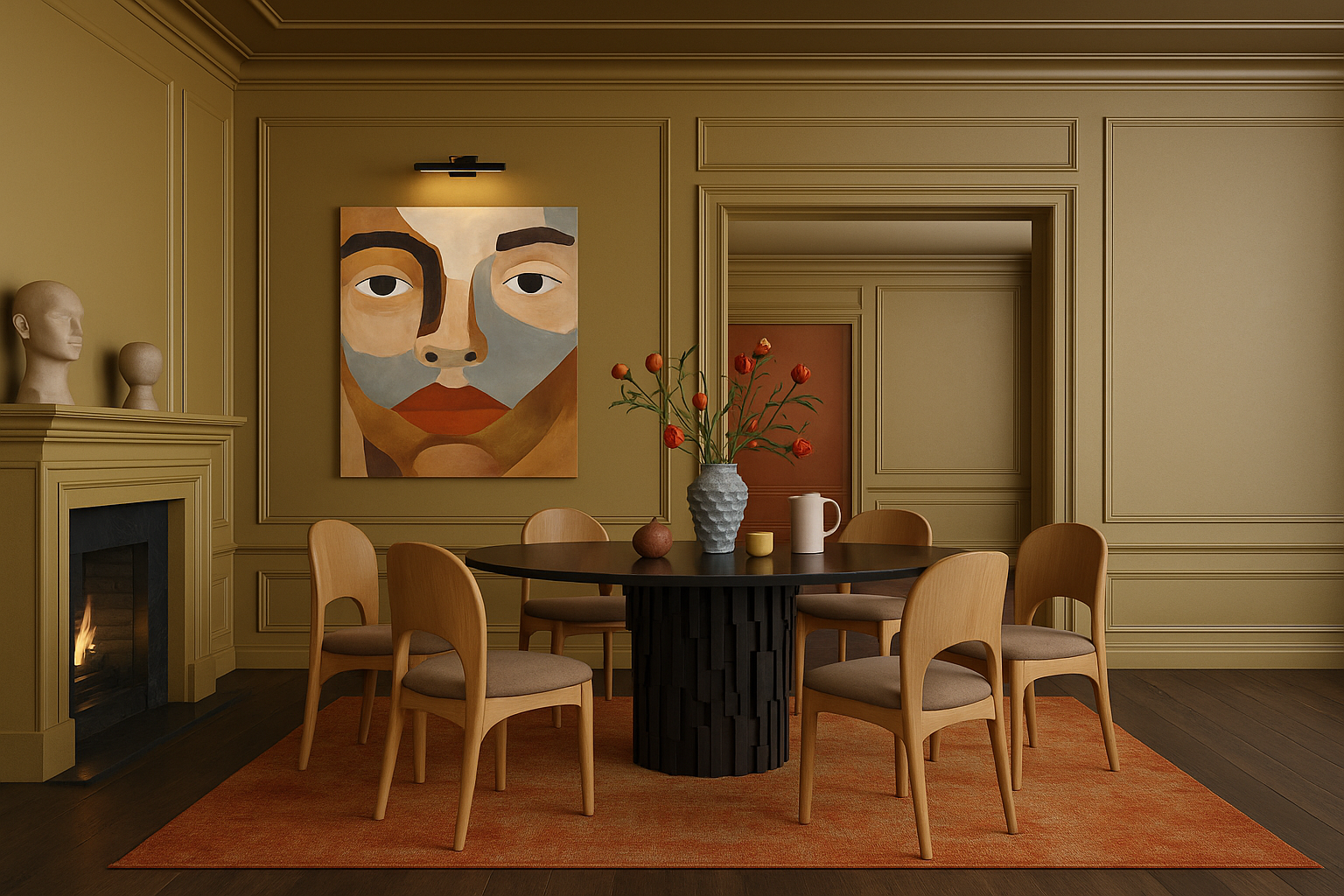
Terracotta or Clay – Brings instant depth to dining rooms or cozy nooks.
-
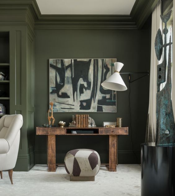
Olive or Moss Green – A sophisticated, grounding choice for libraries or cabinetry.
-
Spiced Pumpkin or Burnt Sienna – Adds seasonal richness to accent walls.
-
Camel or Warm Taupe – A versatile, warm neutral that makes any space feel welcoming.
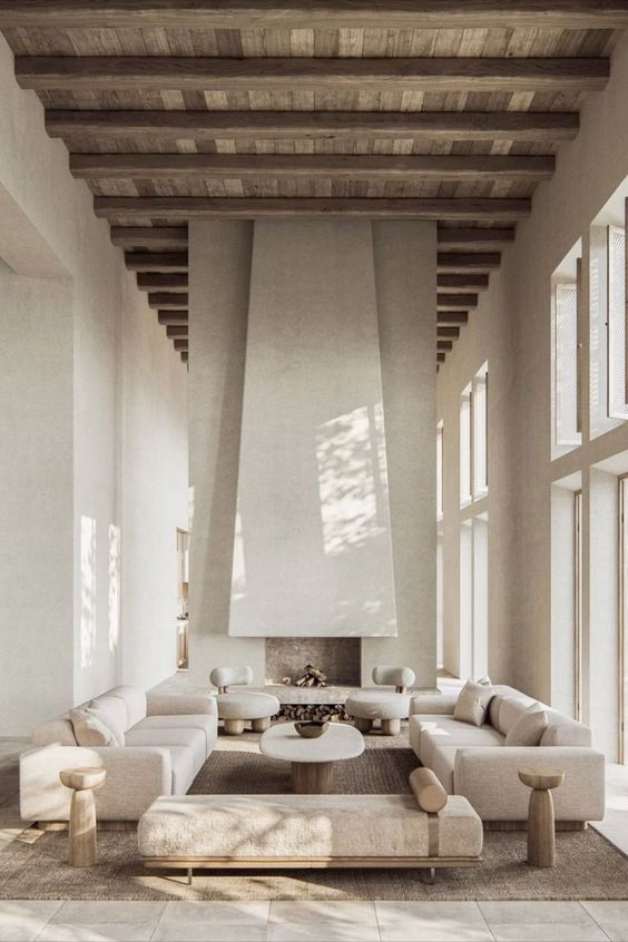
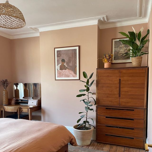
💡 Design Tip: Use matte or eggshell finishes, layer with natural fibers (like jute and linen), and incorporate wood tones, leather, and rattan for warmth and character.
🍁 Explore more curated inspiration on our Pinterest Board for Autumn Interiors
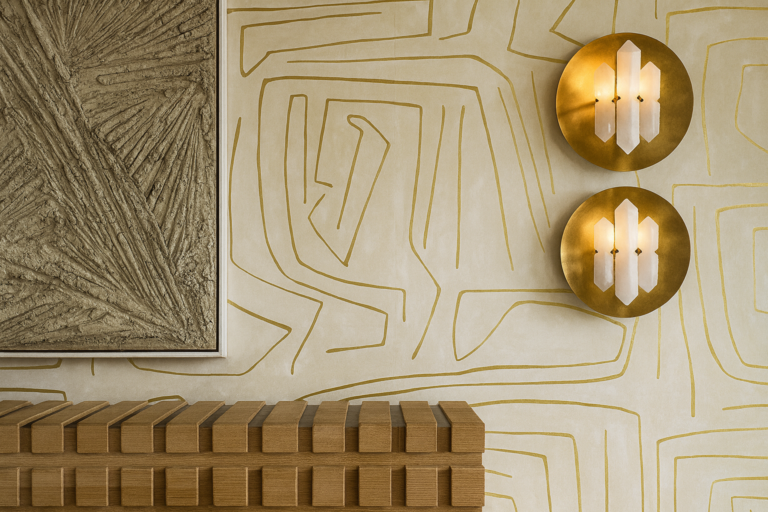
Shop the Autumn Palette

Sienna Handwoven Cotton Coverlet — Terracotta
$485

Cactus Bloom Plaid Napkin
$18

Wexford Square Marble Accent Table, Brown
$1,161

Terra Cotta Side Table
$953
Why It Works: Your Personal Palette, Applied to Your Home
When you walk into a room that aligns with your seasonal palette, something clicks.
The light feels right. The colors flatter your features in photographs. The energy in the space feels calm and tailored—not overstimulating, not dull. Just right. When your home’s colors align with your seasonal palette, everything begins to click. The space feels more flattering, energizing, and serene. Your seasonal palette can subtly influence your energy levels, confidence, and even the cohesion of your wardrobe and interiors.
Not sure of your palette yet?
-
Take the Color Quiz
-
Explore the Power Color Finder Tool for an advanced guide to your top 3 signature colors and the 2 shades to avoid—plus customized recommendations for home and wardrobe.
The Psychology of Alignment
There’s a moment—when the paint is dry, the light hits just right, and the color reflects not only your space but yourself—that everything clicks.
The room feels calm. The edges feel right.
The color doesn’t overpower—you glow within it.
This is what happens when design honors your natural palette. The result isn’t just aesthetic. It’s psychological. It’s subtle, supportive, and sustaining.
Paint isn’t just pigment—it’s emotional architecture. Studies show that color influences how we think, feel, and even behave. Green, for example, has been found to boost concentration and reading ability by up to 15%. Blue can lower heart rate and reduce anxiety. Yellow stimulates serotonin, improving mood and energy. Meanwhile, red can heighten alertness and stimulate appetite—hence its popularity in dining rooms.
How to Actually Pick a Color (Without Losing Your Mind)
Sample Generously: Paint a 2′ x 2′ square on each wall you’re considering. Yes, every wall. Light changes everything.
Observe in Shifts: Check the color in morning light, afternoon light, and evening lamplight. If you’re still in love after 24 hours, you have a winner.
Choose the Right Sheen: Matte for walls, eggshell for bathrooms, semi-gloss for trim. Simple rules, big impact.
Don’t Forget the Flow: Each room doesn’t need to match, but it should feel connected. Use undertones to unify.
Frequently Asked Questions
Q: What is the best interior color palette for a Summer personality?
A: Soft, cool, and muted tones like dusty rose, sage green, French blue, and misty grays work beautifully for Summer interiors. Pair them with matte finishes and subtle textures for a calming effect.
Q: How do I decorate my home using seasonal color theory?
A: Start by identifying your palette—Winter, Spring, Summer, or Autumn—based on your natural undertones. Then layer those hues into your wall color, fabrics, and finishes. This creates a space that reflects your energy and feels deeply personal.
Q: Can couples with different palettes still have a cohesive home?
A: Absolutely. I often design for couples with contrasting palettes. We balance their tones through layering, complementary contrast, and thoughtful material choices that bring both personalities into harmony.
Q: Is seasonal color theory still relevant today?
A: Yes—more than ever. It offers structure, personalization, and timeless guidance in a trend-driven world. I use it regularly to create interiors that resonate emotionally and aesthetically.
Book a Personalized Color & Design Consultation
Whether you’re choosing a single paint color or planning an entire home refresh, I can help you translate your season into a space that feels tailored and timeless.
Shop the Look
Ashford Chenille Dining Chair, Olive Green
$524
Colette Cloud Pillow
$297
Sienna Handwoven Cotton Coverlet — Terracotta
$485

SOMETHING FOR EVERYONE
THE PIECES RACHEL RETURNS TO, AGAIN AND AGAIN