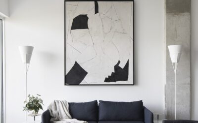
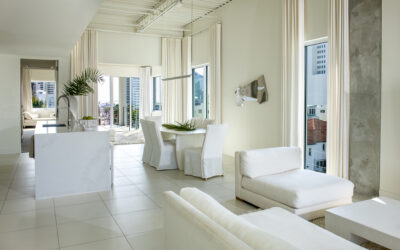
Bathrooms in 2026 are evolving into deeply personal sanctuaries—spaces that blend emotional restoration with tactile luxury. This year’s top paint colors emphasize warmth, texture, and intentionality, drawing from nature-inspired palettes that feel grounding and sophisticated. As an interior designer specializing in refined, narrative-driven spaces, I favor hues that support mood, natural light, and sensory depth while standing the test of time.
Sandstone Beige: Warm, Clean & Enduring Neutral
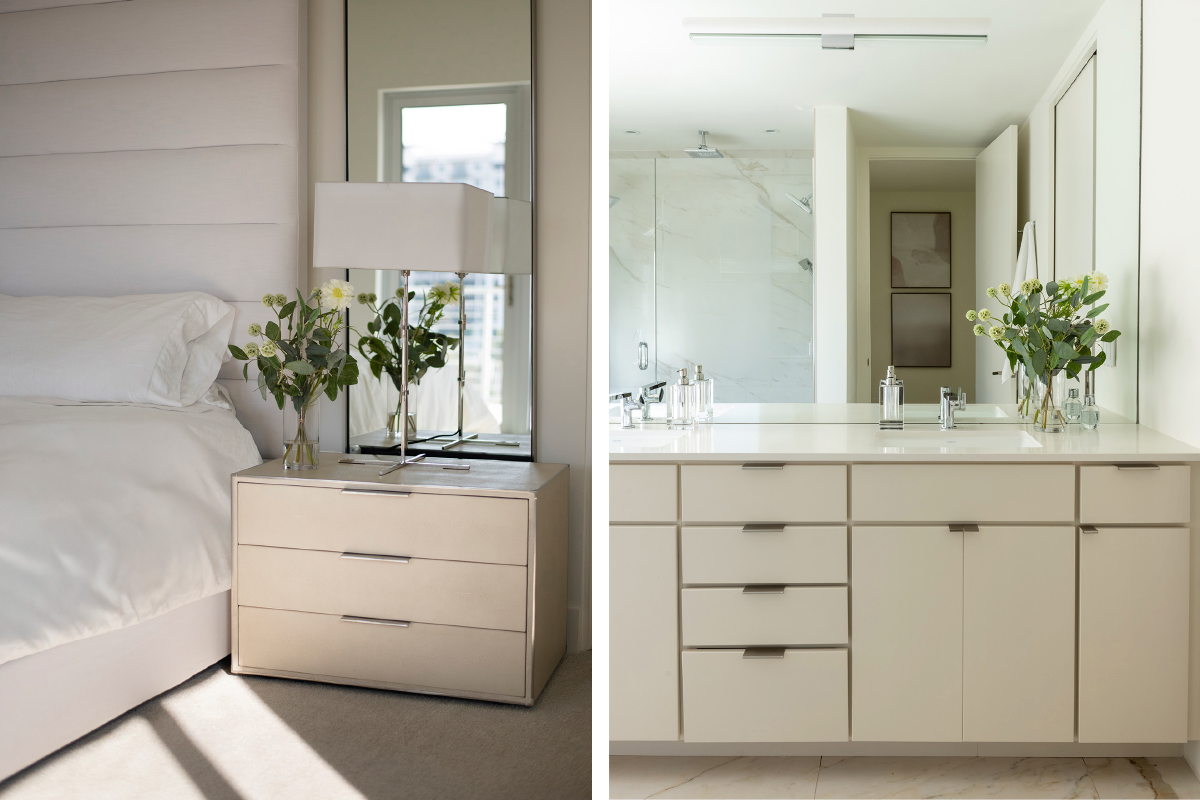
Warm sandstone beiges remain a cornerstone for 2026 bathrooms, offering subtle structure and softness without overwhelming architectural details. These nuanced neutrals—think oatmeal and khaki tones—create a serene backdrop that’s both modern and timeless.
Best paired with: Brass or aged bronze fixtures, woven textures, natural stone tile, and white oak accents. Paint recommendations:
- Benjamin Moore “Muslin”
- C2 Paint “Pale Bone”
- Farrow & Ball “Slipper Satin” or “Stirabout” (a cozy oatmeal neutral trending strongly this year)
Muslin
Benjamin Moore OC-12
#E1D6C1 approx.
Pale Bone
C2 Paint
#F7F2EC approx.
Slipper Satin
Farrow & Ball No. 2004
#E7E2D2 approx.
Stirabout
Farrow & Ball No. 300
#D9CFC1 approx.
Pro tip: Layer with textured elements like a scalloped linen shower curtain or handmade ceramics to enhance the organic feel.
Shop The Look


Mocha & Deep Earthy Tones: The Luxe New Neutrals
Rich browns, mochas, and tobacco-inspired hues are dominating 2026, evolving from 2025’s Mocha Mousse into deeper, more expressive shades like warm mahogany and cinnamon. These create velvet-like warmth and intimacy—perfect for a moody, cocooning escape.
Best paired with: Stained wood vanities, tumbled travertine, antique brass hardware, and layered lighting. Paint recommendations:
- Pantone-inspired Mocha Mousse (or similar)
- Benjamin Moore “Cinnamon Slate”
- Farrow & Ball “Preference Red” or emerging tobacco browns like “London Clay”
Mocha Mousse
Pantone 17-1230 TCX
#A47864 approx.
Cinnamon Slate
Benjamin Moore 2113-40
#897475 approx.
Preference Red
Farrow & Ball No. 297
#694247 approx.
London Clay
Farrow & Ball No. 244
#73665F approx.
Used thoughtfully, these shades add personal depth without feeling heavy.
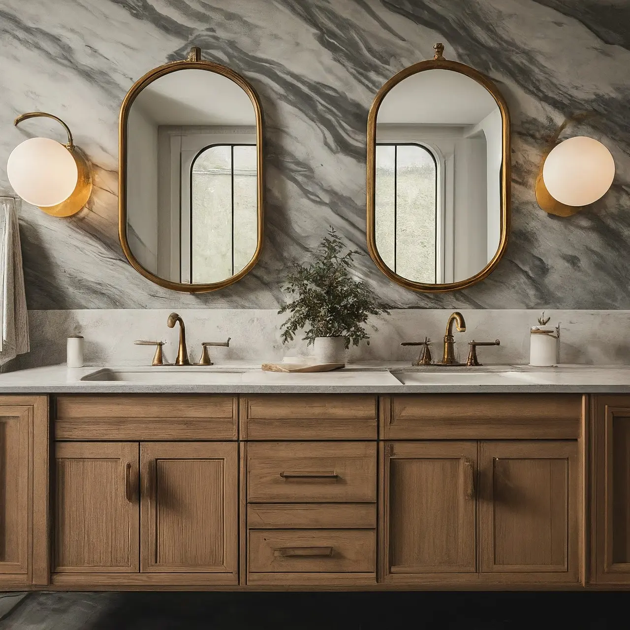
Greige with Taupe Depth: Modern, Layered & Adaptable
Greige is shifting toward warmer taupes in 2026—calm, contemporary shades that bridge neutral and earthy for spa-like serenity.
Best paired with: White oak, microcement floors, linen textiles, and subtle metallic accents. Paint recommendations:
- Farrow & Ball “Elephant’s Breath”
- C2 “Pale Granite”
- Little Greene “Joanna”
Elephant’s Breath
Farrow & Ball No. 229
#CDC3B7 approx.
Pale Granite
C2-783
#B8AEAA approx.
Joanna
Little Greene
#EBEAE0 approx.
These adaptable tones reflect light beautifully in smaller spaces.
Textural Off-Whites: Sculptural, Restorative & Spa-Like
Move beyond clinical whites to layered, textural off-whites with limewash or plaster effects. These create a wabi-sabi elegance that’s restorative and on-trend for 2026’s focus on patina and tactility.
Best paired with: Hand-troweled plaster walls, sculptural brass fixtures, natural wood elements. Paint recommendations:
- Portola Paints “Classic Gray” (limewash)
- Farrow & Ball “Wimborne White”
- Benjamin Moore “Chantilly Lace” in matte
Classic Gray
Portola Paints
#C9C9C0 approx.
Wimborne White
Farrow & Ball No. 239
#F5F2E8 approx.
Chantilly Lace
Benjamin Moore OC-65
#F4F6F1 approx.
Pro tip: Apply limewash for subtle movement that catches light throughout the day.
Chalky Sages & Botanical Greens: The Spa Classic, Grown Up
If there is one color family clients ask me about more than any other for bathrooms, it is green—and the greens I return to are quieter and more mineral than the bright sages of a few years ago. These are greens with chalk and earth in them, the kind that read almost as a neutral until the light moves. In a bathroom they do something no other color quite manages: they flatter skin tones, calm the eye, and make warm stone and aged brass look intentional rather than expected.
Best paired with: Honed marble or zellige in warm white, wood vanities, unlacquered brass or polished nickel, and plenty of linen.
Paint recommendations:
- Farrow & Ball “Cromarty” — a chalky coastal sage, and my first answer for a spa-calm bath
- Sherwin-Williams “Sea Salt” — fresh and ocean-inspired, shifting between soft green and blue-gray as the light changes
- Farrow & Ball “Bancha” — a structured olive with real gravitas for cabinetry or a drenched powder room
- Benjamin Moore “Shady Lane” — a dark, botanical green for the moody end of the spectrum
Cromarty
Farrow & Ball No. 285
#CBCCBF approx.
Sea Salt
Sherwin-Williams SW 6204
#CDD2CA approx.
Bancha
Farrow & Ball No. 298
#676746 approx.
Shady Lane
Benjamin Moore 497
#76754D approx.
Pro tip: Muted greens shift dramatically under artificial light—test a large swatch beside your vanity lighting at night before committing. What reads sage at noon can lean gray or mint under cool LEDs.
Color-Drenched Atmospheres: Bold, Immersive Drama
Color drenching—painting walls, ceilings, and trim in one hue—continues strongly into 2026, with earthy terracottas, deep reds, and muted clays leading the way. These immersive tones add drama and cohesion, especially in powder rooms or en suites.
Best paired with: Matching tile, sculptural accessories, arched niches, and warm metals. Color suggestions: Smoky terracotta, oxblood, claret, or emerging deep plums. Paint recommendations: Farrow & Ball “Red Earth” or similar muted reds.
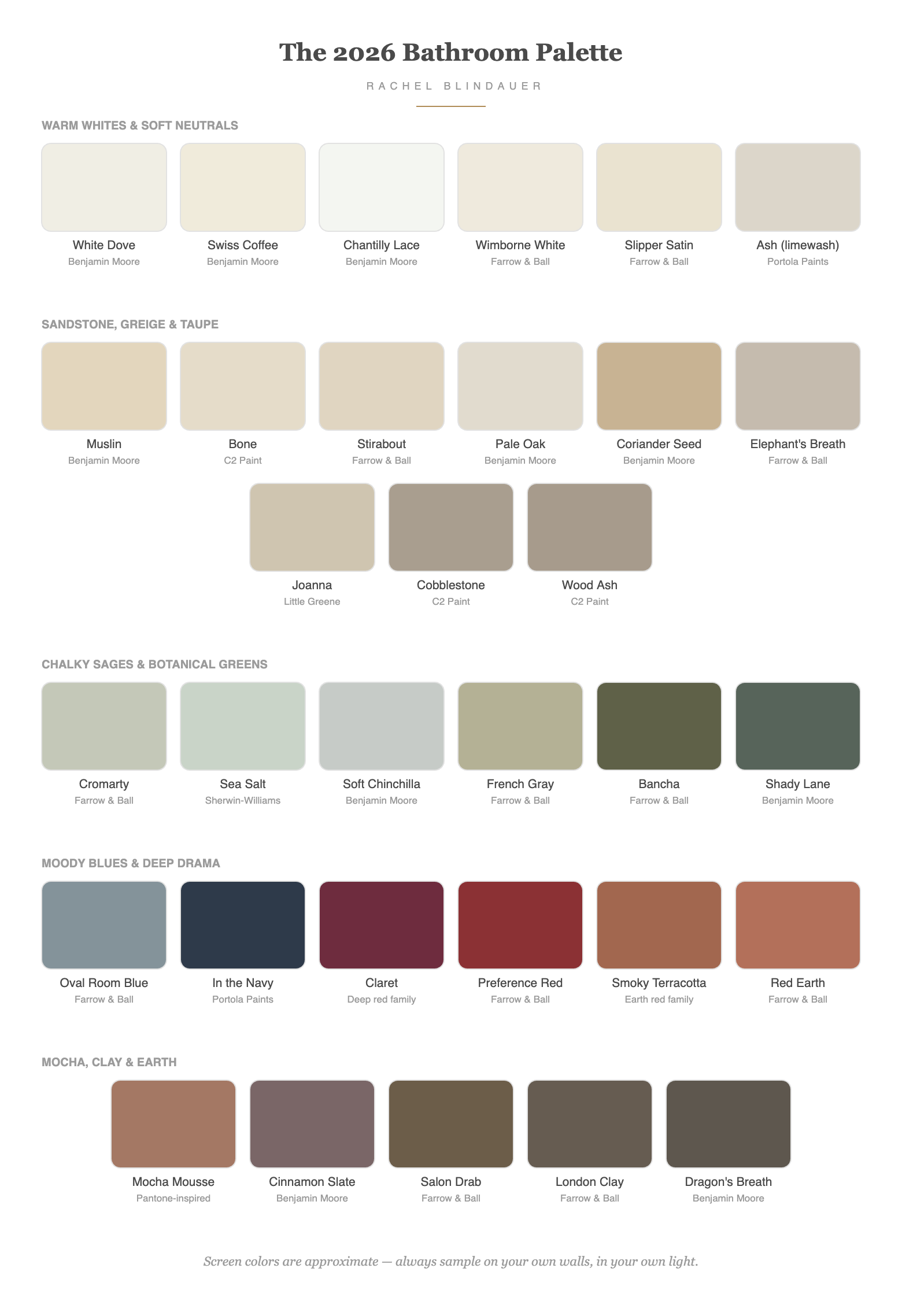
2026 Bathroom Color Mood Chart
| Vibe | Key Tone | Paint Ideas | Mood Created |
|---|---|---|---|
| Calm & Natural | Sandstone Beige/Oatmeal | Muslin, Bone, Stirabout | Grounding, serene |
| Luxe & Moody | Mocha/Burgundy/Tobacco | Cinnamon Slate, London Clay | Intimate, velvet-like warmth |
| Modern Minimalist | Warm Greige/Taupe | Elephant’s Breath, Cobblestone | Layered, adaptable calm |
| Spa-Textural | Off-White + Limewash | Ash (limewash), Wimborne White | Restorative, sculptural |
| Immersive Drama | Terracotta/Deep Red | Red Earth, Claret, Smoky Terracotta | Bold, enveloping depth |
Best Bathroom Paint Colors by Light & Size
The most common mistake I see is choosing a bathroom color from a photograph of someone else’s light. A shade that glows in a south-facing primary bath can go flat and gray in a small interior powder room. Start with your room’s light and scale, then choose within the palettes above.
For small bathrooms, color is only half the trick—the other half is borrowed from every small space I’ve designed. Keep the scheme monochromatic: different tones of a single color unify the room and enhance spaciousness far better than contrast does. Then let a large mirror do the work of a window—a generous, wall-spanning mirror over the vanity reflects light and visually doubles the room. Choose wall-mounted sconces or pendants instead of bulky fixtures to keep surfaces clear, and draw the eye upward so the room reads taller than its footprint.
| Bathroom Type | What Works | Try |
|---|---|---|
| Small bathroom | Monochromatic light tones drenched on walls, trim & ceiling; one oversized mirror | White Dove, Pale Oak, Sea Salt, Soft Chinchilla |
| No windows / powder room | Commit to atmosphere—luminous warmth or full moody drama | Swiss Coffee for warmth; Oval Room Blue or In the Navy Roman Clay for drama |
| North-facing (cool light) | Warm undertones to counter the gray cast of northern light | Swiss Coffee, Pale Oak, Coriander Seed |
| South-facing (warm light) | Cooler, mineral tones the sun will warm on its own | Cromarty, Sea Salt, French Gray |
| Large primary bath | Depth and saturation the square footage can carry | Salon Drab, Shady Lane, Dragon’s Breath, Oval Room Blue |
The Wallpaper Exception
One more small-space truth: powder rooms and small baths are the single best use case for wallpaper in the entire house. The square footage is low, so a paper you’d never commit to across a living room becomes affordable—and the impact per square foot is unmatched. A powder room is a jewel box; it’s the one room where guests expect a point of view, and a bold botanical, a hand-blocked print, or a grasscloth delivers one in an afternoon. In a powder room without a shower, almost any paper works. In a full bath, keep paper away from the wet zone, ventilate well, and look for vinyl-coated or performance papers—or drench the paper’s background color onto the remaining walls in paint for a fully enveloped room at half the cost.
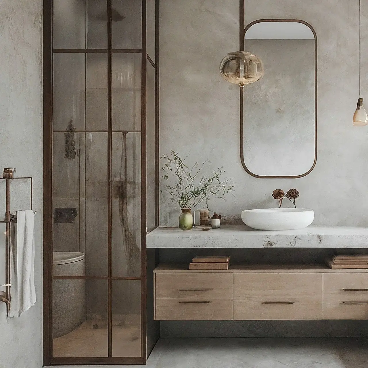
Bathroom Cabinet & Vanity Paint Colors for 2026
Walls get all the attention, but in most bathrooms the vanity is the single largest block of color at eye level — and in 2026, it’s where I put the personality. The formula I use on projects: quiet walls, characterful cabinetry. It lets you commit to a real color without the room ever feeling small or loud.
The cabinet colors I’m specifying this year:
- Sherwin-Williams “Urbane Bronze” (SW 7048) — a soft charcoal-bronze that acts as a neutral but photographs with far more depth than gray. My pick when the countertop already has movement.
- Benjamin Moore “Hale Navy” (HC-154) — the navy that earns its classic status: deep and grounded without going flat under vanity lighting, and the perfect foil for brass, marble, and warm wood. It is also forgiving of water spots and toothpaste flecks — a real consideration in kids’ and guest baths.
- Sherwin-Williams “Tricorn Black” (SW 6258) — a true near-black for a sharp, modern powder-room vanity. It sounds severe but lives graciously: black cabinetry grounds small rooms, hides wear better than anything on this list, and lets stone and lighting do the talking.
Urbane Bronze
Sherwin-Williams SW 7048
#54504A approx.
Hale Navy
Benjamin Moore HC-154
#434B56 approx.
Tricorn Black
Sherwin-Williams SW 6258
#2F2F30 approx.
The part most people skip: the paint itself matters more than the color. A bathroom vanity lives in humidity and takes daily hand contact around the hardware. I only specify hybrid alkyd enamels for cabinetry — Benjamin Moore Advance or Sherwin-Williams Emerald Urethane Trim Enamel, in satin. They cure to a hard, wipeable, furniture-grade finish that regular wall paint can never match. Matte looks beautiful on day one and shows every fingerprint by month three.
Three rules I give every client:
- Contrast the temperature, not just the color. Warm cabinetry with cool-leaning walls (or the reverse) gives the room depth even in a 5×8 footprint. It’s the same principle behind the psychology of warm neutrals — color temperature does the emotional work.
- Match the undertone to your counter, not your tile. The counter meets the cabinet at a hard line; the tile is usually across the room. Hold your swatch to the slab.
- If the room has no window, go darker on the vanity, not lighter. Fighting for brightness with pale cabinetry in a windowless bath reads gray and sad. A deep vanity color plus warm 2700K sconces reads intentional. If you’re drawn to navy here, navy flatters nearly every palette — one of the reasons it never dates.
Expert Design Guidance for 2026 Bathrooms
2026 trends prioritize texture and tactility over polished perfection: think zellige tiles, limewash plaster, travertine, tadelakt, and artisanal hardware.
- Layer for sensory depth: Combine stone, tile, plaster, and metal.
- Embrace patina: Opt for antique or brushed finishes over shiny chrome.
- Consider wet-room layouts: Curbless showers for seamless, luxurious flow.
- Shift from cold tones: Icy blues and grays are out; embrace earthy warmth and material drenching for visual cohesion.
Rachel Blindauer’s Design Advice for 2026 Bathrooms
“Bathrooms should feel layered and intentional. Color sets tone—texture tells the story.”
Rachel favors plaster walls, moody cabinetry, and matte finishes.
Tips:
-
Use matte or eggshell paint for a soft, luminous glow.
-
Mix warm cabinetry with soft walls for balanced depth.
-
Explore rich tones and wallpaper in powder rooms for curated impact.
Bathroom Paint Color Questions I Hear Most
What is the most timeless bathroom paint color?
Warm whites and soft neutrals with real undertones—White Dove, Swiss Coffee, Pale Oak—and chalky sages like Cromarty. They outlast trend cycles because they defer to the materials around them; stone, wood, and metal age beautifully against them. Stark builder white and icy gray are the two shades I most often get called in to repaint.
What color makes a bathroom look expensive?
Depth and commitment read as luxury. Earthy browns like Salon Drab, deep botanical greens like Shady Lane, or a color-drenched Oval Room Blue—walls, trim, and ceiling in one hue—signal intention. So does texture: a limewashed wall will always look more expensive than a flat bright white one.
What is the best paint finish for bathrooms?
For most bathrooms I specify a high-quality satin or eggshell—enough moisture resistance for daily steam, with a soft, designer-level sheen. Powder rooms without showers can go matte, limewash, or Roman clay for atmosphere. Avoid flat paint in full baths unless you’re using a specialty bath formula, and avoid high-gloss on imperfect walls—it broadcasts every flaw.
Can you use wallpaper in a bathroom?
Yes—and powder rooms and small baths are where wallpaper earns its keep best. Low square footage means even a splurge-worthy paper stays affordable, and the payoff per square foot is enormous. In powder rooms without showers, nearly any paper works; in full baths, keep it out of the wet zone, ventilate well, and choose vinyl-coated or performance papers made for humidity.
What bathroom paint color is best for resale?
Pale Oak, White Dove, and soft misty tones like Soft Chinchilla. They photograph well, flatter every tile situation, and let buyers project their own life onto the room. Save the drenched navy powder room for the home you’re staying in—or commit to it fully, because a half-hearted version helps no one.
Are gray bathrooms out of style?
Cool silver-grays and blue-gray builder neutrals are fading fast. But gray isn’t gone—it has warmed up. Greiges with genuine warmth, like Pale Oak or C2’s Wood Ash, are very much current; it’s the icy, flat grays of the 2010s that now date a room.
Should the vanity be lighter or darker than the walls?
Darker, in most rooms. A vanity darker than the walls grounds the room and hides real-life wear. I reserve light-on-light — pale vanity, pale walls — for baths with strong natural light and stone with warm veining.
What is the most popular Benjamin Moore bathroom color for 2026?
For walls, White Dove and Pale Oak still lead my spec sheets. For vanities, Hale Navy is the one clients ask for by name — it holds its character under artificial light, which is the real test in a bathroom.
Can I paint my existing vanity instead of replacing it?
Yes — and it is the highest-ROI update in the room. Degrease, scuff-sand, prime with a bonding primer (Stix or INSL-X), then two thin coats of a urethane-modified enamel. Skip the primer and no color will save you.
Keep Exploring Color
If you’re selecting colors for a renovation or a new build and want a second set of trained eyes, my Design Your Life services and design consultations exist for exactly this decision—a cohesive, timeless palette tailored to your rooms, your light, and your life. And if the refresh starts smaller, the shop carries the travertine, marble, and woven pieces I reach for to finish these palettes.
- The Best Paint Colors for Sarasota, San Francisco & Nantucket—the full palette these bathroom picks come from
- Maximizing Small Spaces: Creating the Illusion of Space—the mirror and light tricks behind the small-bath advice above
- The Psychology of Color in Interior Design—why these palettes feel the way they do
- Why Your Paint Color Looks Wrong—and How to Choose the Right One
- Seasonal Color Analysis: Your Best Colors—the personal side of the same color story
Final Thought: Make It Calm & Personal
Renovating in St. Louis? I answer the questions I get asked most about local bathroom renovations here: St. Louis Bathroom Design: The Renovation Questions I Get Asked Most.
In 2026, bathroom design is about creating retreats that nurture—select colors that resonate with you, not just trends. Luxury starts with intention.
Interested in personalized interior design for your home, hospitality project, or model residence?

SOMETHING FOR EVERYONE
THE PIECES RACHEL RETURNS TO, AGAIN AND AGAIN