Lilac Textural Glamour — a Summer palette executed for a client
I have spent fifteen years telling clients what their houses want. It took a stack of photographs of my own face to work out what I want.
I am naturally a Summer. Ash blonde, cool undertone, low contrast. I have known it since high school & in high school I looked exactly like that, and the attention it drew from sixteen-year-old boys was enough to make me cut my hair off and dye it. I went auburn and artsy and stayed there for the better part of my life.
I rocked the auburn and it worked. But it was a costume worn long enough to become a habit, and the tell was my roots. My wardrobe stayed white and flesh-toned which are the only colors kinda ok for a red head autumn and summer mix. My houses stayed mostly white and oak but with bursts of yellow and orchestrated artful color. So even my attempts at being an Autumn was also part Summer the entire time.
Autumn vs Summer
A wave of people are re-running their color analysis right now, feeding photographs into AI rather than sitting for a drape test, and a striking number are landing where I did.
Autumn and Summer get mixed up more than any other pair, and the reason is that both are soft. Neither wants clear, bright color. What separates them is the base underneath that softness: Autumn sits on gold, Summer sits on grey. Rust, moss, terracotta and mustard belong to the first. Dusty blue, lilac, soft rose and ash neutrals belong to the second. Once you are reading the base instead of the intensity, the two stop looking alike.
The practical consequence for me was smaller than you would expect. I lost rust and yellow. I gained pale blue, purple and pink. Everything else — the whites, the flesh tones, the ash neutrals I had been using all along — stayed exactly where it was.
Cool base, low contrast, soft edges. A Summer palette does not announce itself.
What a Summer Palette Looks Like in a Room
Personal color analysis is written almost entirely for wardrobes. Nobody carries it into the house, which is strange, because a room is a much larger surface than a sweater and you sit inside it.
Three properties define a Summer room: a cool base, low contrast, and soft edges. It fails in one predictable way — someone drops a warm or high-contrast element into it, and the whole room tips. In my experience it is almost never the paint that does the damage. It is the metal or the stone.
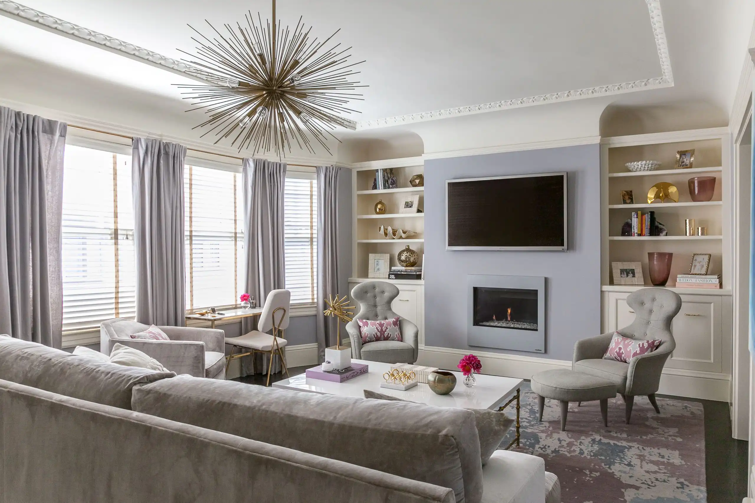
The living room. Everything here sits on a grey base rather than a gold one.
Summer Neutrals, by Where They Go
| Element | What works | Why |
|---|---|---|
| Wall neutral | Grey-white, oyster, pale dove, the ashier greiges | The base has to stay cool. A greige with gold in it turns the room warm and everything else begins to fight it. |
| Upholstery | Ash linen, blue-grey, soft lilac-grey, pale slate | Large soft surfaces are where a cool palette either holds or collapses. |
| Stone | Carrara, grey-veined Calacatta, soapstone, pale blue-grey quartzite | Gold-veined marble is the single most common thing that breaks a Summer room. |
| Metal | Polished nickel, chrome, pewter, soft silver | Warm brass is beautiful and belongs to a different palette. This is the hardest substitution to make right now, because brass is everywhere. |
| Wood | Limed or grey-washed oak, ash, pale rift-sawn white oak | Orange-toned walnut and cherry pull the room straight back to Autumn. |
| Accent color | Lilac, pale blue, dusty pink, grey-sage, dusty plum | These read as color without introducing contrast. |
| Contrast | Low to medium — skip true black against true white | Low contrast is the defining property. Get this wrong and the correct colors still look wrong. |
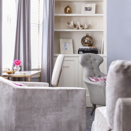
Walls and drapery held in one family — the neutral doing the work is cool, not warm.
The Summer Colors on My Own Paint List
I keep a running list of the paint colors I return to, built long before I had a name for my own season. Reading it back now, the Summer colors are already sitting in it — I had simply never grouped them that way.
| Color | Where I use it |
|---|---|
| Summer Shower, Benjamin Moore | The pale blue. Light and soft, closer to robin’s egg than to sky, and it stays cool in rooms that would yellow a warmer blue. |
| Sea Salt, Sherwin-Williams | The dusty blue. Blue-grey with enough green in it to keep from reading as a nursery. |
| Soul Mate, Benjamin Moore | The dusty pink. An earthy red softened all the way down — the only pink I use in a grown room. |
| French Gray, Farrow & Ball | Misty and historical. Does the work of a neutral while behaving like a color. |
| Soft Chinchilla, Benjamin Moore | Gentle and misty. My quietest wall neutral. |
| Wood Ash, C2 Paint | A mid-toned greige with real character. The ash in the name is the point. |
| Half Moon Bay Lime Wash, Portola | When the room wants atmosphere rather than a color. |
| Oval Room Blue, Farrow & Ball | The deeper anchor. Elegant and moody without going warm. |
| In the Navy Roman Clay, Portola | When a Summer room needs one place to land. |
What all nine share is complexity. Not one of them is a single flat note — each holds more than one hue, which is what gives a room atmosphere at four o’clock and again at nine.
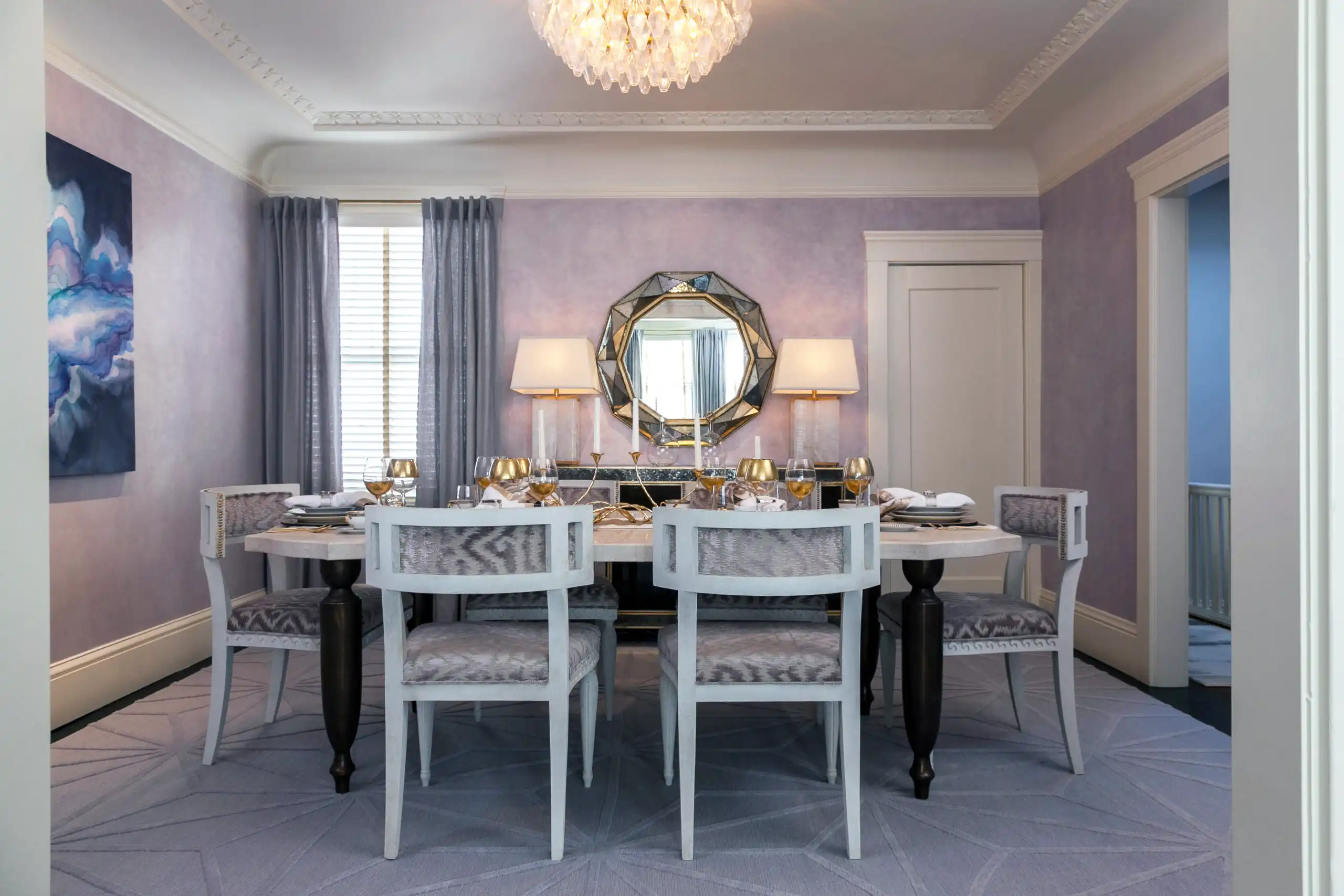
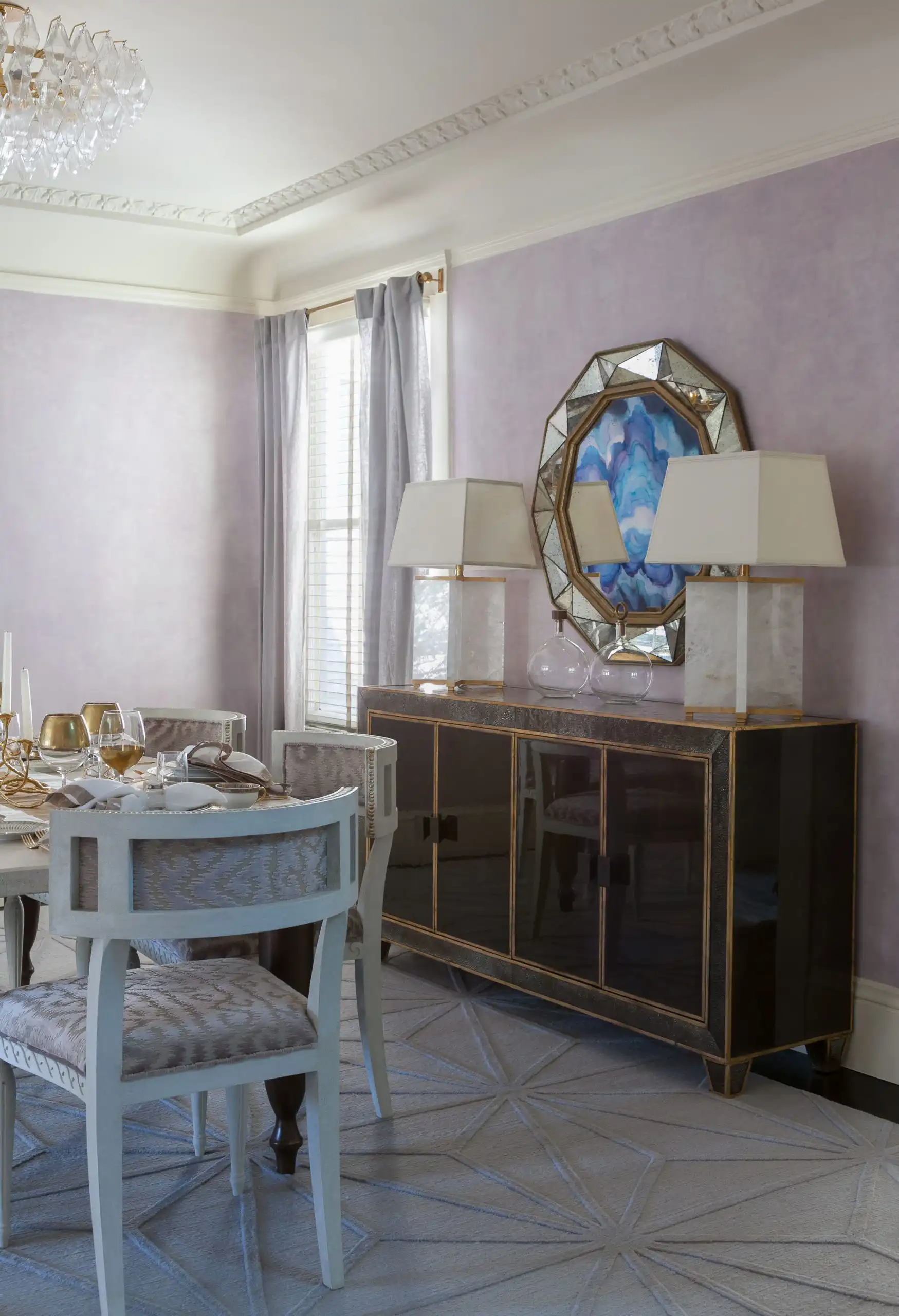
The dining room. Tonal upholstery carries the palette as much as the paint does.
Lilac Textural Glamour: A Room Designed for a Summer
This project was designed deliberately for a Summer. The client is one, and the entire palette was built around her colouring rather than around a trend — which is the most useful thing I can show you, because it is the finished version of the argument above.
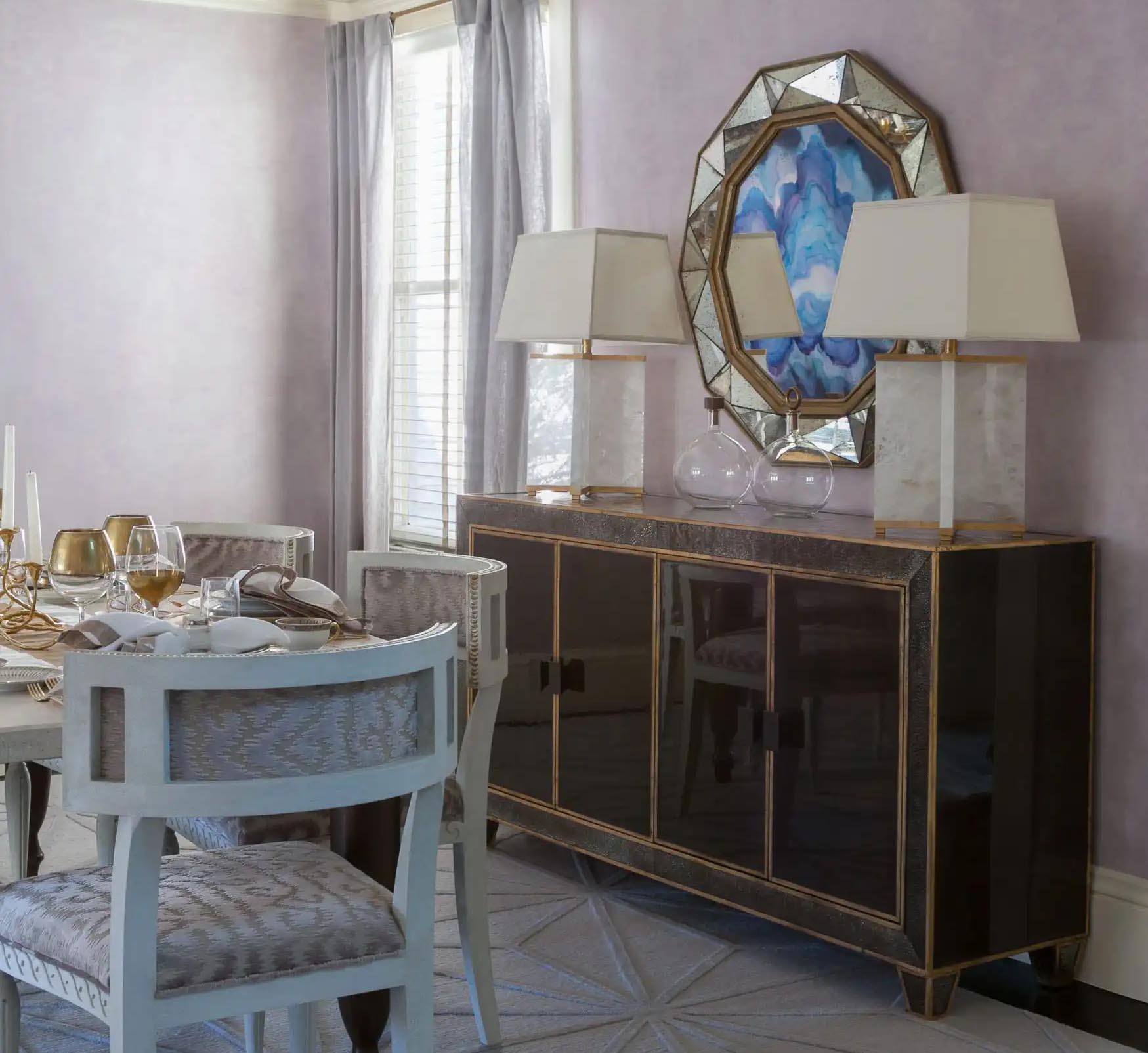
The walls are lilac, working as a neutral rather than as a colour: soft enough to sit behind everything, cool enough that nothing else in the room has to work around it. The drapery is a pale grey-blue held in the same family, so wall and window read as one surface instead of two. The dining chairs are upholstered tonally, which keeps contrast low at exactly the height the eye travels. The lamps are alabaster and pale marble. The artwork is blue. Every large surface sits on a grey base.
The one warm element is the antiqued gold mirror, and it works for two reasons: it is small relative to the room, and the gold has been aged down rather than left bright. Warm metal can live in a Summer room when it is a single accent with the shine taken out of it. Polished brass at that scale would have tipped the whole thing.
There is one more parallel worth naming, and it is the only place the hair comparison actually earns its keep. The neutrals in this project run ash and grey and then climb to platinum — the palest surfaces in the room are effectively white with no gold in them at all. That is the same range a Summer’s hair travels: ash at the base, grey through the middle, platinum at the top. A cool palette does not get its light from warmth. It gets it from going paler while staying cool, and a room built that way lifts the same way ash-blonde hair does.
That is what designing for a season actually looks like. Not a rule applied to a room, but a palette chosen because of who is standing in it.
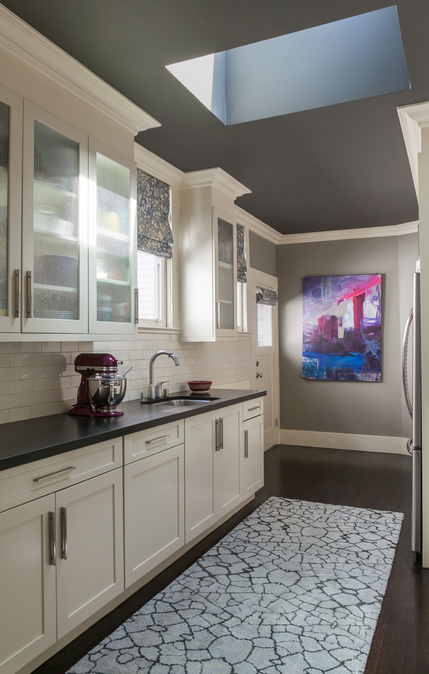
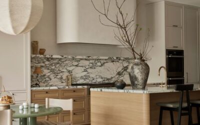
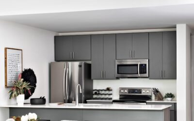
Even the kitchen stays on the cool side of neutral.
What to Reach For Instead
If you have just discovered you are a Summer and are looking at a house built for someone else, the substitutions are simpler than a renovation. Nickel where you would have reached for brass. Grey-veined stone where you would have chosen gold. Limed oak instead of walnut. A dusty pink instead of a terracotta, and a pale blue instead of a mustard.
You are not throwing the room out. You are cooling the base and letting everything you already own sit correctly on top of it.

The dressing room and powder room — nickel and pale stone rather than brass and gold veining.


Marais Chandelier
$2,300

Marais Woven Rattan Chest
$2,796

Sculptural Serenity Vase
$452
SOMETHING FOR EVERYONE
THE PIECES RACHEL RETURNS TO, AGAIN AND AGAIN