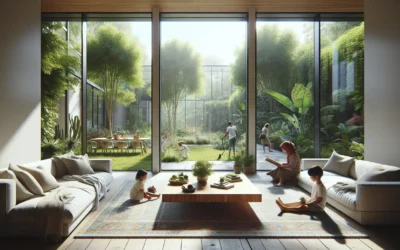
There’s a particular moment in late afternoon light, when the sun dips low over the Sarasota bay and filters through sheer linen panels into a client’s sitting room, that the deep charcoal walls seem to breathe. Shadows soften the edges of a velvet-upholstered settee, and the room shifts from elegant to enveloping—almost protective. That transformation, subtle yet profound, is why I’ve leaned increasingly into moody, layered palettes in recent projects. As 2026 unfolds, the era of pale neutrals and stark minimalism feels behind us; in its place, discerning homeowners and hospitality visionaries are choosing colors that hold stories, evoke emotion, and create sanctuaries that feel lived-in from day one.

A Return to Richness: Historical Roots and Modern Resonance
Color has always been a language of power and intimacy. In the grand salons of 18th-century Europe, deep burgundies and forest greens conveyed wealth and seclusion; Victorian parlors used layered jewel tones to foster closeness amid formal etiquette. The mid-20th century brought a brief restraint with mid-century modern’s muted tones, but even then, designers like Billy Baldwin layered unexpected depths to make spaces feel soulful.
Today’s shift mirrors a broader cultural pivot: after years of uncertainty, we crave environments that comfort and ground us. High-end clients aren’t seeking Instagram sterility—they want rooms that wrap around them like a favorite coat, colors that change with the light and time of day. In my work across Florida’s sun-drenched coasts and Massachusetts’ quieter landscapes, I’ve found that moody hues—think inky charcoals, warm umbers, desaturated teals, and rich ochres—offer that balance of drama and serenity. They don’t shout; they murmur, inviting quiet confidence and personal expression.
The Art of Layering: Materials, Finishes, and Light
Moody color thrives through thoughtful layering, where walls, textiles, and accents build depth rather than compete. Start with the base: lime-plastered or textured walls in a deep, velvety tone absorb light softly, creating a cocoon-like effect. Pair it with matte finishes to avoid glare—honed marble or aged brass accents reflect just enough warmth to keep the space alive.
Textiles amplify the mood: deep velvet drapes that pool on the floor, wool rugs in subtle patterns that ground the room acoustically and visually. In one recent Nantucket project, we enveloped a primary suite in a smoky jade with touches of burnished gold hardware and creamy linen upholstery—the result felt luxurious yet approachable, like stepping into a private retreat after a day on the water.
Lighting is non-negotiable. Warm, dimmable sources—sconces with linen shades, sculptural pendants in unlacquered metals—allow colors to shift from intimate to inviting. Natural light plays its part too: coastal homes benefit from large windows that let the sea’s blues and greens filter in, softening the mood without overwhelming it.
Aspirational prompt: Envision your dining room bathed in a deep, earthy umber, with candlelight dancing across textured walls and a long wooden table set for friends. How does this richer palette change the rhythm of an evening—turning meals into gatherings that linger long after dessert?

Practical Application: Bringing Moody Layers into Your Home
Embrace moodiness without darkness: test swatches in your space across different times of day—colors read warmer in morning light, deeper at dusk. Balance is essential; counter rich walls with lighter ceilings (perhaps a soft, desaturated sky blue) or crisp trim to prevent heaviness.
For humid climates like Sarasota or Nantucket summers, choose breathable, mold-resistant paints and fabrics—low-VOC options ensure wellbeing without sacrificing depth. In urban settings, layered color can make compact rooms feel expansive by drawing the eye inward.
Sustainability fits seamlessly: opt for natural pigments, reclaimed woods stained darkly, and pieces built to endure. These choices create spaces that age beautifully, their patina enhancing rather than diminishing the design.
If exploring a bolder palette feels like the next step for your home, a 2-hour design consultation can help refine your vision—often crediting toward full projects. And for accents that ground moody schemes, our shop offers curated vessels, textiles, and lighting in tones that layer effortlessly.
Shop The Look


The Power of Depth in Everyday Luxury
Moody, layered color isn’t a fleeting trend—it’s a reclamation of intimacy in design. As we move through 2026, these palettes remind us that true luxury lies in spaces that nurture the senses, honor personal stories, and evolve with us. They turn houses into homes that feel as rich and complex as the lives within them.
If rich depths speak to you, I’d love to hear how you’re incorporating them—perhaps a favorite moody hue in your own space. For more on crafting soulful interiors, explore our reflections on organic curves or livable luxury. Here’s to rooms that hold you close.