Color is emotion made visible. And the most timeless hues don’t shout. They whisper, linger, and live well.
Each year brings its fleeting trends, but in 2025, the real conversation in design isn’t about what’s trending—it’s about what’s lasting. What makes a paint color timeless? It’s more than neutrality. It’s about resonance. Atmosphere. How a room feels in the morning light and long after the sun has dipped below the horizon.
These are the 10 most enduring shades of 2025—selected not by algorithms, but by designers who live with color, layer with purpose, and know that the right hue is never just paint.
The 10 Most Timeless Paint Colors of 2025

1. Pointing by Farrow & Ball
A soft, warm white with just enough soul to stand alone.
Named after the lime pointing used in traditional brickwork, this white reads like bone in daylight and candlelit cream at night. It’s not a blank canvas—it’s a backdrop that breathes.
Style Pairing: Quiet Luxury, Classic European
Tactile Note: Looks exquisite against unlacquered brass, warm wood, and travertine.
2. Chantilly Lace by Benjamin Moore
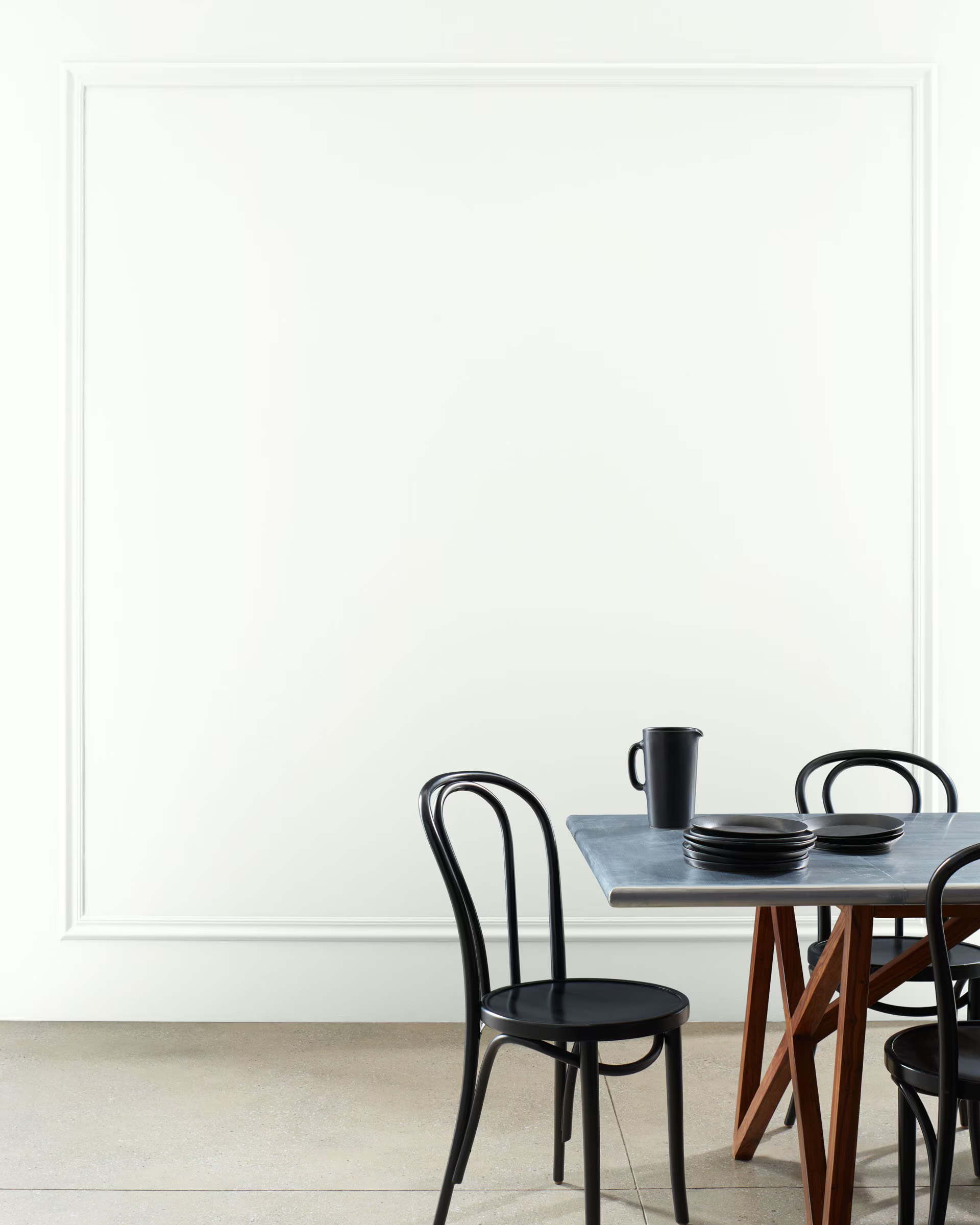
As crisp and classic as its namesake, this is the go-to for a gallery-white look.
Pure, unadulterated, and elegant. Chantilly Lace is the cleanest white on the list, perfect for modern traditional interiors where molding and millwork shine.
Style Pairing: Modern Traditional, California Casual
Design Tip: Use this to freshen ceilings and cabinetry without skewing cold.
3. Jitney by Farrow & Ball
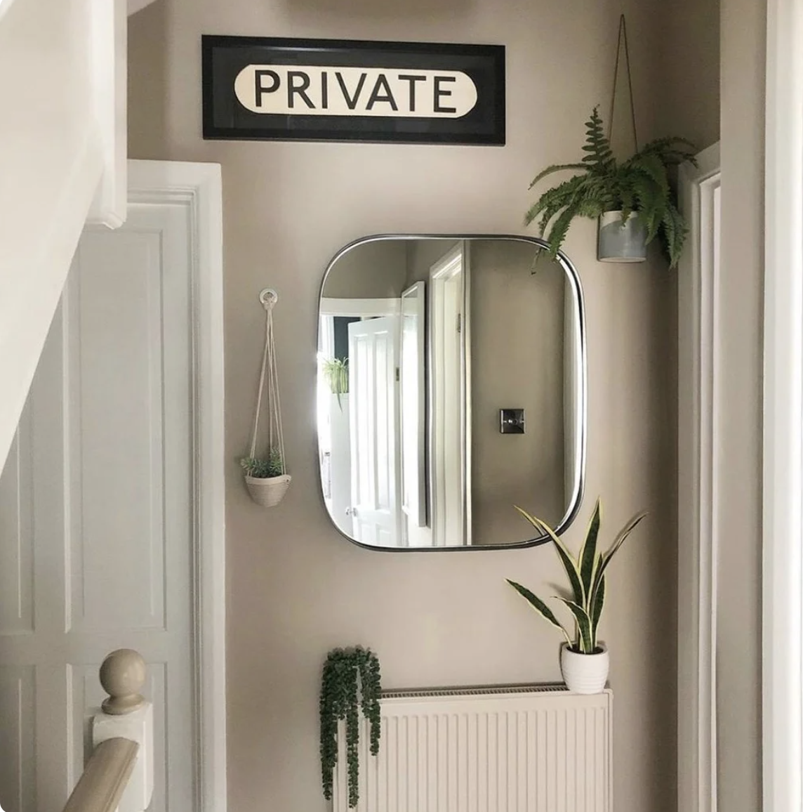
A sophisticated neutral with a coastal undertone. Think sand after the tide recedes.
It’s warm without being beige, soft without being saccharine. Jitney has a way of grounding a room without darkening it.
Style Pairing: Modern Coastal, European Farmhouse
In Context: See how we styled it in The Best Paint Colors for Each Seasonal Type.
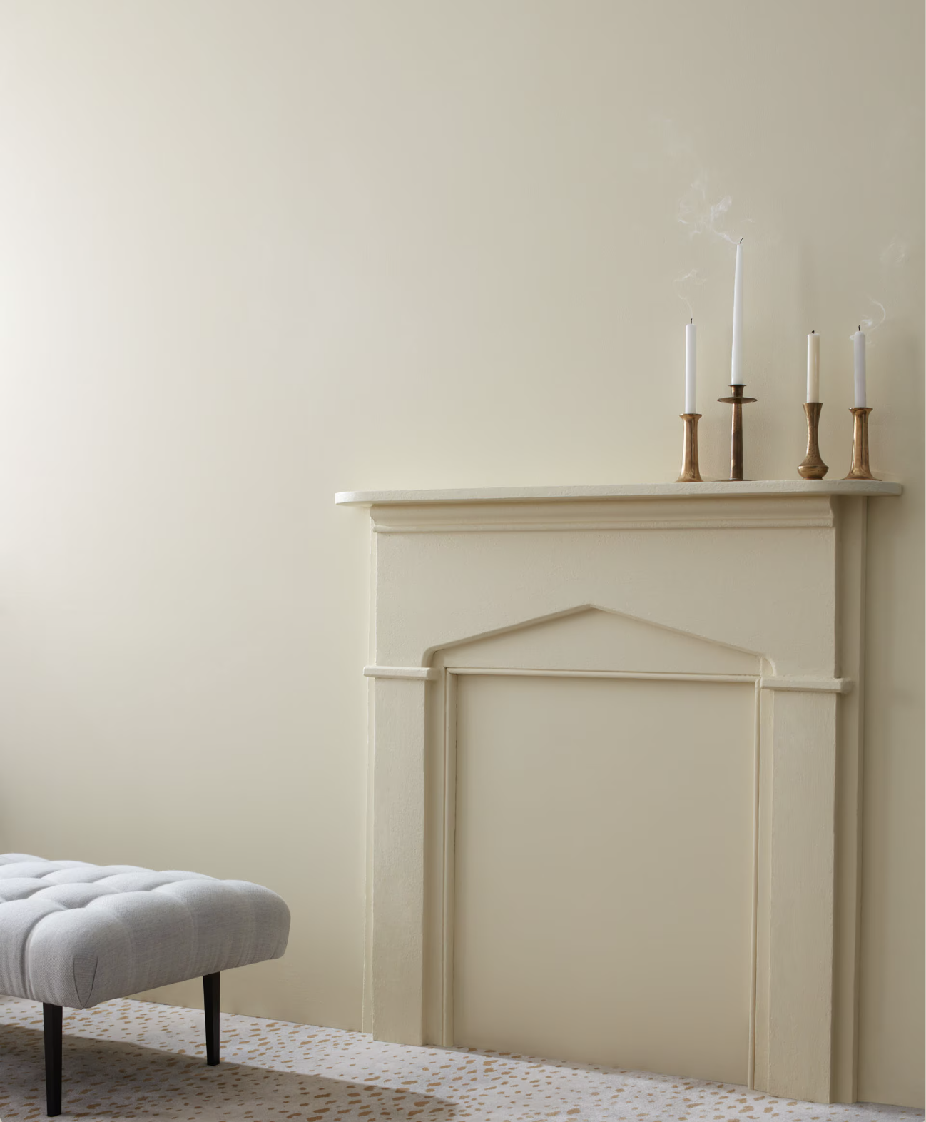
4. Revere Pewter by Benjamin Moore
A designer favorite that balances gray and beige like a seasoned diplomat.
This color refuses to be trendy, yet never looks dated. It’s the answer to clients asking for ‘a warm gray that doesn’t feel cold.’
Style Pairing: Modern Traditional, Transitional Spaces
Aspirational Prompt: Want timeless without committing to white? This is your middle ground.
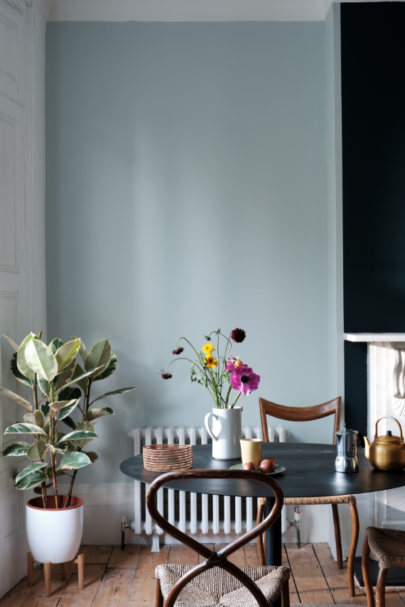
5. Borrowed Light by Farrow & Ball
The pale blue of old French shutters and summer skies. Ethereal but never icy.
It feels like a breeze in paint form. Ideal for bedrooms or any space craving airiness and ease.
Style Pairing: Classic European, Modern Organic
Materials Match: Soft linen, white oak, and creamy ceramics
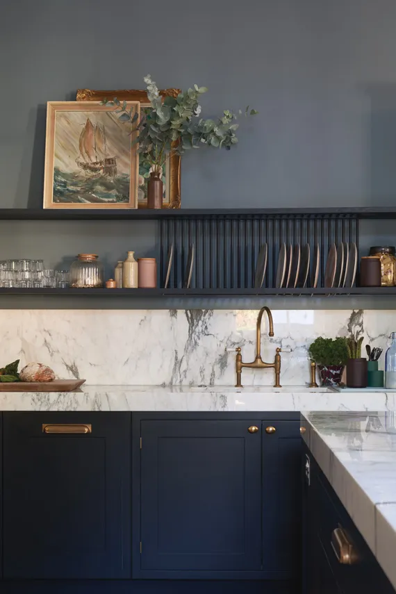
6. Railings by Farrow & Ball
An inky off-black with blue undertones that adds instant architecture to any space.
Dramatic without being gothic, this color acts as a neutral when styled well. Use it on trim, cabinetry, or an unexpected powder room.
Style Pairing: Parisian Eclectic, Quiet Luxury
Design Tip: Pair with antique gold mirrors or marble for moodier depth.
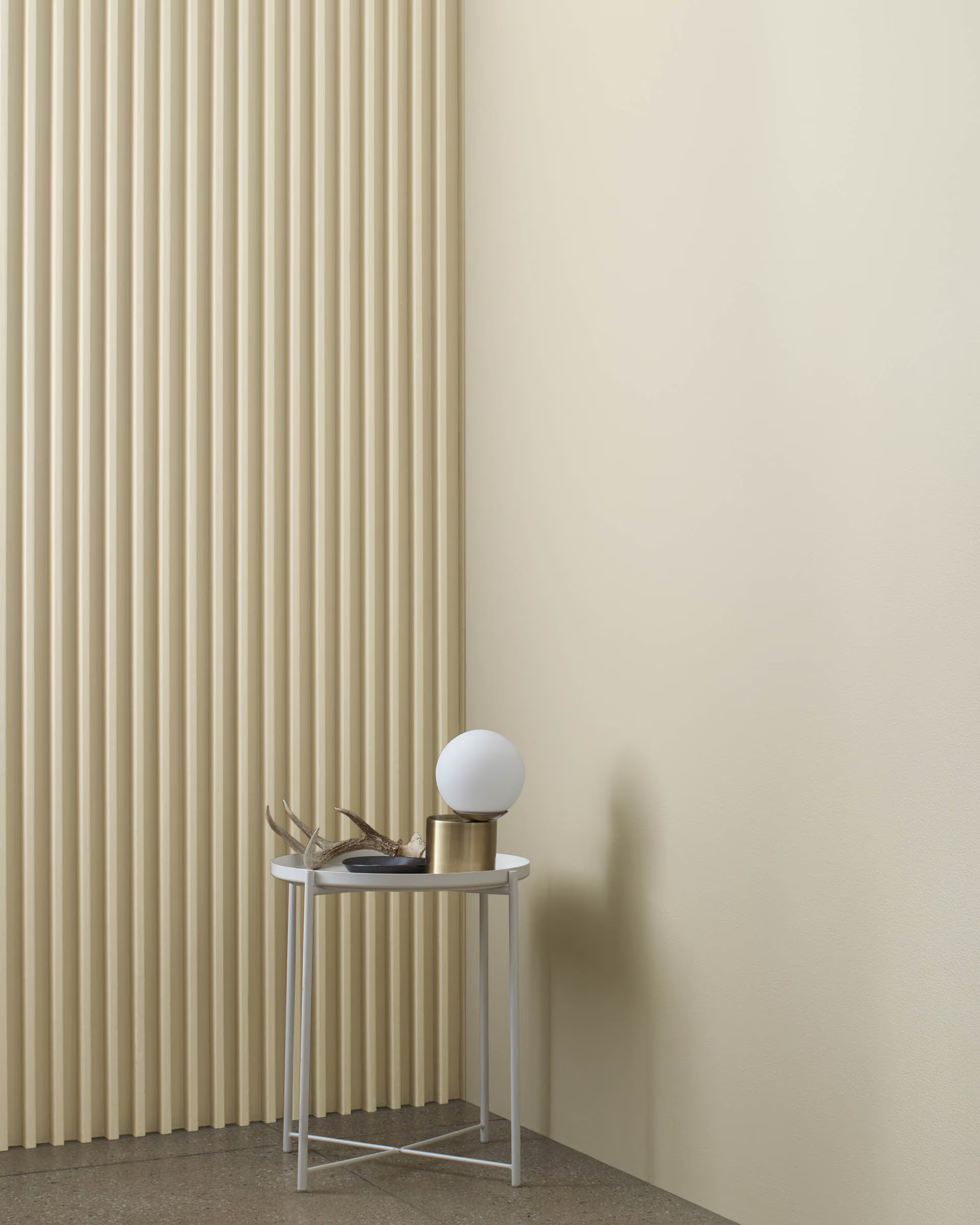
7. Natural Cream by Benjamin Moore
Not too yellow, not too gray—this is the color of soft-focus elegance.
It wraps a space in warmth without turning beige. A favorite for open-plan living rooms or bedrooms.
Style Pairing: European Farmhouse, California Casual
Pro Insight: Especially flattering in low-light rooms or northern exposures.
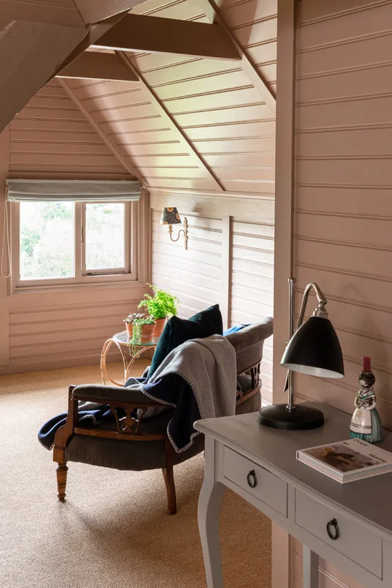
8. Dead Salmon by Farrow & Ball
Don’t let the name fool you. This dusty pink-brown is rich, refined, and deeply livable.
Historically inspired and inherently romantic. A bold but timeless choice for libraries, entryways, or primary bedrooms.
Style Pairing: Classic European, Mediterranean Minimalism
Aspirational Prompt: Want to make your home feel like a Parisian apartment? Start here.
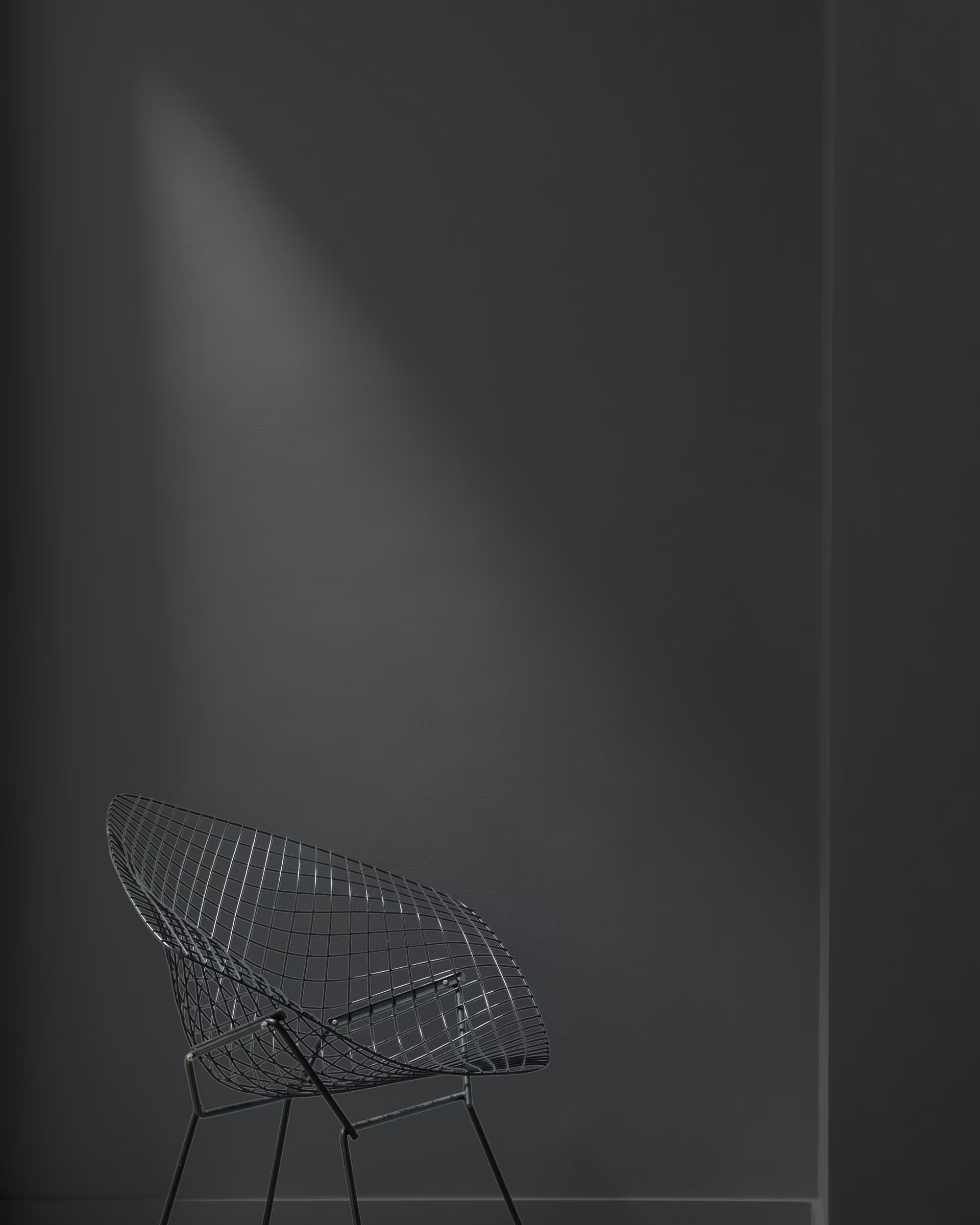
9. Wrought Iron by Benjamin Moore
A deep, warm charcoal that reads like armor but lives like velvet.
More forgiving than black but equally dramatic. Use it for exterior trim, interior built-ins, or even doors.
Style Pairing: Modern Organic, Quiet Luxury
Material Match: Brass hardware, textured wallpaper, matte wood
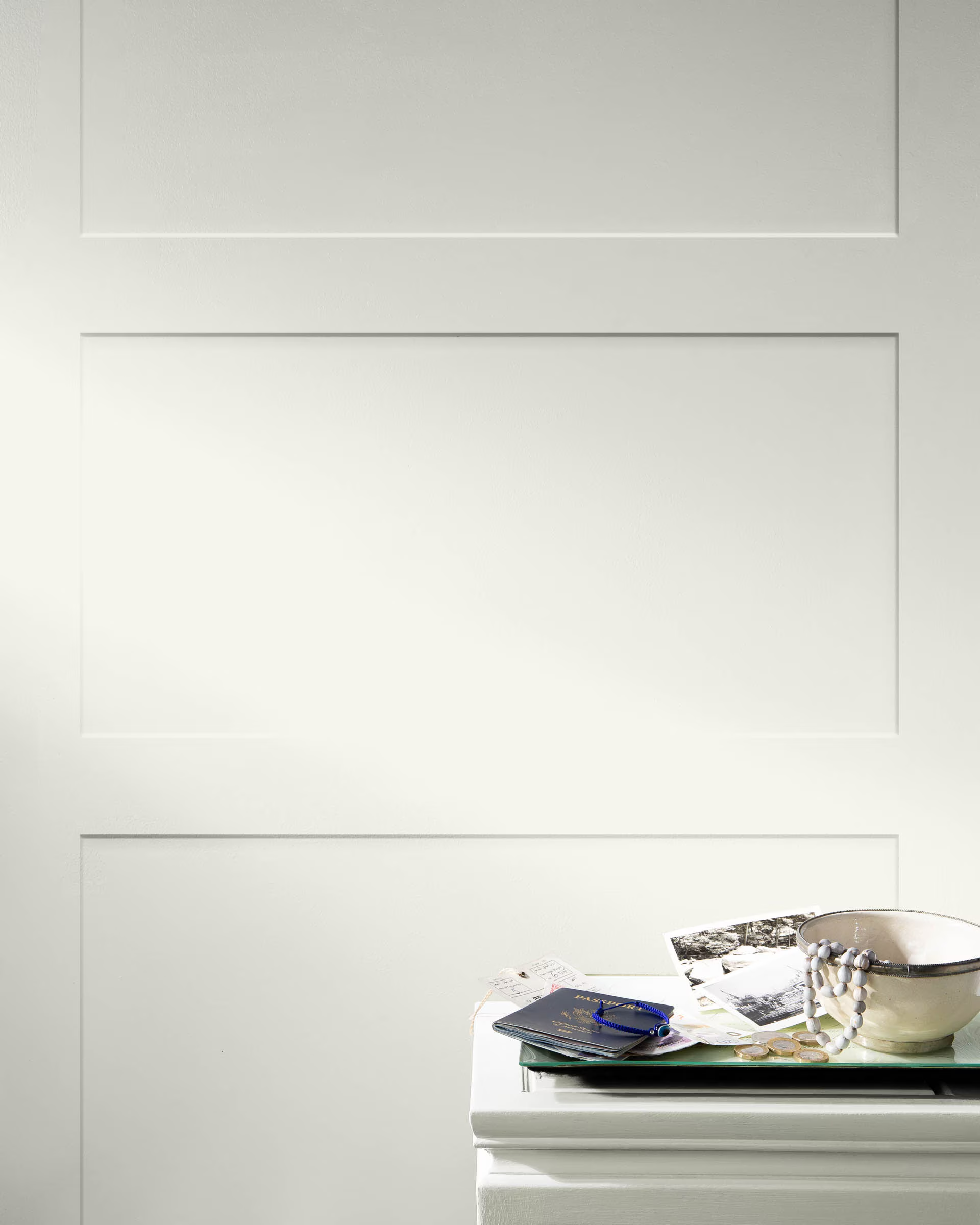
10. White Dove by Benjamin Moore
The designer’s default white—creamy, warm, and always flattering.
It complements every style, softens sharp lines, and makes wood tones glow. White Dove is a quiet classic that lets other elements lead.
Style Pairing: Every single one.
Linked Resource: Learn how it compares to other designer favorites in Paint or Furnishings First?
At-a-Glance: Designer Comparison Table
| Paint Color | Brand | Undertone | Best For | Works With |
|---|---|---|---|---|
| Pointing | Farrow & Ball | Warm white | Walls, trim, ceilings | Travertine, brass, warm wood |
| Chantilly Lace | Benjamin Moore | Clean, true white | Cabinets, ceilings, millwork | Crisp fabrics, white oak |
| Jitney | Farrow & Ball | Sandy beige | Whole-home, bedrooms | Rattan, linen, coastal woods |
| Revere Pewter | Benjamin Moore | Greige | Living rooms, hallways | Brushed nickel, taupe upholstery |
| Borrowed Light | Farrow & Ball | Pale blue | Bedrooms, libraries | Linen, oak, creamy ceramics |
| Railings | Farrow & Ball | Off-black, navy | Accent walls, cabinetry, trim | Gold accents, marble, velvet |
| Natural Cream | Benjamin Moore | Warm cream | Bedrooms, dens, transitional spaces | Leather, cane, warm lighting |
| Dead Salmon | Farrow & Ball | Dusty pink-brown | Entryways, primary bedrooms | Antique mirrors, stone, burgundy |
| Wrought Iron | Benjamin Moore | Charcoal gray | Exterior trim, bookshelves | Brass, matte black, moody textures |
| White Dove | Benjamin Moore | Soft warm white | Everywhere | Natural woods, textiles, classic art |
Most Popular by Region
Choosing a timeless paint color also means choosing what resonates with your light, lifestyle, and location. Here are regionally tailored picks from my design projects across the country:
- Sarasota, FL: White Dove and Jitney glow beautifully in sun-drenched interiors with coastal breezes.
→ See more in The Best Paint Colors for Sarasota - San Francisco, CA: Revere Pewter and Borrowed Light balance cool daylight and fog-filtered views.
→ Explore San Francisco Paint Colors - Nantucket, MA: Dead Salmon and Pointing evoke the patina of historic homes and overcast skies.
→ Discover Nantucket Paint Colors
Timeless paint colors aren’t just background noise. They’re part of the narrative. In my work with high-end residential and hospitality clients, these hues are the ones I return to again and again—not because they play it safe, but because they elevate a space without dominating it.
If you’re ready to transform your space with more than color, book a 2-Hour Design Consultation and let’s paint the picture of what’s possible.
Because the most timeless spaces don’t chase trends. They set them.
SOMETHING FOR EVERYONE
THE PIECES RACHEL RETURNS TO, AGAIN AND AGAIN

