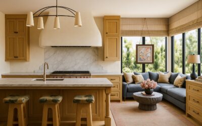
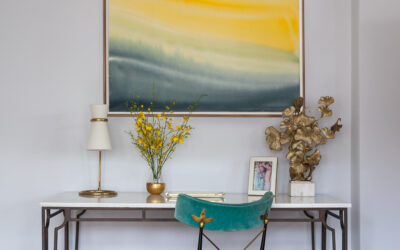
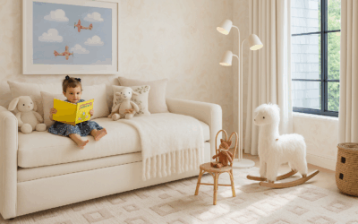
There’s something quietly persuasive about summer light—it softens edges, forgives imperfections, and makes spaces feel gentler. Yet choose the wrong hue, and the same light can turn harsh. In hotel projects, I’ve learned that summer light is the harshest editor: color either calms, or it shouts.
That’s why I approach summer colors 2026 as restorative—radiance without glare, freshness with quiet backbone. This year, the palette is getting more mineral and grounded: frosted pastels, powdered tones, nature-kissed neutrals—never candy-sweet.
“From boutique hotels to homes that feel like retreats—I create the spaces you never want to leave.” —Rachel Blindauer
What “Summer Colors” Really Means
“Summer colors” often means two things:
- Seasonal color analysis — Soft, cool, muted hues that flatter “Summer” people. They look best in these colors based on their skin, eye, and hair tone.
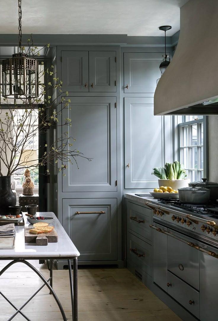
- Design in daylight — Colors that thrive in natural summer light, especially in home design. Yet to me Northeast coastal regions with their soft, cool, diffused light → Overcast skies, fog, and marine layers common along the Atlantic coast create a muted, grayish-blue cast—gentle and even, without harsh shadows or intense warmth. This quality of light mirrors the cool, soft, low-contrast quality of summer palettes (light/cool/soft summers: powdery blues, shell pinks, misty whites, cool sages).
Summer colors overlap elegantly, and in 2026, they gain subtle mineral depth—aligning with a broader desire for calm amid warmer, earthier directions.
This post covers how to dress and how to decorate with calm, refreshing hues that reflect the energy of the season. In 2026, these palettes evolve toward softer, more grounded expressions: frosted pastels tempered by earthy influences, airy blues with subtle warmth, and neutrals that feel nurturing rather than stark.
The 2026 Summer Palette Shift
Quietly evolving:
- Pastels turn frosted and powdered—misty, chalked, weathered.
- Neutrals warm subtly—oat, dune, chalky linen—refined and nurturing.
- Blues soften with gray: sky, slate, periwinkle haze.
- Sage and muted greens bridge cool and calm.
Summer 2026 means composed, not merely cheerful.
Rachel’s Curated Summer Interior Design Palettes (2026 Edition)
Grouped by mood.
Serene Summer: Restorative Calm
For bedrooms and baths where shoulders drop.
- Sky Blue — Expansive and forgiving (Benjamin Moore “Summer Shower”).
- Shell Pink — Gentle, luminous (Farrow & Ball “Setting Plaster”).
- Cool Sage — Nuanced neutral for upholstery or cabinets.
- Misty White — Softly reflective base (inspired by Pantone’s Cloud Dancer).
Coastal Summer: Grounded Refreshment
For living spaces that feel open yet anchored.
- Dune Beige — Earthy calm (Farrow & Ball “Drop Cloth,” warmed subtly).
- Seafoam — Muted refreshment (Benjamin Moore “Iceberg”).
- Sunwashed Terra Cotta — Restrained, dusty warmth—nodding to emerging earthy trends.
Refined Summer: Elegant Layering
For dining or studies that balance softness with structure.
- Dusty Lilac — Unexpected sophistication (Farrow & Ball “Calamine”).
- Charcoal Navy — Grounded depth for trim or accents.
- Chalky Linen — Understated luxury with quiet warmth.
Insight: Layer with natural textures—linen, rattan, limewash—to elevate tactility. Test swatches in your light; summer sun reveals a color’s true character.
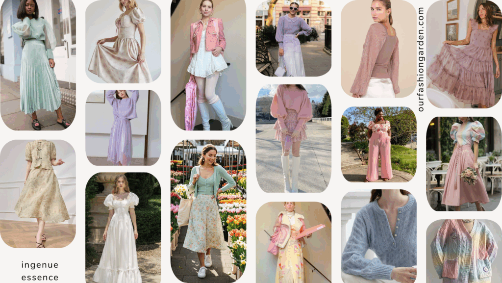
What to Wear If You’re a Summer Palette
For Summer palettes—or anyone seeking effortless glow—these cool, muted hues shine in warm weather while adapting to subtle warmth trends.
Consider tonal layering:
- Light & Airy Blues — Sky-blue dresses, periwinkle tops.
- Soft Pinks — Rose quartz blouses, blush accents.
- Cool-Toned Neutrals — Dove gray linens, misty beige sandals.
Timeless example: a flowing light-blue sundress with blush details and woven neutrals—radiant, restrained.
Rachel’s Guiding Principles for Summer Color in 2026
- Don’t compete with summer’s energy—refine and soften it.
- Cool colors don’t need to feel cold; anchor with wood, brass, clay, texture.
- Choose one hero hue; let the rest support.
- Your space and style should evoke a quiet exhale.
Materials That Elevate Summer Colors
True luxury comes from support:
- White oak + shell pink → Soft, modern, architectural.
- Stone + cool sage → Natural, enduring.
- Antique brass + seafoam → Refined, not clichéd.
- Linen + dune beige → Summer without stereotype.
Prefer matte or eggshell for gentle glow.
The Summer Palette Edit

Two-Tone Banded Throw Pillow
$105

Marbled Tide
From $700

Elevated Black Marble Bowl
$2,205
Shop the Look

Lucent Selenite Bowl
$690

Blush Marble Bowl
$450

Isla Dot Pillow
$297

Wide Sky Framed Canvas
$265

Aurora Color Field Canvas
$275

Colette Cloud Pillow
$297

Violet Cascade
From $700

Cloudform Blush Ottoman
$1,269

Petal Horizon
From $1,000
Curate Your Calm
Whether you’re planning a renovation, room refreshes or just need a palette that brings you back to center, the right color is where it all begins. My design services draw on years of formal education and experience to craft everything to help you become your best self. Or simply explore my shop for pillows, art prints, and decor in these serene palettes.


Textured Waffle Weave Pillow
$127

Siena Marble Urn Vase
$1,695

Westcott Arc Table Lamp in Aged Brass & Linen
$769
Something For Everyone
THE PIECES RACHEL RETURNS TO, AGAIN AND AGAIN
Before you go
Not sure what your style is? Take the two-minute Style Quiz and I’ll send you your look.