There’s something about winter that sharpens the eye. The light is clearer, the shadows longer. In color theory, Winter types echo this intensity—cool, bold, and high contrast. While Summer leans soft and Spring leans bright, Winter is where elegance meets edge. It’s not for the undecided.
But that doesn’t mean stark. Done right, winter interiors can feel deeply luxurious—grounded by contrast, elevated by restraint, and quietly unforgettable.
As a designer who’s worked everywhere from minimal penthouses to snow-covered retreats, I’ve learned that winter palettes aren’t about cold—they’re about clarity.

What Is the Winter Color Palette?
The winter palette includes cool, high-contrast tones with depth and structure. Think pure white, blackened navy, rich burgundy, emerald, charcoal, icy gray, and true black. It’s the most dramatic of the seasonal palettes and the most architectural.
These are the colors of sharp tailoring, gallery walls, vintage mirrors, and velvet chairs. They bring a room into focus.
Core Winter Colors:
-
True White
-
Inky Navy
-
Charcoal Gray
-
Black
-
Emerald
-
Burgundy
-
Cool Taupe
-
Blue-Black
“Winter colors don’t whisper. They articulate.”

Why Winter Colors Work in Interior Design
Winter color palettes create instant refinement in interior design. They command space without overwhelming it, making them ideal for:
-
Open-concept living spaces with modern lines
-
City apartments with little natural light
-
Entryways and powder rooms that need impact
-
Kitchens with clean finishes and statement hardware
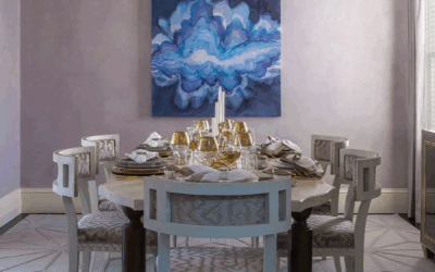
In one St. Louis townhouse, we used Benjamin Moore’s Hale Navy in a library paired with antique brass picture lights and white oak built-ins. The palette didn’t feel dark—it felt deliberate. Controlled. Elevated.
Best Paint Colors for a Winter Color Palette
These shades have been tested across varied lighting—from snowy northern exposures to shaded urban lofts.
For Northern Light (St. Louis, MO)
-
Benjamin Moore Hale Navy – a balanced deep blue with complexity
-
Sherwin-Williams Tricorn Black – crisp, bold, pure black
-
Farrow & Ball All White – warm-balanced but still clean
For Cloudy Days (San Francisco, CA)
-
Little Greene Vulcan – an architectural charcoal
-
Benjamin Moore Chantilly Lace – sharp gallery white
-
C2 Paint Stout – a deep espresso-black with warmth
For Sun-Drenched Rooms (Sarasota, FL)
-
Sherwin-Williams Iron Ore – sophisticated, soft black
-
Farrow & Ball Wine Dark – a blue-black that shifts in light
-
Portola Paints Ash – cool, grounded, textural
Pair these with metals like polished nickel or antique brass, and balance with textured neutrals (bouclé, nubby linen, matte stone).
Layering: Winter’s Secret Weapon
To keep winter palettes from feeling cold:
-
Add depth through contrasting sheens (matte walls, satin upholstery)
-
Bring in texture: velvet, wool, smoked glass
-
Use strong silhouettes (think curved sofas, sculptural pendants)
These spaces are successful not because they are loud, but because they are intentional.
Winter Moodboard Pairings
St. Louis Winter
Paint: Hale Navy + Chantilly Lace
Materials: Cerused oak, aged leather
Anchor: Oversized landscape in black and white
San Francisco Winter
Paint: Vulcan + Chantilly Lace
Materials: Polished concrete, graphite linen
Anchor: Modular sectional in icy gray
Sarasota Winter
Paint: Iron Ore + Ash
Materials: Bouclé, brass, travertine
Anchor: Sculptural lighting in matte black
How to Know If You’re a Winter
Are You a Winter?
-
You prefer bold neutrals over pastels
-
You wear crisp white better than cream
-
You gravitate toward clean lines and high contrast
-
You want rooms that feel intentional, not ornamental

Wear It, Live It
The same palette that flatters your skin tone can bring cohesion to your space. If you look best in black, white, emerald, and navy—your interiors should reflect that.
Pair your home’s palette with wardrobe neutrals that echo it: dark denim, tailored black trousers, crisp shirting, and statement coats.
Download the Seasonal Color Palette Guide or book a 2-Hour Design Consultation to translate your tone into your space.
FAQ: Winter Color Palette in Interiors
What are winter color palette tones?
Cool, high-contrast colors like navy, black, burgundy, emerald, and icy white.
Where do winter palettes work best?
Urban homes, modern renovations, powder rooms, and anywhere drama meets refinement.
Do winter colors make a room feel smaller?
Not if balanced correctly with texture, light, and layout. Depth can feel expansive.
Can I use black walls in small spaces?
Yes—just add sculptural lighting, contrasting art, and soft texture.
What undertones should I avoid as a Winter?
Warm yellows and muted earth tones. Stick with crisp, blue-based shades.
Ready to Design with Intention?
Book a 2-Hour Design Consultation and let’s craft a palette that reflects clarity, contrast, and modern elegance.
About Rachel Blindauer
Rachel Blindauer is an award-winning interior and product designer known for creating spaces that feel as good as they look. Her work spans from boutique hotels to coastal homes, always grounded in clarity, texture, and timeless detail.

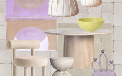
SOMETHING FOR EVERYONE
THE PIECES RACHEL RETURNS TO, AGAIN AND AGAIN