Spring isn’t just a season—it’s a sensibility. A lightness, a lift, a turning outward. In color theory, Spring types are warm, clear, and bright. Their palettes feel effervescent—bringing the clarity of a daffodil or the promise of a cherry blossom into a space that lives, breathes, and uplifts.
Spring interiors aren’t defined by pastels—they’re defined by energy. Warm light. Crisp edges. And just enough softness to keep it graceful.
I’ve worked with Spring palettes everywhere from breezy bungalows in Florida to refined pied-à-terres in San Francisco. What unites them isn’t geography—it’s the feeling they create: forward-looking, joyful, and just a touch undone.
What Is the Spring Color Palette?
The Spring palette includes warm, clear colors with an undertone of optimism. Think peach, butter yellow, celadon green, fresh white, clear coral, and pale robin’s egg blue. Unlike the dusky tones of Autumn or Summer, Spring tones feel sunlit and translucent.
These are the hues of blooming branches, café au lait, morning light, and woven grass. In a well-designed home, they don’t feel precious—they feel personal.
Core Spring Colors:
- Buttery Cream
- Celadon Green
- Pale Apricot
- Robin’s Egg Blue
- Coral Pink
- Warm White
- Soft Marigold
“Spring palettes don’t imitate nature. They revive it—room by room.”
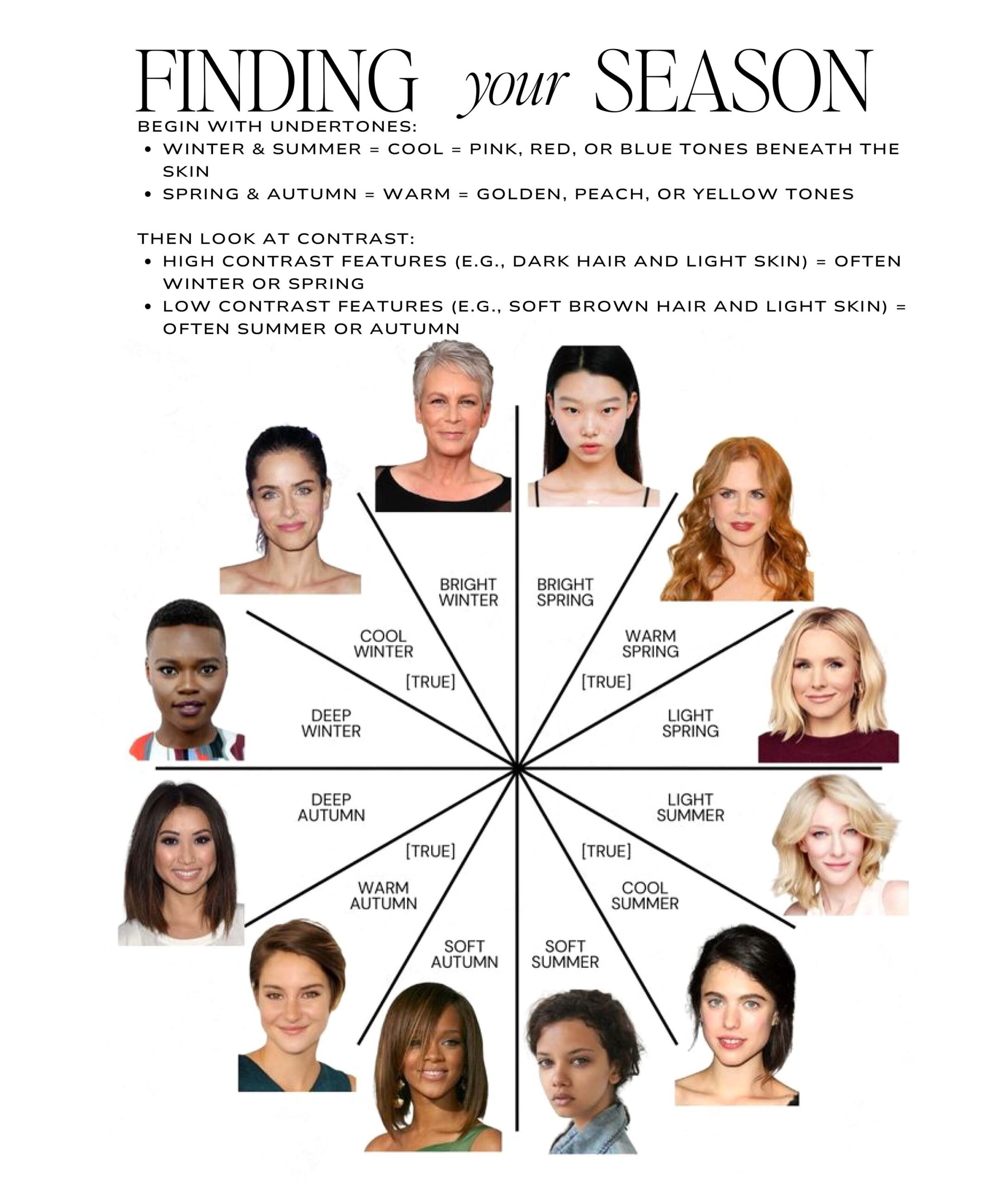
How to Know If You’re a Spring
Are You a Spring?
- You look best in clear, warm tones (like peach, coral, mint)
- You gravitate toward movement and lightness in design
- You love vintage that feels edited—not cluttered
- Your spaces reflect joy more than polish
Why Spring Colors Work in Interior Design
Spring palettes make spaces feel alive. They’re especially powerful in:
- Entryways that need a bright welcome
- Kitchens with natural light and wood tones
- Kids’ spaces that grow with elegance
- Sunrooms and dining areas designed to lift mood
In a recent Sarasota kitchen, I used Benjamin Moore’s Simply White on the walls, paired with painted cabinetry in Sherwin-Williams Peach Fuzz and antique brass hardware. The effect? Uplifting without being sweet. Bright without glare.
Best Paint Colors for a Spring Color Palette
Tested and refined across projects in various lighting conditions:
For Coastal Light (Sarasota, FL)
- Benjamin Moore Simply White – clean, not stark
- Sherwin-Williams Peach Fuzz – a clear, friendly peach
- Farrow & Ball Teresa’s Green – soft green-blue with warmth
For Diffused Light (San Francisco, CA)
- Little Greene Blush – a gentle pink that’s never babyish
- Benjamin Moore Acadia White – warm without yellowing
- Portola Paints Sea Salt – clear and natural without chalkiness
For Seasonal Contrast (Nantucket, MA)
- C2 Limonata – a refined soft yellow
- Farrow & Ball Pink Ground – sophisticated, not sugary
- Sherwin-Williams Topsail – a crisp robin’s egg blue
Pair these with rattan, handwoven textiles, unlacquered brass, or ceramic tile for tactile contrast.
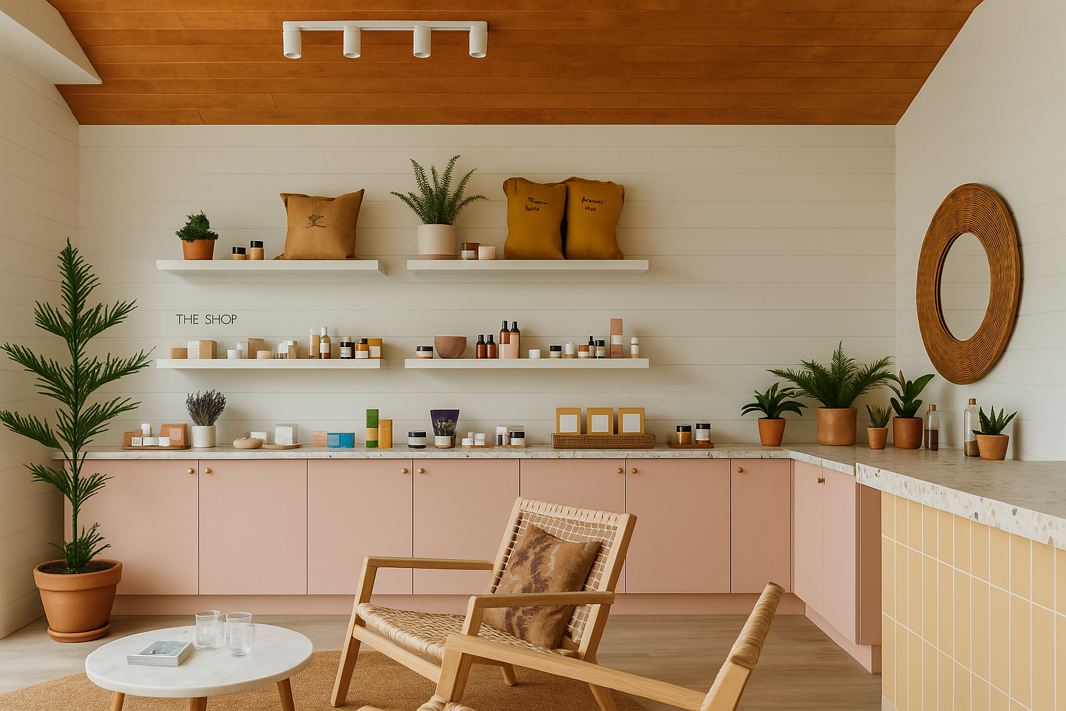
Layering: The Spring Edit
Spring colors shine when layered with lightness. To build depth:
- Layer materials like linen, washed cotton, raffia, and cane
- Use painted woods (whitewashed, not dark)
- Mix old and new—heirloom meets handmade
Nothing should match perfectly. Spring lives in the mix.
Spring Moodboard Pairings
Sarasota Spring
Paint: Simply White + Teresa’s Green
Materials: Cane, linen, white oak
Anchor: Oversized botanical in pale green
San Francisco Spring
Paint: Blush + Acadia White
Materials: Matte ceramic tile, tumbled brass
Anchor: Woven pendant over tulip table
Nantucket Spring
Paint: Topsail + Pink Ground
Materials: Whitewashed maple, vintage linen
Anchor: Abstract pastel art with coastal framing
Wear It, Live It
If your best colors are soft corals, celadon, and cream—your interiors should echo that. Spring types benefit from surroundings that mirror their lightness.
Pair your palette with natural textures, crisp white denim, botanical prints, and sun-washed tones.
Download the Seasonal Color Palette Guide or book a 2-Hour Design Consultation to translate your seasonal palette into a space that breathes.
FAQ: Spring Color Palette in Interiors
What are spring color palette tones?
Warm, clear, sunlit shades like peach, celadon, cream, and coral.
Where do spring palettes work best?
Kitchens, entryways, nurseries, and sunrooms—or anywhere you want energy without chaos.
Do spring colors look too pastel in real life?
Not if they’re grounded with natural materials and contrast. Use texture and shape.
What undertones should I avoid as a Spring?
Cool grays and muddy taupes. Stick with warm whites and clear brights.
Ready to Refresh Your Space with Color?
Book a 2-Hour Design Consultation and let’s bring clarity, charm, and cohesion to your space—rooted in your personal color season.
About Rachel Blindauer
Rachel Blindauer is an award-winning interior and product designer known for crafting spaces that feel as good as they look. From boutique homes to coastal retreats, her work blends joyful restraint with timeless detail.
SOMETHING FOR EVERYONE
THE PIECES RACHEL RETURNS TO, AGAIN AND AGAIN

