Color isn’t just visual—it’s visceral. It can energize, calm, expand, or contain. But choosing the right shades for your home often feels like guesswork. Here’s how to understand interior color theory like a designer—starting with the color wheel and ending with practical palettes that live beautifully.
Understanding the Color Wheel
To understand color well, we return to a concept we all learned as children—the color wheel. This visual guide, originally created by Isaac Newton during his studies on light and prisms, maps out how primary, secondary, and tertiary colors relate.
Primary colors—red, yellow, and blue—combine to form every other color. Mixing these creates secondary and tertiary colors, all of which find their place on the wheel. In design, this understanding forms the foundation for harmonious palettes.
Warm vs. Cool Colors
Colors aren’t just seen—they’re felt. We often refer to them as “warm” or “cool,” but what does that really mean?
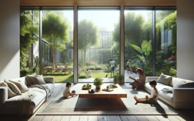
Warm colors—ruby, amber, carnelian, citrine—are associated with sun, fire, and energy. They advance in space, making them ideal for expansive rooms that can handle intensity. Cool colors—azurite, emerald, jade, amethyst—mirror water and foliage. They recede visually, creating calming environments and helping smaller rooms feel open.
Warm Colors:
- Ruby
- Carnelian
- Citrine
Cool Colors:
- Amethyst
- Sapphire
- Emerald

Choosing Your Colors
Color selection can feel overwhelming. An abundance of options, uncertainty about undertones, and fear of regret can lead to indecision. My advice? Start with your wardrobe. The hues we wear most often tend to reflect what we enjoy seeing around us.
Another smart starting point: take the Style Quiz to uncover your personal palette.
Color Psychology: How Colors Make You Feel
Each color carries an emotional charge. Here’s how to work with that:

CITRINE
Uplifting, positive, and creativity-inducing. Perfect for offices and social spaces. Use sparingly to avoid overstimulation.
CARNELIAN
Passionate, sensual, and stimulating. Use in dining areas to boost appetite, or bedrooms in muted tones.


RUBY
Passionate, sensual, and stimulating. Use in dining areas to boost appetite, or bedrooms in muted tones.
ROSE QUARTZ
Playful and soft. Lovely in bedrooms and powder rooms. Best when balanced with neutrals.


AMETHYST
Luxurious and creative. Light tones are restful; dark tones are dramatic. Ideal for studies, bedrooms, and lounges.
OBSIDIAN
A dramatic neutral that pairs well with everything. Great for entryways and dining rooms but should be tempered with light sources.


PEARL
A balanced neutral. Works anywhere but should be warmed or accented to avoid sterility.
SAPPHIRE
Classic and calming. Deep blues bring sophistication, while lighter shades feel coastal and breezy.


EMERALD
Earthy and serene. Excellent for bathrooms, bedrooms, and spaces designed for restoration.
WHITE
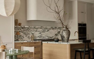
When it comes to deciding on how the colors need to be combined, the desired nature and feel of the room should be considered. For instance, if the intention is to create a breezy and light feeling in the room, much like Scandinavian style interiors, using airy neutrals as the base color for the ceiling and walls are ideal. Colors like pearl, selenite, citrine and celestite have an airy quality that can be utilized for this. For a room that is to be more grounded and earthy, colors like smoky quartz, tiger’s-eye, obsidian and hematite provide a good base color. As a base color, this would form the main part of the scheme, with other colors being added in where necessary. These colors can also be utilised as accents for a similar effect in the designs.


CONNECTING ROOMS AND COLORS
Every room in a house does not need to follow the same color scheme, and could instead have varying secondary or accent colors. In such schemes, it is important to create a continuity in the design using common colors or textures. For instance, if a living room is designed with the ceiling in an amethyst hue, and the dining room adjacent to it uses ruby on the ceiling, the color scheme can be connected by using a common color in the palette, like selenite. The color schemes can also be bridged by adding amethyst accents in the dining room – as part of the dining chairs or a rug, and ruby accents in the living room – on throws and cushions on the sofa or accessories. This would weave a common thread through the designs and make the design cohesive
Coordinating Across Rooms
Not every room needs to match. In fact, variation is part of good design. Still, connecting color schemes across rooms through repeated hues or textures ensures flow. Think: a ruby ceiling in one room echoed in a pillow or art piece in the next.
60-30-10 RULE
One of the most effective ways to combine colors in an interior is to use the 60-30-10 rule. This rule is a simple ratio for using 3 colors in a room. According to this principle, 60% of an interior should use the dominant or base color, 30% should be in a secondary color and the remaining 10% should be the accent color. In a living room or bedroom, the 60% would include walls, large furniture and furnishing pieces like the bed, sofa, and area rugs. 30% of the room would be cabinetry, curtains, coffee tables and smaller pieces of furniture, while 10% of the room would be accent furniture and decor pieces like artworks, plants and accessories.
The 60-30-10 rule does not need to be adhered to completely, and can be tweaked and played around with as needed. Which part of the room makes up each of the percentages is open to interpretation, as are the number of colors used. For example, 60% of a kitchen or living room can be the walls, ceiling and flooring, or it could include the walls and a majority of the furniture or cabinets. Similarly, if the room design feels like it needs both emerald and gold as accent colors, the percentage can be modified accordingly, as long as the accent colors add up to 10% of the room.
At Rachel blindauer interior designs, I begin every design process with a color analysis. This helps me identify the colors that work best for each person. Working as an interior designer in Tampa and Sarasota, I am inspired by the surroundings, and many of my interior designs in Florida are often bright and colorful. With an understanding of the various facets of color theory, you too can effortlessly choose the colors for your interior and furniture designs.

Frequently Asked Questions
What’s the difference between an interior designer and decorator? A decorator focuses on the visual—furniture, lighting, colors—while a designer can also address layout and renovation decisions. Rachel Blindauer blends both for a cohesive, expert-led experience.
Do you work with existing furniture or only start fresh? Both. Rachel can elevate what you have or curate a full design from the ground up—based on your vision, lifestyle, and budget.
Can I book a virtual design consultation if I’m not in Missouri? Yes. Rachel offers 2-hour virtual consultations for clients nationwide, bringing her refined design sensibility to any home, wherev
Take the first step towards creating your dream space. If you are a couple with multiple homes looking for a decorator near you, a hotelier doing a redesign, or a developer looking for top-notch interior design services near you, Rachel Blindauer and her team are here to bring your vision to life. With our wealth of experience and expertise, we can create stunning and functional spaces that exceed your expectations and bring you to a new height of design and sophistication.

SOMETHING FOR EVERYONE
THE PIECES RACHEL RETURNS TO, AGAIN AND AGAIN