And What to Do Instead When Choosing Paint Colors for Your Home
By Rachel Blindauer
Paint is the most deceptively complex choice in interior design. It seems easy—pick a color, match it, paint the walls. But color isn’t just a visual decision. It’s atmospheric. Emotional. Relational.
And when you try to match a paint color instead of choosing it with intention? You often get something that’s technically close—but completely wrong for the space.
The Allure (and Risk) of Color Matching
Color matching feels like a clever shortcut. Especially if you’ve fallen in love with a designer-approved shade and want to replicate it without the designer’s fee.
But here’s the problem: paint isn’t just pigment. It’s chemistry. And chemistry doesn’t translate across brands or finishes as seamlessly as we’re led to believe.
Even if a paint store scans a swatch perfectly, the new version is still based on a different base formula. And that base, combined with the pigments and finish, can shift everything—from undertones to reflectivity.
“A white that looked clean on the chip might read yellow in your home. A serene blue can turn mint under LED. The shift is small on paper—but huge on your wall.”
Why Matched Paint Colors Go Wrong
Let’s say you bring in a Benjamin Moore swatch and ask a big-box store to match it in their house brand. The machine—the spectrophotometer—scans the sample and outputs the closest recipe it can. But that recipe is limited by the pigments in the new brand’s system. It’s a bit like baking a French dessert with American grocery store ingredients. You might get close, but it’s not the same.
Some common mismatches I’ve seen:
- Crisp whites that dry down to cream
- Greiges that shift violet in indirect light
- Muted greens that take on a yellow cast in warm climates
This is why I rarely recommend matching paint for highly visible walls, cabinetry, or spaces where light fluctuates throughout the day.
What Makes Paint So Tricky?
Color isn’t a fixed quality. It’s responsive. It reacts to:
- Light direction (North-facing rooms skew cool, South-facing warm)
- Sheen and finish (Matte absorbs light, gloss bounces it)
- Room texture (Rough walls make color read darker)
- Primer/base coats (They influence undertone)
Even the time of day changes how a paint color shows up. Morning sun can reveal pink undertones. Afternoon shadow might dull it completely.
Undertones: The Silent Saboteurs
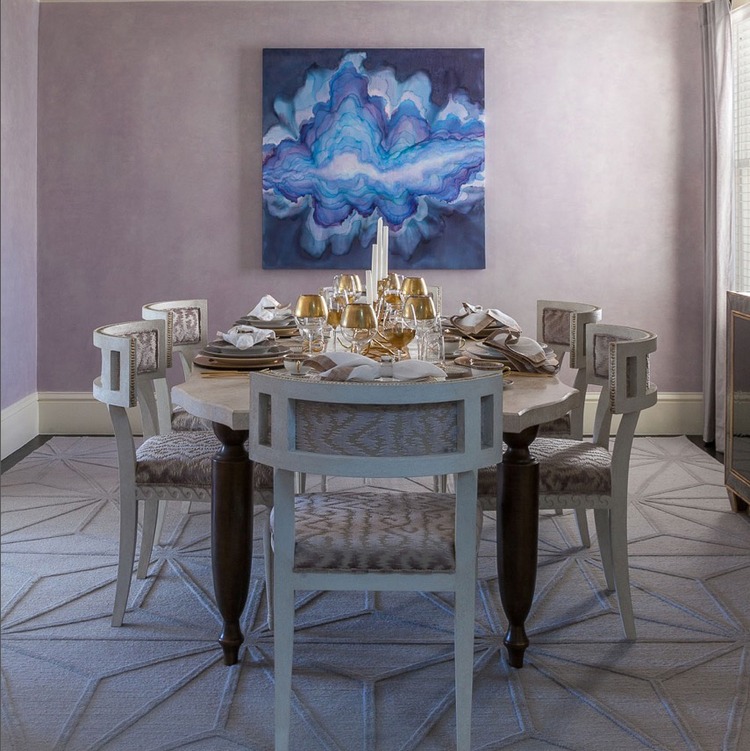
Undertones are the reason a “safe neutral” suddenly looks pink, green, or beige in the wrong space. They’re the subtle color cast underneath the dominant hue. Every paint has one, whether it’s labeled or not.
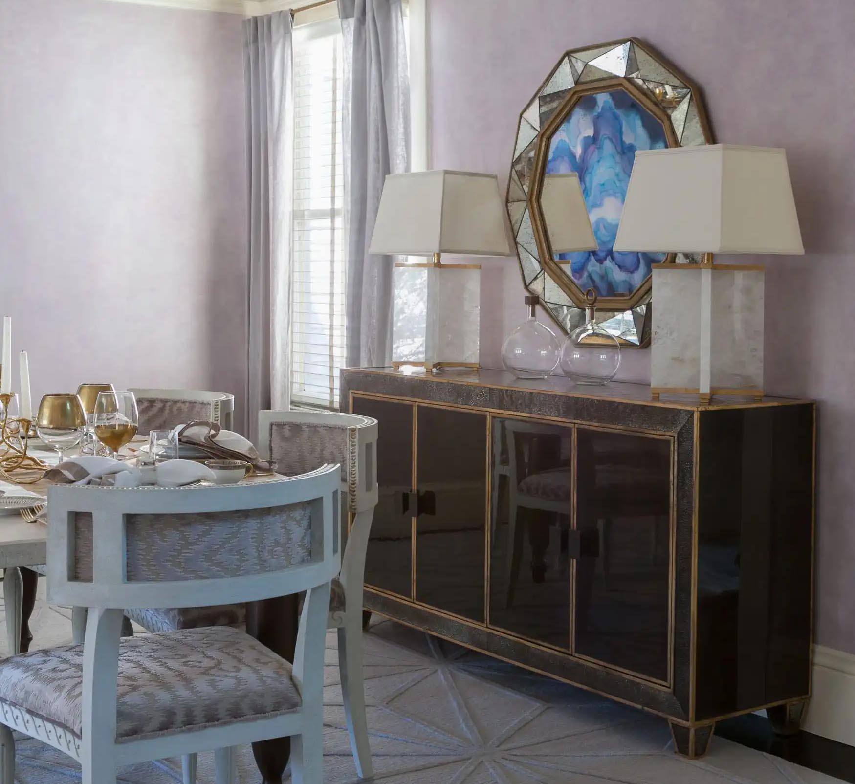
Warm undertones (yellow, red, peach) add softness, while cool ones (blue, violet, green) add crispness. What makes this tricky is that undertones shift based on what’s next to them—tile, wood floors, fabrics, even natural light.
“Color doesn’t exist in isolation. It reflects, absorbs, and responds.”
When Color Matching Can Work
There are a few situations where matching paint is useful:
- Touching up an existing color on a small area
- Recreating a discontinued favorite shade
- Pulling a tone from a fabric or artwork for a small zone like a powder room
But unless you’ve worked with color and finish for years—like I have, mixing my own paints for interiors and canvases—I always suggest starting with the original brand and testing it in your actual space.
Best Paint Colors by Room & Region (Mini Guide)
Here are a few starting points based on my regional experience:
Living Rooms
- Cool climate, low natural light: Soft warm gray with beige undertone
- Hot climate, bright light: Muted olive or earthy neutral
Kitchens
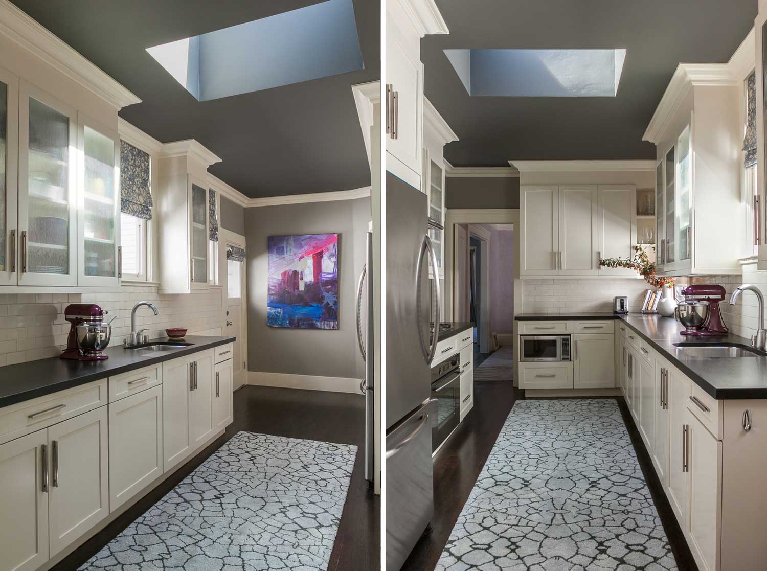
- West-facing: Creamy off-white with a golden undertone
- Cloudy regions: Warm taupe or dusty rose to counter flat light
Bedrooms
- Anywhere: Pale sage, mushroom, or muted clay—they create a cocooning effect and play well with both warm and cool light
For more nuanced suggestions, see:
👉 The Best Paint Colors for Each Seasonal Type
Real Room Example: When It Went Wrong
I once painted a guest room in Sarasota with what should have been a crisp, gallery-style white. On paper, perfect. In practice? It read yellow by mid-afternoon. We swapped it out for a pink-undertone neutral from Portola Paints that played better with the warm natural light. It changed the entire tone of the space—literally and emotionally.
This is why color testing is non-negotiable.
Top Questions Clients Ask Me About Paint
Can’t I just pick a color I like?
You can—but whether it works depends on light, context, and finish.
Do I need to test on every wall?
Ideally, yes. At minimum, test on moveable poster boards in multiple spots.
Isn’t white always safe?
Nope. White is one of the most reactive and variable color categories.
Can I match Farrow & Ball in another brand to save money?
Technically, yes. But I wouldn’t. The subtle pigment blends are what make it special.
My Tips for Choosing the Right Paint
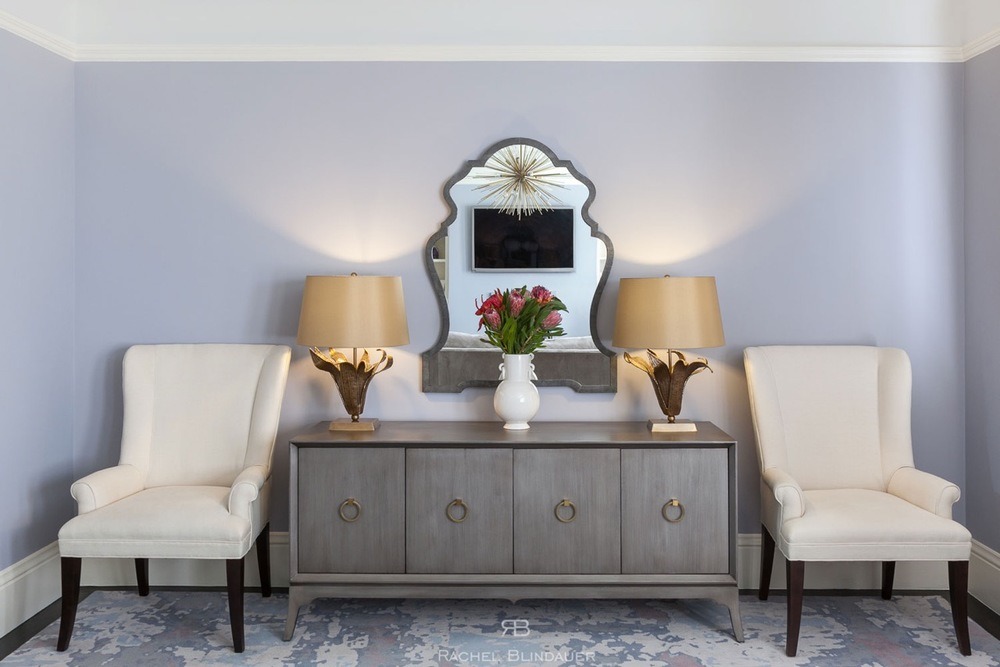
- Use two coats when testing. One coat is always misleading.
- Try it on poster board. You can move it around the room.
- Check at all hours. Light changes everything.
- Be wary of online photos. Many are filtered or mislabeled.
- Don’t overtrust the label. Names don’t always reflect reality.
Need Help Choosing Paint Colors?
If you’re planning a remodel or just updating your color palette, a trained eye can save you money, time, and design regret.
→ Book a 2-Hour Design Consultation to get a professionally curated palette designed for your light, your space, and your taste.
→ Want to complement your color palette with textural accessories? Explore shop.rachelblindauer.com for sculptural vessels, organic trays, and hand-finished accents that elevate the feel of any wall color.
SOMETHING FOR EVERYONE
THE PIECES RACHEL RETURNS TO, AGAIN AND AGAIN


