Every September, the design internet floods with fall color palettes pulled from Scandinavian studios, California editorial shoots, and New York loft apartments. They’re beautiful. They’re also largely irrelevant to how color actually behaves in a St. Louis home in October.
Midwestern autumn light is specific. As the sun moves lower, the quality of natural light in St. Louis shifts dramatically from September to November—from the long golden afternoons of early fall to the short, flat, cool-gray light of late November. The colors that look warm and rich in September can look muddy and heavy by Thanksgiving. Understanding this transition is how you choose a fall palette that works across the whole season.
Why warm colors work so well here in fall
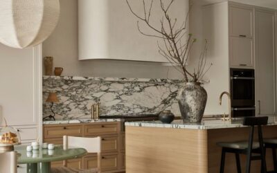
St. Louis homes—particularly the brick colonials, Craftsman bungalows, and ranch houses that define most of our residential neighborhoods—have a natural warmth built in. Red brick, warm wood trim, hardwood floors that run golden to amber: these are the bones most of us are working with. Warm paint colors don’t compete with these elements. They complete them.
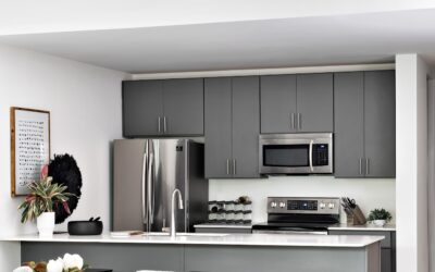
Cool colors—icy blues, stark whites, cool grays—fight the warmth of brick and wood constantly. In fall, when the light is already shifting toward warm, that fight becomes exhausting. A room painted in warm putty or soft terracotta in October feels like it was designed for exactly this moment.
The palette I’m recommending this fall
Benjamin Moore Pale Oak (OC-20) reads warm without being orange, neutral without being beige, and responds beautifully to changing autumn light—warmer in the late afternoon, softer in the gray morning. An ideal living room or dining room color for St. Louis homes with wood floors and original trim.
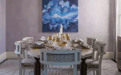
Farrow & Ball Dead Salmon (No. 28) is a warm, dusty, faded terracotta-pink—sophisticated and earthy at once. It’s particularly stunning in dining rooms where candlelight plays against it in the evening. If you want your fall dinner parties to feel warm and memorable, this is your color.
Benjamin Moore Revere Pewter (HC-172) is a classic. It has enough warm gray-green to feel contemporary and enough warmth to feel cozy. In fall light it moves from silvery in the morning to distinctly warm by afternoon.
Benjamin Moore Salamander (2050-10) is for the brave—a deep, forest green with enough warmth to avoid feeling cold. In fall, with brass candlesticks and warm wood furniture, it’s extraordinary.
How to layer color across a room (not just on the walls)
Paint is only one layer. The rooms that feel genuinely warm in fall are layered—textiles in amber, rust, and forest tones on top of a warm wall color, with warm-temperature light bulbs (2700K or below) completing the effect. Switch your bulbs to 2700K in October and watch every warm color in your home improve immediately. It’s the fastest and cheapest design upgrade available, and most people never do it.
What to avoid this season
Cool grays and blue-based whites feel increasingly harsh as fall progresses and natural light diminishes. Also avoid: painting a single accent wall in a saturated fall color and leaving the rest of the room untouched. Accent walls were a 2012 trend. If a color is right for your room, commit to it. If it isn’t, find a different color rather than hedging with one wall.
Fall in St. Louis is one of the most beautiful times of year. Your home can feel like an extension of all of it.
Rachel Blindauer is an award-winning interior designer based in St. Louis with projects across the United States and internationally. Book a color consultation at rachelblindauer.com.



SOMETHING FOR EVERYONE
THE PIECES RACHEL RETURNS TO, AGAIN AND AGAIN