Autumn isn’t just a season—it’s a mood. A shift inward. A slowing down. In color theory, Autumn types are rich, warm, and muted. They don’t shout; they smolder. Where Spring is clear and fresh, Autumn is grounded and layered.
These are the colors of aged leather, spiced cider, olive groves, and golden hour. They thrive in textured interiors that feel as lived-in as they are styled.
As a designer who’s worked on everything from historic homes in St. Louis to boutique hotels in New England, I find autumn palettes bring a depth most people crave but rarely know how to use. This guide makes that simple.
What Is the Autumn Color Palette?
The Autumn palette includes warm, muted colors with deep undertones. Think ochre, olive, terracotta, camel, aubergine, rust, tobacco, and creamy bone.
These hues aren’t seasonal in a cliché sense. They’re timeless and versatile—especially when grounded with soft whites, chalky neutrals, and aged materials.
Core Autumn Colors:
- Ochre
- Olive Green
- Burnt Sienna
- Terracotta
- Deep Burgundy
- Tobacco Brown
- Bone White
- Russet Red
“Autumn colors don’t decorate. They anchor.”

Why Autumn Colors Work in Interior Design
Autumn palettes are perfect for:
- Layered living rooms with collected pieces
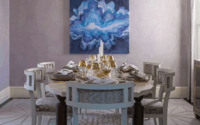
- Dining rooms meant for candlelight and conversation
- Bedrooms that prioritize calm and texture
- Entryways that feel warm without feeling dark
In a Missouri farmhouse, I used Farrow & Ball’s Salon Drab on cabinetry and paired it with unlacquered brass hardware and terracotta floors. The result? A space that felt storied—like it had always been there.
Best Paint Colors for an Autumn Color Palette
Tested in warm, cool, and transitional light conditions:
For Natural Light (Sarasota, FL)
- Sherwin-Williams Redend Point – a clay-toned pink-brown
- Benjamin Moore Montgomery White – creamy, with restraint
- Farrow & Ball Oxford Stone – a warm putty neutral
For Moody Interiors (St. Louis, MO)
- Farrow & Ball Salon Drab – a tobacco brown with depth
- Sherwin-Williams Umber Rust – rich terracotta
- Little Greene Olive Colour – grounded, earthy green
For Diffused Light (Nantucket, MA)
- C2 Paint Carob – soft and enveloping
- Benjamin Moore Fairview Taupe – elegant but cozy
- Portola Paints Roman Clay in Siena – soft and tonal
Pair with oak, aged brass, boucle, raw linen, and handmade tile.
Layering: How Autumn Rooms Earn Their Warmth
Autumn interiors need depth, not decoration. Build mood through:
- Tone-on-tone palettes with layered neutrals
- Natural textures (linen, suede, tumbled leather)
- Materials that patina (brass, stone, rattan)
Autumn color isn’t about perfection—it’s about patina. Let the room feel worn in, not worn out.

Autumn Moodboard Pairings
Sarasota Autumn
Paint: Oxford Stone + Redend Point
Materials: Cane, travertine, sisal
Anchor: Vintage earthenware bowl on oak console
St. Louis Autumn
Paint: Salon Drab + Umber Rust
Materials: Leather, velvet, handmade tile
Anchor: Oversized oil painting with aubergine tones
Nantucket Autumn
Paint: Carob + Fairview Taupe
Materials: Woven wool, brass, terracotta
Anchor: Upholstered bench in moss mohair
How to Know If You’re an Autumn
Are You an Autumn?
- You gravitate toward earthy tones and heritage materials
- You wear camel and rust better than black and white
- Your spaces lean warm, layered, and storied
- You value timelessness over trend
Wear It, Live It
Autumn types look best in warm neutrals, deep greens, and textured fabrics—and your interiors should reflect that. Think suede boots, olive knits, bone-toned linen, and brass jewelry.
Download the Seasonal Color Palette Guide or book a 2-Hour Design Consultation to design your space through the lens of lasting warmth.
FAQ: Autumn Color Palette in Interiors
What are autumn color palette tones?
Warm, muted, earthy colors like ochre, rust, olive, and bone white.
Where do autumn palettes work best?
Living rooms, libraries, dining rooms, bedrooms—anywhere you want comfort with character.
Can I use fall tones in a modern home?
Yes. Ground them with clean lines, quality materials, and subtle contrast.
What undertones should I avoid as an Autumn?
Icy blue and pure white. Stick with warm, muted neutrals and rich browns.
Ready to Create a Space That Feels Grounded?
Book a 2-Hour Design Consultation and let’s translate your season into a space you never want to leave.
About Rachel Blindauer
Rachel Blindauer is an award-winning interior and product designer known for crafting layered, editorial interiors with warmth and restraint. From boutique hotels to family homes, her work brings clarity to lived-in luxury.

SOMETHING FOR EVERYONE
THE PIECES RACHEL RETURNS TO, AGAIN AND AGAIN