TOP COAT POP UP SHOP
A Pop Up Nail Bar
A bright and energetic retail design by Rachel Blindauer. The client needed a modern interior design that was clean and practical while displaying the playful style of the brand.
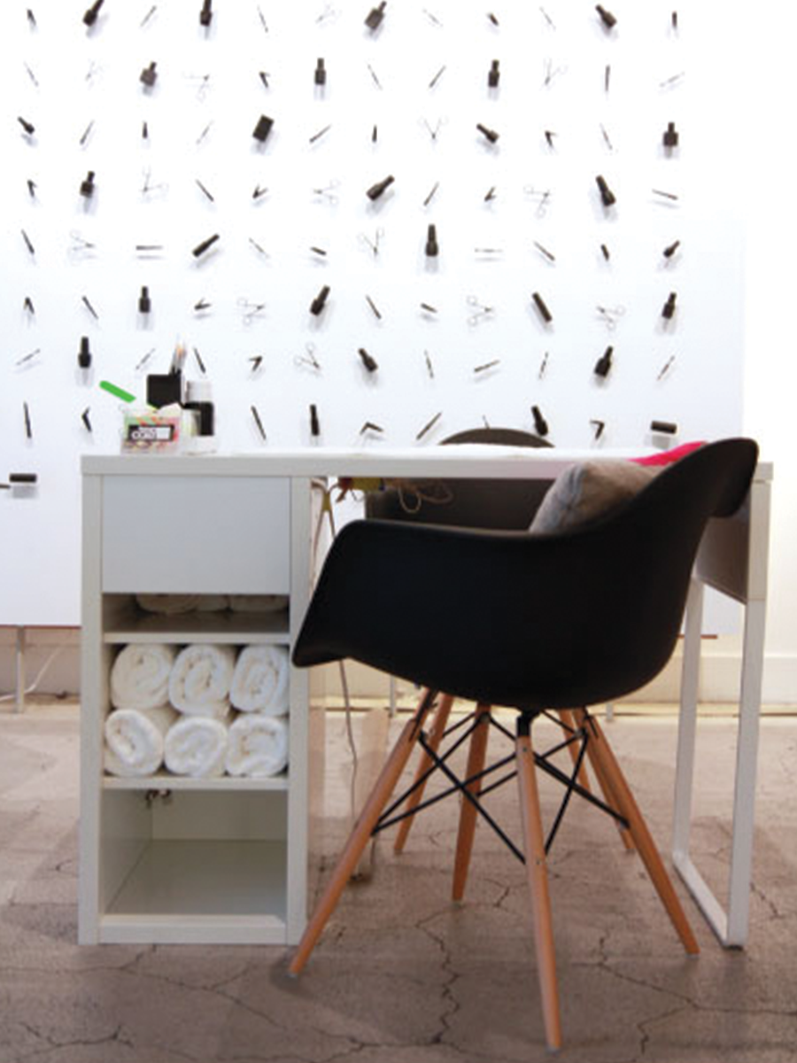
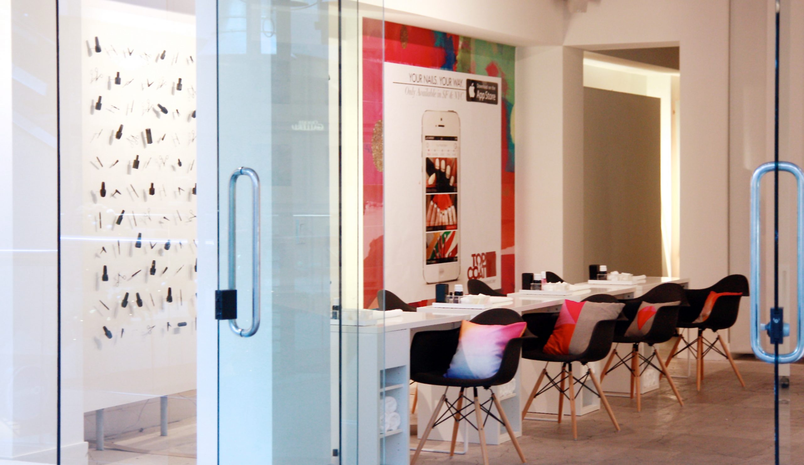
A color scheme in white, black, and light wood was chosen in this commercial design to form a canvas where the nail colors stood out. All the walls in the store were designed to be interactive areas. A monochrome feature wall displaying nail color bottles and tools was used to draw the customers in. Wall shelves in white next to the counter allowed clients to choose their desired colors easily, and also acted as a spot to keep customers occupied while billing. A gallery wall showed pictures of various nail designs, while another displayed the brand’s app. The walls provided inspiration to the clients and encouraged them to interact more with the brand.
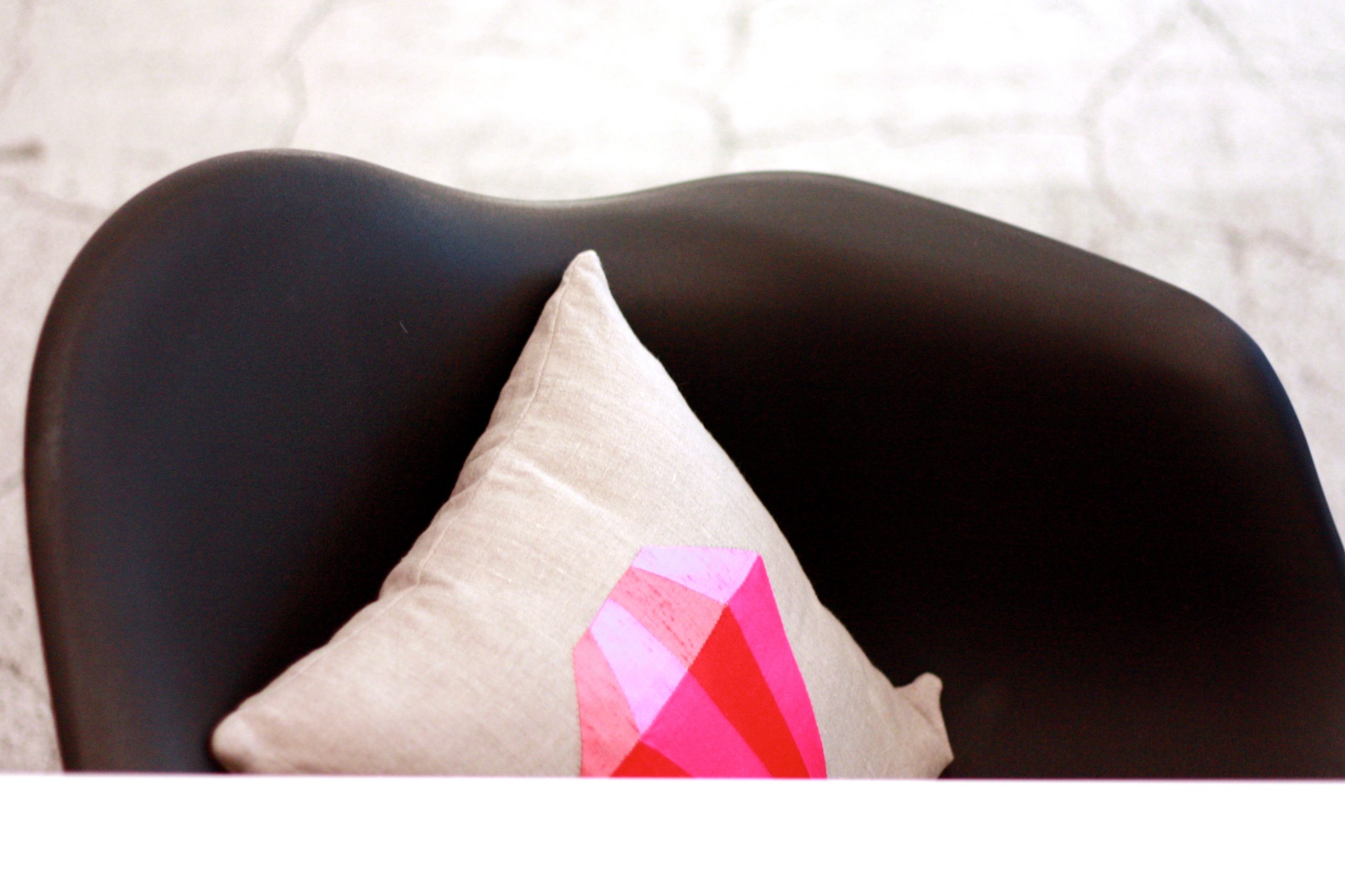
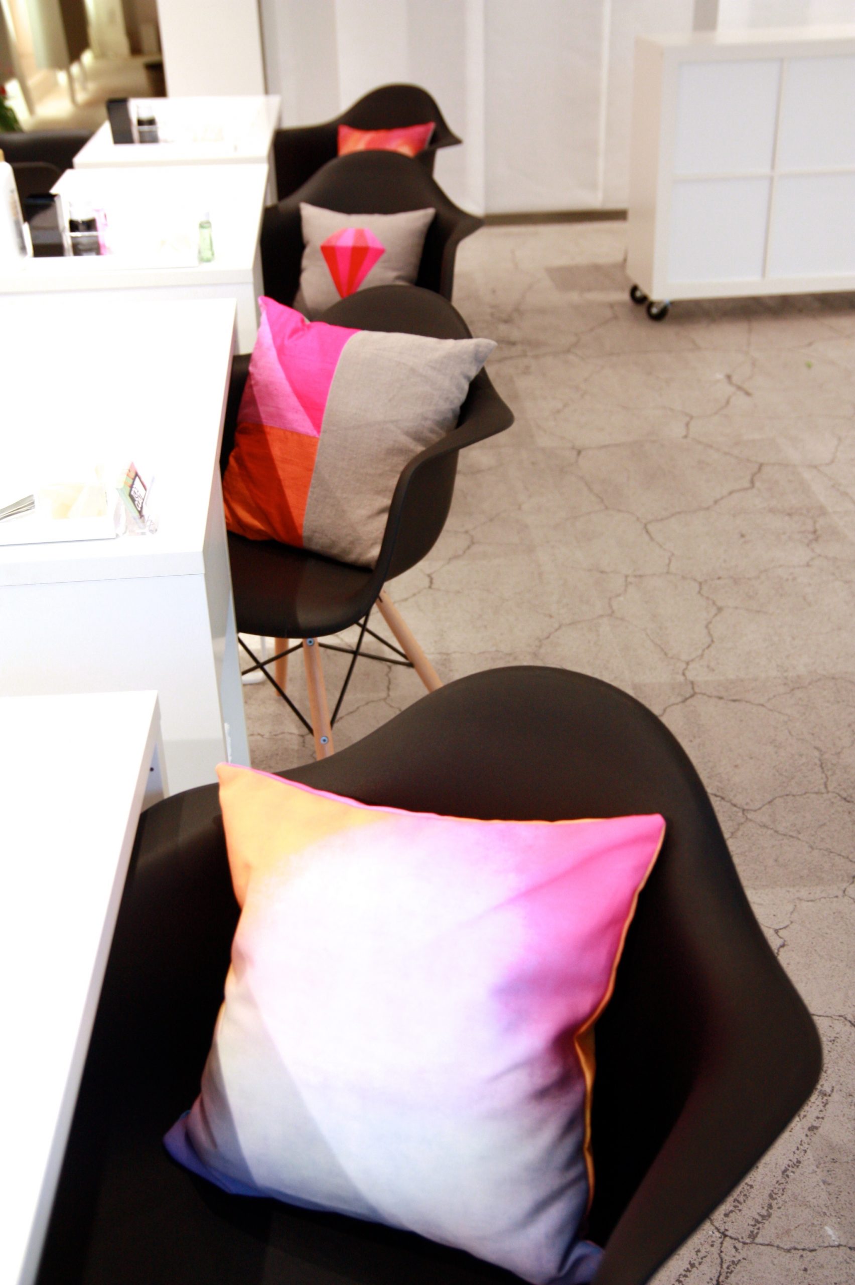
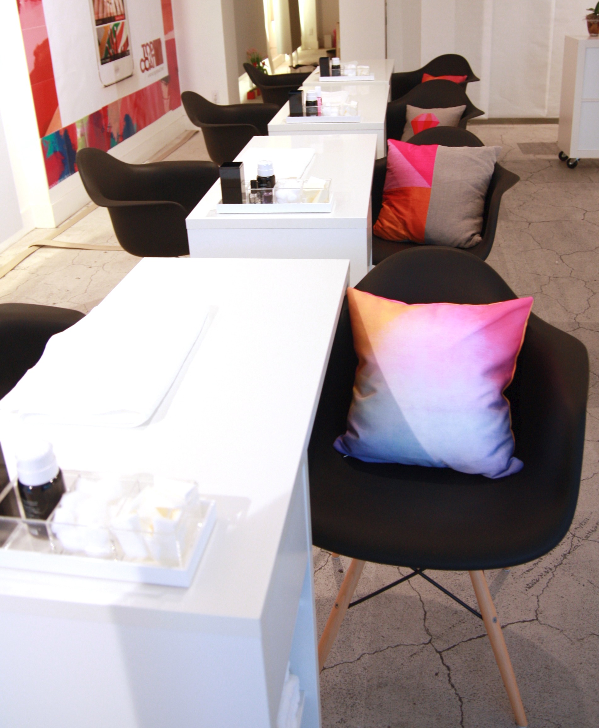
Low maintenance flooring in light concrete was used in the store and blended in with the overall lightness of the space. Simple white tables with storage and modern black chairs with wooden legs were used in this retail design. Colorful cushions on the chairs were added as a fun element that offered comfort.
The minimal retail space with modern furniture design suited the brand and location with its chic and sunny aesthetic. Pops of color conveyed the brand style and appealed to its fashion-forward customers, making the store an instant success in the neighborhood.
