There’s a certain softness in summer that resists definition—something between sea glass and silk, between quiet mornings and golden hours. In both fashion and interiors, we call this ephemeral feeling the summer palette.
But summer colors aren’t just pretty—they’re powerful. They influence mood, perception, even how we remember a space or moment not just on runways and Pinterest boards, but in homes that crave calm and wardrobes that whisper sophistication.
This is your complete guide to summer colors—what they are, how to wear them, and how to live in them.


What Are Summer Colors?
In color theory, summer tones fall into a family of soft, muted, and cool hues with blue undertones. Think: the sky before a storm, petals after rain, chalky seafoam.
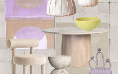
Here’s a classic Summer Color Palette to know in 2025:
- Dusty Blue – calming, timeless, serene
- Mauve – romantic but grounded
- Pale Sage – barely green, endlessly elegant
- Soft White – not quite cream, not quite ivory
- Blush Rose – tender, quiet warmth
- Lilac Grey – a neutral with personality
- Pale Lemon – the softest yellow, barely-there brightness
These aren’t the bold brights of high summer—they’re the colors of reflection, breath, and subtle radiance.
The Psychology of Summer Tones
Summer colors create emotional spaciousness.
In interiors, they open up rooms without feeling cold. In fashion, they flatter without overpowering. Research in environmental psychology suggests that these cooler, dusted hues help regulate the nervous system—promoting focus, calm, and a gentle sense of presence.
It’s no accident that luxury hotels and Mediterranean interiors are bathed in these tones.
They don’t demand attention. They invite it.
How to Use Summer Colors in Your Home
These colors aren’t seasonal—they’re timelessly season-inspired. Here’s how I use them in design:
1. Paint It Soft
- For walls, trim, or cabinetry:
- Farrow & Ball’s Skylight,
- Benjamin Moore’s Moonshine, or
- Little Greene’s French Grey Pale
deliver that chalky softness summer tones are known for.
[See my full list of the best summer paint colors →]
2. Layer Texture, Not Color
Pair pale sage upholstery with linen, matte ceramics, and raffia. Summer tones thrive when they feel dimensional—natural textures over loud contrast.
3. Let the Light Work
These colors change dramatically in daylight—use them in rooms with natural exposure and let the lighting do the layering.
Summer Colors at a Glance
| Color | Interior Use | Styling Tip |
|---|---|---|
| Dusty Blue | Bedroom walls, linens | Layer with ivory and natural wood finishes |
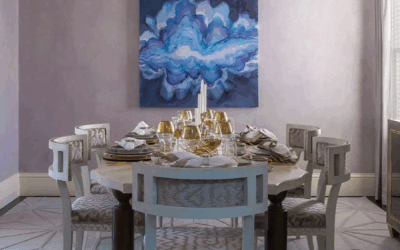
| Mauve | Dining room walls, florals | Pair with brass, navy, or slate |
| Pale Sage | Cabinetry, soft seating | Beautiful with matte black or cane textures |
| Soft White | All-over wall color | Elevate with mixed neutrals and texture |
| Blush Rose | Accent pillows, art | Works well with creamy whites and gold |
| Pale Lemon | Powder rooms, trim | Adds glow without overwhelming |
How to Wear Summer Colors
Summer tones flatter most when worn like watercolors—layered, flowing, and soft at the edges.
Pant Sets + Dresses
- Linen pant sets in dusty rose or sage feel intentional but relaxed.
- A lilac-grey dress paired with gold accessories has just enough contrast for evening.
Accessories
- Pearlescent clutches, raffia textures, matte gold accents—small touches that echo the larger palette.


Summer Color Palettes by Region
Light behaves differently in different parts of the country—and summer palettes shift accordingly.
- In Sarasota: Warm light makes pale cool tones feel grounded. Try ivory, pale green, and faded denim.
- In San Francisco: Fog-soft light loves greys and mauve-pink pairings.
- In Nantucket: Slate blue, driftwood grey, and shell white—nature’s summer palette.
[Browse the Best Summer Paint Colors for Sarasota, San Francisco & Nantucket]
FAQ: Summer Colors & Interior Design
What are summer colors in interior design?
They’re soft, cool-toned hues like dusty blue, sage, mauve, and chalky white that evoke calm and elegance.
How can I use summer colors at home?
Use them in walls, textiles, and layered materials. They pair well with organic textures and sculptural forms.
Are summer colors warm or cool?
They’re cool or neutral, often with blue or grey undertones. They’re meant to soothe, not stimulate.
What’s the best summer color for paint?
It depends on your lighting. Try a test swatch of soft white or sage near your windows and watch it shift throughout the day.
I still remember a client project in San Francisco where we painted a room in Little Greene’s French Grey Pale. In morning light, it felt soft and grounded. By afternoon, it shifted toward lavender mist. That’s the beauty of summer colors—they’re alive. They change with the day. And they change us, too.
A Final Word from Rachel
Color is more than a choice—it’s a memory. Summer colors linger in the background of our most peaceful days. They’re the hue of ease, of sunlight filtered through linen, of lives lived with intention.
I design with them not just because they’re beautiful, but because they’re quietly transformative.
If you want your home to reflect the calm clarity of summer—any time of year—I’d love to help you design it through our design services or our curated shop.

SOMETHING FOR EVERYONE
THE PIECES RACHEL RETURNS TO, AGAIN AND AGAIN