Beige isn’t bland. It’s brave in its restraint.
Once dismissed as the safe choice, beige is staging one of the quietest, most powerful comebacks in design history. But its resurgence isn’t about nostalgia or neutrality—it’s about emotional intelligence.
In a world of overstimulation, beige is the visual equivalent of a deep breath. A reset. A reminder that clarity doesn’t always come in color. Sometimes, it comes in the space between.
Where Beige Went Wrong (and Why It’s Back)
For years, beige suffered from a reputation problem. Brushed onto countless builder-grade walls, it became shorthand for indecision. The absence of color. The default.
But beige isn’t indecisive—it’s nuanced. Its power lies in undertone, context, and materiality. The right beige doesn’t disappear. It grounds. It supports boldness, highlights texture, and invites stillness.
And in today’s world, stillness is a luxury.
From the Kelly Wearstler rebrand of the Santa Monica Proper Hotel to the tonal mastery seen in Bottega Veneta’s latest runway—beige isn’t just having a moment. It’s leading the quiet luxury movement. No logos, no noise—just presence.
“Beige is the pause between two loud thoughts. The margin where good design breathes.” —Rachel Blindauer

The Psychology of Beige: Calm, Comfort, and Control
Beige tones evoke safety, warmth, and trust. Unlike stark white—which can feel clinical—beige is relational. It flatters skin tones, plays well with light, and transitions gracefully from morning to evening.
In color psychology, beige is linked to:
-
Stability: It’s the color of sand, stone, and woven natural fibers.
-
Elegance: When layered with texture and tone, it feels quietly refined.
-
Mental clarity: Less contrast means fewer visual demands—creating a restorative visual field.
This makes beige particularly effective in:
-
Bedrooms (paired with soft lighting and plush textiles)
-
Living rooms (as a backdrop for collected layers)
-
Entryways and transitional spaces (where it calms the pace)
Curious how other colors affect behavior and energy? Explore the Psychology of Color guide.
Beige by Mood & Undertone: A Quick Guide
| Undertone | Vibe | Best With |
|---|---|---|
| Warm Beige | Cozy, grounded | Walnut, brass, terracotta |
| Cool Beige | Minimal, composed | Marble, steel, soft blue |
| Rosy Beige | Romantic, feminine | Mauve, dusty rose, antique gold |
Beige isn’t beige without intention. Undertone is everything.
Designing with Beige: It’s All in the Layers
Beige isn’t one note—it’s a scale. From pale oat to rich fawn, what you choose matters.
Key undertones to consider:
-
Warm Beige: Think creamy cashew or camel—best with brass, walnut, or terracotta.
-
Cool Beige: Think putty or greige—perfect with marble, steel, and muted blues.
-
Rosy Beige: Works beautifully with mauve, dusty rose, or soft plum.
Styling Advice from Rachel:
“Beige doesn’t compete. It completes. I use it to pull focus where I want it—to an heirloom table, a hand-thrown ceramic, the shadow play of afternoon light on linen.”
Texture is the secret: Combine matte finishes, open weaves, and natural materials.
Think abaca placemats, linen napkins, raw oak, and woven lighting.
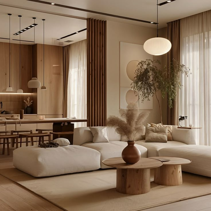
Is Beige the New White? (Yes—But Smarter)
Where white can feel sterile, beige adds depth. It’s a better backdrop for art, photography, and people. It warms cool daylight and softens harsh shadows.
If you’ve ever stood in a perfectly beige room and felt…relieved—that’s no accident. It’s color psychology doing its quiet work.
Try this: Replace bright whites with soft beiges in your next space refresh. Walls, slipcovers, even cabinetry. The result? Timeless, tranquil, and quietly confident.
Rachel’s Favorite Beiges for Interiors
-
Farrow & Ball “Skimming Stone” – Elegant and barely-there
-
Benjamin Moore “Muslin” – A warm, flexible beige that flatters every room
-
C2 “Bone” – Complex and grounding, ideal for cabinetry or trim
-
Little Greene “Joanna” – A cool-leaning beige that feels polished, not cold
Subtle, Not Subdued: Shopping in the Beige Spectrum
Design-forward beige doesn’t mean “boring.” Here are a few pieces that embrace the palette without losing personality:
Paloma Scallop Placemat – Woven abaca that adds natural texture to a neutral table
Capri Marble Catchall Tray – Beige heirloom tray that turns a quiet surface into a curated still life.
Marais Woven Rattan Chest – A quiet standout in any room it brings artisanal texture and everyday grace to the art of storage.
Solaire Upholstered Dining Chair – Textured upholstery meets soft-spoken sophistication
3 Reasons Beige Is a Design Power Move
It reflects light more softly than white, flattering skin tones and furnishings.
It highlights texture—wood, linen, rattan—without competing for attention.
It creates a calming, restorative atmosphere that adapts to any mood or season.
Final Thought: Beige Is an Intentional Blank Canvas
Beige is what makes everything else make sense. It’s not a filler—it’s a frame. A color that doesn’t need to shout to be heard.
Because when a space feels right—but you can’t quite explain why—there’s a good chance beige had something to do with it.
Book a 2-Hour Color & Design Consultation
Discover the tones that restore you—and build a palette that’s quietly powerful.
Designing a hotel, model home, or branded space?
Inquire about partnerships to bring this intentional aesthetic to your next project.
SOMETHING FOR EVERYONE
THE PIECES RACHEL RETURNS TO, AGAIN AND AGAIN

