Before color becomes design, it begins as feeling.
In a Florida guest room, I once painted the walls a chalky blue-gray. The room had become a relief and mirror of calm the client didn’t know she needed.
This is what good color does: not just decorate, but restore, energize, clarify. And while design trends may come and go, the emotional impact of color remains quietly powerful. Whether you’re designing a restful bedroom or an invigorating kitchen, understanding the psychology of color is one of the most potent tools in your interiors toolkit.

The Psychology of Color: What Science—and Experience—Reveal
Color doesn’t just live in the eye; it lives in the body. Cool blues can slow your heart rate. Vibrant reds can raise it. This isn’t just design dogma—it’s backed by research in cognitive science and psychology.
-
Blue: Linked to trust, calm, and lowered blood pressure. Think open sky, still water.
-
Red: Stimulates alertness, passion, appetite. Useful in spaces where energy is welcome—like kitchens or dining rooms.
-
Green: Associated with growth and balance. Just as nature restores us, so do its tones indoors.
But it’s not universal. Cultural context matters. In many Western cultures, white symbolizes purity. In parts of Asia, it’s the color of mourning. Purple, once reserved for royalty due to its rarity and cost, now signifies spirituality and depth. Good design doesn’t impose—it listens. And your color story should reflect the layers of who you are.
Warm Colors: Energy, Comfort, and Connection
There’s a reason so many kitchens glow with hints of terracotta or marigold—warm colors gather people. They create intimacy, spark conversation, and infuse rooms with a lived-in kind of joy.
-
Red: Bold, passionate, best used intentionally. In small doses—an accent wall, a piece of art—it adds confidence and heat.
-
Orange: The happy medium. Inviting like a late-summer sunset, orange works well in creative spaces or casual dining areas.
-
Yellow: Light itself. Uplifting and optimistic, ideal for rooms that benefit from a mental boost—like breakfast nooks or small home offices.
Style note: Balance the exuberance of warm hues with organic textures—think handwoven placemats, linen curtains, or matte ceramic vases.

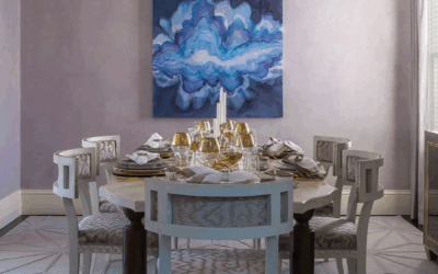
Cool Colors: Calm, Clarity, and Reflection
Cool tones are the interior world’s exhale. They offer reprieve from visual noise and support the kind of deep rest modern life rarely makes room for.
-
Blue: From pale sky to deep indigo, it’s the most psychologically calming hue. Best for bedrooms, bathrooms, or focus zones.
-
Green: Evokes nature, renewal, and growth. Use it in offices, kitchens, or anywhere you need grounded energy.
-
Purple: A fusion of fire and water. Soft lavenders feel meditative; deeper plums add intellectual depth.
Tip from Rachel: Pair cool hues with tactile contrast. Try a navy blue linen napkin beside raw oak. Or a sage green pillow atop crisp white bedding.

Neutrals: Balance Without Boredom
Neutrals are often underestimated. Done right, they’re not bland—they’re grounding. They allow other elements—light, form, material—to shine.
-
White: Pure, expansive, quietly modern. Use it to create visual breathing room.
-
Gray: Sophisticated and endlessly adaptable. Warmer grays feel cozy; cooler tones read clean and minimal.
-
Beige: The unsung hero of timeless interiors. Its warmth plays beautifully with wood, metal, and woven materials.
Beige is trending again—not as a default, but as a choice. Its softness feels like permission to rest.

Color Combinations That Work—and Why
Designing with color is rarely about a single hue. It’s about relationship and rhythm.
-
Complementary colors: Opposites on the color wheel (e.g., blue and orange). High contrast, high impact—perfect for dynamic, statement-making spaces.
-
Analogous colors: Neighbors on the wheel (e.g., blue, blue-green, green). Naturally harmonious and serene.
-
Monochromatic: Variations of a single hue. Elegant and controlled—ideal for minimalist or tonal interiors.
-
Triadic: Three evenly spaced colors (e.g., red, yellow, blue). Vibrant and balanced, great for playful or creative rooms.
Design tip: Limit your palette to 3 main tones. Then layer in texture, form, and material to keep things interesting.
Final Thought: Color is a Language. What Are You Saying?
The colors that surround you don’t just affect your space—they affect your state. Choose with intention. Use what calms you, what energizes you, what feels like you.
Whether you’re repainting a single wall or reimagining an entire home, color is your quietest—and most powerful—design collaborator.

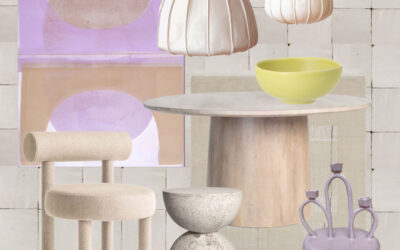
SOMETHING FOR EVERYONE
THE PIECES RACHEL RETURNS TO, AGAIN AND AGAIN