What Are Analogous Colors—and Why Do They Work So Well in a Home?
Color, when done well, doesn’t just decorate a room—it orchestrates how we feel inside it. And one of the most elegant ways to do this? An analogous color scheme.
If you’ve ever walked into a room and felt instantly soothed—without quite knowing why—there’s a good chance it was built on this quiet but powerful principle.
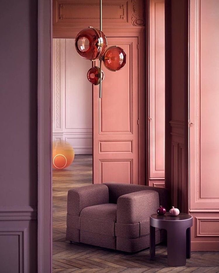
Analogous colors are neighbors on the color wheel. Think blue, blue-green, and green. Or burnt sienna, clay, and rose. Their magic lies in their subtlety. Instead of loud contrasts, you get tonal harmony—a soft flow that mirrors the gradients we see in nature: the way the sky shifts from gold to coral at dusk, or how leaves transition from lime to moss.
In interior design, analogous color schemes are a powerful tool for creating cohesion without monotony. When executed properly, they provide the best color combinations for interiors that feel harmonious, livable, and emotionally aligned with the people who live there.
Why Designers (and Psychologists) Love Analogous Color Palettes
These palettes don’t shout. They hum.
Psychologically, analogous color schemes feel cohesive, relaxing, and easy on the eyes. They’re ideal for creating mood-specific environments: restful bedrooms, welcoming foyers, or even energizing kitchens when you lean into warm tones like ochre, amber, and terracotta.
And as a designer who’s worked on spaces from Nantucket to Sarasota, I can tell you this: when a space needs to feel serene and intentional, analogous schemes are often my first instinct. They’re especially effective for clients looking to create a calming color palette for the home without sacrificing style or character.
How to Build an Analogous Color Scheme
Start with one dominant hue that reflects the emotion you want to anchor.
From there, select one or two neighbors on either side of that hue on the color wheel. Then layer in light, mid, and dark tones for depth. The real art lies in the proportions—I use a modified 60/30/10 rule:
- 60%: Main hue (think walls, large furnishings)
- 30%: Secondary analogous hue (think rugs, upholstery, window treatments)
- 10%: Accent hue (pillows, art, florals)
All while ensuring your neutrals don’t disrupt the harmony—they should support it. (Warm whites or soft oatmeals often work beautifully.)
Need guidance? A Verdant Malachite Box can help you navigate your color choices with precision and ease.
Design Tip: Keep the Saturation Consistent
Want your analogous scheme to feel effortless instead of chaotic? Match your tones. If your main hue is dusty, your accompanying colors should be equally muted. If it’s bold, the rest should have equal presence.
For example, pair cornflower blue with sage and soft spruce. Or go vibrant with cerulean, teal, and leaf green.
Need inspiration? You can always start with nature—a sunrise, a stone fruit still life, or even a ceramic glaze.

Quick Guide to Analogous Color Combos
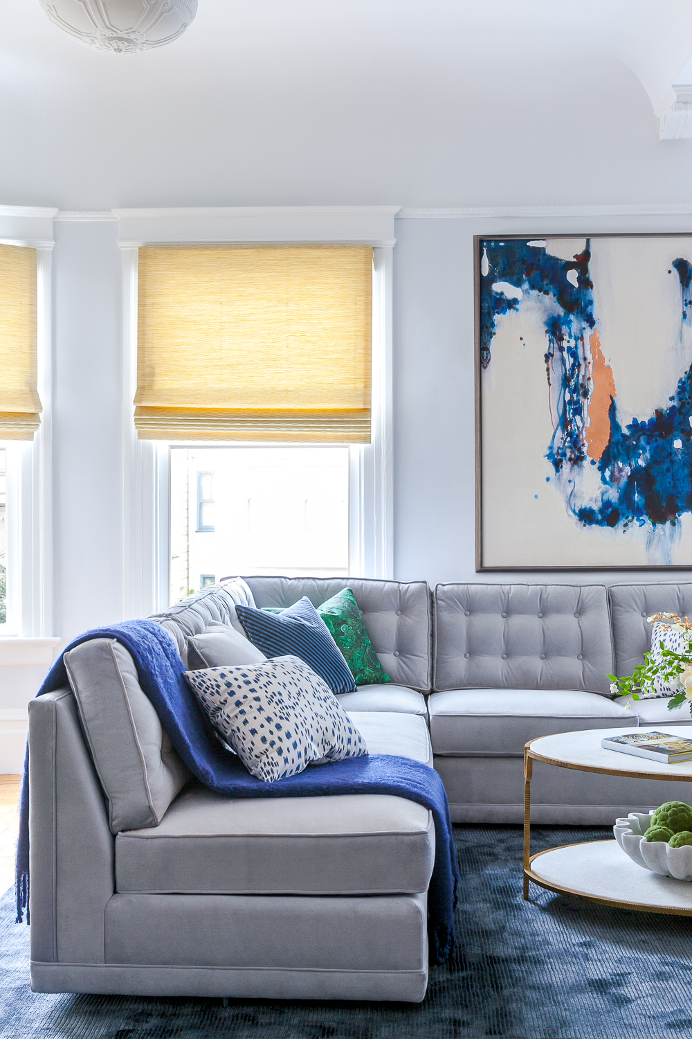
- Blues & Greens: Sky blue, teal, olive
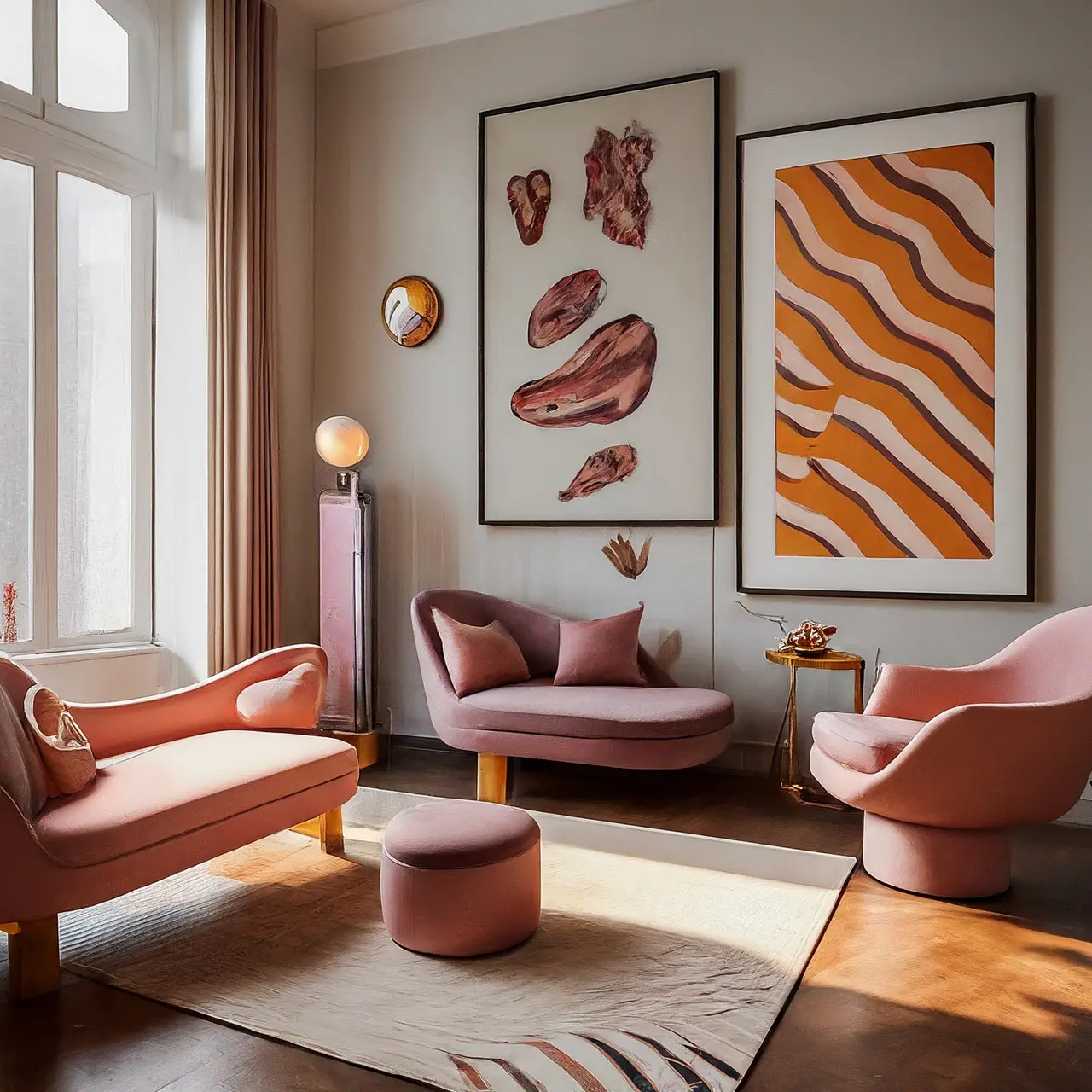
- Warm Neutrals: Clay, terracotta, blush
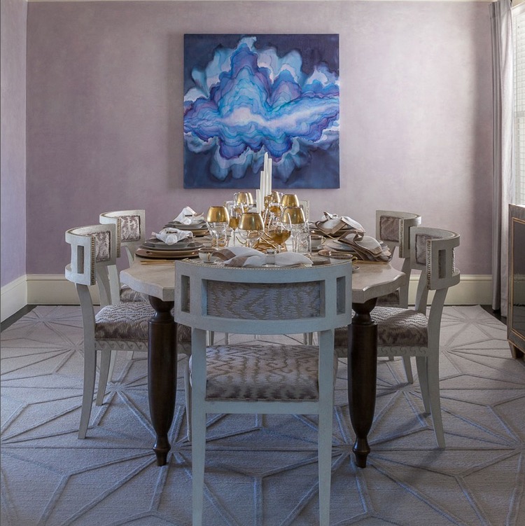
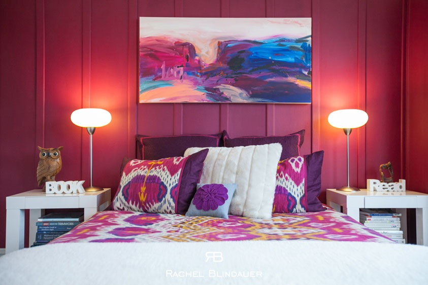
- Purples: Lilac, mauve, plum
- Yellows: Goldenrod, saffron, ochre
Use these combinations as a jumping-off point for designing each room with emotion in mind.
What Not to Do with Analogous Colors
Even the most intuitive color strategy has pitfalls. Avoid these common missteps:
- Clashing saturation – Don’t mix vibrant with dusty tones unless intentional. Match the intensity across all hues.
- Overcrowding – Stick to two or three hues. Adding more disrupts the harmony.
- Forgetting texture – Tonal schemes need material contrast to stay visually interesting (think velvet against linen or rattan beside lacquer).
Want more tips? Explore how to decorate with color for foundational color strategy insights.
Real Rooms Using Analogous Color the Right Way
- A Soothing Living Room: Sky blue grasscloth walls, lavender velvet chairs, and green-gray accents for an elegant take on the blue-purple-green triad.
- A Warm Dining Room: Muted saffron walls, rust-colored dining chairs, and a vintage blush rug anchor a conversation-ready space.
- A Boutique-Inspired Bedroom: Dusty lilac walls, mauve bedding, and plum velvet ottomans—a layered nod to the purple spectrum.
For a few analogously styled accents, I curated several pieces available in the shop: from hand-blown glass vases in tonal sets to raffia-wrapped boxes in coastal greens.

When to Break the Rules
Design, like any good conversation, allows for pauses, emphasis, and contrast. Once you have your analogous foundation, consider punctuating it with a complementary hue used sparingly. A pop of coral in a sea of greens. A brass beetle knob on a pale blue lacquered nightstand.
(Yes, that one. It’s a perfect example of quiet whimsy meeting tonal harmony.)
Not Sure Where to Begin? Let’s Design It Together
Analogous colors are elegant in theory—but transformative when tailored to your space. Book a Verdant Malachite Box and I’ll help you build a palette that reflects not just your style, but your story.
About Rachel Blindauer
Rachel Blindauer is an award-winning interior and product designer with over 15 years of experience. Her work blends architectural clarity with an artist’s restraint. From boutique hotels to homes that feel like retreats, she designs spaces that are equal parts elegant and livable.

SOMETHING FOR EVERYONE
THE PIECES RACHEL RETURNS TO, AGAIN AND AGAIN